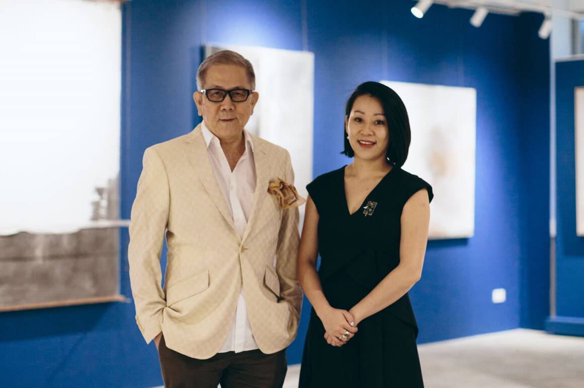
Man and woman standing next to each other

Chong Huai Seng is one of Singapore’s most respected collectors. He and his daughter Ning Chong, a first mover in art investment advisory, speak with LUX Leaders and Philanthropists Editor Samantha Welsh about the future of art as an investment of passion

When international banker Chong Huai Seng started buying art in the 1980s, he could not have imagined growing a collection that would catalyse a forum for South East Asia’s prominent collectors, artists and experts; nor that in co-founding a gallery The Culture Story with his daughter, Ning Chong, she herself would see a gap for a specialist art investment advisory and would go on to found the Family Office for Art (FOfA). Father and daughter share their approach and insights into dealing with passion assets such as art

When did your collecting journey start?

Mr Huai Seng Chong: My collecting journey started in the mid 80’s when I was a stock broker and I used to travel to London frequently for business trips. I loved traipsing around Mayfair, dipping in and out of galleries. I started buying British sculpture and Russian paintings, very unusual because most people start buying art from their own country. I was merely responding to what I like, my daughter likes to call it “retail therapy” at a time before the internet, and all you had, was to trust your instinct and sensibilities.

Nina Chong: About seven years ago, I introduced some governance to my father’s art collection, cataloguing and art collection management and to assess the strengths of the collection and where we should focus our future acquisitions. With that, we are able to identify themes within the collection, and Dad always enjoys selecting and curating the pieces which we put up in our private gallery The Culture Story. Personally I started my own collection a mere two – three years ago. I realised I had a point of view, which was different from my father’s and there were certain artists and themes which resonated more strongly with me, as a new mother, as an entrepreneur.
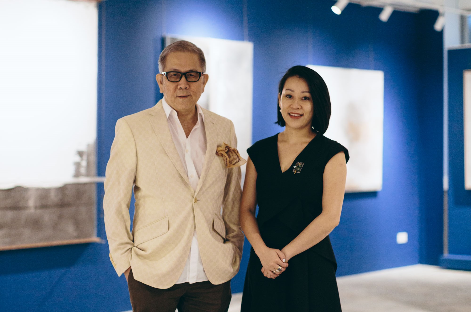
Man and woman standing next to each other

Mr Huai Seng Chong and his daughter Ms Ning Chong are two of Singapore’s most respected collectors.

How did you decide a career as an art professional was for you?

CHS: Art collecting started as a hobby for me, almost forty years ago! I never thought this is something I would continue to do, and now this hobby has turned into a business venture between me and my daughter. This is something we did not plan to do, but I’m happy that we are on this adventure together.

NC: When I was young, I was surrounded by works of art and as a family we used to follow my Dad to visit galleries on the weekend. It was only after graduation, when I didn’t want to pursue banking or finance that my father nudged me to consider the art world. I did my own research, including a few internships in London before I decided that I would commit and pursue a career in the arts. It took me a long time to get to where I am, looking back it has been very rewarding to work in different areas such as art fairs, auction house, galleries to government policy work, it has given me a very comprehensive overview of the art ecosystem.

Follow LUX on Instagram: luxthemagazine

What was the vision behind The Culture Story?

CHS: We started The Culture Story in June 2017 as a private gallery, like Gertrude Stein salon’s setting in her Paris apartment in the 1920s where artists, poets, writers, thinkers would get together and make merry. For us, we wanted to create a cosy environment where we can share works from our family collection, and encourage other collectors to collaborate with us. By organising exhibitions and hosting talks with artists, collectors and art world professionals, The Culture Story aims to promote greater understanding and discourse around art and foster connoisseurship.

How has the mission and collection evolved?

CHS: We are still very much following the mission we set out for The Culture Story at the beginning. The Singapore art scene has matured significantly and we are at a stage where other art collectors are open to collaborate with us. They are happy to share work(s) from their private collection, especially when they encounter feedback from members of the public, students or other art collectors and professionals.
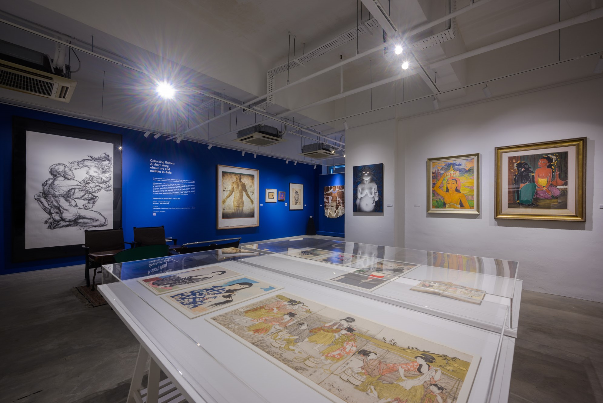
Images hanging inside an art gallery

“Collecting Bodies: a short story about art and nudity in Asia” with works on loan from 10 art collectors

NC: We try to focus on a few themes amongst our family collection. Recently, we have loaned some of our works to museums for various exhibitions. One in particular is an early Kim Lim sculpture which is currently on view at the Hepworth Wakefield Museum in Yorkshire, United Kingdom. Later this year, the entire exhibition will travel to the National Gallery Singapore for her long-await retrospective exhibition.

We also loaned paintings by Futura and Timothy Curtis to Art Science Museum in Singapore for an exhibition called Sneakertopia, which celebrated everything related to the rise of street culture and pop art, and the phenomena of sneaker culture.
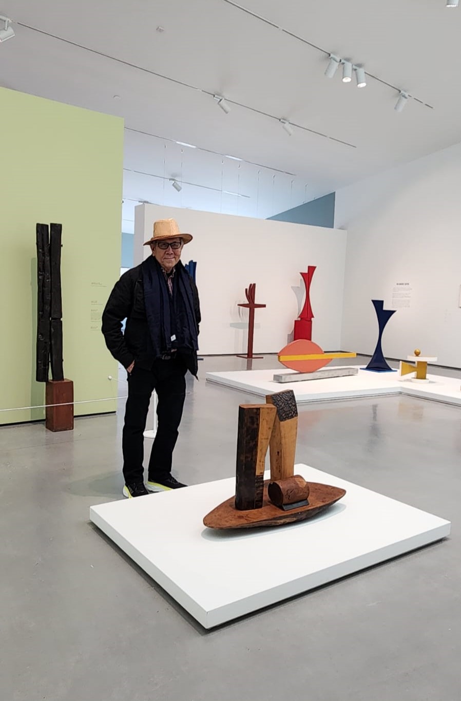
Man standing next to a sculpture

Kim Lim at Hepworth: the first major museum exhibition of Lim’s work since 1999, offering unparalleled insight into the artist’s life and work.
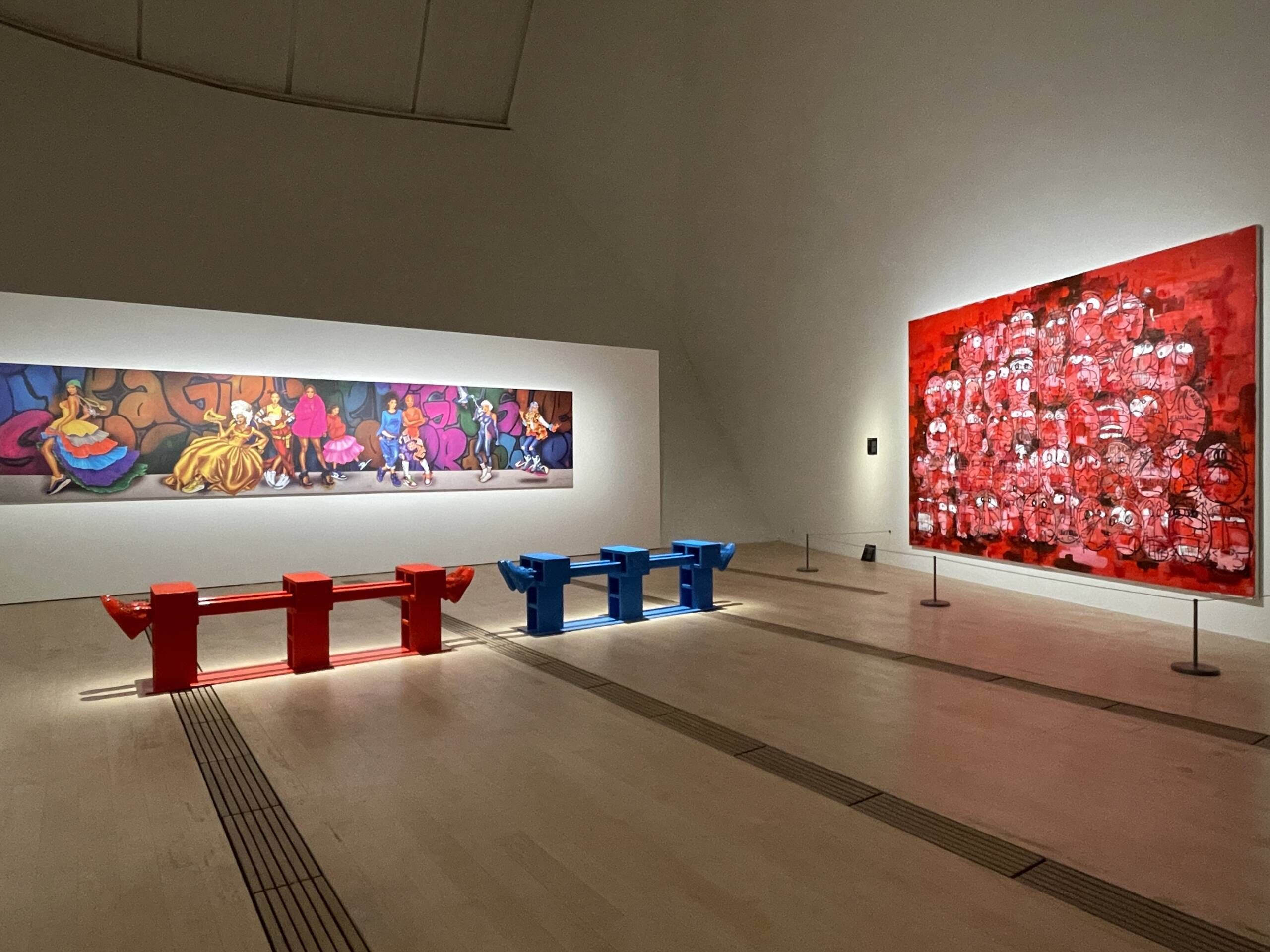
Artsworks shown in a room

Futura and Timothy Curtis at the Art Science Museum

Where has your acquisition strategy been particularly effective in nurturing innovative artists?

CHS: I like to support Singapore’s young and emerging artists. There is one artist in particular Hilmi Johandi whom I spotted almost fifteen years ago at the Affordable Art Fair in Singapore in 2011, today he is represented by OTA Fine Art, one of Japan’s leading contemporary art galleries who also represents Yayoi Kusama. I commissioned Hilmi to create a family portrait for us. Since then I support his practice by buying a work from every new series.
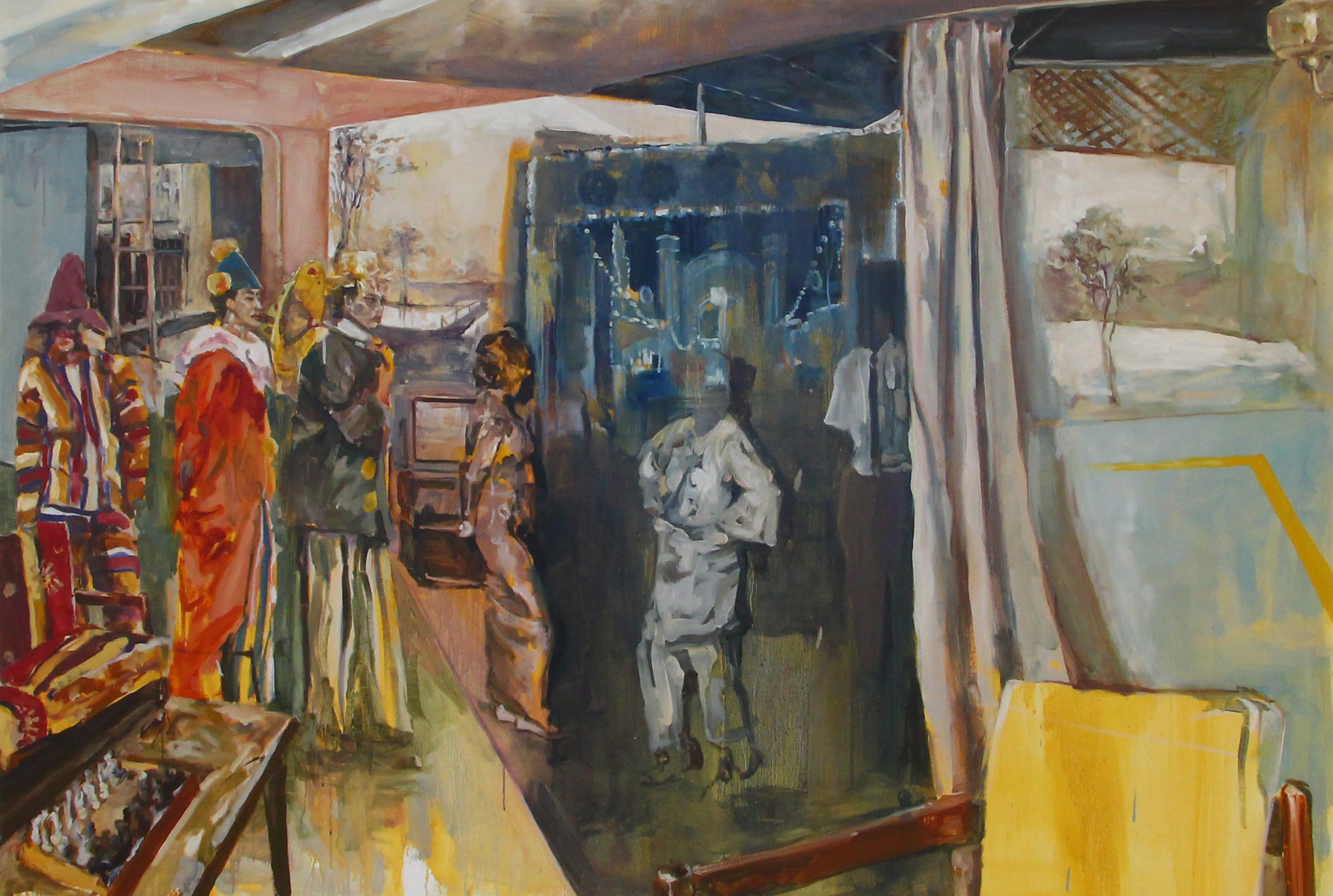
Colourful art painting

Hilmi Johandi works primarily with painting and explores interventions with new media that are associated within the domain of framing, fragmentation and compression

What is it about the Asian art market and intergenerational wealth transfer that created demand for the Family Office for Art (FOFA)?

NC: The South East Asian art market is still a young one, over the two decades we have seen significant progress with the emergence of galleries, art fairs, biennales, dealers and private museums etc.

Two years ago, I identified a gap in the industry, and I felt there were many things I could offer and help other collectors, the same way I used my skills and experience to maintain my father’s art collection. Most wealthy families have their financial assets and businesses handled by their private banker or family office, more often than not, the soft assets such as art and collectibles are overlooked or neglected. However these “passion assets” are very much part of the principle’s estate and his/her legacy. I’ve been studying this space for some time and I’ve learnt that with a proper system in place, it is a significant step towards protecting and enhancing the art collection’s commercial and cultural value.

At FOFA, we understand that dealing with passion assets such as art can be emotional and sentimental, and more often than not, it would require some degree of family involvement. These types of discussions and conversations are not unfamiliar to us and may take a long time to materialise, so our approach is to take a long term view and invest in these relationships.

Read more: Yulia Iosilzon’s groundbreaking new show in London

Based in Singapore, we are well-positioned to meet and serve Asian collectors in the region. Over the next decade and even in present times, it has been said that there will be unprecedented levels of wealth transfer in Asia. Given our first mover advantage and as we continue to grow and widen our international network, FOFA is ready to help families look after and manage their passions or alternative assets such as fine art and collectibles.

 

Share:
Reading time: 6 min
Books
Books

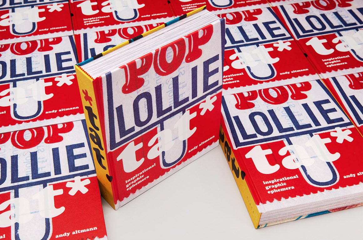
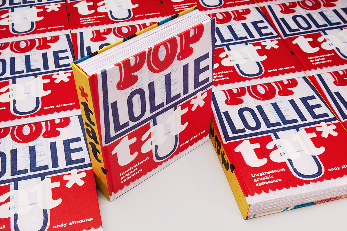
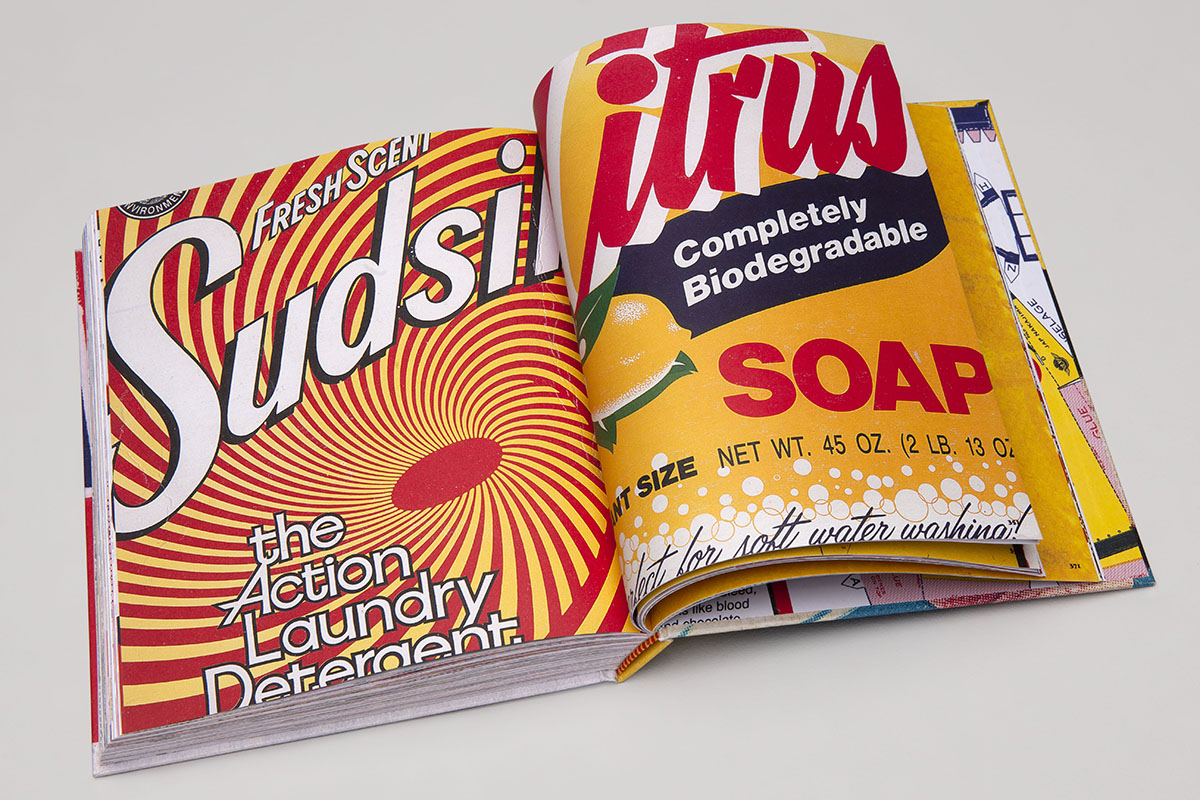
tat* by Andy Altmann

Some people collect wine or classic cars; others collect coins or stamps. Andy Altmann collects graphic ephemera – or what he calls ‘tat’. Altmann developed his interest in scraps during his career at Why Not Associates, the multidisciplinary studio he founded upon graduating from the Royal College of Art over three decades ago. Now, the graphic designer has compiled his collection in a singular, self-designed publication. Here, Altmann speaks to LUX about how the book mirrors his design evolution, and why brash design need not be devoid of beauty

man with box1. Of all the things you might collect, you chose ‘tat’. Why?
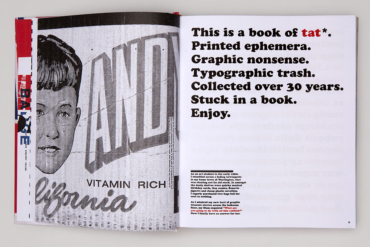
It’s hard for me to explain exactly why I collect tat*. When I was a young boy, my mother noticed me sitting at the kitchen table, carefully studying the label on an HP Sauce bottle. When she enquired why, I apparently replied, ‘someone must have to design this’. I was instinctively attracted by the lettering, the colours and the illustration of the Houses of Parliament on what is still my favourite condiment. It’s a classic example of what was once known as ‘commercial art’. It did its job and pulled me in.

Follow LUX on Instagram: luxthemagazine

However, I didn’t start collecting any graphic ephemera until I was studying graphic design at St Martins School of Art in the early 1980’s. We were encouraged to keep sketchbooks, where we could practice our drawing and put our creative thoughts down on paper. I wasn’t as gifted as some of my peers at drawing, so I started to turn these sketchbooks into idea notebooks where I would also stick in any relevant piece of graphic ephemera. With time, these developed into pure scrapbooks with more and more tat* lovingly glued into their pages. There is a great nostalgic attraction to the particular era that the ephemera has been produced in. But it is also my fundamental fascination with popular culture, including the history of Pop Art, which was and still is a huge influence on me – where the everyday is embraced and celebrated.

2. tat* emphasises the disposability of graphic ephemera even while immortalising it in book form. What fascinates you about that interplay?

These ephemeral pieces of tat* were not designed to survive for a long time. They had a job to do and, in the majority of cases, they end up in the bin. There is certainly irony in me celebrating what some may see as poor graphic design, destined for the trash, ending up in a fancy hardback coffee table book. But I hope people can also see the beauty in the ugly. The cheap production values of much tat* means that the printing is often poor and mis-registered – but to me, this only adds to their aesthetic attraction. I don’t know why this should be: maybe it’s like a stamp collector who is looking for a printing mistake, which makes a stamp much rarer. I think it may however be that they just feel more human, less perfect.

book

tat* by Andy Altmann

3. You frequently extrapolate memories from the graphic scraps reproduced in tat* – of your upbringing in Warrington, or sitting and watching World of Sport with your grandfather. Could we call it a diary of sorts?

I guess it is a kind of diary, as it illustrates moments through my life in association with printed pieces of ephemera. They can evoke various memories of where I may have found them, who gave it to me or a subject that is dear to me. A good friend of mine, on reading a copy of the book, described it as now being his ‘favourite autobiography’. I really like that description. It was a revelation to me, as I had not thought of it in that context, but it’s a really interesting way of viewing it.

As a graphic designer, it is rare for me to be asked to write about anything. I consider myself more of a visual person, so I was hesitant to include any written words in the book. But I was encouraged by friends to have a go at including relevant stories after recounting some of them when showing them work-in-progress spreads. In the end, I found the writing a really enjoyable and rewarding experience, and it turned the final book into a much more interesting piece of work.

Read more: Pioneering Artist Michael Craig Martin on Colour & Style

4. Much of that depicted in tat* is brash, erroneous, or what might be considered ‘bad’ graphic design. What value is there to be derived from this kind of design?

Having a collection of graphic ephemera can be useful to any practicing graphic designer. It’s a library of visual thoughts. Some may be deemed naff or crude but any piece could spark an idea, illustrate a great colour palette, inspire a typographic layout or choice of font. It doesn’t really matter that it may be considered ‘bad design’ – there may well be something that could be taken to start a tract of creative thought.

I was a co-founder of the multidisciplinary design practice Why Not Associates. I used to keep all my scrapbooks of tat* in the cupboard next to my desk. If a designer was having a creative block I used to encourage them to flick through some of the scrapbook pages in the hope that they may spark an idea or just freshen the mind. Some of our best ideas started from a thought inspired by a piece of tat*.

book

tat* by Andy Altmann

5. tat* is clearly fascinated with vintage or retro design. Would you say that any one period inspires you most as an artist and, if so, which one?

That period would be the 1960’s and 1970’s because, as with many people, I think I am most strongly drawn to the period of my childhood. It is where we form our fundamental characteristics and loves that stay with us for life. I guess it’s the basic human desire for nostalgia for our youth. One only has to watch contemporary television to see the many shows dedicated to salvaging objects from peoples childhoods or early adulthood.

Read more: Big Boy Blue: In the Studio with Idris Khan

6. You ran a design studio, Why Not Associates, for 33 years before you decided to embark on more personal projects like tat*. How have you ensured that your designs stay inventive and surprising throughout your career?

I co-founded Why Not Associates with two fellow students on leaving the Royal College of Art in 1987. We never worked for another design company, and I think because of this direct transition we maintained the spirit for experimentation and surprise that we had developed as students. We left the RCA with just three drawing boards, but we were among the first design groups to buy an Apple Mac. We were not scared of the change, unlike many of our contemporaries, and we embraced the technology which led us to be one of the first multidisciplinary design groups. An open mind to change, collaborating with people of all ages and not taking yourself too seriously help to keep new, inventive and surprising ideas flowing.

I don’t think my approach to solving a creative problem has basically changed over the years. I am a curious person who loves researching the background to a project and this always forms the platform to relevant and strong ideas. However, you still need that child-like mind to embrace the unexpected. Look at it upside down and back to front. What at first may seem to be a daft notion or irrelevant idea could turn it into a thought provoking concept.

Find out more: circa.press

Share:
Reading time: 6 min
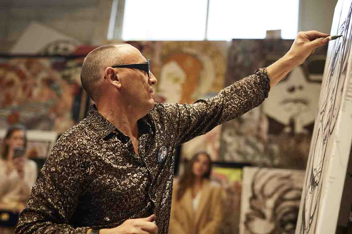
Artist painting
Artist painting

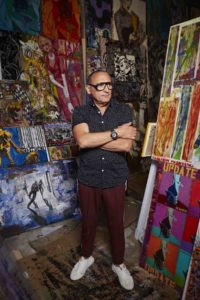
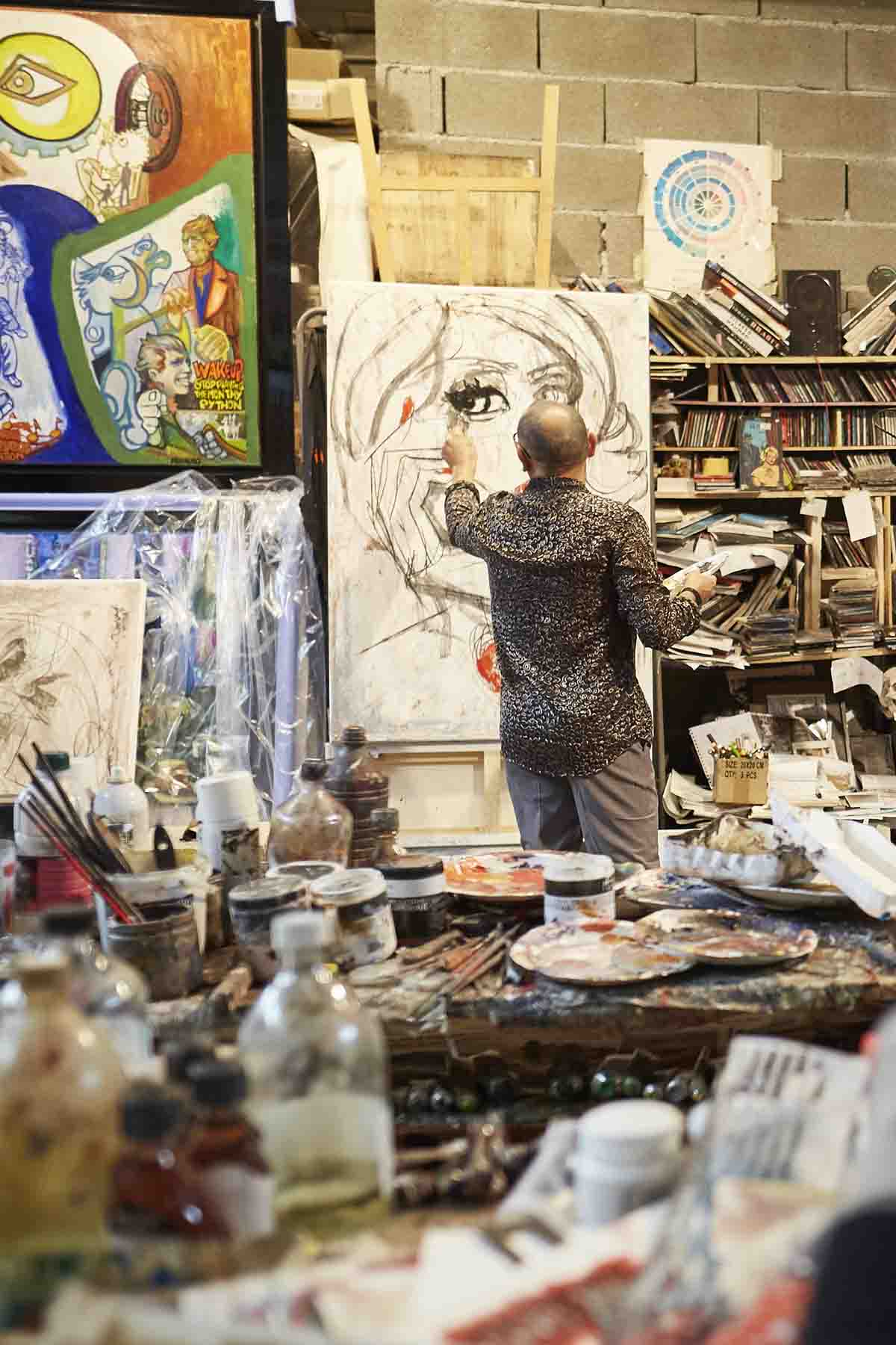
Marc Ferrero in his studio

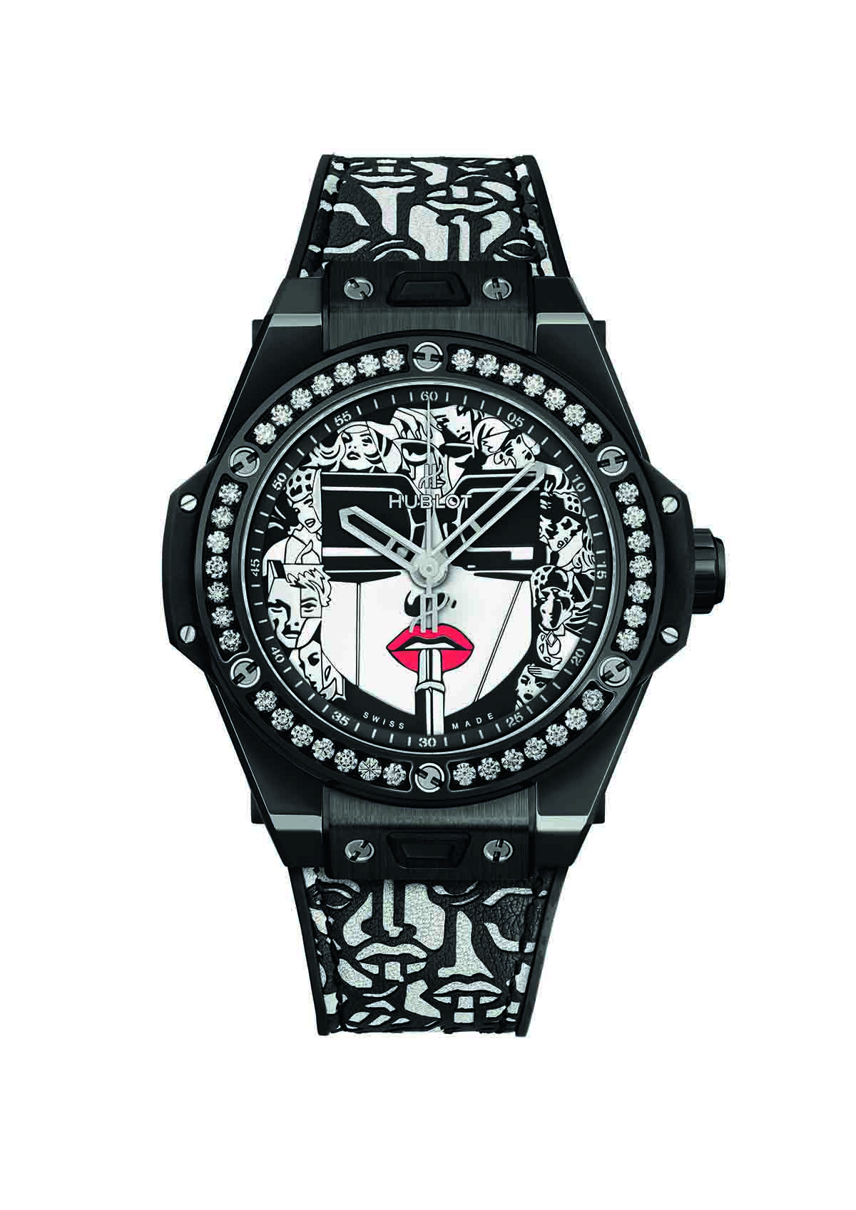
Marc Ferrero’s unique practice of ‘Storytelling Art’ combines aesthetic styles and visual references from different artistic movements and cultures to create striking, narrative-driven paintings. His most iconic artwork ‘Lipstick’ first appeared on the watch face of Hublot’s Big Bang One Click last year, and this month, marks the launch of the latest edition in monochrome. Here, we speak to the artist about visual storytelling, the language of colour and man versus machine

Artist in the studio

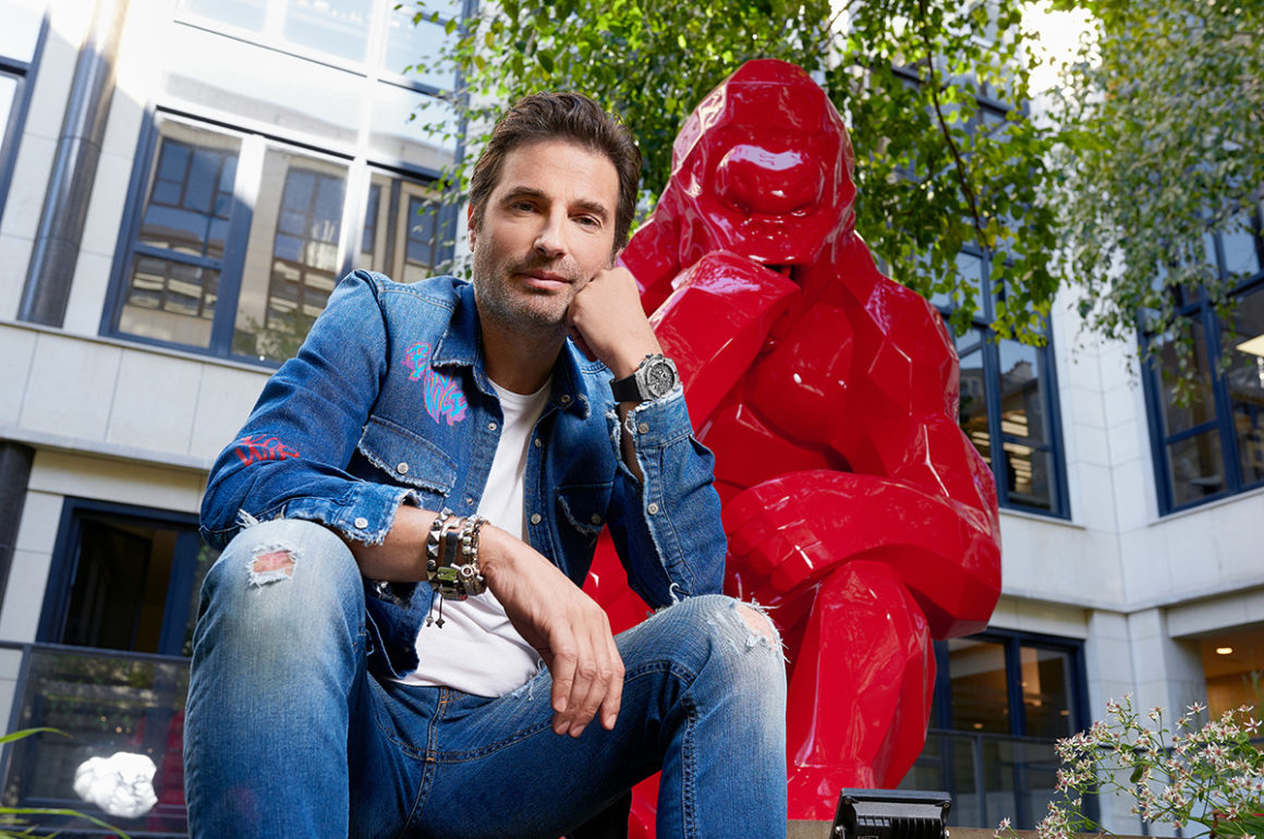
Marc Ferrero wearing his Hublot watch

1. Tell us about the concept of Storytelling Art.

Artistic movements will always be a mirror of their generation. To me, a simple graphic representation doesn’t speak loudly enough to create big emotions, but stories touch many different sensibilities. Telling a story, means that you enter in the imaginary world of  people. Nobody is passive in the face of a story, because it mixes two different concepts, inaccessibility and identification.

Each time somebody stands in front of one of my paintings they can relate to it through their own story; this creates a very dynamic relationship between the public and me as the artist. Faced with a graphic representation you are a spectator; faced with a storytelling painting you are an accomplice… it makes a big difference.

Follow LUX on Instagram: luxthemagazine

I created the Storytelling Art movement because I thought the field of painting needed a new approach. The normal process for most painters is to start from reality, to create a personal vision. I reverse that process by starting from my imaginary world and creating an entirely new world that is expressed through stories and fictional characters.

Compared to the other visual arts, the evolution of framing in painting is close to zero. I purposefully try to create different framings in order to produce more dynamic images and suspense. Storytelling art is not a graphic style, it is all about interpretation. The fact is all paintings tell some kind of story, but with my work, nobody will discover its story through an audioguide… The story is expressed on the painting directly.

Fiction, manipulation and fusion are the main words of Storytelling Art movement. What could be more connected to the time we are living in now?

2. What’s the story behind your iconic artwork ‘Lipstick’?

The central subject of the LIPSTICK painting is a woman wearing large black glasses. In art history, when an artist wanted to create a feminine subject, he made round shapes. For me, what a woman says is as important as how she looks; this is the definition of a ‘modern woman’. My way to express that psychological reality is to use angles, lines, and Cubist forms through the glasses. The LIPSTICK rebalances all these lines because it is a symbol of femininity. All around the main subject, there are many different realistic portraits of woman, who express the different roles that a modern life can offer.

artist watch

Big Bang One Click Ferrero Steel Red

3. How did you go about adapting the design for the latest Hublot Big Bang One Click?

The first time we met with the Hublot team in Switzerland everybody felt in love with my series of LIPSTICK paintings so it made sense to use that design. We worked as a team with Hublot’s graphic designer to translate the spirit of the painting onto a smaller scale. Usually, I work on a much bigger scale so I had to rework some outlines of the different figures around the central subject. To reproduce a painting onto a watch without trying to find the balance between the size of the dial and the spirit of the
painting itself would be a failure for sure. The strap is based on a stencil that I made specially for Hublot; it completes harmony of the watch.

Read more: How Hublot’s collaborations are changing the face of luxury

4. There’s a distinct graphic quality to your paintings – what inspired this style and what role does colour play?

Storytelling Art is a fusion of all kind of graphism on the same plane. This creates different values of time and space, which is absolutely necessary if you want to express several ideas or a specific story through a painting. Until now, an artist typically belonged to one graphic movement only, but to me, that’s old fashioned and doesn’t represent the time we are living in, but it all depends on the purpose of the painting. For example, my most recent paintings are based on abstraction to express a dehumanised world and the struggle of my characters in a society ruled by mathematical formulas and machines. I stick the characters onto the canvas in a comic strip, creating a fusion between abstraction and graphism which has a very powerful visual impact.

Colours have their own language in my work. For example, red is the colour of passion, audacious people and glamour, blue is the colour of transparency that expresses quiet places and the respect of tradition, but if you go to turquoise, it will express tropical places, holidays… Orange is the colour of energy, violet is the colour of dreams, yellow is a very convivial colour etc. Black and white fit with all other colours but never compete with them. Black has no movement and white is the colour of the future. I love to mix, and experiment with colours to create great harmonies.

5. Are you especially drawn to a particular type of story or character?

Mixing the verticality of a painting and the horizontal concept of a story opens up new fields of possibilities. The stories I’m working on go through the filter of my art.

Graphic tools offer me the possibility to divide a story in different sections of graphic styles. Pop art, for example, tends to fit very well with the heroes of my story. The ‘banksters’ of the story are expressed through Cubism. The world of the machines is treated through surrealism and abstraction, which fits
with the idea of a dehumanised world or the opposite idea of a dream world.

When I’m working on a story, I experiment. My studio is a laboratory, not a place where I copy myself. The type of stories and characters I love to create must fit with my imaginary world and my specificity of being a painter, but it could be a surrealistic modern fairytale or a kind of dream with a V8 engine.

Artist painting in studio

6. What are you working on now?

I am working now to adapt one of my stories with movie producers in Los Angeles. The climax of the story speaks about a dark idol who has changed the value of time and created the acceleration of the world. It is a world led by magic mathematic formulas and machines. The heroes (Lisa L’aventura, Duke Spencer Percival, Cello Di Cordoba) have created a secret network called ‘La Comitive Society Club.’ All the members of that network are connected through another measurement of time, in which the time is not based on hours, but on emotions and colours. The time of human emotion will fight the time of acceleration… It is a story about the fight between humans and machines.

Find out more: ferreroart.com; hublot.com

Share:
Reading time: 6 min
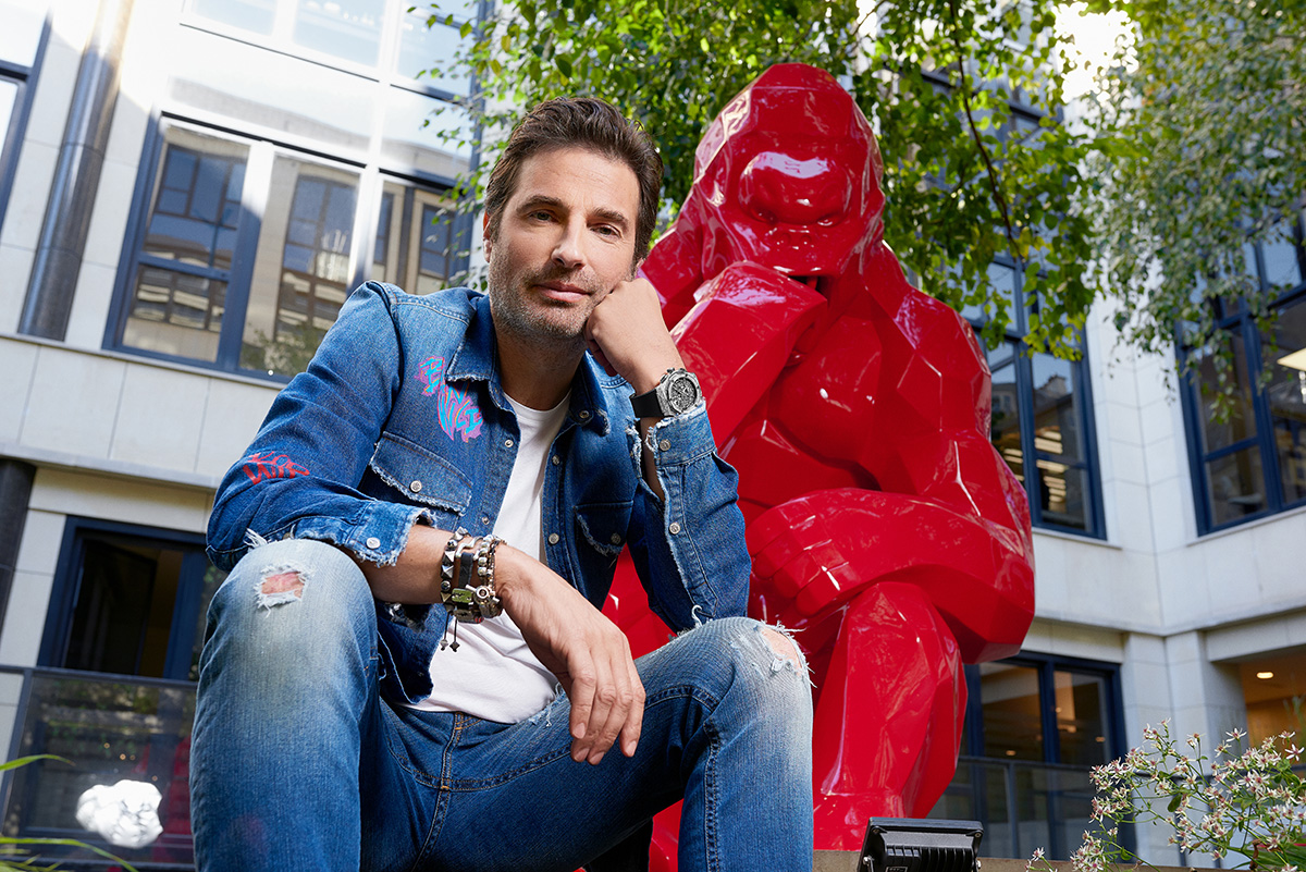
Artist sitting by sculpture of a gorilla

French artist Richard Orlinski is known for his large-scale vibrant sculptures

The contemporary art world might turn up its nose at Richard Orlinski’s Disney collaborations, but the French artist couldn’t care less. For him, it’s about connecting with as many people as possible. Here, Jess Brown speaks to the artist about making his work accessible, saying yes to every opportunity and his love of Andy Warhol

Pikachu sculpture in yellow

Pikachu (yellow resin) by Richard Orlinski

LUX: Can you talk us through your sculpting process? Do you begin by sketching, or by experimenting with your chosen material?
Richard Orlinski: It really depends. Sometimes I start with computers, sometimes I start just by watching nature. I’ve been somewhere like Mexico, for example, watching the animals for inspiration and then I will make a mould. I have so many ideas, I know what I want to do, but what about the size and about the material? So as I said, sometimes I draw the design on computer to try it out and then I 3D print it to see what will happen. So there’s a big block of polystyrene foam and  a real robot picking away at the material until a sculpture appears. Then I can change it by hand and make a mould. For one sculpture, I need 10,15, 20 sometimes even more moulds. These are for the resin and then we stick them together. But I also work with aluminium and stainless steel which requires laser cutting. I’m not working alone though, I work with a big team and together we work out how to fix things. Of course, I have the final say but I always listen to what my team says about the creation – having ten brains is better than one.

Follow LUX on Instagram: luxthemagazine

LUX: How long does it typically take to make a piece?
Richard Orlinski: I’m like a kid. I’m always very much in a hurry to make things, but sometimes, it’s not possible to do it quickly. It depends on the complexity of the project and sometimes it can take a very long time. Time can be a real problem if I have a big commission, for example, someone asking for something to be ready in 15 days. Even if the person is offering me billions, it still wouldn’t be possible. Some of my pieces can take six months to create, sometimes a year.

LUX: How do you think your artistic style has evolved over the years? Was there a moment when you felt that you’d found your niche?
Richard Orlinski: I have no red line underneath my work. One day I do, that day I do something else. I find inspiration everywhere and I want to be free, but also for the auctioneer and the art buyer customers to feel free to take what they want from my sculptures. I find it interesting that you can ask three different people about one sculpture and they’ll say something different: ‘Oh it’s against petrol or it’s against pollution.’ People read the piece through their own emotion and I’m okay with that. I love watching kids seeing the sculptures and laughing. For me, it’s about connection and sharing with the world, I suppose that’s my ‘niche’. I’m really mainstream. I like commercial music, I like the things that everyone likes and I don’t want my work to be elite.

Sculpture of a red stag

One of Richard Orlinski’s resin animal sculptures

LUX: Speaking of sharing and connecting, your work has been exhibited on the ski slopes of Courchevel. Do you ever consider where your work is going to be exhibited when you’re making it?
Richard Orlinski: No, never. In Courchevel, we put animals because it goes with the snow: the wolf, the bear. But you know, my work can go anywhere. Last year, I was in old coal mines in the North of France. All of the people are poor there because there’s no more more work since the mines shut down. I put my sculpture there and they were so happy. I really like that it’s not for money, it’s for sharing and I was so happy to see their reaction. I was supposed to stay for one hour, but I stayed for two days in the end because there were so many people to meet.

Read more: Why we love the ‘Jeux de Liens Harmony’ necklaces by Chaumet

LUX: Do you have a particular type of person that your work is aimed at or is it for everyone?
Richard Orlinski: Any religion, any age, from all kinds of backgrounds. We have sculptures for a million dollars and sculptures for a few euros because I make some co-branding with Disney and you can find a small Mickey Mouse for fifty pounds. I’m very proud of those kinds of collaborations. Many of my followers, don’t have money to buy sculptures, to buy art, but they can maybe afford to buy the Mickey Mouse and they’re proud to show that to their friends. I like this connection with people. Not everyone likes that approach though. I’m not loved by other artists or by the establishment because I break the code.

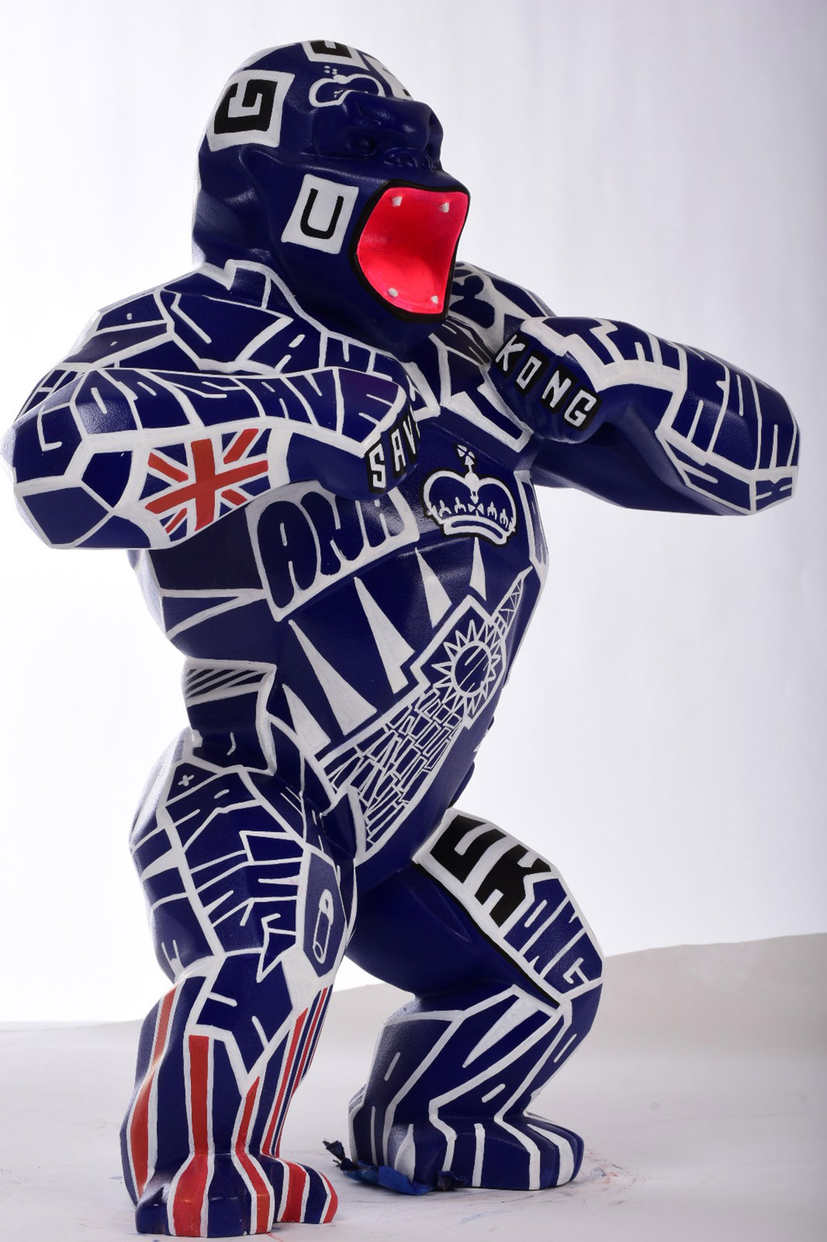
Large sculpture of a gorilla beating its chest

‘Wild Kong’ by Richard Orlinski

LUX: What draws you to sculpt animals in particular?
Richard Orlinski: It’s really simple. You would have made the same choice. What do you like when you’re a kid? You like to to go to the zoo, you like animals on TV. Basically all of the cartoons have animals in them, and even if you look back historically, humans have always had this connection with animals. Think about ancient Egyptian culture, Greece, all of the old civilisations. So when I was a kid, maybe as young as four years old, I started created small elephants and hippos.

Read more: Jewellery designer Theresa Bruno on authentic bespoke design

LUX: Which artists from past or present have been the biggest influence on your work?
Richard Orlinski: I think maybe Andy Warhol, not so much his work, but I think he is really amazing. He was from the commercial side, he was a publicist and he did so many things. I think if he had internet during his time, he would be huge now. I mean he is still huge now, but he would be like a king of the world because he was making movies, books, kitchen appliances and everything was amazing. Anyway, he started from the commercial side of things and nobody loved him, but I think he opened a way through pop art. I like his mind, his way of thinking.

Product image of a white watch

Richard Orlinski has an ongoing collaboration with luxury watch brand Hublot. Pictured here: Classic Fusion Tourbillon Orlinski Sapphire. Below: The artist wearing the Classic Fusion Aerofusion Chronograph Orlinski

Man wearing a watch draped over a sculpture

LUX: You also make lots of different things: music, sculpture, fashion. How do your artistic mediums intersect or influence one another?
Richard Orlinski: For me, art is not just sculpture or painting or music – art is everything. Nowadays, we tend to put people in a cage, we categorise them, but I think when you have a certain sensibility, you can feel something about music and about sculpture. At my studio, I have a sculptural studio and my studio for music downstairs. I work with a lot of different people: people from music, people from TV, rappers. It’s a real melting pot. I like this mixed energy.

LUX: Finally, what are you currently working on?
Richard Orlinski: I have so many projects. I’m working now on a club in Belgium, and then we’re going to build a huge disco in Europe. I get a lot of offers for collaboration and I always want to say yes, sometimes I can, sometimes I can’t. I also have my sculptures, of course, and my ongoing collaboration with Hublot. I like doing new things, taking on new opportunities.

Find out more: richardorlinski.fr

Share:
Reading time: 6 min
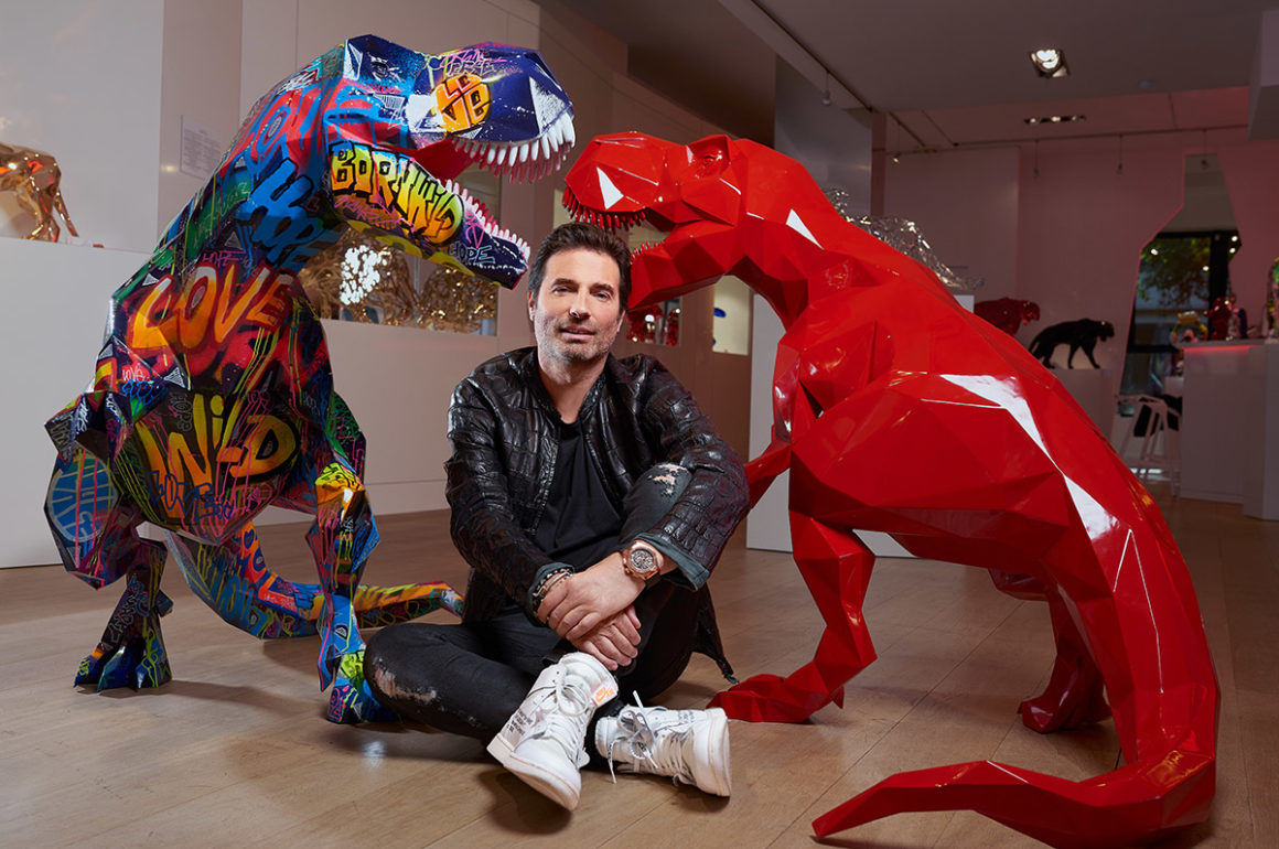
Man sitting on the floor in front of sculptures of dinasours

French artist Richard Orlinski with two of his T-Rex sculptures

French artist Richard Orlinski is known for his bold, pop-art sculptures, which have appeared at French Grand Prix and on the slopes of Courchevel. Most recently, he collaborated with luxury watch brand Hublot and last month, saw the opening of his first London gallery on New Bond Street. Here, he tells us about falling in love with art, colours, and wild animals

1. When did you first realise that you wanted to be an artist?

I remember very well the moment I had a kind of love at first sight for creation. At school, when the other little boys used to play the brawl, I would prefer to create small terracotta animals. I was only 4 years old when my teacher called a local TV to come and discover my little sculptures. But growing up I ended up choosing a more steady job before I dropped it off to become an artist.

Follow LUX on Instagram: the.official.lux.magazine

2. Do you need a specific atmosphere to be able to create?

I don’t need a particular atmosphere to create. Everything inspires me, people’s daily lives, wherever I am, I can find an object, a feeling or an environment that inspires me. Afterwards, I get a lot of inspiration from animals for my sculptures. The first piece of artwork I created was a red resin crocodile. This mysterious animal has always fascinated me and humans in general. It has been on earth for a hundred million years. It is a witness of mankind. My creations are a reflection on the animal instinct and human nature. I have always been attracted to wild animals.

Large sculpture of a gorilla beating its chest

‘Wild Kong’ by Richard Orlinski

3. Many of your recent sculptures have taken the form of a wild animal – which animal from your series do you think you’re the most like and why?
The work with which I identify most is my ‘Wild Kong‘. It is one of my most emblematic works, but it is above all the one that comes closest to man and the human being. Strong and protective at the same time – he is a little bit like the ideal man without the hairs!

Read more: Inside the penthouse apartment designed by Roksanda

4. How has social media changed the art world?
My goal is to make art that speaks to the greatest number. I like to provoke an “immediate emotion” for both adults and children. I attach great importance to popularising my art by making it accessible. I like to exhibit my sculptures for free and in the open air. It’s very important for me. Social media has helped me a lot with that. This world of the instantaneous is quite fascinating.

Sculpture of a red stag

One of Richard Orlinski’s resin animal sculptures

5. You work with a distinct colour palette, what draws you to those particular shades?

The first piece I ever made was red. I love [to work with] a very colourful palette. All of my resin pieces are so pop and joyful. The pop colours give an immediate feeling especially with children. From one colour to another, the emotions could be different. We’re all time thinking about new colours and we always want to work with new matters, which can change the sculpture’s colour.

6. If you weren’t an artist, what would you be?

An artist!

See Richard Orlinski’s full portfolio: richardorlinski.fr

Share:
Reading time: 2 min
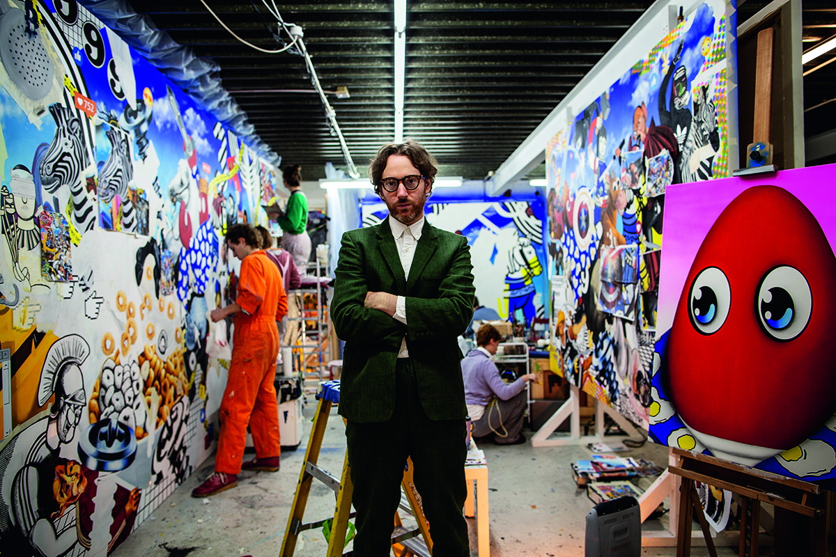
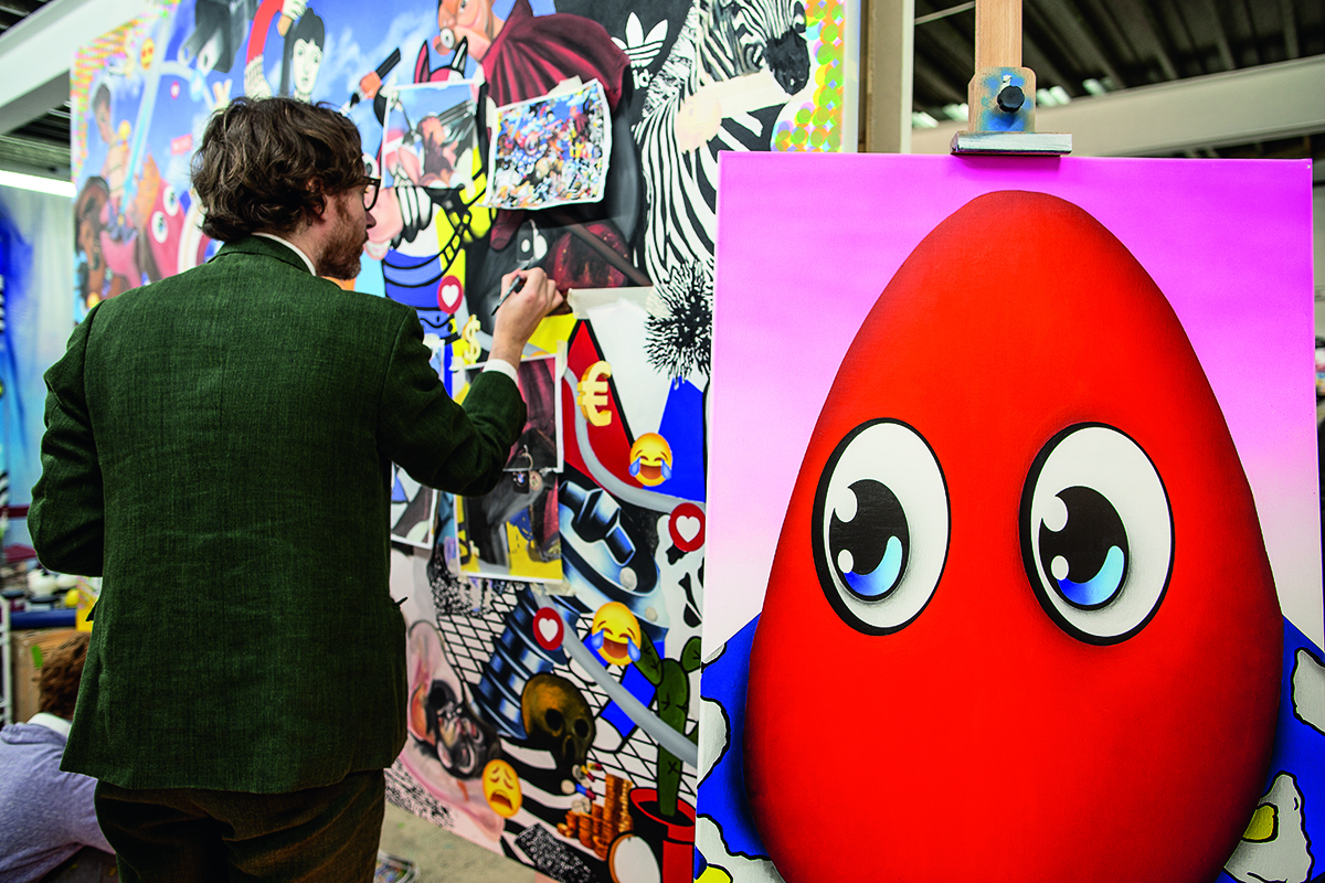
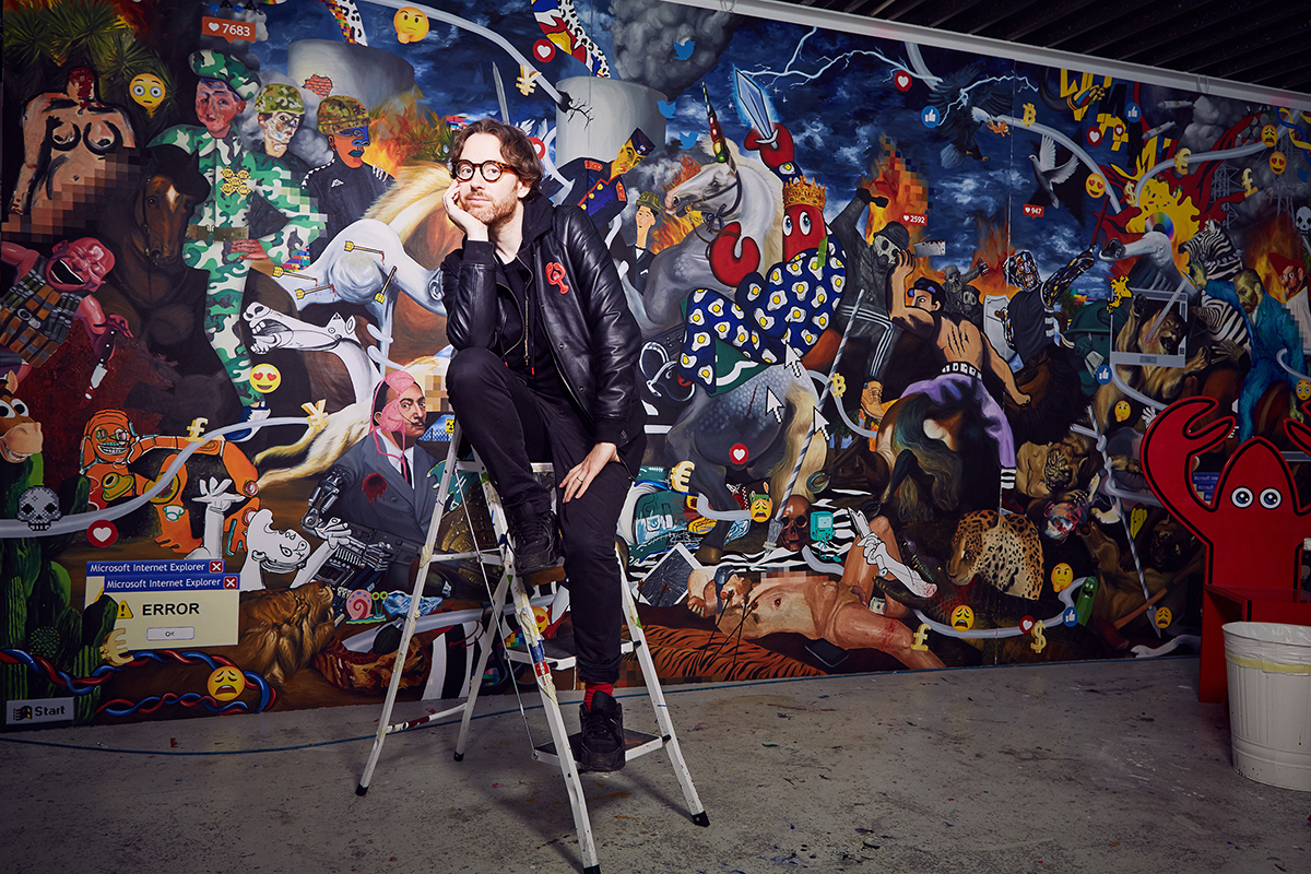
Artist Philip Colbert pictured in his London studio
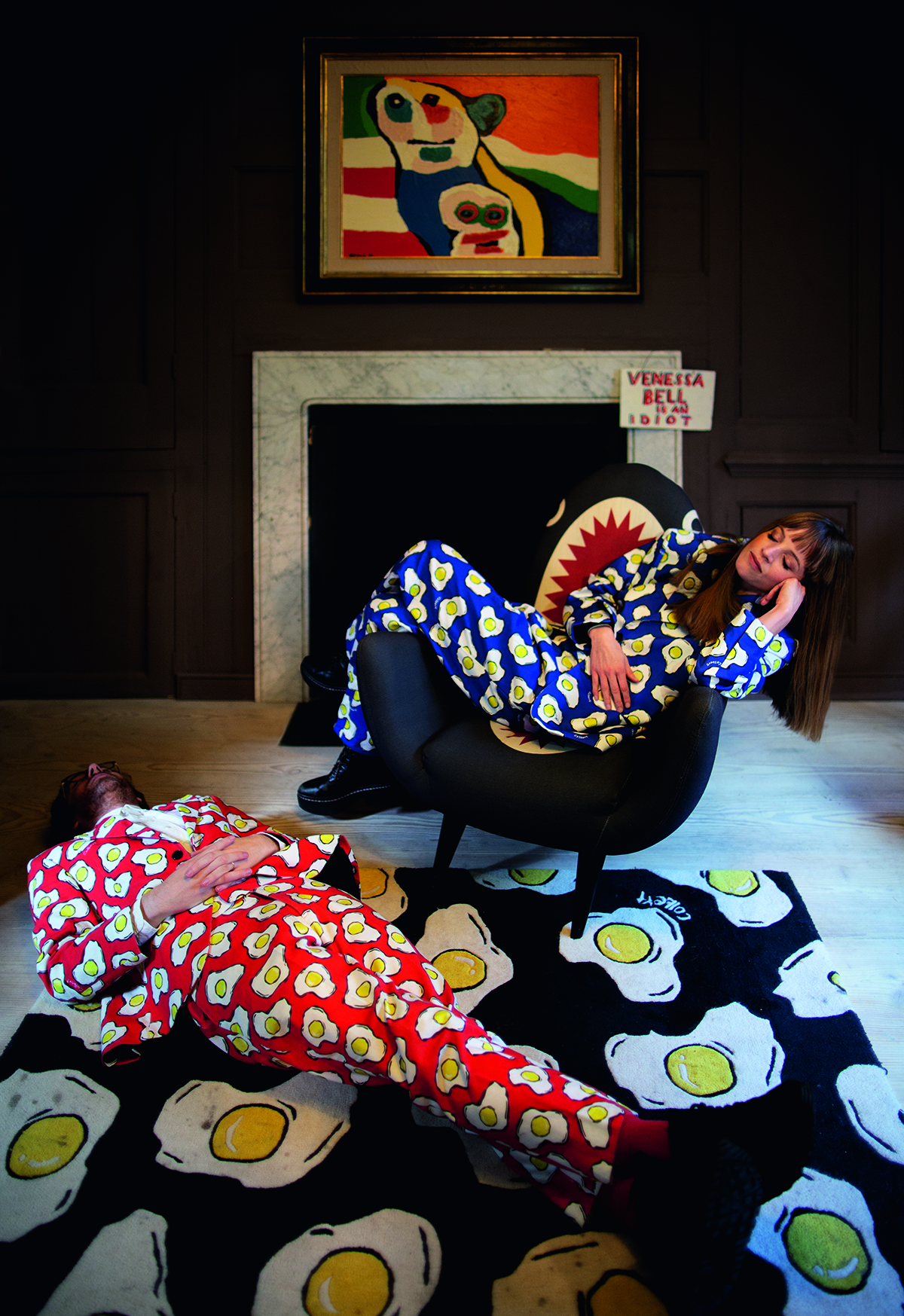
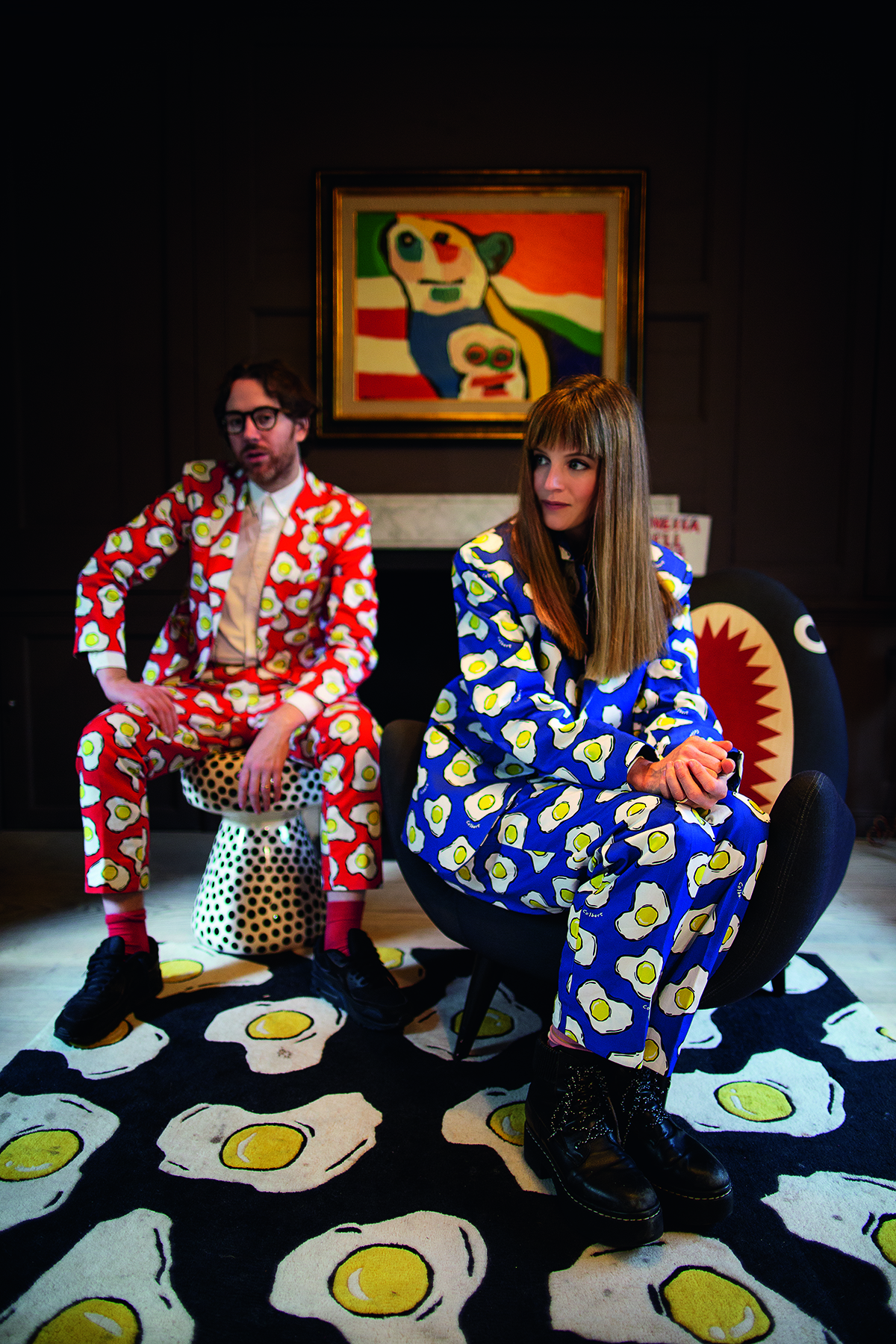
Artists Philip and Charlotte Colbert wearing matching suits

Philip and Charlotte Colbert in their fried-egg suits designed by Philip

In a warehouse in east London, Philip and Charlotte Colbert are creating a world of Pop art and sculpture that is putting them on the global map. Darius Sanai speaks to the dynamic enfants terribles of the London art scene while Maryam Eisler photographs them

At the back of a warehouse in east London, Philip Colbert sticks his head out of a doorway. “Come in,” he says, smiling, while simultaneously holding a conversation with his phone on one ear. “No, it needs to be there tonight. Right,” he says, into the phone. His tone is soft, firm, a gentle Scottish accent is present but inconspicuous, almost shy.

Inside, workers are cutting and daubing in an area full of canvasses and paint, and behind a rail of pop-coloured clothes, four more people are on their phones, sitting at desks. Through a space in the wall is another artist’s studio, this one tidier, less colourful, more precise, hung with sculptures of curved forms and creatures.

Follow LUX on Instagram: the.official.lux.magazine

Welcome to the world of Philip and Charlotte (through in the other studio) Colbert, the enfants terribles of the London art scene. Philip has been called all sorts of things, including a worthy successor to Andy Warhol; in his zany coloured suits he is a mainstay of the party (and social media) scene and with his classical education (philosophy, St Andrew’s University) combined with his cheeky-to-outrageous art he is one of the capital’s most desirable dinner party guests.

Colbert has created everything from lobsters sold in his (now closed) Paris namesake store to partnerships with Peanuts and Rolex; he has bucket loads of celebrity followers (Cara, Sienna, Gaga) and he’s big in China.

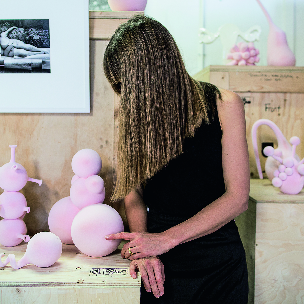
Artist touching a pink ceramic sculpture

Charlotte with some of her flocked ceramics

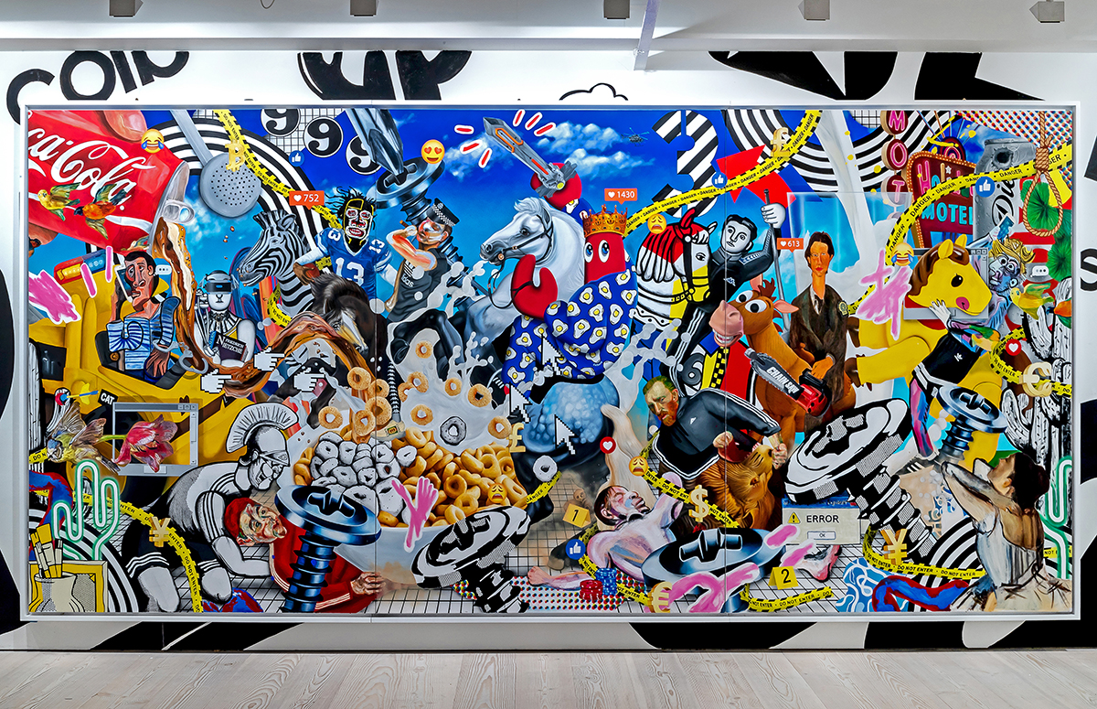
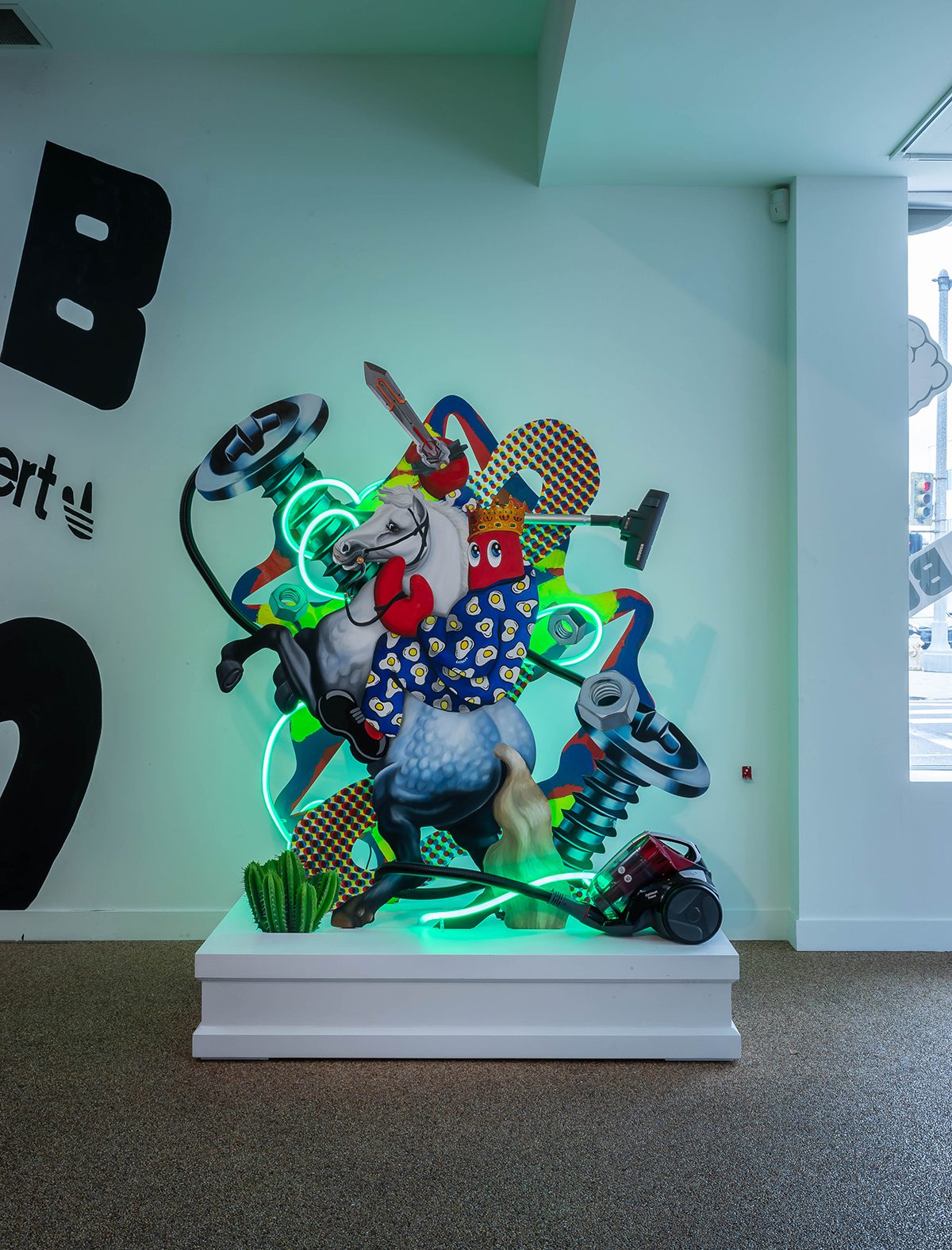
But as his latest works show, he is also a proper artist. His ‘Hunt’ paintings, shown recently by the Saatchi Galleries in both London and LA, around each city’s Frieze art fair, are a kind of Raft of the Medusa for contemporary society, riffing on themes around social media’s banal power, swatches from his favoured artists [Dalí, Lichtenstein, Hockney], and providing a poignant commentary on the chaos of contemporary society. They are also vibrant, colourful (as pop art should be) and, frankly, rather beautiful. He thinks of himself as a “neo-pop surrealist”, though a case could be made for him being more pop-impressionist: out of the microcosms of his creations there emerges a whole image of something quite different.

Read more: 6 artists creating new experiential spaces

His wife Charlotte, meanwhile, has created her own artistic world, one which shocks and smiles at the same time. Youthful, photogenic, and with enough wit not to take themselves entirely seriously, the Colberts may just be among the most interesting artists to emerge from Britain in the last decade. And you feel their whole future may just be ahead of them.

Artist Philip Colbert pictured in his London studio

Philip Colbert

LUX: How would you describe yourself ?
Philip Colbert: I’m someone who’s trying to create a world. I started out creating a sort of art brand, with artworks and furniture and was, in a way, trying to expand what the idea of art was beyond painting. But recently I’ve come back to painting in a big way and I think fundamentally my journey is about just trying to make my own sort of artistic world. The lobster alter-ego is really an articulation of my artistic persona.

LUX: Why a lobster?
Philip Colbert: I’ve always been into symbols. The lobster was a symbol of surrealism for a lot of surrealist poets and Dalí as well. I like the idea of bringing it to life and taking it on a journey.

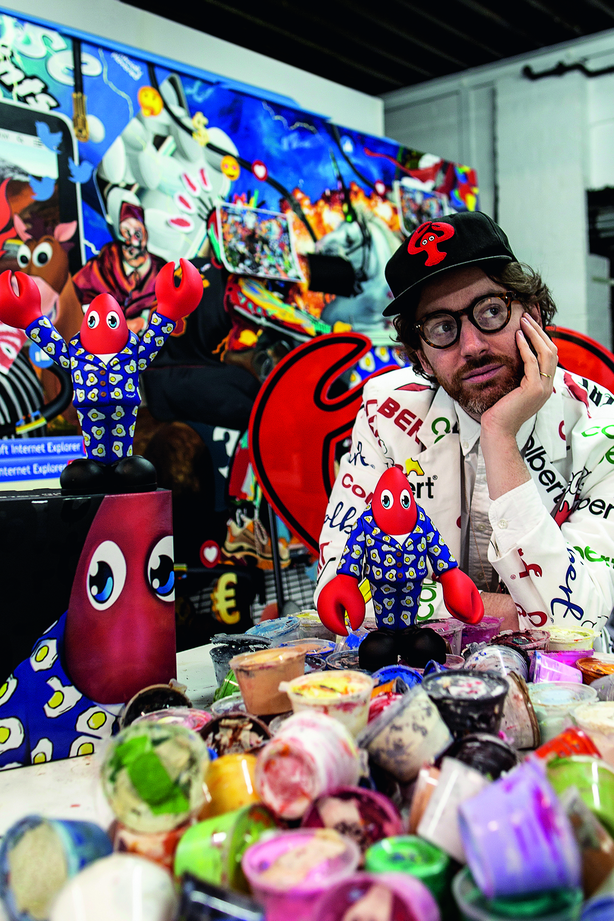
Artist philip colbert surrounded by lobster imagery

Philip Colbert with his iconic lobster alter-ego

LUX: What is art about, for you?
Philip Colbert: The simple essence of art is human freedom, and pushing the creativity that we have. And if you push freedom forward and create more, you push reality and create more freedom for art. There’s something I like about taking the idea of art and trying to inject it with new energy and a new sense of possibility.

LUX: Should artworks be beautiful?
Philip Colbert: It’s an important part of communicating, to understand visual language. A cornerstone of my art is to try and be very positive and use primary colours and really radiate a sort of energy from my works. Even though they may still have a sort of darker undertone, I still like to give them the essence of a sunflower.

Large scale pop art work by Philip Colbert

‘Untitled II’ (2018) from Philip Colbert’s ‘Hunt Paintings’ series

LUX: Can you talk about ‘The Hunt’ series and how your work has developed?
Philip Colbert: ‘The Hunt’ paintings are important for me. I have been engaging with the idea of contemporary culture and the mass saturation of images and the internet. At the same time I’m still having a conversation with painting. The Old Masters are such a powerful part of art history and I like the idea of making my contemporary Pop culture paintings to be informed by and in conversation with them.

Read more: 6 questions with art collector Kelly Ying

LUX: Symbols from painters – how do you choose them?
Philip Colbert: Well, I was really drawn to elevated images, such as in history painting, with heroic battle depictions by artists such as Rubens. I wanted to underpin the violence of contemporary culture and use the analogy of a more traditional battle scene, to structure it like an Instagram feed. We consume so much today, and we see so much, we’re aware of so many amazingly escapist ideas juxtaposed with a lot of darker elements, like global warming or political instability. A lot of artists have been exploring abstraction or exploring obsession, but I wanted to capture more of this play of light and dark. I thought that the analogy of the battle scene was a good way to explore these tensions.

Artist Philip Colbert at work on a painting in his studio

Philip at work on ‘Screw Hunt II’ (2018)

LUX: Have you felt pushed back by contemporary art establishments?
Philip Colbert: I think of myself as an outsider in a way, because I studied philosophy and really just developed my own practice. I’m not looking for validation from anyone. I feel that in the art world, people are sometimes groomed to want to please, but I’m much more interested in just connecting to people on a real and direct level.

LUX: Are you here to sell art or create art?
Philip Colbert: One hundred per cent to create art. The sales side of it is obviously an essential part of being able to grow because it allows one to do more, but I’m not deliberately engineering my works to be purely reflective of the market, which is not necessarily a bad thing either – Warhol was very good at mirroring what he felt the system wanted. My paintings are complex and intense and highly saturated, so are not the easiest to sell via Instagram, for example.

LUX: Talk about your use of social media.
Philip Colbert: If I think of my paintings as a reflection of my interaction with contemporary culture, social media are a significant element within that. There are some different strands of my work. I’m really developing a lot of these big history paintings, but also I’ve developed ‘Lobster Land’, a virtual reality world, which is the digital world where my lobster character lives. And in Lobster Land there’s a Lobster Bank, Lobster Coin, there’s a museum. I’m building my own reality there, which is one way of engaging with contemporary technology.

Large scale pop art collage featuring digital imagery

‘Hunt Triptych’ (2018) from the ‘Hunt Paintings’ series

LUX: How did you get started in China?
Philip Colbert: It happened very organically. When I had my first exhibition at the Saatchi Gallery, curators from China came along and they featured some of my paintings in a group show in China. That was maybe June last year. It was amazing – I saw a crazy energy in China when I was there. So many people came to the show. It has simply evolved from there.

LUX: What are your influences?
Philip Colbert: There’s very much a ‘celebration of appropriation’ in these paintings. I was putting myself at the centre of the piece –you get the idea, it’s like my character is the narrator of the painting but then there’s art history effectively having a sort of ‘battle dialogue’ with this voice. This sort of dialogue is present in an artist’s mind when they’re creating an artwork. There’s the idea of place and time in the relationships to other philosophies and ideas within art, so by putting them into a battle sequence, it represents my own philosophy battling with other ideas and also being able to present a much bigger holistic idea, to create an orchestrated, ‘multi-philosophied’ painting. I’ve referenced loads of things deliberately. Léger was, for me, a very important proto-Pop thinker/painter, and his work was influential on people like Lichtenstein, who often even referred to Léger in the bottom corners of his paintings. My paintings are an evolution of Pop art – I have those references while I’m still playing with abstraction and different varieties of painting styles within a single painting.

LUX: This sounds more like it’s from inside someone’s mind rather than culture?
Philip Colbert: Yeah, I think of the paintings as like mind-maps in a way. I was really interested in ideas of art, so that’s why I like to use preconceived ideas because for me they are language. I could create my own characters but I wanted to use branded ideas that people could understand. So, when people look at the paintings, they will immediately understand ‘That’s Van Gogh’, or ‘that’s a Gucci handbag’. It’s using things that are already loaded with meaning.

Portrait of artists Philip and Charlotte Colbert

Philip and Charlotte Colbert

LUX: Is it strange not coming from a family of artists?
Philip Colbert: No, I don’t think so. Some people’s parents are artists and they follow suit and are inspired by a world they’ve already been presented with. For me, I was always just connected with art and so it was always the language I was immediately connected with. As you know, I went into making clothing first, but I wasn’t making clothing to be a fashion designer, I was making clothing and thinking about artwork. I was more interested in this idea of ‘wearable art’ and trying to use the idea of a brand as a vehicle for art.

Read more: Maryam Eisler in conversation with Kenny Scharf

LUX: What plans do you have for the future?
Philip Colbert: Well, I have an exhibition in Shanghai at the end of June, then I have two shows in Hong Kong, a show in a museum in South Korea, and then another in Moscow in September in a multi-media art museum.

LUX: Do you and Charlotte collaborate?
Philip Colbert: Well, we’re married, so we inevitably interact and have an influence on each other’s work. We have quite a different aesthetic and even though we’re both interested in a lot of the same things, our end picture is very different, which is nice. But I think we both understand each other’s DNA, so we can help each other.

Artist charlotte colbert in her studio

Charlotte Colbert with ‘Self Portrait in Lucian Freud’s studio’ (2018) from her ‘Screen Portrait’ series

Charlotte Colbert

LUX: Tell us about your photography.
Charlotte Colbert: I have done a couple of series. I started in 2013 with ‘A Day at Home’. It correlated the madness of the writer and the madness of the housewife in this domestic space that was both a prison and open to the landscapes of the imagination. It sort of chronicled the porousness of the world around the woman in a decrepit house in East London. We kept shooting as the place was being demolished, so we were getting layers of that story-telling within the building itself. Then I worked on ‘Ordinary Madness’ [2016], which was about our relationship to the digital age. The idea was that we expected aliens to come from outer space and somehow conquer us. But, little by little, we are becoming the cyborg, and technology is being absorbed into our bodies and changing the fabric of our being until we’ve become a new sort of human.

LUX: The video sculptures, ‘Screen Portraits’, are they bronzes?
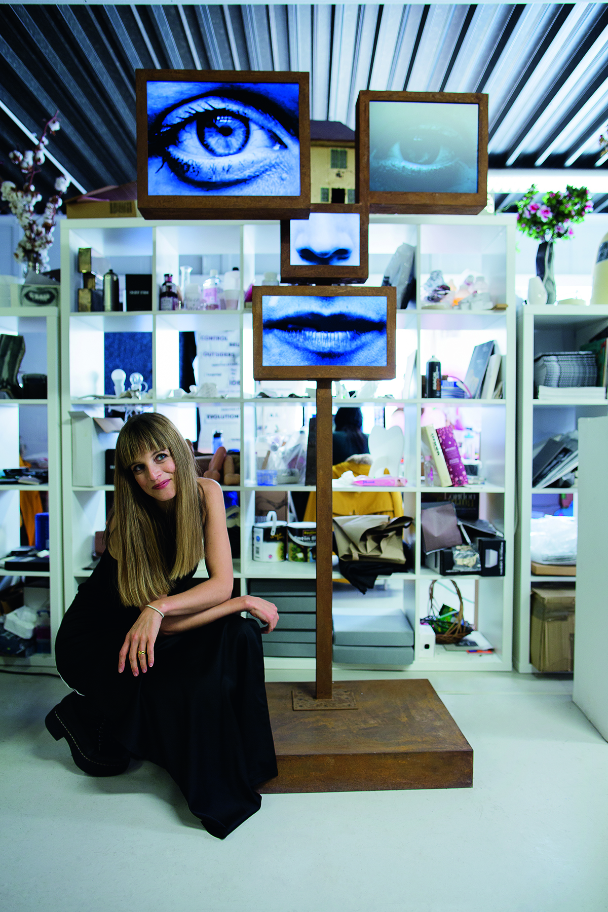
Charlotte Colbert: No, they’re made of Corten steel. The first one was done for the Korea Institute. I came across this beautiful but heart-breaking story of a South Korean woman, Lee Soon-Kyu, who was 79 when I met her. She was pregnant when the Korean War started in 1950, but was separated from her husband who ended up in the north. She was able to meet him many years later, and went to North Korea with her son, who was then 65, to see him for the last time. It seemed fitting to do her portrait at this moment in her life, after she’d been in this Cold War kind of narrative for decades. She had to stay very still with just one light on her face. The filming of the sculpture was an extraordinary moment.

A woman hiding behind a sculpture

LUX: The one with a nuclear explosion, tell us about that.
Charlotte Colbert: That’s a piece called Disassociation. It’s a self-portrait. The eyes and the face are very much at peace and the head contains the nuclear explosion. I made it when I was seven months pregnant, at a time when you feel disconnected from the world around you. But I feel that in some ways it’s like an extreme version of everyone’s relationship to the world.

LUX: Neighbouring studios with Philip – how does that work?
Charlotte Colbert: Funnily enough, we’ve done loads of stuff together and I think in some way, we do look at each other’s works and comment on them, but our worlds definitely haven’t fused. I feel like both of us have pushed the identities really as defined against each other.

LUX: The studio, it seems very serene.
Charlotte Colbert: It’s amazing but there’s a lot of interesting characters around, and the building’s quite fun and it’s got all these layers of history. I think at one point it was a kennels, so there were dogs, now there’s more little mice. It’s a really amazing location – we’re so lucky.

Find out more: philipcolbert.com and charlottecolbert.com

This article was originally published in the Summer 19 Issue.

Share:
Reading time: 12 min
Painter Kenny Scharf pictured in front of his artwork

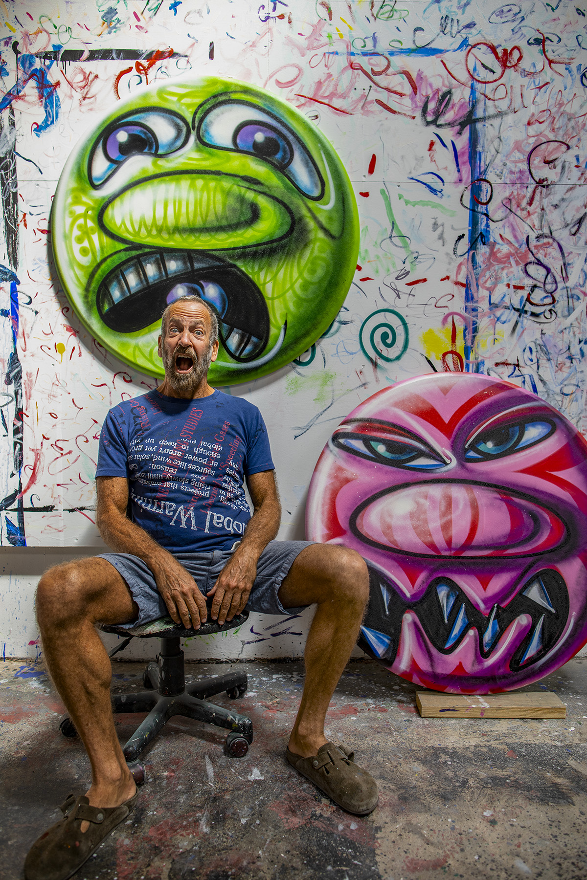
Kenny Scharf reenacting his emoji-like paintings’ emotions with ‘Scardey’ (above his head) and ‘Tribali’ on his side

American artist Kenny Scharf’s work straddles a line between pop-art, street art and neo-expressionism. Through surreal imagery and humour, he challenges the elitist boundaries of fine art. Granted exclusive access to his new LA studio, LUX editor-at-large and artist Maryam Eisler spoke to Scharf about cosmic donuts, emojis and his friendship with Keith Haring.

Photography by Maryam Eisler

Maryam Eisler: You posted on your Instagram page that you found the black hole (referring to your image of a donut suspended in space) long before the black hole was photographed! Tell me about that.
Kenny Scharf: Well, I’ve been making cosmic donuts for quite some time now. I was always intrigued by this theory that the universe was shaped like a donut. I love the way donuts look….so it seemed so natural to do donuts in space! So when I saw the new blackhole image, I said ‘Uhhhh that looks like a donut!!’ I couldn’t help it.

Maryam Eisler: So I cannot help but ask you the question: where do we end up? In the donut’s hole or do we keep sparkling like its sprinkles?
Kenny Scharf: I don’t really know…maybe it’s even more sparkly in the hole!

Follow LUX on Instagram: the.official.lux.magazine

Maryam Eisler: Would it be fair to say that you invented the emoji?
Kenny Scharf: I guess I did. I’ve been doing it [referring to the round paintings] for 40 years before the actual internet came about.

Maryam Eisler: So copyright on the emoji?
Kenny Scharf: Yeah I need to get a penny every time someone uses those emojis. Actually I have my own emojis app. It costs two dollars!

Maryam Eisler: You’ve never been about definition, have you? And pretty much spanned across all mediums…
Kenny Scharf: I’m always wanting to break boundaries. If there’s a border, I’m going to go outside of it. You can’t keep me in. That’s against my…everything!

Artist studio belonging to Kenny Scharf with one of his pop art paintings on a round canvas

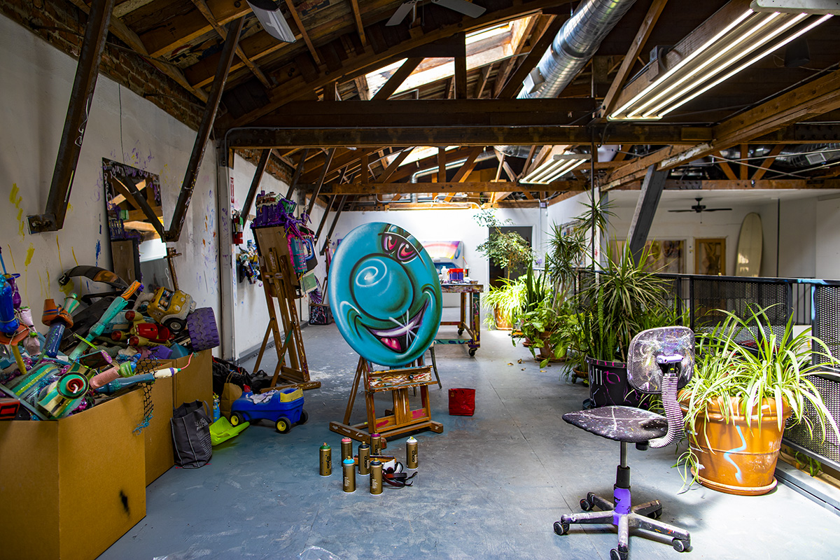
A view into the mezzanine of Kenny Scharf’s LA studio space

Maryam Eisler: Talk to me about New York in the 80s and the confluence of art, fashion, music, and the night clubs.
Kenny Scharf: When I moved to New York in the late 70s, there weren’t a lot of places artists could show their work or even make their work. There were so many young kids like myself who moved to New York with ambition. There were musicians and writers and people in fashion too. So nightclubs were a great venue to do your thing. Not only were nightclubs a place where you could make and show art, but they were also our livelihood. So we worked a couple nights a week and that was all you needed to pay your bills for the whole week, and you were then free to make your art. So New York became a place where you could move to, as a young artist without money, and find your way and meet other artists. It was this whole community that was just there. I feel very lucky that I arrived at that moment in time. But, I think the nostalgia for the 80s is more about the late 70s’. Because by ‘82, people started dying. I was just in my 20s and I was spending most of the latter part of the 80s going to hospitals and funerals and saying goodbye to friends and people. It was just beyond a nightmare.

Maryam Eisler: From Studio 54 to Club 57, tell me about it.
Kenny Scharf: Studio 54, I only went into once. Everyone knows it was a famous disco, a happening place. But my kind of group was more Punk-rock, New-Wave, downtown and very anti-uptown.

Read more: Artist Sassan Behnam-Bakhtiar on the rise of interest in Iranian art

Maryam Eisler: East Village right?
Kenny Scharf: Yeah. At that time, Manhattan was very different with different parts to it. We hardly ever went north of 14th street, and the uptown people never ventured down to our neighbourhood. Club 57 was an amazing place and it did get its spotlight recently. There was a show at the MoMA that highlighted it. It was just this kind of moment. I don’t know if that kind of gathering place exists anymore, now that everything is online and internet-based. It almost harkened back to Berlin or Paris before the war and to these moments where artists got together and created with and for each other, always testing new ideas.

Artist Kenny Scharf painting an abstract composition of flowers

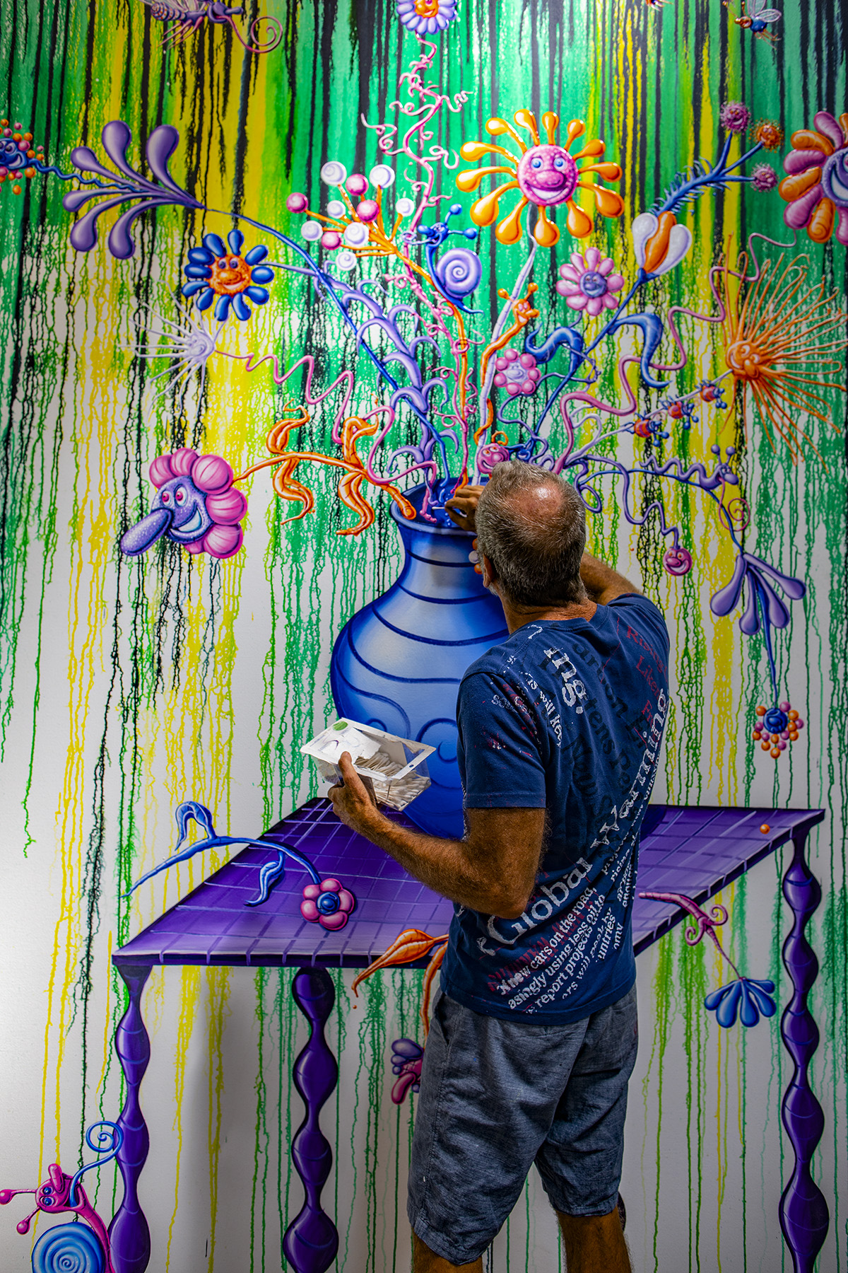
Kenny adding his final touch to an untitled painting depicting a flower arrangement

Maryam Eisler: A form of inner salon of some sort?
Kenny Scharf: Exactly. And the thing that was so good in retrospect, even though we were all dying to be famous and whatnot, was that we had each other to test out whatever we wanted to do. It was very inspiring. You were able to do whatever you wanted to do in the safety of this audience before you went out into the big world. A chance to incubate ideas.

Maryam Eisler: Would that idea of safety and sanctuary translate into your own Cosmic Taverns?
Kenny Scharf: Yes, that idea is definitely about safety and sanctuary. In fact, the very first one I did was around ‘82 and I was living in an old ramshackle townhouse in the middle of Times Square. Keith Haring was my roommate. It was on 6th Avenue and 42nd street. There was so much madness on the street surrounding us that I would create these environments inside, using artificial things – mostly plastic garbage and appliances and stuff which I would find on the street. And I would create this very chaotic artificial environment that actually acted as a refuge. Let’s call it artificial nature for urbanites!

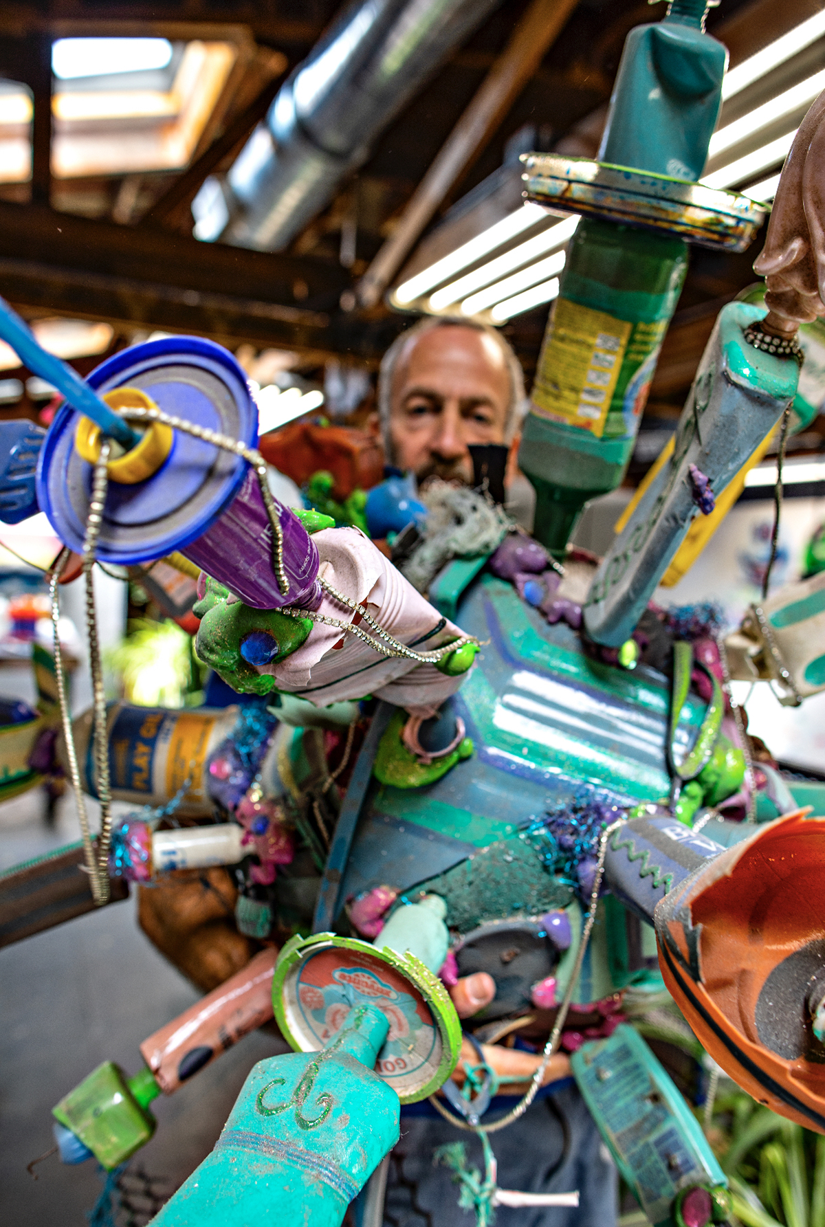
Maryam Eisler: The idea carries on today. I see it here in your studio. It seems like you still work with found objects, recycled plastic and disused garbage ….
Kenny Scharf: I’m obsessed. I’ve been obsessed with garbage all my life. When I first moved to New York in the late 70s, the whole city was garbage. Nobody was picking it up. Everything I needed for my new life was there on the streets: I found my furniture, my clothes. This whole New Wave scene … we were all wearing 50s clothes because we all found them in the garbage! I feel like trash is such an indicator of the society that we live in. Not only does it show a lot about who we are, but I love the idea that these objects were actually used by somebody, and that they have this whole story and life that I don’t know about. And of course, there’s also recycling and the fact that we are drowning in our own garbage!

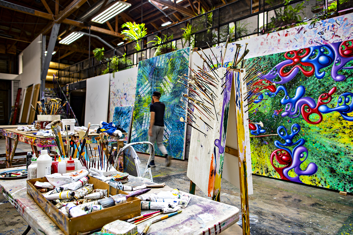
Artist studio with huge painted canvases and paint brushes

A view into the ground floor of Scharf’s studio

Maryam Eisler: From garbage to accessible artistic content, philosophically speaking?
Kenny Scharf: Yes. Philosophically, I’ve always been a proponent of accessibility. When I moved to New York in the late 70s, Conceptual and Minimal art were in fashion. I just didn’t like it. It felt too elitist and I don’t want to be elitist. I’m always staggering this fine line because I want to be in museums, that upper echelon of where art is shown, but I don’t like the idea of alienating anyone either. And I mean Joe Blow on the street who may have never read art history or gone into a single museum before! I would like to get those people interested in art and maybe inspire someone with an uplifting message. My language is the language of art so I don’t want to turn off the art-educated either!

Read more: Why you need to see the Luc Tuymans exhibition at Palazzo Grassi

Maryam Eisler: Isn’t art, at the end of the day, about interaction and connection?
Kenny Scharf: Yes, and communication. I have a message. You have a show in a major museum and you are going to get a certain amount of people to go and see it. You do a mural in a high traffic spot on the street, and you’ll get the same number of people, if not more, seeing it every day. I also love the idea that art goes beyond boundaries. Most people think that art belongs on a wall in a gallery or a museum. I think it should be everywhere. I often like to think about ancient civilisations, the Greeks and the Egyptians, and how they infused art into their everyday objects the same way I do. I really believe that by doing this, you elevate your daily existence.

artist Kenny scharf poses in his studio with a sculpture

‘I’ve been obsessed with garbage all my life!’

Maryam Eisler: Your emojis are a form of hieroglyphic art, right? Image after image, you try to describe a state of mind, an emotion, a space, a place …. There’s an emotive aspect to your art.
Kenny Scharf: Yes. Communication, feelings, history… Art that I love is art that emotionally gets to me, and I want to convey the same thing to people. I want people to feel.

Maryam Eisler: I love your lack of concern about the monetary value of your art in a world dominated by the $ sign . You paint cars and give them away as long as they’re not resold for gain!
Kenny Scharf: Yes, I’ve done 250 cars. We take pictures. People have crossed the line only two or three times in the past. Not cool.

Kenny Scharf painting on the side of a truck parked by a brick wall

One of Scharf’s 250 painted cars, utilitarian artworks which he creates for free, with the promise that they are never to be sold for gain

Maryam Eisler: From Cosmic Taverns to Flintstone’s cavern. Where did it all start?
Kenny Scharf: The Jetsons and the Flintstones? Back in the early 80s, when I was trying to figure out how to get myself out there, I realised nobody in the gallery world was going to be interested in me if I just told them ‘Hey I make art! Come and see.’ My whole group was in the street and we met all these graffiti artists with incredible paintings on subway cars; they used the whole city as their canvas basically. Around the Times Square show in ‘81, a lot of downtown, Punk, New Wave art-types like myself, met with all the uptown Bronx graffiti artists, and there was this very interesting cultural mix moment. I had a studio at PS1 and I lived in the East Village so I used to ride my bike at two in the morning down from the 59th street bridge to the East Village and bomb the walls the whole way down. I thought that I wanted to do something that was very personal to me in many ways, the Flintstones! Not only because I grew up with them but because conceptually I love the idea of the Flintstones representing the past and the Jetsons representing the future. And everybody knows who they are. I wanted to do something that people already connected with but that was also part of me. And at one point, the past and the future collided and created mutants which were my own characters.

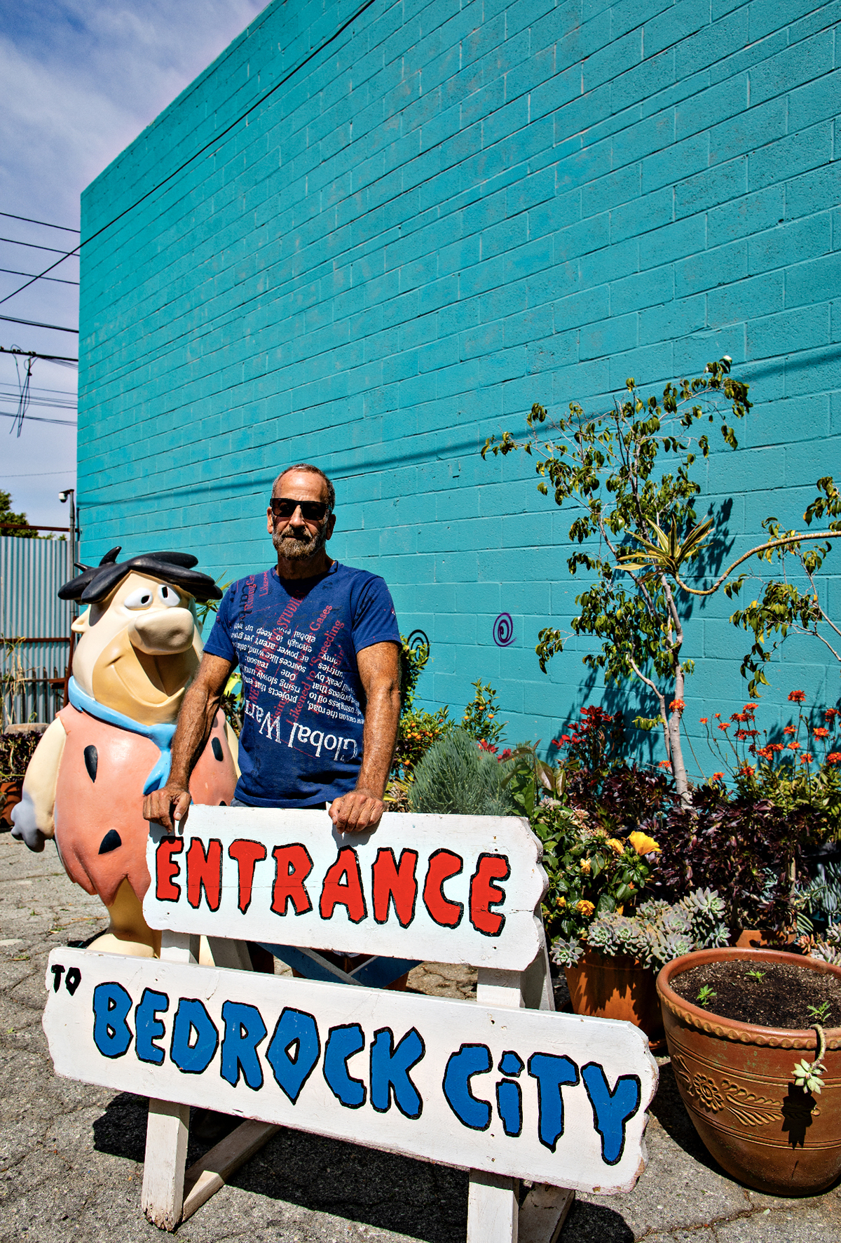
Artist Kenny Scharf standing by an entrance sign to bedrock city

‘Conceptually I love the idea of the Flintstones representing the past and the Jetsons representing the future. And at one point, the past and the future collided and created mutants which were my own characters.’

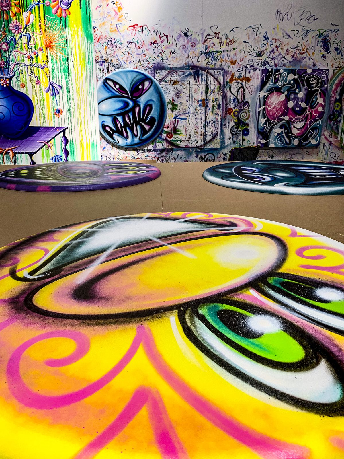
Kenny Scharf round paintings in his studio

Maryam Eisler: So I haven’t brought up Keith Haring and Jean Michel Basquiat purposefully. Could you give me one word, one anecdote or a wonderful memory for each?
Kenny Scharf: I mean I have so many memories. I met Keith and Jean Michel in 1978, basically my second week of arrival from LA to New York. And we all had this instant connection. It’s like when you meet somebody and you don’t really know why you are so attracted to them and vice versa. I met Jean Michel and introduced him to Keith. The three of us were a little bit of a posse. I used to go around with Jean Michel and Keith and draw and paint on the street. One of my first memories was when I went to this apartment where Jean Michel was living; it was just about a block away from where I was living, and I saw these collages he had on the wall and I was just blown away. I swear I almost fell on the floor. It was one of those moments when you see something and there is so much energy coming off this piece of paper that it literally floored me. I’ll never forget that moment.

Maryam Eisler: Can you share your last memory with Jean Michel?
Kenny Scharf: Of course. With Jean Michel, our relationship was not easy. It started off very close and then he kind of turned on me. We had this very volatile relationship where I didn’t know which Jean Michel I was going to get on any particular day, and actually, it was the source of a lot of stress for me. I really cared for him a lot, and he could be really difficult. So in the late 80s, all that amazing explosion from the early 80s, had a little backlash where that kind of expression was not ‘the thing’ any longer and Jean Michel, as always, really took everything to heart and he was just really down. There was this moment where I remember connecting with him on the street, where he could look at me not as competition and an enemy anymore and realise that we were both on the same side of the line; he let down the guard. We had this special moment. I didn’t know he was about to die.

Maryam Eisler: I read the book The Widow Basquiat. It seems like he did that uncertain thing to everyone?
Kenny Scharf: He did it to the ones he cared about. He was always testing. He was really…very…disturbed. He really was.

Maryam Eisler: A sign of artistic genius, perhaps?
Kenny Scharf: Yes, I know.

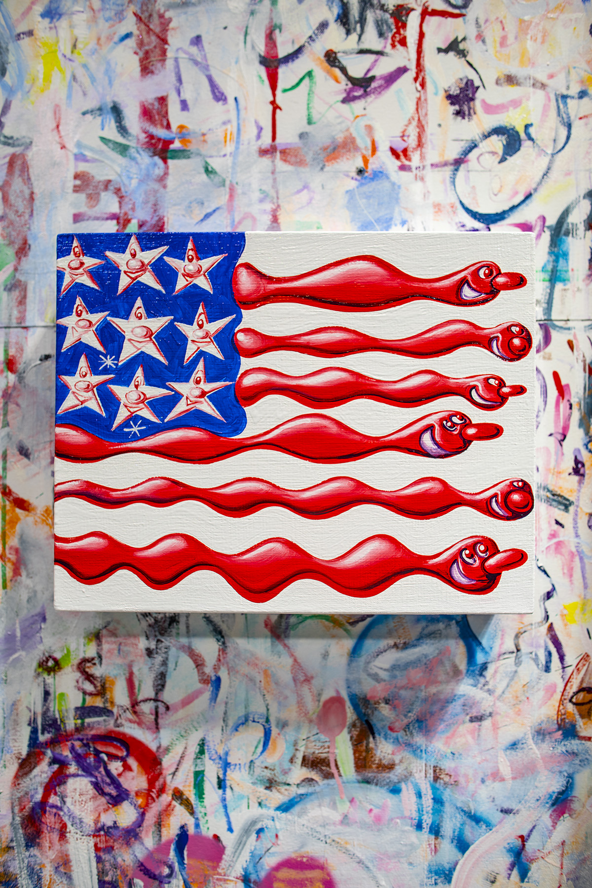
Pop art version of the american flag by artist Kenny Scharf

Untitled 2019 by Kenny Scharf

Maryam Eisler: What was your last memory with [Andy] Warhol?
Kenny Scharf: Right before he went in for the gallbladder surgery, I remember having a similar thing as I did with Basquiat – not that we ever had any down times because Andy was always great to me. He was always very supportive. But I remember…I dunno maybe he wasn’t feeling well or something. I remember I was in a restaurant and there was an emotional connection where I really felt something strong with him. Then I went to Brazil a week later and actually Keith [Haring] was with me when we found out about his death.

Maryam Eisler: And lastly, with Keith?
Kenny Scharf: I was the last person to be with him. So I was sitting with him and he wasn’t able to talk anymore. There’s no way I cannot cry, talking about my last moments with him. He was very agitated and I just told him ‘I know you can hear me’; I also told him that he should just calm down and relax because I was with him. And as his body relaxed, I said ‘You know you’re going to live on forever.’ I was telling him everything I believed and felt….It was really hard…losing my best friend.

Maryam Eisler: For you personally, to perform the act of creation, do you have to be at an emotional high or low? Are you really that happy-faced person?
Kenny Scharf: Sometimes. All the emotions, I am. I am a happy person. I’m an optimist despite a million things that are freaking me out. My feeling is that if I’m not an optimist, then I will kill myself. So I force myself to be optimistic no matter how I may be feeling inside. I take the stance and I do it. Because I’m here and I want to make the best of it. Now, I have grandkids and I’m really freaked out about the world they’re inheriting, so I have no choice but to be an optimist for them.

Maryam Eisler: Speaking of the world, one word on Trump?
Kenny Scharf: Piece of shit. Or just shit. Everything about what he represents is the antithesis of everything that I believe in. I’ve always felt that way all the way back to the 80s. I actually met him ten years ago, and I was so freaked out by his lack of normal decent connection. He was just so creepy. The whole thing nauseated me so much. The day of the election I couldn’t stop crying. I cried for a week. It was devastating and here we are two years later, and I still cannot believe this has happened. His name and the word President do not go hand in hand.

Maryam Eisler: You are now back in LA , your ‘home’? You left the concrete for greener pastures and blue skies, with a much more laid back attitude and even more space? And, of course, your family.
Kenny Scharf: I love it here. I was bouncing back and forth between LA and New York but when my grandson was born I realised that I didn’t want to be away anymore. I am completely in love with my grandkids. Obsessed in fact. I never realised how great being a grandpa was actually going to be.

Kenny Scharf’s solo exhibition ‘blue blood’ runs from 2 May to 28 July 2019 at the David Totah gallery, New York City

Discover Kenny Scharf’s portfolio: kennyscharf.com

Share:
Reading time: 15 min
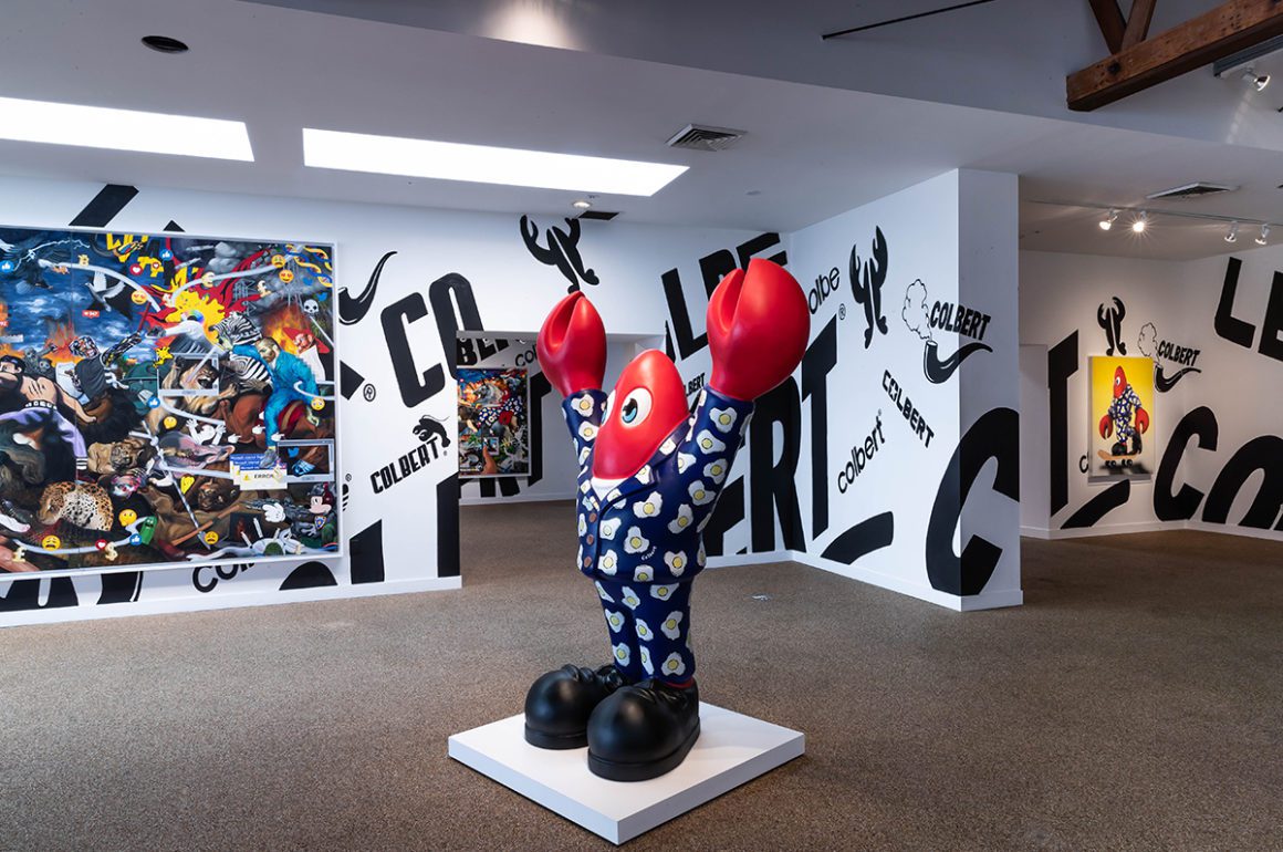
Philip Colbert lobster art installation
Contemporary artist Philip Colbert pictured standing on a ladder in front of one of his oil painting collages

Artist Philip Colbert in his studio

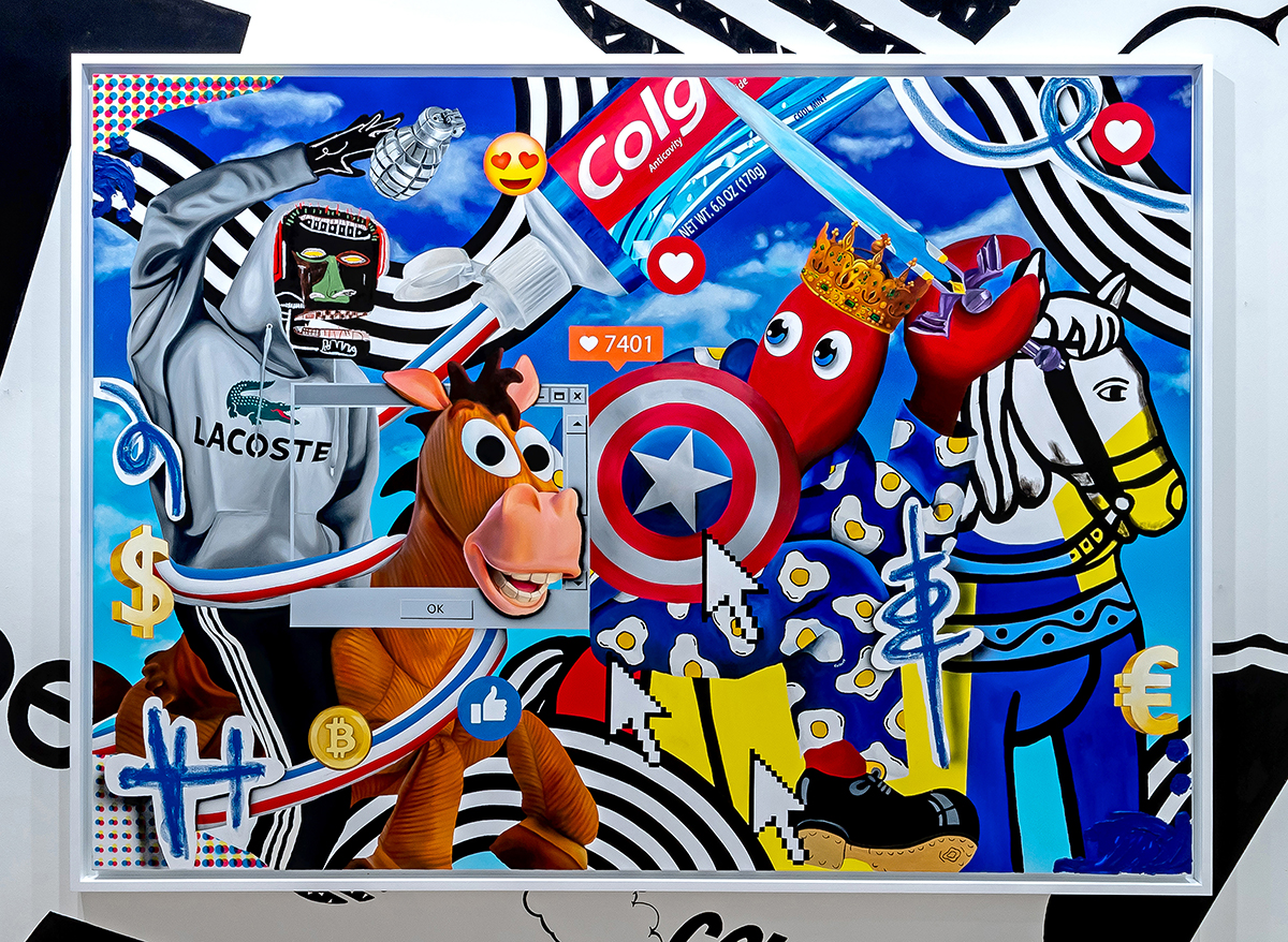
London-based contemporary artist Philip Colbert works within the self-defined movement of ‘Neo Pop Surrealism’. His distinctive, wildly vibrant aesthetic speaks of a hyperactive age swollen with imagery, media and symbols. His oil paintings are chaotic, visual overloads, creating imaginary surrealist dreams of swirling Colgate toothpaste roads, falling currency signs and laugh-crying face emojis.

Follow LUX on Instagram: the.official.lux.magazine

The exhibition “Hunt Paintings” presented by Unit London at the Saatchi Gallery pop-up in Los Angeles, coinciding with this month’s Frieze art fair, brings together a diverse range of artworks, including large-scale paintings, sculptures, and a virtual reality experience which transports viewers into ‘Lobster Land’. The title makes reference to the old master hunt scenes, depicted in works by artists such as Reubens. Reflecting on the violence of these scenes, Colbert’s collages teeter on the edge of nightmare, reflecting on the darker side of pop culture that lies beneath the sheen, slogans and humour.

‘The Year of the Lobster’, a collaborative work with art auctioneer Simon de Pury, is the most striking satire and an exhibition highlight. The surreal video is an art auction come pop song come music video, ridiculing the art world, consumerist society, advertising and modern day paranoias as de Pury calls out brand names and slogans, continually asking the viewer: “You do like that lobster, don’t you?”

Art sculpture by contemporary artist Philip Colbert

Philip Colbert lobster art installation

Installation shot of ‘Hunt Paintings’ by Philip Colbert at Saatchi Gallery, Los Angeles

“Philip Colbert – Hunt Paintings” runs until 11 March 2019 at the Saatchi Gallery pop-up, 8070 Beverly Blvd, Los Angeles. For more information visit: theunitldn.com/whats-on

Check out the next issue of LUX magazine, on sale from May 1 for a fabulous collaboration with Philip and Charlotte Colbert.

Share:
Reading time: 1 min
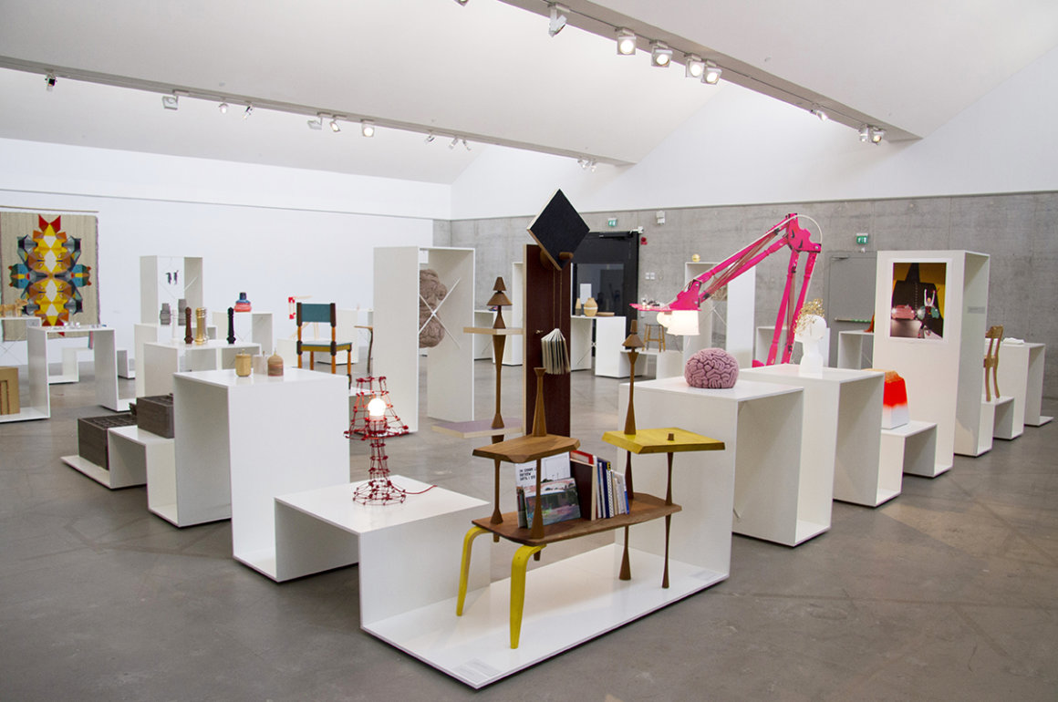
an exhibition space of design pieces such as furniture and sculptures
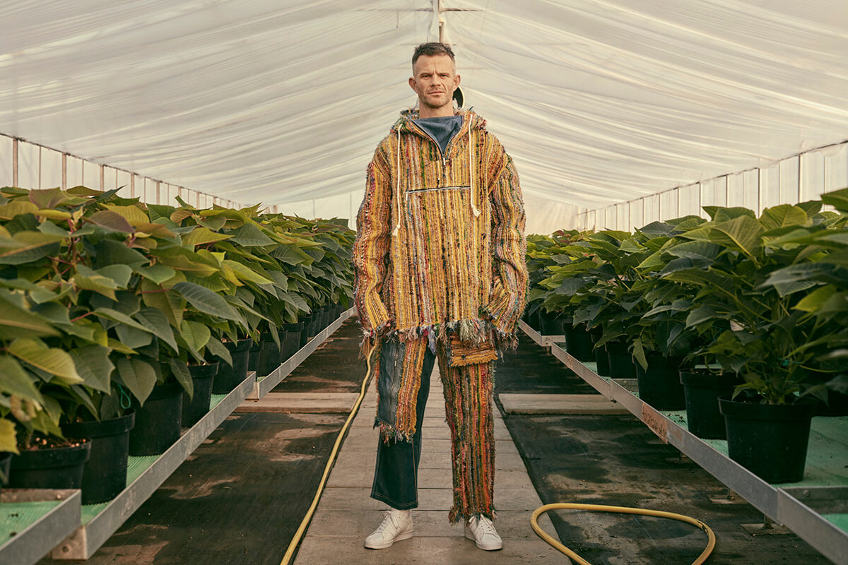
Man standing in greenhouse wearing high fashion apparel

Bethany Williams is one of the emerging designers stocked at concept store, 50m in Belgravia

With a gimlet eye for the latest and newest, LUX’s Cool Hunter and Digital Editor Millie Walton reveals what is grabbing her attention this season

50m

Experimental isn’t a term one associates with London’s upmarket Belgravia, but that’s where you’ll find the new concept store 50m (so-called after the 50 metres of clothes rail that runs along the inside walls). Created by artist collective Something & Son to support new design talent and tackle high shop rents, the store functions as a space for emerging designers to showcase and sell their work at a more affordable cost. The designers also receive mentorship from leading figures in the industry. Paul Smyth, co-founder of Something & Son, says its aim is to “create a store where people don’t simply consume stuff, but can meet designers, hang out with friends, cooperate and collaborate”. Find the likes of menswear designer Bethany Williams and jewellery studio RÄTHEL & WOLF.

50-m.com

Follow LUX on Instagram: the.official.lux.magazine

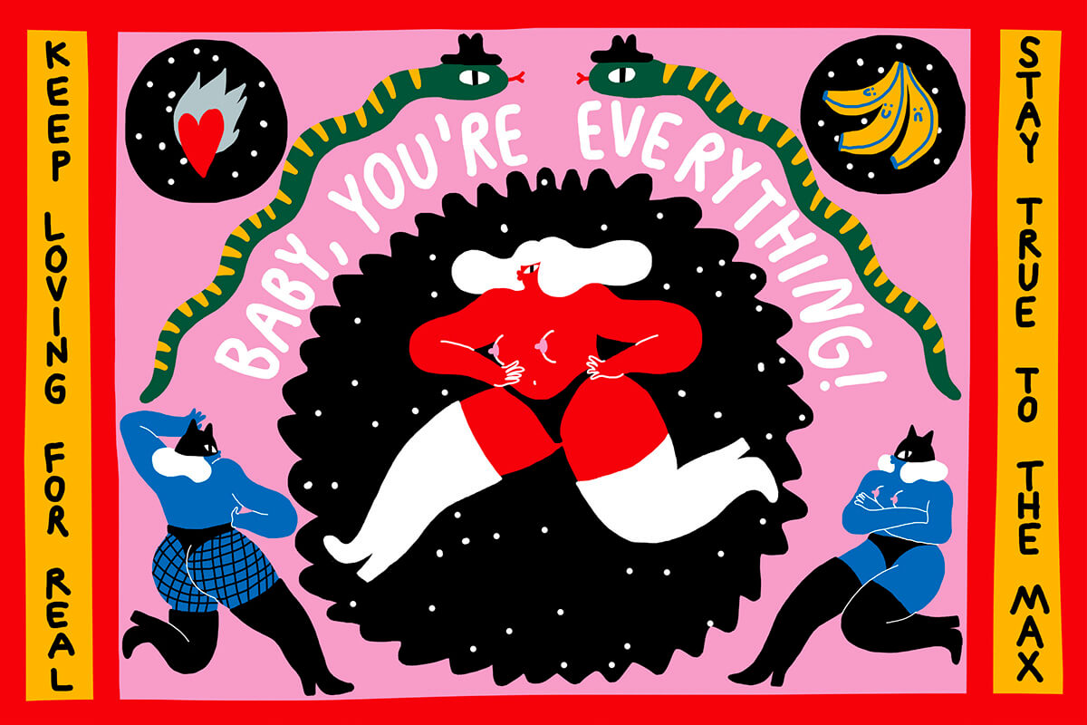
vibrant illustration of a woman running in thigh-high boots, captioned Baby you're everything!

Comic-strip meets pop-art graffiti by Lithuanian artist and illustrator Egle Zvirblyte

Egle Zvirblyte

Lithuanian artist and illustrator Egle Zvirblyte describes her work as a “bright, juicy, punch-yourface explosion with existential undertones”. The aesthetic is comic-strip meets pop-art graffiti, bursting with colour, humour and movement. Look through the artist’s portfolio and you’ll see the same characters often reoccur as if it’s all one big story with the next chapter spontaneously popping up in unusual places. Earlier this year, Egle created six huge installation works for Inis Oírr (a small island off Ireland’s west coast) as part of the Drop Everything annual contemporary cultural biennale, and she’s currently planning “a collaborative wall in London” with typographer Oli Frape. Keep your eyes peeled for larger-than-life, eccentric-looking characters dressed in 1980s fashion, cigarette-smoking tigers and bananas in shades and high heels. It will be hard to miss.

eglezvirblyte.com

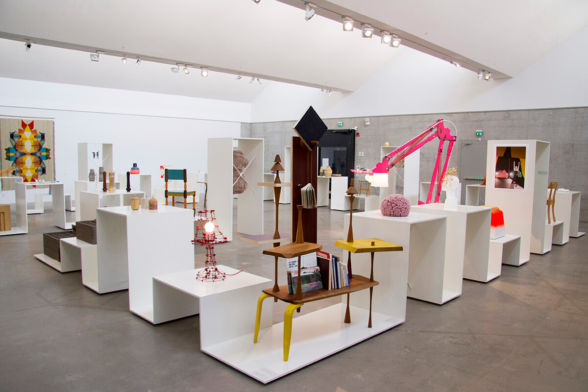
an exhibition space of design pieces such as furniture and sculptures

Petra Lilja Design Studio specialises in concept design

Petra Lilja Design Studio

The Swedish studio led by designer Petra Lilja specialises in concept design, curatorial work and exhibition design, with a strong focus on sustainability. For a recent project around the themes of ‘utopia’ and ‘dystopia’, Petra sourced material while ‘plogging’ (walking or jogging and picking up plastic rubbish). “It’s amazing how little we value a material that takes thousands of years to disintegrate,” commented the designer. The studio often collaborates with other designers to create intriguing objects such as the Rephrasals project with Aalto+Aalto, which explored the possibilities and expressions found through a method of associations and chance.

petralilja.com

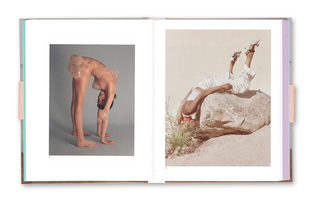
arty fashion photos of bodies distorted into complicated postures

Alternative fashion photographs from “Posturing”

Read more: Art auctioneer Simon de Pury on modern philanthropy

Posturing

Posturing is a fashion photography book with a twist – or several. Dreamt up by fashion curator Shonagh Marshall and Wallpaper* photo editor Holly Hay, it celebrates the body as a sculpture in contemporary fashion photography. The images are aesthetically intriguing, with a focus on the shapes created by limbs rather than the garments the models wear, and are accompanied by a series of interviews discussing the current state of the fashion industry. “I noticed a shift in the way contemporary fashion photographers were positioning the body,” says Shonagh. “There was a move away from the glamourised, sexualised body of the celebrity-driven 2000s.” Welcome a new age of perception.

shop.selfpublishbehappy.com/product/posturing

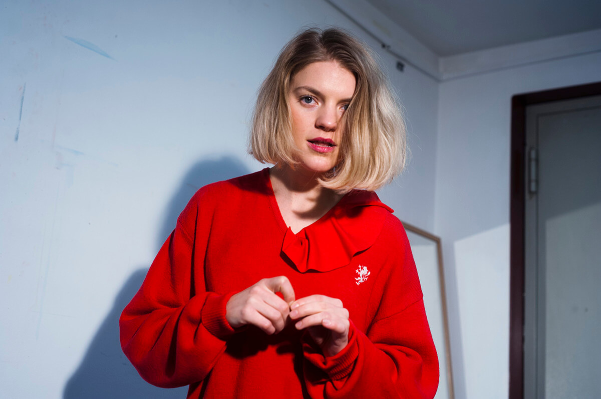
portrait of musician Annie Hockeysmith

Annie Hockeysmith is sometimes described as ‘Kylie Minogue on acid’

Hockeysmith

Hockeysmith’s music is the very definition of heady: a blend of woozy electronic beats, unorthodox rhythms and smudgy vocals. Based in Cornwall, Hockeysmith (AKA Annie Hockeysmith) takes inspiration from the arcane landscapes, occult folklore and local rave scene to create a breed of darkly textured electronic pop that’s impossible not to dance to. You feel like you’re throwing yourself across a strobing dance floor even if you’re lying on your bed at home. Sound frightening? It is a little, but it’s also a lot of fun – and has been described as ‘Kylie Minogue on acid’. I’m currently obsessed with the track Go Baack.

facebook.com/hockeysmithband

This article originally appeared in The Beauty Issue, to see more content click here.

Share:
Reading time: 3 min
Munch inspired prints by pop art artist Andy Warhol
Andy Warhol's colourful print interpretation of the iconic painting by Edward Munch, The Scream

Andy Warhol, The Scream (After Munch), 1984 © The Andy Warhol Foundation for the Visual Arts Photo Sparebankstiftelsen DNB

Andy Warhol first became properly interested in Edvard Munch on a visit to Oslo in 1971, where he spent time at the National Gallery and the Munch Museum. He was said to be a great admirer of Munch’s prints, far more so, in fact, than of his paintings. The Norwegian master was not only a prolific printmaker, but also technologically innovative; he enjoyed experimenting with textures and colours, which naturally resonated with Warhol as a leading figure in the Pop Art movement.

Munch inspired prints by pop art artist Andy Warhol

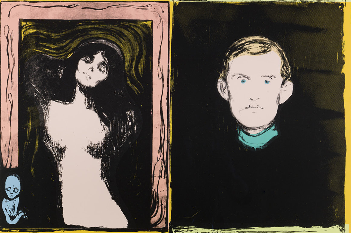
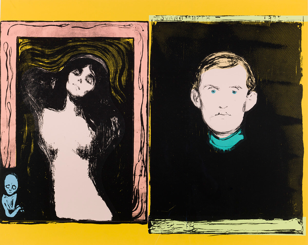
Madonna and Self-Portrait with Skeleton Arm (After Munch), Andy Warhol, 1984. © Haugar Vestfold Kunstmuseum

Follow LUX on Instagram: the.official.lux.magazine

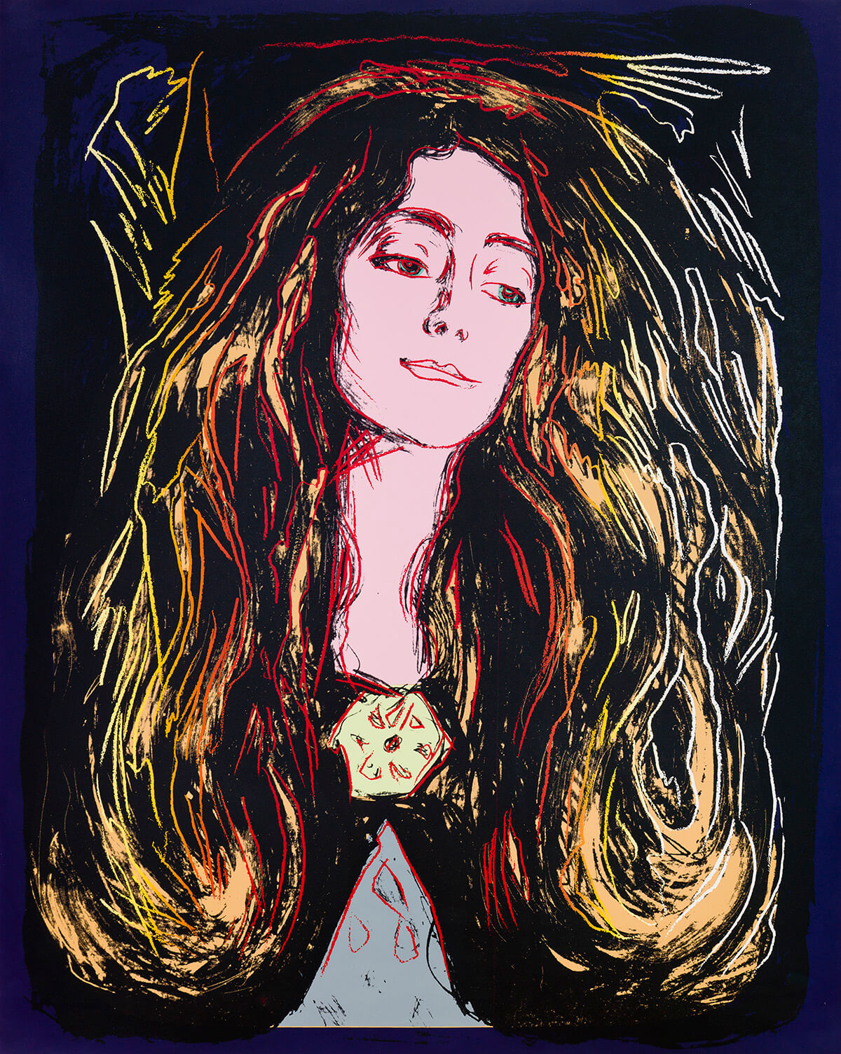
Between 1938 and 1984, Warhol produced a series of 15 prints, known as After Munch,  featuring some of Munch’s most renowned motifs. Like most of Warhol’s best-known works, these prints transform the meaning of the original image to lend a new and intriguing perspective.

Andy Warhol print of Eva Mudocci inspired by painter Edward Munch

Eva Mudocci (After Munch), Andy Warhol, 1984. © Haugar Vestfold Kunstmuseum

Read more: Why The Thief is Oslo’s coolest hotel

The most striking example of this – and the stand out piece on display in the Munch Museum – is Warhol’s interpretation of the The Scream. One of the most iconic artworks of the 20th century, if not of all time, Warhol’s reproduction of the The Scream using different colour variations and stencils gives the work a completely different mood, thus encouraging the viewer to more deeply consider the artistic process.

‘Andy Warhol – After Munch’ runs until the 26th August at the Munch Museum, Oslo. For opening times visit: munchmuseet.no/en/exhibitions/andy-warhol-after-munch

Millie Walton

Share:
Reading time: 1 min