Gabriel Scott Design
Scott

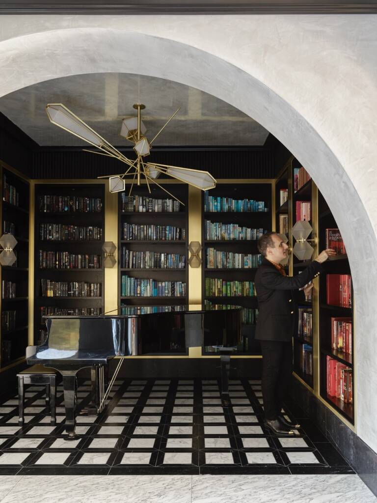
Portrait of Scott Richler, founder and creative director of Gabriel Scott

The furniture and lighting studio Gabriel Scott was founded in Montreal, by Scott Richler. It was established in an effort to blend his jewellery design experience developed over many years to designing lighting and furniture. He speaks to LUX about the process behind it and how he focusses on craftmanship and exquisite materials

Q: Where do you draw inspiration from your furniture and lighting?  Which brands, or elements of brands, inspired you when you began your design line?

Scott Richtler: Mostly the language of our Gabriel Scott pieces is based on some prior experience in my life.  Mostly from the time I spent in jewellery design and fashion with a separate brand called Jennifer Scott between 2000 and 2005. I created statement jewellery from semi-precious stone.

This led to a career in design, mostly in women’s accessories like handbags seen in Bergdorf’s and Neiman Marcus. Working in high end fashion design meant I developed a high range of design skills learning from the best artisans in Italy.

Before this though I had an architecture background, so I have macro scale and smaller scale design experience; I like the immediacy of this, I speak many different design languages.  I’m into details and you can see the story of my background come through into our lighting fixtures.

Gabriel Scott Design

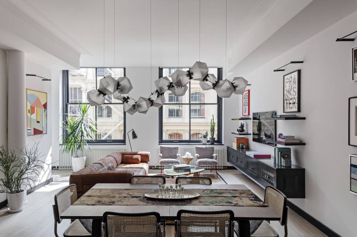
The Welles Glass Chandelier, curated in essence of timeless jewellery

Q: In the 18th century, furniture was elevated from functional pieces to works of art, acting as a status symbol in the Victorian home. What would you say is furniture’s symbolic purpose today?

SR: The function of an architect is to look at a space and interact with it. Furniture and lighting are all objects you interact with in one way or another. Everything in your life surrounding you has a form of dialogue around it.

Furniture can be seen as sculpture or more precisely functional sculpture. It’s also about how the user of that space interacts with the environment. Decorative lighting can be viewed as a pretentious status symbol and pretentious pursuit.

Decorative lighting is functional but not totally necessary in a home. Decorative lighting is a focal talking point, creating interest and texture in a home, it is an elevated art form in this sense.
interior

Greg Natale’s East Brisbane house in Australia: This riverfront residence combines interior architecture with the layering of sumptuous finishes to create a “modern palazzo” that celebrates its owners’ deep connection to Italy.

Q: The lighting industry now faces issues with regard to electricity usage and sustainability. How do you combat or navigate these issues, and how do they challenge your principle that designs should be ‘Timeless’?

SR: Gabriel Scott designs use low LED’s and these drop very little electricity, you could keep them on forever and they’re very environmentally friendly. I’ve always approached design through timelessness because it should be like this.

Gabriel Scott furnishings and lighting are classic with longevity just like Chanel. You can wear a Chanel piece from 60-years ago and it’s still as contemporary in present day today. I’m in the camp sitting with vintage Porsche’s being more sustainable than Tesla’s.

The amount of investment required to build a Tesla that will be used for no-more than 10-years is less sustainable than driving a Porsche that’s been on the planet for 50 years. Investing in a Gabriel Scott light is much the same, it’s an investment which will stand the test of time and last.

Q: How else does Gabriel Scott engage with sustainability?

SR: Like a fine designer quality brand, Gabriel Scott’s pieces are investments, well made, amazing materials with longevity.  The materials come from the earth, they’re minerals and glass is recyclable. We use materials that are long-lasting, if you invest in our furnishings they will last forever and you can move with them from home to home.

I do feel strongly that the word sustainability needs to be used carefully by companies. There are so many brands out there greenwashing their companies in a way that is detrimental to the wider sustainability agenda.

Q: Is it important for contemporary art to be functional as well as aesthetic?

SR: It’s not important for any art to be functional.  The dialogue of art is to not be functional whatsoever. As a matter of fact, if it’s not functional, sometimes it creates more questions in the user, which therefore creates a dialogue that may be intentional or not.

The Welles Long Chandelier 17, Smoked Purple and Gray Glass. The Welles collection was coined by notable architect and designer, called David Rockwell.

Q: Would you say furniture and lighting are of increasing importance in the art world now?

SR: Lighting and art in juxtaposition are increasingly important and the majority if not all high-end clients have both in their homes.  We’re recognizing this and from May our London showroom will be welcoming in the Virginia Damsta gallery.

We’re creating a art and lighting gallery with an inaugural exhibition, titled “The New Artists: When Machines Dream” departing from the conventional white cube concept, we’re going to be presenting a synthesis, a symbiosis of art and design. This fusion illuminate’s artwork and creates a harmonious interplay between art and design.

Q: What key changes have you noticed in lighting/furniture design since you founded Gabriel Scott in 2012?

SR: I’ve seen a shift culturally, pre-2012 most high-quality furniture and lighting was manufactured mostly Italian.  Italy is known for being refined and creating the best.  But most of its industrialized and this was the key to the Italian success, being able to industrialize production of beautiful lamps and furniture.

For the last 10-years, there’s been a pivot towards a more artisanal approach. A much more hands-on, handmade approach to furniture and lighting which is more appreciated. The shift has been from the benchmark of quality Italian pieces which have been industrialised. Not the benchmark is more artisan like a carpenter trained in skills from hundreds of years ago which is just exquisite so there has been an elevation.

Q: Do you feel like people are getting more adventurous with their lighting?

SR: Yes I 100% agree with this, but if you look back into time you’ll find plenty of people who were adventurous with design. For example, if you look into interior designer’s in North Carolina, it would not have been surprising to find a sculptural element to a wall sconce in a Gio Ponti house like 50-60 years ago.

You would find sculptural lighting, it just was something that was very European it never really traded into the sort of mass market.  The general public are more conscious about lighting due to big interiors companies being more adventurous with media campaigns.  Decorative lighting has kind of become the norm – with more people on board!
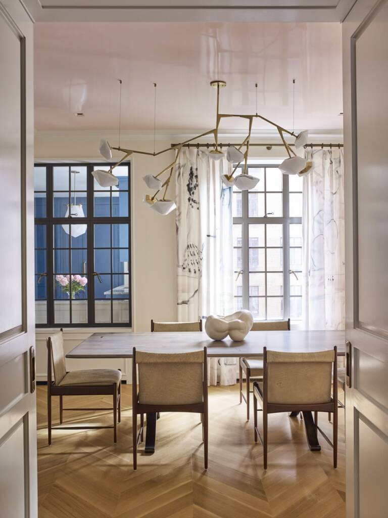
The Myriad Chandelier, 12 Long. The chandelier projects a warm light through its double-blown glass and is hand-made to order.

Q: With your background in architecture and fashion, you interpret decorative lighting as larger scale jewellery. How else has your experience in the fields impacted your perspective on interior design?

SR: I’ve taken inspiration from many great interior designers such as Joseph Dirand. My perspective on interior design is that you can easily interpret a space through the objects that populate that space. My perspective is being an interior designer doesn’t necessarily have to be a maximalist pursuit.

You don’t have to put a great deal into a space to make it special. You can put in an amazing table, piece of art and light fixture – the look can be pretty minimalist. But there’s something unique and special about it is because of the objects in space.

Q: Are there any elements of different brands that have inspired your line?

SR: I love to look at jewelry lines like Pomellato, Cartier and De Beers for inspiration for our lighting. A discontinued Cartier ring inspired the Harlow light.  The ring was like a series of balls that are cold and explode.

In terms of furnishing’s I find Gio Ponti inspirational. Buckminster Fuller is an incredible inspirational architect. I’m enthused by Olafur Eliasson the artist. So its varied, it doesn’t come from furniture traditions. It’s just like images that are blended.

www.gabriel-scott.com

Share:
Reading time: 7 min

In the fourth part of our Driving Force series from the AW 2022/23 issue, LUX’s car reviewer gets behind the wheel of the Maserati Levante Granlusso

As the car industry moves into its new phase focused on electric and, in due course, autonomous motors, presumably there will be shifts in priority for consumers. Previously, you may have chosen a car for its exciting engine noise and performance advantage over rivals. In an autonomous, electric-car future, these factors will be uniform: all cars will go at the same speed and make the same (lack of) emotive sound.

So how will they be distinguished? Or will they not be distinguished at all? Will cars become like road-going versions of train carriages, the space inside them hired out by passengers?

It would be logical to presume that personal (as opposed to shared) automotive transportation will continue for the wealthier consumer and, with differentiation in the performance stakes no longer possible, design and luxury will come more to the forefront.

Follow LUX on Instagram: luxthemagazine

Designing a car’s interior to look striking is not as simple as creating a fashion collaboration for a sneaker, though. Like a plane’s, the interior of a car has to adhere to specific stipulations for safety, space, comfort and security. Materials also need to handle years of being sat on and scraped by (luxury) behinds. Which is why, we reflected, as we sat in the Maserati Levante Granlusso, it is rare to see an interior with this much style. The most luxury car interiors are fairly interchangeable. Not so this one.

It was designed by the Italian fashion house Ermenegildo Zegna – a special edition that is worth seeking out. There were swathes of what looked like men’s suit fabric along the seats and doors, and it had a delicious boudoir feel.

We subjected the Maserati to a longer test than usual, over a period of weeks rather than days, because this is a car designed as everyday luxury transportation, just as your Birkin is designed as an everyday luxury carrier of stuff. If you’re going to be using the car every day and will be seeing a lot of its interior, then it deserves serious consideration on this alone from anyone in the market for a mid-size luxury SUV. Everyone who experienced the car – friends, relatives and so on – commented on the interior. It’s a comfortable car under any circumstances, but the design touches give it a distinctiveness that is unique to this edition.

brown and leather and black car seats and a steering wheel

Embodying function and Italian flair, Maserati’s new mid-size luxury SUV is particularly distinctive for its fashion house-designed interior

Before we go further, let’s elaborate on the term “mid-size luxury SUV”. A few years back cars came in simple categories. Now there’s an infinite variety of what the industry calls “crossovers”: vehicles that are fluid in terms of categorisation, sometimes the better for it, too, and sometimes not, if you look at the more curious attempts at merging luxury, high-performance and bling. Fortunately, Maserati does not fall into this trap. It is a relatively simple, medium-sized (that is to say, pretty big by European standards and quite small by American standards), sporting off-road vehicle, the type seen on school runs and in luxury shopping streets globally.

Its shape is more quiet and harmonious than out-there and ostentatious, and all the better for it, unless your primary aim is to be noticed. It has a touch of Italian flair – more so than its Germanic rivals, like the Porsche Cayenne and BMW X5 – but not so much that it shouts at you. Unusually for an SUV, it attracted many compliments from people we encountered, and no inner-city anti-car hostility.

To drive, it felt a bit bigger than it is. The flowing shape means that it is hard to judge where the ends of the car are (the 360-degree camera was an advantage here). In a car with a Maserati badge, we expected something focused on performance and agility (as much as possible for a large, tall car) but, actually, the Maserati is aimed more towards the comfort end of the spectrum. This was fine most of the time, except occasionally the ride did get more lumpy than in a true luxury car, such as a Mercedes E-Class, and it was a shame not to have a bit more excitement on a twisty road. That is the essential compromise of these sport- utility vehicles – they encompass engineering challenges for the way they drive and ride. Still, it hasn’t hurt their sales and it would be a very sensitive driver or passenger who noted this.

Read more: Driving Force: Porsche Panamera 4S E-Hybrid

One thing you may notice, depending on how mechanically aware you are, is the engine. If you are part of a (now dwindling) demographic for whom an Italian car brand means a glorious, smooth and powerful engine, you will need to readjust for the diesel engine. It gets the car around effectively enough, but it’s not going to make you feel like a racing driver. It is functional, which is slightly out of kilter with the car’s flair.

And it is flair that we keep going back to. In a world of increasingly homogeneous cars notable for their efficiency, Maserati has succeeded in making a comfortable, functional, spacious everyday car with a splash of luxury. That is an attractive trait in itself, and a very nice place to be when you are sitting in everyday traffic surrounded by your Zegna-fabric interior.

Find out more: maserati.com

This article first appeared in the Autumn/Winter 2022/23 issue of LUX

Share:
Reading time: 4 min
yellow bentley
yellow bentley

The Bentley Continental GT Speed

In the first part of our Driving Force series from the AW 2022/23 issue, LUX’s car reviewer gets behind the wheel of Bentley Continental GT Speed.

In this era of speed cameras and efficiency, the idea of a 12-cylinder car expressly made for two people touring the continent and called Speed, seems so impossibly incorrect that we had to try it. Our Bentley Continental GT Speed came in Damson, a rather tasteful purple close to black. The interior was also a deep purple, not of the heavy-metal kind but more what you might expect in the drawing room of the mildly wayward youngest son of an Italian count.

Follow LUX on Instagram: luxthemagazine

Considering it is one of the faster models in a powerful car range beloved of footballers, as well as a wealth of a variety of other types, the Speed is remarkably un-blingy and understated. The engine hums: a tuneful moderate hum around town, a more purposeful hum on the highway and a “tuning up at the opera” hum when accelerating hard, when it is accompanied by a tasteful “whoosh”. It never makes any other noises, though; that would be out of keeping.

The standard Bentley Continental GT is such a good car of the type – comfortable, beautiful, powerful, fast and exclusive in feel – you need a good reason to choose the Speed, with its extra horsepower, instead. Driving around town, the difference is marginal. It picks up with a tad more vigour and turns corners more sharply, but this is a heavy luxury car and you can’t throw it around little bends as if it were a go-kart.

 The Speed’s significance becomes apparent on long stretches of empty rural roads. Here, if another car is impudently driving in front of you, shoot past by twitching the gas pedal: the car surges forward, stable whatever the road surface or weather conditions, due to its four-wheel-drive, to obtain its rightful place at the head of the traffic. For more drama when overtaking a line of cars, put the accelerator to the floor and it storms past, attaining a three-figure speed.

clock in a car

The Bentley Continental GT Speed combines all the understated elegance you might expect with the assurance that the driver is truly in the driving seat of the ride

It does all this with an air no other car, even its siblings, can quite achieve: effortless and muscular, yet the right side of involving. Bentley’s engineers have made sure that you, the driver, are not a passenger, as you are in some fast luxury cars. A Bentley driver likes to drive.

The quality of materials in the interior is as good or better than anything else on the road, perhaps barring Bugatti and Rolls-Royce. Even the Alcantara, the man-made suede stitched on the dashboard to give a sportier feel, seems of a lusher, thicker grade than in supercars. The controls feel as if they have been personally machined for you and have haptics familiar to owners of expensive watches.

Read more: LUX Car Review: Ferrari F8 Tributo and F8 Spider

Crucially, the Speed is easy to drive. If you wanted to drive it around Mayfair or Beverly Hills, it would be no problem. Visibility is good, the controls are light and straightforward, and you can get in and out easily. The seats are comfortable in the front, although with limited room for rear-seat passengers, in GT style. If you want a Bentley for four, there are other models in the range – less sexy, but more practical.

Is there anything missing? Objectively, no. Subjectively, while the car offers all the speed you would expect, we think there is room for a Bentley that offers an even more sporty driving experience, even at the expense of some comfort. When that comes, we will certainly want one.

LUX rating: 18.5/20

Find out more: bentleymotors.com

This article first appeared in the Autumn/Winter 2022/23 issue of LUX

Share:
Reading time: 3 min
interior restaurant
interior restaurant

La Muña restaurant at La Réserve Eden au Lac Zurich.

In the second of our four part luxury travels view column, our editor-in-chief Darius Sanai discovers the elegant alpine charm of La Réserve Eden au Lac Zurich

Have you come across a La Réserve junkie? They are fans of one of Europe’s most distinctive and chichi luxury hotel groups, a kind of micro-version of the original Aman concept. There are La Réserves in Paris, Geneva and Saint-Tropez. The Geneva and St-Trop (in fact, Ramatuelle, on the coast just outside) properties have similarities. They’re both resorts, with delicious swimming pools – Geneva’s is the city’s most bijou pool and spa, as well as an outdoor pool with a country-club feel for the summertime.

Follow LUX on Instagram: luxthemagazine

So, I was interested when the owner of the La Réserve group, Michel Reybier, told me that he was opening a La Réserve in Zurich, not a city known for the quality or variety of its luxury hotels. But where would it be? Just outside town, on a greenfield site near the lake, like Geneva? Or a city centre hotel like Paris?

hotel bathroom

The view from one of the hotel bathrooms. Image by G Gardette

The answer is, a bit of both. The La Réserve Eden au Lac is, as its name suggests, set on the shore of Lake Zurich, a ten-minute walk or five-minute taxi ride from the heart of downtown. It is still in the city centre, a conversion of one of the city’s most celebrated properties, Hotel Eden, which had become a little neglected.

Read more: How ethical blue economy investments support ocean conservation

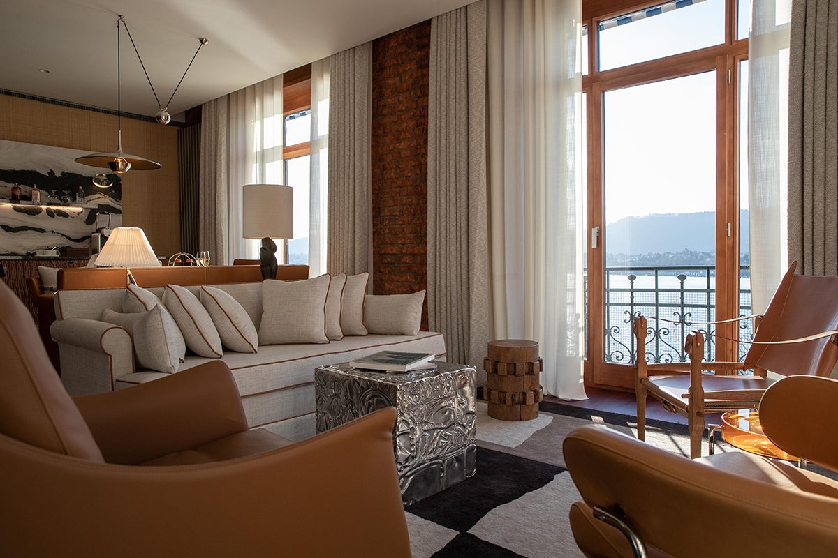
My room, on the second floor, with a small balcony, had an entrancing view across the lake to the Alps beyond. The interior was just delightful. The bed was in the centre of the room, with a writing desk behind, a blend of 20th-century modern and contemporary touches in the design, bare walls, Ibiza-style white drapes and some beautiful Swiss marquetry.

luxury bedroom

The Eden Suite at the hotel

Reybier has made the Geneva and Saint-Tropez properties destinations in themselves due to their dining and bar options. Would Zurich be the same? The Eden Kitchen & Bar is melded into the lobby restaurant and, while many people would enjoy their Cecconi’s-type vibe, I like my hotel bars to feel a little bit more exclusive, more club-like.

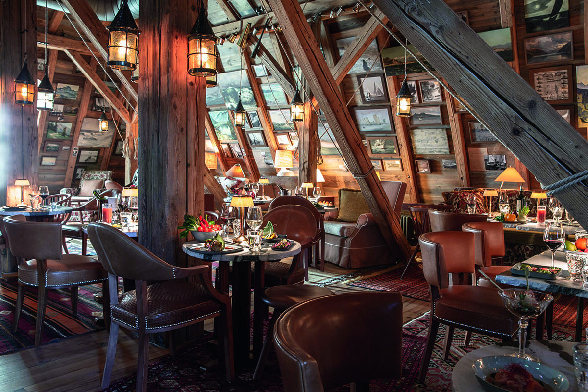
Fortunately, Reybier also appointed Philippe Starck to create La Muña on the top floor. With a view across the lake and city on a clear summer day, it’s also a curious and rather wonderful mix of Alpine and ‘yachty’ (the concept is ‘an imaginary yacht club created by Starck’) in an attic-type space in the rafters of the building. It really feels like an Alpine chill-out bar serving fabulous Japanese food, with a hint of South America. Creamy spicy salmon tartar with tobiko, sesame, jalapeño and fried rice was gorgeous, as were the grilled vegan gyoza. La Muña also has a very painstakingly sourced list of Swiss wines, the best of which were superb and hard to find.

Chapeau, Monsieur Reybier, you may just have created your best Réserve yet.

Find out more: lareserve-zurich.com

This article originally appeared in the Autumn/Winter 2020/2021 Issue. 

Share:
Reading time: 2 min
contemporary art sculpture

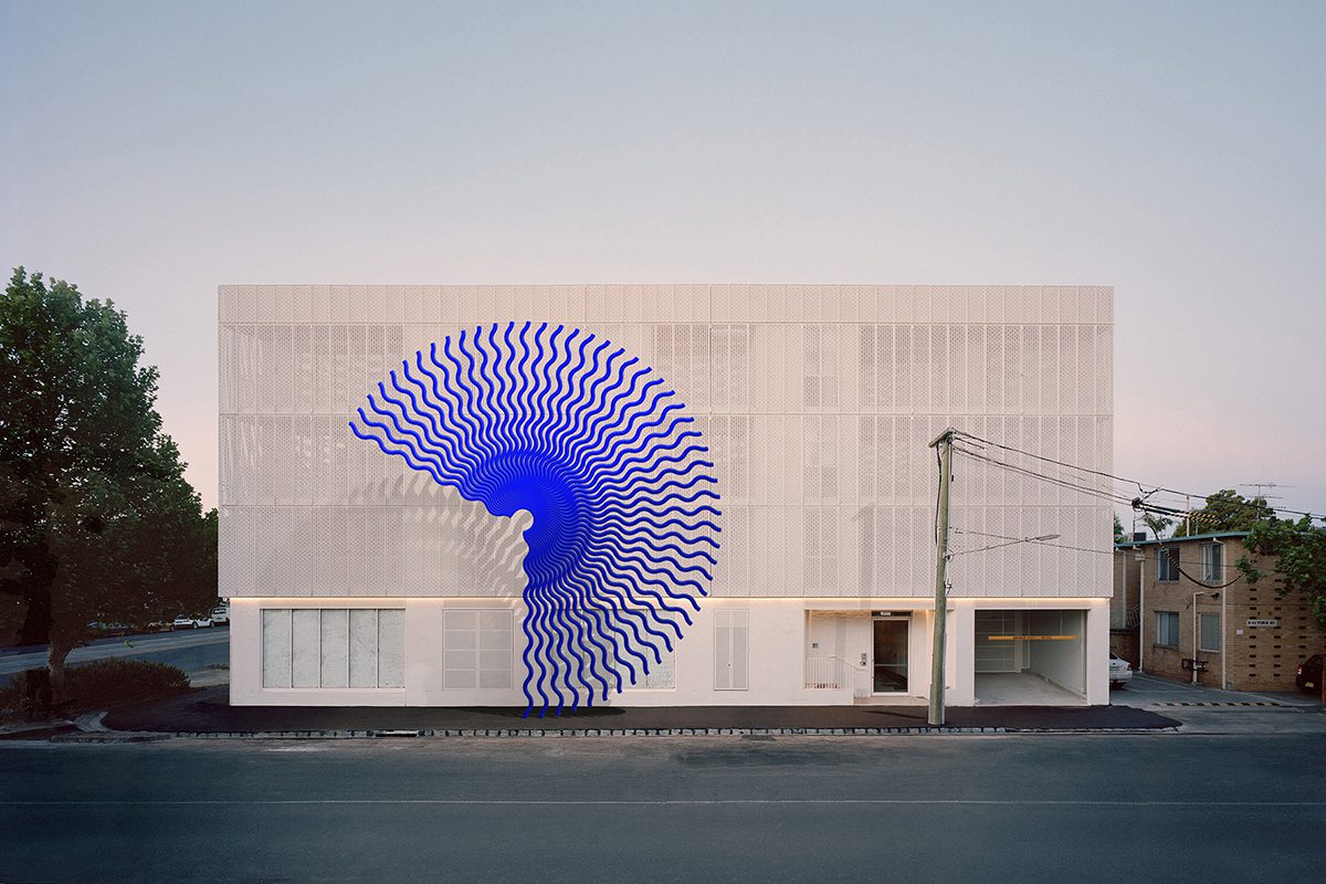
‘La marea bajita’ from Diango Hernández’s Instopia Instagram project

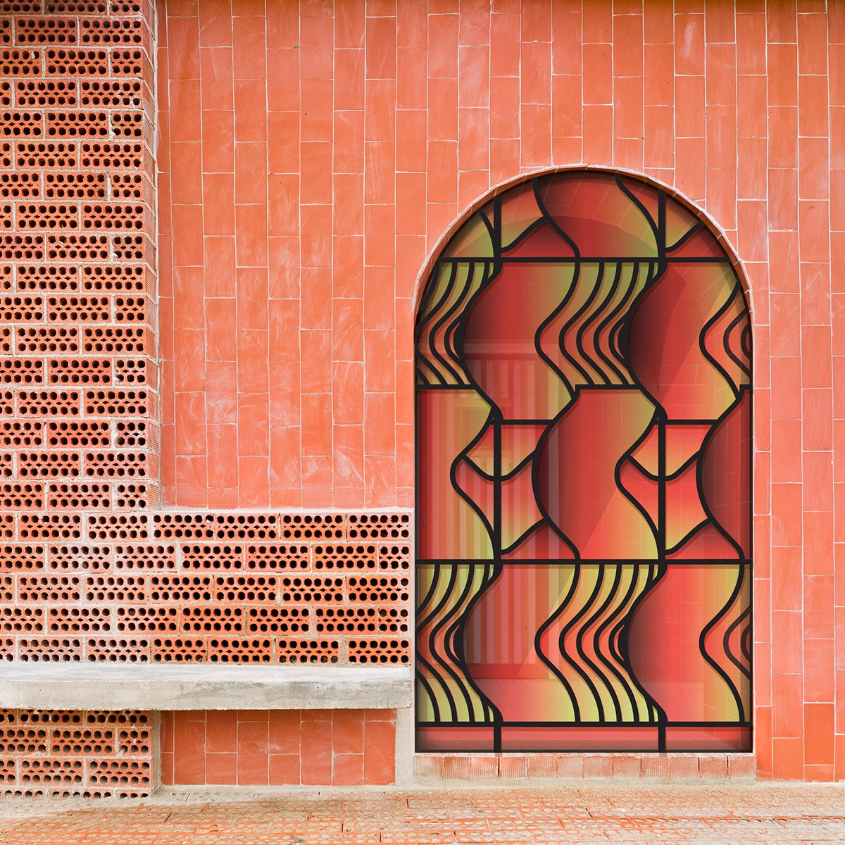
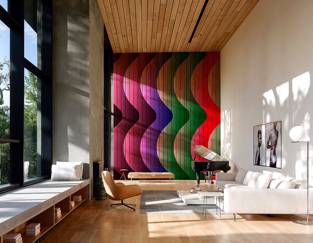
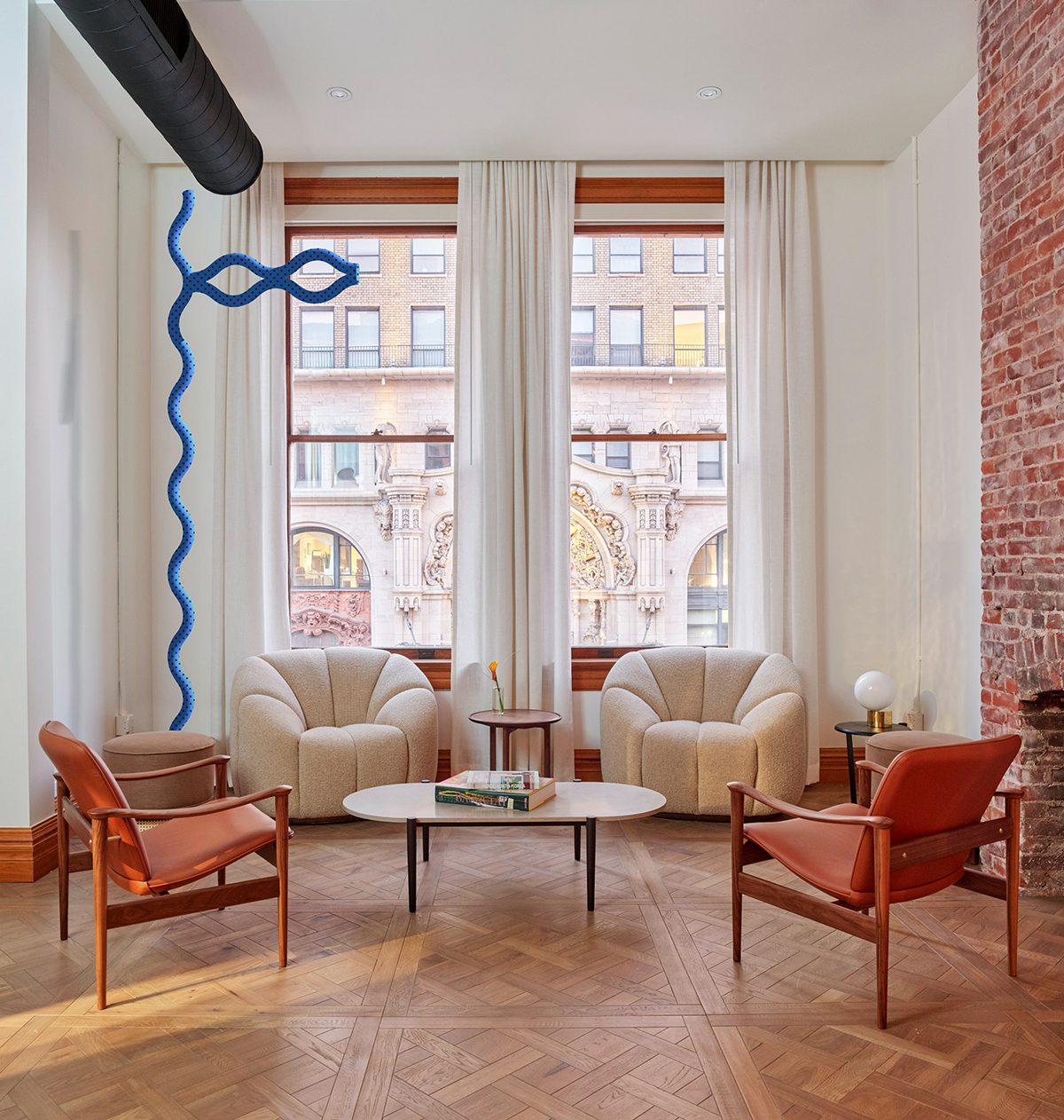
Dusseldorf-based, Cuban artist Diango Hernández has been blurring the lines between the virtual and physical since 2015 with his ongoing Instagram art project Instopia in which he digitally places his own artworks into existing photographs of luxury spaces. Nick Hackworth speaks to the artist about ownership, challenging perceptions of reality and the culture of revolution
artist in the studio

Diango Hernández

LUX: Can you describe Instopia in a nutshell?
Diango Hernández: Instopia is an ongoing series of images that show artworks of mine in extraordinary places; a painting of mine hanging, for example, in a luxurious villa in Greece or Capri or, say, a huge sculpture inside a high-end ‘white cube’ gallery in New York or London.

Follow LUX on Instagram: luxthemagazine

There’s a bit of magic or sleight of hand, in the way these Instopia images are made. The process begins with me finding an image of one of these luxurious spaces on Instagram or online. Then I design a virtual artwork, it could be painting, a mural or a sculpture, that I think would look perfect in that particular, photographed space. I take into careful consideration of all the elements of the spaces, its colours, lighting and textures. Then I digitally place my artwork into the image of that space and post up this new picture onto my Instagram account. The work only becomes Instopia only when makes you believe that it’s “real”.

LUX: How did you come up with the concept?
Diango Hernández: It wasn’t actually about the irony, cynicism or any form of mockery. It was just that very often when I came across beautiful images of luxurious places I always found in them, some spaces that I thought would be good for my art. But people got offended by the project because it challenged their ideas of reality. They’d look at an Instopia image and ask, ‘How real is it?’ or ‘Are you lying to me? You don’t have a painting of yours hanging in that beautiful mansion!’ I lost friends because of Instopia. In fact, the longer I’ve been continued the project the more that other artists and art dealers have reacted strangely toward me.

abstract art doorway

‘Cadenas de agua’ from Diango Hernández’s Instopia Instagram project

LUX: Why do you think people in the art world reacted so strongly?
Diango Hernández: They were upset, insulted even, because they thought I was using these Instopia images to pretend that my work was hanging in this space or was part of that great collection or museum. For instance, I’d replace a Francis Bacon one of my paintings in an image and people would be like, ‘your work isn’t in that collection!’ They’d be really rude, but I would say to them, ‘I’m not bound to the sense of reality you have. I come from another country, another tradition.’ I still believe we have can an intense dialogue with pictures. Pictures are more serious than most people believe.

Read more: Loquet’s co-founder Sheherazade Goldsmith on creating sustainable jewellery

LUX: In the captions of your Instagram posts do you refer to the reality or unreality of the image?
Diango Hernández: No. On Instagram you have a few elements that will imply a level of truthfulness: the image, the hashtags and the text. I work with all of these elements to make you believe, as much as possible, that the post is real. This is why people got really upset. Galleries even cancelled shows. They had collectors calling and telling them that I was abusing the internet. I was like, ‘Are you kidding me guys? Don’t know the history of collage?’ It just shows you how contradictory the contemporary art world is. Everyone is busy selling the ‘new’ and the ‘radical’ but only a few can really deal with what is really new.

swimming pool artwork

digital artwork

Cielo bajo el agua (above) and Tu muchas veces (here) from Diango Hernández’s Instopia Instagram project

LUX: The negative reactions to your work are interestingly hypocritical. Instagram is a vast, collective platform which people use to project or imagine their own fantasies. But as usual, things get conservative when people with money get upset…
Diango Hernández: Exactly. When people complain about me inserting an artwork into an image of their beautiful interior, they are effectively saying, ‘Come on, I have spent millions of dollars on this living room!’ A lot of the outrage is connected to people’s sense of ‘property’.

Read more: Laid-back fine dining at Knightsbridge restaurant Sumosan Twiga

Most of the legal issues I’ve had have come from photographers complaining that I’d abused their copyright. That make sense as people are crazy about property. They forget that artists challenge and question that very notion of ownership. Somehow, we have to do it, it is in our DNA. A world without people questioning private property is an unfair world. But it’s true that my way of doing this is more ‘gentle’, I just add ‘value’ to your beautiful property by adding my ‘art’ to it!

luxurious interiors

contemporary artwork

Ojos claros (above) and Noches (here) from Diango Hernández’s Instopia Instagram project

LUX: Do you think of your work as having a punk or anarchist spirit?
Diango Hernández: I’d say my attitude isn’t so much punk, I’d say it comes out of the culture of revolution. To illustrate what I mean, a particular story comes to mind…

In the Havana of the 1940s and 1950s there was a very fancy country club park, frequented by Americans and the Cuban bourgeoisie. In January 1961, the Cuban revolutionary leaders Fidel Castro and Che Guevara were enjoying a drink just after they finished a game of golf at the club. They were pondered the future of the country club, since all of its members had fled the country. There and then Guevara proposed the creation of a complex of tuition-free art schools to serve talented young people from all over the Third World. ‘The school must be built just right on top of these holes,’ Che Guevara said.

vintage golf photograph

Cuban revolutionary leaders Fidel Castro and Che Guevara playing golf

A few years later Cuba’s National Art Schools were built. In the design they attempted to reinvent architecture in the same manner that the Cuban Revolution aspired to reinvent society. To this day the art school is one of the most beautiful buildings ever built in Cuba.

That idea of subverting the function of that exclusive country club into a school for the arts, seems to me, like a radical and powerful act of collage. There is a lot to learn from the history of design and architecture. One valuable lesson is that transforming images and the values they embody is one way of transforming our reality, culturally and socially. I want people to interact more thoughtfully with images and to create ‘better’ pictures.

Follow Diango Hernandez on Instagram: @diango.hernandez

Nick Hackworth is a writer and curator of Modern Forms, an art collection and curatorial platform founded by Hussam Otaibi, Managing Partner at Floreat Group

Share:
Reading time: 6 min
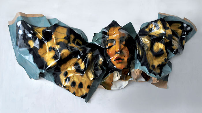
Rupert Shrive: Painted Lady, 2012

Rupert Shrive: Painted Lady, 2012

Serena Morton had a unique challenge to curate an art collection for one of London’s landmark historic buildings, now an exclusive members’ club. The twist: she had to complement décor ranging from Georgian grand to Zaha Hadid-designed cool. Caroline Davies discovers how she did it

How do you start curating for a space like Home House?

Before this project the art in Home House was a bit of a mish-mash. Over the years, someone would take a fancy to this or to that and it would go in. The Courtauld Institute was based at Home House from 1932 to 1976. It is a strong thread that holds the house together and we wanted to bring it back with a big statement.

We looked at Home House members. They all have a connection to London, are varied in age and are a pretty sophisticated bunch. We decided that you could make the balance of membership more interesting by really creating a solid art program, which helps draw more of a culture crowd.

Why did you decide to have individual artists in each room?

I have launched, run and directed 3 galleries, two of my own and one for someone else, and curated exhibitions in many different pop-up forms. The one thing I know is that it is much less impactful when you put a bunch of artists together who don’t really have any connections. This is happening a lot at the moment, but the connections are still forming. We don’t really have a current movement so why would you mash them all together? When you just have one thing to look at and the space around it it’s more interesting.

Home House is itself a set of rooms. It was three Georgian town houses which were joined together, each a residence so each room is different and so is the décor. Spreading the art across all the rooms wouldn’t necessarily work, but these ‘mini galleries’ allow the art to flow and creates conversation.

Which artists did you use and why?

They range in age from seventies downwards. You have some really senior artists like Ethel Walker and Simon Edmonson right down to some emergent stars like Jim Threapleton and Robi Walters who recently won the Lexus Telegraph prize.

Rupert Shrive, who has had double page Vogue spreads around the world, a huge piece in the Grand Palais and is now in the Courtauld, is on the staircase. Ethel Walker, one of the leading Scottish colourists has painted some huge panels in the dining room, they take you up to the heavens. Mary Anne Aytoun-Ellis is in The Garden Room next to her; I love the scale she uses, which is physically difficult, combined with her feminine take on landscapes. I hope the dining room atmosphere elevates your palette and your senses, rather than getting indigestion because you are looking at something rather pornographic.

Jim Threapleton: 3-Quinuclidinyl Benzilate IV, 2012

Jim Threapleton: 3-Quinuclidinyl Benzilate IV, 2012

Piers Jackson’s geometric shapes are in the bar, which is the core, the kernel of the club; everything else starts to morph around that. Theo Mouxigouli, next door, is very different. He is a Georgian painter based in Shoreditch. He lives in squats and travels around with his canvases rolled on his back. His work is mainly of London, representational, all about feeling with a sense of going back to the past. I think you get a kind of mini buzz from each. Simon Edmondson is a huge heavyweight that London forgot. He has a whole installation in one big member’s lounge which is almost going to be like a Rothko chapel. He creates large interior scenes with a muted pallet, sometimes quite sexual. I think he needs to be seen again. Jim Threapleton was a film maker that has been studying at art school. It has taken a long time to work out what he is doing visually and he has not shown; it’s about slowly presenting him without too much over exposure. I loved Robi Walters’ work as soon as I saw it. There is such an intelligence and positivity about it. He is a massive star in the rising and still very young. Chris Moon is in the House lounge. The Hayward described him as a cross between Bacon and Hockney which is a rather large statement. He is a darn good painter.

How did you select the artists?

I tend to go with my gut feeling. I picked people that I hoped would appeal to a range of ages and members. All the pieces are originals, there is no edition work and they are all technical; they don’t look like things that have been made easily, you couldn’t do it yourself. There is a lot of conceptual art around at the moment and it is not that. It is nice to promote the emerging rather than fully blown. There is a gang of artists that everyone knows about in the London scene at the moment and I wanted to present something different. I am working with these people, but I am always working with a huge number of others as well. I think it’s only natural that you would promote people that you believe in.

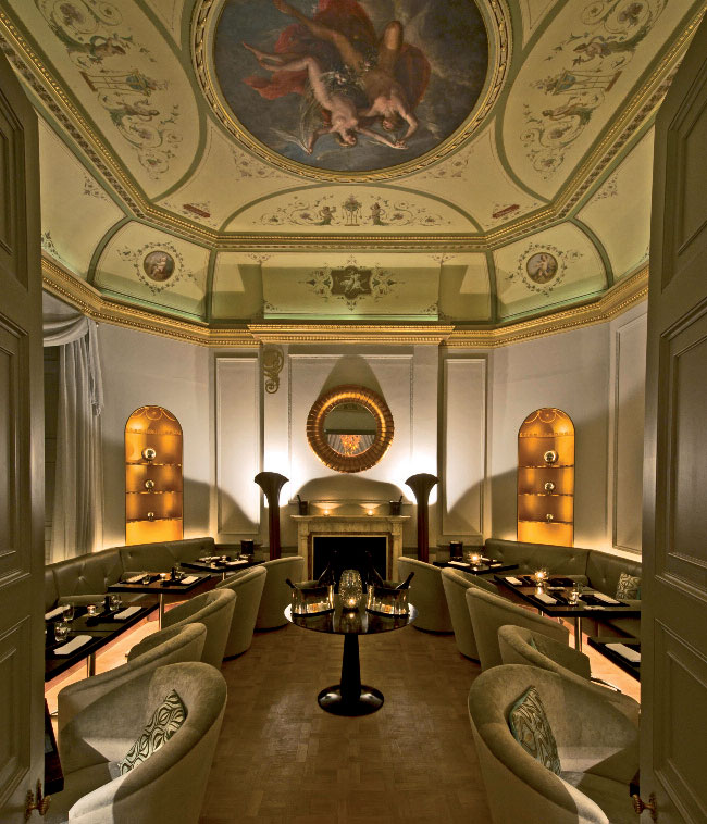
The Octagon 02 dining room

The Octagon 02 dining room

How did you work with your artists?

All of the artists have been in to see the space. They go away, put together a mock up, come back and we talk. As a curator they trust me to say what I think and to steer the project. At the end of the day, I have chosen the pieces with them. We work together; I’m very artist indulgent.

What do you want to achieve?

I’m not trying to be clever, I’m just trying to present things that are interesting and beautiful and well made. I’m tired of going to art fairs, tired of being presented with over-priced things. I call it the “I could do that” school of art. I feel we are in serious times and we can still put something forward that is hopefully taking this to a more beautiful, hopeful, positive place.

homehouse.co.uk

Share:
Reading time: 5 min