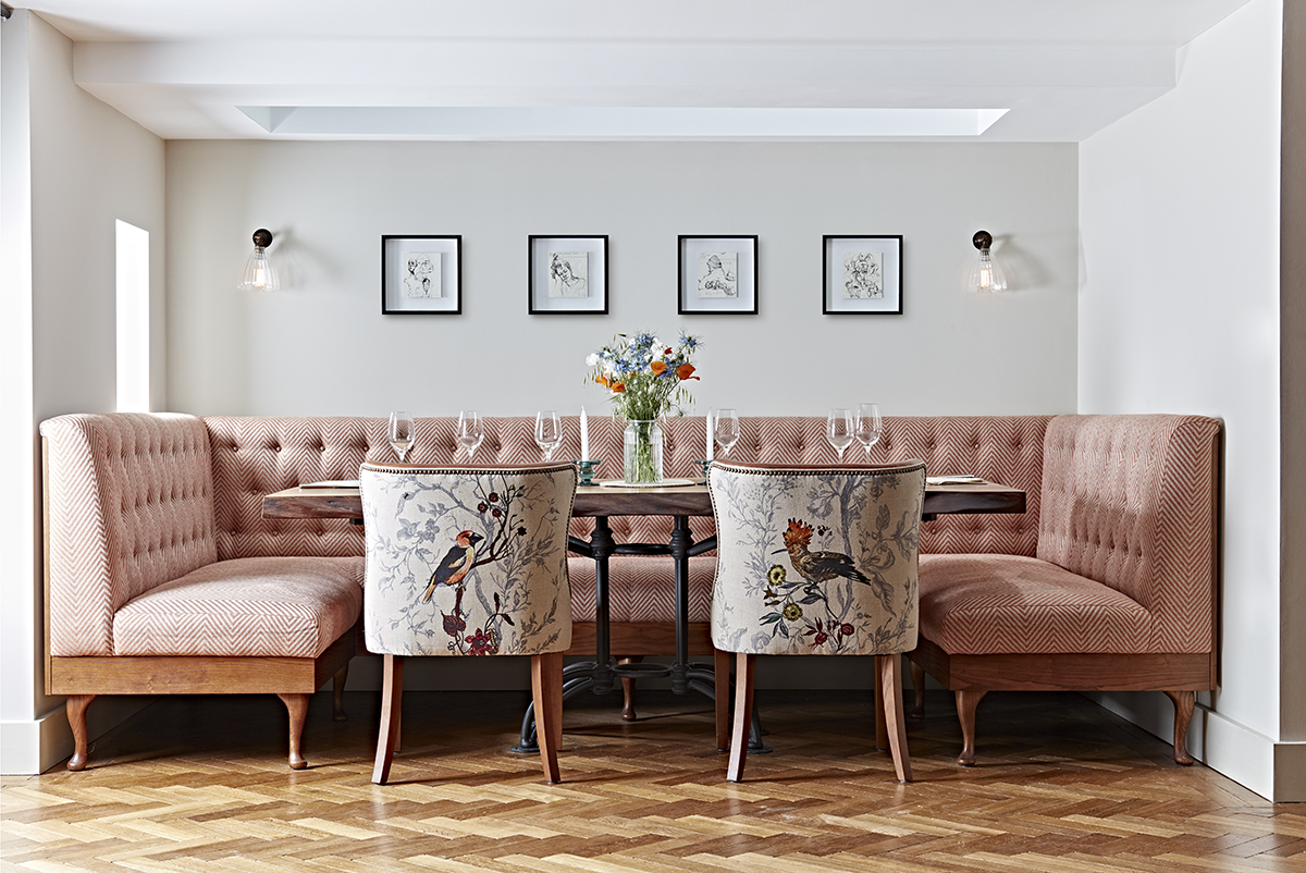
Woolsery Cottage, a private residence with interiors by Hannah Lohan
Since launching in 2015, Hannah Lohan Interiors has developed a reputation for designing uniquely decorative spaces. The studio’s portfolio includes numerous residential properties, boutique hotels, restaurants and spas with two ambitious hotel-village projects currently in development. Here, we speak to the studio’s founder Hannah Lohan about creating immersive environments, the return of maximalism and collecting vintage furniture
1.Where does your design process typically begin?

Hannah Lohan
It starts with the client – we spend as much time as we can getting to know them and developing a deep understanding of how they want their space to feel to their guests. We get them to list their key adjectives – do they want to create somewhere calming, nurturing and tranquil, perhaps? Or would a buzzy, vibrant and eccentric environment be more appropriate? It sounds basic, but the act of narrowing down to just five words can really focus the design process, as well as being a useful reference to prevent the project veering into another direction.
Follow LUX on Instagram: luxthemagazine
The next step is to consider the architecture and locality of the building. We try to draw on the surroundings as much as possible, including local artisans and makers in the design wherever we can. Personal touches and stories from the owners are also so important. The Dunstane Houses in Edinburgh, for example, was a lovely project for us as the owners were keen for us to include references from Orkney, where they grew up. We looked into Orcadian culture and history and came up with a design story for their whisky bar, the Ba’ Bar, based on the Kirkwall Ba’ – the traditional street football game that has been played in Orkney for centuries. We celebrated this with a picture wall full of historical photographs of the games, and even an old Ba’ ball that sits proudly on the shelves. The heritage and history of the building and its owners can play a huge part in shaping the character of the space.
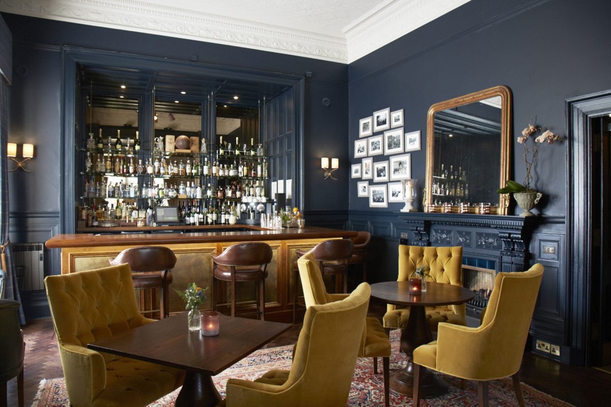
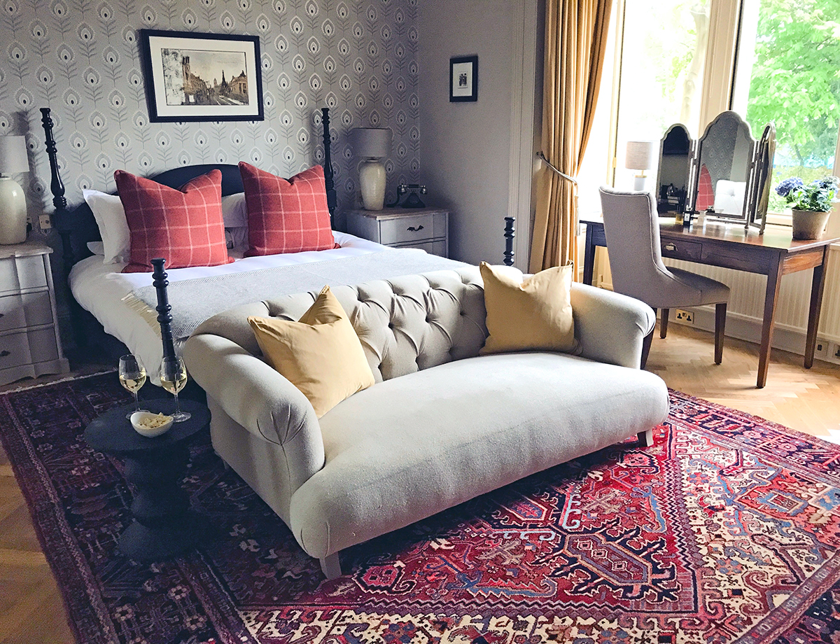
A bedroom at The Dunstane Houses hotel in Edinburgh, and above,Ba’ Bar, the hotel’s whisky bar
2. How do you utilise theatrical and storytelling techniques?
I think my passion for theatre in design comes from years of running a creative events company, designing immersive environments that transport people to other places. We love designing boutique, independent hotels, because they allow us to incorporate that sort of theatrical detail and employ unique elements that create truly memorable spaces. Good interior design isn’t just beautiful, it tells stories and sends you on imaginative journey as you experience it. That can be achieved by including elements of the unexpected and the playful – from treehouses and luxury safari tents hidden in the grounds, to pop-up bars in old horse boxes or disarmingly offbeat boot rooms.
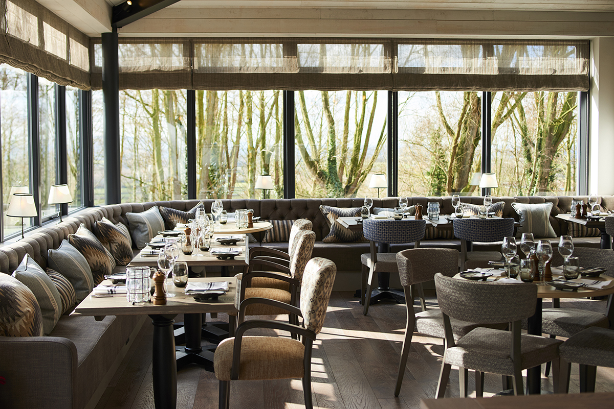
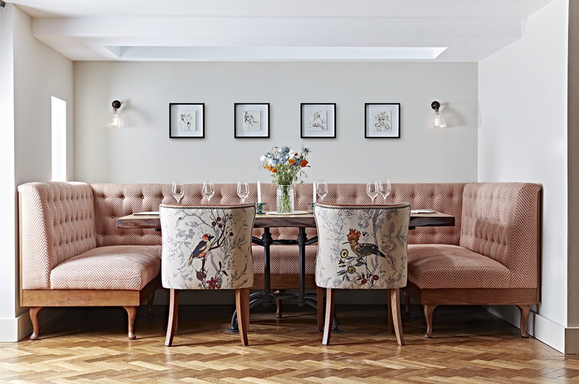
Hook restaurant at The Fish hotel in the Cotswolds
3. Is it more important to have a recognisable aesthetic or to be adaptable?
As designers, it’s our job to be adaptable and to tell our clients’ stories by guiding them through the creative process but I recognise that, as our studio has grown, we’ve become known for a more layered, decorative aesthetic. We wouldn’t be a good fit now for someone wanting a truly minimalist look. I don’t want us to be pigeonholed, and we never, ever take a cookie-cutter approach to our projects, but I am proud of all the work my team and I have put in over the years to research and build a fabulous library of materials, finishes and interesting furniture suppliers and makers, so it would be foolish not to see this as one of our biggest strengths.
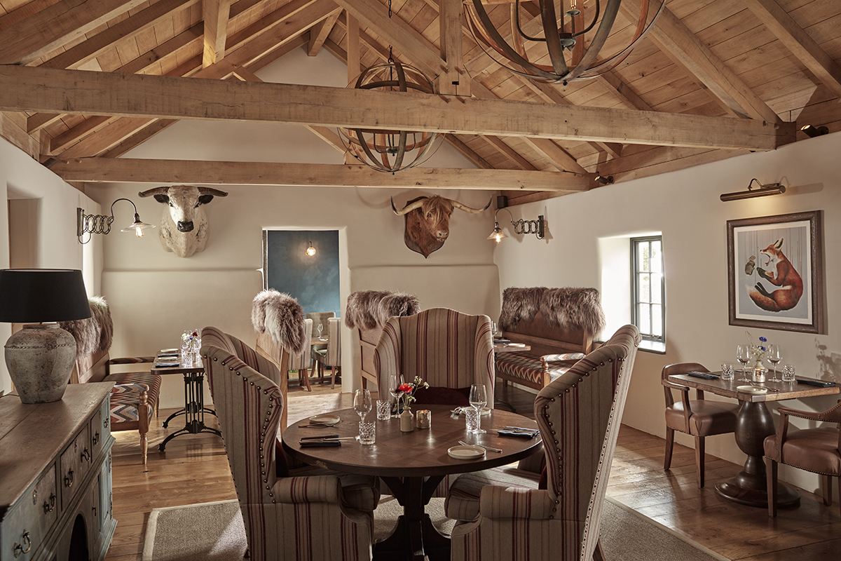
The Farmer’s Arms, a Grade II listed pub in Devon, with newly renovated interiors by Hannah Lohan
What makes a design rich and interesting is layer and detail. We have to love what we do and be fully invested in order to create something truly magical. The hardest thing is to get clients to trust you – this is why we work best with creative owners who are willing to push themselves out of their comfort zones and understand that designing a hotel is very different to designing a home.
4. What do you think have been some of the most interesting evolutions in design in recent years?
Hotel design has evolved very quickly in a short space of time. My brother and his wife, James and Tamara, are the founders of boutique travel company Mr & Mrs Smith. When they started 17 years ago, they struggled to find enough hotels with strong enough interior design to fill their first book. Today, it’s completely different; you can really pick a hotel that appeals to your personal taste or go for somewhere that offers something completely different. This has pushed designers and hoteliers to be braver and bolder and makes for a really exciting era in design.
One trend that has been really interesting to be part of is the demand for quirky, outdoorsy places to stay, from cabins and shepherds’ huts to treehouses, like the ones we designed in the grounds of the Fish Hotel in the Cotswold. From the gorgeous Bert’s boxes at The Pig hotels to the luxurious treehouses at Chewton Glen, they’ve proved that you can connect guests to nature without compromising on style or comfort. And as we discover more and more about how important the countryside is for our mental wellbeing, this trend is going to continue to thrive.
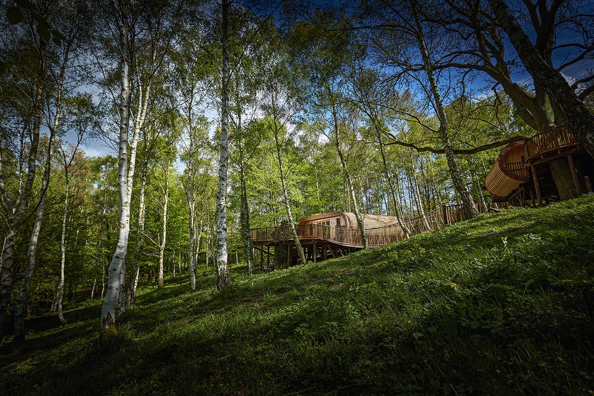
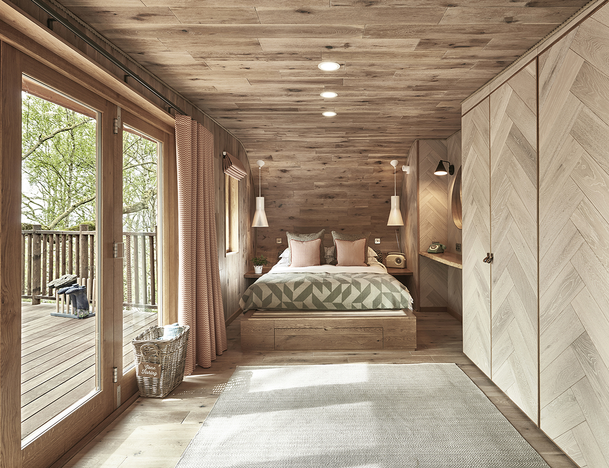
The treeperches at The Fish hotel in the Cotswolds designed by Hannah Lohan interiors
Provenance is another key trend – guests are engaging with food much more deeply and taking an interest in ingredients and where they come from. This has led to a boom in hotels opening cookery schools (there’s a lovely one at Thyme), and in hotel restaurants opening up their kitchens – first by adding windows, then kitchen theatres, then chef’s tables, and now it’s gone even further, with glass cabinets of butchered meat and wine cellar tours. This has a direct impact on interior design – what was once storage is now display.
The return of maximalism is another trend I find fascinating. Minimalism is such a niche style and shabby chic has evolved in to a more finished and polished look. Amazing designers such as Martin Brudzinski, Kit Kemp, Abigail Ahern and the Soho House design team have shown that maximalism and chintz is all about layering to give a more modern, curated and very glamorous interior. We’re even seeing the trend towards coloured bath suites again – at our project in Devon, we’re bringing back the avocado tub, thanks to the stunning Water Monopoly supplier who we love!
5. Your concepts often combine vintage and modern pieces – is there a design era that you’re particularly drawn to?
I’ve always been attracted to vintage furniture and I love nothing more than finding an old tired chair and giving it a new look with modern fabric and a good French polish. It’s so satisfying to see something old look current again; it just takes a little imagination – maybe contrast piping or a different pattern on the back. We sell a lot of revamped 1950s and 1930s chairs like this through our shop at the Old Cinema in Chiswick. I’m certainly not an antiques expert like lots of my fellow dealers there and I don’t have a preferred era. I buy on instinct, so you’ll find anything from old industrial factory tables to Victorian dressers to French vintage tableware. It’s a constantly evolving collection of lovely finds from our travels and contacts we’ve built up over the years of designing hotels. We love using these pieces in our projects; they add character and it’s a much more sustainable approach.
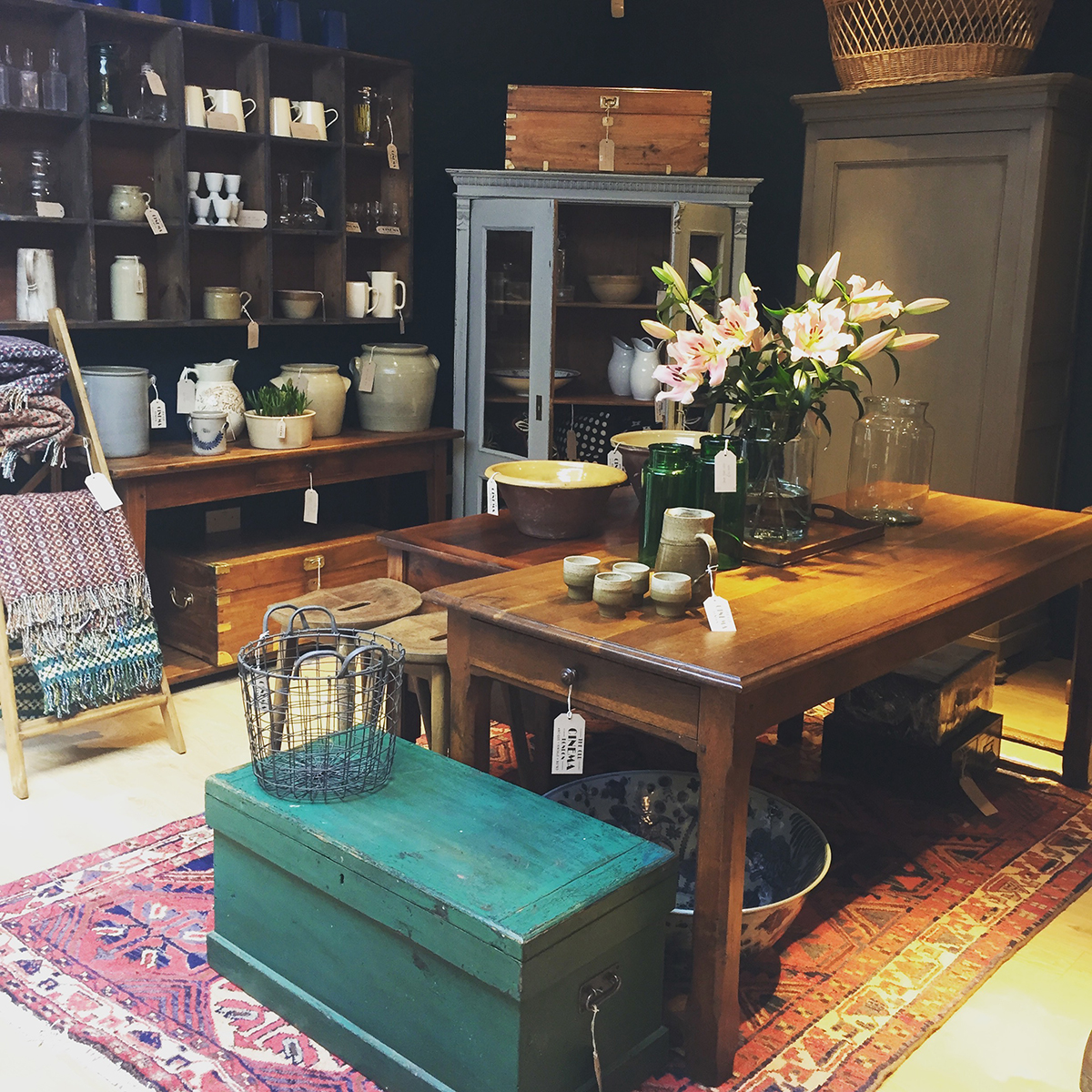
Hannah Lohan Interiors shop at The Old Cinema in Chiswick, London
6. Does good design last forever?
What is considered ‘good design’ is constantly evolving – but that doesn’t mean you have to do a total refurb every five years. It’s amazing what can be achieved with some simple styling and up-cycling certain pieces of furniture. My favourite design studio, Roman and Williams, headed by Robin Standefer and Stephen Alesch, are such an inspiration to me. They started off their career as set designers for movies and then went on to design amazing hotel interiors, such as the Ace Hotel and the Standard in New York. Their designs are all story-led, as though they were following a film script, which makes them brave in their approach. They don’t follow trends or rules – they love to surprise and disrupt traditional ideas by doing things like painting a Georgian cabinet red, or mixing eras to create a really eclectic, unexpected design. This, to me is good design – having the vision and confidence to adapt what’s there, rather than replace it as trends change.
Find out more: hannahlohaninteriors.com


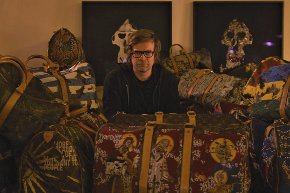
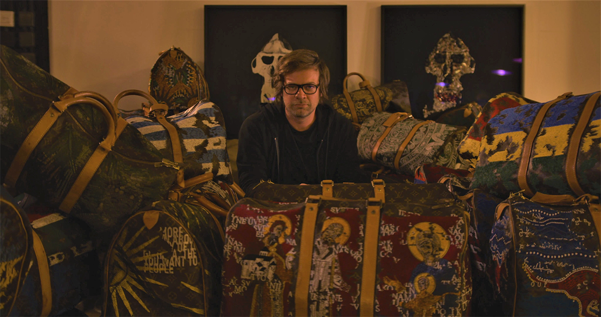
 2. Can you tell us your favourite story about one of the bags you’ve sourced?



Recent Comments