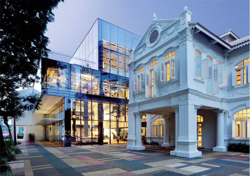
RECENT WINNER OF SINGAPORE’S URA ARCHITECTURAL HERITAGE AWARDS, SPACE FURNITURE’S NEW HOME JOINS TWO HISTORIC BUILDINGS WITH A MODERN GLASS STRUCTURE TO FORM A 40,000 SQ FT MULTIPLEX THAT IS A TRIUMPH OF DESIGN. LEAD ARCHITECT Chan Ee Mun, SENIOR ASSOCIATE OF WOHA, WALKS US THROUGH THE PROJECT

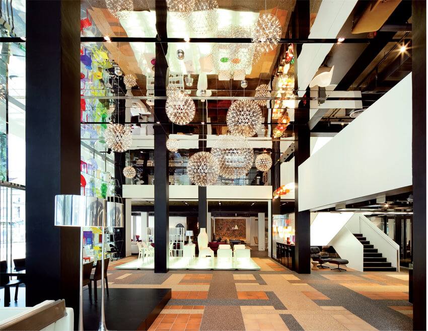
We’d known about these buildings ever since they received Heritage status and I d admired them from the outside but had never been inside. The space was stifling, dark and closed. The previous owners had it very compartmentalized in order to maximize on rental. It was not at all compatible with SPACE.  From the onset we decided that we wanted to recapture the charm of the original building with as much authenticity as possible. At the same time we needed to create a voluminous interior. We also had to take into account the fact that the neighbouring buildings were at least 12 stories tall so we had to find a way to make the building stand out in its own way and, of course we had to do so within the confines of some very strict zoning laws that mandate how we could use the space.

Whenever you work with an existing structure you have to deal with the constraints of the building as well as with your budget constraints. Demolition is expensive and there are obvious disadvantages. It was our job to enhance rather than rebuild. One of the problems we faced was that there was not enough height between the floors. To make this work for SPACE we needed much higher ceilings, so we had to reconfigure the floors without interrupting the original structure too much.

Even the glass building in the centre of the project is built over the original building. We had to readjust and strip the internal floor plates and relocate them to new floors. It was a complex procedure. It also had to look right since the internal structure would be exposed by the use of glass.

The fact that it’s a sales site means that there are very specific requirements. The main challenge was designing the middle unit because although modern it had to get along with its neighbours, the two older buildings. We wanted to expose the showroom/furniture and we were trying to figure out how to best accomplish that. The law at the time stated that if a building had Conservation status then the exteriors must not be altered. We had to work with the authorities to change that rule to allow us to give it a more modern and urban look.  Inside, we needed to find the best way to design a showroom that would work well with lots of different brands, many of which are in competition with each other. They needed to be separate but at the same time there has to be a connection between them all. SPACE carried 13 major brands and each had a different design philosophy. In the end it was SPACE that determined the location of each brand and how much floor space to allocate to each and it was our job to make that possible.

SPACE was very adamant about creating an experience for their clients. They were very particular about the lighting and for the music they installed a Bang & Olufsen sound system. To complete the picture, they even customized their own scent for The . Every detail was taken into consideration to enhance the shopping experience in a homely setting, so that the customer can understand the pieces and the environment.

spacefurniture.com.sg

Share:
Reading time: 3 min
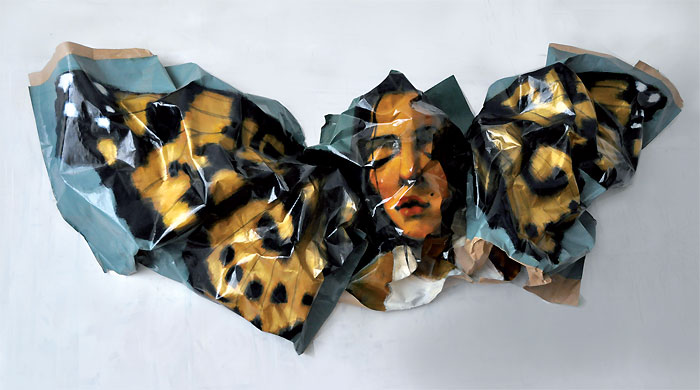
Rupert Shrive: Painted Lady, 2012

Rupert Shrive: Painted Lady, 2012

Serena Morton had a unique challenge to curate an art collection for one of London’s landmark historic buildings, now an exclusive members’ club. The twist: she had to complement décor ranging from Georgian grand to Zaha Hadid-designed cool. Caroline Davies discovers how she did it

How do you start curating for a space like Home House?

Before this project the art in Home House was a bit of a mish-mash. Over the years, someone would take a fancy to this or to that and it would go in. The Courtauld Institute was based at Home House from 1932 to 1976. It is a strong thread that holds the house together and we wanted to bring it back with a big statement.

We looked at Home House members. They all have a connection to London, are varied in age and are a pretty sophisticated bunch. We decided that you could make the balance of membership more interesting by really creating a solid art program, which helps draw more of a culture crowd.

Why did you decide to have individual artists in each room?

I have launched, run and directed 3 galleries, two of my own and one for someone else, and curated exhibitions in many different pop-up forms. The one thing I know is that it is much less impactful when you put a bunch of artists together who don’t really have any connections. This is happening a lot at the moment, but the connections are still forming. We don’t really have a current movement so why would you mash them all together? When you just have one thing to look at and the space around it it’s more interesting.

Home House is itself a set of rooms. It was three Georgian town houses which were joined together, each a residence so each room is different and so is the décor. Spreading the art across all the rooms wouldn’t necessarily work, but these ‘mini galleries’ allow the art to flow and creates conversation.

Which artists did you use and why?

They range in age from seventies downwards. You have some really senior artists like Ethel Walker and Simon Edmonson right down to some emergent stars like Jim Threapleton and Robi Walters who recently won the Lexus Telegraph prize.

Rupert Shrive, who has had double page Vogue spreads around the world, a huge piece in the Grand Palais and is now in the Courtauld, is on the staircase. Ethel Walker, one of the leading Scottish colourists has painted some huge panels in the dining room, they take you up to the heavens. Mary Anne Aytoun-Ellis is in The Garden Room next to her; I love the scale she uses, which is physically difficult, combined with her feminine take on landscapes. I hope the dining room atmosphere elevates your palette and your senses, rather than getting indigestion because you are looking at something rather pornographic.

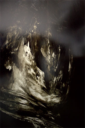
Jim Threapleton: 3-Quinuclidinyl Benzilate IV, 2012

Jim Threapleton: 3-Quinuclidinyl Benzilate IV, 2012

Piers Jackson’s geometric shapes are in the bar, which is the core, the kernel of the club; everything else starts to morph around that. Theo Mouxigouli, next door, is very different. He is a Georgian painter based in Shoreditch. He lives in squats and travels around with his canvases rolled on his back. His work is mainly of London, representational, all about feeling with a sense of going back to the past. I think you get a kind of mini buzz from each. Simon Edmondson is a huge heavyweight that London forgot. He has a whole installation in one big member’s lounge which is almost going to be like a Rothko chapel. He creates large interior scenes with a muted pallet, sometimes quite sexual. I think he needs to be seen again. Jim Threapleton was a film maker that has been studying at art school. It has taken a long time to work out what he is doing visually and he has not shown; it’s about slowly presenting him without too much over exposure. I loved Robi Walters’ work as soon as I saw it. There is such an intelligence and positivity about it. He is a massive star in the rising and still very young. Chris Moon is in the House lounge. The Hayward described him as a cross between Bacon and Hockney which is a rather large statement. He is a darn good painter.

How did you select the artists?

I tend to go with my gut feeling. I picked people that I hoped would appeal to a range of ages and members. All the pieces are originals, there is no edition work and they are all technical; they don’t look like things that have been made easily, you couldn’t do it yourself. There is a lot of conceptual art around at the moment and it is not that. It is nice to promote the emerging rather than fully blown. There is a gang of artists that everyone knows about in the London scene at the moment and I wanted to present something different. I am working with these people, but I am always working with a huge number of others as well. I think it’s only natural that you would promote people that you believe in.

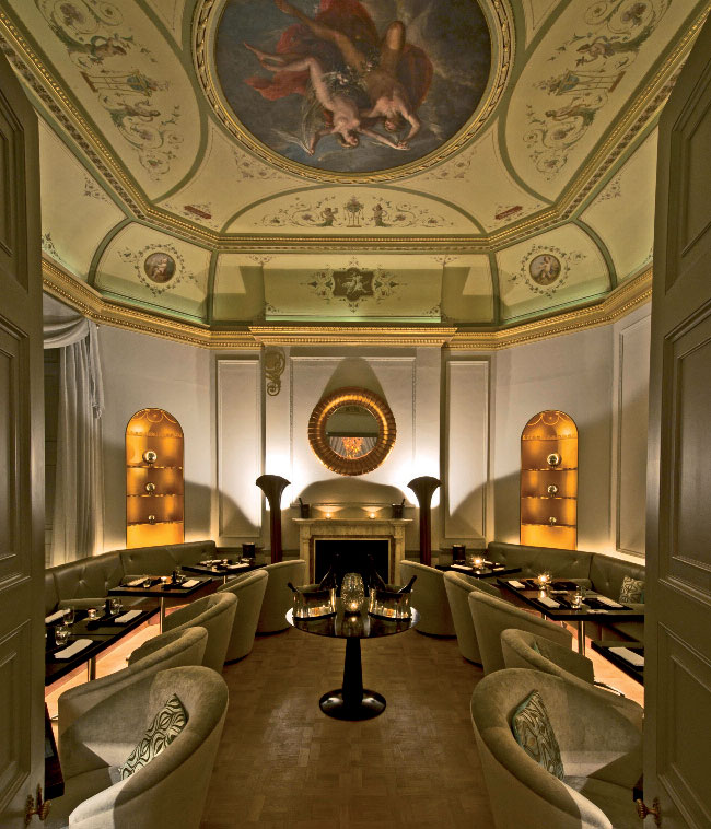
The Octagon 02 dining room

The Octagon 02 dining room

How did you work with your artists?

All of the artists have been in to see the space. They go away, put together a mock up, come back and we talk. As a curator they trust me to say what I think and to steer the project. At the end of the day, I have chosen the pieces with them. We work together; I’m very artist indulgent.

What do you want to achieve?

I’m not trying to be clever, I’m just trying to present things that are interesting and beautiful and well made. I’m tired of going to art fairs, tired of being presented with over-priced things. I call it the “I could do that” school of art. I feel we are in serious times and we can still put something forward that is hopefully taking this to a more beautiful, hopeful, positive place.

homehouse.co.uk

Share:
Reading time: 5 min