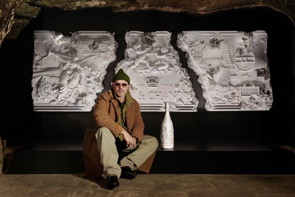
Daniel Arsham sitting with a bottle of Moët & Chandon before his 280th anniversary monumental relief sculpture

American artist Daniel Arsham sculpts a monumental relief in celebration of the 280th anniversary of Moët & Chandon, aligning the present-day champagne house with a classical history of prestige and grandeur.

French champagne house Moët & Chandon unveils Collection Impériale Création No. 1 through a monumental sculptural relief created by the New York based contemporary artist Daniel Arsham. Inspired by his personal tour of the Moët & Chandon estate in Épernay, France, Arsham drew from the neoclassical architecture, busts, and faux columns to reimagine the Moët & Chandon bottle.

One of the eighty exclusive bottles that Arsham designed for Moët & Chandon, inspired by their estate

Arsham’s final creation is quite a striking, wall-mounted plaster-cast sculpture, monumental in scale. It feels as if it were recovered from the ruins of an ancient civilization, evoking a sense of mystery and history akin to ancient spolia. Yet, ‘Moët & Chandon’ appears in the place of etched Latin. Interspersed throughout the piece are clusters of grapes, a nod to the vineyards surrounding the estate; a wooden wine barrel, referencing the craft of winemaking; and images of the estate, woven into the relief.

In a rather grandiose gesture, the goddess Pheme, the personification of fame and renown, blasts her trumpet. Arsham cleverly intertwines the brand’s present-day prestige amongst fashion-house-drinkers with the grandeur of antiquity, creating an emblem of the enduring reputation of Moët & Chandon.

Cleo Scott


Share:
Reading time: 1 min
winery at sunset
winery at sunset

The vineyards of Château Mouton Rothschild. Photo © Studio Goodday. Courtesy Château Mouton Rothschild

This morning, Château Mouton Rothschild revealed its latest artistic collaboration with Xu Bing. We take a closer look at the Chinese artist’s label design for the 2018 vintage

Since 1945, Château Mouton Rothschild has invited an artist to design a label for its latest vintage. The collection of miniature artworks, which are transferred onto the wine bottles and also exhibited in a special gallery in the château, features some of the most famous artists from the past 100 years including the likes of Pablo Picasso, Salvador Dali, Francis Bacon, David Hockney, Jeff Koons, Gerhard Richter and now, Xu Bing.

Follow LUX on Instagram: luxthemagazine

One of China’s most renowned artists, Xu Bing is best known for his installations which often explore the relationship between image and language. His artwork for the 2018 vintage label is a continuation of his ‘square word calligraphy’ series which originally involved the artist organising English letters into structures that resembled Chinese characters. The idea was to break down cultural barriers by demonstrating the similarity of components in both languages and therefore, demystify the Chinese written language for non-Chinese speakers.

label artwork

Xu Bing’s label continues his ‘square word calligraphy’ series

For this artwork, the pair of elegant, stacked symbols once again appear to be an example of traditional Chinese calligraphy, but the characters are, in fact, composed of the Latin alphabet and denote “Mouton Rothschild”. 

Read more: Fashion entrepreneur Wendy Yu on creativity and charity

wine label

Château Mouton Rothschild’s 2018 vintage with label design by Xu Bing. Photo © Studio Goodday. Courtesy Château Mouton Rothschild.

The design’s inspiration comes from the layered experience of tasting wine, each character reveals itself as the reader engages more deeply with the image, but also with the idea of history, symbolism and reinvention. By reimagining the literary shape of the iconic winery, Bing symbolically suggests the possibility of new discovery in the old.

Discover Château Mouton Rothschild: chateau-mouton-rothschild.com

Share:
Reading time: 1 min
woman with red hair
woman with red hair

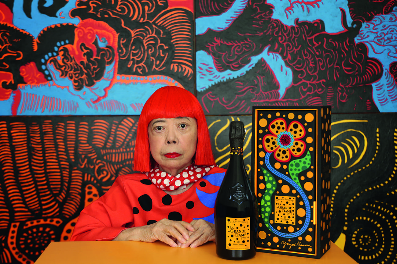
Yayoi Kusama portrait with La Grande Dame x Yayoi Kusama Limited Edition © Yayoi Kusama

Contemporary Japanese artist Yayoi Kusama’s artistic impressions of Veuve Clicquot’s new vintage La Grande Dame 2012 pay tribute to the lasting influence and creativity of Madame Clicquot

After her husband’s death in 1805, Madame Clicquot took the reins of the eponymous champagne house. In era when women were excluded from the business world, this was an achievement in its own right, but she was also extremely good at her job, earning her the nickname ‘La Grande Dame of Champagne’. Two centuries later, Veuve Clicquot is paying tribute to her legacy through their latest vintage and a stunning artistic collaboration with Japanese contemporary artist Yayoi Kusama.

Follow LUX on Instagram: luxthemagazine

Renowned for her flamboyant, quirky aesthetic, Kusama’s designs for the bottle and box incorporate flowers and her signature polka dot pattern in yellow, referencing the champagne’s bubbles, and expressing a sense of joy and energy.

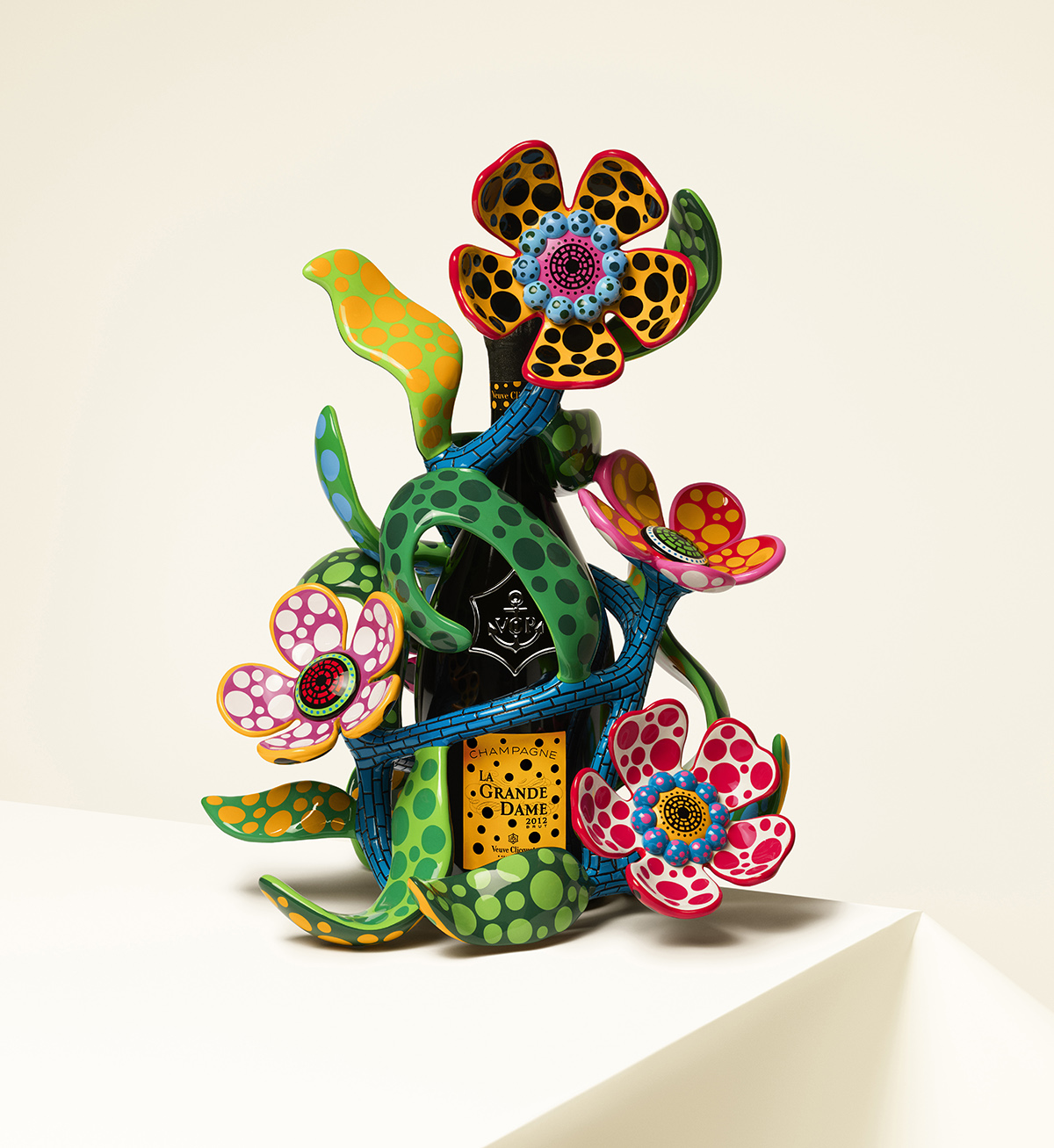
floral sculpture

My Heart That Blooms in The Darkness of The Night, special object designed by artist Yayoi Kusama for Veuve Cliquot

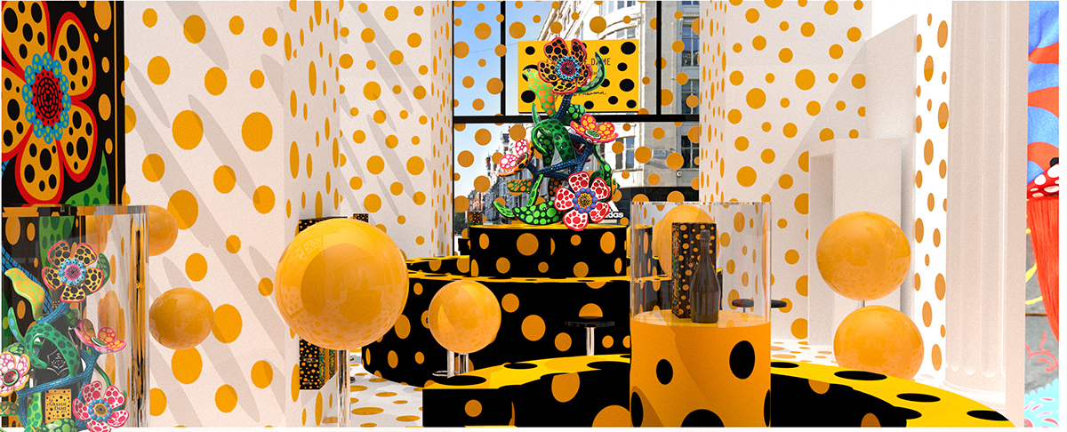
polka dot interiors

Yayoi Kusama at Selfridges’ Corner Shop

She has also created an exuberant floral sculpture, in continuation of her Flowers That Bloom at Midnight series, that wraps around the champagne’s bottle. Available in only 100 numbered pieces (12 are available for sale in the UK), the sculpture is cast in fibreglass reinforced plastic and painted by hand in vibrant hues.

The La Grande Dame x Yayoi Kusama designs will be on display within the Selfridges Corner Shop in early Spring 2021. The limited edition is available to purchase online via: selfridges.com For enquiries regarding the special object visit: veuveclicquot.com


Share:
Reading time: 1 min
wine bottles
wine bottles

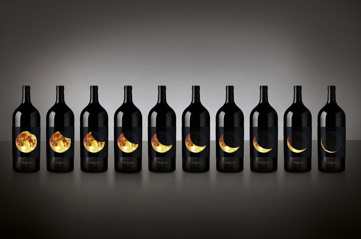
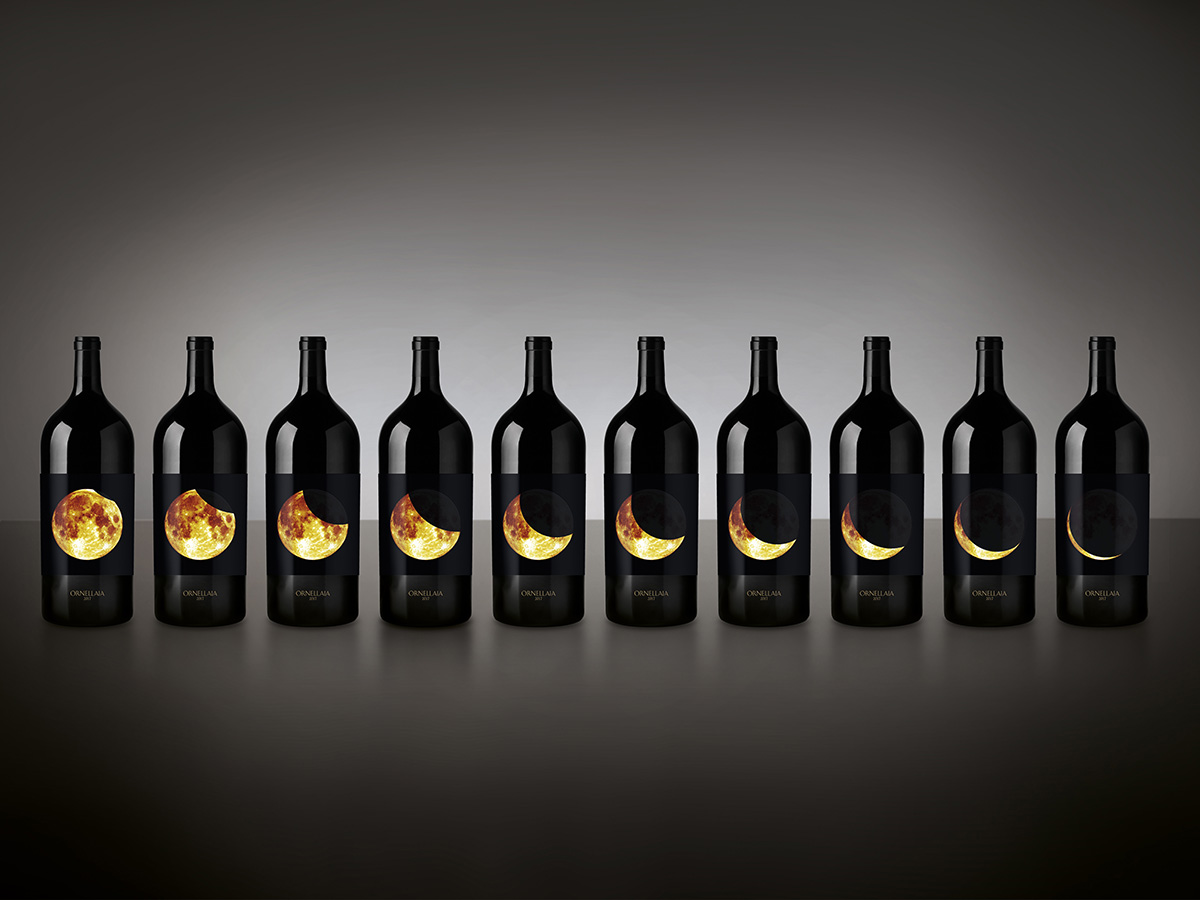
Ornellaia 2017 Solare Vendemmia d’Artista 6 litre with label designs by Tomás Saraceno

This week, Italian wine producer Ornellaia opened its 12th annual online benefit auction in collaboration with Sotheby’s and the Solomon R. Guggenheim Foundation, featuring vintages with label designs by Argentinian artist Tomás Saraceno. Chloe Frost Smith takes a closer look at the available lots
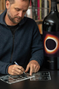
artist signing work

© Photography by Studio Tomás Saraceno, 2019

This year’s auction continues Ornellaia’s Vendemmia d’Artista project, which commissions a different contemporary artist each year to create an artwork for a series of limited-edition labels. The artist is given a single word description of that year’s harvest by the estate director, Axel Heinz, as inspiration. Last year, Iranian artist Shirin Neshat responded to ‘La Tensione’ with a series of monochrome photographs, and this year, Argentinian artist Tomás Saraceno has incorporated ‘Solare’ (‘radiant’ in English) into several aspects of his designs.

Follow LUX on Instagram: luxthemagazine

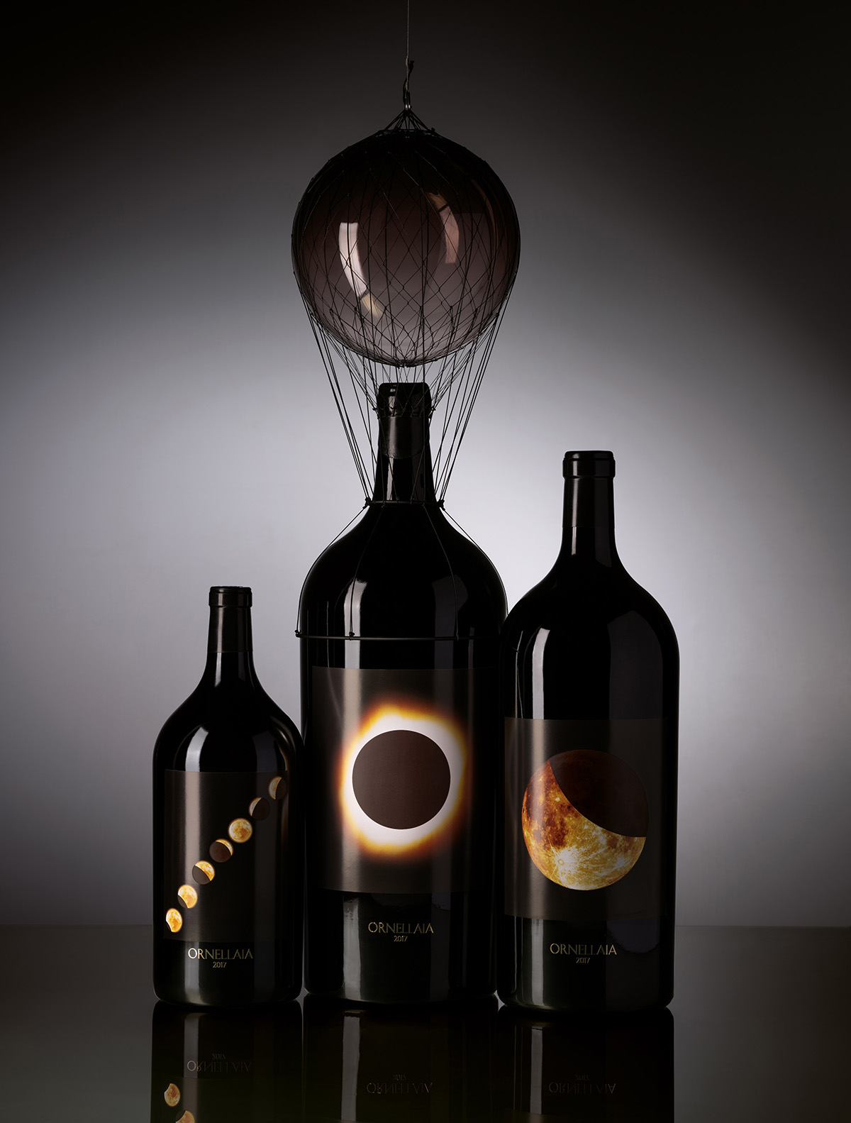
Renowned for his interactive installations that allude to new sustainable ways of living, Saraceno has created a striking set of labels which depict various phases of a solar eclipse for nine lots of Imperials, to be sold individually or in pairs. The auction’s most prestigious lot comes in the form of the Salmanazar sculpture, titled “PNEUMA 4.21×10⁵”, an impressive 9-litre bottle of Ornellaia 2017 topped with a floating sphere anchored to the neck of the bottle. Reminiscent of the artist’s previous work on untethered flight, this celestial sculpture highlights the importance of the relationship between the Sun and the Earth, and of renewable resources more generally.

three wine bottles

Ornellaia 2017 Solare Vendemmia D’Artista, with various designs by Tomás Saraceno including the Salmanazar sculpture (centre)

Not only embodying ‘Solare’ visually, the labels are a tangible take on the concept – made from thermochromic paper, which changes colour according to the heat of a person’s hand. This sensory detail invites reflection on the impact of humanity on the planet, in keeping with the wider issue of environmental sustainability which is at the heart of both Saraceno’s artistic ethos and Ornellaia’s production philosophy, which has long focused on self-sustaining ecosystems and precision agriculture.

Bringing a sense of completion to the auction, a unique vertical of the last six years of Ornellaia is available, in twelve 750ml bottles featuring the customised labels in a celebratory wooden case, alongside six Ornellaia Bianco magnums from the last three vintages.

The auction ends on 9 September 2020. Register via: sothebys.com/ornellaia 

Share:
Reading time: 2 min
Artist painting
Artist painting

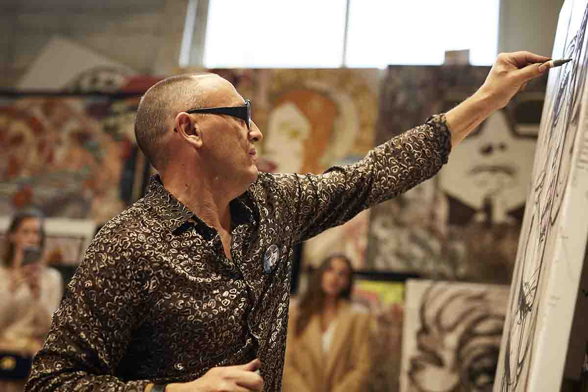
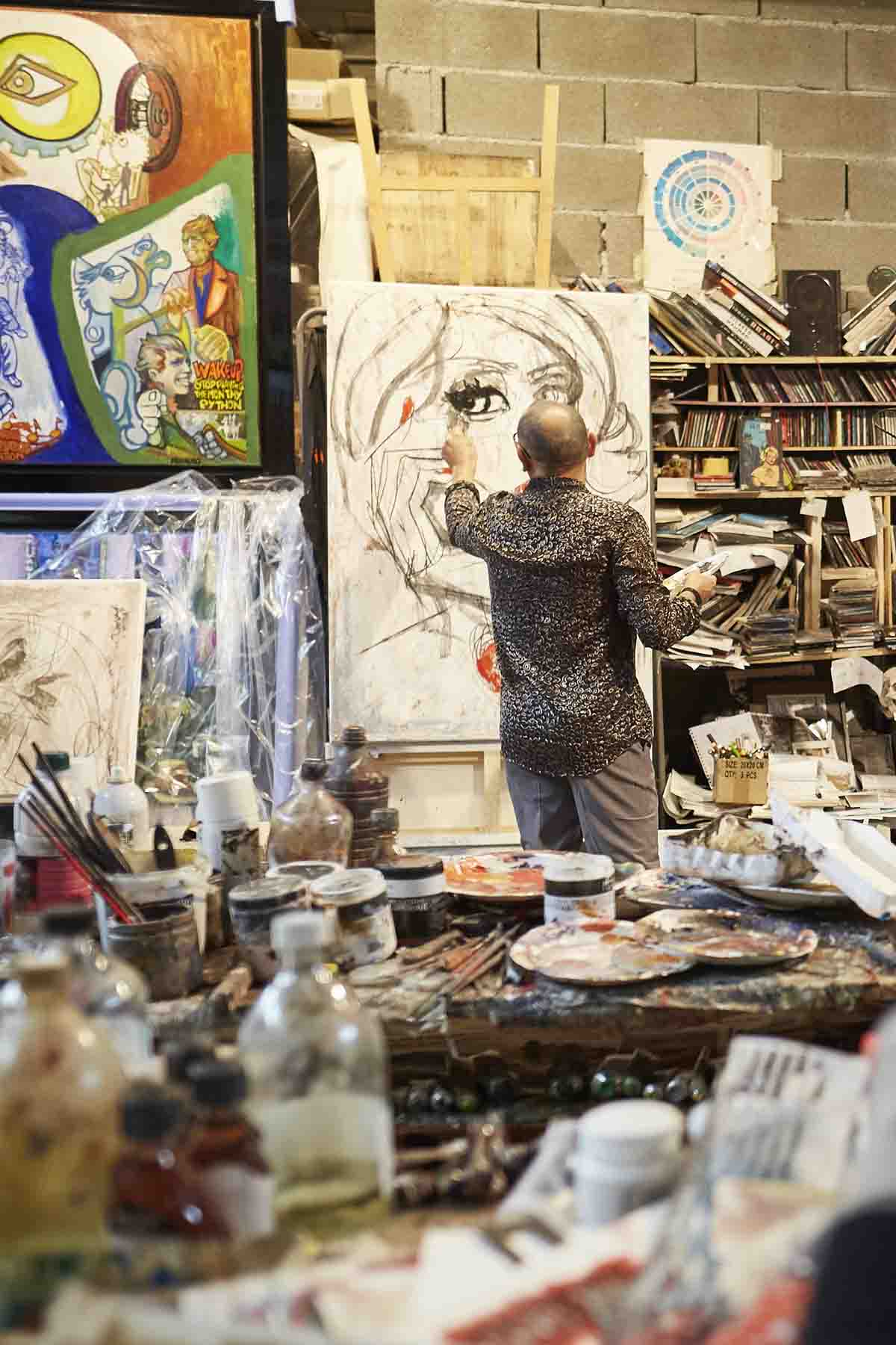
Marc Ferrero in his studio

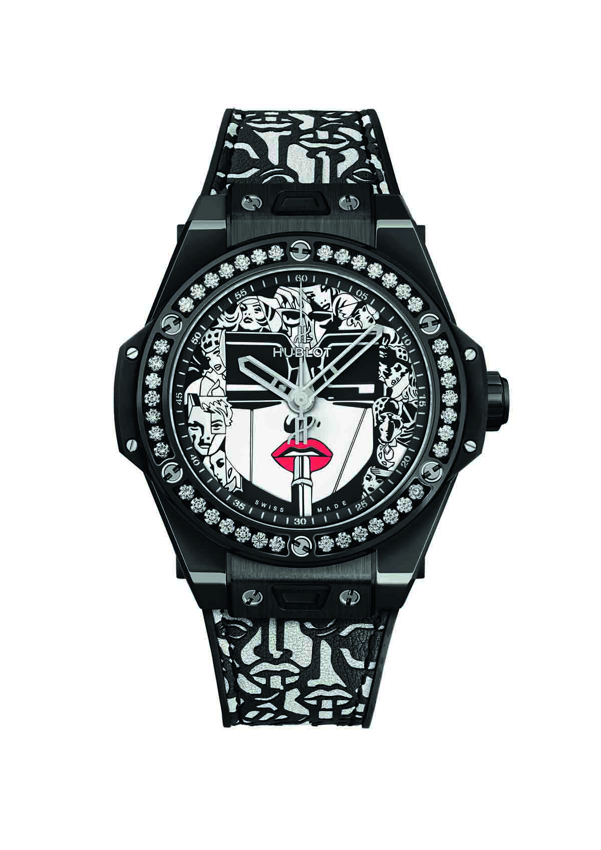
Marc Ferrero’s unique practice of ‘Storytelling Art’ combines aesthetic styles and visual references from different artistic movements and cultures to create striking, narrative-driven paintings. His most iconic artwork ‘Lipstick’ first appeared on the watch face of Hublot’s Big Bang One Click last year, and this month, marks the launch of the latest edition in monochrome. Here, we speak to the artist about visual storytelling, the language of colour and man versus machine

Artist in the studio

Marc Ferrero wearing his Hublot watch

1. Tell us about the concept of Storytelling Art.

Artistic movements will always be a mirror of their generation. To me, a simple graphic representation doesn’t speak loudly enough to create big emotions, but stories touch many different sensibilities. Telling a story, means that you enter in the imaginary world of  people. Nobody is passive in the face of a story, because it mixes two different concepts, inaccessibility and identification.

Each time somebody stands in front of one of my paintings they can relate to it through their own story; this creates a very dynamic relationship between the public and me as the artist. Faced with a graphic representation you are a spectator; faced with a storytelling painting you are an accomplice… it makes a big difference.

Follow LUX on Instagram: luxthemagazine

I created the Storytelling Art movement because I thought the field of painting needed a new approach. The normal process for most painters is to start from reality, to create a personal vision. I reverse that process by starting from my imaginary world and creating an entirely new world that is expressed through stories and fictional characters.

Compared to the other visual arts, the evolution of framing in painting is close to zero. I purposefully try to create different framings in order to produce more dynamic images and suspense. Storytelling art is not a graphic style, it is all about interpretation. The fact is all paintings tell some kind of story, but with my work, nobody will discover its story through an audioguide… The story is expressed on the painting directly.

Fiction, manipulation and fusion are the main words of Storytelling Art movement. What could be more connected to the time we are living in now?

2. What’s the story behind your iconic artwork ‘Lipstick’?

The central subject of the LIPSTICK painting is a woman wearing large black glasses. In art history, when an artist wanted to create a feminine subject, he made round shapes. For me, what a woman says is as important as how she looks; this is the definition of a ‘modern woman’. My way to express that psychological reality is to use angles, lines, and Cubist forms through the glasses. The LIPSTICK rebalances all these lines because it is a symbol of femininity. All around the main subject, there are many different realistic portraits of woman, who express the different roles that a modern life can offer.

artist watch

Big Bang One Click Ferrero Steel Red

3. How did you go about adapting the design for the latest Hublot Big Bang One Click?

The first time we met with the Hublot team in Switzerland everybody felt in love with my series of LIPSTICK paintings so it made sense to use that design. We worked as a team with Hublot’s graphic designer to translate the spirit of the painting onto a smaller scale. Usually, I work on a much bigger scale so I had to rework some outlines of the different figures around the central subject. To reproduce a painting onto a watch without trying to find the balance between the size of the dial and the spirit of the
painting itself would be a failure for sure. The strap is based on a stencil that I made specially for Hublot; it completes harmony of the watch.

Read more: How Hublot’s collaborations are changing the face of luxury

4. There’s a distinct graphic quality to your paintings – what inspired this style and what role does colour play?

Storytelling Art is a fusion of all kind of graphism on the same plane. This creates different values of time and space, which is absolutely necessary if you want to express several ideas or a specific story through a painting. Until now, an artist typically belonged to one graphic movement only, but to me, that’s old fashioned and doesn’t represent the time we are living in, but it all depends on the purpose of the painting. For example, my most recent paintings are based on abstraction to express a dehumanised world and the struggle of my characters in a society ruled by mathematical formulas and machines. I stick the characters onto the canvas in a comic strip, creating a fusion between abstraction and graphism which has a very powerful visual impact.

Colours have their own language in my work. For example, red is the colour of passion, audacious people and glamour, blue is the colour of transparency that expresses quiet places and the respect of tradition, but if you go to turquoise, it will express tropical places, holidays… Orange is the colour of energy, violet is the colour of dreams, yellow is a very convivial colour etc. Black and white fit with all other colours but never compete with them. Black has no movement and white is the colour of the future. I love to mix, and experiment with colours to create great harmonies.

5. Are you especially drawn to a particular type of story or character?

Mixing the verticality of a painting and the horizontal concept of a story opens up new fields of possibilities. The stories I’m working on go through the filter of my art.

Graphic tools offer me the possibility to divide a story in different sections of graphic styles. Pop art, for example, tends to fit very well with the heroes of my story. The ‘banksters’ of the story are expressed through Cubism. The world of the machines is treated through surrealism and abstraction, which fits
with the idea of a dehumanised world or the opposite idea of a dream world.

When I’m working on a story, I experiment. My studio is a laboratory, not a place where I copy myself. The type of stories and characters I love to create must fit with my imaginary world and my specificity of being a painter, but it could be a surrealistic modern fairytale or a kind of dream with a V8 engine.

Artist painting in studio

6. What are you working on now?

I am working now to adapt one of my stories with movie producers in Los Angeles. The climax of the story speaks about a dark idol who has changed the value of time and created the acceleration of the world. It is a world led by magic mathematic formulas and machines. The heroes (Lisa L’aventura, Duke Spencer Percival, Cello Di Cordoba) have created a secret network called ‘La Comitive Society Club.’ All the members of that network are connected through another measurement of time, in which the time is not based on hours, but on emotions and colours. The time of human emotion will fight the time of acceleration… It is a story about the fight between humans and machines.

Find out more: ferreroart.com; hublot.com

Share:
Reading time: 6 min
man wearing watch
man wearing watch

Hublot ambassador Maxime Plescia-Büchi. © Hublot SA

Hublot is celebrated for being the most pioneering and original brand in the world of haute horlogerie. The first watch brand to sponsor international football, the first watch company to make an all-black watch with black dial, numbers and hands, the company famously mixes precious and base metals and materials in its timepieces, and counts sports stars and athletes on its roster of fans. Its partnership with London-based Swiss tattoo haute artiste Maxime Plescia-Büchi takes luxury to a different dimension, as Millie Walton discovers through a conversation with CEO Ricardo Guadalupe

Next year Hublot will celebrate its fortieth anniversary. In the world of Swiss watches, that roughly equates to early adolescence, but, as Hublot’s chief executive Ricardo Guadalupe assures me, “You can be young and have success”. This, in fact, neatly sums up the brand’s aspirational ethos and hugely successful marketing strategy. Through select partnerships with the likes of Usain Bolt, Richard Orlinski, DJ Snake and Maria Höfl-Riesch, the brand has developed its own culture encompassing everything from music, sport, cars and contemporary art to luxury destinations such as Courchevel, Zermatt, Saint-Tropez and Mykonos. The idea is, as Guadalupe puts it, “to create a universe of Hublot”.

Follow LUX on Instagram: luxthemagazine

Today, the brand has 4.8 million followers on Instagram, which is not only reflective of their young consumer base – 60 per cent of Hublot’s customers are aged between 20 and 40 years old – but also the changing nature of luxury itself. “The young generation don’t have in mind which are the standard brands of [the luxury] industry. When you’re older, you’re less likely to move to another brand, your choices are already made,” explains Guadalupe. “That’s why we speak to very young consumers, as young as fifteen. We want them to one day dream of getting a Hublot watch.”

watch with blue strap

The Big Bang Sang Bleu II in titanium pavé

This forward-thinking approach is most clearly demonstrated in Hublot’s choice of collaborations and specifically, the brand’s decision to associate with the art world and notable figures from contemporary urban culture such as renowned tattoo artist and designer Maxime Plescia-Büchi who has now been collaborating with the brand for just over four years. “I think they really took a chance on me at every level,” says Plescia-Büchi, but as a Swiss national, watches were already an integral part of the designer’s identity well before Hublot came along. He recalls flicking through adverts for early luxury sports watches in his collection of vintage National Geographic magazines and even once interviewed Jean-Claude Biver (the former president of LVMH Watches and chairman of Hublot) for an issue of a magazine that he was then running. Nevertheless, receiving an invitation to design the iconic Big Bang must have been exciting.

Designer at work

Plescia-Büchi at work on the Big Bang Sang Bleu

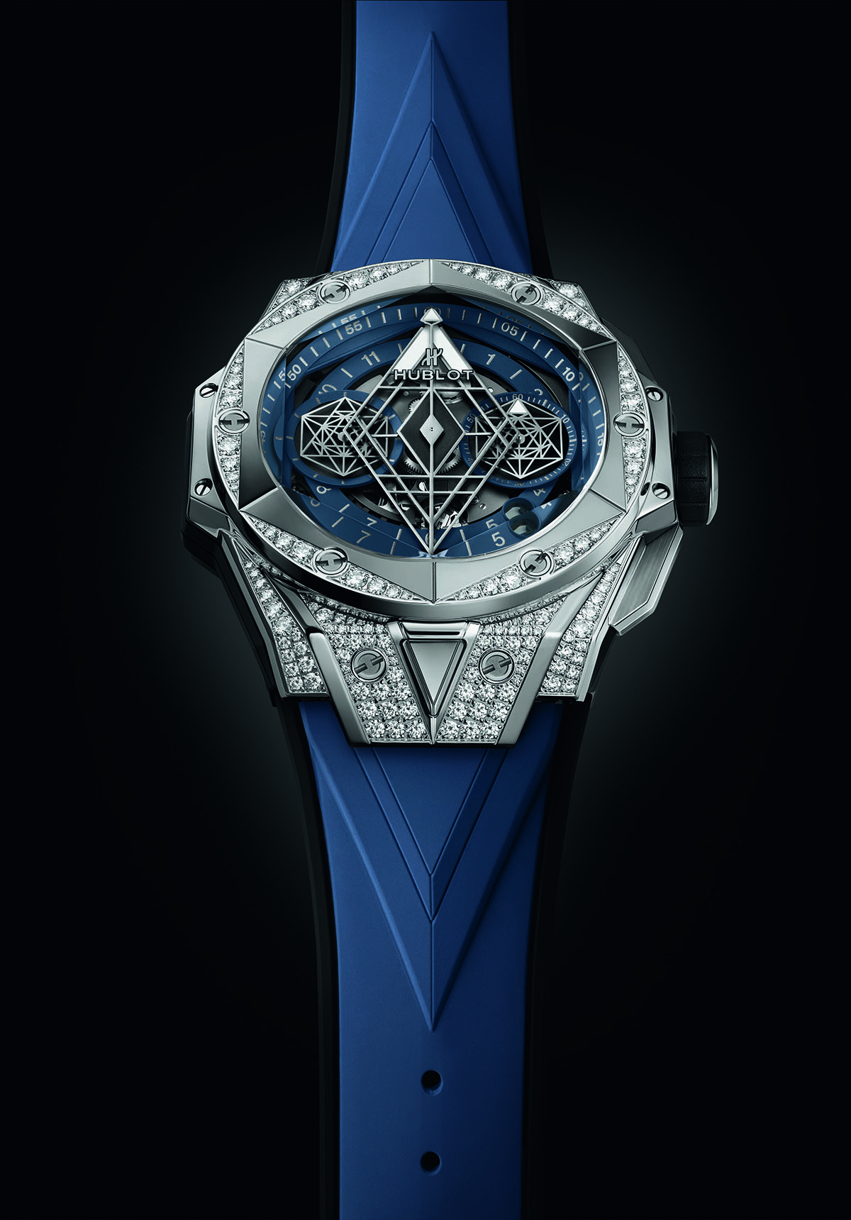
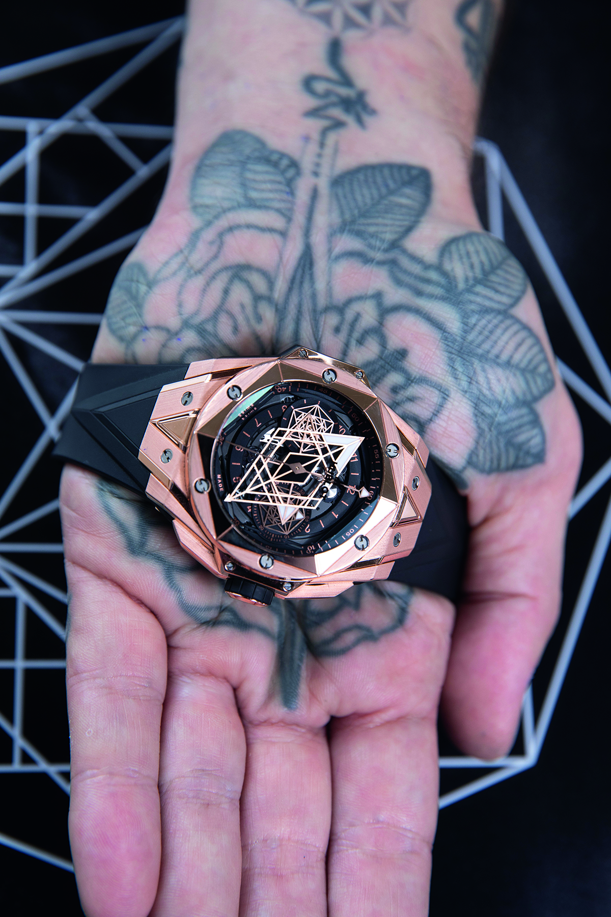
“I prepared some quite radical designs alongside some more conservative options,” says Plescia-Büchi, reflecting on the design process of his first timepiece, the Big Bang Sang Bleu. ‘To [Hublot’s] credit, it was 100 per cent their decision to go with the weirder one.” With a few adjustments – “we had a lot to do in terms of translating how to make [the 2D design] into a watch” – the timepiece launched in 2016 with an initial run of 200 pieces. Crafted largely from glass and titanium, the Big Bang Sang Bleu was a celebration of pure form and geometry, taking influences from architecture, philosophy and Plescia-Büchi’s own tattoo designs. The original idea was to feature the geometric pattern printed onto the watch face with the hands on top, but the designer envisioned more depth and suggested using the shapes as the hands themselves. Given the delicate art of watchmaking, the final version, which features three octagonal discs instead of hands to indicate the hours and minutes, is a huge achievement. “Seeing the watch finished,” Plescia-Büchi admits, “was the closest thing to having a child.”

Read more: Princess Yachts CEO Antony Sheriff on a new generation of yachting

Hublot’s collaborators, unlike with a lot of brands, work with the watchmaker on an ongoing basis, thus becoming an integral part of the brand’s identity. For the Big Bang Sang Bleu II, which was released at the end of 2019, for example, Plescia-Büchi refined the original design to create a more three-dimensional case and inverted the facets to restore Hublot’s iconic porthole shape. “It’s about combining my DNA and Hublot’s DNA to create something new that is also true and faithful to both of the origins,” says Plescia-Büchi. “Something that I find extremely pleasant is that when you’re designing watches you work over many years on slow incremental changes, which is actually quite akin to designing tattoos. You get time to continue improving the design, which is different from designing fashion, for example, because you have a quicker turnover. You can come up with something crazy and the next season, people will have already forgotten.”

Tattoo hand holding watch

The Big Bang Sang Bleu II in gold

The designer was, in fact, approached by another watch brand before Hublot but declined the opportunity: “It wasn’t the level of prestige where I thought I could be”. Though fifteen years ago, Hublot might not have made the cut. Success truly came from the brand when they started “to connect tradition and innovation,” explains Guadalupe, a concept that is at the heart of Hublot’s universe and rooted in a deep understanding of their consumers’ expectations and lifestyles. “The young generation in particular are looking for something iconic with a strong personality and identity,” says Guadalupe. “For men, especially, a watch is the main way to really differentiate yourself, it expresses who you are.” Part of the appeal of buying a Hublot watch is gaining access to the ‘family’ and all the perks that come with it. Football-loving collectors, for example, are invited to all of the games at Chelsea FC with whom Hublot has an ongoing partnership. Indeed, Hublot was the first luxury watch brand to ever support football, again demonstrating a deep understanding of consumer culture as well as a highly innovative marketing strategy. Since 2008, the brand has been the official timekeeper of all of the UEFA men’s European Championships as well as the FIFA World Cup since 2010, and this year, marks the beginning of the brand’s relationship with UEFA’s women’s football.

When it comes to women’s watches, Hublot is still developing – the brand sells only 25 per cent to women – but their approach is unique in the sense that their designs differ very little for the female audience. With the Sang Bleu timepieces, for example, the ladies’ versions are embellished with diamonds, but otherwise remain the same. Look for a women’s collection on the Hublot website and you won’t find it; the watches are listed only by their collection. “It’s no longer men who buy watches for women as gifts. Women decide to buy whatever they want,” says Guadalupe.

Hublot x Women’s Football

Men shaking hands

Aleksander Ceferin, UEFA President & Ricardo Guadalupe, Hublot’s CEO

Over the past few years, women’s football has increased significantly in popularity with US-based data company Nielsen revealing that approximately 314 million people are now interested in the game. It is perhaps no surprise then, that Hublot recently announced its support, becoming the Official Partner of the Women’s EURO 2021. “In the end [football] talks to the consumer. It doesn’t matter that not everyone can afford to buy a luxury watch, if they know Hublot is a watch that’s positive,” says Ricardo Guadalupe. But the partnership works both ways. As Guy-Laurent Epstein, Marketing Director of UEFA Events SA, puts it, Hublot’s presence as a world-famous brand is “proof women’s football can be supported on its own merits”.

Find out more: hublot.com

This article was originally published in the Summer 2020 Issue.

Share:
Reading time: 6 min
Stainglass windows lining a corridor
Portrait of a man against a white background

French designer Philippe Starck. Image by JB Mondino.

Legendary French designer Philippe Starck gives Mark C. O’Flaherty his radical vision of the future: a time when designers won’t be needed – and maybe even chairs

“I’m not interested in aesthetics anymore,” says Philippe Starck, sipping on a glass of mineral water in the Royal Academy in London. “I am interested only in our evolution, and how the intelligent craft of human production is going to be rerun by dematerialisation. We are working on making things disappear.” As Starck speaks, I notice the periodic flashing of a red LED from beneath the skin on a fingertip of his left hand. It’s extraordinary. I ask him what it does – is it connected somehow to his laptop, perhaps? “Ah, it’s magic!” he says, cryptically, before steering the conversation to his ongoing project with the Roederer champagne house: “I never wanted to just design a bottle, I wanted to share in the making of what was inside. And it was about creating something that had less in it, nothing added, no sugar.”

Follow LUX on Instagram: luxthemagazine

We are at the Royal Academy for the launch of the new Roederer-Starck 2012 rosé champagne, where he is judging a competition between 13 artists at the Academy’s Schools to interpret the taste of the champagne through their art. His choice of winner – a white-on-white embossed spiral on paper called Cycles, by Sofía Clausse – is apposite for his ongoing philosophy of design: “It was the most accessible piece,” he says, “It was simple. It captured the spirit of champagne, which to me isn’t a wine, or a reality, but an idea.”
Contemporary plastic chair against white background

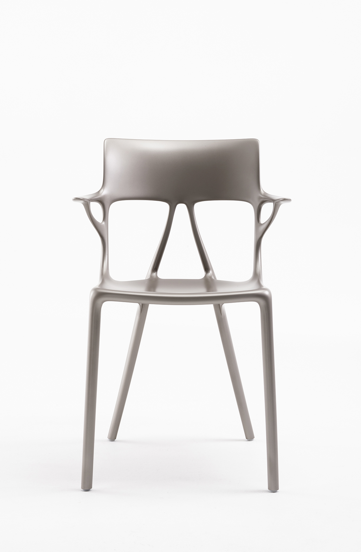
Starck’s AI Chair for Kartell

When the world first caught sight of Philippe Starck’s work in the 1980s, the Parisian-born designer had been creating products for a new way of living. He was changing the vocabulary of interiors, rephrasing the language with futuristic accents on everyday items. His choice of materials was aggressively different from the tradition of French design – he selected transparent plastics, metallics and pop colours. He was as New Wave as the cinema of Luc Besson and Jean-Jacques Beineix and of the architecture of Jean Nouvel. Today, at 70, he is one of the most prolific designers who has ever lived, having created literally (his studio can offer no official number) countless products from clocks to yachts. Today, he still works on an average of 200 projects a year. And yet, as he tells me, he believes that “fifteen years from now, thanks to technology, every material obligation will have disappeared.”

Read more: Chaumet’s CEO Jean-Marc Mansvelt on historic innovations

How does a designer who has been apocryphally credited with 10,000 products balance his current view of a future with nothing in it, with his business model? “The business element will shift,” he says. “We debuted the AI chair with Kartell at Salone del Mobile in Milan this year, and it was the first of its kind ever to be created with artificial intelligence. AI is going to create a new freedom in design. With AI, we can now ask any question, but it’s all about knowing the right question.” He also sees a time beyond furniture. “Design as we know it will be dead,” he says. “There will be better solutions to sitting down than a chair. I think a chair has always put you physically in a bad position. We can do better than a chair.”

Stainglass windows lining a corridor

The entrance to the Starck-designed L’Avenue restaurant at Saks Fifth Avenue, New York, with stained glass by his daughter Ara

Starck has always been radical. In 1984 he created the interior for Café Costes in Les Halles. With its theatrical blue staircase and oversized minimal clock, it was as much a postmodern landmark leisure-time interior as Ben Kelly’s Haçienda in Manchester, and Arata Isozaki’s Palladium in New York City. All were created in the same decade, but Starck’s project was notably more dramatic because of its location. This was Paris, a city still stuck in Belle Époque aspic. French design was frozen in curlicues and froth. Starck was an iconoclast.
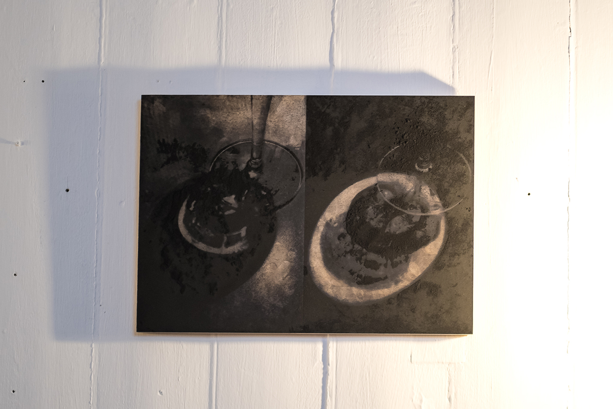
Contemporary artwork hanging on wall

Photograph of wine glasses

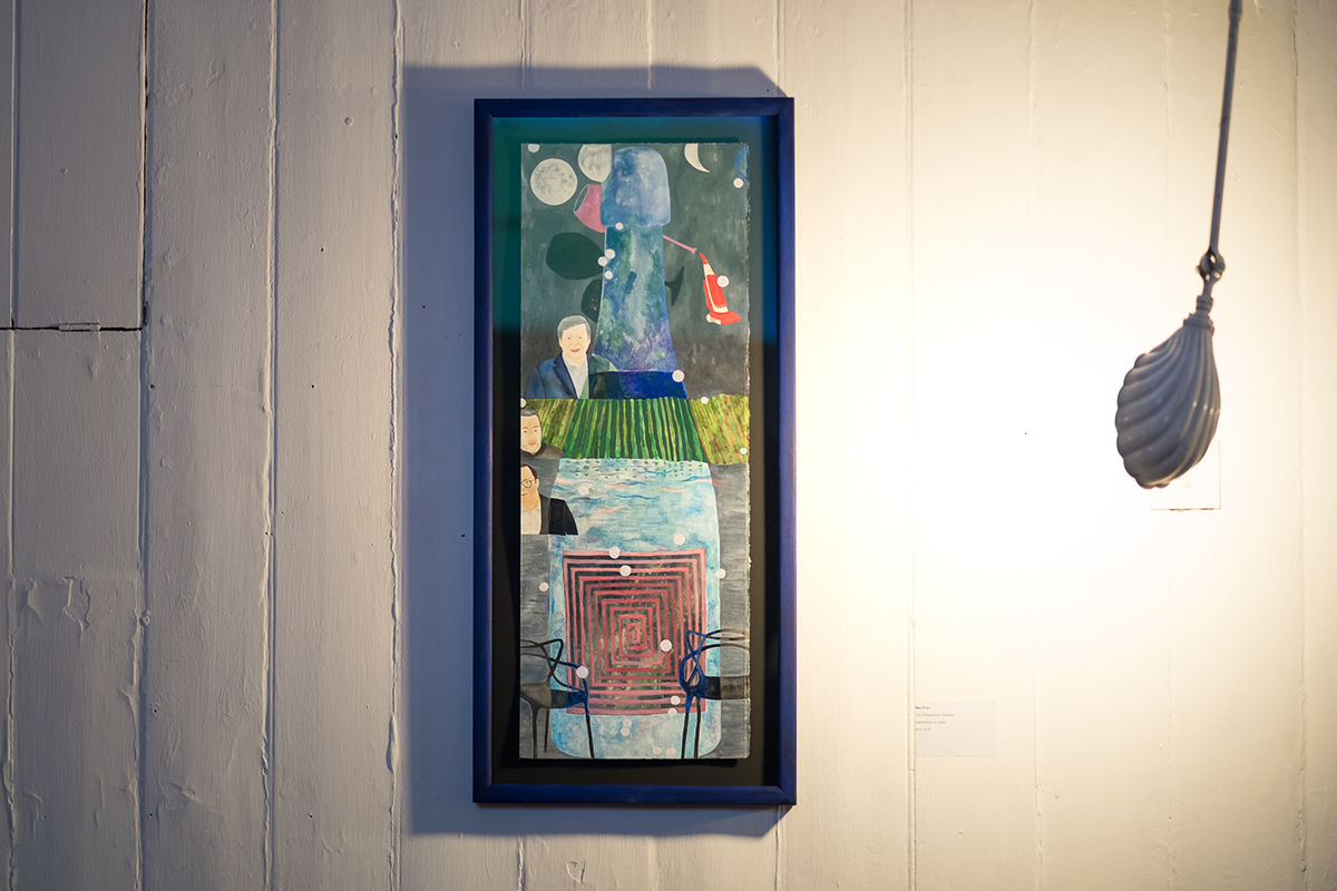
Entries to the Brut Nature competition from Royal Academy students, with (top) The Philosophers’ Reserve by Max Prus, and (here) Tidally locked by Olu Ogunnaike

After a series of successful Paris interiors, he was aligned for a long period with Ian Schrager’s fantastical hotel projects, bringing some of the eccentric visual flair that Schrager and his late business partner Steve Rubell brought to Manhattan nightlife with Studio 54. There was a fairytale, supersized element to much of what he did, from elevated swimming pools to triple-height billowing curtains. From the Royalton in Times Square in 1988 onwards, their partnership helped take Starck’s name and distinctive, witty style to the world.

Read more: Founder of Nila House Lady Carole Bamford’s guide to Jaipur

While his peers, including Marc Newson – who currently holds the record for a design object at auction after one of his Lockheed Lounge chairs sold for over £2 million in 2015 – focused on rarefied edition pieces, Starck focused on mass production. A rare blue glass Illusion Table sold for $50,000 a decade ago, but Starck is known more for his alien-looking Juicy Salif lemon squeezer – which first appeared in 1990 – and continues to be one of Alessi’s best-selling products of all time. At one point, the company produced 10,000 gold-plated versions, purely for display in the home (lemon juice discolours the surface). His transparent plastic chairs for Kartell – the La Marie, which launched in 1999, and the Louis Ghost armchair, which debuted three years later – are as instantly recognisable as any piece of furniture ever made. They brought avant-garde design to the mass market. But when plastics are being demonised, do his polycarbonate objects belong to the past? Starck remains a passionate cheerleader for the material. “For me, it’s the only way to achieve the quality product I want,” he says. “There is a great difference between single-use plastic and a chair that you can keep for a century or more. The media has created great confusion. I prefer to work with fossil energy than to cut down trees and I would rather use vinyl for upholstery than kill cows.”
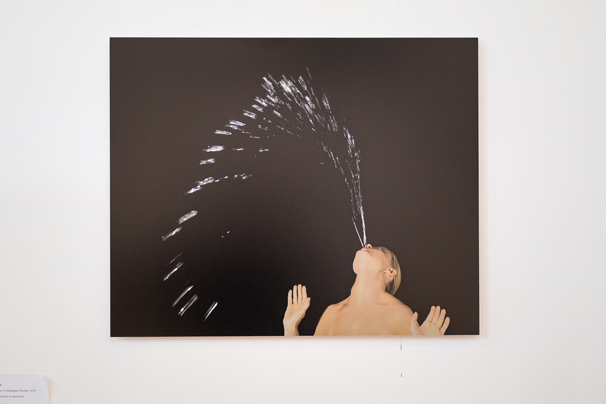
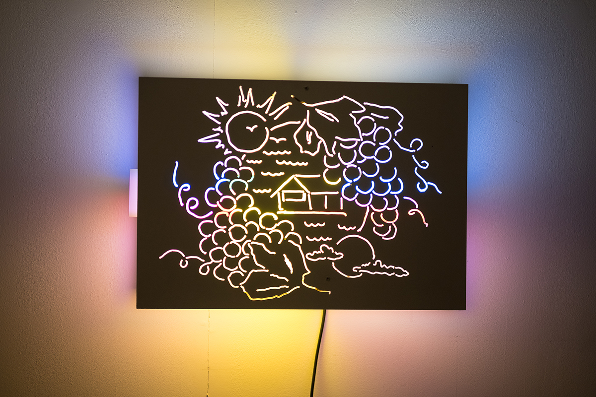
Woman spitting fountain of water against black background

Artwork etching with mulitcolours

Two further entries from Royal Academy of Arts students to the inaugural Brut Nature competition judged by Philippe Starck, with (top) Self-portrait as a Champagne Fountain (2019) by Clara Halstrup and (here) Sun on the coast of the moon by Richie Moment

One area in which he, and indeed most of us, remain guilty in terms of the unfolding climate crisis is in carbon emissions from flying. But Starck is one of the busiest designers on the planet, and for someone who still uses pen and paper and tactile models to create (“If you create using a computer, you are just creating within the frame of the guy who created the software!”), he needs to appear in person for projects. The day after we meet, he has to get up at 4am to catch a plane to Milan where he’ll be for a few hours before flying off again, heading further south. “It’s fine – I am so used to it,” he shrugs. “I once went to Seoul from Paris for three hours.” At 70, he shows no signs of slowing down, but when he takes time out, it’s the most understated resort he has ever designed that he likes to head to. “I like lots of places I have been involved with,” he says, “but the one I really love is La Co(o)rniche in the Bay of Arcachon near Bordeaux. It’s really just a few cabanas on top of the Dune de Pilat, the highest sand dune in Europe. You are there looking at the waves and the sunset and it feels like the best place in the world.”

The choice of a fairly rustic, nay, Zen destination ties in with his world view right now, and his intention to both continue democratising design and make it vanish. Just as he believes the future is chair-free, so he believes our everyday tools and indeed all of our furniture will go. “Designers won’t dictate the aesthetic in the future,” he says, “it will be down to your coach and dietician, because telephones and computers will disappear and everything we use will be incorporated within the body. We will be naked in an empty room, and we will be able to conjure flowers or whatever we want from nothing.” As Starck gesticulates, the red LED flashes on his finger tip again. “So, come on, tell me…,” I ask, “is that part of the new cyborg tech you are talking about?” He smiles. “Oh, this? I got it from the Harrods toy department. Fun isn’t it!?”

Louis Roederer and Philippe Starck
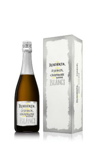
Champagne bottle and caseThe recent launch of the 2012 Roederer and Starck rosé champagne marks 13 years of the designer’s collaboration with the French family-owned champagne house and maker of Cristal. Starck has been involved in each step of the production, including, of course, the champagne’s packaging. From the first brut-nature product in 2006, the champagne has been created sugar-free, with zero dosage. As Jean-Baptiste Lécaillon, Roederer’s chef de cave  says: “We have used nature as our collaborator as much as anything with our work with Philippe – it is organic, with minimal intervention and a focus on the real taste of champagne. This came from our discussions with him.” The presentation attempts to democratise the luxury product – it looks more like a chic bottle of olive oil than a grand cru. The hand-lettering on the label and box and the rough line of fluorescent pen creating the edging makes it look effortless. As Frédéric Rouzaud, president and family scion of Louis Roederer says: “It represents spontaneity. He wanted a simple paper for the label, and just wrote by hand what the product is. He wanted it to be approachable, to speak to everyone.”

Find out more: louis-roederer.com & starck.com

This article was originally published in the Spring 2020 Issue.
Share:
Reading time: 8 min
Woman sitting on leather sofa in a contemporary space

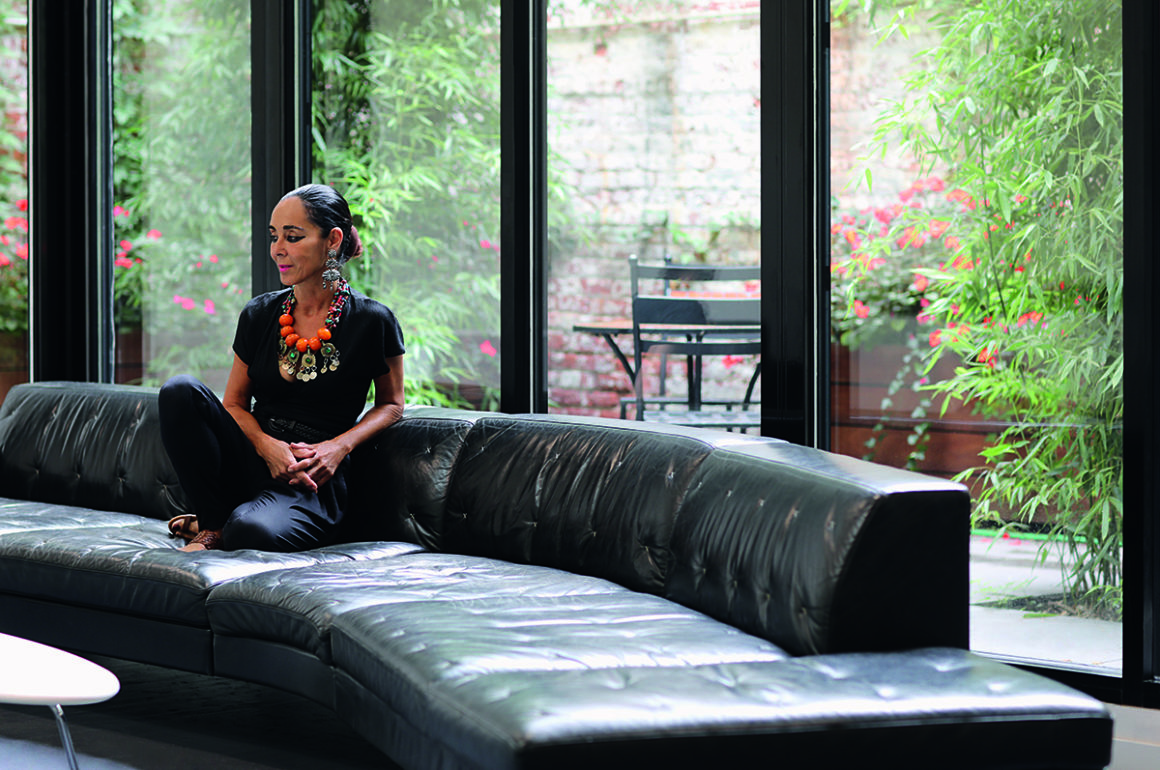
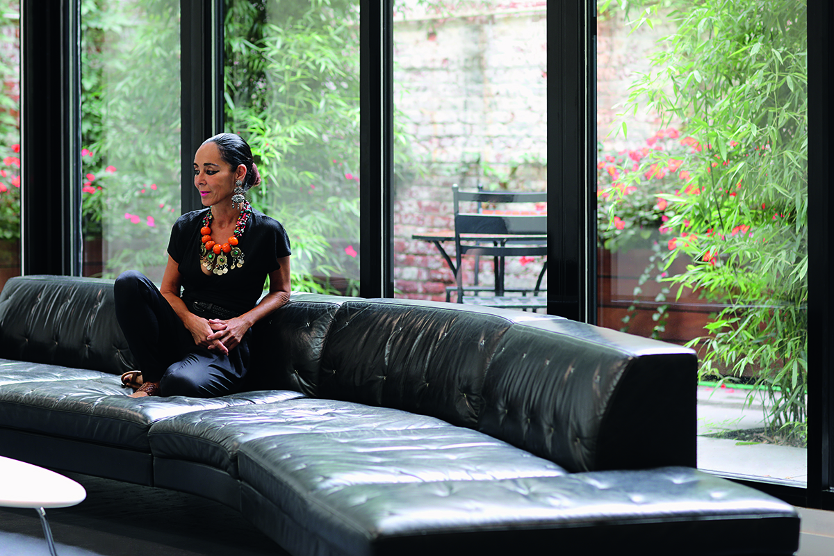
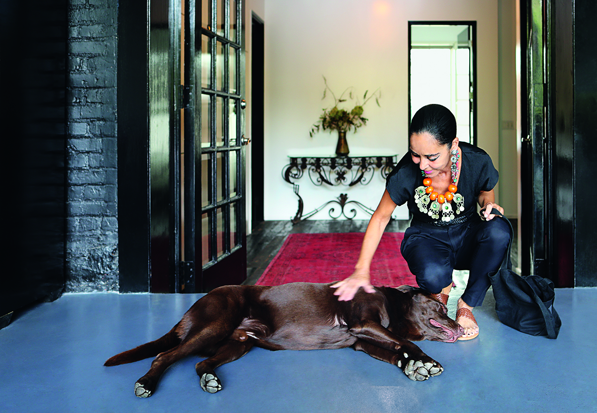
Shirin Neshat at home in New York City

Shirin Neshat’s devastatingly striking art combines dream, reality and an undercurrent of anger and sadness. As a major retrospective of her work is held in Los Angeles, Millie Walton meets the artist at the launch of her collaboration with celebrated Italian winemaker Ornellaia, famous for its artist labels

Portrait photography of Shirin Neshat at home in New York by Maryam Eisler

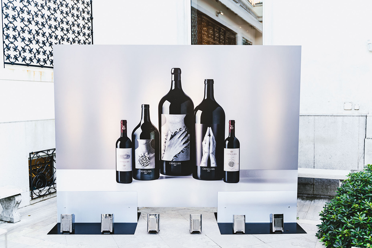
Iranian-born filmmaker and artist Shirin Neshat sits demurely drinking a cup of coffee in the palatial breakfast room at Baglioni Hotel Luna in Venice. It’s the morning after the Sotheby’s auction at the Peggy Guggenheim Collection which saw the sale of limited-edition bottles of 2016 Ornellaia wine with Neshat’s label artwork. A total of $312,000 was raised, with all profits going to the Mind’s Eye programme, which was conceived by the Solomon R. Guggenheim Foundation to help blind people experience art through the use of other senses.

Follow LUX on Instagram: luxthemagazine

The success of Neshat’s collaboration, following that of William Kentridge’s in 2018, was well deserving of late-night celebrations, but the artist is composed and alert, her jet-black hair scraped tightly back from her face, and her dark eyes lined with black kohl. It’s a look that would seem somewhat severe or even theatrical on most, but Neshat wears it with authenticity, grace and a sense of homeliness. She pulls up another chair close to hers so that I can hear what she’s saying over the clamour of the breakfast buffet and tells me that she’s been ordering coffee to her room each morning and is worried that Ornellaia will have to foot the bill. Given the sum raised last night along with Neshat’s status as the world’s most important and widely recognised contemporary Iranian artist, it’s hard not to laugh, but she speaks softly and sincerely, taking time to consider each of her answers and apologising when yet another admirer interrupts for an autograph. She has a lot of fans it seems, yet her politically engaged work continues to generate debate. She admits, “Some people dislike what I do. There are a lot of people who hate my work in Iran, but still it is discussed, so I think I’m relevant.”

Monochrome image of white-shirted men on a cliff edge

Veiled women walking across a beach towards the sea

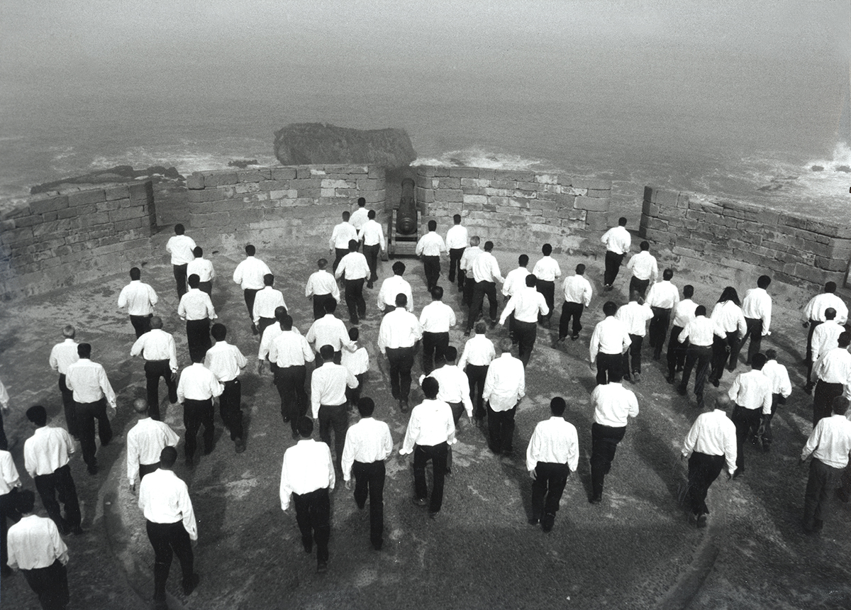
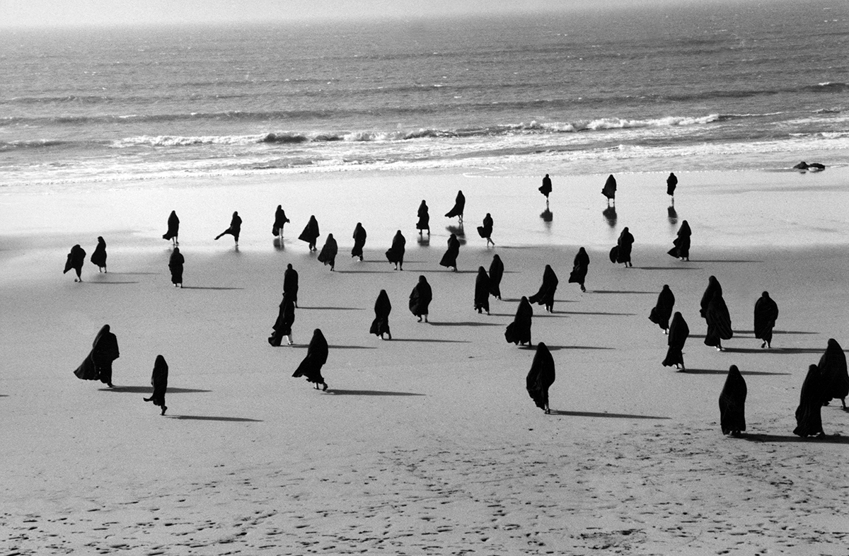
Here and above: stills from Neshat’s video Rapture (1999)

Neshat was born in the city of Qazvin, north-west of Tehran, but left for California at the age of 17 to finish her schooling. Her training as an artist began with her undergraduate and masters degrees in fine art at the University of California, Berkeley. However, she abandoned art-making and moved from Los Angeles to New York in the early 1980s. It was a decade later, through photography first and then film, that she found her artistic vision. She has now been working as an artist for more than 30 years and has won numerous international awards, including the Golden Lion at the 1999 edition of the Venice Biennale for her powerful short film Turbluent, which explores gender roles and social restrictions in Iranian culture. The film plays out on two screens: one shows a male performer singing a love song by the 13th-century Persian poet Rumi to a large audience of men, whilst on the other screen, a veiled woman waits in an empty auditorium, her back turned to the camera. When the man’s performance finishes, the woman begins a wordless song of guttural cries, mournful melodies, panting and animalistic screeching. This film was not only significant in establishing Neshat’s career, but also in paving the way for her succeeding works, which all, in one way or another, deal with the restrictions of female experience. Though embedded in narratives of conflict, Neshat’s work offers a sense of hope in which women find freedom through art in all its various guises.

Monochrome image of hands inscribed with symbols

Artist labels for wine bottles

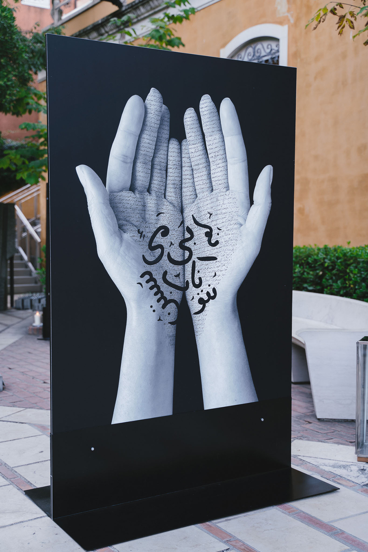
Neshat’s designs for Ornellaia’s ‘La Tensione’ bottle label

Man shaking hand of woman at event

Neshat with Ornellaia’s estate director Axel Heinz

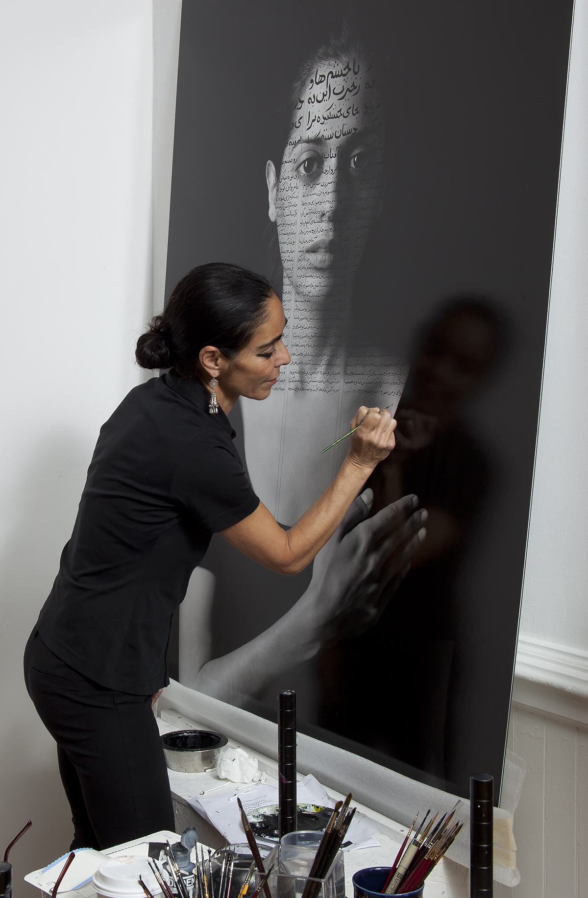
Given these preoccupations, the artist’s decision to collaborate with Tuscan winemaker Ornellaia is somewhat baffling. “In our culture, wine is a way not to escape, but to transcend reality and so [drinking wine] is a sacred, spiritual act,” says Neshat. “But in general, I feel like an occasional step out of your own milieu is actually very positive. For one thing, it puts your work in front of a new audience, but also, for me, [commercial work] is an attractive way of financing my projects. I make work that takes me six years and I make zero money so I think that any patronage that finances your practice and gives you the freedom to do your work is great.” Her series of images for Ornellaia, interpreting the theme ‘La Tensione’ which gives this vintage its name, depict white hands inscribed with Persian script, luminous against a black background. The use of hands, along with literature and monochromatic shades are all typical of Neshat’s aesthetic and imbue the work with a haunting, dreamlike quality. “I’m very interested in the subtlety of body postures and how they can reveal emotion, especially coming from the Islamic tradition and how provocative and problematic the body can be,” she says. “There’s a certain universality about hand gestures.” She places one palm against her chest: “This, for example, could be love”.

Portrait of a man illustrated with Farsi script

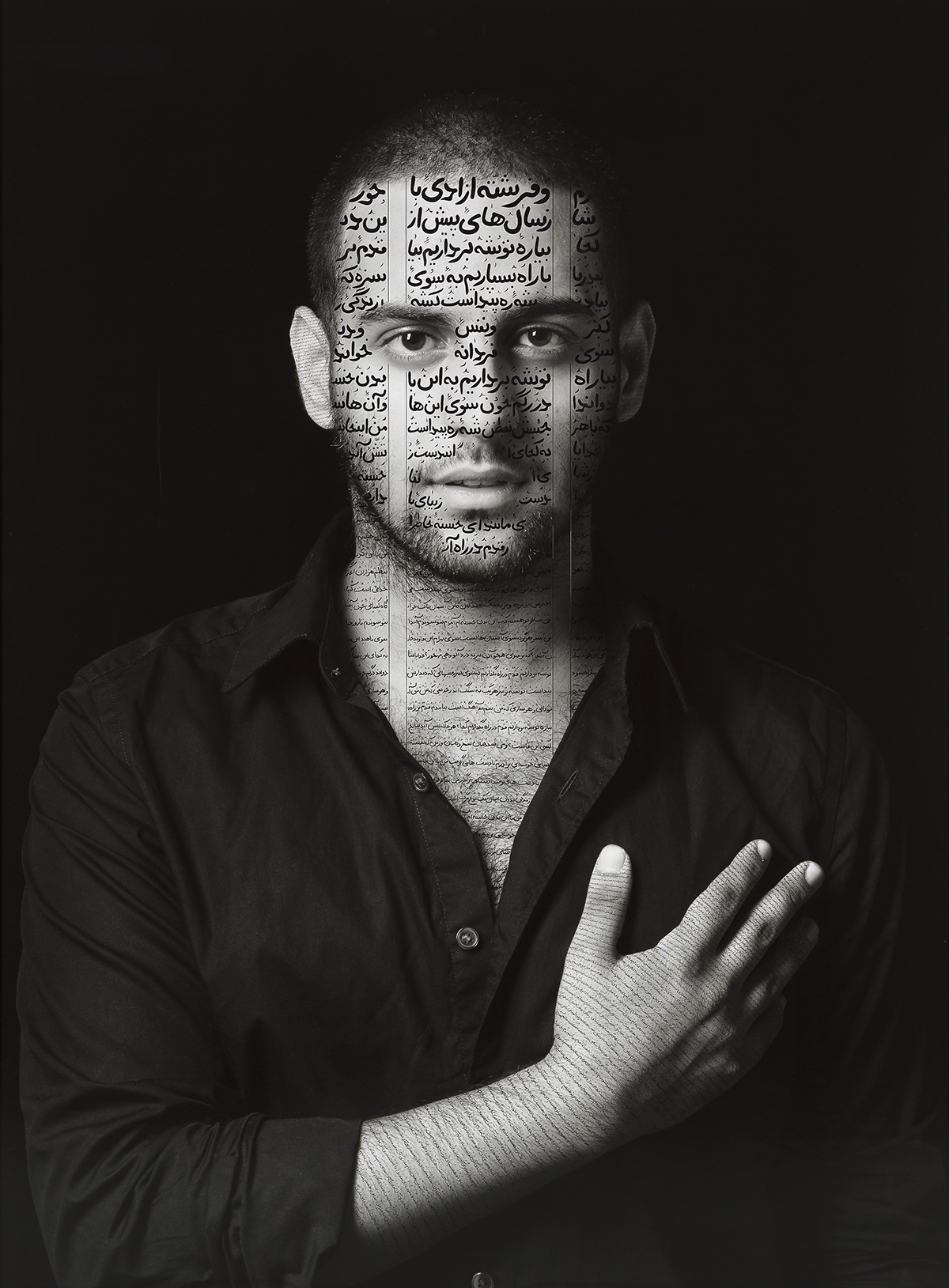
Ibrahim (Patriots) from The Book of Kings series (2012) by Shirin Neshat

The work is reminiscent of Neshat’s first series of black-and-white photographs, entitled Women of Allah (1993–97), which was created following the artist’s return to Iran in 1990, her first visit following the 1979 Islamic Revolution. When Neshat arrived back in Iran, it was in the wake of dramatic cultural changes. Women of Allah not only marked the rebirth of her making art, but also her engagement with the country’s political landscape – an engagement which led to her current state of exile. The series focuses on female martyrdom, showing veiled women holding weapons, their faces, hands and feet again inscribed with Farsi poetry, highlighting the revolutionary Iranians’ dual identities as both Persians and radical Islamists, as well as the tension between devotion and violence.

Read more: Introducing the next generation of filmmakers at Frieze LA

Her practice continues to be preoccupied with contrasts, highlighted by the minimalism of black and white, but also with conflict. “There are plenty of artists whose making of art is an aesthetic exercise, which is important because it has intellectual and artistic values of the highest level,” she explains. “But for artists born to a country like Iran, the relationship to art is personal in a way that it cannot be separated from daily realities. I don’t think we have the emotional capability of distancing ourselves from these issues, and it is an incredibly fulfilling process when you make work that is politically conscious. It also means that you have a relationship with an audience that is larger than the [usual] art audience because people are able to identify with the subject matter.”

Woman crouches in doorway to stroke dog

Despite Neshat’s acute political engagement, her work has a sense of timelessness achieved by incorporating literature and music as well as elements of the surreal. “Music is very existential,” she says. “It sort of neutralizes a political reality, but it also contains all these cultural references and has a strong physical impact. Powerful music affects your heart.” This is perhaps most apparent in Turbulent, which was inspired by a young blind woman who Neshat saw singing on the streets of Istanbul. Many of her works have involved collaborations with composers and musicians as well as writers and cinematographers. “It’s an essential part of my work to collaborate, especially with people who know me and my work well,” she says. “I’m doing a lot of work in media that I never studied. It’s been really interesting to surround myself with people who have the expertise.”

Artist working in her studio

The artist in her studio

Neshat’s artistic ‘family’ is international, but she has gravitated towards other Iranians in New York: “I am sitting on the outside [of Iranian culture], others are by choice and others not; either way, we’re naturally drawn to each other and spend a lot of time helping each other. I do feel integrated in American culture as far as the artwork goes, but I can also see the limitations of not being Western, when your practice is considered to be a little bit outside the box.” Reflecting this duality, Neshat curated ‘A Bridge Between You and Everything’, an exhibition of Iranian women artists held at the High Line Nine Galleries in New York in November 2019.

Portrait of a girl sitting in front of illustrated wall

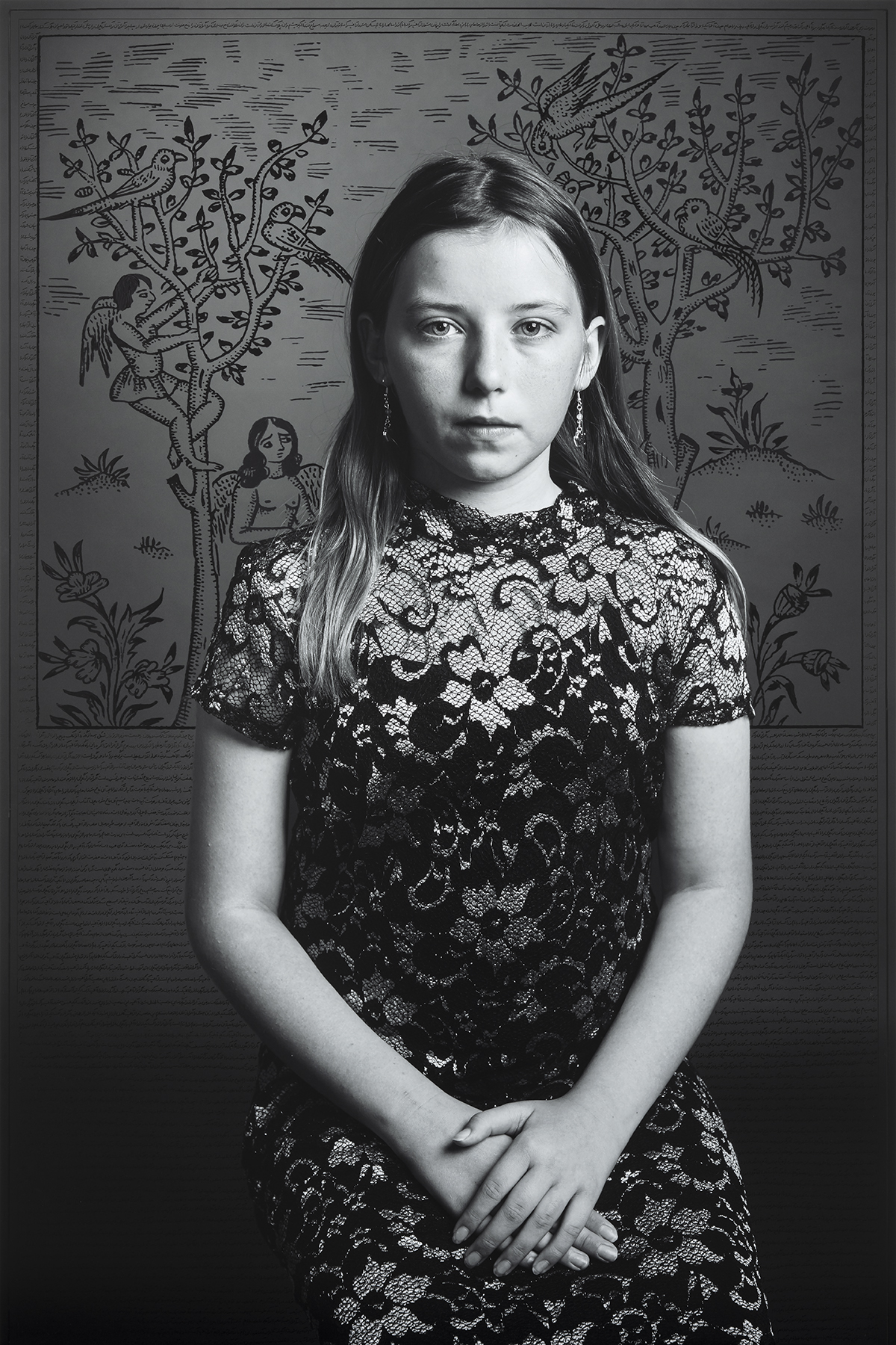
Raven Brewer-Beltz (2019) by Shirin Neshat

Neshat has called New York her home for many years, but her latest project, Land of Dreams, is the first time that she has directly turned her artistic attention towards the US. The project explores her experiences of being an immigrant, focusing on an Iranian woman who collects dreams that portray American people and takes them back to an Iranian colony for analysis. The project is now being shown for the first time as part of Neshat’s major retrospective ‘I Will Greet the Sun Again’ at The Broad in LA, and one wonders at the colony’s interpretations. “It’s kind of an absurd comedy,” she laughs, “but it was also [about] how to tackle a very important political subject – the antagonism between the two cultures as well as the corruption on both sides – through a human surrealism so that it escapes absolute realism. I want it to be timely, but I don’t want it to have no value in a hundred years’ time.” Are these surreal imaginings ever drawn from Neshat’s own dreams? “Yes, I try to write down my dreams every time I wake up. I like how ephemeral dreams are. My work is like the story that comes after.”

‘Shirin Neshat: I Will Greet the Sun Again’ is on show at The Broad, Los Angeles until 16 February 2020: thebroad.org.

Shirin Neshat ‘Land of Dreams’ opens at the Goodman Gallery in London on 20 February and will run until 28 March 2020. For more information visit: goodman-gallery.com

This article was originally published in the Spring 2020 Issue.

Share:
Reading time: 8 min
Aerial shot of Château de Versailles, France
Château Mouton Rothschild vintage wines with labels designed by contemporary artists

Five Château Mouton Rothschild vintages will be included in the “Versailles Celebration Cases”

Throughout Spring 2019, Sotheby’s will auction 75-limited edition cases from Château Mouton Rothschild to help fund restoration projects at the Palace of Versailles

Château Mouton Rothschild celebration wine case containing five bottlesRenowned French wine producer Château Mouton Rothschild  is auctioning 75 collector’s cases each featuring five vintages with labels designed by contemporary artists who have also exhibited at the Palace of Versailles, including Giuseppe Penone, Bernar Venet, Anish Kapoor, Jeff Koons and Lee Ufan. Aptly titled the “Versailles Celebration Cases”, funds raised will go towards supporting the ongoing restoration projects at the Palace.

Follow LUX on Instagram: the.official.lux.magazine

Aerial shot of Château de Versailles, France

Château de Versailles. Photo by Thomas Garnier, Courtesy Château de Versailles

The auction will begin in Sotheby’s Hong Kong on 1 April, followed by London on 17 April and concluding in New York on 4 May. Successful bidders will also win an invitation to a private tasting at Château Mouton Rothschild, as well as two tickets to the Versailles Celebration Gala Dinner at the Palace of Versailles in September where ex-cellar vintages of Château Mouton Rothschild will be served.

Discover Château Mouton Rothschild’s full list of collaborating artists and labels: https://www.chateau-mouton-rothschild.com/label-art/discover-the-artwork


Share:
Reading time: 1 min