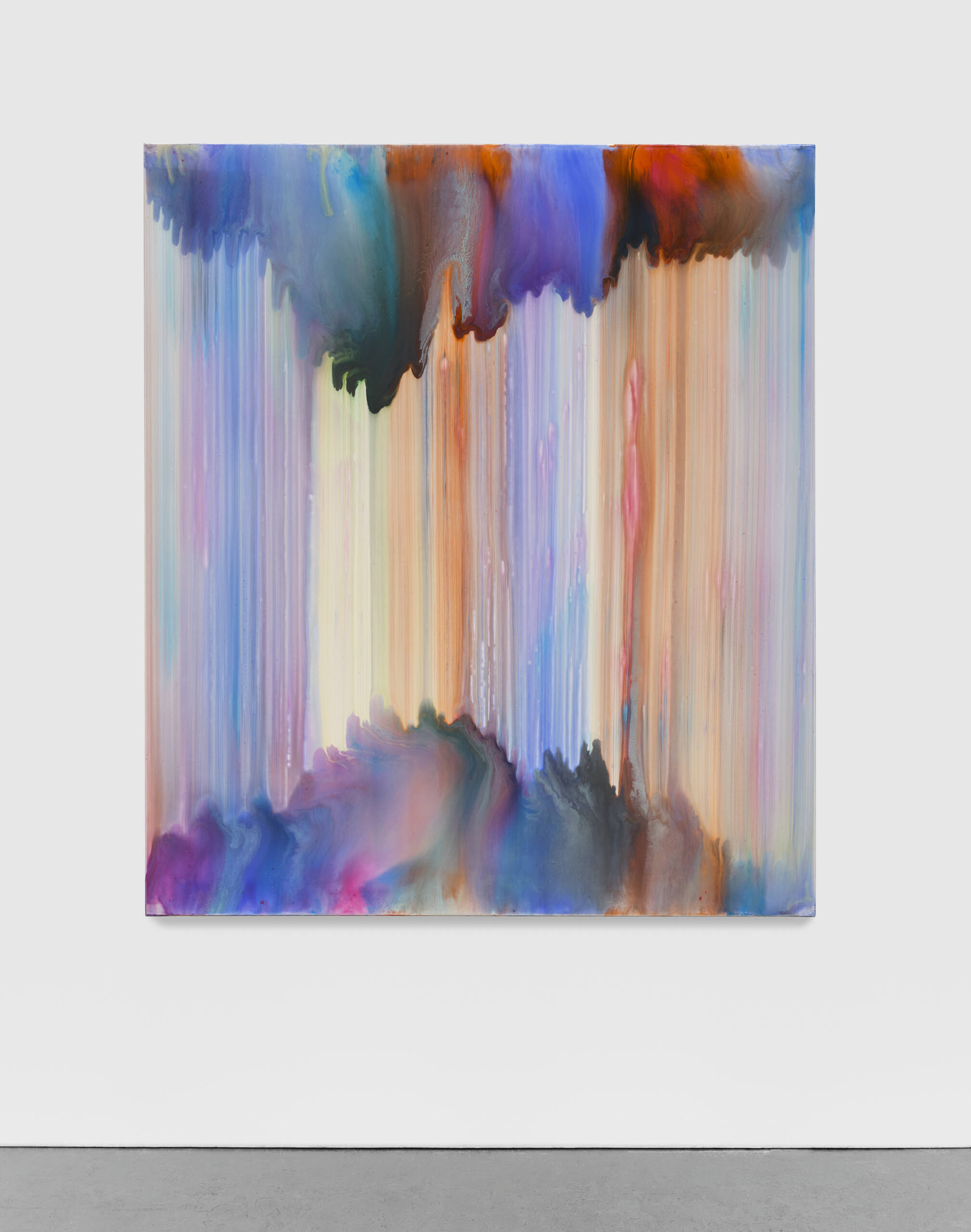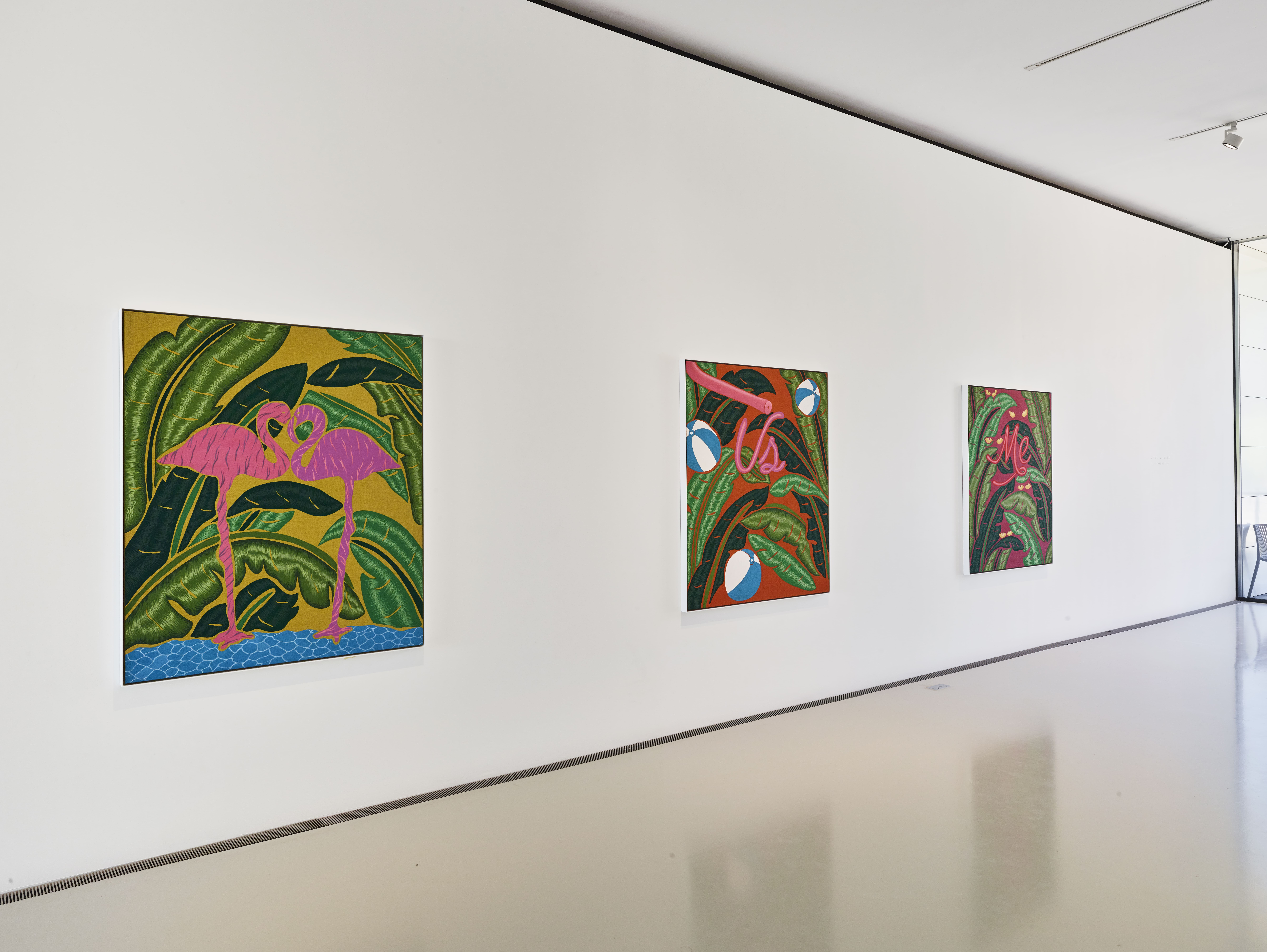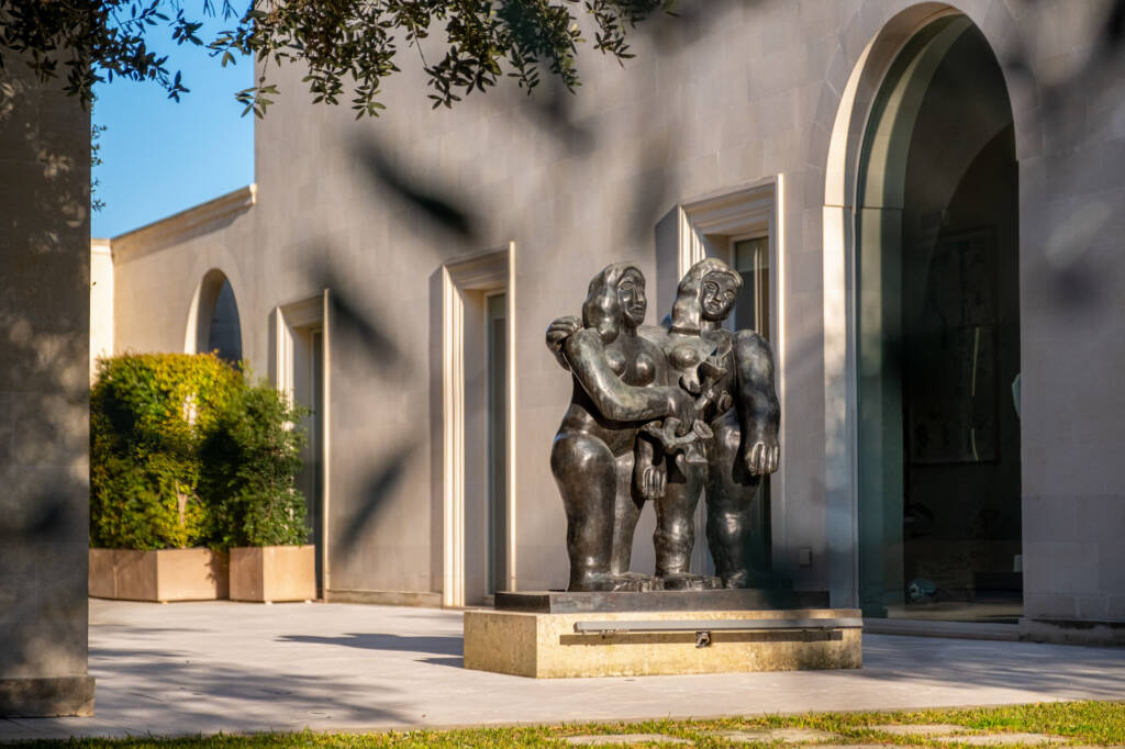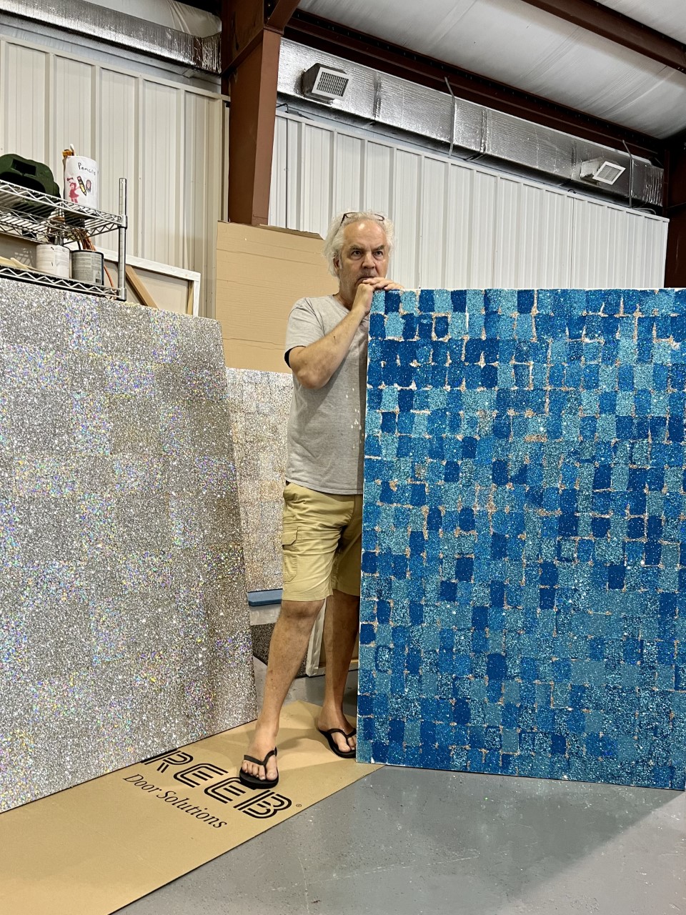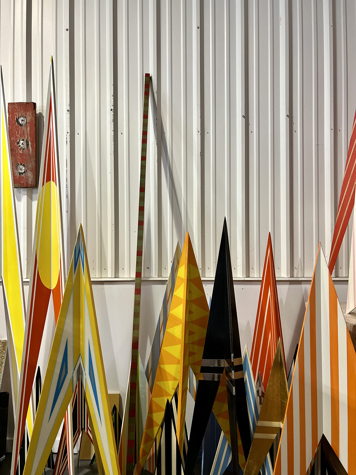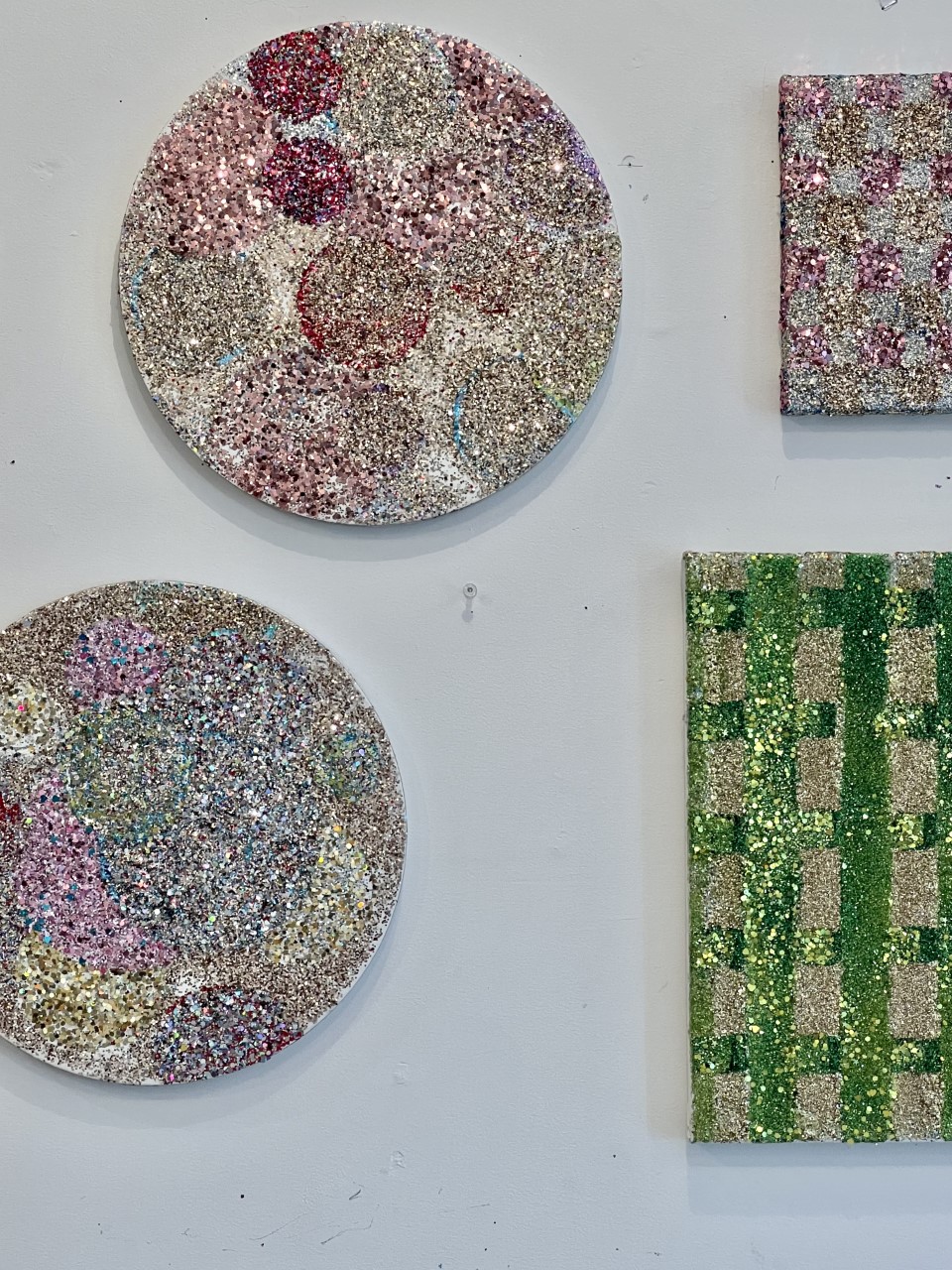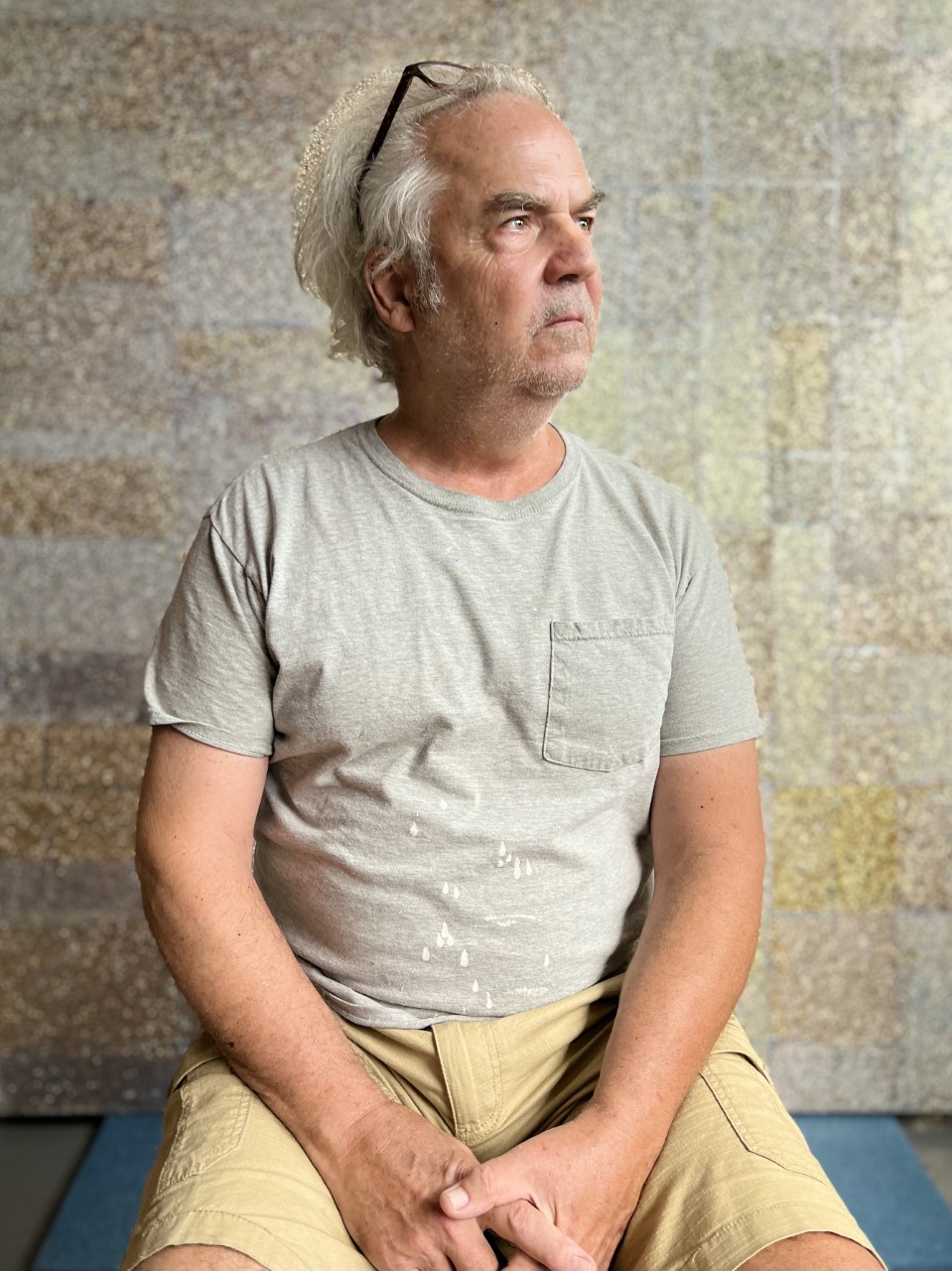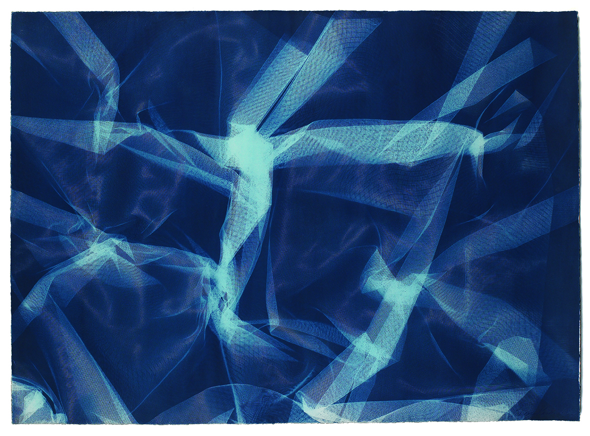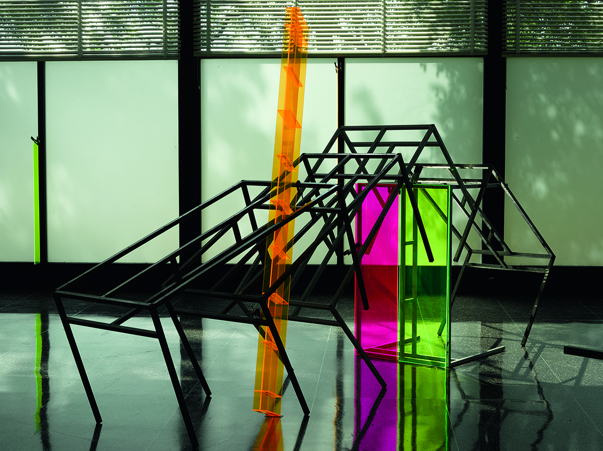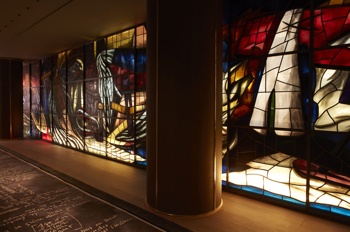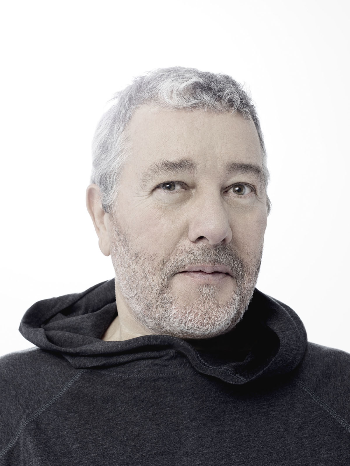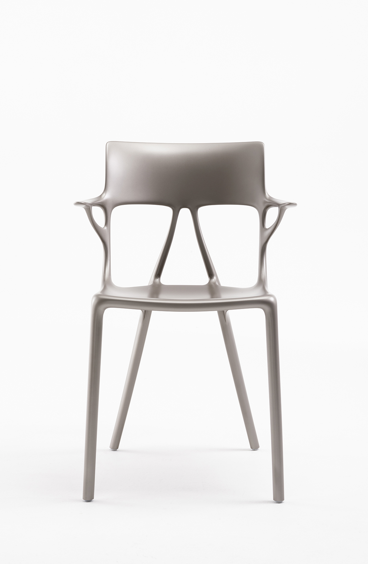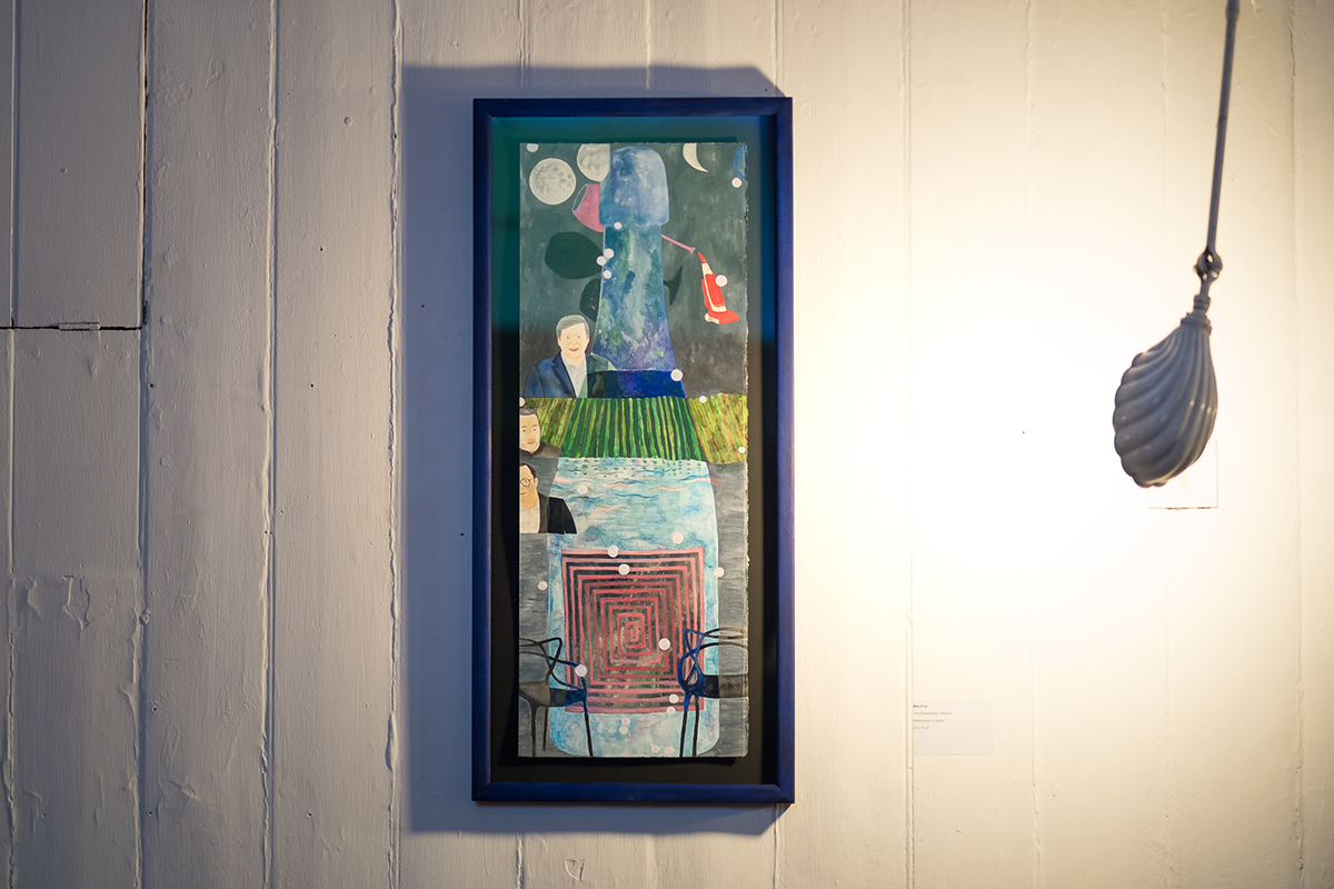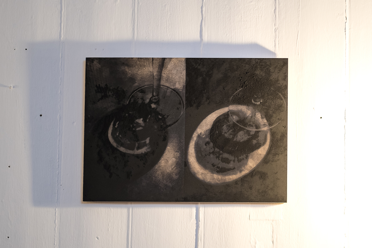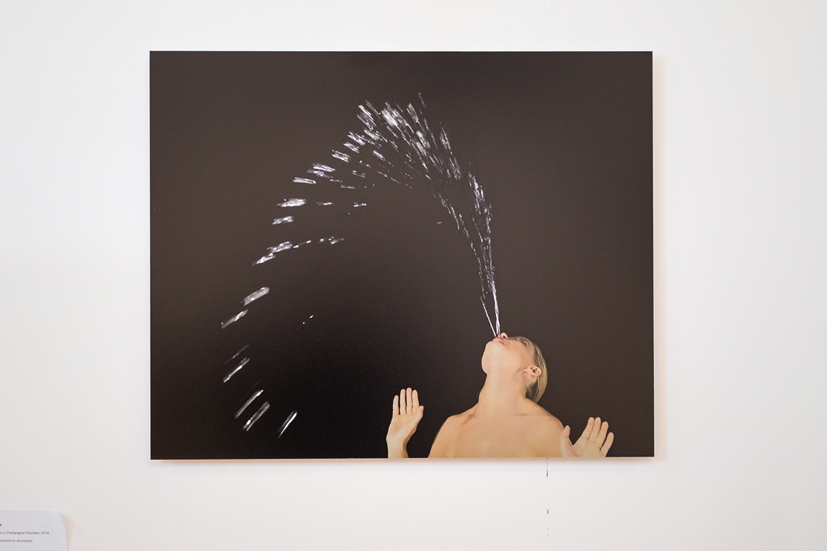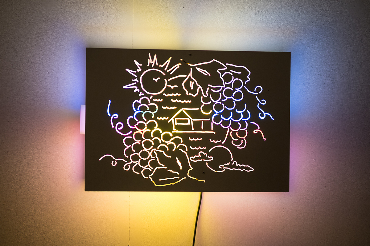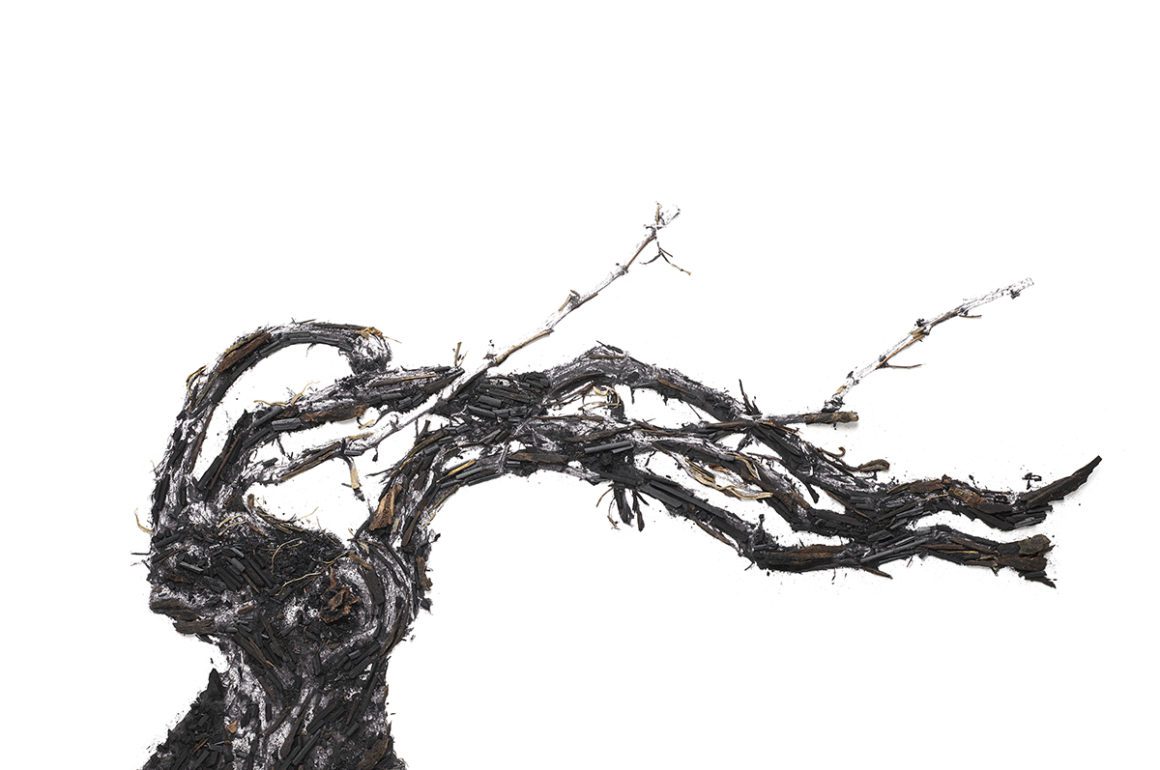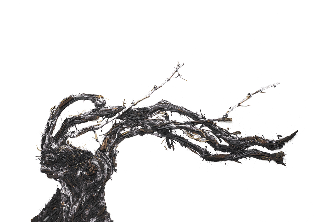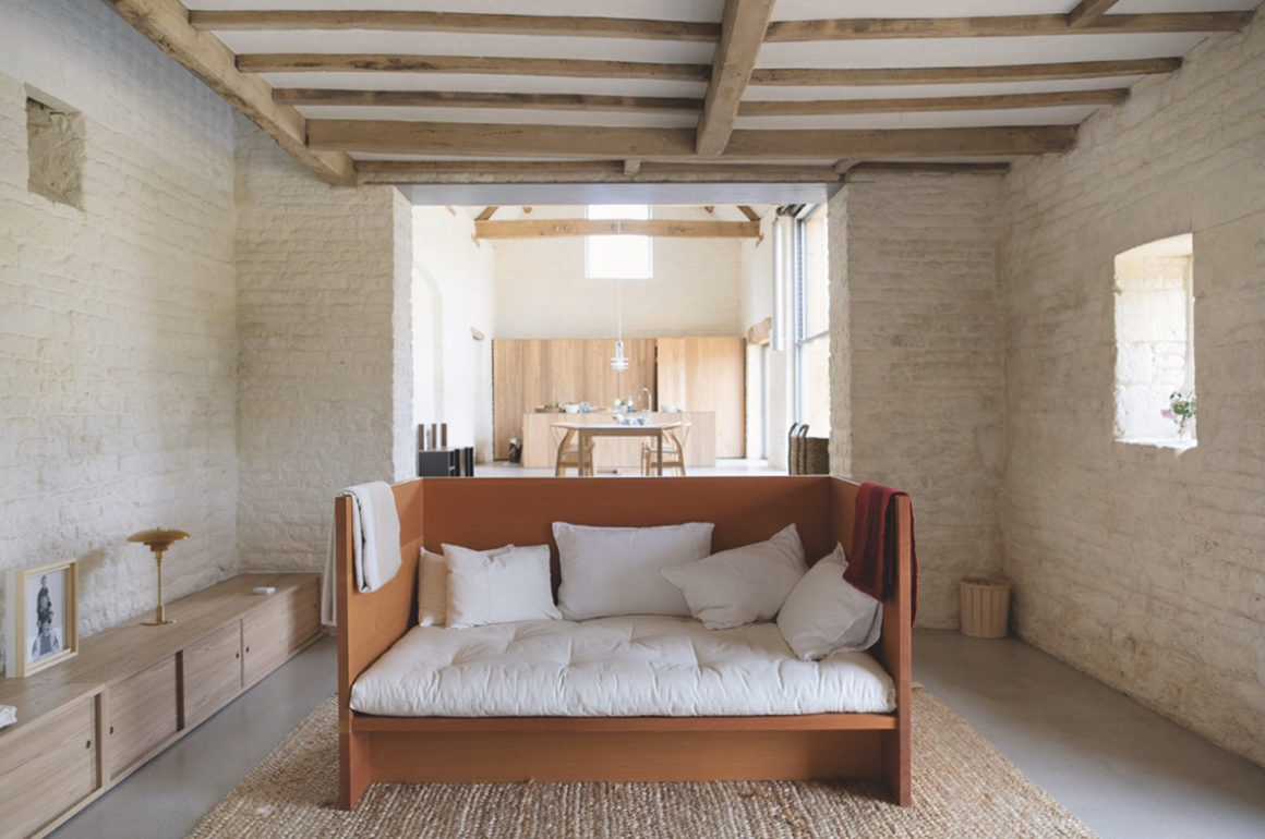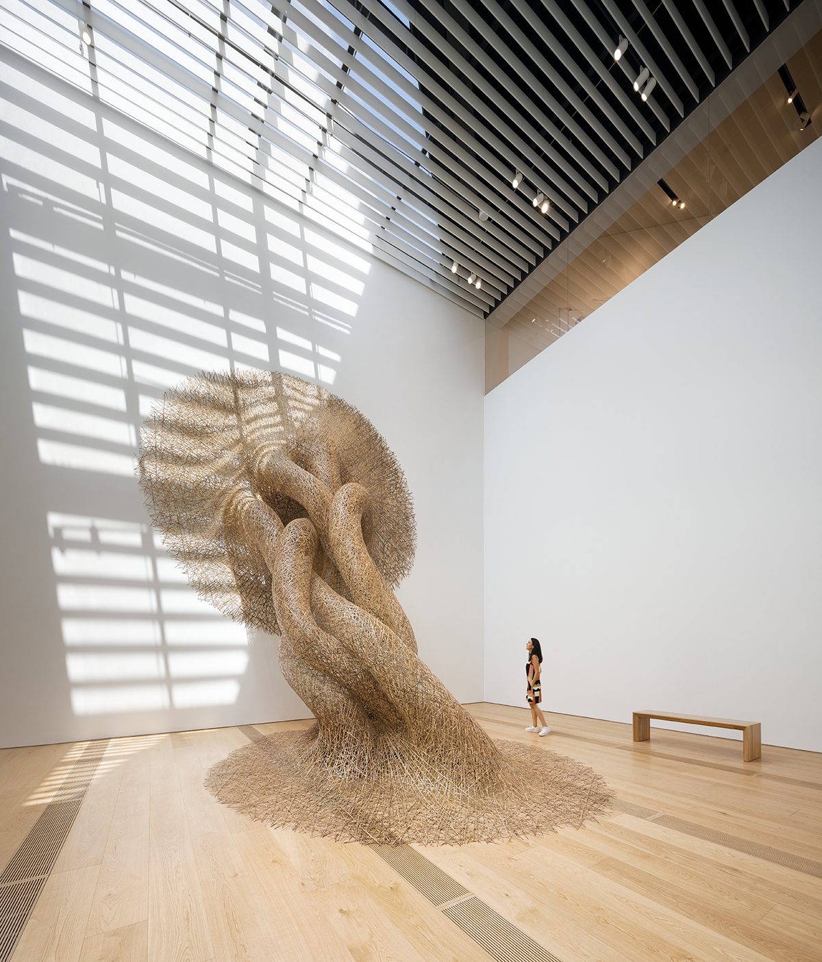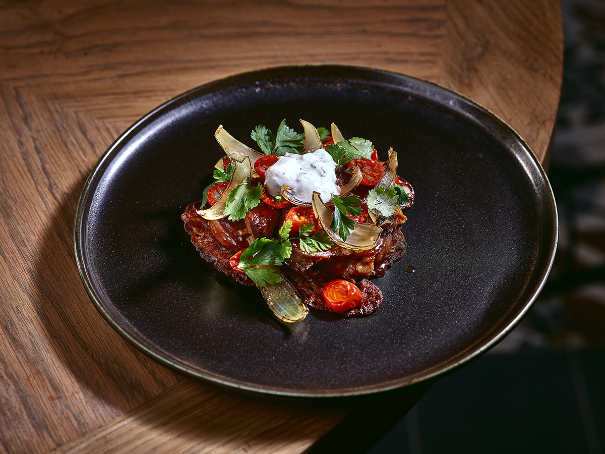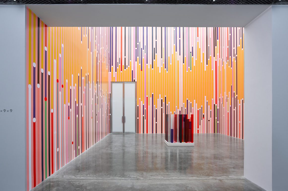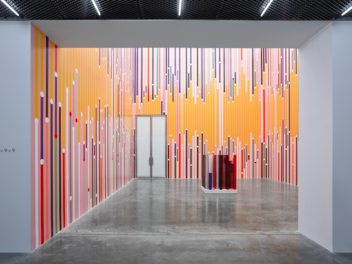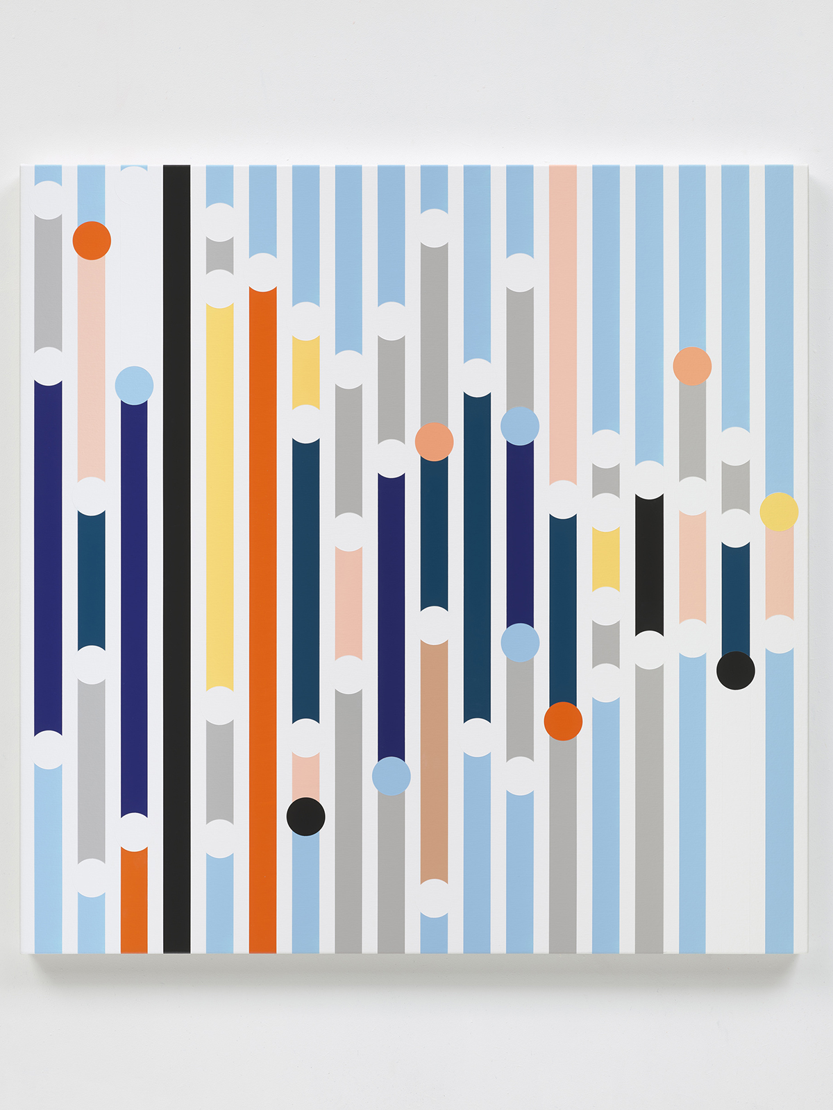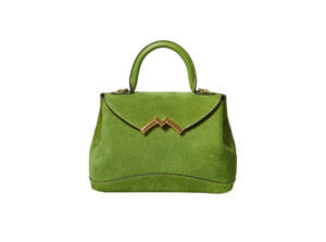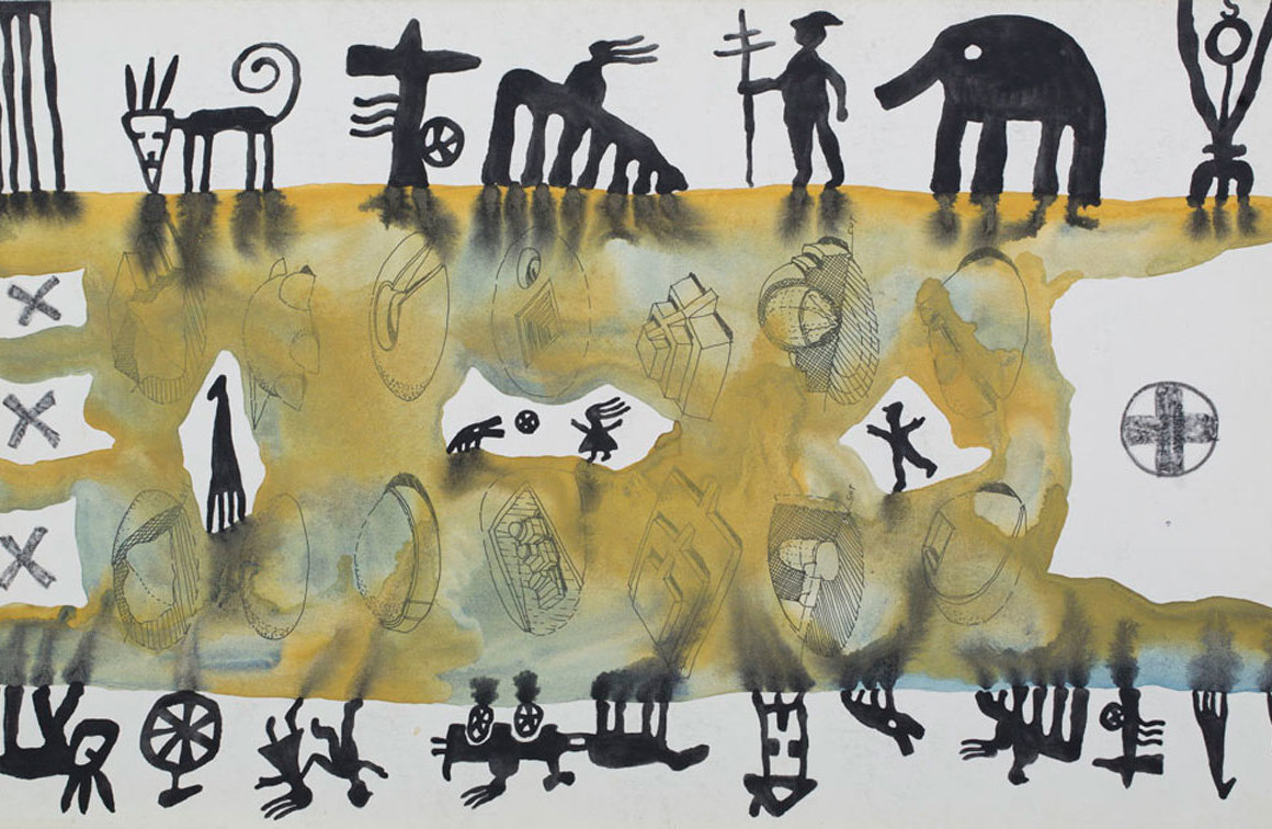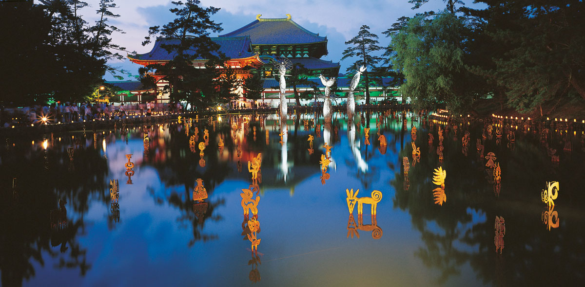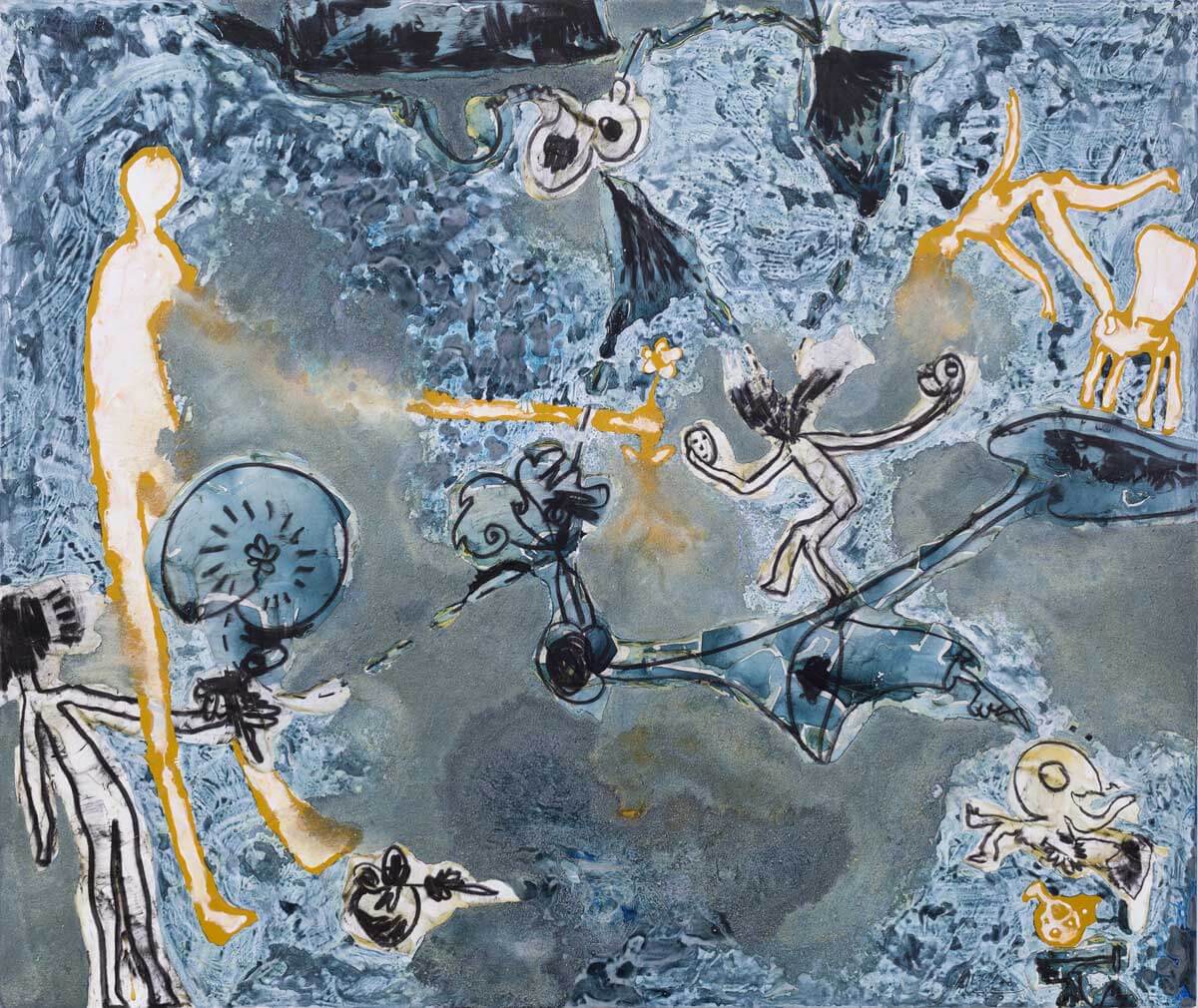
‘Geller’, 2024, on display at Bernard Frize’s upcoming exhibition at the LA branch of Marian Goodman Gallery.

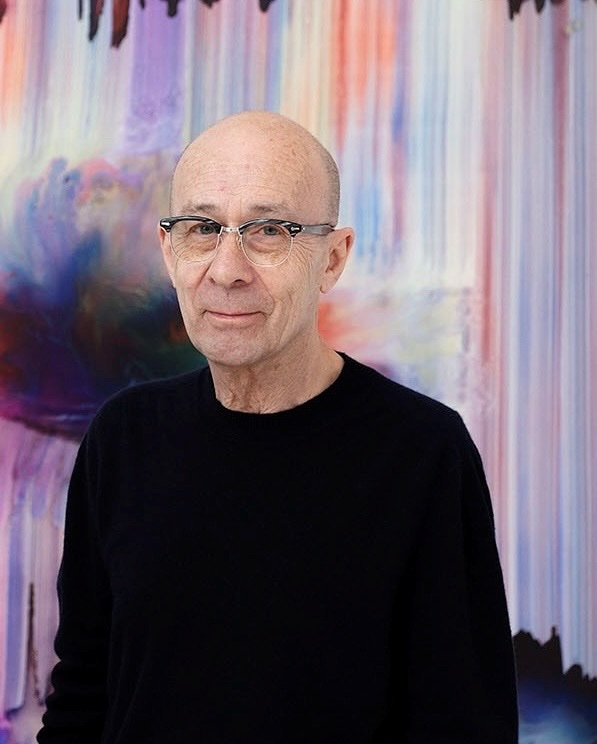
Bernard Frize is an artist who lets the materials decide for him. A French painter who has been developing his uniquely industrial practice over the past 45 years, leading gallery Marian Goodman announced their representation of him in 2024. Ahead of his inaugural solo exhibition at Marian Goodman’s Los Angeles space, Cleo Scott asks him about process, materiality, and the role of the artist

LUX: Your works are centred around the process of creation. Can you take me through your process of creation of ‘Tama’, which will be on display in your upcoming exhibition at Marian Goodman in LA?

Bernard Frize: I’ve always liked the fact that my paintings are multicoloured, in other words that I don’t choose the colours and mix them. These paintings are very simple: large brushstrokes crossing the canvas vertically; there is an overload of paint on both edges because there is no beginning or end – could I say that the edges are in their raw state? In fact, I paint in both directions and I stop the brushstrokes before the end of the canvas. The latency, the veil which covers what has not yet explanation, but shows its potential, this is what I wish to call in these paintings.

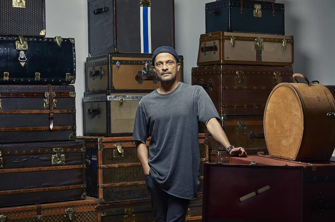
Bernard Frize photographed before his work

LUX: Your works ‘Tama’, ‘Kario’, and ‘Voni’ appear to have been made using the same process of creation. What is the relationship between your works, focusing on process and materiality?

BF: I’m always fascinated by the dissolution of the image into its materiality or by the creation of images from their raw components.

It reminds me of the birth of Aphrodite on the shore of Paphos and I like to imagine how to describe a picture, her body emerging from the waves, which could also be interpreted as a plunge into the sea. There is always this temporal ambiguity in the image, between diving and emerging, doing and undoing; each gesture stopped at a moment in its course could have been something different if we had thought of other options. The paint is wet and then dries.

I went to Paphos a long time ago and stared at the beautiful sea; now, the place of Aphrodite’s birth has become a waterpark.

When doing a painting, either there is no goal, no objective, or there are means and processes for doing something. There is no idea without its material inscription. I like processes to embody ways of thinking. There is always a sequence of operations necessary for the organisation of a painting; I like this organisation and its possibility to be the motif of a painting, because after all, the subject of a painting is what makes it exist, not only what it represents, but also how it is represented. The word itself, representation tells us that it is presented two times.

Bernard Frize’s ‘Voni’, which will be on display at his upcoming exhibition at the LA branch at Marian Goodman Gallery.

LUX: You have said ‘the method has disappeared under the conditions of its realisation’ in your work. Does this create a tension between your experience of creation and the viewer’s experience of its realisation?

BF: I will always feel and understand my painting in a different way than a viewer. A painting is not showing a recipe. Its description will, I hope, never exhaust what is in it. Why can we stay long minutes in front a painting in a museum, come back, and find again pleasure to see it? Isn’t it incredible that a canvas could provoke feelings and thoughts? Do we ever think about the painter? We mostly think about ourselves, how we receive the painting and decipher how the elements we look at are stimulating thoughts and feelings.

I always had some warmth enveloping me and a feeling of completeness from my visit in a museum. I am not receptive to all the paintings but looking at those which move me – and this is often changing – give me a feeling of wealth, of exhaustion. I hope my work can do the same; a work of art does not talk, does not say anything and will never be replaced by sentences. We read explanations on plates in the museums, do they satisfy our feelings?

Follow LUX on Instagram: @luxthemagazine

They give, at most, a context for the painting, and most people read them but do not look at the paintings more than the time it takes to read. The viewer and I have different goals; my work is to be as clear as possible to offer satisfying and intellectual pleasure which lasts and could be renewed.

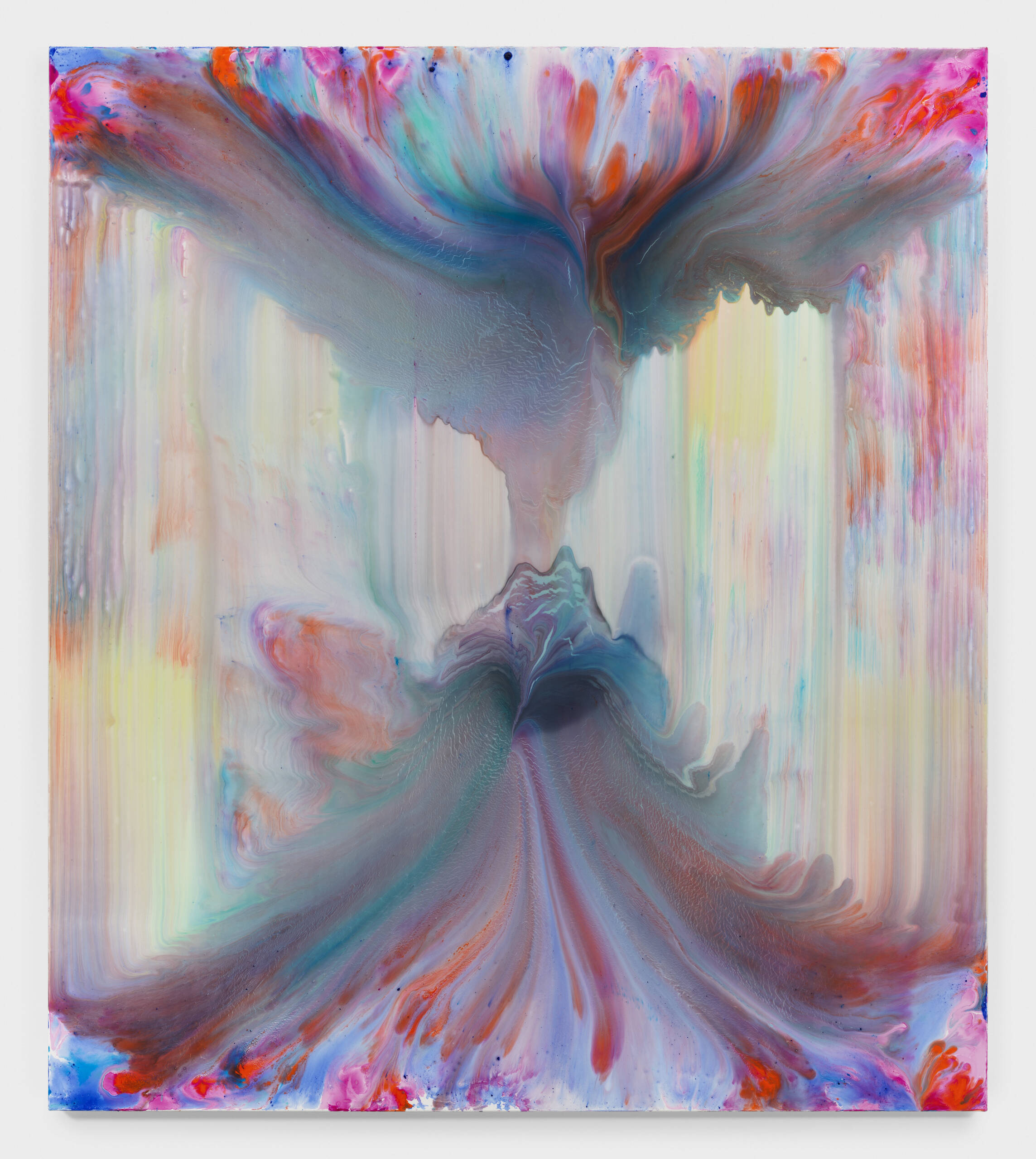
Frize’s acrylic and resin painting ‘Irfan’, 2024, as part of Frize’s inaugural solo show.

LUX: How does the space of the Marian Goodman gallery in LA interact with your works?

BF: I have no idea! I only know the beautiful cardboard model that the French branch of Marian Goodman Gallery offered me. I printed the reproduction of my paintings and hang them into the model. I know that when I will see the real space, I will have another experience and I will hang the paintings.

LUX: Why have you chosen to be represented by Marian Goodman?

BF: I had the chance to meet Philip Kaiser a long time ago when he was working in the Kunsthalle Basel and always appreciated his curatorial vision. I was thrilled when he proposed me to join the gallery; I suppose everyone in the art world pays respect for the achievement of Marian Goodman’s gallery and for the exhibitions of the artists it is working with. There was, for me, no doubt that being represented by the gallery would be a great opportunity.

In ‘Yudzon’, the transparency of the layers reveal ‘the creation of images from their raw components’.

LUX: Are there any values – aesthetic or philosophical – that you share with the gallery?

BF: A gallery is a business; painting is a business too. I’ve spent many years, if not the majority of my adult life, without earning much from painting. I believe one continues to do what one likes not for the money but because one is driven. At one point, I had the chance to work with galleries who helped me to live from my work and found ways to distribute my work.  There are many good artists at Marian Goodman Gallery who seem difficult to sell. I suppose it is a balance between the artists who sell well and those who don’t very much. The quality of their work is not a question. The aesthetic or philosophical qualities of these artists are not meeting market value, but aesthetic or intellectual ones. Meanwhile, the gallery respect them and decided to support them. Most galleries today would not do this, or would not afford it.

Read more: LUX curates for Richard Mille

I suppose running a gallery is an intellectual journey with companions you admire and you want to give them time to develop. In reverse, many galleries would not exist without the support of artists.

In my understanding, Marian Gallery is “old-fashioned” like one would say there is tradition in quality; there is a deep belief that good art is not always meeting the request of the market and it is important to give time to the time when the art is the main preoccupation.

Bernard Frize will be exhibiting his work at Marian Goodman, Los Angeles, from November 16th. 

Share:
Reading time: 6 min

Joel Mesler: Me, you and the sunset. Photograph by Francois Deladerriere

A striking new show by Joel Mesler brings nature, light and life to Château La Coste in the south of France, a place not short of any of these qualities. “Me, you and the sunset” is quite mesmerising

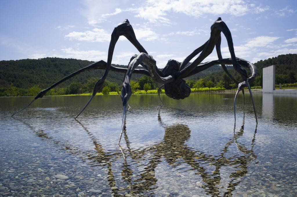
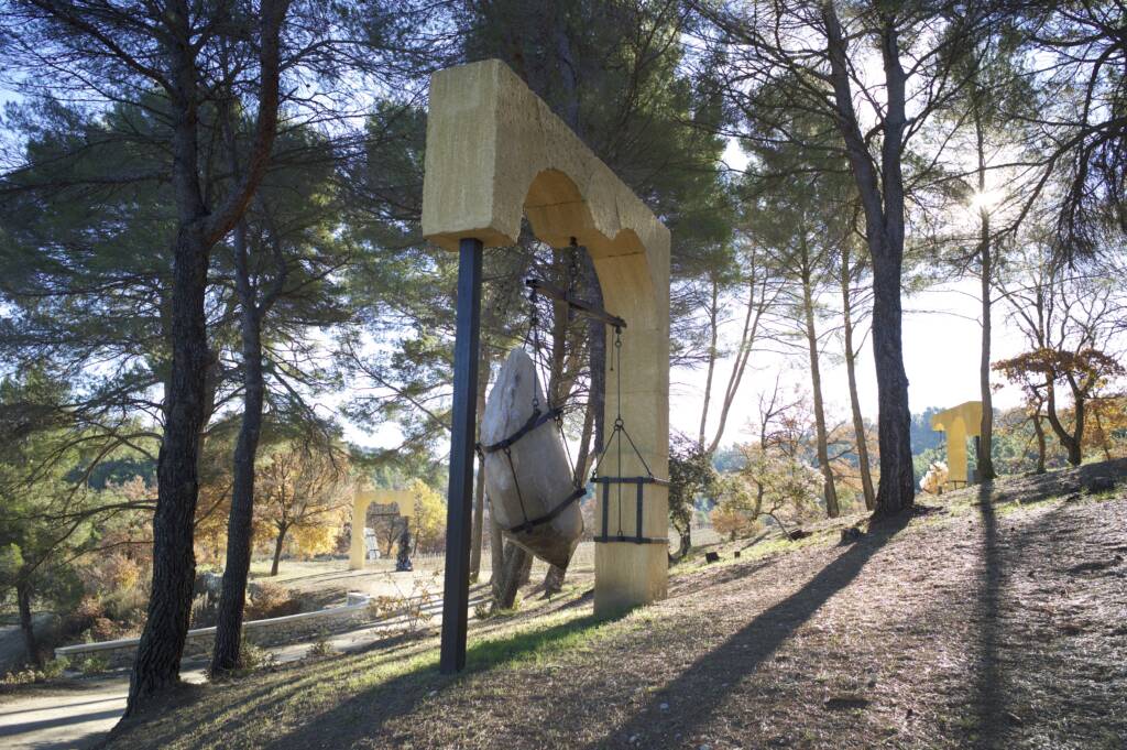
You can’t walk around the grounds of Paddy McKillen‘s Château La Coste without bumping into a museum-spec artwork. A Louise Bourgeois spider here, a Damien Hirst there, site-specific works by the likes of  TungaBob Dylan, Tatsuo Miyajima, or Sophie Calle there. In total, there are about 40 artworks in the grounds.

Crounching spider by Louise Bourgeois. Photograph by Andrew Pattman

Follow LUX on Instagram: @luxthemagazine

Psicopompos by Tunga. Photograph by Andrew Pattman

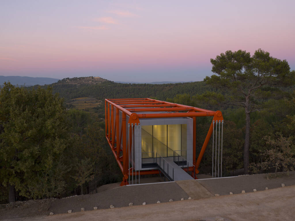
As if that’s not enough, the estate complex in the heart of Provence also has three exhibition pavilions or galleries that host temporary and rotating exhibitions.

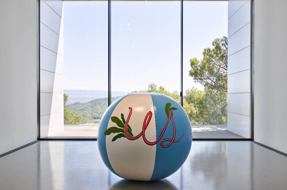
This summer, Californian artist Joel Mesler is showcasing his exhibition “Me, you and the Sunset” in the gallery designed by architect Richard Rogers.

The Richard Rogers Gallery at Château La Coste

Mesler’s show is inspiring. His twelve new paintings represent a series of connections between an individual (the self) and the landscape, as well as the people within it.

Joel Mesler: Me, you and the sunset. Photograph by Francois Deladerriere

The body of work reflects Mesler’s own views during his visit to the Château the previous summer. The paintings and sculptures, reflect the luminous sunsets of Provence.

Read more: MedBodrum: A New Type of Luxury Festival

There’s hints of Van Gogh there, but also the Californian in Mesler, who seems to pick up on the refractions and shades created by the Saharan desert dust that the high atmospheric Sirocco winds carry northwards here, a link to the desert skies in the east of his home state. Mesler’s paintings tell woven, personal tales.

Joel Mesler: Me, you and the sunset. Photography by Francois Deladerriere

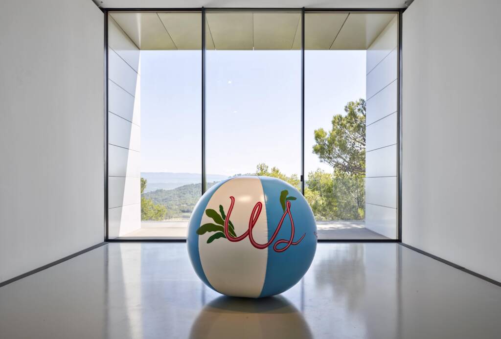
The colorful, almost neon-like glowing paintings feature simple words like “ME,” “YOU,” “LOVE,” and “SUNRISE,” reflecting the recurring themes in Mesler’s art.

Read more: Nachson Mimran’s photography at the Leica Gallery

They serve as a reminder of the iconic Beverly Hills Hotel in Los Angeles, which was a significant part of his youth. And also of the artistic links between southern Europe and southern California, an area fortified by this strikingly curated show.

Joel Mesler’s exhibition “Me, you and the Sunset” can be visited from July 7th until September 8th, 2024, every day from 12:00 p.m. to 6:00 p.m.

chateau-la-coste.com

Share:
Reading time: 2 min

Boutique hotel La Fiermontina Luxury Home is an homage to Antonia Fiermonte and the two artists who loved her. The garden shares its ancient city walls with Lecce

Lecce, the most celebrated city in Puglia, comes at you unexpectedly, like many of Italy’s gems. You drive past vineyards and olive groves, go through some unremarkable suburbs and then suddenly you are faced with a wall and gate of Roman origin. Once inside, the streets shrink and are cobbled; but what looks like a cluster of ancient buildings also houses more treasures within.

One of these is La Fiermontina Luxury Home, the city’s most celebrated hotel, set around a garden and olive grove within the ancient walls. The owners have just opened a new property, the Fiermonte Museum, 50 metres away down a quiet cobbled street.

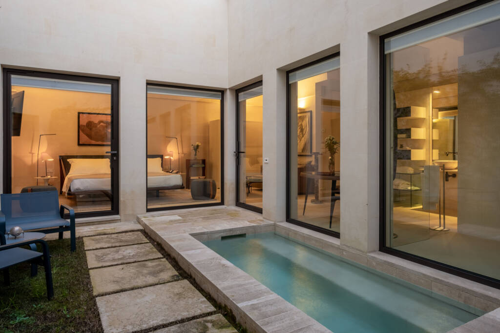
All rooms and suites of La Fiermontina Luxury Home are inspired by traditional local buildings and are full of character, decorated with vintage and high-end antique pieces

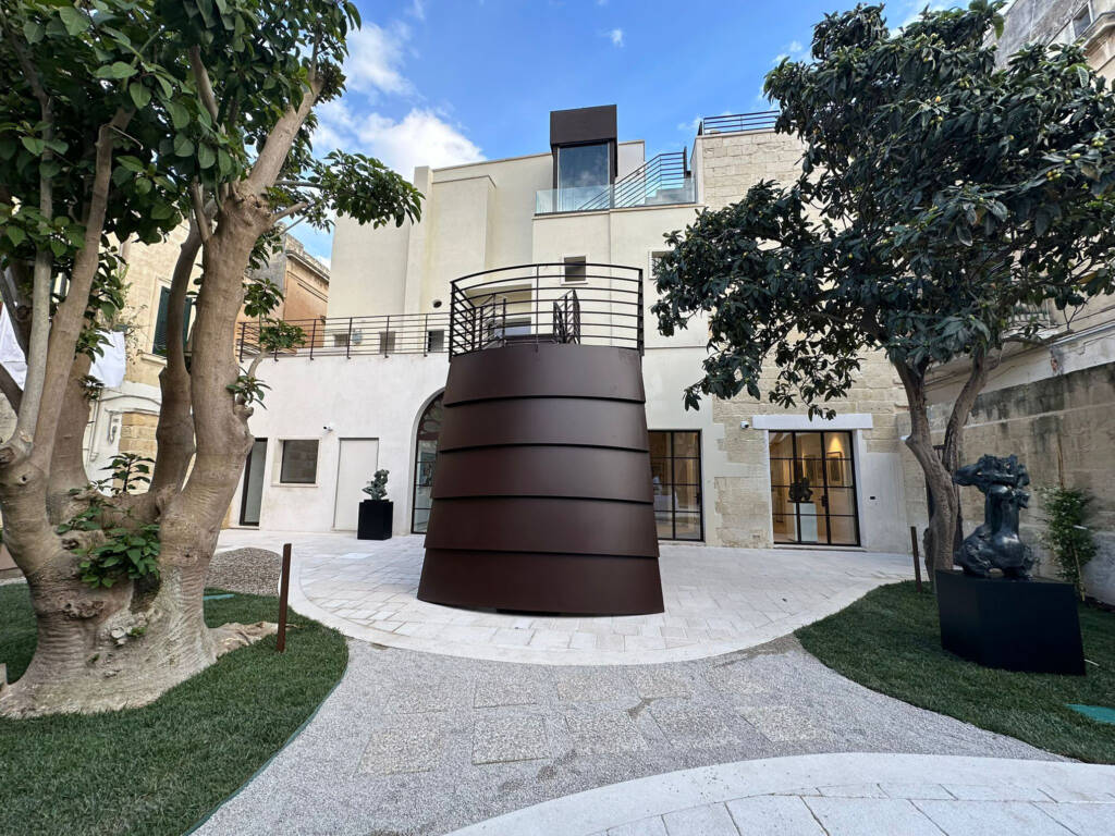
Turn  right at the old lady who spends her days sewing, sitting on a chair on the cobbles, through a latticed iron gate, and you enter into a bijou courtyard, surrounded by lush trees – you could pick your own loquats certain times of the year.

Under a newly built staircase – the whole construction is new out of old sit two sculptures, and the art theme continues when you walk through the first floor terrace and slide the glass doors open, to be greeted by an array of sculptures and paintings.

Follow LUX on Instagram: luxthemagazine

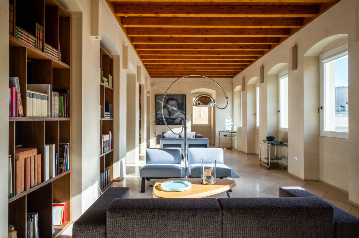
Our room had high, vaulted ceilings, showcase artworks and furnishings – the Fiermontina team are masters at creating contemporary art and design elegance out of historic landmarks.

The artworks around La Fiermontina Luxury Home are part of the carefully selected collection, and the architecture tells a story of the family’s ancestors and the country’s history

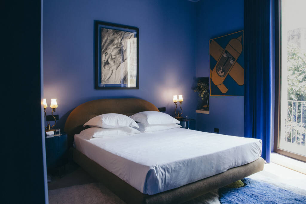
The Suite Nocturne of the Fiermonte Museum is covered in blue tones and music-themed

Ceilings and curtains were a deep blue, the window looking out onto a lush tropical treescape (all this within the old town). It was utterly peaceful, silent both at night and during the way, yet a couple of minutes stroll along the cobbles takes you into the heart of the old town.

Read more: Artists In Conversation: Michelangelo Pistoletto and Pascale Marthine Tayou with Maryam Eisler

The Fiermonte Museum consists of works from the Fiermonte family’s private collection, taking visitors on a kaleidoscopic journey through 20th-century art

This really is a Museum with rooms: you are given tickets, key card access and a lantern so you can access the museum in the same building at night. And then have breakfast in the courtyard, with an utterly bijou buffet served by your own staff – it feels like staying in a private home, more than a hotel.

We had dinner on our last night at the Zephyr restaurant.

www.lafiermontinacollection.com

Share:
Reading time: 2 min
Gabriel Scott Design
Scott

Portrait of Scott Richler, founder and creative director of Gabriel Scott

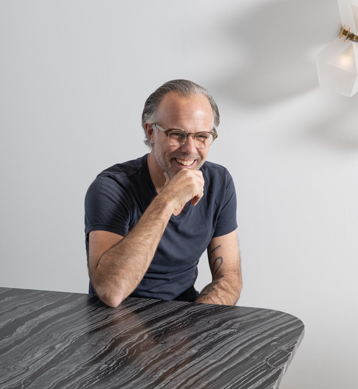
The furniture and lighting studio Gabriel Scott was founded in Montreal, by Scott Richler. It was established in an effort to blend his jewellery design experience developed over many years to designing lighting and furniture. He speaks to LUX about the process behind it and how he focusses on craftmanship and exquisite materials

Q: Where do you draw inspiration from your furniture and lighting?  Which brands, or elements of brands, inspired you when you began your design line?

Scott Richtler: Mostly the language of our Gabriel Scott pieces is based on some prior experience in my life.  Mostly from the time I spent in jewellery design and fashion with a separate brand called Jennifer Scott between 2000 and 2005. I created statement jewellery from semi-precious stone.

This led to a career in design, mostly in women’s accessories like handbags seen in Bergdorf’s and Neiman Marcus. Working in high end fashion design meant I developed a high range of design skills learning from the best artisans in Italy.

Before this though I had an architecture background, so I have macro scale and smaller scale design experience; I like the immediacy of this, I speak many different design languages.  I’m into details and you can see the story of my background come through into our lighting fixtures.

Gabriel Scott Design

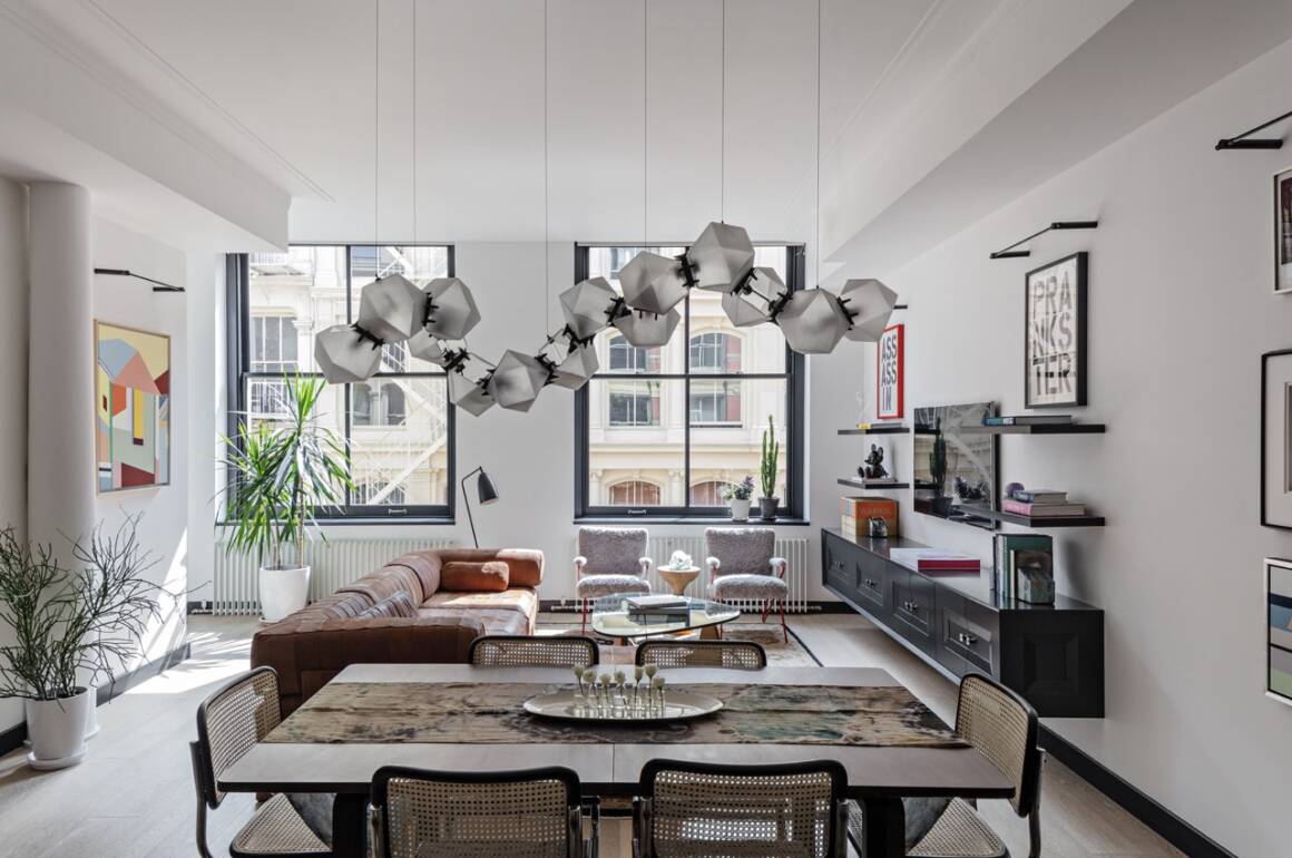
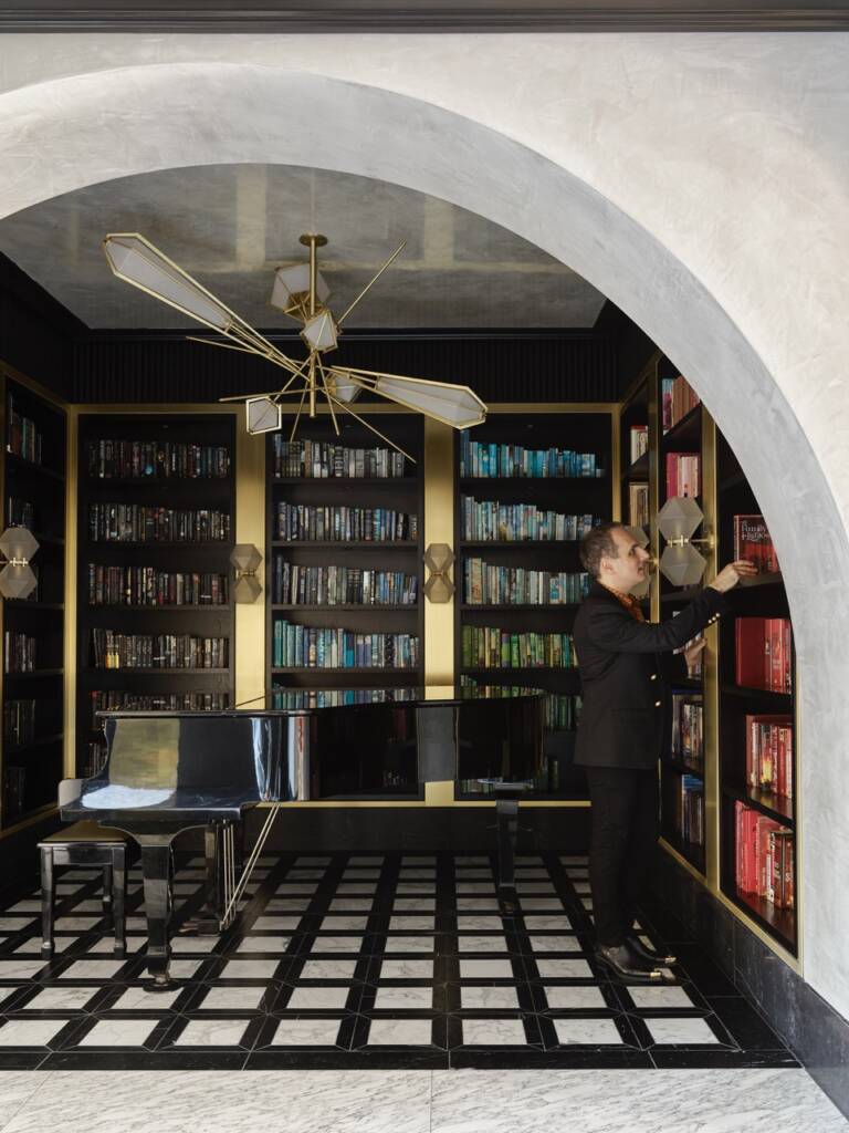
The Welles Glass Chandelier, curated in essence of timeless jewellery

Q: In the 18th century, furniture was elevated from functional pieces to works of art, acting as a status symbol in the Victorian home. What would you say is furniture’s symbolic purpose today?

SR: The function of an architect is to look at a space and interact with it. Furniture and lighting are all objects you interact with in one way or another. Everything in your life surrounding you has a form of dialogue around it.

Furniture can be seen as sculpture or more precisely functional sculpture. It’s also about how the user of that space interacts with the environment. Decorative lighting can be viewed as a pretentious status symbol and pretentious pursuit.

Decorative lighting is functional but not totally necessary in a home. Decorative lighting is a focal talking point, creating interest and texture in a home, it is an elevated art form in this sense.

interior

Greg Natale’s East Brisbane house in Australia: This riverfront residence combines interior architecture with the layering of sumptuous finishes to create a “modern palazzo” that celebrates its owners’ deep connection to Italy.

Q: The lighting industry now faces issues with regard to electricity usage and sustainability. How do you combat or navigate these issues, and how do they challenge your principle that designs should be ‘Timeless’?

SR: Gabriel Scott designs use low LED’s and these drop very little electricity, you could keep them on forever and they’re very environmentally friendly. I’ve always approached design through timelessness because it should be like this.

Gabriel Scott furnishings and lighting are classic with longevity just like Chanel. You can wear a Chanel piece from 60-years ago and it’s still as contemporary in present day today. I’m in the camp sitting with vintage Porsche’s being more sustainable than Tesla’s.

The amount of investment required to build a Tesla that will be used for no-more than 10-years is less sustainable than driving a Porsche that’s been on the planet for 50 years. Investing in a Gabriel Scott light is much the same, it’s an investment which will stand the test of time and last.

Q: How else does Gabriel Scott engage with sustainability?

SR: Like a fine designer quality brand, Gabriel Scott’s pieces are investments, well made, amazing materials with longevity.  The materials come from the earth, they’re minerals and glass is recyclable. We use materials that are long-lasting, if you invest in our furnishings they will last forever and you can move with them from home to home.

I do feel strongly that the word sustainability needs to be used carefully by companies. There are so many brands out there greenwashing their companies in a way that is detrimental to the wider sustainability agenda.

Q: Is it important for contemporary art to be functional as well as aesthetic?

SR: It’s not important for any art to be functional.  The dialogue of art is to not be functional whatsoever. As a matter of fact, if it’s not functional, sometimes it creates more questions in the user, which therefore creates a dialogue that may be intentional or not.

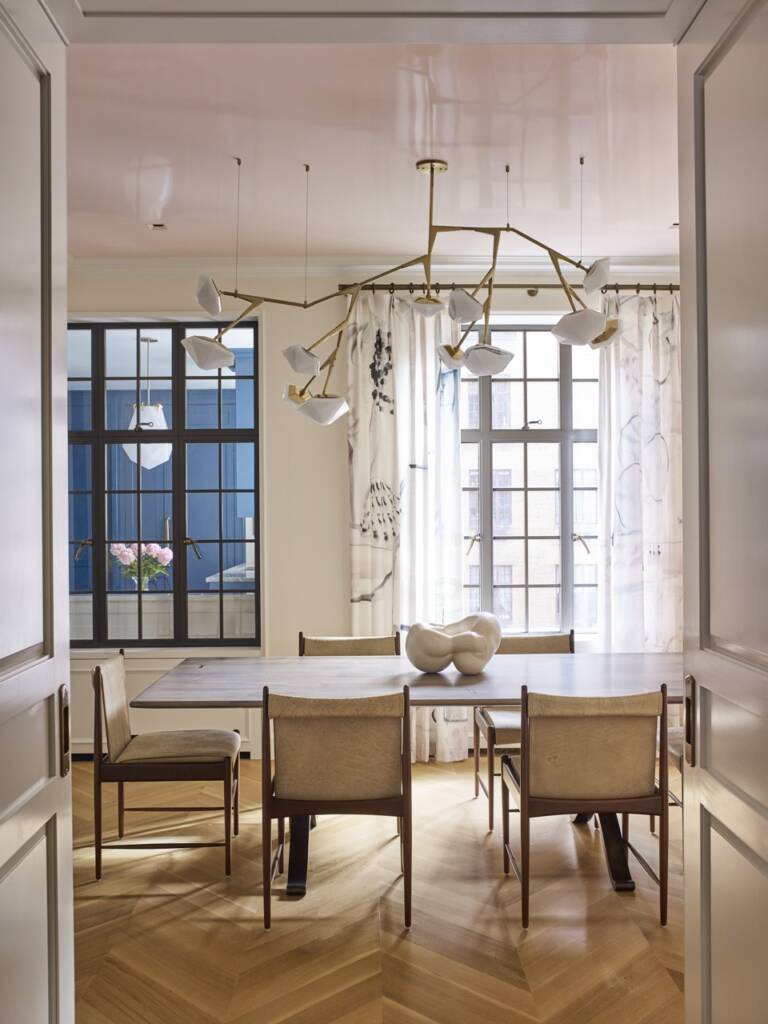
The Welles Long Chandelier 17, Smoked Purple and Gray Glass. The Welles collection was coined by notable architect and designer, called David Rockwell.

Q: Would you say furniture and lighting are of increasing importance in the art world now?

SR: Lighting and art in juxtaposition are increasingly important and the majority if not all high-end clients have both in their homes.  We’re recognizing this and from May our London showroom will be welcoming in the Virginia Damsta gallery.

We’re creating a art and lighting gallery with an inaugural exhibition, titled “The New Artists: When Machines Dream” departing from the conventional white cube concept, we’re going to be presenting a synthesis, a symbiosis of art and design. This fusion illuminate’s artwork and creates a harmonious interplay between art and design.

Q: What key changes have you noticed in lighting/furniture design since you founded Gabriel Scott in 2012?

SR: I’ve seen a shift culturally, pre-2012 most high-quality furniture and lighting was manufactured mostly Italian.  Italy is known for being refined and creating the best.  But most of its industrialized and this was the key to the Italian success, being able to industrialize production of beautiful lamps and furniture.

For the last 10-years, there’s been a pivot towards a more artisanal approach. A much more hands-on, handmade approach to furniture and lighting which is more appreciated. The shift has been from the benchmark of quality Italian pieces which have been industrialised. Not the benchmark is more artisan like a carpenter trained in skills from hundreds of years ago which is just exquisite so there has been an elevation.

Q: Do you feel like people are getting more adventurous with their lighting?

SR: Yes I 100% agree with this, but if you look back into time you’ll find plenty of people who were adventurous with design. For example, if you look into interior designer’s in North Carolina, it would not have been surprising to find a sculptural element to a wall sconce in a Gio Ponti house like 50-60 years ago.

You would find sculptural lighting, it just was something that was very European it never really traded into the sort of mass market.  The general public are more conscious about lighting due to big interiors companies being more adventurous with media campaigns.  Decorative lighting has kind of become the norm – with more people on board!

The Myriad Chandelier, 12 Long. The chandelier projects a warm light through its double-blown glass and is hand-made to order.

Q: With your background in architecture and fashion, you interpret decorative lighting as larger scale jewellery. How else has your experience in the fields impacted your perspective on interior design?

SR: I’ve taken inspiration from many great interior designers such as Joseph Dirand. My perspective on interior design is that you can easily interpret a space through the objects that populate that space. My perspective is being an interior designer doesn’t necessarily have to be a maximalist pursuit.

You don’t have to put a great deal into a space to make it special. You can put in an amazing table, piece of art and light fixture – the look can be pretty minimalist. But there’s something unique and special about it is because of the objects in space.

Q: Are there any elements of different brands that have inspired your line?

SR: I love to look at jewelry lines like Pomellato, Cartier and De Beers for inspiration for our lighting. A discontinued Cartier ring inspired the Harlow light.  The ring was like a series of balls that are cold and explode.

In terms of furnishing’s I find Gio Ponti inspirational. Buckminster Fuller is an incredible inspirational architect. I’m enthused by Olafur Eliasson the artist. So its varied, it doesn’t come from furniture traditions. It’s just like images that are blended.

www.gabriel-scott.com

Share:
Reading time: 7 min

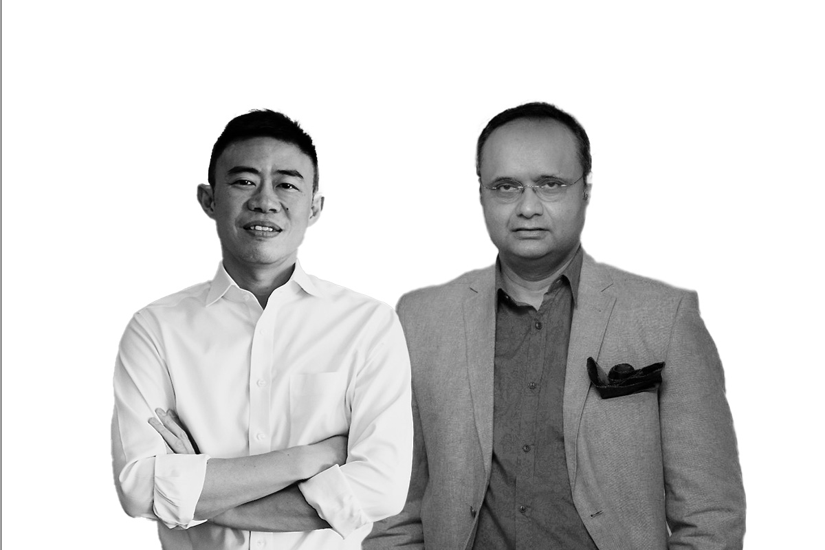
Alan Lau and Durjoy Rahman. Photomontage by Isabel Phillips

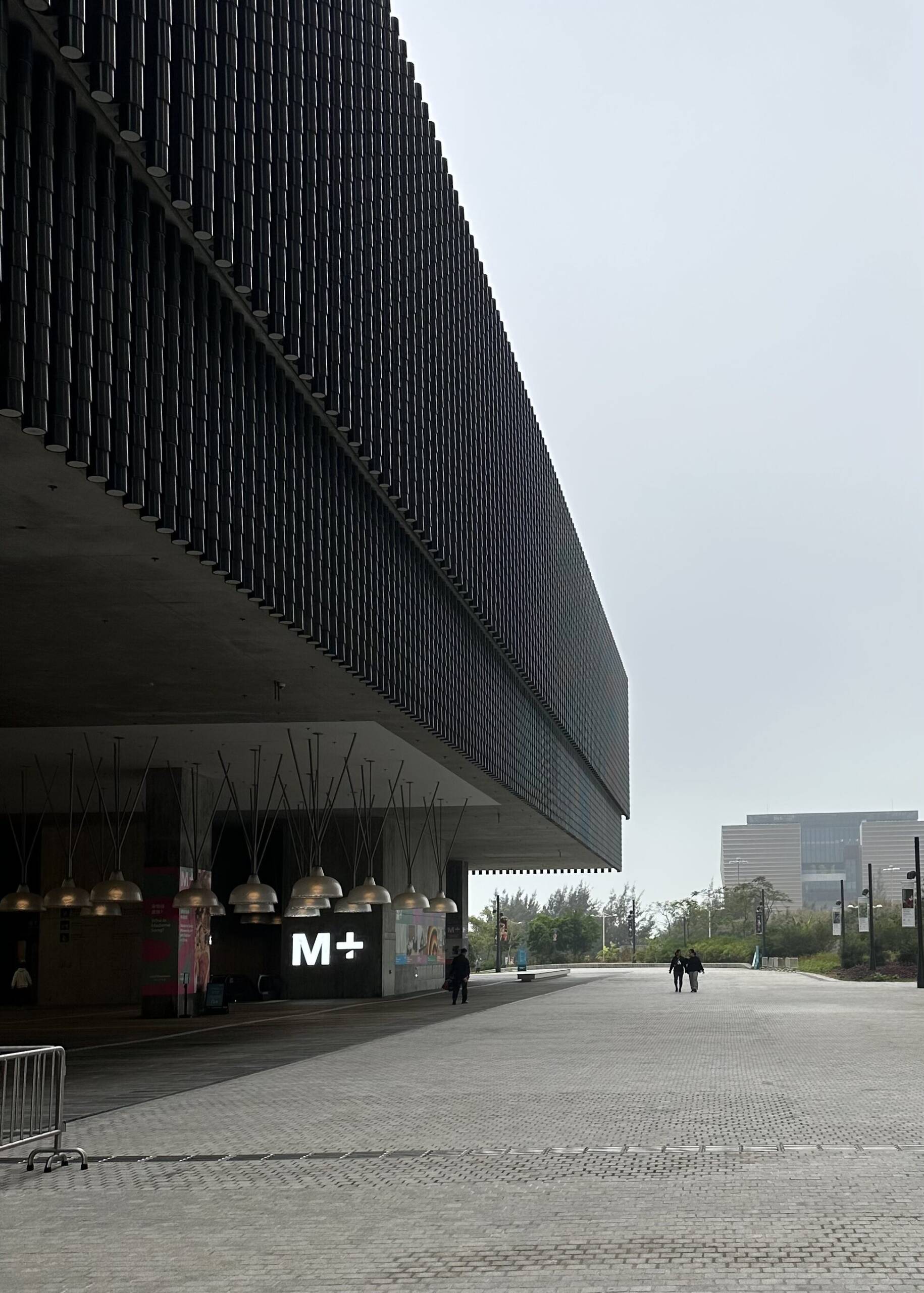
Alan Lau is Vice Chairman of M+ Museum, the era-defining new institution in Hong Kong’s West Kowloon district. Here he speaks with philanthropist and collector Durjoy Rahman about why private individuals need to support artists and art activations, and how Asia is moving to control its own narratives in the cultural world. Moderated by LUX Leaders & Philanthropists Editor, Samantha Welsh

LUX: Why is private philanthropy and engagement important in bringing art to a broader audience in general and particularly in Asia?

Alan Lau: Private philanthropy and patronage are critical because governments rarely cover arts funding entirely. The percentage contribution from UK public sources is higher than in the US but patrons are needed not just for the money they bring in but for their networks, resources and connections that enable museums to develop.

One particularly interesting phenomenon is China where there are over a thousand private museums established by collectors. Many are located in Beijing, Shanghai and the largest cities, but a lot of them are set-up in corporate headquarters or the collector’s hometown, bringing art to a community that may not have had access to art before.

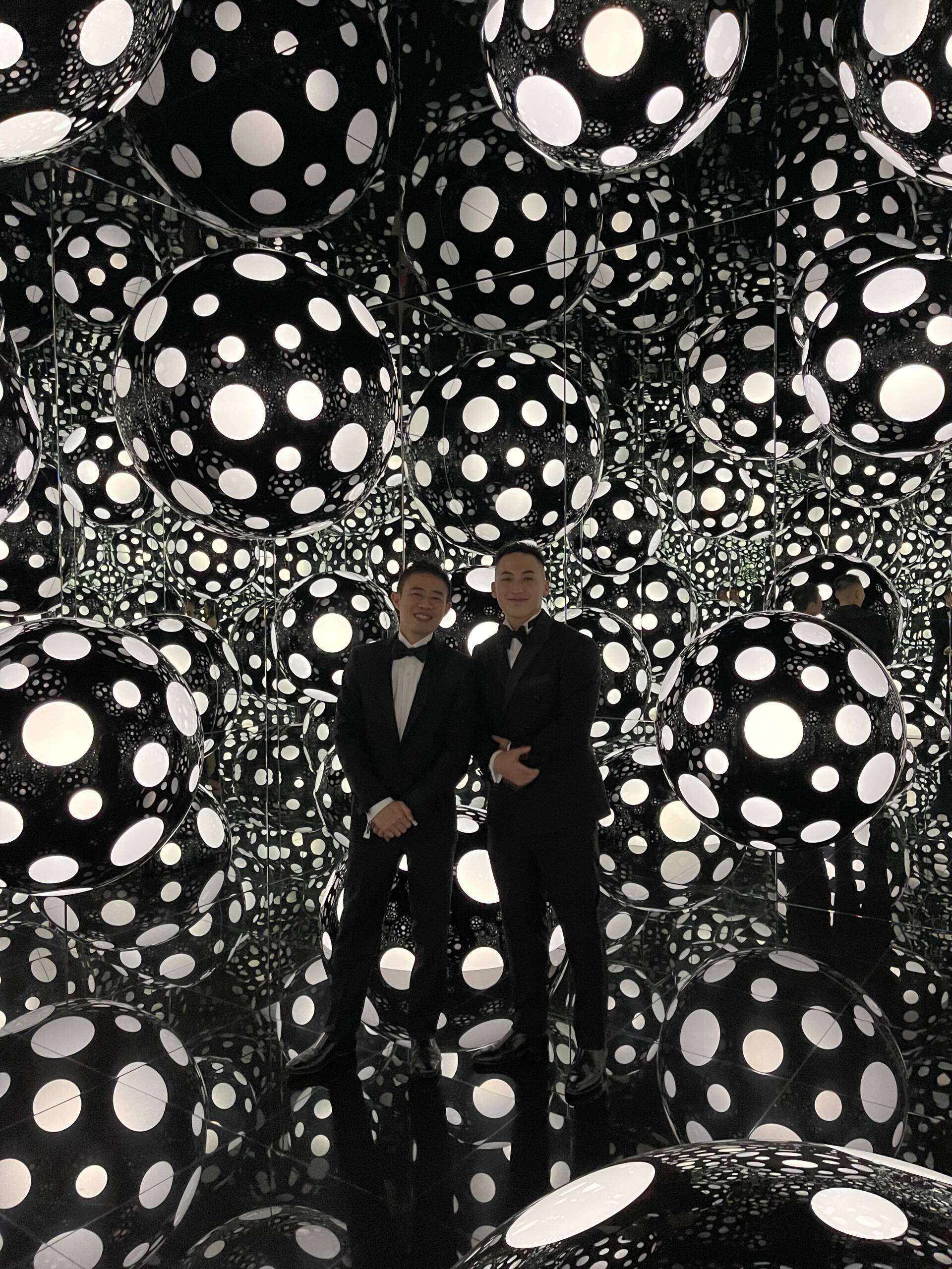
ALAN LAU AND HIS FRIEND IN SUITS ON BLACK AND WHITE BACKGROUND

Alan Lau within the exhibition, ‘Yayoi Kusama: 1945 to Now’

Durjoy Rahman: Conventionally art philanthropy was the preserve of a small proportion of society. Patronage was offered by this tiny minority for centuries until now, in the 21st century. This is a new era for patronage. For our foundation, patronage involves strategic social investment into creativity and innovation for the wider public benefit. It takes account of our collective history, original cultures, and future directions and fosters the development of a more equitable, sustainable society.

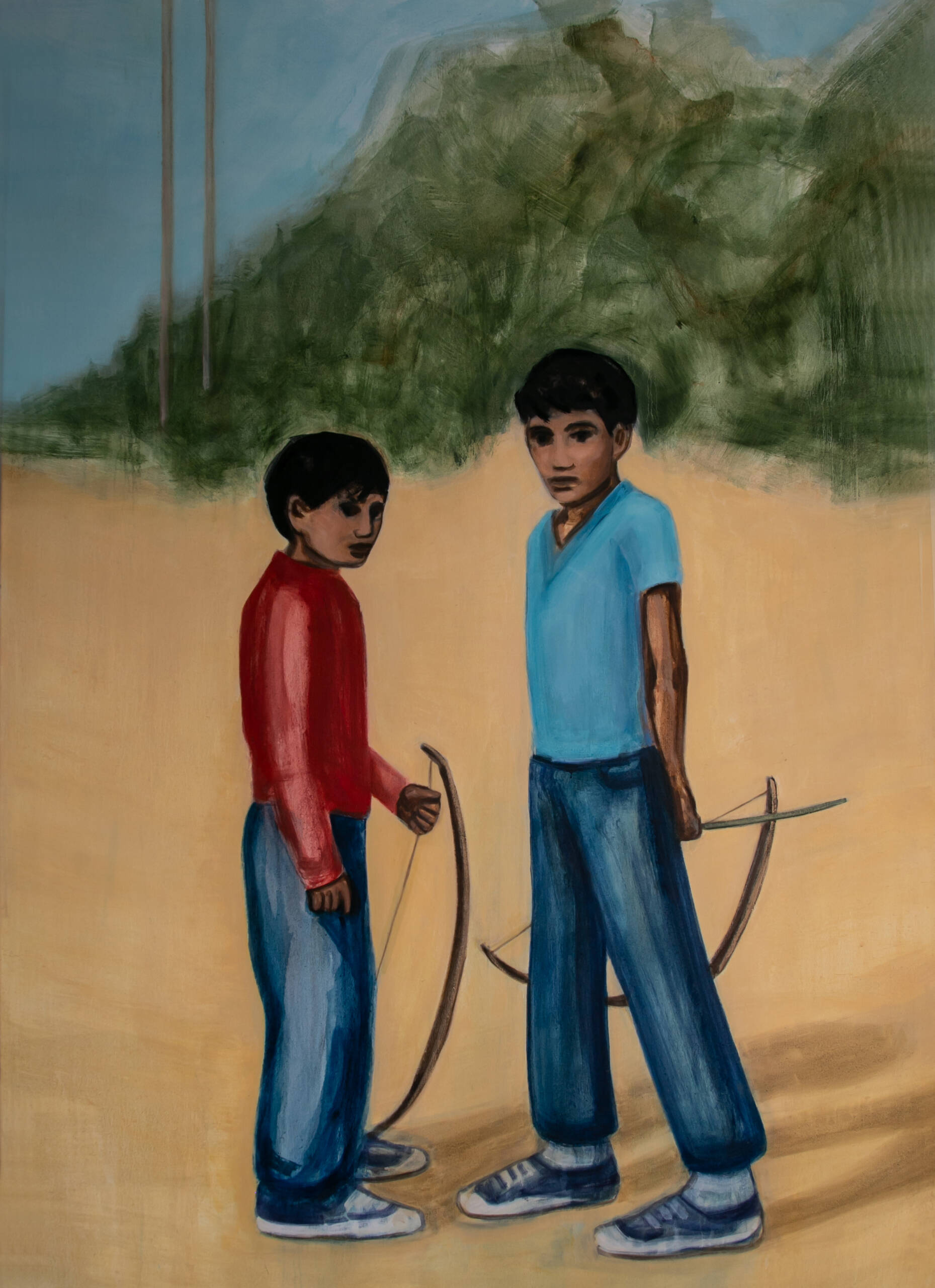
two boys standing next to each other holding bows and arrows

‘Archers’ (2021), by Matthew Krishanu, from the Durjoy Bangladesh Foundation Collection

I am a business owner but I still felt that the economic landscape of GDP and foreign investment are not the only way to measure the development of a society. Art and culture help define who we are and where we came from, give rein to our imagination and support social justice.

LUX: Why is that particularly important in Asia?

AL: The benefit of not having a long history of arts philanthropy is that people experiment with different models. When wealth creation happens in this part of the world, it comes with the tradition of giving back and that is where the phenomenon of museums founded locally back in the hometown came from. The idea has propagated only over the past decade really.

Follow LUX on Instagram: @luxthemagazine

LUX: How has patronage and philanthropic support for institutions changed? And how should it change?

AL: It has always been the private patrons who have funded programs and supported curatorial roles, put their names on buildings and so on. There has been innovation in the institutional space about 20 years ago, starting from TATE Modern setting-up International patron groups in North America, Asia, MENA and growing to over ten committees. The Guggenheim and Pompidou have something similar. These patron groups bring people from different regions to support programming, curatorial research and exhibitions. So these are not municipal museums but institutions that serve a global audience and have a global perspective. The global patrons help attract resources into specific acquisitions and research. This is relatively new for museums. With corporate sponsorship too there is a lot of change.

DR: With patronage, we need also to open a conversation about overcoming cultural barriers. South Asia has a long history of art and culture but also long history of being colonised. So our arts and cultural heritage have not been projected properly. When global art movements started, the major arts and cultural institutions were set up in Europe. This meant that our legacy was not represented or discussed. The arts’ press, academics, art writers, also all were European, so there was no discussion or projection of our art heritage. We were left behind.

So with art philanthropy, what has changed over the past decade, has been led by major biennial art fairs and significant curatorial institutions, particularly in China, in Hong Kong like M+, India, Dubai and Saudi Arabia where I was recently in AlUla and Riyadh. We are all reassessing our lost identity, which was always there but not at the forefront simply because we did not own our story or have the press and art critics onside. You can have magnificent works but it is not enough if no one shares it with the wider audience.

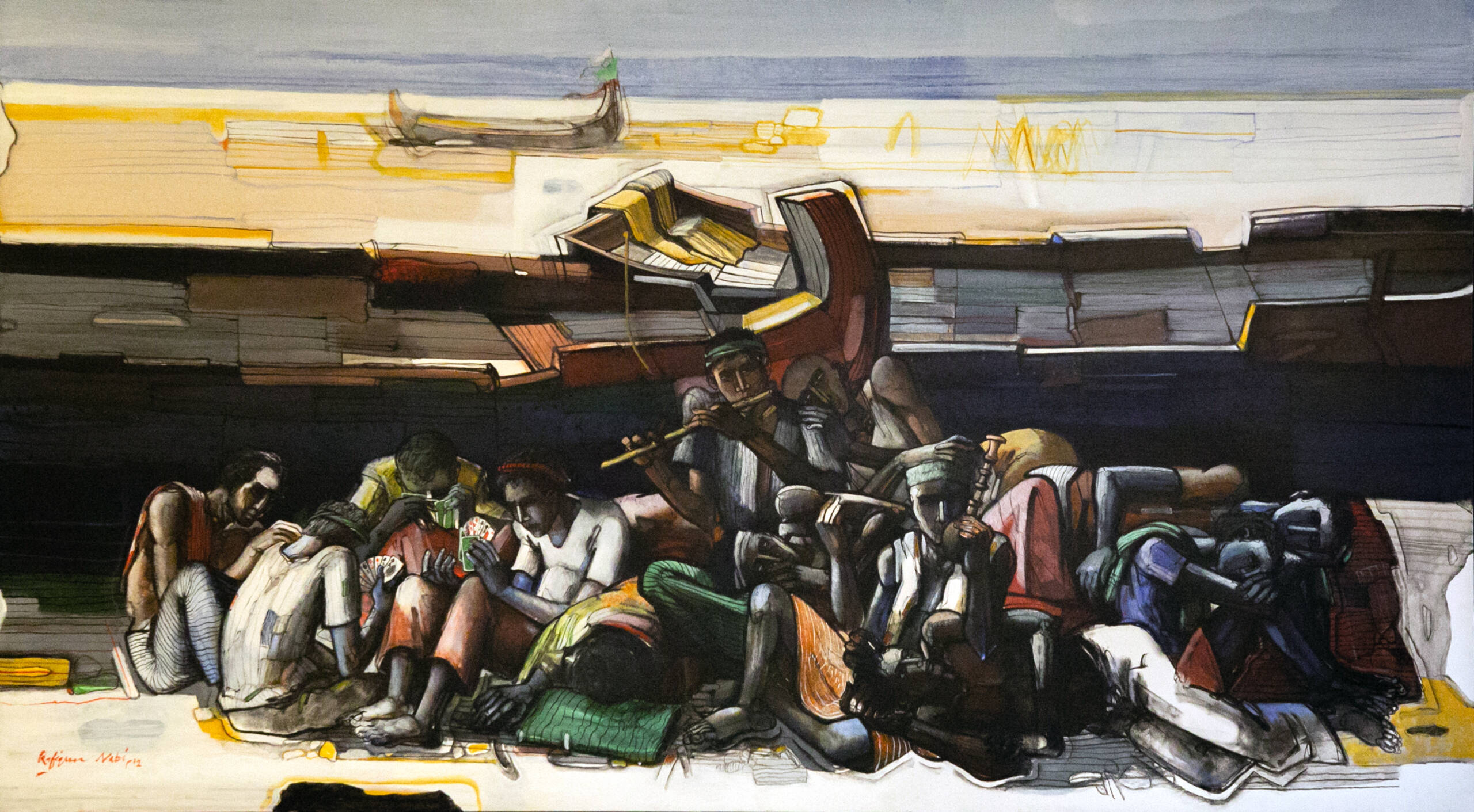
A ship

‘Fishermen at rest’ (2012), by Rafiqun Nabi, from the Durjoy Bangladesh Foundation Collection

LUX: How does Asia overcome cultural barriers to art in terms of its creation and appreciation, as it’s still not considered a ‘real job’ in many quarters?

AL: There is a deep history of art in Asia but it is interesting you ask why art is not considered a real job here. Once you say ‘job’ that says there is a market and assumes a market for local art. That is a very interesting topic for Asian artists right now and comes down to cultural confidence. We see that in Korea where Koreans collectors like to buy Korean art. Hong Kong collectors have begun to collect Hong Kong artists in the last couple of years, and the Japanese are famous for not collecting Japanese art. The Chinese collected a lot of Chinese art around the Olympics and now they’re back to collecting western art.

It really comes down to cultural confidence, to what they think is good, so it is very easy to gravitate toward the Anglo-Saxon and Western art world. It’s difficult, but it’s the gold standard for whatever is best at the time, from Picasso or most recently to George Condo or Jeff Koons. Locals need to learn to develop that cultural confidence to buy local and to support local art for culture to flourish.

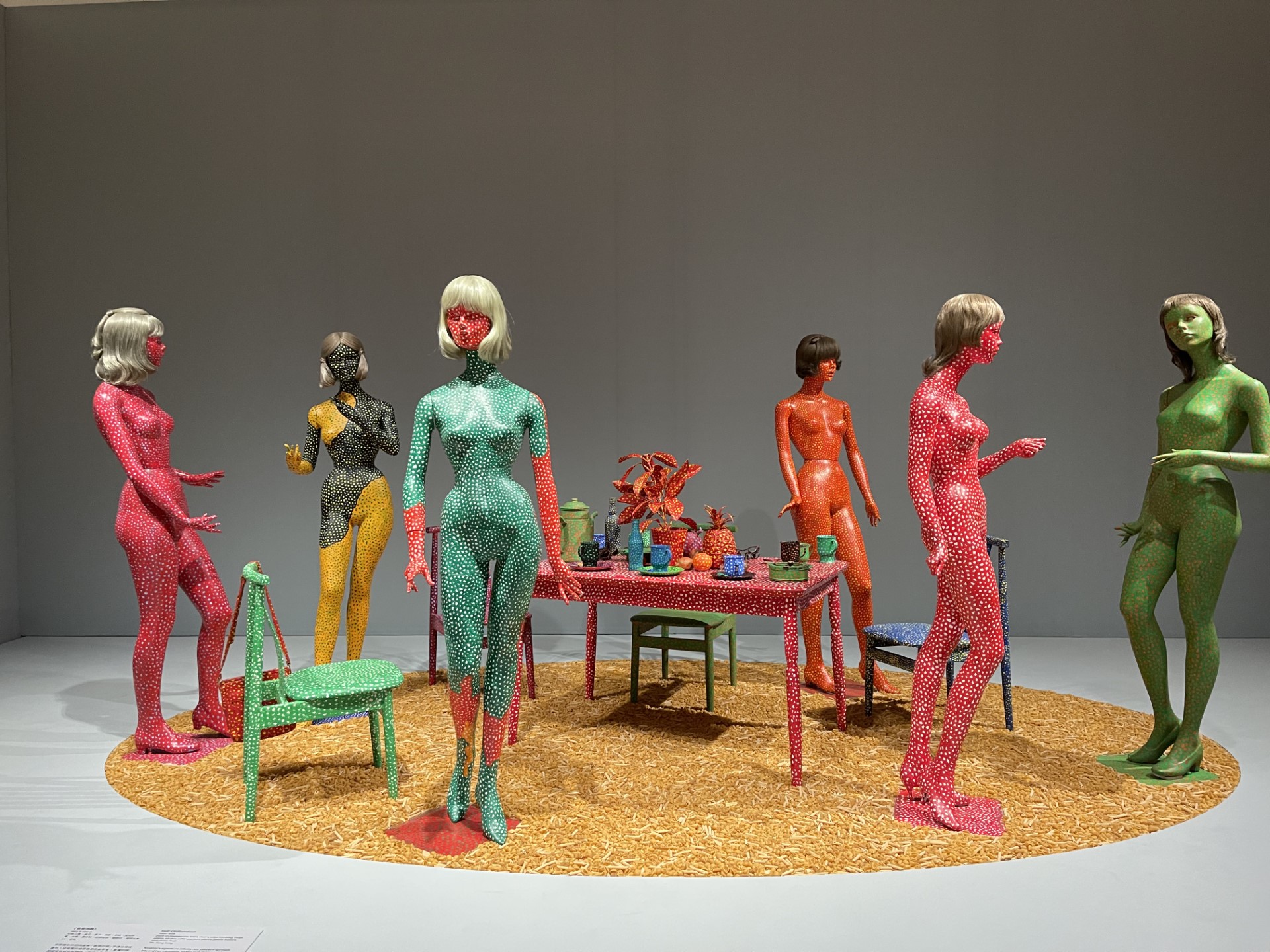
Colourful figures standing around a table

From the M+ exhibition, ‘Yayoi Kusama: 1945 to Now’

DR: When we talk about art markets, I agree with what you say, Alan. In South Korea, the Koreans are buying the Korean artists who are represented by the western galleries. So the locals are going to the western galleries originally from US and Europe, who are exhibiting at fairs in Korea, effectively buying their local artists via those western intermediaries.

In Bangladesh, as an example, we are a population of 180 million. If the 1% or .5% started buying art, there would be no supply in the market! So why is .5% of an entire nation not interested in buying art? It is because creative people, not only the artists but curators, gallerists, collectors are not creating the momentum to promote investment in art. And there is a problem with status and perception. In Bangladesh there is an appetite and a market for luxury brands but not for art. The wider audience does not aspire to buy local art.

In the western world, particularly where I have seen in France, Germany, Netherlands, Switzerland, and Canada where I lived for a long time, creatives are supported with subsidised housing or studio space so they can afford to produce art. That just doesn’t exist in a country in like Bangladesh. Artists graduate from an important school but change their profession for a better life.

I was preparing a lecture for my HK session for Sotheby’s Institute and commented that In Bangladesh we buy a lot of western art. Why are we buying so much western art and supporting western artists? Forget about aspiration, many of those artists are time-tested investments and our local artists are not. George Condo or Ai Wei Wei will be keeping value for decades. I want to and do support local artists but it’s a bigger picture.

LUX: How does Asia become a leader in art rather than participating in the so-called western gaze?

AL: No one will tell your story, you have to tell it yourself! While I love the Met or Tate or Guggenheim’s China show or Korea show, that is a fantastic spotlight but it is you who understands your story. One of the inaugurating shows of M+ was with Kusama and I think it was us telling that story from here in Asia that gave it a very different texture.

THE OUTSIDE OF A MUSEUM WITH A MODERN LOOK AND A GREYSIH SKY

M+ Museum, is Hong Kong’s cultural hub for twentieth and twenty-first century art encompassing visual art, design and architecture, and moving image

M+ was set up to do just that, to be a Museum for Asia. One of the most touching things for me, two years after our opening when we welcomed the first group of visitors, was the overwhelming comment I heard from people saying is ‘Thank you! This is my Museum!’. These are not people from Hong Kong but from South Korea, Japan, Singapore and they see themselves in our collection. This is an Asian museum giving a voice and creating narratives and telling stories from an Asian point of view. We need more institutions to do that. You need to tell your own story.

LUX: What is it about being from Hong Kong and Dhaka that has contributed to your identity and vision for collecting?

AL: My collection is about stories that I feel privileged to talk about. The collecting vision is a reflection of who I am, which is someone born in Hong Kong, living in the city when it was a British colony, witnessing HK’s transition back to China, living through big changes, seeing the economic rise of China and the issues that come with all of that, living through all the tech development, broadband, now video, now AI. I have a strong link with artists from HK and the region and a strong relationship with technology with the context of my day job.

A BLUE PICTURE ON A WALL WITH SOME BOOKS IN FRONT

From Alan Lau’s expansive collection

DR: Dhaka is important in South Asia but for me Hong Kong is the centre of gravity in the so-called Far East because it is a connector to APAC and South Asia. Hong Kong and Bangladesh already had a connection historically and we represent a new “silk route”. We need to create Asian art power by amplifying the patronage of institutions like M+.

LUX: In what ways can innovative artists capture the essence of our time and realities?

AL: Artists are story-tellers, here to tell stories of our time. The best art is time-stamped but timeless. For example, at M+ right now, the most recent M+Sigg collection show is a controversial work by Chinese duo Sun Yuan and Peng Yu. It is set in an old people’s home, created nearly 20 years ago, taking the faces of the world political leaders at that time, and fast-forwarding them to when they are 80 years’ old sitting in automated wheelchairs that go round the hall so you see all these old people roaming around. Twenty years’ on how funny it is our world is still run by grey old men!

DR: That is true and sometimes when we talk about innovation, that does not mean it has to be technological innovation. At the end of the day you are talking about art. We are really talking about mental science and inventive hands that influence because it is about newness and original ideas. Art can’t be boring, or monotonous because we are not forced to look at art. Art has to inspire us and innovation is part of that inspiration process.

A lung of fruit

Organic To Organ – V (2022), by Shimul Saha, from the Durjoy Bangladesh Foundation Collection. Crochet weaving, cotton yarn and cotton

LUX: How has your interest in innovation catalysed your collecting journey, Alan?

AL: I am fascinated by artists who are very resourceful storytellers. They always find find the latest technology or way of production to present their ideas in new ways that offer fresh perspectives. This creates all kinds of interesting dynamics in our human relationship with technology. We have futuristic, experimental tech, with artists like Cao Fei from China showing humans’ chaotic relationship with technology, Camille Henrot on the abuse of social networks, dystopic work from Jon Rafman, and then of course Beeple and other digital artists. We have a much more tense relationship with technology and that’s reflected in the artistic output and practices.

LUX: What are you looking forward to at the Venice Biennale?

AL: I’m definitely looking forward to what Hong Kong will present. Trevor Yeung is someone we know very well because we worked with him at ParaSite and we have really seen him grow. Another one that’s going to be in the main Pavilion is Isaac Chong Wai, originally from Hong Kong but representing the diaspora, based in Berlin, with a lot to say on global topics.

DR: There will be some artists from Bangladesh, India and Pakistan there and I will be looking out for their practices, how they respond to the concept that the curator has identified like displacement, the diaspora, identity and cultural history. I like go to a national Pavilion to see how that country is portraying their art and culture, rather than look for the presentation of a particular artist.

Read More:

mplus.org

durjoybangladeshfoundation.org


Share:
Reading time: 11 min
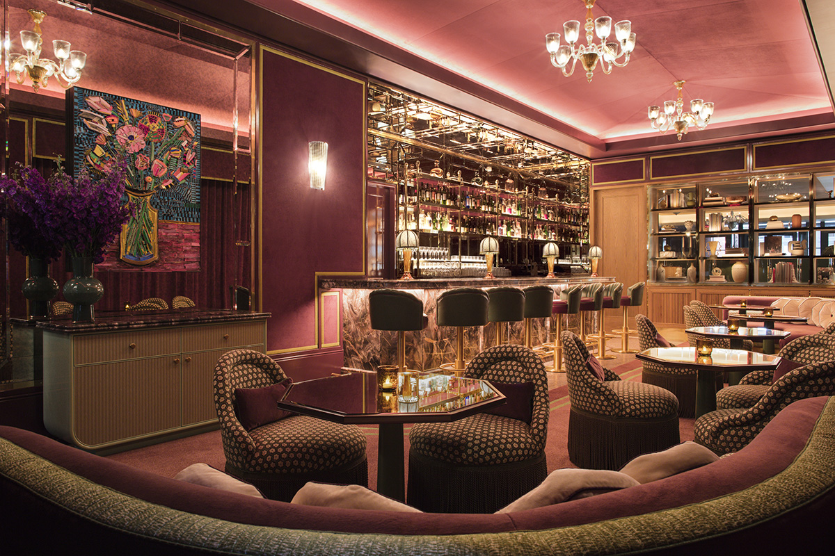
Bar with lots of drinks and lights and chairs and mirror
We check in to the Principe di Savoia, a palace hotel offering grandeur and glamour for anyone visiting Italy’s fashion capital, Milan
outside of a hotel with green plants and blue sky and balcony

Le Principe di Savoia is a grand palace building in central Milan

The trend among contemporary hotels to integrate the bar (and sometimes a dance floor) into the main reception lobby area was started by the original boutique hotelier Ian Schrager back in the 1980s. It accelerated with the development and corporatisation of hotels like the W hotel group, in the ’90s and 2000s, and now whether you are in the Alps or LA, you are likely to be greeted by a receptionist standing next to a bartender.

And while this works for a certain category of oriented hotel, where the vibe is more important than the room and everyone is invited, a good hotel bar needs its own space and should be a unique and compelling concept, not a funky alcoholic addendum to a reception desk.

red and yellow sofas under wood ceiling in lavish, carpeted room

The presidential suite encapsulates the classic grandeur of this Dorchester Collection property

Nowhere makes this more clear than the Principe di Savoia in Milan. We arrived after a delayed flight and a traffic-filled entrance into Italy’s biggest city. It was too late to go for dinner, but we did crave a little atmosphere, rather than just room service. A quick change in the room, and then we went into the Principe Bar, a grand room located in pride of place at the centre of the ground floor at this Milanese palace.

Follow LUX on Instagram: luxthemagazine

A luscious sweep of a room, with perfectly dimmed lighting, the whole place is focused on the showpiece bar counter. We were immediately swept into another world, a universe where everyone is glamorous, drinking a Bellini makes you Sophie Loren. Not that you should really drink a Bellini, with a list of decorative gastronomic cocktails at your disposal: a particular favourite was an Indian Summer 22, with Chrysanthemum gin, Monin Paragon White Penja Pepper cordial, homemade cordial, Teapot Bitter, and a garnish of flower powder.

Bar with lots of drinks and lights and chairs and mirror

Le Principe Bar is a place in which to get lost with friends and disappear into a world of gastronomic, cocktail-inspired glamour

The Savoia is a proper palace, an imposing building right on the edge of the old city centre of Milan. Arriving there, whether it is the cocktail hour or not, is dramatic as you sweep up a flower lined driveway and are whisked into the hotel by a phalanx of door people. And across the big square in front of the hotel is the city’s finest park.

Read more: Hotel Crans Ambassador, Crans-Montana, Switzerland Review

Our suite had rich art deco panelling, high ceilings, dark floral drapes, a marble-clad bathroom and a sense of utter still in the heart of a great city. Walking down into the lobby from your suite, you feel you need to be imperious, as if this hotel expects a certain standard of style – although the attentive and delightful staff (this is a Dorchester Collection hotel) certainly wouldn’t bat an eyelid if you came down in a onesie.

But if you’re that kind of person, maybe you won’t appreciate the classic chic of this true Grande Dame.

Find out more: dorchestercollection

Share:
Reading time: 2 min
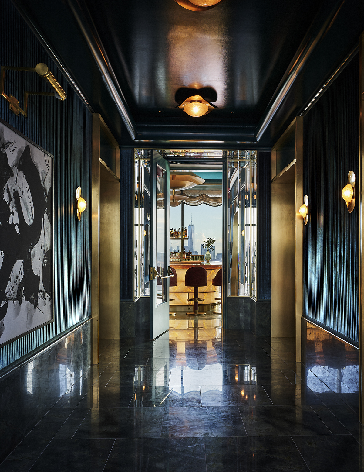
A dark green walkway to a bar overlooking the Freedom Tower in New York

Nubeluz at the Ritz-Carlton New York, Nomad by Martin Brudnizki bring guests to the skies of New York

Martin Brudnizki and Bruno Moinard are two of the most celebrated names in interior architecture and design today. Here, Brudnizki takes LUX on a grand tour of Martin Brudnizki Design Studio’s most recent projects, while Moinard shares his design inspiration and creative process

Martin Brudnizki

Nubeluz at the Ritz-Carlton new York, Nomad
With Nubeluz located on the 50th floor of the Ritz-Carlton, our concept for its interior was to create a star in the New York sky. The project’s core is a central backlit onyx bar, and the surfaces are designed to reflect its lighting. A high-gloss lacquer ceiling, a marble floor, mirrored and onyx tables, plus six statement brass saucer chandeliers ensure that light bounces around the room in a magical way.

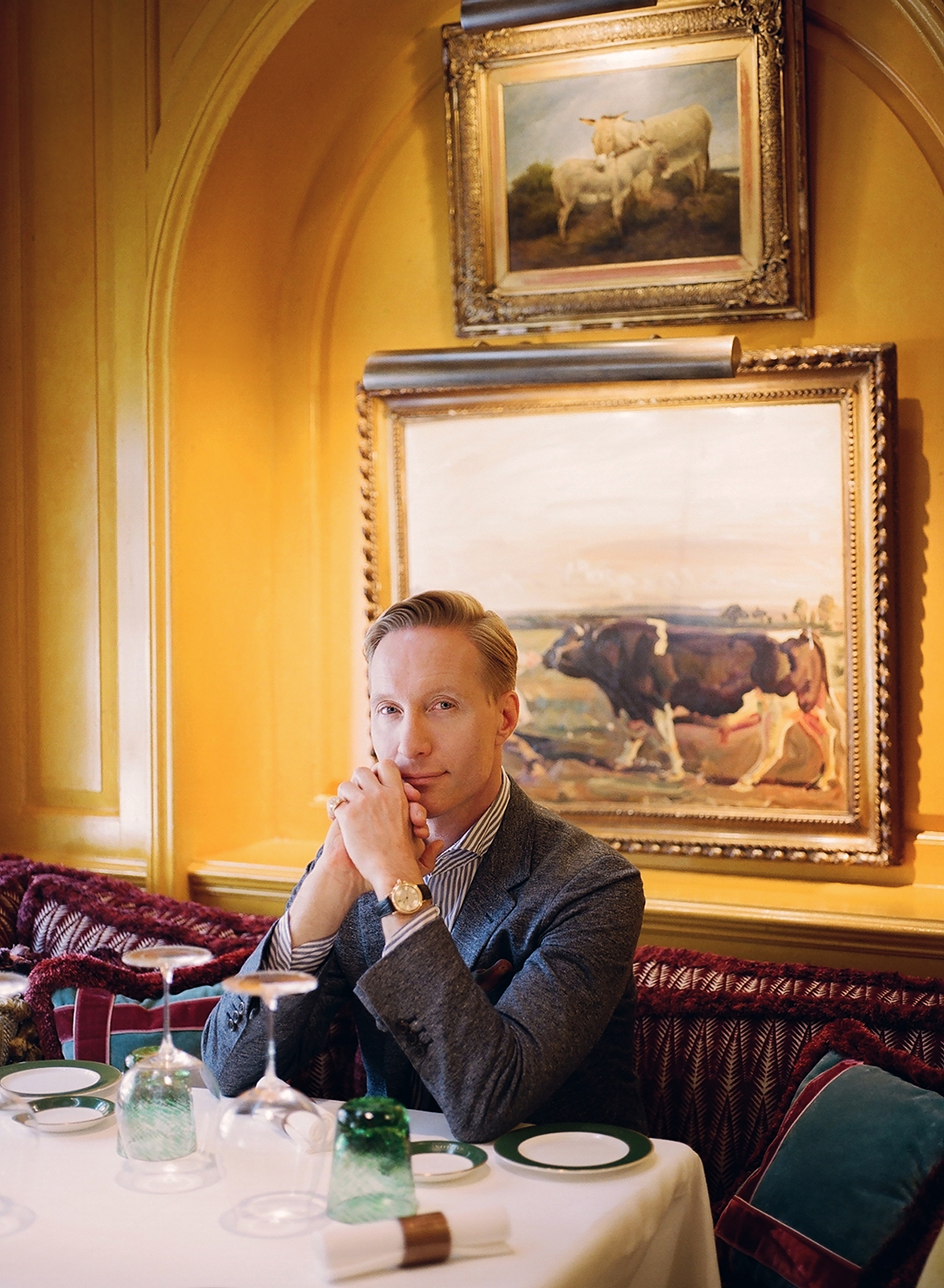
A man sitting with this hands to his chin at a bar

Martin Brudnizki

The colour scheme takes the project from lightbox to jewel box with a teal envelope to the walls, floor and ceiling, highlighting the coral seating in its luxurious mohair and flame stitch-patterned fabrics. We didn’t want to disrupt the views, so sheer teal-trimmed roman blinds hang across the windows. Our interior is a celebration of light and the city, referencing the classic hotel bar and saluting the views over an iconic skyline. It is modern and quintessentially New York.

nubeluzbyjose.com

Hôtel Barrière Fouquet’s New York
This is the illustrious French five-star hotel brand’s first foray into the US. In Paris it is located on the Champs-Élysées, so you might think its natural New York home would be the Upper East Side, but its team chose Tribeca – a decision I love. Our design challenge was to combine a distinctly Parisian ambience with a downtown location.

A brown and red bar with velvets and wood

Hôtel Barrièrre Fouquet’s New York by Martin Brudnizki brings the iconic Parisian hotel to Paris

We have brought together high glamour and elegance in a modern, timeless design, while leaning on the building’s loft-style architecture that blends seamlessly into the Tribeca landscape. Parisian design accents can be found in the rich materiality and colour palettes, while a carefully curated art collection, featuring many local artists, has a gritty urban appeal.

hotelsbarriere.com/en/collection-fouquets/new-york

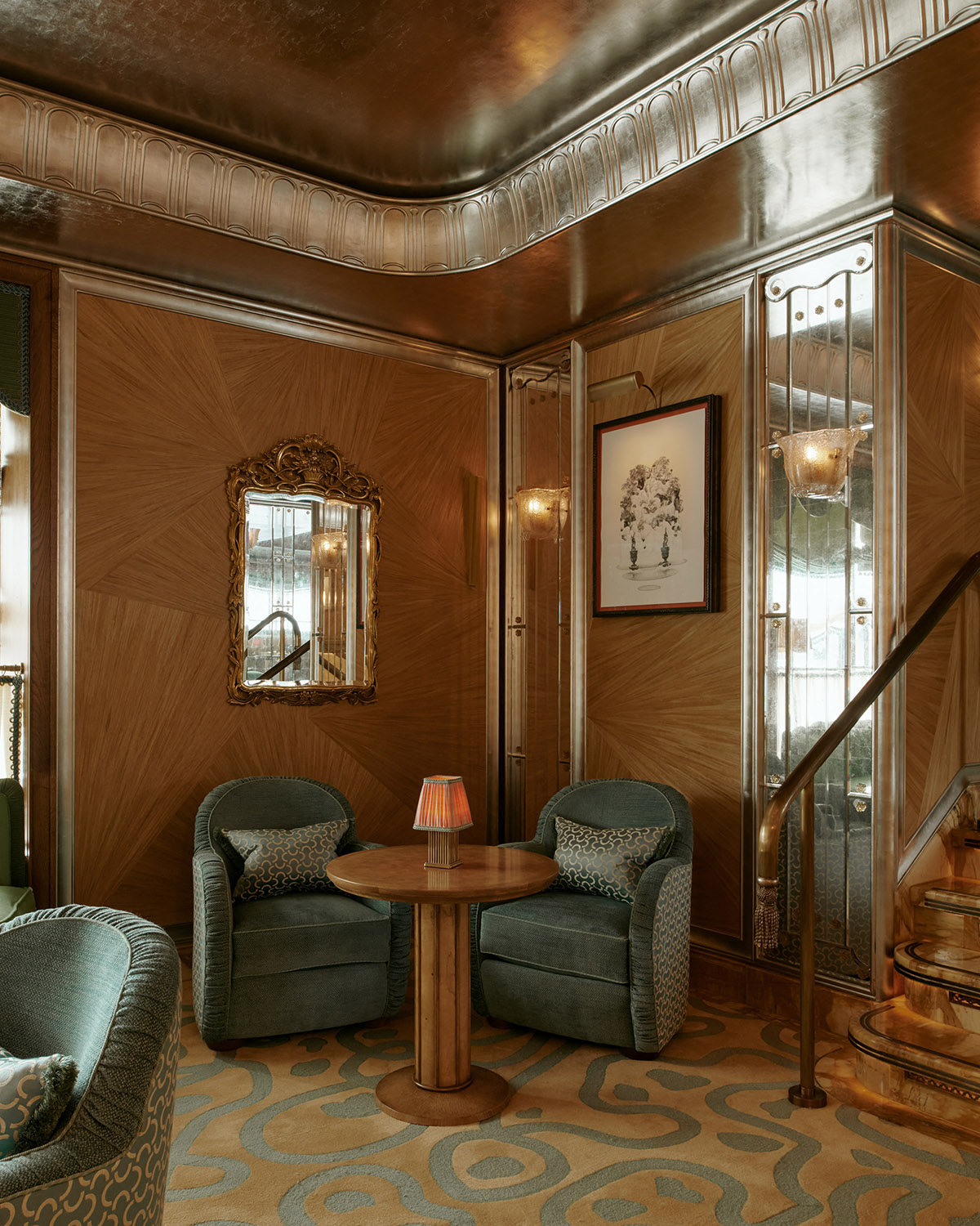
Vesper Bar at The Dorchester, London
With this project, it was important to respect the past while bringing it to a new era. We were inspired by celebrated Roaring Twenties creatives, such as Cecil Beaton and Oliver Messel, who each had a history with The Dorchester.

Two green chairs next to a wooden table and wooden wall

Vesper Bar at the Dorchester by Martin Brudnizki

Their inspiration was integral to the spirit of this landmark bar. We also nodded to designer Syrie Maugham in our use of the mirrored columns. The hope is that the Vesper Bar inspires another Roaring Twenties.

dorchestercollection.com

Mother Wolf, LA
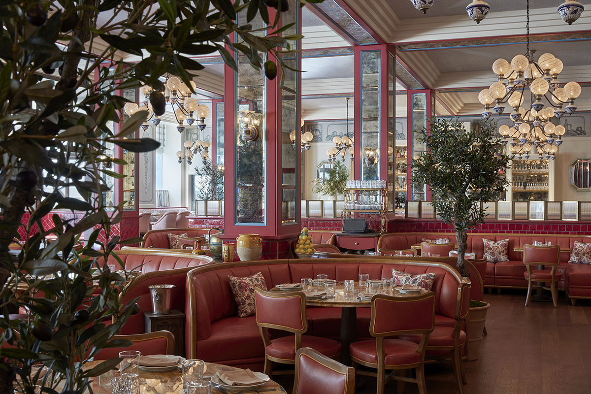
Situated off Sunset Boulevard, Mother Wolf is a playful Italian restaurant that has become a magnet for LA celebrities since its opening in 2022. Working with chef Evan Funke and Ten Five Hospitality, we created a homage to the glamour and elegance of Italian design.

A room with green plants and red leather furniture and mirrored walls

Mother Wolf, LA by Martin Brudnizki

References to architects Gio Ponti and Carlo Scarpa can be found in the dining chairs and central bar, while a trompe-l’oeil scene depicts lemons and pomegranates – an ode to Italy’s chic riviera. With its Murano-glass lighting, antique mirrors and Siena-marble table tops, every aspect of the restaurant’s interiors connects to the design heritage of Italy.

motherwolfla.com

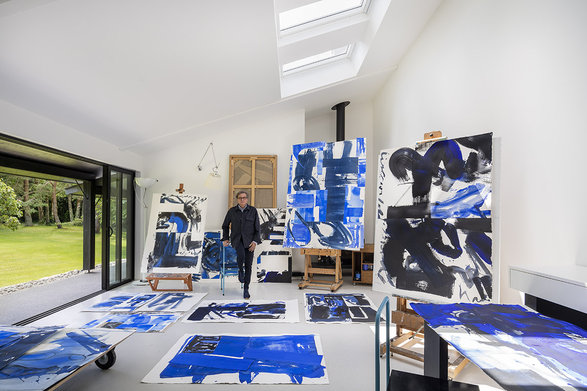
Bruno Moinard

I am guided by lines, materials, light, energy and movement: whether in my work as an architect – in our projects around the world with Claire Bétaille for famous brands and high-profile clients – or in my more intimate work as a designer and painter.

A man standing amongst blue paintings in a studio

Bruno Moinard in his studio amongst his paintings

When I began to appreciate beautiful old cars – and I have three mythical English models – I saw their design is a distillation of everything that makes me vibrate in my creative process. I see these qualities in the bodywork, the leather, wood and chrome, the colours, the interplay between interior and exterior, the vision of the future in front of me and of the road travelled behind.

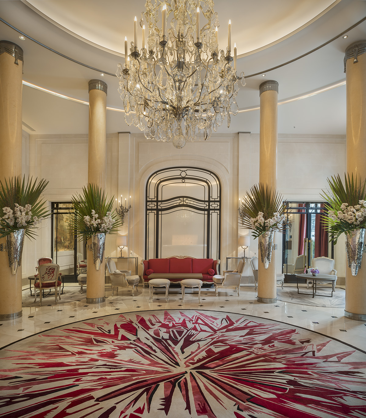
A red and white lobby with flowers hanging on pillars a large chandelier hanging over a rug

Interiors of Hôtel Plaza Athénee lobby, Paris by Bruno Moinard

So the challenge I set myself is to work with authenticity to evoke an emotion, to give a simple pleasure and generate unique sensations. This is luxury. It has nothing to do with glitz or so-called rarity.

A hallway with a marble floor and staircase

Hôtel du Marc lobby, Reims by Bruno Moinard

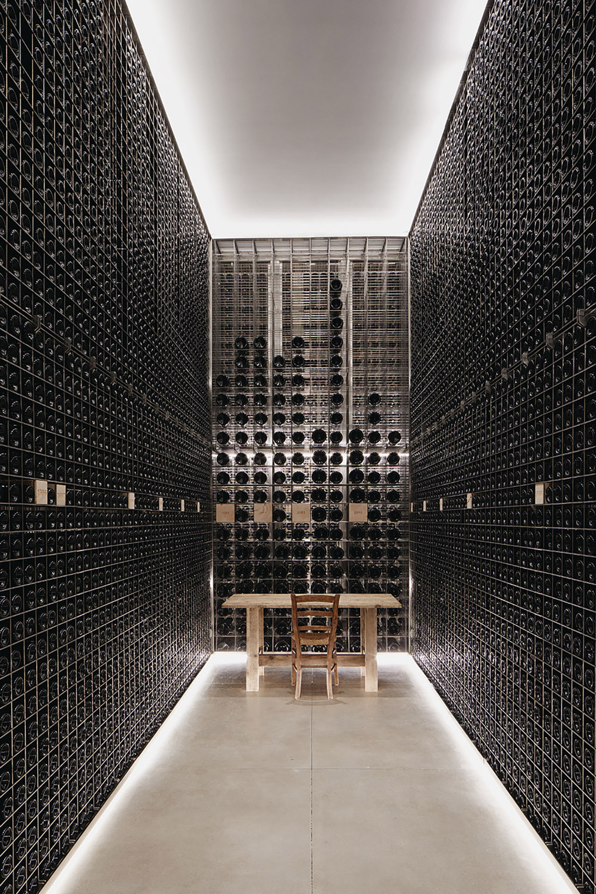
So in the cellars of Clos de Tart, a 1,000-year-old Burgundy vineyard with a Cistercian history, we built on the exceptional quality of the historic building, bringing light into the space, giving it life, to place it in harmony with the pure elegance of the wines.

A dark dining room with a chandelier hanging over the table

Hôtel du Marc dining room by Bruno Moinard

In “Résonance”, my recent exhibition in Paris, we made each painting an experiential space that I invited people to enter. My recent furniture collections also seek this sense, which has a direct impact on quality of life and on the welcoming nature of a space.

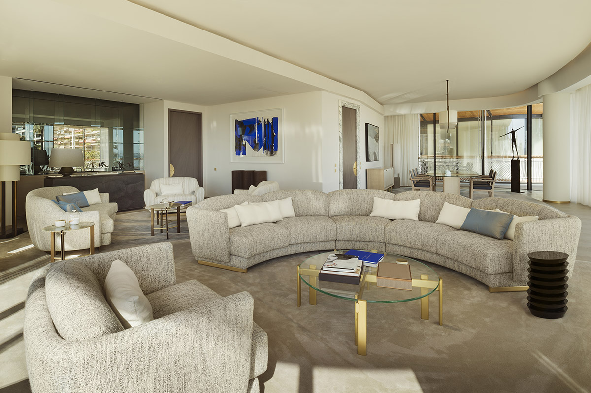
A living room with cream and grey furniture and a blue painting on the wall

One Monte-Carlo living room, Monaco by Bruno Moinard

My lights, furniture, carpets and objects bring freshness and softness with natural forms and materials. I am privileged to work in complementary fields and my inspiration in both is based on the same triptych of emotion, continuity and sustainability, while promoting the finest workmanship and expertise.

brunomoinardeditions.com

moinardbetaille.com

brunomoinardpeinture.com

This article first appeared in the Autumn/Winter 2023/24 issue of LUX

Share:
Reading time: 5 min

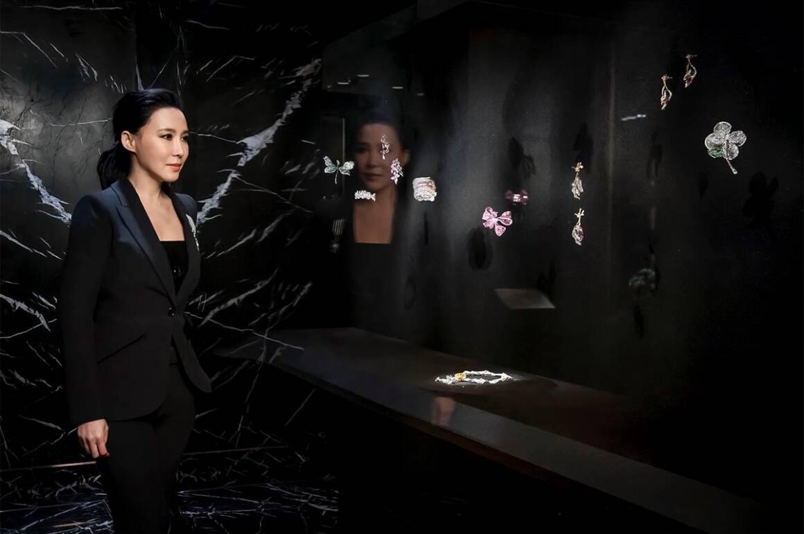
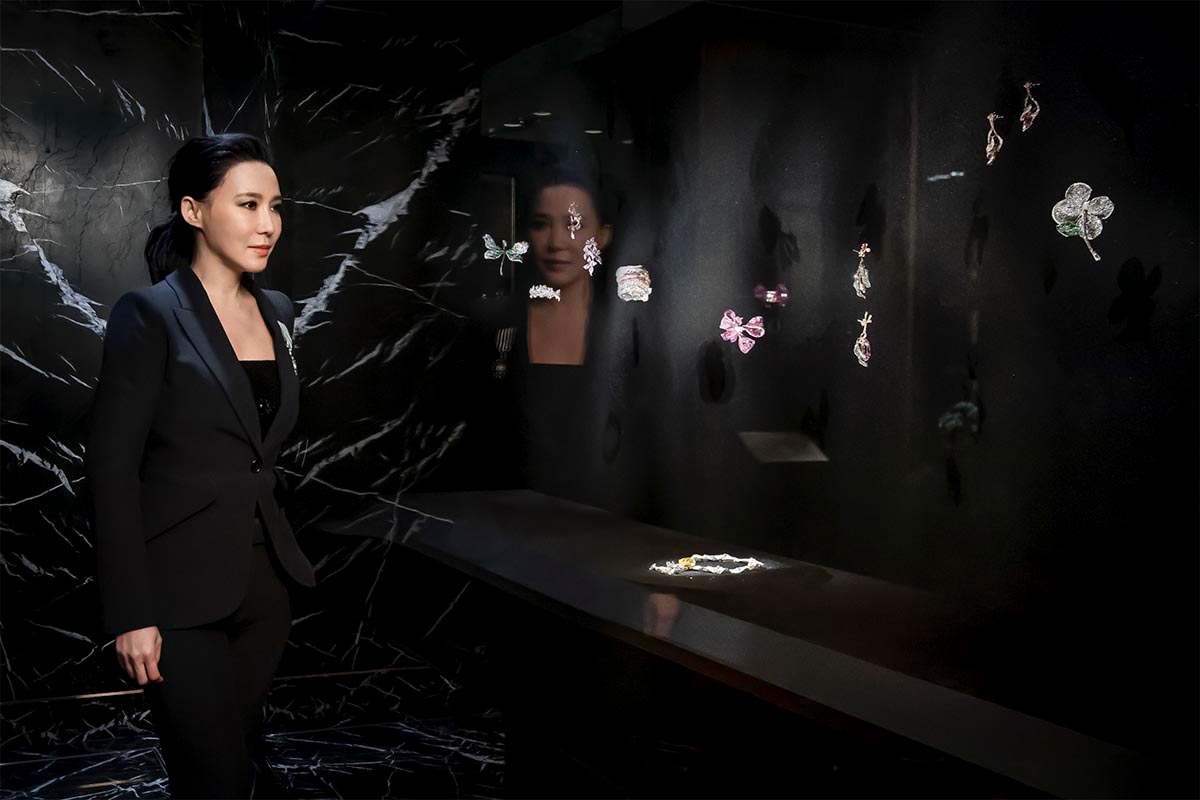
Cindy Chao at the new Cindy Chao The Art Jewel Gallery. Courtesy of Cindy Chao The Art Jewel

Cindy Chao is known for fusing art and jewellery to create unique collectibles. Here she speaks to LUX about the importance of her heritage, emotions and craftsmanship

LUX: How has your upbringing shaped your career?
Cindy Chao: Creating art jewels, for me, is a continuation of my family heritage. My grandfather was an architect who always took me to the construction sites of his architectural projects. I was trained from a young age to see the world in a structural and spatial way. My father was a sculptor. He taught me to take into account each angle, form and expression of what I observe, and to transform observations into well-rounded creations.

Both my grandfather and father moulded who I am today. Having the mind of an architect helps me to visualise my compositions three-dimensionally, and with the hands of a sculptor, I am able to pour life and emotion into my wax sculptures.

LUX:  How do you bring the two disciplines of jewellery and art together?
CC: My vision is to bring art and jewellery together by redefining how jewellery pieces are created and perceived. If a great piece of art must transcend culture, language and geographical boundaries in order to be widely understood and appreciated, the same should be true for jewellery. Thus, I hold the belief that every piece of fine jewellery should be a miniature artwork in a wearable form.

My jewellery creations are an extension and an expression of my emotions and soul. They carry the thoughts and the mood I experience when I obtain inspiration during the creation process. By combining my creativity with high-quality craftsmanship, I aim to imbue my art jewellery pieces with collectible value.

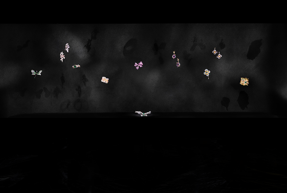
Cindy Chao The Art Jewel Gallery Gravity-free Showcase.

LUX: Can you share some insights into the process of creating your pieces and the techniques and materials you prefer to work with?
CC: I always view the world from a three-dimensional perspective, so my creations are very architectural, sculptural and organic, and can be appreciated from every angle.

I start every creation with wax sculpting, which is where I sculpt a wax block into a 1-to-1 ratio sculpture of the jewellery piece in my mind. The process is an ancient technique, once widespread in Europe in the 18th-19th centuries. This enables my work to be three-dimensional throughout the project.

Follow LUX on Instagram: luxthemagazine

I am particularly fond of crafting my works in titanium. Being one of the lightest types of metal, titanium can effectively reduce the weight of the entire piece; however, its toughness and extremely high melting point also make the forging and setting extremely difficult, and any mistake would cause the whole crafting process to start over again. Using the toughest metal to form the softest curvature has always been an ultimate goal of mine.

Recently, I’ve been working on using unconventional materials in my jewellery pieces. For example, ox horn, maple wood, and golden ebony are applied and combined with titanium, 18K gold, silver, and various precious stones. These organic materials lack malleability and require careful evaluation, selection, and calculation of the joining positions and angles between the metals and unconventional materials.

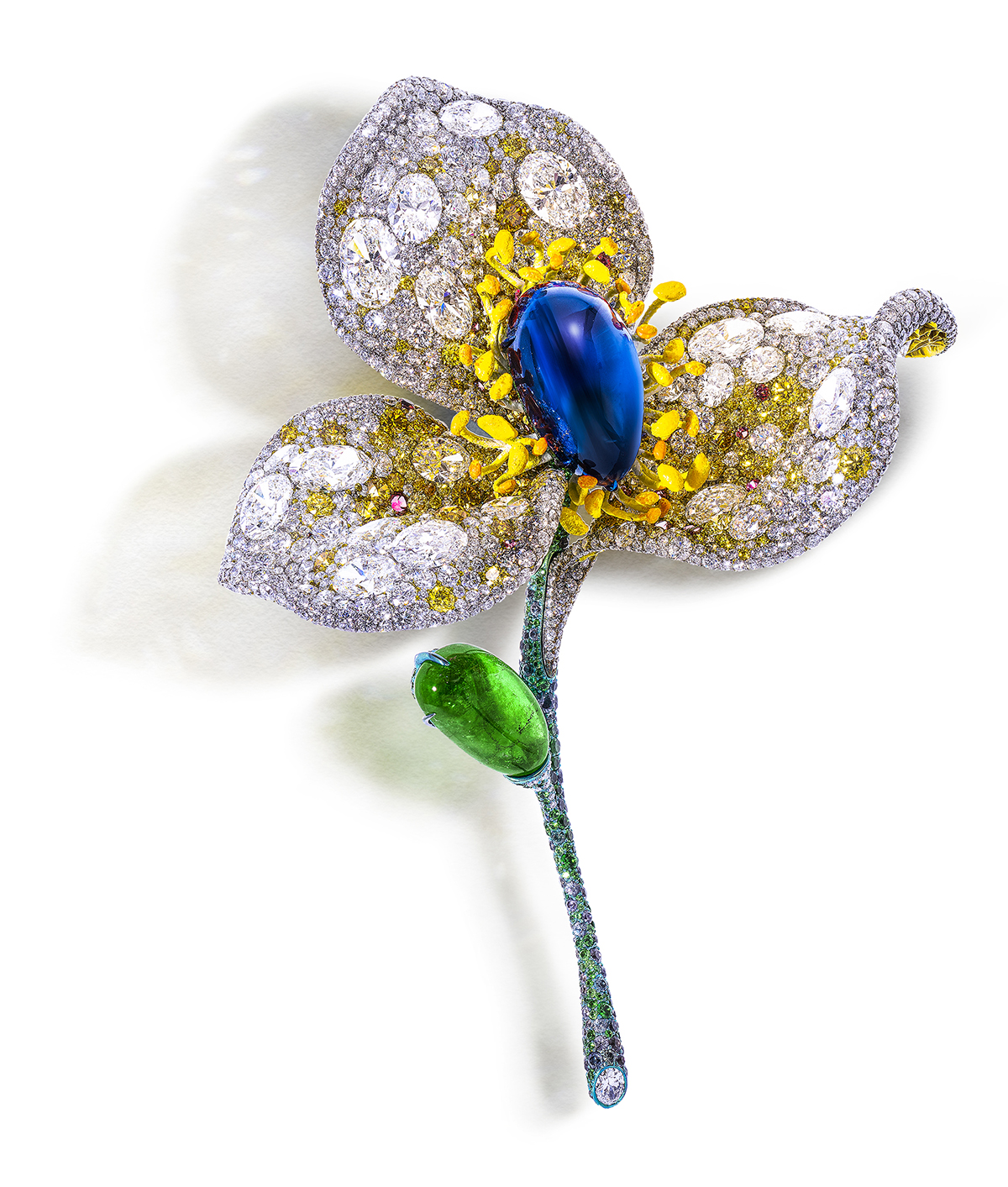
Sapphire Floral Brooch from the White Label Collection

LUX: Which of your pieces are you most proud of?
CC: I believe that a good work is one that, when you look back, leaves you with no regrets, and with no room to think, If I had another six months, I could have done better.

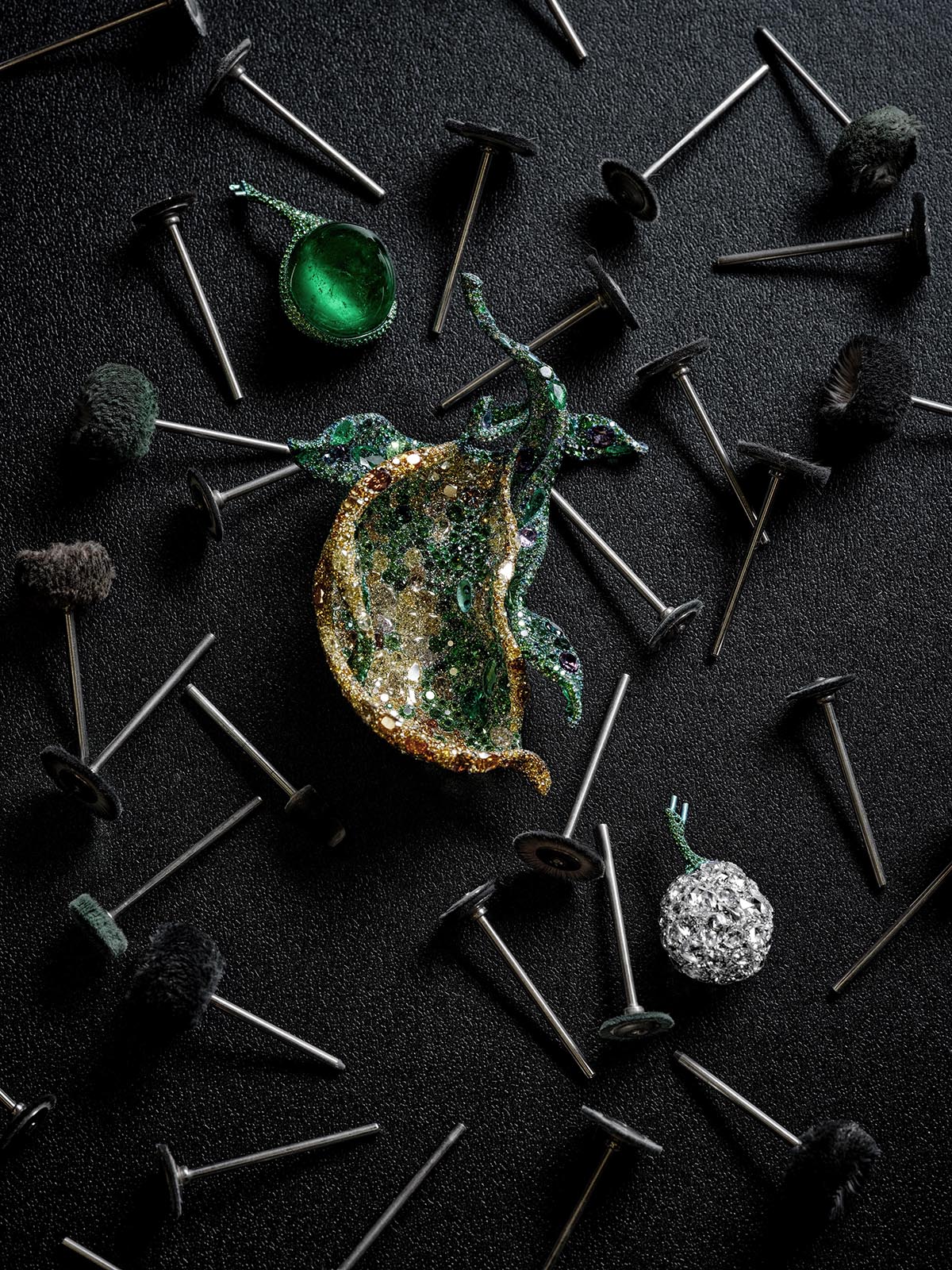
I believe my latest 2022 Black Label Masterpiece Spring Cardamom Brooch is one of those “no regrets” works.

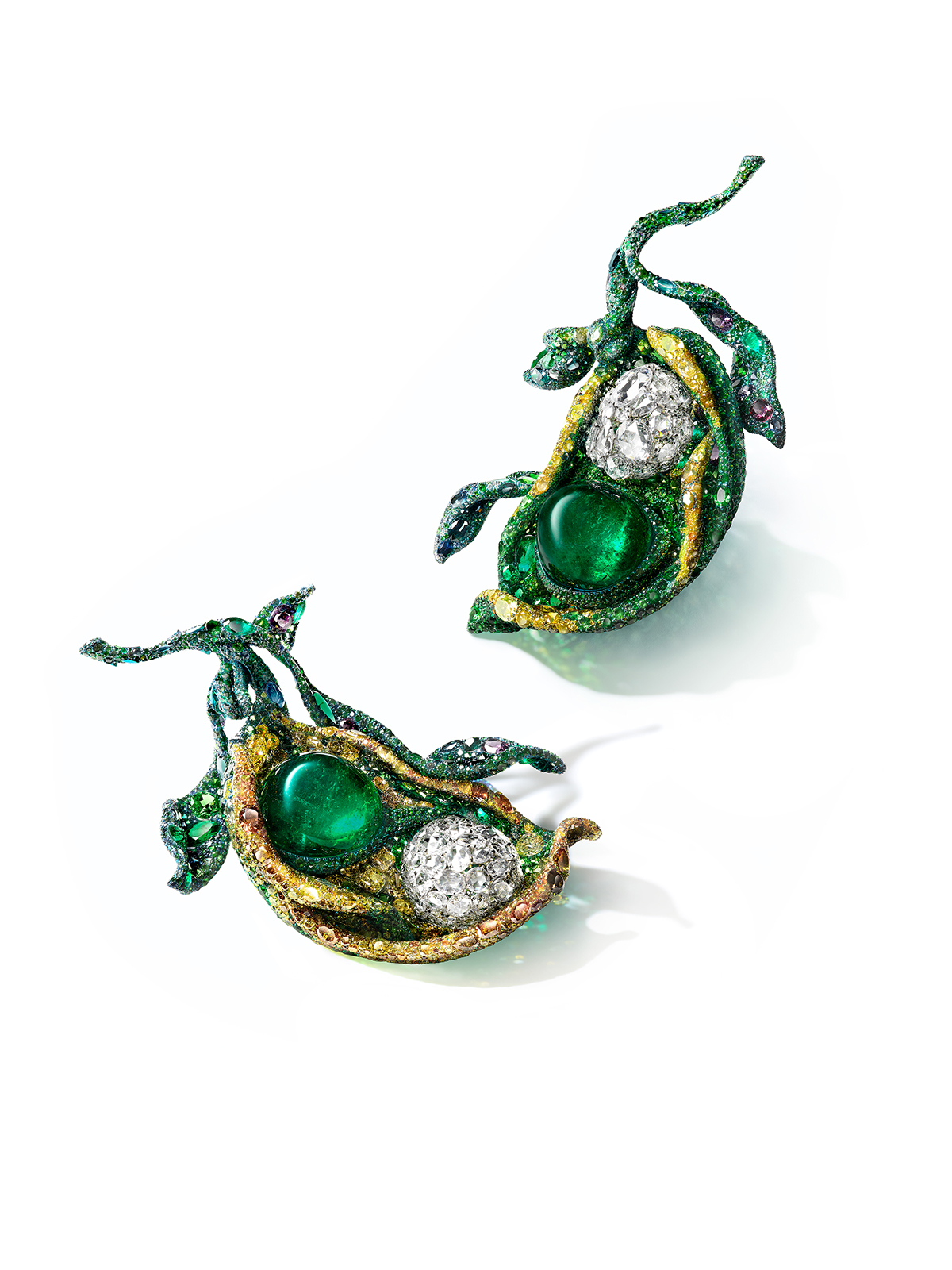
I created a pair of Spring Cardamom Brooches, inspired by freshly sprouted Cardamom pods, to express the vitality and hope of a new Spring. The brooches feature two oval-shaped cabochon Colombian emeralds of nearly 81 carats each. Next to the emeralds are two glistening hollow diamond spheres that are composed of several fancy rose-cut diamonds. The juxtaposition of a large emerald and the hollow diamond ball is my exploration of the coexistence of the abstract and real.

The brooches were also my attempt to accentuate sculptural aspects with colour science. I truly wanted to create a sense of dimensionality through the undulations, color arranging, gem setting and light. They were set with 28 shades of green gemstones, complemented by yellow and brown diamonds.

2022 Black Label Masterpiece X and XI, Spring Cardamom Brooches

LUX: Can you tell us about your annual butterfly masterpieces and what inspired you to start creating these every year?
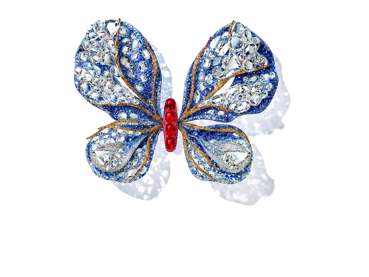
CC: My first annual butterfly was completed in 2008, the fourth year after I founded the brand and at a time when I was still establishing myself as a jeweller. It was very challenging for me at the beginning, as an artist and as a brand, and I did not know how long I could persevere. I embarked on this butterfly creation with a feeling that it might be the last piece of work in my life. Even if my creative period ended that way, I wanted it to be special.

The short yet splendid life of a butterfly deeply inspires me. It reminds me that even though human life is brief and fragile, we should constantly undergo metamorphosis, surpassing our limits, and ultimately live a brilliant and meaningful life.

It took me a whole year to create my first butterfly, the Ruby Butterfly Brooch, and I poured all my efforts into it. From the front, you may only notice the pair of rubies on the butterfly, but when turning it over, you discover that the entire butterfly is fully set in a three-dimensional manner from the side to the back. The “side-flying” butterfly with its wings folded together and not yet fully spread, as if it had just emerged from the cocoon and was about to take off, symbolises my state of mind at the time.

From then on, I decided to use the “Annual Butterfly” as a symbol of transformation for both an artist and a brand.

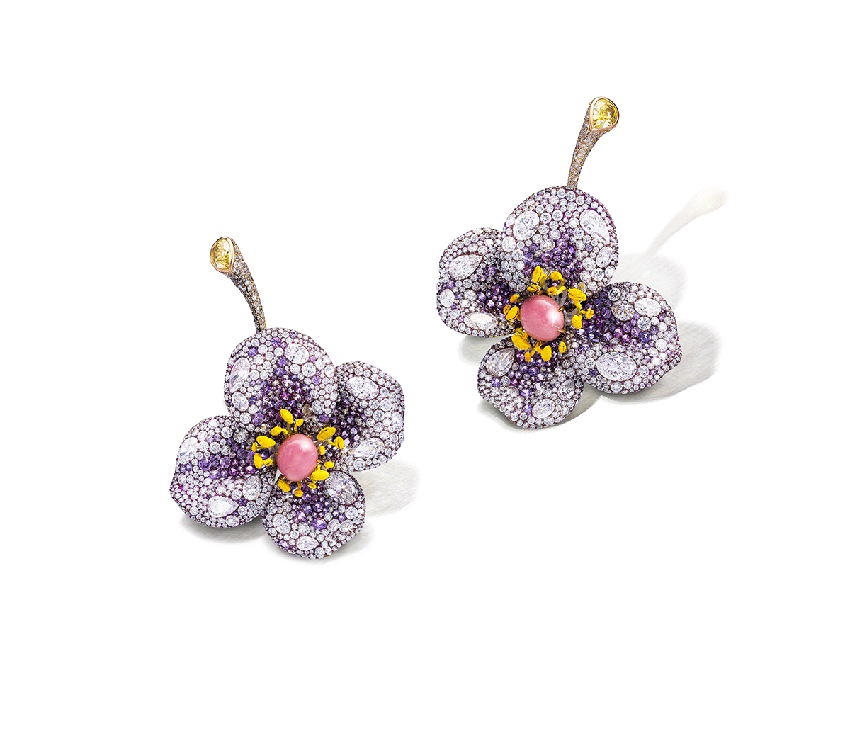
Sweet Violet Earrings from the White Label Collection

LUX: On the note of butterflies and metamorphosis, can you speak about your evolution as a jewellery designer?
CC: My growth as an artist is closely related to confidence, which is crucial for creating good works, but it requires time to accumulate through experience. My increased confidence is reflected in two aspects: first, simplified lines and “subtraction” in my work. Because I have mastered the techniques, I don’t need as many lines to present a piece anymore. Second, there is a breakthrough in colour. Comparing the first “Ruby Butterfly Brooch” with the latest “Aurora Butterfly Brooch,” one will notice that I have become bolder in my use of colour. Just like a painter, the colour tension in early works and later works is certainly different.

The Aurora Butterfly

LUX: In what ways is Asian culture particularly important to you, and how is this reflected in your work?
CC: Influenced by my grandfather and father, I received an education in aesthetics from an early age. My creations are imbued with a traditional Chinese style of “impressionism”, using depictions of nature to express emotions. In my works, I want to showcase a harmonious blend of structural forms and artistic conception, brimming with a poetic and emotive essence.

LUX: You have achieved many accolades in your career, from your pieces being selected for Christie’s auctions to being featured in the Smithsonian National Museum of Natural History and the V&A. What would you say has been the highlight of your career so far and why?
CC: I am grateful for the acknowledgement from esteemed international institutions such as museums, art fairs, and auction houses over the past few years. These commendations have not only been instrumental in building up a firm foundation for my brand, but also instilled within me a profound sense of confidence.

Read more: Veuve Clicquot CEO Jean-Marc Gallot on the spirit of the iconic brand

In November 2021, I received the “Chevalier de l’Ordre des Arts et des Lettres” distinction from the French Ministry of Culture. This is definitely a highlight of my artistic career. France – being one of the birthplaces of jewellery art with its extensive history and cultural heritage – has consistently equipped me with abundant inspiration and nurtured my creative endeavours. I feel deeply honoured to be recognised for my vision and contribution in bridging eastern and western cultures through art, and I am aware of the great responsibility that lies ahead.

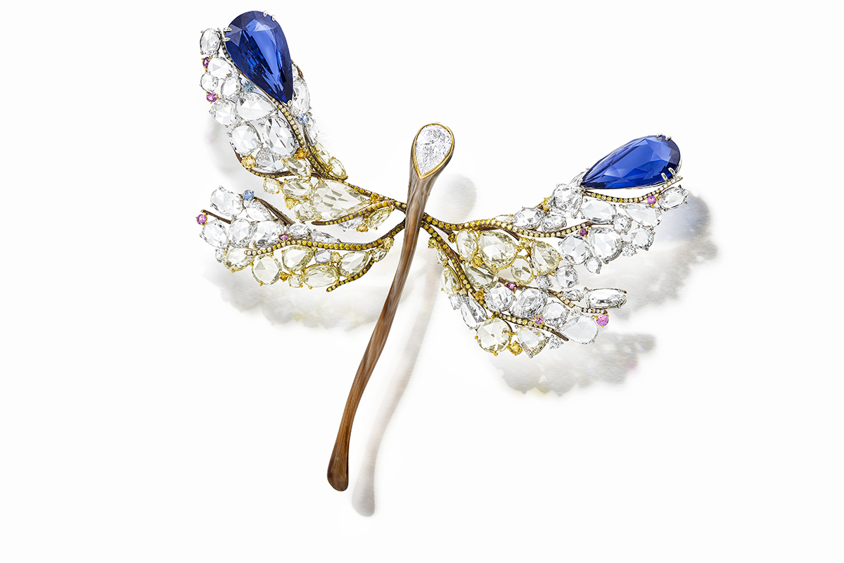
Sapphire Dragonfly Brooch from the White Label Collection

LUX: What would you say is the overall message you are conveying through your work?
CC: Our lives are finite, whereas genuine art possesses the ability to withstand the trial of time, transcend time, and be passed on from generation to generation.

LUX: You have broken boundaries as a Taiwanese woman in a male-dominated, Western-centric industry. Are you hopeful for the future of other Asian women in the jewellery, art and luxury markets and how do you hope to see your legacy continue?
CC: I am optimistic about the future of Asian female artists as they are gaining global recognition for their immense talent. The opportunities for women in Asia are vast and promising.

My team and I have created our own unique path on this journey, and we aim to continue the growth in the following decades to come, and to become a truly global brand that embraces its Asian heritage. In order to preserve this craft within the wider jewellery industry, I feel it is important to teach and inspire young talent to embrace this age-old knowledge and savoir-faire of jewellery-making.

The making of the Spring Cardamom Brooches

LUX: What would you say differentiates a jewellery piece which is a collectible from one which isn’t?”
CC: The value of a collectible jewellery artwork includes two aspects: rare gemstones and artistic value.

Firstly, top-grade rare gemstones are the primary element that gives jewellery pieces their collectible value. As a new investment vehicle, the market trend for rare gemstones has garnered increasing attention in recent years.

Artistic value is also one of the elements that contribute to the collectability of jewellery pieces. Collectible art jewellery possesses aesthetic, intellectual, and philosophical value beyond ordinary commodities. Artists dedicate themselves wholeheartedly, infusing their emotions into their creations, allowing their pieces to convey the artist’s unique creative stories and inner world.

All images courtesy of Cindy Chao The Art Jewel

Find out more: www.cindychao.com

Share:
Reading time: 9 min
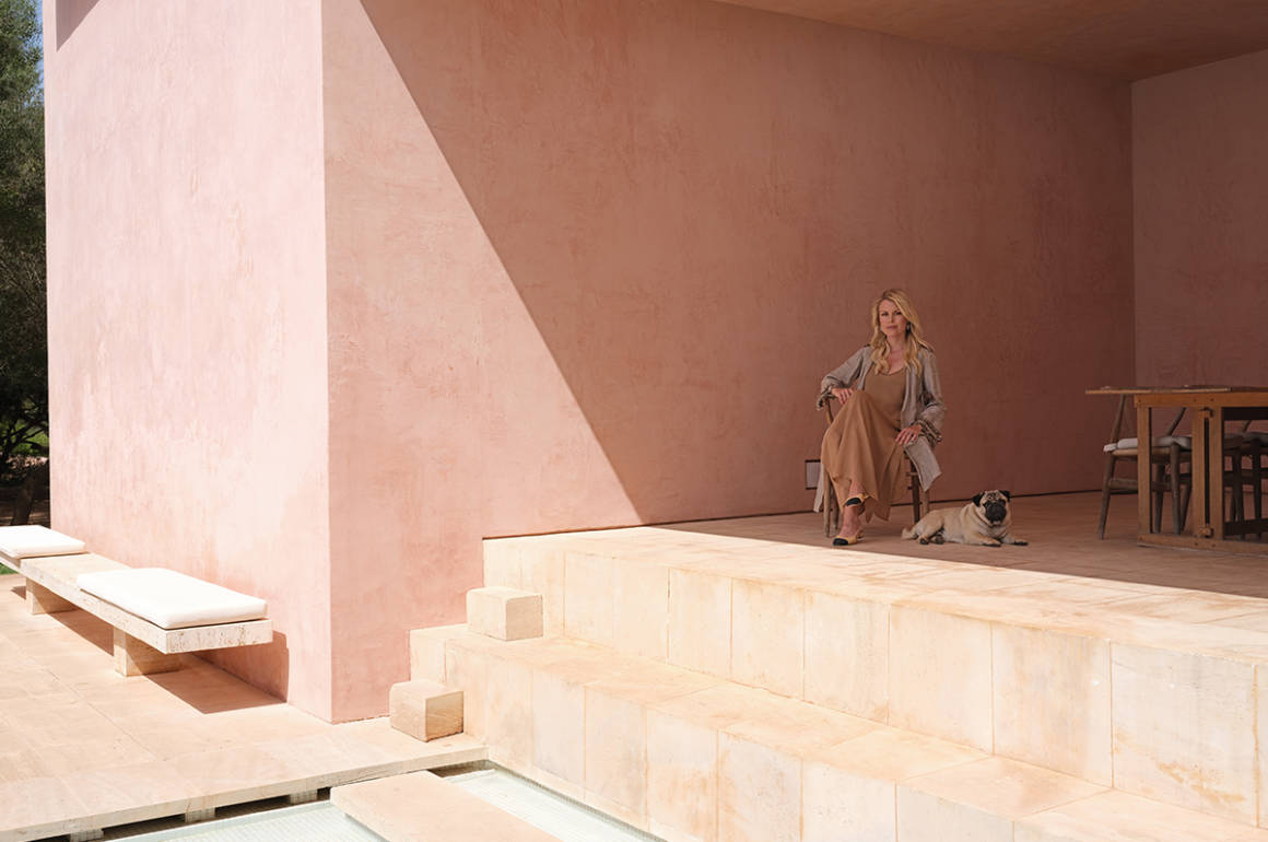
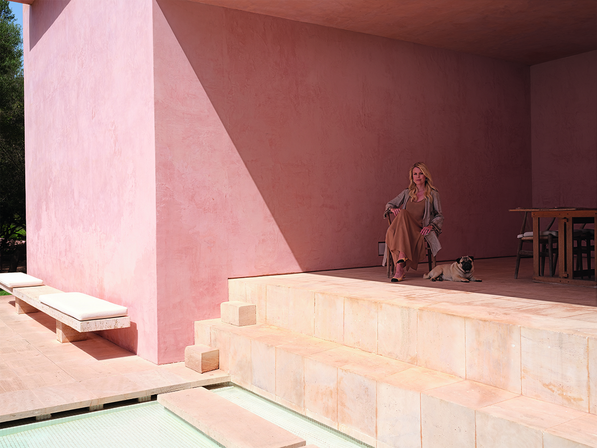
A woman sitting with a pug in a pink stone terrace house

“This is one of my favourite areas of the house, as we often have meals or work together at this table. In the mornings, the sunlight as it hits the pool is reflected on the walls and ceilings. It’s quite magical” – Sophie

In the 1980s, Hans and Caroline Neuendorf had a dream. The German art entrepreneurs wanted to build a house in Mallorca unlike any other. Pioneering and minimalist, the house would go on to redefine luxury living. More than 30 years on, Caroline and her daughter Sophie reflect on life at one of the world’s most distinctive homes, Neuendorf House

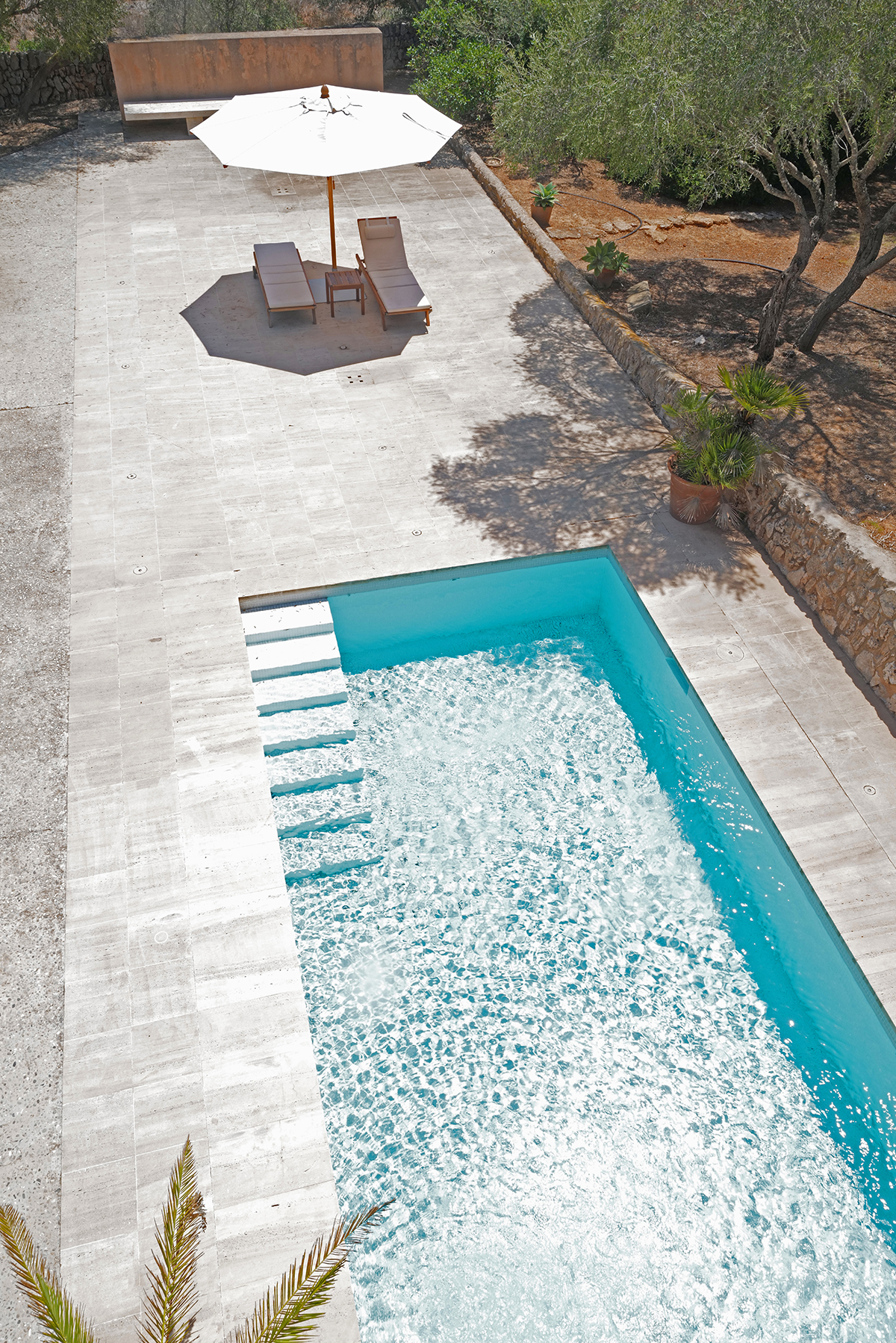
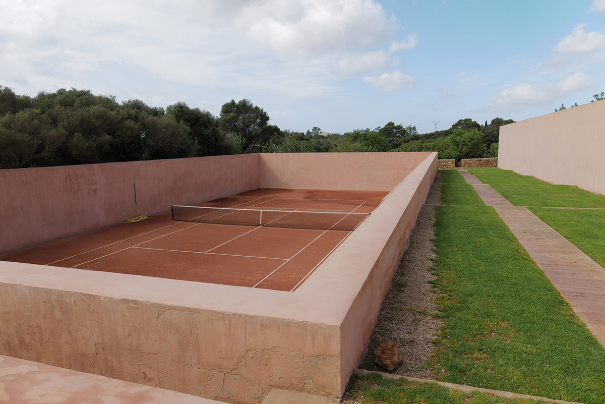
 “In 1984 we accidentally met John Pawson on a holiday in Porto Ercole, Italy. He was a young architect working with Claudio Silvestrin at the time. Neither had so far ever built a house. They transformed some flats in London into divine empty spaces with little furniture. We immediately fell in love with their concept – it was long before ‘minimalism’ was coined. We had bought a big piece of land in the Mallorcan countryside and we gave both architects carte blanche. We wanted a holiday house for our growing family. It was an adventure for the architects and us. At the time, Mallorca was largely undiscovered, and we were lucky to find a builder who was at the same time mayor of the little village nearby. With his help we were able to build this amazing structure. Little did we know that this house would become famous some day – on the contrary, most of our friends made endless jokes about us. Who would excavate a huge piece of land to build a sunken tennis court? Who would build a 110m wall with the sole purpose of defining the space between house and countryside? We would.”

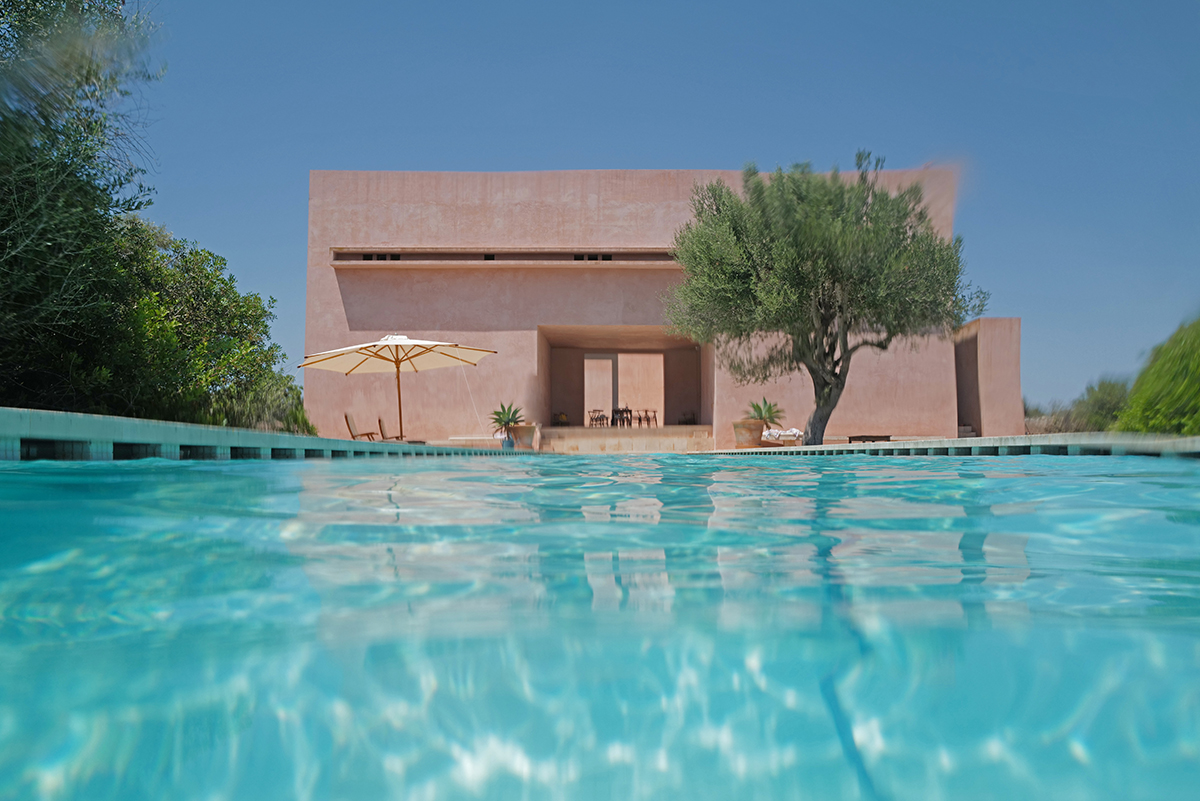
A pool with umbrellas and a tree and pink stone house

You take it all in from there: what a view!” – Caroline

Neuendorf House was built when I was just born, so my brothers and I spent nearly all our childhoods there and most summers since. We moved around a lot, from New York to Berlin and London, so the house represents for me a place of constancy, peace and happiness. I travel there both to spend wild holidays and special occasions with family and friends or to disconnect. For years, we had no phone, TV or internet there, and my parents encouraged us to read if we were bored. There is a soft wind, the smell of wild lavender, thyme, almond trees and sea air, which is intoxicating. Time moves slowly – we’ve had many long languid lunches and dinners at the house. It’s important for us to come together there every summer, as I live in Madrid, my brothers in New York, Paris and London, and my parents are in Berlin. For me, the house was always protective, yet many friends didn’t understand how we could feel comfortable in a house that’s so empty. It’s the emptiness that gives room for laughter and creativity, that lets the mind wander. One is stripped down to nature and togetherness without distraction. I’ve spent the happiest days of my life at the house, notably my 30th birthday. And now my wedding, one of the most important moments in one’s life.” 

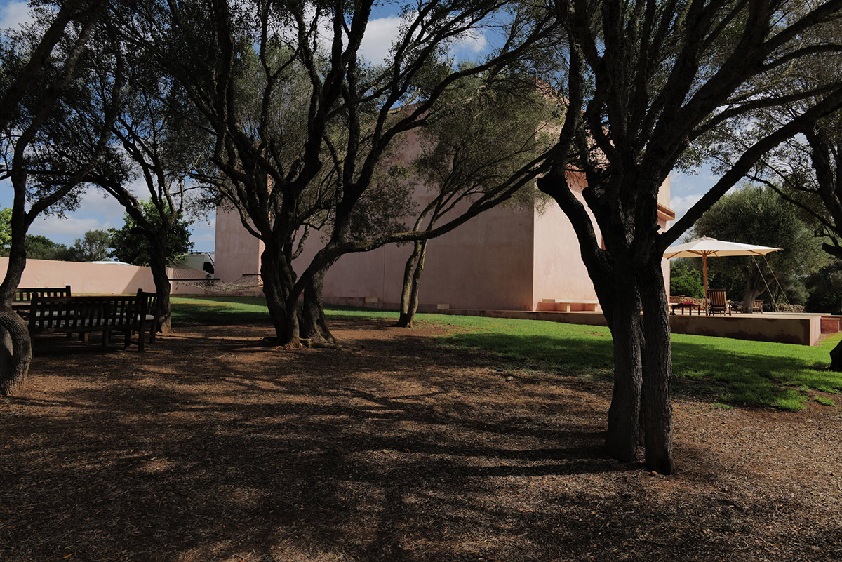
trees in a garden

“These trees were always on the property and as there is so little distraction they almost become sculptures” – Caroline


Two deckchairs in front of a pink wall and a cactus between them

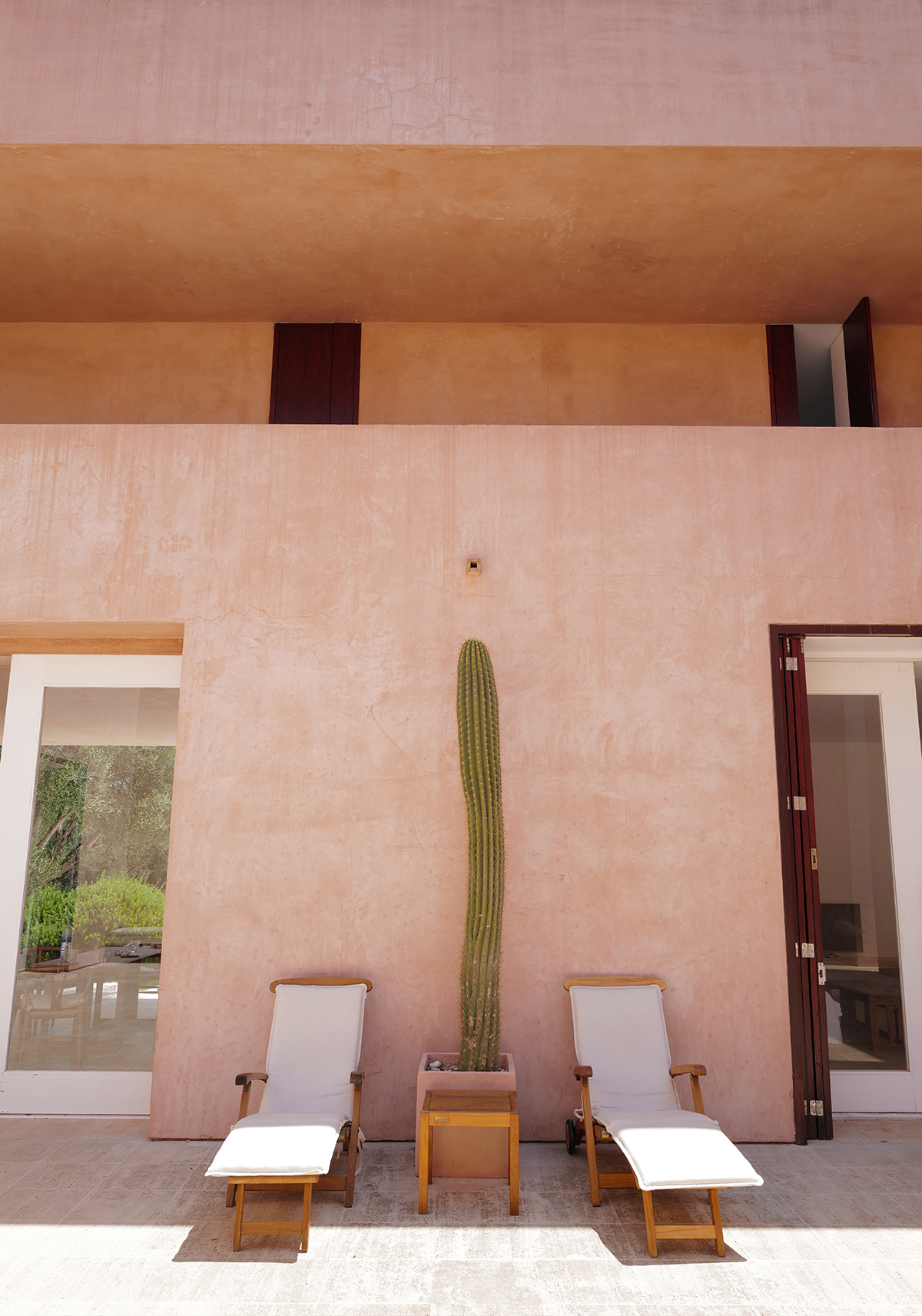
“These deckchairs stand in the courtyard, from which you can contemplate a piece of private sky – and that happens a lot! The cactus was left by Cartier, when they shot the famous Cactus Collection” – Caroline


green grass on either side of a path

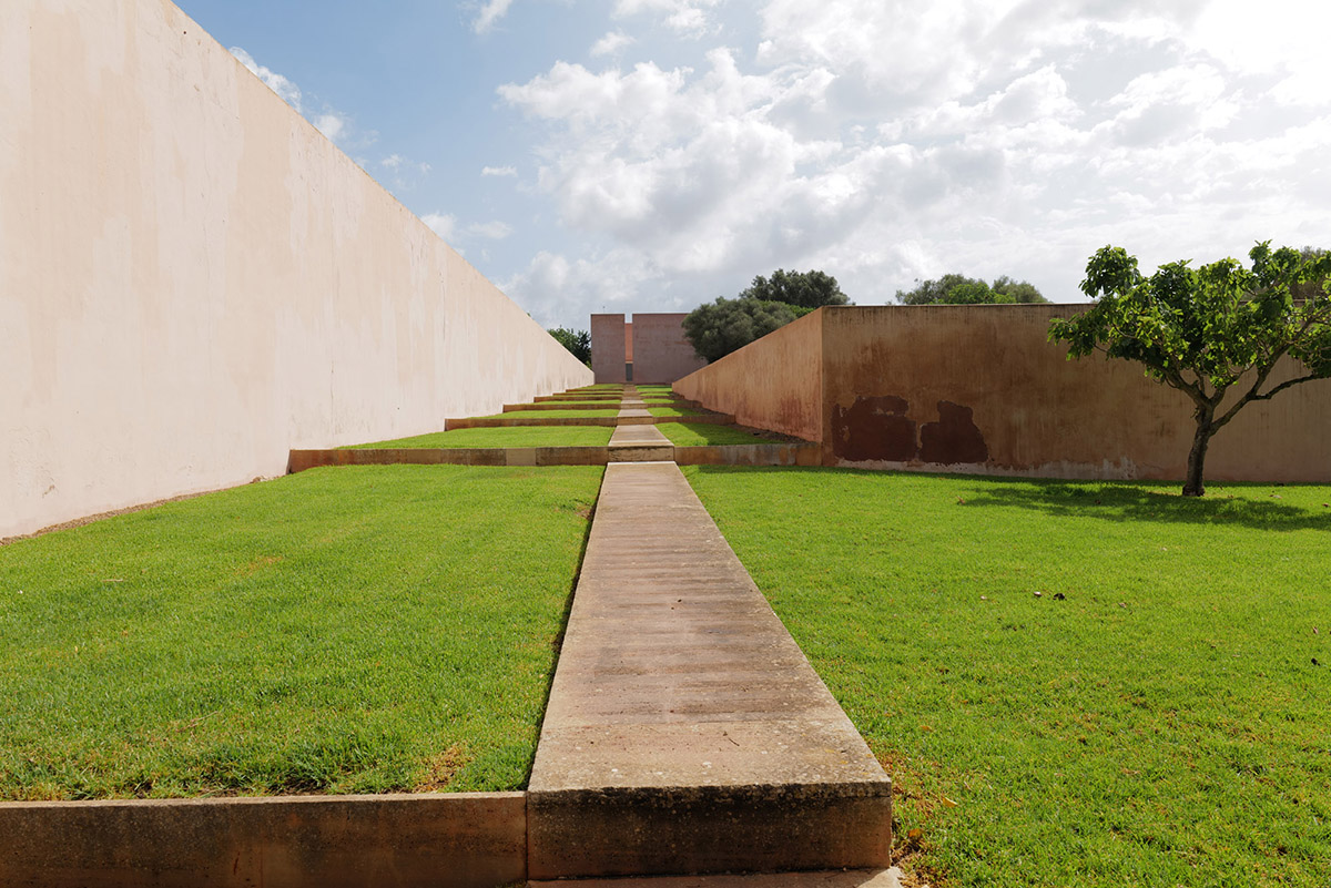
“The long view – the runway, as we call it” – Caroline


A woman leaning against two large pink walls

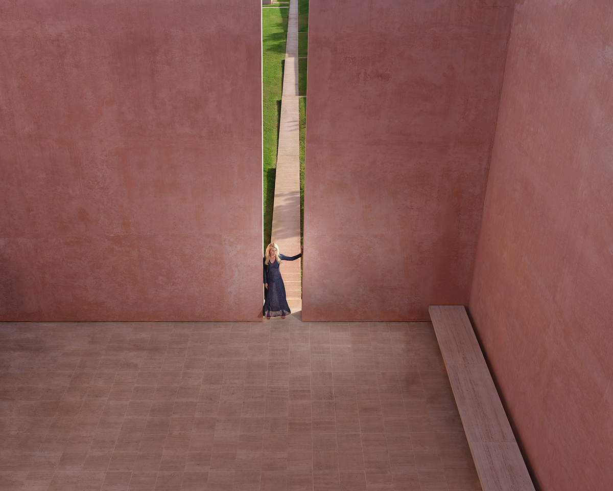
“The light coming from the ‘door’ is like a sundial. Depending on where the light and shadows fall, one can roughly tell the time of day. I’ve always used it as a good reference to see if I’ve overslept!” – Sophie


A pink stone house

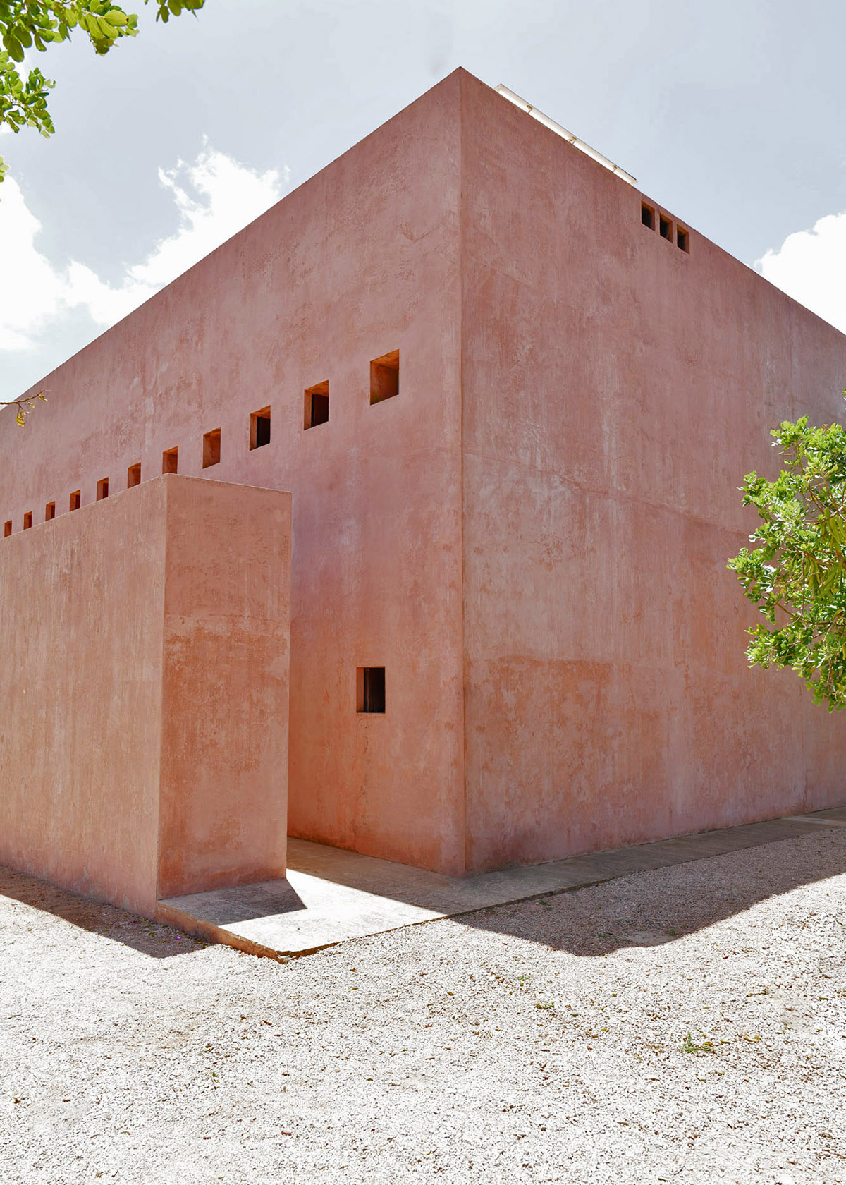
“A view of the house from the north. The little windows give a postcard view of the landscape” – Caroline


A swimming pool

“A view of the smaller saltwater pool. In the winter it is heated; I have spent such wonderful moments there in the winter months, turning on the Jacuzzi and enjoying my first coffee” – Caroline


A tennis court

“The clay tennis court, a dream for any tennis aficionado” – Caroline


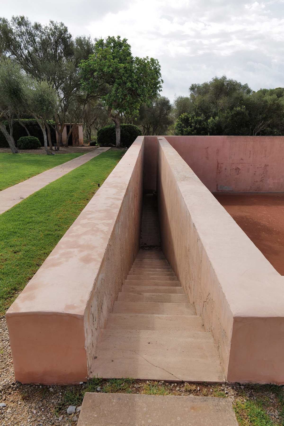
stairs in a garden leading to a basement

“The stairs to the sunken tennis court – the Tennis Temple” – Caroline

Sophie Neuendorf is Vice President at Artnet

neuendorfhouse.com

Share:
Reading time: 4 min
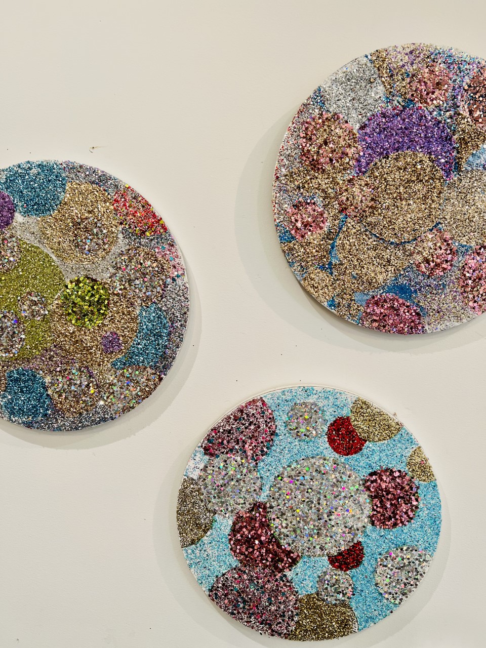
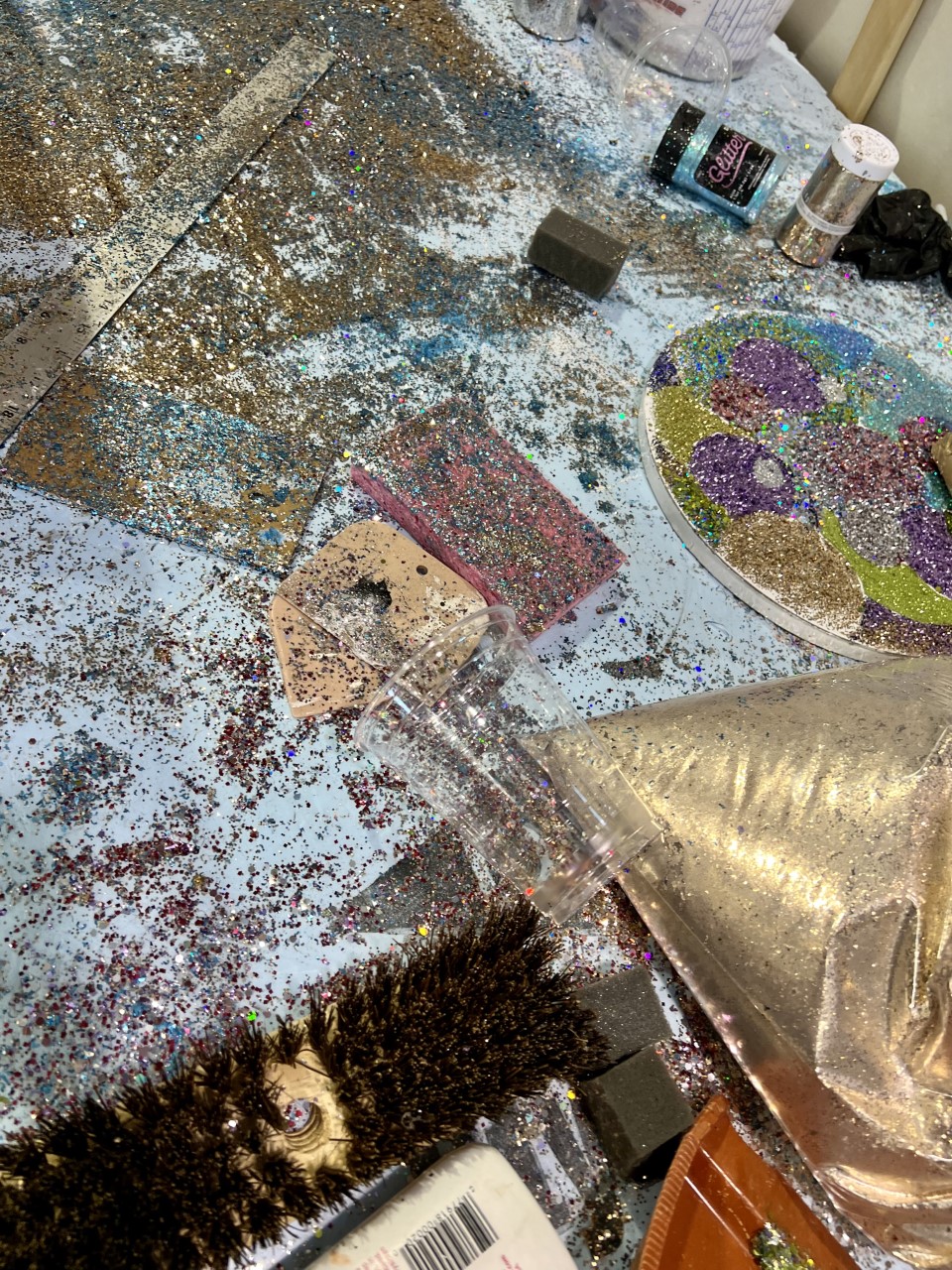
multi coloured sparkles on circle canvases
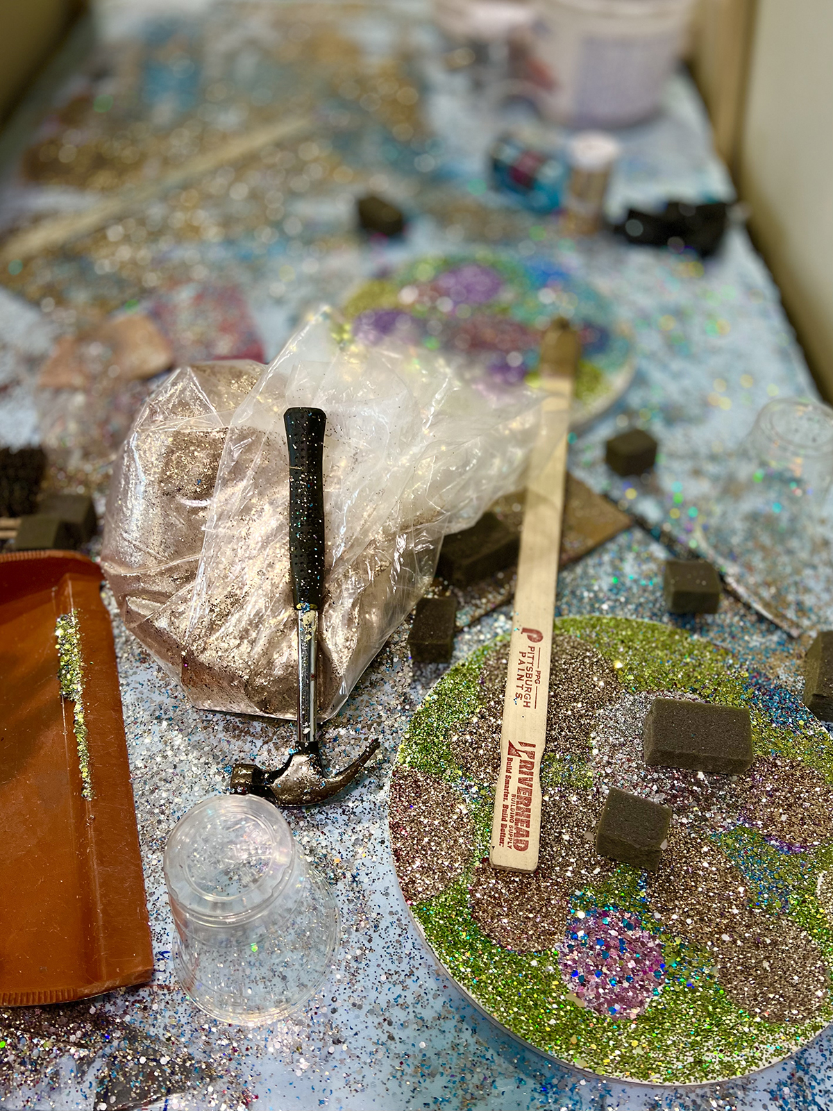
A paint brush and scalpel on a table covered in glitter

Studio detail with glitter tondo. Photo by Maryam Eisler

LUX’s Chief Contributing Editor, Maryam Eisler, visits Peter Dayton to photograph and interview the East Hampton-based artist at his studio. Here, Dayton speaks about the intention and ideas behind his artworks as well his relationship with Peter Marino and Chanel

Maryam Eisler: What lies behind the eye candy, the glitz and the glitter?

Peter Dayton: I feel like I’ve reached a kind of pinnacle where it’s just about incredible celebration. And, it’s interesting to me because I don’t always want to make work that looks really good. And somehow this glitter thing, which really shouldn’t have worked, is in fact working. By taking everything out of the picture including figuration, I feel like I’ve really got something that has a lot of meaning.

A man standing by a large canvas of blue squares

Right Blue Wave, 2022. Left Magic Carpet Ride, 2022. Photo by Maryam Eisler

ME: What’s even more interesting is that you are not staying shy of beauty, something we don’t see much of in the art world these days.

PD: We’re in a new art world. And, you know, to me, beauty is the law. I do it intrinsically. It just happens. I’ve always been a little left of centre because of that, and it just isn’t on the surface. It’s deep. Peter Marino saw immediately that I had a gift for this ‘beauty thing’ and he just took me under his wing. That’s how and why my association with Chanel has been so great.

rocket shaped sculptured in different colours

The Rockets, 2016-2018. Photo by Maryam Eisler

ME: Has the act of ‘glittering away’ all day every day scared you in any way?

PD: It’s a little scary. Yes, because I’ve been spending the past 12 months just doing glitter and, you know, there are bills to pay. But I do feel like there may be a super happy ending to all this. Or, better yet, a happy beginning!

Follow LUX on Instagram: luxthemagazine

ME: I was taken by your choice of words and thought association; you said ‘It’s time for celebration!’ This is a positive outlook, also rare these days.

PD: Well, the negative is so real right now, but let’s face it, this isn’t like the bubonic plague. You know, I don’t want to intentionally make people happy, but I do want to give them a chance to choose happiness. So, I make these paintings. The time feels right for it.

glitter on round and square canvases

Studio wall detail, Too Many Planets, 2022. Photo by Maryam Eisler

ME: I’m also interested in the idea of space and place. I know you’ve been coming out to the East End [of Long Island] since 1975 and started living and working here full time in 1988. Have things evolved a lot since then?

PD: Yes, there’s been a lot of evolution out here. On a personal level I got married and started a family. And East Hampton as a town has certainly evolved – it used to be dead in the winter. As an artist it was total evolution. I’d been studying art since I was 12 and then ditched art to play punk rock. I basically reinvented myself as an artist out here after living in Paris for couple of years making music.

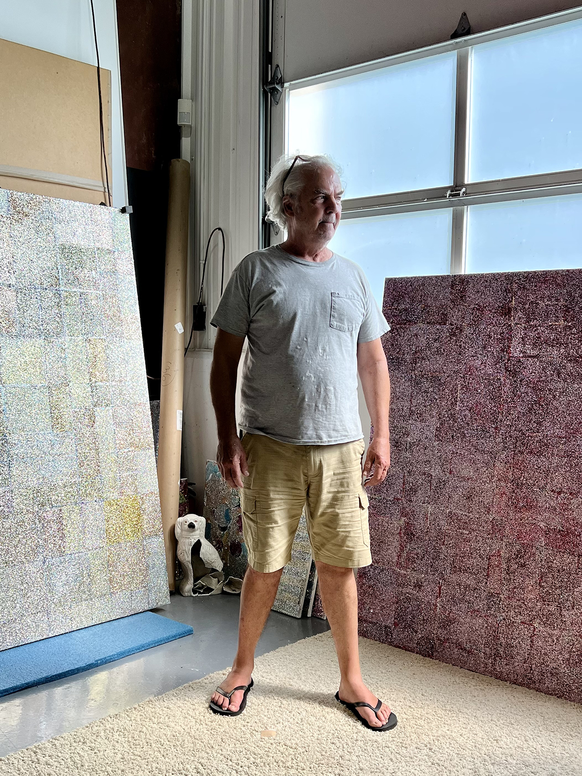
A man in a grey t-shirt and yellow shorts

Portrait of the artist. Photo by Maryam Eisler

I also happen to love de Kooning, and I love Pollock; I love the idea of all that is anchored here- even before I was aware of all this, when my mother moved here all those years ago and when I started coming here from Boston where I was studying at The Museum School. I always thought, ‘my Lord, this place is beautiful.’ And then I understood the special light that’s out here. I think De Kooning called it ‘double light’. It relates to when the sun reflects off the water, back up into the sky! I don’t harp on it, but, you know, it is very important.

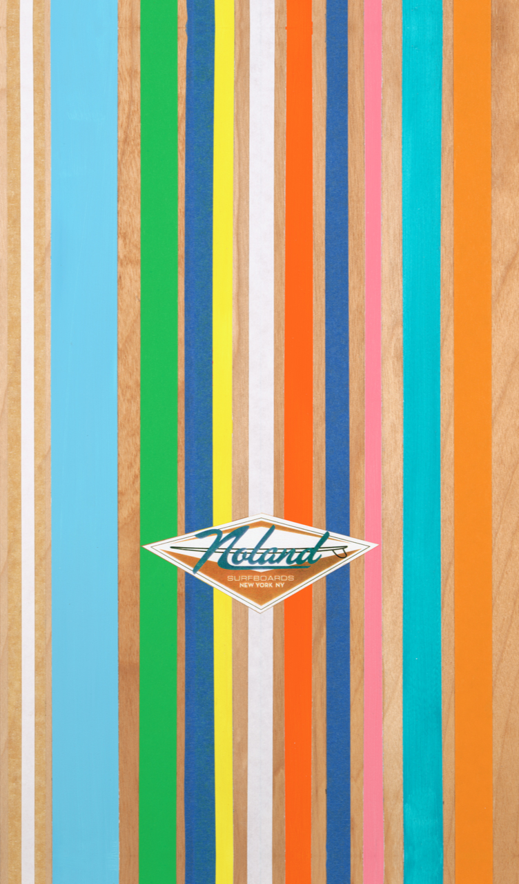
multicoloured lines

Noland, 2014

ME: In your work, I see surfboards. I see flowers. Where do they coincide?

PD: Good question! The flowers started because I had been doing music professionally for ten years, and then I burnt out completely. I went to Paris for six months to find myself and I stayed for three years. And it was fabulous. And I did find myself. ‘Myself’ was somebody who wanted to grow old in his studio, making pretty pictures – but pretty serious pictures too.

Too Many Planets, detail 2022. Photo by Maryam Eisler

The ‘flower’ phase started because I thought to myself, I missed the eighties. It happened by chance. There was a construction site behind my mother’s house. I saw a big dumpster. I went to the dumpster and I looked in. There were hundreds of House and Gardens from the 50s, and I thought, ‘Oh, wouldn’t that be so weird if I made flower collages out of old magazines and seed catalogues’? In a way it was this kind of totally ‘immature-ish’ thing you know, the kind of craft that grandma would do at the kitchen table. So I made one. And that’s when I first showed that work with Paul Morris in 1994 in Chelsea when the area was just starting. There was a really big splash about the work and it went really well. That’s also when and where I met Bob Colacello and where Peter Marino came in. Bob was so supportive right away. The show was more successful than I could have imagined.

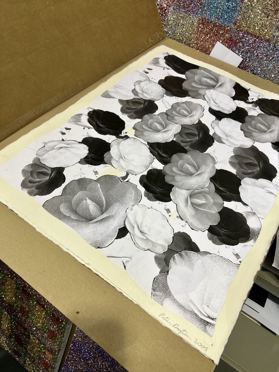
A picture of black, white and grey flowers

Camellias for Chanel, 2005. Photo by Maryam Eisler

ME: Historically, with the collages, there was a process of appropriation of others’ images which when rearranged, became your own. With these new glitter paintings, however, it’s your own hand at play.

PD: The cut-up method borrows. Taking pictures from a source that you shouldn’t be taking them from and turning it into something – in my case, into something that was weirdly beautiful.

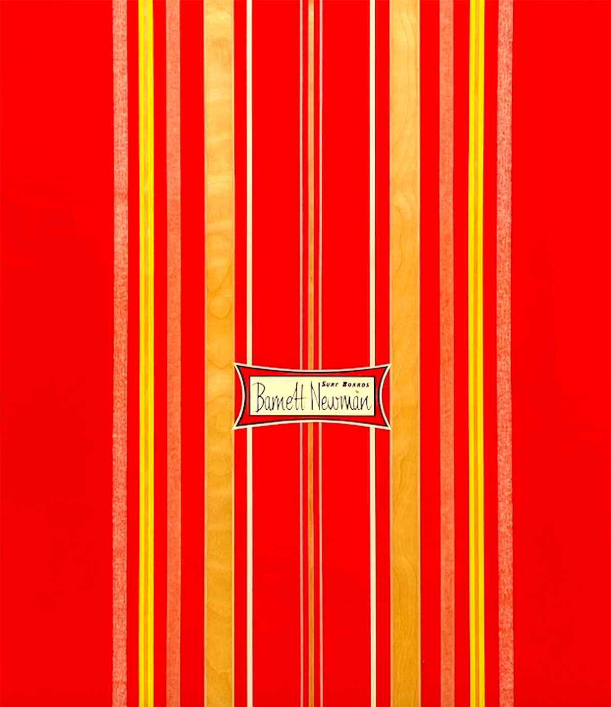
A red and yellow painting with 'Barnett Newman' written in the centre

Surfboards by Barnett Newman, #4 New Generation

ME: And if it’s good enough for Chanel, it should be good enough for most! Tell me about your relationship with Chanel over the years.

PD: It’s been great. Peter [Marino] was collecting my work early on and doing things with private clients and for himself, too. He’s been supportive all the way. It must have been at least 12 years ago that he contacted me and said, ‘I want you to do the interior of the elevator for the 57th Street Chanel store’. And I’m saying,’ sure, I’ll do that’. So I made a map card of all these small Camelia collages. I showed that to him and that’s how he designed it. And then I did one in Beverly Hills. And I think that one is still going. I also did one for the Peter Marino Foundation recently, which is amazing as it’s permanent.

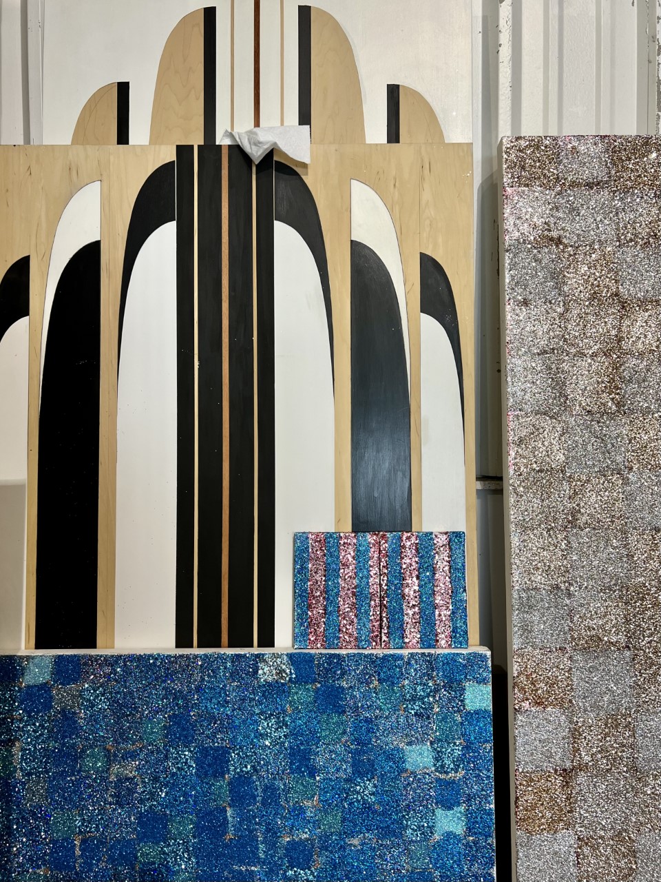
blue and pink sparkles and wooden beams

Studio detail, Northwest Coast Surfboards, and glitter paintings. Photo by Maryam Eisler

ME: It seems like you are highly influenced by the lifestyle of this area, in particular anything that has to do with surfing. You then associate your ‘surfboards’ with known art world figures. Please tell us more about this.

PD: I feel like all the artists from the early 50s all the way to pop art were acting with a lot of swagger and they were just doing these minimal paintings that were so challenging. And I have always equated them with surfers, those who go out there by themselves and ride these giant waves. So, I just put the two together. What they did was like a sport. And very physical. And there’s also the American cultural idea of surfing. I’m not a ‘surfer’ but I am a water person. I boogie board and belly board and all that stuff. There’s also that idea of great freedom in the water.

A man wearing a grey t-shirt and yellow shorts standing in front of a large pink canvas

Portrait with glitter paintings. Photo by Maryam Eisler

ME: And it all started with Barnett Newman?

PD: Yes, when I saw his painting in the Met, ‘Concord’. There are two pieces of actual tape, which I think he left in the painting. But if he didn’t, he taped it off and pulled it off. I forget. And I said, ‘Oh, my God, that’s the stringer on a surfboard’. Because every surfboard in the centre has a piece of wood running through it for stability so it doesn’t snap in half easily; and I just found that fascinating. So, I went ahead and made one exact copy of the painting, kind of green, and put his name on it. And I remember Robert Rosenblum was alive then. And he said, ‘Boy, these are really odd, Peter. I kind of see what you’re doing, but I’ve never seen this before’. And I thought to myself, ‘Well it must be cool!’

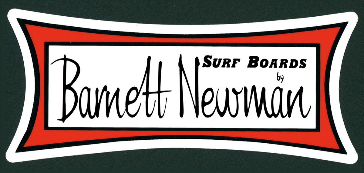
a red, green and white sign that says "Barnett Newman"

Surfboards by Barnett Newman, custom made decal, 2008

ME: Who are your other icons?

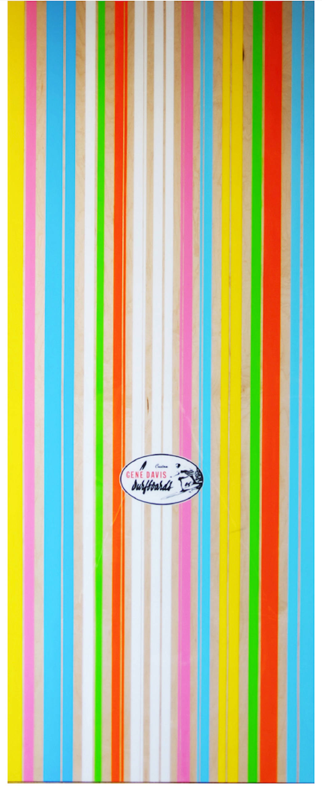
PD: Gene Davis. Which is the striped one, he did multi-coloured geometric stripes on canvas. I’ve also done Ken Nolan and Frank Stella. In all cases, I’ve done a facsimile of their works and superimposed their names into the actual surf decal. Dewey Weber is placed in the same script as Barnett Newman. So when a surfer sees that detail, he goes, ‘Oh my God, Dewey, Who’s Barnett Newman?’ Because I also equate the artists in their large studios in Soho all by themselves, smoking cigarettes, staring at these giant paintings with guys in California, making surfboards in their garages; they’re all kind of doing the same thing. Even though one is super high culture and the other is not, they’re kind of the same thing.

multicoloured stripes on a painting

Surfboards by Gene Davis, 2007, collection Carl Bernstein

ME: But that’s what Warhol did- marry high and low culture so seamlessly.

PD: They come together. They always do.

Read more: An Interview With KAWS

ME: You were once part of this band called ‘La Peste’ out of Boston. Music is a different form of expression, but it’s still part of your own language, your identity…two complementary worlds, would you agree?

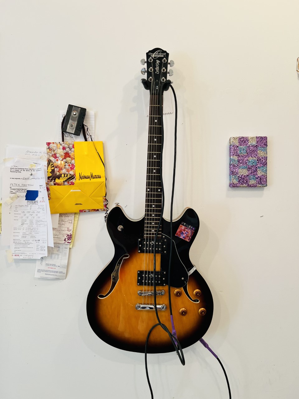
PD: Yes, I still have the guitar to prove it! And there’s great new interest in my band, maybe even a double album coming out next year on a label in Brooklyn. It’s really exciting. It’s been 45 years …

A guitar hanging on the wall by a small piece of art

Studio Wall. guitar with glitter. Photo by Maryam Eisler

ME: Talk to me about your relationship with Peter Marino. He’s been a patron of your work.

PD: Peter’s a genius and it’s a privilege making work for his projects. He’s incredibly knowledgeable about absolutely everything that has to do with art, architecture, music – a total renaissance man. I’ve never met anyone who knows that much and can articulate it in front of you at any given moment. He’s a patron to a number of artists and his support has been so important to me. Working with him is great because he gives me great freedom to do what I want to do and that’s all an artist could ask for.

glitter on a table

Studio work table with glitter and brush. Photo by Maryam Eisler

ME: A final comment from me: I could practice yoga in front of your paintings and just wonder with my eyes. Such serenity!

PD: Thank you. I think the glitter is here to stay, for the world to enjoy. Even though the refraction of light is so busy, there’s a certain calmness to it all. That’s probably what you feel. So I invite you to sit back, relax and lose yourself in it all day!

Find out more: peteredayton.com

Share:
Reading time: 10 min
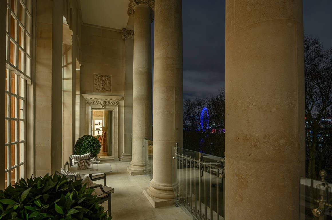
a terrace at night
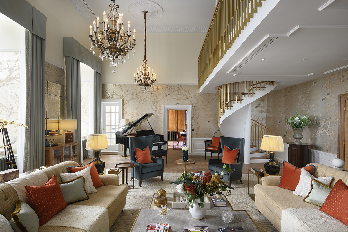
A bright drawing room with red cushions

The drawing room

One of the grandest residences in London has been created out of the former head offices of a British institution. Samantha Welsh takes a look around and imagines a future inspired by the past

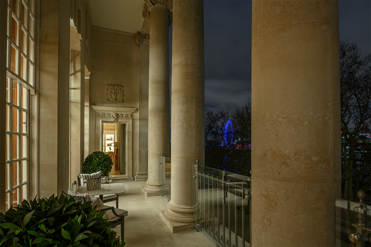
You stroll along your 30 metre long, south facing terrace balcony, lined with Ionic columns. Your view extends from the House of Lords to your left, the River Thames in the middle, M15 and Lambeth Palace, the London residence of the Archbishop of Canterbury, across to the right. Directly below spread the waterside gardens of the Palace of Westminster. You sit back and enjoy a glass of champagne and look forward to the grand reception gala you are going to host ‘at home’ next weekend.

a terrace at night

Views from the terrace at night

Your home is in the heart of Westminster, London, but it is not created from a dusty terraced house with a view just across the street, and nor is it a unit in a shiny new glass building. Your London base is the former headquarters of Imperial Chemical Industries, the largest manufacturer in UK at the time when Britain had an empire, and the Residence comprises its board room, executive offices and more.

Follow LUX on Instagram: luxthemagazine

Grandeur and power ooze from every centimetre – or should that be every inch – of the 5.5 metre ceilinged, 970 square metre, 4-bedroom 5-bathroom penthouse atop this trophy building, whose colonnaded terrace offers a view of every ship passing down the Thames.

A kitchen

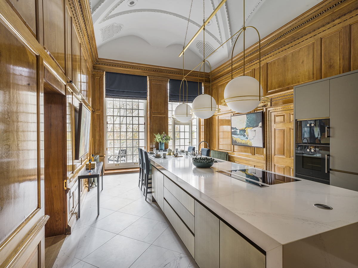
The kitchen

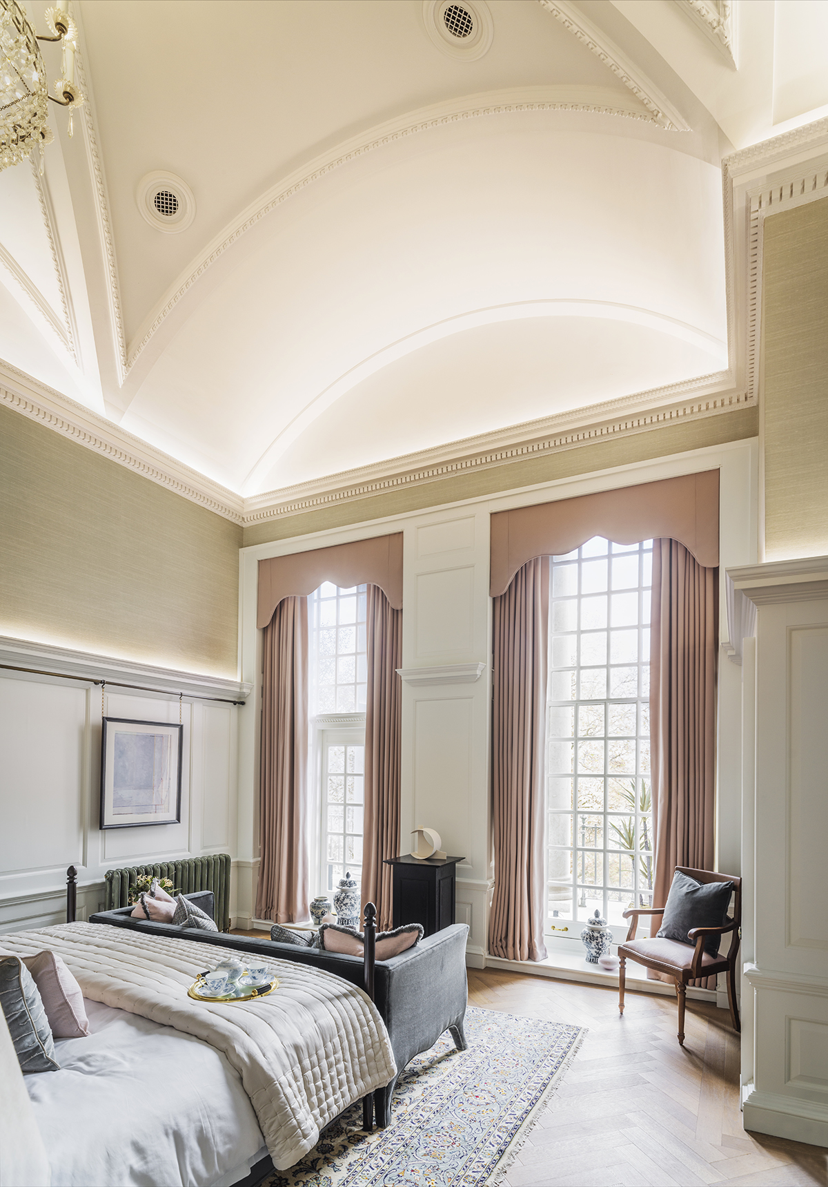
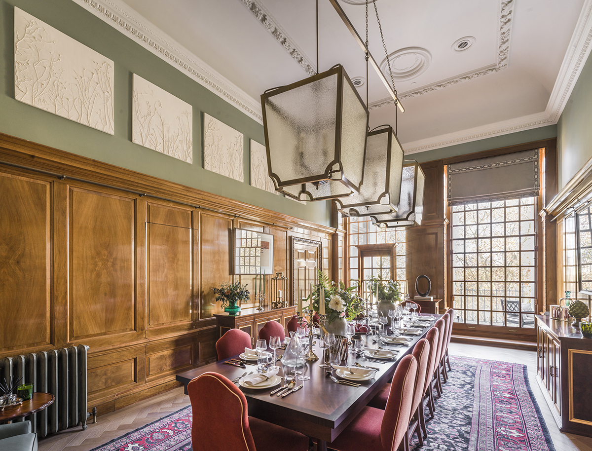
The heritage features of this Grade II listed building have been restored while enhancing volume and light through a palette of contemporary greens and blues. Architect-designers Goddard Littlefair conserved door frames, panelling, plastering, introduced flooring in oak parquet, black and white marble tiling, bespoked light installations, carpeting, rugs, velvet and silk furnishings, and sourced objets.

a bedroom

A bedroom

The double height reception salon, with its grand piano, feels as if it should have David Niven and Cary Grant singing a duet – what a marvellous thought – while Ava Gardner and the young Joan Collins dance tipsily with their coupes de champagne.

Read more: A tasting of Bond, California’s new luxury wine

A secret directors’ bar and games room was discovered under the eaves and reimagined as an inner sanctum, while a subterranean suite of services includes 24/7 golden key-style concierge, gym and fitness, the GL-designed lap pool, spa, cinema, and parking.

a dinning room

The dining room

LUX held a soirée here, celebrating the work of renowned British artist Petroc Sesti, who exhibited at the Royal Academy summer show this year. His work was on display in The Conrad. Our guests didn’t want to leave. And if you don’t want to leave, you don’t have to: the entire site will be delivered in 2023, The Conrad being the only residence that is completed and ready for occupation, fixtures and furnishings optional.

Residences starting from £18 million

Find out more: 9millbank.com

Share:
Reading time: 2 min
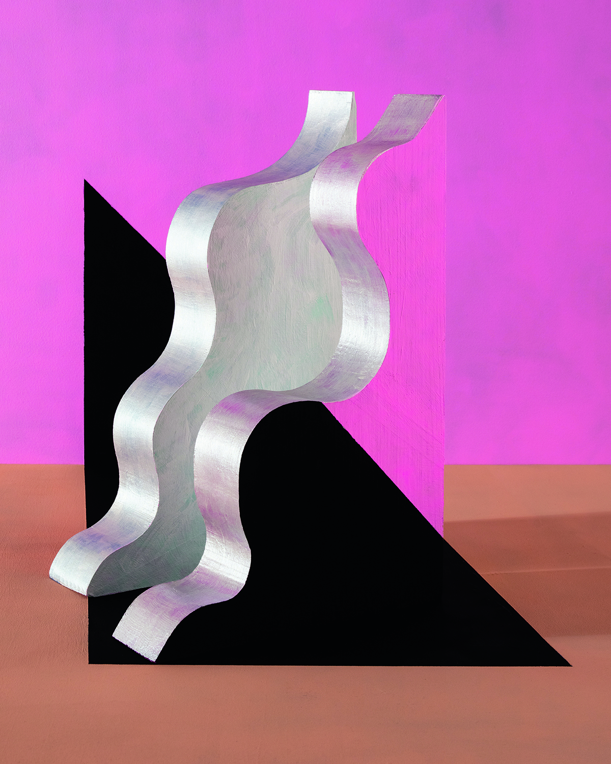
photograph that looks like painting with swirly silver object and squares

Lost at the Beach. Image courtesy of the artist

New York-based architect-turned-artist Erin O’Keefe plays tricks with our perceptions with her photographs that look like graphic paintings. The Deutsche Bank Lounge Artist for Frieze New York 2022 speaks to LUX about the transition from being an architecture professor to an artist, how the disciplines are interconnected, and her inspirations from the original Bauhaus art school in Weimar Germany. Interview by Darius Sanai

LUX: Was your dream when you were younger to be an architect or an artist?
Erin O’Keefe: I always wanted to be an artist. Although I guess what that actually means is an open question. Architecture provided a way of supporting myself that felt super interesting, and teaching meant I could explore theoretical issues that have turned out to be relevant to my art practice.

LUX: Were you always fascinated by the crossover between architecture and art?
EOK: Thinking about how architecture is represented in painting and photography has always been a source of fascination. I particularly love the wrongness of space in early Renaissance paintings – it actually feels pretty liberating. And I’m interested in the fact that most of what I know about architecture has come through images rather than visiting the actual buildings – that seems perverse, but it’s true. So you need to become a good translator to make a bridge between a picture of the thing and the thing itself, but I think it’s actually impossible to get the two things to align.

Follow LUX on Instagram: luxthemagazine

LUX: Are we right in seeing influences of the Bauhaus – the physical school itself and its teachers – in your career and your works?
EOK: Yes, absolutely – it’s a kind of touchstone for me, and the development of my practice. The sense of interconnectedness among the disciplines, and the primacy of making, were both things that feel relevant. I did the Albers colour exercises with my architecture students, which was really the beginning of thinking about the spatial impact of colour in my work.

photograph that looks like painting with pink black and silver elements

Fever. Image courtesy of the artist

LUX: How do you set out to create your works: what is the process of conception and execution? Are you looking for a particular effect on the perception of the viewer?
EOK: I am always looking for a condition of uncertainty in the images. Something that operates in multiple ways and is a bit destabilising for the viewer. I’m interested in the friction between the ordinary tactile objects and the unreality of the image.

My studio process is quite open-ended, lots of trial and error. Small shifts or alignments in the still life can transform the reading of the image, and that moment feels like magic to me.

Colour and light play a huge part in how the objects are perceived, and what they are capable of spatially. The objects themselves are made with the awareness of how they will operate in the photograph – although it’s always a very rough guess, and most of the time I discover possibilities that I couldn’t have anticipated.

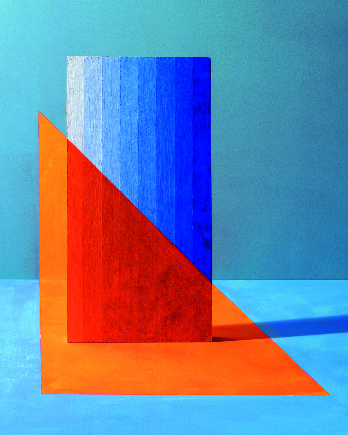
blue and orange shapes in photograph

One Day Soon. Image courtesy of the artist

LUX: Please tell us a little about some of the works at Frieze NY.
EOK: The consistent focus of my work is the gap between the real condition and its representation in the photograph. For the work at Frieze, I became interested in perspective correction – meaning I can paint shapes on the ground and back wall of my still-life set-up that appear very differently in the image – a trompe-l’oeil situation in reverse. I’m also using paint in these photographs as a kind of camouflage to confuse or amplify a spatial condition.

LUX: What kind of a visual artist do you describe yourself as?
EOK: At this point, a photographer, as a way of underlining what these images are. People often mistake them for paintings, but the fact that they are photographs that utilise the language of painting feels like an important distinction.

Read more: Uplifting New Paintings by Sassan Behnam- Bakhtiar 

LUX: Do you still teach and if not, will you ever teach again?
EOK: I really loved teaching, but I’m glad to have the time and attention to devote to my practice. I do miss the studio interaction – architectural education is pretty unique. I have no plans to teach in the future, but who knows?

Find out more: erinokeefe.com

This article appears in the Summer 2022 issue of LUX

Share:
Reading time: 3 min
white chairs on the grass by a pond
white lounge chairs by a swimming pool under a willow tree

LUX stopped off for an al fresco lunch with Fiona Barratt Campbell, founder of her eponymous interior design studio, FBC London and Sol Campbell, English professional football manager and former player. Sitting in their sequestered country home, in a lee of the Wessex downs the couple’s vision is clearly focused on the restoration of landscape, terraces and gardens, and the repurposing of original outbuildings

We sipped aperitifs amid darting blue dragonflies on the jetty lounge and adjourned poolside for a locally-sourced meal. Conversation ranged widely to include Fiona’s most innovative business development yet. Fiona’s bespoke FBC furniture blends with her personally-discovered antiques. We inspected the couple’s artwork in the pool house, the gardener’s cottage, walled kitchen garden, self-seeding wild flower margins, and listened to plans to re-wild the downland pastures. The second phase of restoration to their home is the refurbishment of the main house, predominantly of Georgian origin. Behind the scenes, effective estate management and skilled groundsmen underpin immaculate presentation, there are no short cuts… if necessary even Sol will get on his tractor!

a deck on a lake with a fire and sofas in a circle at the end
white deckchairs in front of a hut and grass

Follow LUX on Instagram: luxthemagazine

white chairs on the grass by a pond
white tables and chairs in front of a swimming pool with a hut in the background
white chairs in front of an olive tree and a hut on the grass
white chairs by a pool with a dining room in the background
white tables and chairs in front of a swimming pool

Find out more: fbc-london.com

Share:
Reading time: 4 min
Dining room
dining room

Chelsea Barracks, with spatial layout and interior design by Elicyon. Photo Michael Sinclair

An architect by training and an interior designer by trade, Charu Gandhi cites her multicultural upbringing as the source of her fascination with people and how they occupy space. To translate her design language to others, she founded design studio Elicyon in 2014, and has since completed super prime luxury residential projects in New York, Dubai, Shanghai, and London  to name just a few. Here, Gandhi speaks to LUX Contributing Editor, Samantha Welsh, about the importance of finding fluidity between disciplines and cultures, and her optimism about the future of women in design

A woman sitting on a sofa with flowers on a table in front of her

Charu Gandhi

1. What are Elicyon’s chief design principles?

At Elicyon, we are led both by how space is used and a fine attention to detail. We also focus on how those can be executed differently for each project. Often you can walk into a project and know how the home would work best for the client. I have a strong spatial understanding that helps to guide the design scheme. What we aim to do is to make our clients fall in love with design, and embark on the journey of learning about materiality and craftsmanship when they work with us.

Follow LUX on Instagram: luxthemagazine

2. What questions do you ask when considering the design brief for a super prime residential scheme?

We have an extensive briefing process that’s about getting to know the client. We ask how each room is used differently by family members and at what times of the day. Designing a home is often about evoking a feeling: I always ask clients to think about a time they really enjoyed themselves – be it an experience in a restaurant or a holiday destination – and what they loved about it. They might remember that they loved the linen on a hotel bed, the details of a ceiling in their favourite restaurant or even the size of the bedside tables in a hotel room.

luxurious interiors of private residence

41-43 Beaufort Gardens, designed by Elicyon. Photo Michael Sinclair

3. How does Elicyon deliver projects globally?

We’ve delivered projects in every continent, and what it really comes down to is great planning. It’s paramount to understand the logistics of a project thoroughly, and often working with a strong local team has proved invaluable. They act as our eyes and ears on the ground. For each new location, we do a recce to understand the particularities, culture and to be familiar with the buildability (seeing what is physically possible to build locally).

Having worked internationally for many years, we have built up a solid black book of partners that we can rely on, from transport companies to logistics managers, the majority of which are based in London but have global reach.

Read more: Molori Designs Founder Kirk Lazarus on Ultra Bespoke Luxury

4. How did this cross-cultural appeal come about?

Having an international client base naturally means we are asked to help on projects in many different continents – we might start with their London home, and end up designing their homes in Dubai, LA and Shanghai too. It’s a reflection of how multicultural London is as a design centre.

Ultimately, however, it comes down to my upbringing. I have travelled extensively since an early age and was educated at an international school, so my school friends live in all parts of the world. I also have an innate interest in people and how they live and occupy spaces.

A living room with fireplace and armchairs

Chelsea Barracks, with spatial layout and interior design by Elicyon. Photo Michael Sinclair

5. What during your training most inspired your vision as an architect and designer?

My first year at the Architectural Association was my most formative year, led by a brilliant teacher, Julia Wood, who passed away too young some years after. She turned the notion of architecture on its head – and we explored concepts through dance, through sculpture and the human body, and she introduced us to a myriad of conceptual artists of the time. I remember being particularly struck by Rachel Whiteread’s work.

6. What do you think has changed for women in architecture in recent years?

There is no better time to be a woman in architecture: the playing field, from a London-centric view, is full of great women designers, thanks to groundbreakers like Zaha Hadid who cracked the mould. Nevertheless, there are worrying statistics of those who graduate as architects versus those still in the role 10 years on. In my mind, the UK needs to fix its childcare challenges, and only then will the female-led architecture and design ecosystem thrive.

I know the Royal Institute of British Architects (RIBA) and Architects Registration Board (ARB) have task forces working on it, and that I too have a responsibility as a leader to grow and build female teams.  I am proud to say that at Elicyon our senior leadership team is entirely female. As an industry, however, we must endeavour to always do better.

Find out more: Elicyon.com

Share:
Reading time: 4 min
luxury beach residence

One of Molori’s recent and largest projects is this 2,100 sq m home in California, remodelled as a resort

Molori Designs takes the concept of bespoke to a whole new level. Answering all your lifestyle needs, whether you’re on safari in South Africa or settling down in Santa Monica, they specialise in tailoring everything to the individual client. LUX speaks with founder Kirk Lazarus

Super yachts, private jets, sleek urban apartments, tropical beachside villas, endless vistas and infinity pools – global architecture and lifestyle company Molori Designs is in the business of dreams (‘molori’ means ‘to dream’ in Tswana, a southern African language), or rather, the dream. This is the one where you, essentially, have it all. Founded by South African-born, Sydney-raised entrepreneur Kirk Lazarus, the company owns a safari lodge in Madikwe Game Reserve in South Africa, several resorts in Clifton and Cape Town, and Port Douglas in Australia and a superyacht called Told U So. They also develop and design luxurious, turnkey homes for the ultra-rich which are carefully curated to the individual’s needs and tastes, from the art hanging on the walls to the types of spirits stocked in the bar. “Usually when people think of resorts, it’s connected with the idea of going on holiday. Our goal, from a design perspective, is to create a lifestyle where you don’t need to take a vacation from it,” says Lazarus.

Follow LUX on Instagram: luxthemagazine

As such, their design approach is focused on not only achieving the highest possible standards of luxury living, but also anticipating the future owner’s day-to-day needs. They often ask clients to talk them through their daily routine from the time they wake up to the time they go to bed so that they can pinpoint moments which could be made more seamless. Of course, this is also the appeal of branded residences, which are kitted out head-to-toe in, say, Giorgio Armani or, in the case of hotel-branded residences, come with all the expected five-star amenities and services: private chefs, valet parking, housekeeping, a 24-hour concierge. The key difference, however, is that with Giorgio Armani or Four Seasons residences, you’re buying into a lifestyle defined by that brand, but with Molori’s homes, every aspect of the design is tailored to the specific individual or family. All furniture is custom-made in Italy and the company collaborates with luxury brands to create bespoke fixtures such as Murano glass × Molori chandeliers, and Missoni Home upholstery.

luxury living room interiors

luxury dining room

The living room (top) and formal dining room of an apartment in New York City overlooking Central Park designed by Molori

There are, however, a few design principles that define every Molori residence. “We make sure that every corner of your home has a purpose regardless of how big the property is,” says Larissa Makkonen, one of the company’s designers. “Amazing views are also always a priority for us. We often use mirrors to reflect the ocean or landscape so that you feel surrounded by nature.”

luxury pool

The pool area of a California beachfront home, designed by Molori in 2018

As the company is relatively small, the team is directly involved in every stage of the project, which allows them to continuously adapt their designs and push for greater levels of personalisation. With yachts, for example, that means going to the shipping yard where the boat is being built and discussing how much they can manipulate the basic structure to include bigger windows or more spacious bedrooms.

Read more: How Andermatt became a leading luxury destination

The ability to adapt is also fundamental to the company’s approach to sustainability. They try to “create the greenest environment possible” while also anticipating changes in climate and landscape. According to Lazarus, beachside residential projects have been particularly challenging in recent years due to global rising sea levels and how the need to accommodate this will impact the coastline in the future.

luxury bedroom interiors

The master bedroom in the New York apartment

For now, though, his sights are set on Miami – “one of the places to be for luxury” – where Molori currently has several turnkey projects in progress. “It’s exciting to see how far we can push the envelope in luxury-style living,” Lazarus says.

Find out more: molori.com

This story was originally published in the Autumn/Winter 2021 issue.

Share:
Reading time: 3 min
kitchen design
kitchen design

The kitchen of a Cologne family designed for socialising, with Gaggenau equipment including a 200 series oven, a 400 series cooktop and discreetly hidden fridge-freezer and dishwasher.

The impact of climate change, digitalisation and the pandemic is demanding bold, new visions for our homes and public spaces. Here, Millie Walton speaks to Sven Baacke, Head of Design at the luxury home appliance manufacturer Gaggenau, and Ian Lambert, Director of Cambridge-based architecture and design studio Inclume — who recently created an installation for Gaggenau’s London showroom — about sustainability, adapting to shifting lifestyles, and the experience of luxury

SVEN BAACKE
Head of Design at Gaggenau

Sven Baacke is Gaggenau’s visionary head of design. Visionary in both senses of the word: he is a passionate, radical creative, and a kind of prophet. Then again, part of his job, and perhaps of all good designers, is to anticipate the future and in some ways, also to shape it.

Follow LUX on Instagram: luxthemagazine

Baacke is in the business of kitchens, which means any emerging cultural or social trends are filtered through a very specific perspective: “What will that mean for kitchens?” and more specifically, “What will that mean for Gaggenau’s luxury appliances?” Take, for instance, the trend for biophilic design. While the desire for creating living spaces that are more closely connected to nature might not directly affect say, the design of an oven, it does affect the architectural structure of the home, which in turn, means rethinking the positioning of the kitchen and the way that people move through and use the space. “Our customers are increasingly creating environments such as outdoor kitchens or gardens where they can grow their own ingredients,” says Baacke. “But what we think about is: how far can Gaggenau go? Is the kitchen the limit for us, or beyond?”

team of designers

Gaggenau’s design team

The brand’s global success is built on its ability to create a range of good-looking, technologically advanced appliances that effortlessly respond to these shifts and demands in lifestyle. Baacke calls their approach “traditional avant-garde”, in the sense that they are a historic brand with a contemporary ethos. At one point during our conversation over Zoom, he holds up the Gaggenau designer’s handbook, flicking through the pages to show me what seems to be mostly images, which Baacke describes as “mood boards”. “It helps to have guidelines,” he says, “but it’s not a cookbook.”

How does Gaggenau decide what to make next? “Our designers are very curious, so there are always a lot of vibrant ideas floating around. Mostly, we are thinking of what not to do and I don’t just mean physical design, shapes and colours, but also topics. There are so many things already out there. You really need to think twice before you create something new and to ask what difference will a new product make in the world.”

Despite fluctuating trends in aesthetics, the kitchen remains a central feature of building design. Even if it is becoming increasingly integrated into our homes, for now, at least, we still need somewhere to cook, eat and gather. “There’s a big chance the kitchen will become invisible in the future, but there are two poles of opinion about that,” says Baacke.

minimal kitchen design

Paris kitchen designed with Gaggenau equipment by the Russian architecture and design studio IQOSA

Gaggenau’s appliances might look like design objects, with super-sleek metallic finishes and sculptural lines, but they are also made for everyday usage. “The tactile element of our products is very important,” says Baacke. “Nowadays, with the increasing digitalisation of our lives, nothing is really by chance, everything is calculated. So, it’s nice to still have something in your hand, to touch a real material.”

Read more: How Andermatt became a leading luxury destination

At the same time, technological advances have undoubtedly enabled Gaggenau’s appliances to provide increasing levels of precision and ease in both professional and domestic kitchens. The heat in their combi-steam ovens, for example, can be controlled to within one degree, a process which continually revises the estimated cooking time based on temperature-probe readings from three different sensors. They can also be integrated with voice-controlled AI systems such as Alexa. Is this the modern-day definition of luxury?

“There are a lot of products that are high-end, but luxury is more of a feeling. It’s very individual, and it’s not just about the technology,” says Baacke. “We try to create feelings. When you use our appliances in your beautiful home which is connected to your family, that can be a luxurious experience.”

luxury kitchen design

Gaggeanu’s 200 series ovens

Gaggenau’s materials (think stainless steel, dark aluminium, rich woods and glass) are selected for technical and aesthetic reasons, but also durability, which is a crucial part of the brand’s approach to sustainability. Baacke’s response, as always, is to look to the future, and longer-term solutions, rather jumping on the sustainability trend as a marketing tool without properly considering the consequences.

“We create appliances that are really reliable. You can buy our ovens from the 1980s on the internet and they still work and look good,” he says. “But it’s also a mindset. Does a patina on a surface mean that you have to throw it away, or could it be like a leather bag that gets better over time and tells a story? Crucially, for us and the whole industry, sustainability also means repairability. Can you unscrew the appliances? Can you separate the materials?”

Alongside an increased cultural awareness of the environment, the difficulties of the past year have brought with it a new appreciation for a slower way of living, which in turn has led to a renewed interest in antiques, vintage products, and craft and artisanal practices that all speak to a certain feeling of nostalgia. Since 2019, Gaggenau has been supporting small-scale makers and producers through their Respected by Gaggenau initiative, and Baacke himself recently bought a BMW motorcycle from 1973 that he describes as “the true essence of a motorcycle”. “There’s a lot of anxiety about what the future will bring, so I think people need to have familiar things around them, things that make them feel good,” he says.

Sven Baacke: Where to start with redesigning your kitchen

The first question has to be: why? What don’t you like? Is it the colour, the arrangement of cupboards or the appliances? Has your lifestyle changed in some way? Has your family grown, or have your kids moved out? Do you like to host dinners? Do you enjoy cooking with guests in the kitchen, or would you prefer for them to sit while you cook? Start with the small things, and the ideas will get bigger.

installation artwork

Ian Lambert with Fragment in Gaggenau’s London showroom

IAN LAMBERT
Director of Inclume

LUX: Your installation for Gaggenau’s showroom in London made innovative use of paper. How did that project come about?
Ian Lambert: We won a competition which was run by the London Festival of Architecture in partnership with the paper supplier G.F. Smith, so a large part of the brief was to create something using paper. We have used paper in the past and it’s actually a great material to work with because it’s malleable and very lightweight, which especially helped with Fragment, the window installation, as we were suspending 4,000 polygonal forms. The design took inspiration from the craftsmanship that Gaggenau has pursued since it started as a hammer mill and nail forge in 1683. The polygonal forms were an abstract representation of fragments of metal and we chose colours that reflected the history of the brand, with the black signifying the Black Forest in Germany, where the brand was born, and the orange representing the roaring fires of the furnaces used to craft the appliances.

LUX: What’s your process for coming up with an initial design? What are the factors you consider?
Ian Lambert: We usually start with a brief, which will be formatted as a response to a question. Visiting the space, talking with the client about how they’ve used the space, what works for them, what doesn’t work for them, and how we can introduce new things – all these factors provide a narrative and a set of parameters to work within.

LUX: Where do you, personally or as a studio, find inspiration for new ideas?
Ian Lambert: I think we’re inspired by what’s around us. It’s difficult to pinpoint a specific place. Looking online is quite a dangerous thing to do – you don’t want to copy other people, but you can find inspiration in little details from different projects and also by revisiting ideas that you’ve already done. At the end of each project, it’s not the final piece, because we can always improve. We take each project and then try and build on that next time by refining details. Over time, it gets better and better.

Read more: How to create a truly sustainable luxury hotel

LUX: In your opinion, what are the key principles to good design?
Ian Lambert: I think good design makes your actions feel easier in daily life. That doesn’t necessarily mean that you have to identify with what’s good architecture or good design. It doesn’t have to be noticed, it can be subtle and understated.

LUX: Do you think the pandemic has had an impact on how people perceive their living environment?
Ian Lambert: I think people are beginning to appreciate the things around them and the value of the spaces that they inhabit. Most people have been working from home lately, so it’s about adaptability. You might have your kids or your partner around and you’re also living in the same space 24 hours a day, so you are able to more easily identify the things that work and the things that don’t work.

LUX: How much of a consideration is sustainability in terms of the materials you use?
Ian Lambert: We’ve always been fairly conscious of what materials we use. With an existing house and its various elements, we try to keep as much of the original as possible, but create a new focal point. We also use a lot of materials, particularly in our installations, that are recycled. It presents a challenge as to how we can use and modify them to create a different experience. It might be just paper or some old pieces of timber but it can be aesthetically amazing if you see something that’s been recycled and then used in a very good way. At the same time, it doesn’t mean that using brand new materials can’t be sustainable. You need to consider other elements. If you’re doing an installation for example, how long will it be up for? Will it get chucked away at the end? Or are you then prolonging the longevity of the material by reusing it in a different way?

LUX: What makes a design luxurious?
Ian Lambert: I think luxury is subjective. For us, as a studio, it’s something that makes your life easier in a seamless way, whether that’s through bespoke design or creating a positive experience for someone. For example, we did a project where we made a raft out of sustainable materials such as recycled timber pallets and barrels. We took it to a lake and it was very complex putting it together, but when you sat on the raft on the water in silence beneath the canopy of trees with different shades of light filtering through, it felt like a luxury space. Luxury experiences can also be about the fun and enjoyment of doing something with other people.

Find out more: gaggenau.com/gb

This article was originally published in the Autumn/Winter 2021 issue.

Share:
Reading time: 10 min
architectural pavilion in a city
black and white portrait of a man

Santiago Calatrava. Portrait by Jacqueline Roberts

The beauty and purity of form of Spanish architect Santiago Calatrava’s buildings around the world belie the marvels of engineering that he brings to his show-stopping designs, as well as sometimes the controversies over budget overspends, design flaws and construction delays. But, as Mark C. O’Flaherty finds when he speaks to the architect, his extravagant vision never loses sight of each project’s singular purpose

Few things truly warrant the term ‘sensational’. Santiago Calatrava’s architecture demands it. You don’t look at his structures, you experience them. He engineers a feeling. Each project has its own potent energy, from the exhilarating elongated archery bows of his Puente de la Mujer in Buenos Aires and Samuel Beckett Bridge in Dublin, to the balletic falcon silhouette of one of his most recent works, the UAE Pavilion at Expo 2020 in Dubai. “Look, let me show you something,” he says, sitting in the garden of his home in Zurich. “See…?” Taking a finger to his iPad, he draws the outline of a bird in flight, with curlicued feathers, reminiscent of a Cocteau sketch. “And here is my signature…” Again, he creates an effortless swoosh and a soaring gesture on screen. “Birds were a big part of my childhood. I grew up in a house next to a tower full of doves and watched them come and go. Using nature as an approach to architecture has always fascinated me. Not in a decorative way, but as a purity of spirit.”

Follow LUX on Instagram: luxthemagazine

Calatrava’s career began in the early 1980s, with warehouses and railway stations in Germany and Switzerland and the Bach de Roda Bridge in Barcelona. Even then his style was fully formed, with its roots in fine art. He left Spain in 1968 with the intention of studying in Paris at the École des Beaux-Arts. But fate – and that year’s student riots – closed one door and opened another. “I visited Notre Dame one morning,” he recalls. “The light was streaming through the windows on the south side of the building and it was the first time I realised how sublime architecture could be, and how it can reach levels of expression that move your heart.” He left Paris and returned home to Valencia to study architecture for the next six years. Today, his work has been acknowledged with twenty-two honorary degrees, a retrospective (in 1993) at MoMA in New York, and a gold medal from the American Institute of Architects in 2005.

radical architectural structure

Innovation, Science & Technology Building at Florida Polytechnic University, designed by Calatrava in 2014. Image by lan Karchmer for Santiago Calatrava

In person, Calatrava radiates enthusiasm and charm, frequently appending sentences with an endearingly accented English “…isn’t it?” When he isn’t hard-wired into his studios in Zurich, Dubai and New York, he reverts to painting and sculpting. “I think of it as patient research, and parallel to my architecture,” he explains. “It all has the same energy. All my work is figurative. Even when I sculpt something abstract, the weight and tension in it are related to the human body. It’s all based on nature.” Those doves at the family home are part of an expansive flowchart of a global ecosystem that is Calatrava’s mood board. “I used to visit the Paleontological Museum in Valencia with my brother, and I was fascinated by the shells there,” he says, “I take inspiration from things that are skeletal, but also unicellular organisms visible by microscope. My PhD thesis was called ‘The Natural is Mother and Teacher’. I see the science of engineering as empirical – it comes from observing the behaviour of natural structures.”

a bridge lit by pink neon

The Puente de la Mujer, Buenos Aires, 2001. Image by Diego Grandi/Alamy. 

A Calatrava building is anything but simple. It also certainly isn’t cheap. In 2013 The New York Times ran a critical piece on the architect, flagging up certain projects in Europe that ran two or three times over budget. His striking red bridge over the Grand Canal in Venice, completed in 2008, had various parties lawyering up after it took an extra €4.6m to complete, while his PATH station in New York City – the World Trade Center Oculus – is rumoured to have cost $4bn, twice its original estimate. Money aside, many wondered if the Oculus would ever actually be finished. But, as the saying goes, “Rome wasn’t built in a day”, and Calatrava’s are some of the most ambitious buildings in history. Walking into the Oculus, despite the visual noise of its retail outlets, is akin to walking into the Sagrada Família in Barcelona, or St Peter’s Basilica in Vatican City. The spatial qualities are sublime.

new york buildings

The World Trade Center Transportation Hub, New York, 2016. Image by Alan Karchmer

The architect’s vision for the future of our cities is as ambitious as his individual projects. While much of his work is for private clients – including the Turning Torso residential skyscraper in Malmö – he is a go-to for governments. He creates landmarks that market their location, but he is also, for all his flash, obsessive about the impact on a landscape. “We have an obligation to deliver for the next generation,” he says. “Communities need to be respectful of all things natural – something that begins with government, and then private clients react to that.” One forthcoming project is a new bridge across the Rhine in Eglisau, intended to pull traffic flow from the town centre, while being harmonious with its idyllic landscape. The jury behind the project flagged Calatrava’s design as having “a certain discretion” while still being “extremely elegant and self-confident.”

steel building entranceway

Innovation, Science & Technology Building at Florida Polytechnic University, Lakeland, FL, 2014. Image by Ian Karchmer for Santiago Calatrava. 

Modern architecture and nature can seem at odds, but Calatrava’s skill is in elevating what currently exists – he is a paradigm of the future of city planning as well as a high-profile architect. His 2015 Museu do Amanhã (Museum of Tomorrow) in Rio de Janeiro, which focuses on the role of science in the future of the environment, is remarkable for several things. The structure features solar panels that shift according to the direction of the sun, while water from the bay it overlooks regulates the temperature inside. “If you visit the museum, you learn so much, so simply,” he says. “We built a miniature forest and created a series of pools around the museum, drawing from the river. Gravity pumps it to the end of the pier and it cascades to the sea, not only filtering it, but oxygenating it. We are condensing an idea – showing how important the forests are around the city, and how the bay can regenerate things.” The museum also represented a major intervention in the existing urban plan of Rio. “We demolished the viaduct that had cut the city in two,” explains Calatrava. “Architecture can transform a city and contribute to a better way of life. Look at the Golden Gate Bridge in San Francisco – it brings magic to that Pacific bay.”

Read more: Product designer Tord Boontje on sustainable materials

While working in Rio, Calatrava met Brazilian master architect Oscar Niemeyer, whose contemporary art museum opened in Niterói in 1996. Its blindingly white, futuristic, flying-saucer form offers a dialogue with Calatrava’s new building across the water. “He was over 100 when I met him, but still capable of enormously clear thinking,” he says. “He was my idol. His work showed me how you can transmit a kind of poetry through the shapes and forms of architecture, and how it goes beyond the everyday needs of people, and becomes art.”

station escalator

Guillemins TGV Railway Station, Liège, 2009. Image by James Ewin

Art is inherent in Calatrava’s work. Like the sculptor Richard Serra, he creates negative space that generates a sensation: “It is the void that delivers the atmosphere and emotion,” Calatrava says. “It is a constant for me. Even with my bridges, there is a space beneath them, and looking up at it can be as interesting as crossing over it. Architecture is essentially a material casket around a space you are developing. And, like a wheel without the hole in the middle, it won’t turn. It’s the most important aspect.”

walkway through a building

The Oculus at the World Trade Center Transportation Hub, New York, 2016.

His use of negative space to create emotion is perhaps most apparent at the Oculus and at the neighbouring St. Nicholas Greek Orthodox Church, currently under construction. Both are in his typical reductionist Mediterranean white, and both expose internal space to the sky. “The Oculus is a strip and the church is a circle,” he explains. “The latter has ribs in the dome to let the light in, and the void there has an image of the Almighty at the centre of the roof.” Calatrava references the beauty of the Pantheon in Rome, where the focal point of everything is, essentially, the hole at the centre of the ancient dome – “The emotion of the immaterial being framed by the material,” as he describes it. So with the church, it is Jesus that is framed rather than the sky. But at the white-winged Oculus, it is pure air. “The roof is designed to open,” Calatrava explains. “We calculated it precisely so that when it retracts each 11th September, at 10.28am to mark the time of the 2001 tragedy, the orientation of the sun delivers a strip of light down below. It is the light, and the void, that deliver the message.”

Find out more: calatrava.com

This article was originally published in the Summer 2021 issue.

Share:
Reading time: 8 min
performance art
performance art

Chin Cheng-Te, Lee Chia-Hung, Lin Chuan-Kai, and Chen Yi-Chun, still image from Making Friends/ Fire, 2020, mixed media installation, dimensions variable. Videographer: Lee Chia-Hung.

Independent curator Eva Lin worked alongside French philosopher Bruno Latour and Martin Guinard to select contemporary artists and designers interrogating climate issues for the 12th edition of the Taipei biennial. Here, she speaks to Tara Sallaba about experiencing artworks in a digital format and how art can help to raise awareness

portrait of a woman in glasses

Eva Lin. Image by Etang Chen

1. The biennial has transformed the Taipei Fine Arts Museum into “planetarium”, representing different interpretations of the world. Which one most closely aligns with your views and why?

What I want to answer intuitively is the Planet Terrestrial*, but it should be the sum of all planets including the unveiled one. It’s like you plant a tree in your garden and underneath, the tree’s roots are intertwined with other species and cannot be separated anymore. Each mountain is not independent, but a symbiosis interactive with soil, species, bacteria, humidity, sunlight, wind. Geopolitical methods are no longer the answer to climate emergency. All problems nowadays are closely related to ecology, and each of us is no longer an outsider.

Follow LUX on Instagram: luxthemagazine

2. How do you think art can most effectively participate in wider discussions around climate change?

We, as art workers, have to be modest about this issue. Art is certainly not the solution; it’s not created for problem solving. However, art can certainly serve as an alarm to wake up audiences and draw attention to social issues which cannot be solved due to the scientific uncertainty.

industrial boat on a green lake

Liu Chuang, still image from Lithium Lake and the Lonely Island of Polyphony, 2020, 3 channels video, colour, sound, 35mins 55 secs. Courtesy of the artist and Antenna Space

3. Are there any artists who are particularly inspiring you at the moment?

From the biennial, Chang Yu-Tang and for work about the Anthropocene, Forensic Architecture.

Read more: How women artists are reshaping art history

4. How do you think experiencing art through online formats affects our relationship with the pieces?

It’s somehow similar to observing the reflection of the moon on the ocean. You feel really close to the moon as you could actually catch the moon from the water, though you can’t feel the texture and temperature of the moon. We can easily access and experience art through online formats, though we certainly lose something and may not be able to encounter the soul of the piece.

man in jungle with bee hive

Pierre Huyghe, Exomind (Deep Water), 2017, concrete cast with wax hive, bee colony, figure: 72×60×79 cm, beehive dimensions vary. Courtesy of the artist, Winsing Arts Foundation and Taipei Fine Arts Museum. Photographer: Rex Chu

5. Do you think the art industry is doing enough to be sustainable?

There is still a long way to go. It’s really a lifetime task as the world is changing every day.

6. Once international borders open, which galleries/museums will you be visiting first?

Haus der Kulturen der Welt [HKW] in Berlin.

The Taipei Biennial runs until 12 March 2021 at Taipei Fine Arts Museum. For more information, visit: taipeibiennial.org/2020

*According to the biennial’s press release: ‘Planet Terrestrial restlessly looks for ways to achieve prosperity while staying within the limits of planetary boundaries.’


Share:
Reading time: 2 min
sunken terrace
man in suit

Ali Behnam-Bakhtiar. Image by Marko Delbello Ocepek.

Iranian-born designer Ali Behnam-Bakhtiar does it all – interiors, architectural design, weddings. Whether large-scale events or private homes, a converted airplane or a château, he runs the gamut from extravagant to minimal with equal flair and imagination, bringing his clients’ stories to life. Torri Mundell reports

Architectural designer Ali Behnam-Bakhtiar is a man on the move. Since 2003, his striking design projects have made their mark on coastlines, private islands, mountainsides and city streets in Europe, Asia and the Gulf, while his events company operates from Dubai, London, Paris and Monaco. The spaces he conceives, from the cargo plane he transformed into an airborne apartment to a spectacular eco-friendly château in Provence and a refurbished 150-metre yacht extended with landscaped green spaces, are equally dynamic. “I think of spaces and events like personal books,” he says. “They are stories that we experience through an introduction, a body and a grande finale.”

Follow LUX on Instagram: luxthemagazine

Though Behnam-Bakhtiar claims not to have a signature style, the emphasis on experiencing a space – rather than simply passing through it – is an essential part of his aesthetic. “To create this kind of extra dimension, I am very detail orientated. I study the space carefully, I envision the memories that can be created and I focus on the senses that can be discovered.”

floral wedding display

Behnam-Bakhtiar’s floral design for a wedding in Ljubljana, Slovenia. Copyright and courtesy Ali Bakhtiar Designs

Ali Bakhtiar Interiors clients do not commission him to create something they have already seen somewhere else. “Everything I do is one of a kind,” he says. “I don’t hold on to what I have done or what has been done.” Conceiving wholly original designs for every project can be hard work, he admits, but it means that he never caves in to “the dullness of repetition.” Instead, each project is always “a learning process that definitely keeps me challenged and excited.”

Read more: Meet the marine biologist pioneering coral conservation

Behnam-Bakhtiar’s curiosity, extensive research and the relationships he fosters with his clients to “deeply understand their values, wants and needs” all feed into his vision for a project. Every aspect of design is thoughtfully considered to create a harmonious whole, but his spaces are also full of daring, unexpected moments. Consider the château he restored in Provence: he preserved the historic façade and added a self-sustainable modern basement, a pond that irrigates the rest of the estate and a formal dining room with a glass floor that overlooks a garden lavishly planted with lotus flowers. “I believe it is important to embrace modernity as much as ancient knowledge, because something might look cool and new but it also needs to age well,” says the designer about his blend of the traditional and contemporary.

sunken terrace

A 2019 house on Saint-Jean-Cap-Ferrat designed with glass walls to make the surrounding forest part of the interior. Copyright and courtesy Ali Bakhtiar Designs

Though the scale of the properties he designs can be vast, Behnam-Bakhtiar imbues his spaces with personal elements as well. “Generally, my favourite events or interior projects are the ones in which I deeply connect with my client, because this is what inspires me to go beyond expectation, and create something ‘out of this world’, a visualisation of their dreams and more.” In the château, for instance, each of the 34 suites was decorated to represent places or moments in time that are meaningful to the owner.

Creating a blueprint that encompasses both grand design moments and personal detail requires a nuanced approach. “Architecture to me is about conserving memory; creating spaces that host our lives but remain in existence beyond it,” Behnam-Bakhtiar continues. “Unlike events, architecture has permanence and so you are not just working on one experience in time, you are working on a timeless structure that impacts repeatedly. I believe architecture, landscaping and interior design need to merge to bring true and lasting harmony.”

He takes his cues from the outdoors to create this harmony. “I used to design houses that stood out from nature,” he remembers. “I now create ones that integrate with nature. The house becomes engulfed by the landscape rather than being simply set in it.” This approach also chimes with the current drive for sustainability. “Much more than ever, we now see nature as something that needs to be integrated in interiors and architecture. Rather than fighting the rules of nature or working against it, which we have done for so long, we are finally starting to see the incredible benefits of an alliance.”

Luxury villa

A 2018 house design in Florida with a characteristic Behnam-Bakhtiar blending of natural and built environments. Copyright and courtesy Ali Bakhtiar Designs

The “green and self-sustainable” glass house he designed for a client on a private island epitomises how this can work. In building the residence from scratch, Behnam-Bakhtiar gave it a “system that transmits and observes energy” along with an ultra-modern, sleek exterior and sumptuous Art Deco furnishings.

Read more: American artist Rashid Johnson on searching for autonomy

Similarly, on a property refurbishment in the French Pyrénées, Behnam-Bakhtiar preserved the ancient rocks that predated the house by encasing them in glass boxes and installing a “hydraulic system to make the house ‘convertible’; completely open towards the seascape, on multiple levels. We also created several distinct courtyards and fountains, to give the landscape exciting layers.”

architectural render

A render of an island house off the coast in Abu Dhabi, with an Art Deco inspired interior in contrast to the building’s ultra-modern minimalist exterior. Copyright and courtesy Ali Bakhtiar Designs

Born in Tehran, Ali Behnam-Bakhtiar was still a child when he moved with his family to Paris after the Iranian Revolution in 1979. He grew up surrounded by art and culture and his parents indulged his drive to “redecorate their interiors on a weekly basis”. Even so, he says, “it was very much a conscious adult decision to develop my creativity professionally.”

His early memories from Iran, particularly before the revolution, “in which large-scale events and gatherings were considered normal” may have informed Behnam-Bakhtiar’s other hugely successful business: event planning. Orchestrating large-scale, fantasy weddings, celebrations and parties is a complementary discipline to his design work but he came upon it entirely by chance. “I was working on the interior design of a palace for a client of mine, whose daughter was in the midst of planning her wedding. Completely uninspired by the process, she had sort of given up on her dream wedding until she coincidentally saw my plans for their winter garden. In love with the plans for the garden, she convinced me to design her large-scale royal-like wedding for 2,500 guests.”

events space

A reception that took place in Hall of Mirrors at the Palace of Versailles. Copyright and courtesy Ali Bakhtiar Designs

Behnam-Bakhtiar’s ability to imagine multidimensional, immersive spaces works as well for one-off events as it does permanent buildings, and working across the two disciplines allows for a beneficial cross-pollination of ideas. “I mix architecture and interior design with event planning, and do things that have never been seen or done before. This has allowed me to evolve and remain modern. I embrace the future and the process of change and growth.” In 2019, Ali Bakhtiar Designs was named “best wedding planner in the Middle East” at the Destination Wedding Planners ACE awards, and in the same year the company won an honorary award at the Influencer Awards Monaco.

As with his architectural designs, the events he designs are inspired by their setting. “The location and not the budget is what creates the possibilities,” he says. What would he conjure up for a wedding at a castle with an unlimited budget? “I’d probably create a sunset moment, curate different areas so there is movement and a multi-layered experience of the castle. I would also do something with the façade, so the guests can view it differently throughout the evening.”

Read more: Why the market for modern classic Ferraris is hot right now

He is delighted to be commissioned for wedding and parties abroad. “Like creating a world from scratch, the entire infrastructure is purposefully built and specifically curated for the event, in the middle of nowhere.” The possibilities are endless, he points out, describing a beautiful event he planned on “a private island lit by 50,000 candles. The guests arrived by raft laid with beautiful flowers and in the middle of the island, we created a pond and fountain on which the gala’s dinner tables floated.” More unusually, Behnam-Bakhtiar also oversaw a divorce party on a cruise ship.

As with his design projects, Behnam-Bakhtiar and his team ensure they have oversight of every detail. “The design of the food, the uniforms, the bar; anything that has to do with the visuals, the service, the presentation… To me an event is never just about decoration, it is about continuous implementation; everything needs to run smoothly and as we visualised it.”

floral wedding display

An impression of flower-covered columns for a wedding at the Basilica della Santissima Annunziata in Florence, January 2020. Copyright and courtesy Ali Bakhtiar Designs

floral arch

A rendered image of a tunnel of flowers for a wedding in Cape Town, 2020. Copyright and courtesy Ali Bakhtiar Designs

With high-profile architectural and interior design clients and starry party guest lists, discretion is part of the Ali Bakhtiar Design service. He will not be drawn on the high profile personalities that have commissioned him. “We work with a lot of different people including celebrities and royalty, but under no circumstances do we share our clients’ names, whether we signed confidentiality agreements or not. We pride ourselves on being private.”

Word, however, is out – partly because of the design company’s huge international reach. “We go where our clients are, so it was only natural to expand,” Behnam-Bakhtiar explains of his company’s outposts in Dubai, London, Paris and Monaco. The company does not promote its productions but exposure has come nonetheless through guests’ photos on social media. And who can blame them? The vast hall filled with reflective ponds and dancing LED lights for a party in Shanghai and the arcade of pink roses for a church wedding in St Barts demanded a selfie. “Much of the current exposure of our work is not just because we have expanded but also because it is shared,” Behnam-Bakhtiar agrees.

Contemporary living interiors

A digital impression of a 2019 building design in Switzerland that brings nature into the heart of the home. Copyright and courtesy Ali Bakhtiar Designs

Like the architectural design industry, the events business is also becoming more mindful about expenditure. “I would like to see more consciousness around long-term trust and a sustainable use of funds,” Behnam-Bakhtiar asserts. “Rather than creating an event for the budget and exhausting funds, we now look at what we need for the event. This means we spend less on unnecessary things, so that these funds can be used elsewhere or go to charity.”

Behnam-Bakhtiar’s diligence is even more relevant in a post-Covid era. “Events of up to 7,000 people are postponed for at least a year,” he says, “but the smaller events are starting to take place now, in a more down-sized manner. We’re on stand-by, like the rest of the world.” With his vivid imagination, a roster of international clients and almost two decades of experience, he won’t be standing by for long.

Find out more: alibakhtiardesigns.com

This article features in the Autumn Issue, which will be published later this month.

Share:
Reading time: 9 min
contemporary design

Tom Dixon’s Fat chairs, Beat pendant lights and Tube table. Image by Peer Lindgreen.

Millie Walton speaks to four design leaders – Bentley’s Stefan Sielaff, Gaggenau’s Sven Baacke, Tom Dixon and Cristina Celestino – about innovation, sustainability and the evolution of their industries

TOM DIXON
British designer and founder of the Tom Dixon design studio

man portrait

Tom Dixon

“After trying art college for six months, I broke a leg in a motorcycle accident and gave up education in favour of a career as a bass guitarist in a disco band. After another fortuitous motorcycle accident, I was unable to join the band on tour. I discovered welding and, driven by my enthusiasm for making functional forms in metal, I began a series of radical experiments in shape and material. There is a freedom in music that I transferred to design.

Follow LUX on Instagram: luxthemagazine

“I rarely think of the final shape of an object or the surface before I start. I’m always thinking of the material possibilities, the potential of the factory and the structure of the object, which means that I’m a vertebrate designer rather than an invertebrate! I’m obsessed with how you make things and what they are made of. My style is reductionist and constructivist, meaning I try to make things as simple as possible.

“It’s hard to not be overwhelmed by outside influences. It’s important to develop your own design personality. I avoid looking at design and look at art, industry, cooking, science and nature.

“A designer has to work on the edge of their comfort zone, to use new processes or materials or shapes or new functions to create something new. They have to be in the present.”

tomdixon.net

modern pink furniture

The Back Home furniture collection designed by Cristina Celestino for Fendi Casa. Image by Omar Sartor

CRISTINA CELESTINO
Architect and designer, founder of Attico Design

woman portrait

Cristina Celestino

“When I design a product, a chair or a lamp, I start by thinking not only about the single item, but also about the whole mood, and where it could be settled within an interior. I pay a lot of attention to the proportions and scale. For me, there is not much difference between designing an interior or a piece of furniture; in the end they must both have strong personality and power. Details are always what matter most. Every last finish, all the colours and fabrics, must be perfect and work together. What’s important is the coherence of the story that you are telling.

Read more: Gaggenau is bringing global attention to regional artisans

“The way we approach design and, in particular, architecture should be definitely changed by the theme of sustainability. Nature should be protected and valued like an infrastructure that is always ready to help us when needed. In the furniture and interior design fields, I work with sustainability at different scales. It is not enough to use the ‘right’ or eco-friendly materials if they are not related to the design or to the success of a project.

“Sustainability should be part of all logistic and manufacturing processes, not just about the final product itself. This is why I pay careful attention to the materials I use, from their sourcing to the geographic location of suppliers and the manufacturing techniques.”

cristinacelestino.com

adventure car

The 2020 redesign of the Bentley Bentayga. Courtesy of Bentley Motors.

STEFAN SIELAFF
Director of design at Bentley Motors

Stefan Sielaff

“Our customers expect a luxury product, manufactured with integrity. They want a unique, timeless piece of art that they will feel happy with for many years; an object that does not age from an aesthetic point of view so that it can be passed on to their daughters or sons. Bentleys are a fusion of the best. The sporting aspect of Bentley models is historically in our genetic code, but we don’t design, engineer and manufacture sports supercars in the common sense. The power in our Bentleys is not for showing off, it is discreet and sophisticated.

Read more: Looking back on 125 years of Swarovski and into a new era

“Very often the source of inspiration comes when we are in a team setting and sparks a whole series of design concepts, not only with me, but with the whole design team. This works like a chain reaction. If the idea is really good, there is a natural flow in the team.

“Car design will change dramatically in the next 10 years, as the car industry itself will also change. There will be new and completely different challenges from a technical as well as social acceptance point of view. The mind-set will change especially for luxury cars just as it will in the luxury industry as a whole. Sustainability is a key factor already within the Bentley brand, and it will continue to be crucial to the driver and passenger experience.”

bentleymotors.com

oven

Gaggenau’s 200 Series combi-steam oven. Image by BJP Photography Ltd

SVEN BAACKE
Head of design at Gaggenau

Sven Baacke

“In my opinion, there is no such thing as timeless design because design is always in the context of people and the time in which it is bought and made. I call Gaggenau’s design approach traditional avant-garde. The brand has a heritage of over 300 years, but on the other hand, it has always been looking to the future and doing things that other people thought would never sell. Balancing these two things is in the DNA of Gaggenau, but what we have done in the past two years is to think about the traditional and the avant-garde in the extreme. One extreme could be that in the future there is no kitchen at all.

Read more: How Andermatt Swiss Alps is drawing a new generation of visitors

“We have been thinking about megacities where space is a luxury and about the future of housing more generally. What does it mean when luxury comes in a nutshell? What is compact luxury living? What will happen if the whole kitchen becomes even more invisible when not in use? What happens if people don’t go to work anymore, but work from home?

“The other major question is: can luxury be digital or is it always analogue? At the end of the day, I believe that the kitchen is still and always will be the heart of the home. We will still gather around a fireplace even if it’s a digital one in the future.”

gaggenau.com

This article features in the Autumn 2020 Issue, hitting newsstands in October.

Share:
Reading time: 5 min
dining table
dining table

Woolsery Cottage, a private residence with interiors by Hannah Lohan

Since launching in 2015, Hannah Lohan Interiors has developed a reputation for designing uniquely decorative spaces. The studio’s portfolio includes numerous residential properties, boutique hotels, restaurants and spas with two ambitious hotel-village projects currently in development. Here, we speak to the studio’s founder Hannah Lohan about creating immersive environments, the return of maximalism and collecting vintage furniture

1.Where does your design process typically begin?

Hannah Lohan

It starts with the client – we spend as much time as we can getting to know them and developing a deep understanding of how they want their space to feel to their guests. We get them to list their key adjectives – do they want to create somewhere calming, nurturing and tranquil, perhaps? Or would a buzzy, vibrant and eccentric environment be more appropriate? It sounds basic, but the act of narrowing down to just five words can really focus the design process, as well as being a useful reference to prevent the project veering into another direction.

Follow LUX on Instagram: luxthemagazine

The next step is to consider the architecture and locality of the building. We try to draw on the surroundings as much as possible, including local artisans and makers in the design wherever we can. Personal touches and stories from the owners are also so important. The Dunstane Houses in Edinburgh, for example, was a lovely project for us as the owners were keen for us to include references from Orkney, where they grew up. We looked into Orcadian culture and history and came up with a design story for their whisky bar, the Ba’ Bar, based on the Kirkwall Ba’ – the traditional street football game that has been played in Orkney for centuries. We celebrated this with a picture wall full of historical photographs of the games, and even an old Ba’ ball that sits proudly on the shelves. The heritage and history of the building and its owners can play a huge part in shaping the character of the space.

interiors hotel bar

bedroom interior

A bedroom at The Dunstane Houses hotel in Edinburgh, and above,Ba’ Bar, the hotel’s whisky bar

2. How do you utilise theatrical and storytelling techniques?

I think my passion for theatre in design comes from years of running a creative events company, designing immersive environments that transport people to other places. We love designing boutique, independent hotels, because they allow us to incorporate that sort of theatrical detail and employ unique elements that create truly memorable spaces. Good interior design isn’t just beautiful, it tells stories and sends you on imaginative journey as you experience it. That can be achieved by including elements of the unexpected and the playful – from treehouses and luxury safari tents hidden in the grounds, to pop-up bars in old horse boxes or disarmingly offbeat boot rooms.

restaurant interiors

Hook restaurant at The Fish hotel in the Cotswolds

3. Is it more important to have a recognisable aesthetic or to be adaptable?

As designers, it’s our job to be adaptable and to tell our clients’ stories by guiding them through the creative process but I recognise that, as our studio has grown, we’ve become known for a more layered, decorative aesthetic. We wouldn’t be a good fit now for someone wanting a truly minimalist look. I don’t want us to be pigeonholed, and we never, ever take a cookie-cutter approach to our projects, but I am proud of all the work my team and I have put in over the years to research and build a fabulous library of materials, finishes and interesting furniture suppliers and makers, so it would be foolish not to see this as one of our biggest strengths.

pub interiors

The Farmer’s Arms, a Grade II listed pub in Devon, with newly renovated interiors by Hannah Lohan

What makes a design rich and interesting is layer and detail. We have to love what we do and be fully invested in order to create something truly magical. The hardest thing is to get clients to trust you – this is why we work best with creative owners who are willing to push themselves out of their comfort zones and understand that designing a hotel is very different to designing a home.

4. What do you think have been some of the most interesting evolutions in design in recent years?

Hotel design has evolved very quickly in a short space of time. My brother and his wife, James and Tamara, are the founders of boutique travel company Mr & Mrs Smith. When they started 17 years ago, they struggled to find enough hotels with strong enough interior design to fill their first book. Today, it’s completely different; you can really pick a hotel that appeals to your personal taste or go for somewhere that offers something completely different. This has pushed designers and hoteliers to be braver and bolder and makes for a really exciting era in design.

One trend that has been really interesting to be part of is the demand for quirky, outdoorsy places to stay, from cabins and shepherds’ huts to treehouses, like the ones we designed in the grounds of the Fish Hotel in the Cotswold. From the gorgeous Bert’s boxes at The Pig hotels to the luxurious treehouses at Chewton Glen, they’ve proved that you can connect guests to nature without compromising on style or comfort. And as we discover more and more about how important the countryside is for our mental wellbeing, this trend is going to continue to thrive.

luxury treehouse

treehouse bedroom

The treeperches at The Fish hotel in the Cotswolds designed by Hannah Lohan interiors

Provenance is another key trend – guests are engaging with food much more deeply and taking an interest in ingredients and where they come from. This has led to a boom in hotels opening cookery schools (there’s a lovely one at Thyme), and in hotel restaurants opening up their kitchens – first by adding windows, then kitchen theatres, then chef’s tables, and now it’s gone even further, with glass cabinets of butchered meat and wine cellar tours. This has a direct impact on interior design – what was once storage is now display.

The return of maximalism is another trend I find fascinating. Minimalism is such a niche style and shabby chic has evolved in to a more finished and polished look. Amazing designers such as Martin Brudzinski, Kit Kemp, Abigail Ahern and the Soho House design team have shown that maximalism and chintz is all about layering to give a more modern, curated and very glamorous interior. We’re even seeing the trend towards coloured bath suites again – at our project in Devon, we’re bringing back the avocado tub, thanks to the stunning Water Monopoly supplier who we love!

5. Your concepts often combine vintage and modern pieces – is there a design era that you’re particularly drawn to?

I’ve always been attracted to vintage furniture and I love nothing more than finding an old tired chair and giving it a new look with modern fabric and a good French polish. It’s so satisfying to see something old look current again; it just takes a little imagination – maybe contrast piping or a different pattern on the back. We sell a lot of revamped 1950s and 1930s chairs like this through our shop at the Old Cinema in Chiswick. I’m certainly not an antiques expert like lots of my fellow dealers there and I don’t have a preferred era. I buy on instinct, so you’ll find anything from old industrial factory tables to Victorian dressers to French vintage tableware. It’s a constantly evolving collection of lovely finds from our travels and contacts we’ve built up over the years of designing hotels. We love using these pieces in our projects; they add character and it’s a much more sustainable approach.

Hannah Lohan Interiors shop at The Old Cinema in Chiswick, London

6. Does good design last forever?

What is considered ‘good design’ is constantly evolving – but that doesn’t mean you have to do a total refurb every five years. It’s amazing what can be achieved with some simple styling and up-cycling certain pieces of furniture. My favourite design studio, Roman and Williams, headed by Robin Standefer and Stephen Alesch, are such an inspiration to me. They started off their career as set designers for movies and then went on to design amazing hotel interiors, such as the Ace Hotel and the Standard in New York. Their designs are all story-led, as though they were following a film script, which makes them brave in their approach. They don’t follow trends or rules – they love to surprise and disrupt traditional ideas by doing things like painting a Georgian cabinet red, or mixing eras to create a really eclectic, unexpected design. This, to me is good design – having the vision and confidence to adapt what’s there, rather than replace it as trends change.

Find out more: hannahlohaninteriors.com

Share:
Reading time: 7 min
Render of apartment
Render of apartment

One of the luxury apartments in the Arve building with spectacular views of the surrounding landscape

Two new apartment buildings in the Swiss village of Andermatt offer the calm and luxury of contemporary Alpine living. LUX speaks to the architects behind the designs

The historic village of Andermatt is fast becoming one of Switzerland’s most desirable year-round destinations offering a variety of winter and summer sports, activities, dining options, and accommodation. Located in the village’s car-free area known as Andermatt Reuss, Arve and Enzian are the development’s latest apartment buildings, designed to harmonise with the traditional alpine setting whilst catering to a contemporary luxury lifestyle.

Follow LUX on Instagram: luxthemagazine

Designed by CAS Architects, the Arve building comprises 17 apartments with spectacular views of the village and surrounding mountains whilst the Enzian building comprises 12 apartments designed by Swiss architecture firm Schmid Generalunternehmung. Here, Michael Häfliger of CAS Architects and Men Vital of Schmid Generalunternehmung talk us through the design concepts for each property.

What inspired the design intent for Arve and Enzian, and what differentiates the two properties?

Michael Häfliger: In the design for Arve alpine tradition meets contemporary with clear forms and natural charisma. We have combined cosy ambience, warmth and rustic security with the need for high comfort. 
These exclusive apartments are as dignified and enduring as the Swiss pine trees after which the building was named (Arve is the German name for the Swiss pine). Much like the noblest tree in the mountain landscape, the Arve Chalet Apartments offer spectacular views of the world below.

Read more: Three top gallerists on how the art world is changing

Men Vital: The Enzian Alpine Apartments are styled on modern Alpine villas. We wanted each apartment to provide the ideal place to sit back and unwind after an active day in Andermatt, with an atmosphere as calming as the Alpine herb after which the building is named (Enzian is German for “gentian”). Some of the apartments feature a fireplace and sauna, and some boast a private roof terrace or a garden terrace on the raised ground level. The private gardens are raised above the level of the adjacent paths, allowing residents to relax in privacy whilst the interiors are designed to fit all the needs of a peaceful Alpine lifestyle.

detail interior shot

Arve’s apartments combine alpine tradition with contemporary furnishings

How much of a consideration was the resort’s heritage and commitment to sustainability?

Michael Häfliger: When developing the design for Arve, we greatly considered the inclusion of the local conditions and the extraction of the resort’s identity by creating features as important prerequisites during the planning. The urban structure of the central zone of Andermatt does not follow an orthogonal grid and does not show any symmetry. Crystalline building forms, narrow and wide alleys merge into an urban density and create spatial tensions. We have taken up and adapted this atmosphere with the building structure. The interior of the building does not follow a grid either and arranges the apartments in a free structure whilst the external appearance takes up elements that are typical for the location, such as bay windows, stone plinths or wooden facades, and translates them into a contemporary form.

CAS Architects have been committed to sustainability in its mission statement for years. Conscious use of resources is a matter of course for us and has also led to efficient processes and procedures at Arve. The building materials and construction materials were procured as far as possible in the Ursern valley and the landscaping consists exclusively of local plants. Arve also meets all the criteria of the Minergie standard and is certified accordingly. High-quality external insulation and a ventilated wood cladding façade underline the sustainable energy concept.

interiors of an apartment

luxury apartment interior

Here and above: Enzian apartments feature luxurious interiors with unique detailing such as parquet flooring

Men Vital: The design of the Enzian building took the specifications from the architectural competition into account and buildings will be constructed to the Minergie standard with controlled ventilation. Mineral-insulated rock wool has been used for the façades, which is a high-quality, non-combustible material with a high sound insulation value. The use of fibre concrete is similar in quality to natural stone and the flat roof is extensively greened, which increases the outflow of water and helps to create a better ambient climate.

Can you talk us through some of the materials that were used for the interiors?

Michael Häfliger: High quality and timelessness underline the Alpine character and so precious and durable materials such as wood, natural stone, glass and steel dominate the design of Arve.

Read more: Meet the winners of Prince Albert II of Monaco Foundation’s awards

Men Vital: Durability and quality were taken into account when selecting materials. For example, we used parquet flooring and wet room panels with an oriental-style design.

open plan apartment

The open-plan living space in one of Arve’s apartments

How do the designs fit into the larger Andermatt Swiss Alps development?

Michael Häfliger: With Arve, the Alpine tradition of Andermatt is continued, and the chalet style is interpreted in a modern, self-confident way. The exclusive apartment building is strongly reminiscent of the character of the Arve; it takes up the sublimity and tranquility of the pine tree and creates a clear reference to the surroundings. The house has an unusual form that creates exciting exterior and interior spaces.

Men Vital: Enzian house is distinguished by its cubic architecture with a frescoed roof, bay window, loggias, and plinth. This is further emphasised by the window partitions in sandstone look, which are reminiscent of a traditional patrician house. It sets an extraordinary accent within the Andermatt Reuss area of the resort due to its architectural form and its lower height compared to the neighbouring properties. In terms of colour, the house is based on the wider surroundings; it is like a rock covered with lichen.

Find out more: andermatt-swissalps.ch

Share:
Reading time: 5 min
Luxurious hotel bedroom
brutalist building

The exterior of The Standard hotel, Kings Cross. Image by Tim Charles

East London-based architecture and design practice Orms masterminded the renovation of Camden Town Hall Annexe in Kings Cross for The Standard hotel group’s first UK property. Here, James Houston speaks to one of the company’s directors John McRae about the project and its challenges

1. How does your approach differ when working with an existing building versus a new build?

On all of our projects we undertake extensive research and analysis to understand the site, its context and history. When retaining an existing building our research is forensic in order to establish the parameters and rules that will inform and guide the design. We believe it’s important to understand the thinking behind the building, its structural principles and construction techniques. We were fortunate to work with structural engineers Heyne Tillett Steel who share the same research ethos and they were able to build a Revit 3D model from the archive drawings.

Follow LUX on Instagram: luxthemagazine

2. What are the challenges when refurbishing a brutalist building?

The use of raw concrete defines Brutalism and in nearly always used on both the structural frame (insitu) and facades (precast). This building was no exception and to add to the complexity it was a two way spanning ‘waffle’ slab that transferred the load of the façade back onto a very deep first floor slab and the inboard columns. This fully integrated structure and façade solution meant that major internal interventions or a new facade would not be viable. Surprisingly, the residual structural load capacity within the building structure was limited and this needed careful consideration when adding the new top floor extension.

Luxurious hotel bedroom

The 9th Floor Suite with views of St. Pancras Station. Image by Tim Charles

3. How do you see The Standard fitting into the wider redevelopment of the Kings Cross area?

The vast majority of regeneration projects within the Kings Cross have been to the north of the Euston Road so it was always an aspiration of the project to draw that energy to the south. A key component of this strategy was to have an occupier such as The Standard, a respected brand with an established following, that can attract people and act as a catalyst for further regeneration within the area. The hotels variety of spaces to socialise, listen to live music and talks means there are reasons to keep coming back.

library space

The hotel’s library lounge offers a space to meet, socialise and read. Image by David Cleveland

4. Do you have a favourite room or space in the hotel and why?

My favourite space is the library lounge on the ground floor. Set within an eclectic collection of eating, socialising and drinking areas that provide visual activity to the street but a moment of calm in the hustle and bustle of Kings Cross the library lounge is a nod to the former Camden public library. Surrounded by carefully selected and arranged books the space is used for meetings, live music and talks.

Read more: Entrepreneur Dr. Li Li on the importance of global relationships

5. What was the inspiration behind the external lift pod?

A new lift was required to supplement the main bank of lifts and serve the 10th floor restaurant and bar. Given the complexity of the existing structure the idea of an external lift was explored to provide a visual marker and signal that something special was going on at the top of the building. The red lift demarcates the entrance to the restaurant, which was always intended to be able to be separate from the hotel entrance. The concept and look and feel of the lift was led by Shawn Hausman Design and inspiration for the form came from the Mercedes Benz museum elevator and the iconic Routemaster bus for its red colour.

architectural sketch

External lift pod

Orms’ preliminary sketches of the hotel’s external lift (above) which takes its colour from London’s iconic Routemaster bus. Image by Tim Soar

6. Do you have a favourite brutalist building in London?

London is spoilt for choice with respect to brutalist buildings but one of the hidden gems is Space House (now often referred to as 1 Kemble Street), a 1960’s office development by Richard Seifert & Partners for the developer Harry Hyams. It is a great speculative office building, whose exteriors reflect many of the themes at play at their Centre Point development. Its innovative use of a precast concrete grid, partial prefabrication that allowed for rapid construction without the use of scaffolding and striking visual effects makes it an exemplar even for today’s commercial developers and architects.

Find out more: orms.co.uk

Share:
Reading time: 4 min
Architectural image
Image of fabric like water

Photogenic Painting, Untitled 75/31, Barbara Kasten. Copyright & courtesy the artist

Barbara Kasten is one of the most intriguing and influential photographic artists of the past 50 years. Born in the US before the second world war and initially influenced by the Bauhaus movement of the 1930s, her work seems to meld two dimensions into three and defy easy categorisation. In a rare interview, she speaks to Millie Walton about some of her techniques ahead of her postponed solo show at Kunstmuseum Wolfsburg in Germany

“I do not think of my work as abstract photography. My abstraction is a search for a fleeting moment in time when a nondescript, real thing is transformed and perceived in another state of being. By definition a photograph records reality. I use photography to capture a unique abstraction of perception which can only happen with the interaction of light. It’s about how materials interact with light and how light is so essential to the way that we look at the world.

Follow LUX on Instagram: luxthemagazine

“Normally, my interest is in the material that I’m using and its properties so there’s a lot of controlling and experimentation, and that’s the initiating point for me. I make shapes out of these materials that have no representational value; they are basic geometric shapes, building blocks, which is where the relationship to architecture comes in. Everything that I build in front of the camera is not held together, it’s balanced on each other. I’m building something that looks like an object, but I don’t want it to look like an object so I cancel it with what happens when the light hits and the shadows create other objects that are fleeting. The shadows also become building blocks, but they’re not there so it creates this contrast between the real and the unreal.

Colourful architectural scape

Architectural Site 19, July 19, 1989, Barbara Kasten. Copyright & courtesy the artist

Architectural image

Architectural Site 17, August 29, 1988, Barbara Kasten. Copyright & courtesy the artist

Artist in studio

Architectural Site 15, Whitney, 1989, installation shot with the artist. Copyright and courtesy the artist

Read more: In the studio with the radical New-York based artist Mickalene Thomas

“All of my work is in the studio so I can move the light to achieve a different perspective of the object, but I don’t move the camera. I build in front of it and because [the viewer] is large, I can look at it as I might look at a painting where if a shape is not in a compositional relationship to another shape that I like then I can go in and change it by moving the object or the light. In that way, it’s a very painterly organisation and composition that I create, but then there’s also the three-dimensionality of the sculpture that is a different experience to the three-dimensionality as it is translated to the flat surface. I think that’s one of the reasons why more recently I’ve been taking what I call the set-ups in front of the camera and treating them more like standalone sculptures. I don’t make a photograph, I just use the same kind of material elements and I allow the audience to see what I see before I go to the back of the camera because once I’m looking through the camera, it’s my point of view and it’s frozen in the moment. Now, I’m more interested in how I can broaden this experience so that other people see the discovery for themselves.”

sculpture of coloured glass and metal

Crown Hall, Artist City, 2018, Barbara Kasten. Copyright and courtesy the artist

Due to Covid-19, the artist’s solo exhibition ‘Works: Barbara Kasten’ at Kunstmuseum Wolfsburg has been postponed, and is expected to open later this year. For updates, visit: kunstmuseum-wolfsburg.de

View the artist’s full portfolio of work: barbarakasten.net

This article will also be published in the Summer 2020 Issue, hitting newsstands in May 2020.

Share:
Reading time: 3 min
Luxurious lounge area of town house

Residents of Clivedale London’s latest luxury development can enjoy branded services and amenities provided by the Dorchester Collection

Mayfair-based developers Clivedale London recently unveiled the interiors for a townhouse at Mayfair Park Residences, an exclusive residential development managed by the Dorchester Collection. Chloe Frost-Smith takes a look inside

Mayfair Park Residences is a collection of 24 private apartments, all fully-serviced with five-star amenities by the adjoining Dorchester Collection hotel, 45 Park Lane. Ranging from spacious pieds-à-terre to an eight-bedroom penthouse complete with rooftop pool, the generously proportioned apartments are spread over eight floors with sweeping views over Hyde Park.

Follow LUX on Instagram: luxthemagazine

Incorporating the character of a Grade II listed townhouse, Lee Polisano of London-based PLP Architecture has created a contemporary yet complementary counterpart to the refurbished historic Georgian façades, one in black-painted brick, the other in Portland stone and white travertine. Fronting two streets and presenting six distinct exteriors, Mayfair Park Residences blends into the surrounding eclectic architectural styles.

Luxurious double bedroom

Grand dining room with piano

The spacious dining room of a townhouse at Mayfair Park Residences, and (above) one of the bedrooms

The classic Georgian period details are continued in the interiors, which draw on historical references combined with bespoke features by Parisian design studio Jouin Manku. With a number of previous Dorchester Collection hotel projects in their portfolio, Jouin Manku has taken a fresh approach to the group’s first residential development, focusing on an organic, natural colour palette and luxurious materials. Soft, muted tones are paired with elegant marble work, floor-to-ceiling windows, and wood-panelled spiral staircases.

Read more: Film director Armando Iannucci on David Copperfield & Fleabag

Contemporary spiral staircase of apartment

Interiors by Parisian design studio Jouin Manku blend historical references with contemporary details

Residents will enjoy access to an impressive selection of services available on an à la carte basis, including 24-hour room service, concierge, security, and valet parking. In addition to 45 Park Lane and The Dorchester amenities, residents can also make full use of the heated swimming pool, sauna and steam rooms, and hydrotherapy pool.

Find out more: mayfairparkresidences.com

Share:
Reading time: 1 min
Stainglass windows lining a corridor
Portrait of a man against a white background

French designer Philippe Starck. Image by JB Mondino.

Legendary French designer Philippe Starck gives Mark C. O’Flaherty his radical vision of the future: a time when designers won’t be needed – and maybe even chairs

“I’m not interested in aesthetics anymore,” says Philippe Starck, sipping on a glass of mineral water in the Royal Academy in London. “I am interested only in our evolution, and how the intelligent craft of human production is going to be rerun by dematerialisation. We are working on making things disappear.” As Starck speaks, I notice the periodic flashing of a red LED from beneath the skin on a fingertip of his left hand. It’s extraordinary. I ask him what it does – is it connected somehow to his laptop, perhaps? “Ah, it’s magic!” he says, cryptically, before steering the conversation to his ongoing project with the Roederer champagne house: “I never wanted to just design a bottle, I wanted to share in the making of what was inside. And it was about creating something that had less in it, nothing added, no sugar.”

Follow LUX on Instagram: luxthemagazine

We are at the Royal Academy for the launch of the new Roederer-Starck 2012 rosé champagne, where he is judging a competition between 13 artists at the Academy’s Schools to interpret the taste of the champagne through their art. His choice of winner – a white-on-white embossed spiral on paper called Cycles, by Sofía Clausse – is apposite for his ongoing philosophy of design: “It was the most accessible piece,” he says, “It was simple. It captured the spirit of champagne, which to me isn’t a wine, or a reality, but an idea.”

Contemporary plastic chair against white background

Starck’s AI Chair for Kartell

When the world first caught sight of Philippe Starck’s work in the 1980s, the Parisian-born designer had been creating products for a new way of living. He was changing the vocabulary of interiors, rephrasing the language with futuristic accents on everyday items. His choice of materials was aggressively different from the tradition of French design – he selected transparent plastics, metallics and pop colours. He was as New Wave as the cinema of Luc Besson and Jean-Jacques Beineix and of the architecture of Jean Nouvel. Today, at 70, he is one of the most prolific designers who has ever lived, having created literally (his studio can offer no official number) countless products from clocks to yachts. Today, he still works on an average of 200 projects a year. And yet, as he tells me, he believes that “fifteen years from now, thanks to technology, every material obligation will have disappeared.”

Read more: Chaumet’s CEO Jean-Marc Mansvelt on historic innovations

How does a designer who has been apocryphally credited with 10,000 products balance his current view of a future with nothing in it, with his business model? “The business element will shift,” he says. “We debuted the AI chair with Kartell at Salone del Mobile in Milan this year, and it was the first of its kind ever to be created with artificial intelligence. AI is going to create a new freedom in design. With AI, we can now ask any question, but it’s all about knowing the right question.” He also sees a time beyond furniture. “Design as we know it will be dead,” he says. “There will be better solutions to sitting down than a chair. I think a chair has always put you physically in a bad position. We can do better than a chair.”

Stainglass windows lining a corridor

The entrance to the Starck-designed L’Avenue restaurant at Saks Fifth Avenue, New York, with stained glass by his daughter Ara

Starck has always been radical. In 1984 he created the interior for Café Costes in Les Halles. With its theatrical blue staircase and oversized minimal clock, it was as much a postmodern landmark leisure-time interior as Ben Kelly’s Haçienda in Manchester, and Arata Isozaki’s Palladium in New York City. All were created in the same decade, but Starck’s project was notably more dramatic because of its location. This was Paris, a city still stuck in Belle Époque aspic. French design was frozen in curlicues and froth. Starck was an iconoclast.

Contemporary artwork hanging on wall

Photograph of wine glasses

Entries to the Brut Nature competition from Royal Academy students, with (top) The Philosophers’ Reserve by Max Prus, and (here) Tidally locked by Olu Ogunnaike

After a series of successful Paris interiors, he was aligned for a long period with Ian Schrager’s fantastical hotel projects, bringing some of the eccentric visual flair that Schrager and his late business partner Steve Rubell brought to Manhattan nightlife with Studio 54. There was a fairytale, supersized element to much of what he did, from elevated swimming pools to triple-height billowing curtains. From the Royalton in Times Square in 1988 onwards, their partnership helped take Starck’s name and distinctive, witty style to the world.

Read more: Founder of Nila House Lady Carole Bamford’s guide to Jaipur

While his peers, including Marc Newson – who currently holds the record for a design object at auction after one of his Lockheed Lounge chairs sold for over £2 million in 2015 – focused on rarefied edition pieces, Starck focused on mass production. A rare blue glass Illusion Table sold for $50,000 a decade ago, but Starck is known more for his alien-looking Juicy Salif lemon squeezer – which first appeared in 1990 – and continues to be one of Alessi’s best-selling products of all time. At one point, the company produced 10,000 gold-plated versions, purely for display in the home (lemon juice discolours the surface). His transparent plastic chairs for Kartell – the La Marie, which launched in 1999, and the Louis Ghost armchair, which debuted three years later – are as instantly recognisable as any piece of furniture ever made. They brought avant-garde design to the mass market. But when plastics are being demonised, do his polycarbonate objects belong to the past? Starck remains a passionate cheerleader for the material. “For me, it’s the only way to achieve the quality product I want,” he says. “There is a great difference between single-use plastic and a chair that you can keep for a century or more. The media has created great confusion. I prefer to work with fossil energy than to cut down trees and I would rather use vinyl for upholstery than kill cows.”

Woman spitting fountain of water against black background

Artwork etching with mulitcolours

Two further entries from Royal Academy of Arts students to the inaugural Brut Nature competition judged by Philippe Starck, with (top) Self-portrait as a Champagne Fountain (2019) by Clara Halstrup and (here) Sun on the coast of the moon by Richie Moment

One area in which he, and indeed most of us, remain guilty in terms of the unfolding climate crisis is in carbon emissions from flying. But Starck is one of the busiest designers on the planet, and for someone who still uses pen and paper and tactile models to create (“If you create using a computer, you are just creating within the frame of the guy who created the software!”), he needs to appear in person for projects. The day after we meet, he has to get up at 4am to catch a plane to Milan where he’ll be for a few hours before flying off again, heading further south. “It’s fine – I am so used to it,” he shrugs. “I once went to Seoul from Paris for three hours.” At 70, he shows no signs of slowing down, but when he takes time out, it’s the most understated resort he has ever designed that he likes to head to. “I like lots of places I have been involved with,” he says, “but the one I really love is La Co(o)rniche in the Bay of Arcachon near Bordeaux. It’s really just a few cabanas on top of the Dune de Pilat, the highest sand dune in Europe. You are there looking at the waves and the sunset and it feels like the best place in the world.”

The choice of a fairly rustic, nay, Zen destination ties in with his world view right now, and his intention to both continue democratising design and make it vanish. Just as he believes the future is chair-free, so he believes our everyday tools and indeed all of our furniture will go. “Designers won’t dictate the aesthetic in the future,” he says, “it will be down to your coach and dietician, because telephones and computers will disappear and everything we use will be incorporated within the body. We will be naked in an empty room, and we will be able to conjure flowers or whatever we want from nothing.” As Starck gesticulates, the red LED flashes on his finger tip again. “So, come on, tell me…,” I ask, “is that part of the new cyborg tech you are talking about?” He smiles. “Oh, this? I got it from the Harrods toy department. Fun isn’t it!?”

Louis Roederer and Philippe Starck

Champagne bottle and caseThe recent launch of the 2012 Roederer and Starck rosé champagne marks 13 years of the designer’s collaboration with the French family-owned champagne house and maker of Cristal. Starck has been involved in each step of the production, including, of course, the champagne’s packaging. From the first brut-nature product in 2006, the champagne has been created sugar-free, with zero dosage. As Jean-Baptiste Lécaillon, Roederer’s chef de cave  says: “We have used nature as our collaborator as much as anything with our work with Philippe – it is organic, with minimal intervention and a focus on the real taste of champagne. This came from our discussions with him.” The presentation attempts to democratise the luxury product – it looks more like a chic bottle of olive oil than a grand cru. The hand-lettering on the label and box and the rough line of fluorescent pen creating the edging makes it look effortless. As Frédéric Rouzaud, president and family scion of Louis Roederer says: “It represents spontaneity. He wanted a simple paper for the label, and just wrote by hand what the product is. He wanted it to be approachable, to speak to everyone.”

Find out more: louis-roederer.com & starck.com

This article was originally published in the Spring 2020 Issue.

Share:
Reading time: 8 min
Artist portrait of a branch

Flow Diptych, Part 2 of 2 by Vik Muniz, for the 2019 Ruinart Carte Blanche commission and installed at the Ruinart Art Bar at Frieze London 2019

Brazilian photographer Vik Muniz has responded to Ruinart’s Carte Blanche commission by going back to the roots

“A photograph marks a moment in time,” says Vik Muniz. We sit surrounded by his latest photographic series, ‘Shared Roots’, in the Ruinart champagne bar at the 2019 Frieze London. “One way or another, everything fades and everything ceases to be. Photography is one way for you to hold on a little longer.”

Follow LUX on Instagram: luxthemagazine

The Brazilian-born artist is fascinated by the fragile materiality of photography. “Visual technology broke a membrane, and the image became autonomous from any material relationship,” he says. “Our relationship to facts is getting more and more problematic. The idea of information, the idea of representation, is completely disconnected from tangibility, from facts. Psychologically, that has an effect. And, I chose to go in the opposite direction and make things that we have not lost. They require physical presence, they are heavy, even though they’re photographs.” The photographs around us are rooted in this physicality. Muniz used wood and charcoal to create temporary sculptures of hands clutching gnarled vines, captured in overexposed, grainy monochrome. “There is an architecture when you make art,” he says, “I find it quite pyramidal. The base of it has to be optical, haptic, sensory, perceptual. You have to have a physical reaction to it.”

Find out more: ruinart.com

This article was originally published in Spring 2020 Issue.

Share:
Reading time: 1 min
Fashionable kitchen with modern appliances

Family-owned Italian brand Smeg transforms kitchen appliances into objets d’ art

Originally established as an enamelling plant in 1948 by the Bertazzoni family, Smeg is now globally renowned for making stylish kitchen appliances. Here, the brand’s third generation family member and CEO Vittorio Bertazzoni speaks to LUX’s Editor-in-Chief Darius Sanai about consumer trends, collaborating with Dolce & Gabbana and creating sustainable products
Man in suit standing in kitchen appliance showroom

Vittorio Bertazzoni

LUX: Do you think product design has become more important for consumers in recent years?
Vittorio Bertazzoni: I would say yes if we are talking specifically about kitchen appliances, which is mainly what we do at Smeg. I think there are a number of reasons for that, maybe one of the main reasons is that nowadays the domestic space itself is becoming more and more visible and central in the house. Once the kitchen was hidden, but today it is more and more visible. People like to gather in the kitchen with friends and family, so of course they want to have more beautiful kitchens. The other reason is that you have more and more appliances in the house generally. Nowadays, people like to buy steam ovens, dishwashers and lots of other appliances so it makes sense for everything to be more consistent in terms of style.

Follow LUX on Instagram: luxthemagazine

LUX: Do you think it’s a global trend?
Vittorio Bertazzoni: Definitely, maybe it wasn’t the case a few years ago but it has become a global trend because of higher attention towards food and health and the rise of like TV programs such as [The Great British] Bake Off and MasterChef. There is a global trend that starts with food then eventually how you cook the food and how you preserve the food and I think this is a very positive trend, not only from our business point of view which of course is positive, but also it allows for more products and technological advancements as people are more conscious about what they eat, how they preserve food and cutting back on waste.

Contemporary mixer with colourful pattern

A mixer from the Dolce & Gabbana x Smeg collection

LUX: Can you tell us about your collaborations with fashion houses?
Vittorio Bertazzoni: So the collaboration started with Dolce & Gabbana four years ago, but we started to think about the collaboration with Domenico Dolce ten years ago. So it is not something we did over night. As Italian companies, we share values and Italy, from my point of view, is quite well regarded when it comes to food, lifestyle, fashion and design so it is already linked together and the combination of fashion and design feels very natural.  The aim of collaborating was to create something new and I think the result was pretty remarkable in that sense that the produce is unique and special. It wasn’t easy to translate the pattern, especially onto the smaller domestic appliances because the patterns are really, really precise and handmade. It took us 3 or 4 years to get the right technology. If you think about a kettle or toaster and working with the curves of those appliances as well as the liquid – the pattern has to be resistant to that kind of temperature. I have to say we are very pleased with the result. I think it is a good example of how sometimes design is not only design, but also technology. We will hopefully continue to work on new ideas together.

LUX: What are the challenges of being a family business?
Vittorio Bertazzoni: The obvious challenge for a family are the roles each person plays. You have to be very clear that one member of the family is a shareholder and another is a manager of the company. In Italy we struggle because in a typical family business you have family and shareholders and then you think that since you are a shareholder you have no option, but to be involved in the everyday business which is not the case. If we look at the US or even in the UK, the two roles are very different. You can, of course, be a shareholder and even work in the company, if you have certain attitudes and if you are engaged. Otherwise, you shouldn’t, as being a shareholder is also a job. It is not as if you just sit and wait for the dividends. Most of the time, family businesses are medium sized so the distinction of being a shareholder and being a CEO or whatever is still not very clear, so there is a challenge for the management of the company to understand this and be prepared for this. I see that there has been a big revolution recently in the stock market, more family businesses are going public and this helps a lot, as when you are not a close company you have to apply to certain rules and you have other stakeholders.

LUX: How has the nature of your business changed over the past few years with regards to digitisation and social media?
Vittorio Bertazzoni: The appliances industry has been regarded for many, many years as quite a conservative business. A fridge is a fridge, an oven is an oven. More recently, due to social media and the attitude of the consumer, the lifecycle of the product in terms of how long a product can last and the consumer demand to get the newest design and the newest collection has changed. Ten years ago, people didn’t have the desire to have so many changes in a product’s design. For example, Smeg is known for the retro style of refrigeration, maybe until a few years ago the cream, the black and the red were high selling products, but now, we see huge differences in colour preferences.

Read more: The must-visit destinations of 2020 by Geoffrey Kent

LUX: In terms of challenges in the future, do you think that this kind of universal visibility will become a challenge for you?
Vittorio Bertazzoni: I think Smeg has a unique place in the appliances market. We are very much about design, colour and putting together architects and designers to create distinctive appliances. So in this world of social media, where everybody is aware of what is available, I think we are in a good position. That doesn’t mean, of course, that is is easy and I think this really goes to the nature of being an Italian company, of our products being made in Italy. If you think about something made in Italy, you think of something distinctive and unique, not standard or a commodity product. I think that the consumer wants to be surprised by a product which is made in Italy – that is the very essence of the word. You think about Ferarri and Ducati, Armani, Dolce & Gabbana and Prada. The challenge we have is to not create different products for the sake of being different, but because they are truly different and they can add value to your flat, your house, your home.

Luxurious contemporary kitchen

The ‘Made in Italy’ concept is at the heart of Smeg’s design ethos

LUX: It sounds like the ‘Made in Italy’ ethos is very important for you?
Vittorio Bertazzoni: No doubt it is. Made in Italy is a concept that goes back centuries to the Renaissance when Italy started to nourish the beauty of the buildings and the architecture within towns, the paintings and sculptures. In Italy we are surrounded by the beauty of the country and the beauty of art everywhere. The Made in Italy concept is in the DNA of Italian people. For us, as a design led company it is very important for us to have our production in Italy which obviously doesn’t mean we are not open to the world – we are a global brand with 85% of our products sold outside of Italy – but we can see that people really like the Made in Italy concept and the care of our design. From this point of view, you could say that Italy itself is a global brand.

Read more: Artist Henrik Uladlen on the concept behind his latest exhibition

LUX: Can you tell us more about how you work with architects and what is your criteria for choosing partners?
Vittorio Bertazzoni: So first of all, from my personal point of view, I believe that architecture is the ultimate form of art. This I learnt from Michaelangelo as he used to say, painting is a very fine art but in the end it is not so difficult and not so important… sculpture, is a more evolved form of art it is three dimensional, but still architecture is the ultimate form of art. This is not my original thought, this was Michaelangelo’s thinking. Architecture is always going to influence a lot of people; if you have a nice building you have a huge impact on people and in the end, humanity. If you have a bad painting you can remove it, but if you have a bad form of architecture you are going to have a bad influence for a long time because you don’t have the opportunity to cancel the building and do a new one. By saying that I am explaining why we love to work with architects because generally speaking they have a vision for the future which is quite unique and when they design an oven, hob or a refrigerator they go about designing it as they would design a building or something that should last a long time. In fact the product we designed with the architect Renzo Piano, which was designed in the mid nineties, is still one of the best sellers because these products don’t age, they are beautiful and unique. I understand it’s hard for people to compare an oven or a refrigerator with buildings like the Guggenheim or the Shard but if you study it, the approach is the same. A beautiful product made by an architect can last a long time.

Luxurious contemporary kitchen

LUX: Smeg has long had impressive environmental credentials, whilst it seems that other companies are only catching up now. How have you seen attitudes towards sustainability change in the industry?
Vittorio Bertazzoni: That is right, it is part of our commitment as a family, I have learnt it from my father and he learnt it from his father. Obviously, this is something that happens everyday, it is not something that happens just one day, you have to work on it daily and sometimes you make a little step ahead, sometimes you can make a huge step with a very good innovation and ideas. But most of the time it is really having the idea and being consistent in everything you do. There is no doubt that the industry, in general, has improved a lot in the past 10-15 years. When I began in the company, I remember a dishwasher used 50 litres of water which has gone down to around 6.5 litres, I mean the saving is amazing on a global scale. Instead of hand washing your dishes, if you now own a dishwasher you use 1/10 th of the water used and ⅓ of the energy used than if you washed by hand. The new technology in refrigeration now allows a saving of around 700-750 euros per year of food waste because food can be preserved much longer. All this is really interesting and I see these concerns becoming more and more relevant. As as a company have introduced a new blast chiller, which is a very powerful refrigeration unit that can blast -30 degrees to the core of the product, which will allow you to save all the food that you have cooked and preserve it for longer. This is different from the concept of a standard freezer which goes down to -18 degree, but also our unit takes all the food down to that temperature very safely with no bacteria. I believe it is a revolutionary product and I am very happy that after a few years we are now out in the market.

LUX: Do you fear imitators?
Vittorio Bertazzoni: Well obviously, competition is always there and we have to accept that it is good for the customers on some level, but of course imitating is stealing ideas so we have to protect ourselves. Still, I believe by being innovative and forward thinking in terms of design and technology, we shouldn’t have to fear too much. It is a challenge, but I think it’s possible.

Find out more: smeguk.com

Share:
Reading time: 10 min
Render of luxurious beachside villa
Architectural render of villas on tropical island

One of the luxurious five-bedroom residences at Rosewood Half Moon Bay in Antigua

Due to open in 2022, Half Moon Bay Antigua is set to offer luxury hotel accommodation and private beach-front residences by Rosewood. Here, Rosie Ellison-Balaam takes a first look at the residential designs

Sprawling a 132 acre plot on the Caribbean island of Antigua, Half Moon Bay Antigua comprises 47 pavilion-style suites and luxurious residences by Rosewood. Headed up by Amsterdam-based practice Piet Boon, the design across the resort focuses on incorporating natural materials and light to provide bright, large spaces. The residences, for example, range from two to five bedrooms and have direct access to the shore as well as en-suite facilities, and the option of a gym and wine cellar.

Follow LUX on Instagram: luxthemagazine

Following the natural sloping landscape of the site, Piet Boon has also designed a series of private outdoor terraces for each of the homes, made from wood and soft yellowed stone. These platforms have a subtle division of space, creating a private dining area, a restful area with a panoramic view of the ocean, and two swimming pools. The space is also enclosed by tropical plants thanks to the project’s landscape designers VITA.

Infinity pool at villa with sea views

Render of luxury terrace with sea views

The outdoor terraces provide space for relaxation and al fresco dining

The interior design of the residences focuses on warm, natural materials such as stone-tiled and wooden floors, with exposed timber beams and a neutral colour palette. The communal spaces are large and light-filled with contemporary fittings including a long island in the kitchen for preparing and serving food.

Render of luxurious beachside villa

One of the resort’s exclusive beach villas

For more information visit: halfmoonbayantigua.com

Share:
Reading time: 1 min
Open kitchen living space with exposed beams

Man sitting on bench in white room

John Pawson is one of the UK’s most renowned architects, known for his signature white, pared-back aesthetic that celebrates space over clutter. His projects vary from high-end private homes to hotels, shops, restaurants, monasteries and London’s Design Museum. LUX Contributing Editor Maryam Eisler visits and photographs his recently completed home in Oxfordshire consisting of a farmhouse and barns to talk about light, lines, and imperfect perfection.

Maryam Eisler: Talk to me about light John.
John Pawson: Well, Louis Kahn said there’s no architecture without natural light. So if there are ten building blocks for architecture, whether it’s scale or proportion or materials, light has to take priority. Cause you’re fucked otherwise!

Follow LUX on Instagram: luxthemagazine

Maryam Eisler: If I say monastic, you say …
John Pawson: We’ve been very lucky to have completed three monastic commissions (referring to the new Cistercian Abbey of Our Lady of Novy Dvur in Bohemia, interior renovation of the basilica of the Benedictine Archabbey of Pannonhalma in Hungary and work at the Cistercian Abbey of Sept-Fons in France). Religious buildings – and specifically monastic buildings – are very different. And the brief is different. But the fact that someone who’s done a Calvin Klein shop can also do a monastery isn’t a contradiction. We’re there to do buildings and we are not measured for our morals or religious beliefs. And the monks saw something in the domestic and retail architecture which attracted them; they thought I might be the right person to help them with their projects.
Open kitchen living space with exposed beams

Maryam Eisler: So, if I say the Rothko Chapel in Houston or Tadao Ando’s Church of the Light near Osaka in Japan…
John Pawson: I could relate to these projects. A lot.

Maryam Eisler: Talk to me about clutter. Or the lack of it.
John Pawson: I’m not a great one for things, but you know you need tools to do stuff, as an architect, a gardener or a cook; it’s just about making sure that you don’t have more than you need.
Minimalist style sitting room

View through an open glass door onto barn

Maryam Eisler: So you take quite a utilitarian approach to life?
John Pawson: I think that the architecture comes from the way I like to live and it always has done. It’s what I do, and the clients seem to like what I do.

Maryam Eisler: Is your mind as clean as the space and environment you function in?
John Pawson: No, quite the opposite. It’s crammed with stuff, and my brain is all over the place. That’s why I like things ordered. But you can never have exactly what you want. Especially if you live with people.

Read more: Island paradise at the Ritz-Carlton Abama resort, Tenerife

Maryam Eisler: What about order?
John Pawson: I see order as being a good thing. But it has pejorative tones for some people. They see regiment. They see military. They see oppression. I just think it helps.

Maryam Eisler: You appear to have a sense of inner peace and balance, reflective of your work. Am I reading it right?
John Pawson: I’ve been very lucky in my life, and things have gone for the most part smoothly. Work can be quite stressful as I try to produce really special things.
Minimalist kitchen

Maryam Eisler: Talk to me about lines.
John Pawson: Yes, Lines. Lots of them. Straight lines.

Maryam Eisler: Are they always straight?
John Pawson: Human beings and women in particular have curves. Buildings are, for the most part, rectilinear. Things are only curved when they need to be.

Maryam Eisler: Have you ever produced anything circular?
John Pawson: Very rarely. We once did a circular surround hedge to a tennis court for Karl Lagerfeld in Biarritz. And he went slightly mad because he said, ‘Don’t you know I don’t like curves’ and I didn’t ! – You know, one of the rules! The other one is ‘Don’t spill coffee on the plans’ which I did as well; that didn’t go down very well either [laughter]!

Maryam Eisler: Which brings me actually to the topic of ‘favourite’ project. Have you had one?
John Pawson: Yes! A monastic city. That was the most fulfilling project of all. And different. Also, I suppose on an egotistical level, not many architects get to do monasteries on this scale.
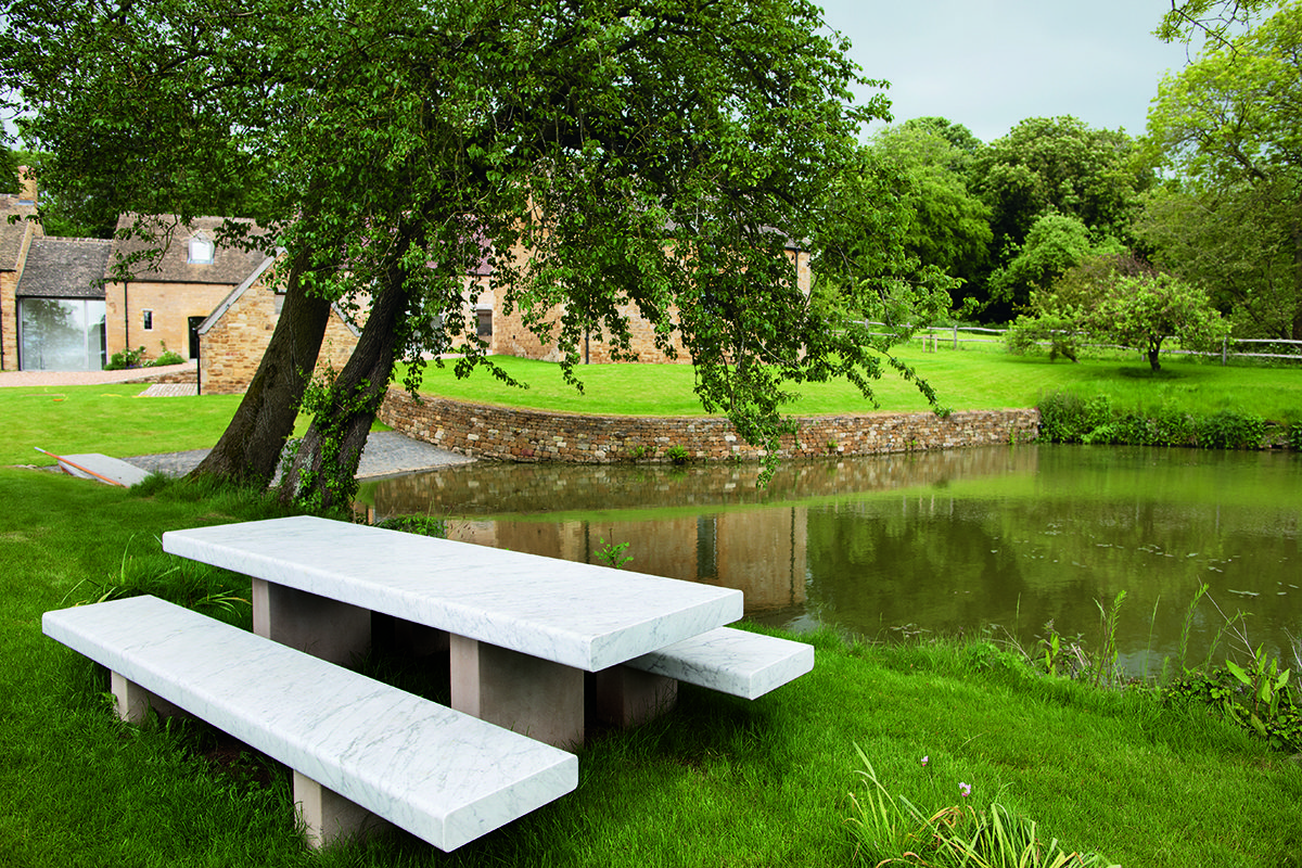
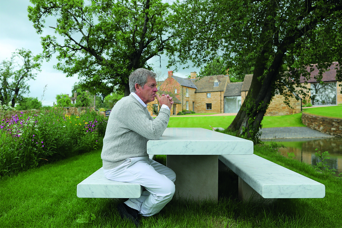
Gardens of a country home with a marble bench

Man sitting on bench in garden

Maryam Eisler: What about this particular farm house, where we’re sitting now ?
John Pawson: Having worked on this project for five years, you forget how fresh it can be for other people. The level of detail which isn’t always apparent in the materials and the amount of work that has gone into it …. It must seem very calm, judging by peoples’ reactions. So, I don’t know whether this will become like the monastery or not. I just don’t know.
Ma and woman sitting on bench in gravel courtyard

John Pawson conversing with Carrie Scott, an independent art historian and curator who is currently working with John on his photographic series

Maryam Eisler: The strength of your work, the clean lines in your designs, are reminiscent in my opinion of Judd’s work. Same strength. Same presence. Interesting that the first thing I saw when I came here are three Judd chairs, perfectly aligned in the kitchen. Has he been a source of inspiration?
John Pawson: Yes. From very early days – I think I first saw an exhibition of his in Japan when I lived in Tokyo in the early 70s. After that Hester [van Royen, mother of John’s children Caius and Phoebe] became his dealer in Europe, so I got to meet him. He was not too big on conversation!

And then there was a moment in Basel when Hester said, ‘Oh let’s go for lunch !’ Judd was hungry. So, the three of us went out and I thought ‘Oh great; I finally get to sit down with Donald Judd over lunch. Amazing!’ And just as we were going out of the hall, a client of mine caught me and I couldn’t help but to say ‘come along’. He talked non-stop. So, I never got to listen to Judd!
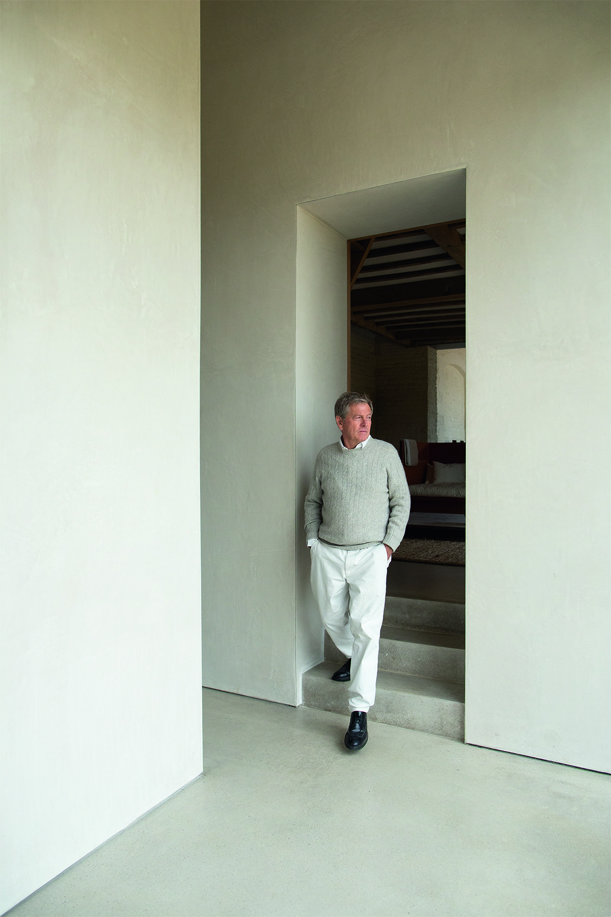
Man standing in doorway of staircase

Maryam Eisler: Your aesthetic and emotional connection to Judd seems obvious.
John Pawson: Definitely. Extraordinary, in fact! It’s been a natural thing. He was one of the first artists I was exposed to. I was asked by Hester to give a talk in Oxford on Judd’s work. ‘Sure, cool’, I said and had the complete set of the most incredible slides relating to him – his work, Marfa, everything! It was a big hall and a lot of people. I got up very confident. I was, maybe 30 or 35, and of course my mind went completely blank! So, I put up that first slide and I just said ‘window’, because it was a window. And then the next one was ‘door’. And it went on and on.

Maryam Eisler: We’ve talked about light. What about shadow or darkness?
John Pawson: Everything is about the contrast. Without one, you don’t have the other. But it’s all in the subtlety – the colour changes so quickly, doesn’t it?

Read more: In conversation with painter Luc Tuymans

Maryam Eisler: I’m assuming you see a lot of colour even though, to an outside observer, your work may appear to be somewhat monochrome, neutral, in various shades of beige and grey.
John Pawson: There’s a huge amount of colour in my work and they’re all different! I also slightly underestimated the garden side of things here in the country. Because I thought I could just lay it all out simply and everything would be fine. And at this time of year (end of Spring), it’s so green and yellow … just incredible!

Maryam Eisler: It looks like a painting. Which brings me to the subject of art! You are an architect, a creative mind and a photographer. An artist in every sense of the word. I hope you agree ? Yet, I see no art (in its traditional sense) in the house. No painting on walls. No sculptures in rooms.
John Pawson: I’ve always been very very careful with that. I keep it clean and uncluttered. I know people consider architecture to be an art form. But, to me, architects are not artists. There is a very distinct line between art and architecture.
Rustic living room

Open plan dining room in converted barn

Maryam Eisler: What are the main lines of differentiation between art and architecture?
John Pawson: I think that architecture has a functional aspect to it. It has to be used. People need shelter. Whereas ‘art’ doesn’t have to fulfil any practical or functional qualities. However, it is important to say that we would not survive as a human race without art.

Maryam Eisler: And you, personally, can do both. You can be an architect and a photographer, simultaneously.
John Pawson: I’m definitely not an artist [laughter]. And I would be very careful about considering myself a photographer.

Read more: Dutch artist Viviane Sassen’s photographic series ‘Venus and Mercury’

Maryam Eisler: But the world will label you as that, especially as you are becoming more public with your photography! You look, think and see like a photographer!
John Pawson: Well then, I am happy to review the situation. It isn’t false modesty. It’s just that I’ve always enjoyed framing things and taking photographs, and until now, I’ve never sought to take it any further than the daily musings.
Black and white photograph of stairwell

Fire place photographed in black and white with light and shadow on wall

Here and above: Images from John Pawson’s photographic series Home, a portfolio of 8 images available in an edition of 10.
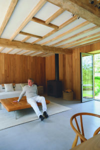
Man reclining against table in sitting roomMaryam Eisler: These daily musings which I follow on your instagram have become in effect a journal or a diary of your life. One can feel your soul through your photographs. I would even go as far as saying that they are self- portraits of some sort. And even though we don’t see you, you’re there and we definitely feel you.
John Pawson: This is just the way I see life, and it’s been a very nice discipline for me. I’m always amazed at how people see things and how they each photograph the same subject so differently. I’m not saying that they’re worse or better, but they’re so different and yet they use the same machine and have two eyes! I’ve always taken photographs but I had never shown them publicly before Instagram.

Maryam Eisler: Now that you’ve come out of the closet with your photography, do you impose more rules onto yourself? Or do you keep the practice spontaneous in the way that you have always done before?
John Pawson: I’d say I am spontaneous because I never think too much before framing a shot. They’re for me, first and foremost. It’s a bit the same with architecture. I design things for me, or as I would like them to be.
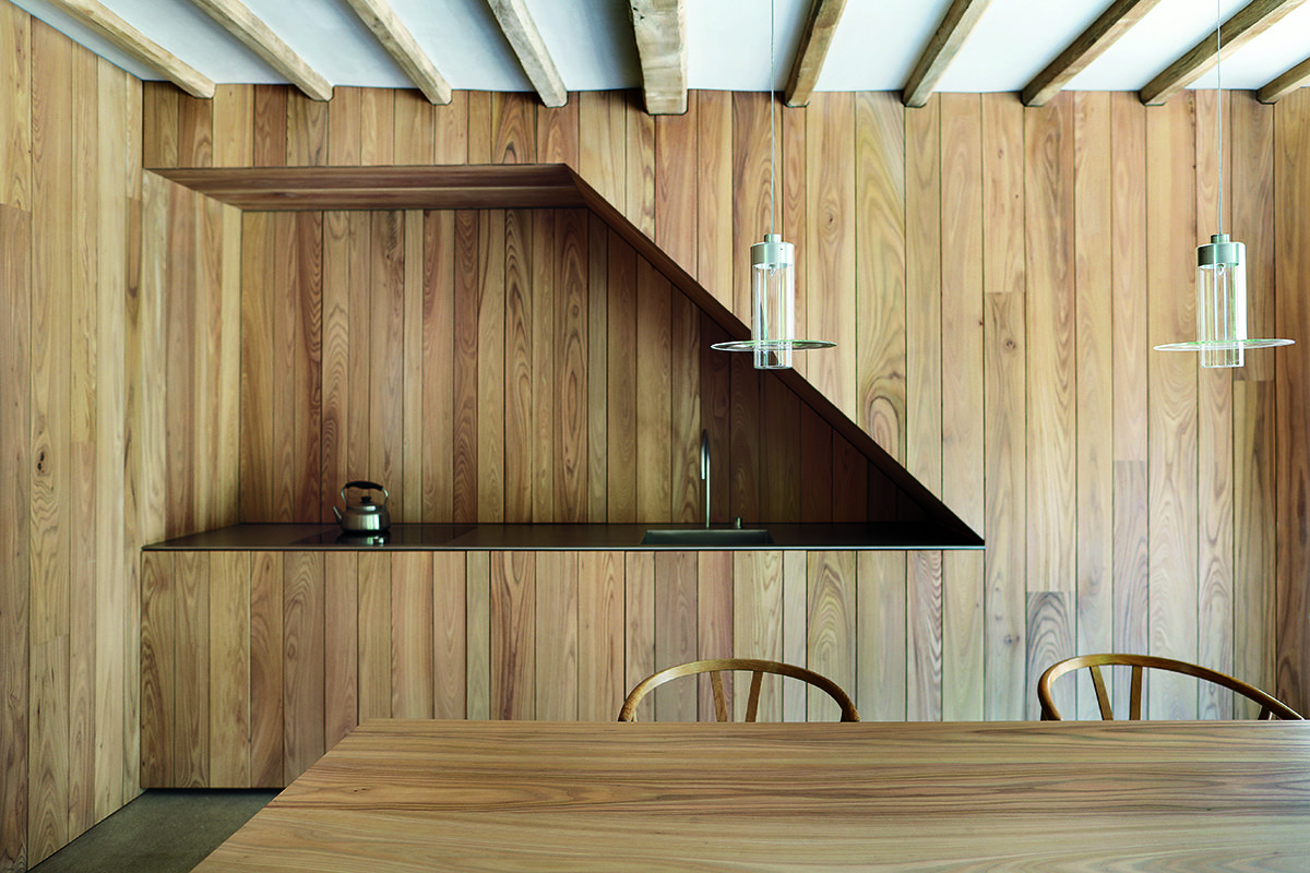
Wood panelled kitchen

Maryam Eisler: You give birth to buildings and you give birth to photographs, and then they get adopted, basically, by the collector, or by the clients.
John Pawson: Sure.

Maryam Eisler: And then they do what they wish with it.
John Pawson: Absolutely.

Maryam Eisler: Does that bother you?
John Pawson: No.

Maryam Eisler: They have a life of their own and that’s OK?
John Pawson: Even though I spend months designing a building, the day you hand it over, it’s no longer yours.

Maryam Eisler: Do you believe in some form of sublime intervention in the act of creation? A hand that enables some – maybe not everyone – to produce and to be creative?
John Pawson: I don’t think so. I’ve always thought that anyone can do it. Although I didn’t think I could. I thought designing was something other people could do. So I learnt; I went to school and learnt to design, literally. Which was illuminating in itself.
Interior detailing of minimalist house

Maryam Eisler: Are there any limitations in the act of creation?
John Pawson: One of the things that’s held me back is that people find it very difficult to see what I might do for them. Because the work seems so simple. But it’s a hard grind. It’s making umpteen models. And the problem is that most people just can’t see it. And I can understand that. People came here and saw this place and simply couldn’t understand how I could possibly do anything with it.

I remember giving a talk at RIBA years ago and I turned up, and the whole place was buzzing and heaving, and there were lots of incredibly attractive people, and they all looked very intelligent. And for a moment I wondered why they were there. And then of course I realised they were there for my talk. I still couldn’t think ‘why are they not doing it themselves, and why am I doing it?’ And I realised that it just takes a certain drive; every day you push and you keep your head down and then at the end, there’s something special.

Maryam Eisler: Whereas with photography, there’s much more instant satisfaction. No? You snap, you see…
John Pawson: Oh it’s heaven. Pure satisfaction.

Maryam Eisler: You are your own language in photography. Is the black and white a conscious choice?
John Pawson: Yes I think. Well, my photographs have a black and whiteness about them. But I think it just provides more focus, a stronger message. It takes away the noise.

Read more: Louis Roederer’s CEO Frédéric Rouzaud on art and hospitality

Maryam Eisler: In the chaotic world that we live in and share, do you think your photography helps you gain some control of your life, possibly even focus and introspection?
John Pawson: Definitely. It’s a sort of ordering of things, and the discipline is important. And it makes me even calmer because I’ve captured something. We’re always seeing things as we drive. But I very rarely stop the car. Lost moments. It’s important to capture these instances.
Window from a house onto a river

Wild English garden with wallMaryam Eisler: Are you concerned by the passage of time, by the ephemeral?
John Pawson: Of course I’m concerned about the state of things in the world. But I just find it difficult to get involved or to get concerned too deeply about something I can’t personally do something about. Maybe I should do more.

Maryam Eisler: Maybe you do. And maybe you’re not aware of it. Maybe you are adding that much required inner peace to people’s lives. Either through the serenity of your architectural spaces or your peaceful, well measured photography…
John Pawson: We do have a drawer of thank you letters. People’s lives are saved. It feels good to hear about the stories. And there are many stories.

Maryam Eisler: How would you like your legacy to be pondered upon?
John Pawson: Definitely not something I consider at all.

Maryam Eisler: So, for you, it’s about being here, in the moment?
John Pawson: Yeah, I’m here in the moment and legacy is impalpable. I didn’t chart this life, and I never set out to be an architect, but it’s come my way.

Maryam Eisler: A favourite photographer?
John Pawson: Crikey. I do tend to like the classics and people who did things first, but I used to hang out with Robert Mapplethorpe. Some of his works were really good. Not so much the portrait he made of me …

Maryam Eisler: Tell me about that moment when he shot you…
John Pawson: Early 80s is when it happened. Sadly, I was not asked to take my clothes off for him [laughter]… It was just a very relaxed shot of me sitting on the floor, cross-legged. I remember the moment well.

I was around the studio when he was taking photographs. A huge amount of energy went into his photography. He knew what he was doing. He was also very good with people.

Maryam Eisler: I suppose that the primary source of inspiration when you photograph is derived from your own spaces… as well as the reflection of shadow and light within these spaces ?
John Pawson: Yes.

Maryam Eisler: I see the odd tree or landscape every now again. Would you ever snap a figure?
John Pawson: I took Catherine [John’s wife] doing press ups on the beach once! Taking people is a whole other ball game isn’t it? When you’re travelling, I used to see a lot of potential interesting photographs of people and things happening around me. I would take them, but the stress levels were too much, because strangers get uncomfortable. So I decided to stick to what I know.
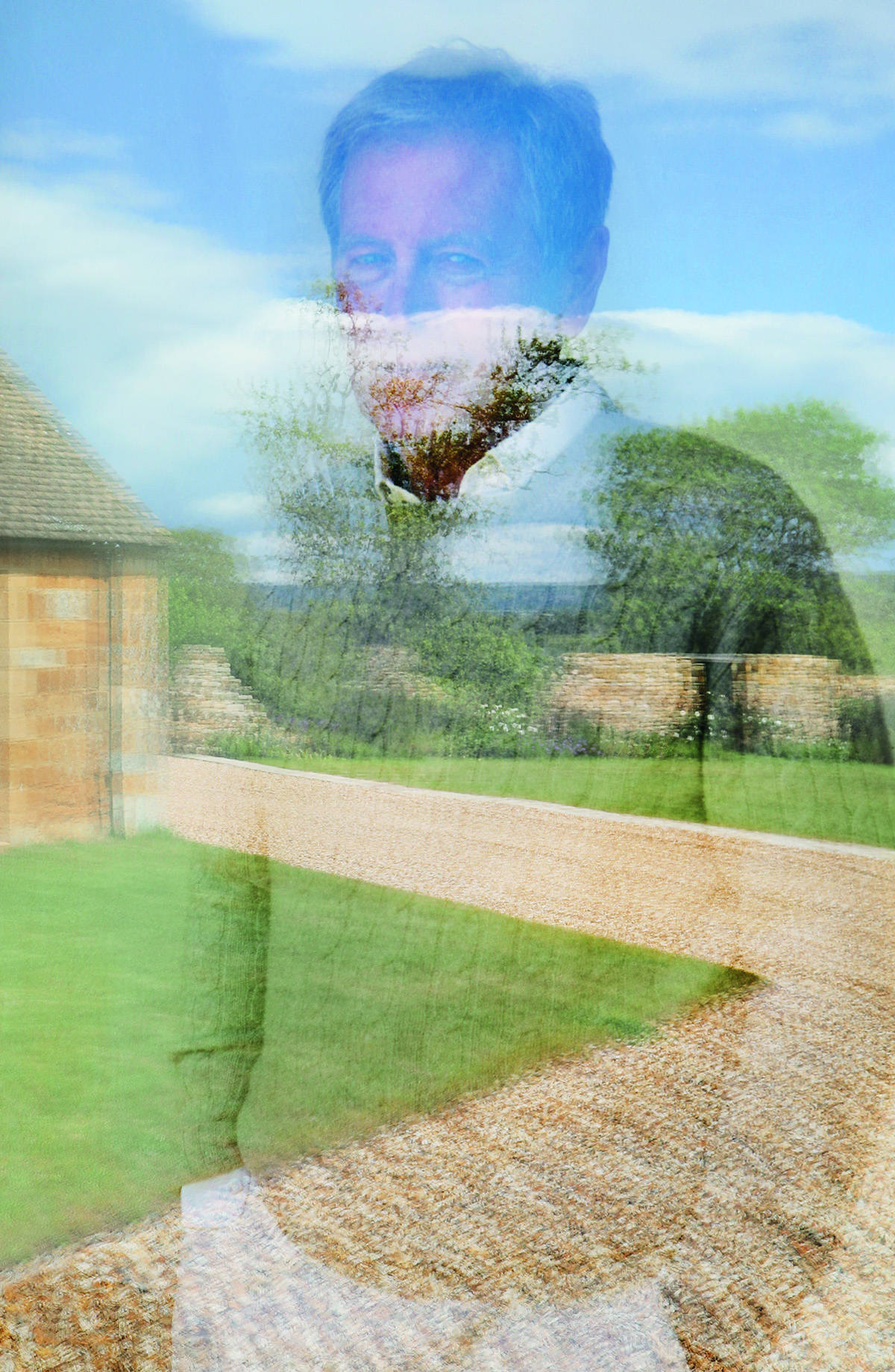
Man reflected in glass

Maryam Eisler: Would you say you’re a perfectionist?
John Pawson: Absolutely. An imperfect person.

Maryam Eisler: So, you’re an imperfect perfectionist ?
John Pawson: Well I’m obviously aware. A lot of it comes from being very imperfect. At the end, the goal is to produce something really really special, and I don’t personally have the means to do it on my own, so I’m always marshalling other people. It’s a big team. Building is an imprecise trade. So nothing is actually perfect anyway, which is fine because only God can be perfect, as the monks say. And that’s where the curve comes, I think; it’s only God who does curves well.

Maryam Eisler: So perhaps you’re the God of architecture?
John Pawson: That I know not. No delusions there!

John Pawson’s latest book ‘John Pawson: Anatomy of Minimum’ is published by Phaidon: phaidon.com

View his full portfolio of work: johnpawson.com
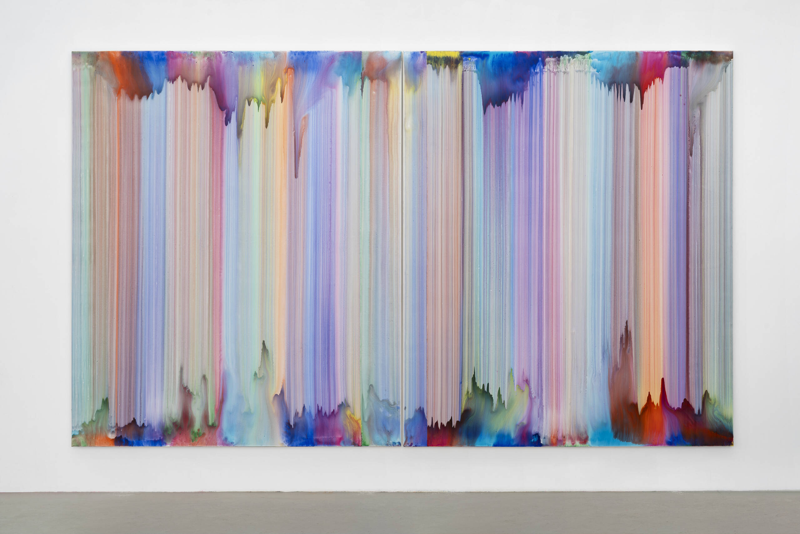
 

Share:
Reading time: 14 min
Render of a timber stacked contemporary structure

OMM designed by Kengo Kuma & Associates. © NAARO

Last weekend saw the opening of Odunpazari Modern Museum (OMM), a major new art museum  founded by art collector Erol Tabanca and designed by Kengo Kuma & Associates in North West Turkey. Here, we recall the event in pictures

Home to Erol Tabanca’s 1000 piece contemporary art collection alongside a curated program of exhibitions, OMM officially opened its doors to the public on Sunday 8th September following a glamorous launch party on the Saturday night.

Black tie guests at VIP opening party

Guests at the opening party of OMM

Guests at VIP opening party in front of OMM branded wall

Erol Tabanca with Kengo Kuma and Yuki Ikeguchi

The opening celebrations saw Japanese bamboo artist Tanabe Chikuunsai IV completing the final touches of his largest ever installation, alongside performances by Turkish artist Lin Pesto, and singer-songwriter Jonathan Bree , and two immersive installations by British digital art collective Marshmallow Laser Feast.

Contemporary bamboo art installation expanding from a museum gallery wall

The largest installation to date by Japanese bamboo-artist Tanabe Chikuunsai IV © NAARO

Read more: OMM’s Creative Director Idil Tabanca on creating an art institution

The night also launched the museum’s first exhibition Vuslat​ (loosely translated as The Union). The group show features a selection of over 100 works by 60 leading artists predominantly from Turkey including Bedri Rahmi Eyüboğlu, Canan Tolon, Erol Akyavaş, İlhan Koman, Ramazan Bayrakoğlu, Sinan Demirtaş and Tayfun Erdoğmuş.

Guests attending a VIP party

Rana, Idil and Erol Tabanca

Woman standing in blue and gold blazer with red lips

Fashion designer Dilara Fındıkoğlu has designed the uniforms for the museum’s staff in collaboration with Creative Director Idil Tabanca

Digital art display in a museum

For more information visit: omm.art

Share:
Reading time: 1 min
Contemporary light well inside a building made from wooden panels
Interiors of an art gallery space with wooden light well feature at centre

Inside OMM designed by Kengo Kuma & Associates. Photo by Batuhan Keskiner

This September will see the opening of Odunpazari Modern Museum (OMM), a major new art museum in Eskişehir, Turkey. Designed by architects Kengo Kuma and Associates, the museum is the brainchild of art collector Erol Tabanca, whose collection will provide the permanent exhibition, and his daughter Idil Tabanca who sits at the helm as Creative Director. We speak to Idil about her multidisciplinary approach, creating an international cultural destination and the challenge of bringing contemporary art to new audiences.
Portait of a young woman wearing a blazer and red lipstick

Idil Tabanca. Photo by Emily Hope

LUX: You were one of the founding editors of the successful New York-based art and fashion magazine Bullett – do you see yourself primarily as a journalist?
Idil Tabanca: No, not at all. I studied digital media because I always thought I was going to go into film. I wanted to do set design, production design, that kind of thing. Growing up that was my dream. I just wanted to make stuff. After I graduated, I worked in film for a couple of years on various projects in the US and then I was called in to do production design for a film in New York and that’s where I met the people I ended up setting up the magazine with. We just fell into, it was very organic and we didn’t have any money so we became our own publishers because we had all this great content that we wanted to put out. There are so many stories which aren’t at all luxurious like we would get our friends to dress up as catering staff for the cover shoot of some Oscar winning actor. We didn’t have the money to hire actual caterers but we wanted to keep up the appearance. It was like the con that didn’t end.

Follow LUX on Instagram: the.official.lux.magazine

LUX: And you’ve gone from that to being the Creative Director of OMM.
Idil Tabanca: Well yes, and this is a very different project because for starters, it’s my family’s foundation. My father [Erol Tabanca] started collecting art about thirty years ago. It started out just as a pure love for art and the pleasure he got from it, there was no strategy involved. He was buying what he wanted to buy. As time progressed, he filled up his house and then his entire office, he didn’t have enough room for the art and he also wanted to share the works that he found so inspiring so he started the foundation. That was around the time I was closing the magazine because the internet happened. It happened to the world. So many magazines were closing. The museum is a great opportunity because if I was at another institution like this, it would’ve taken me a really long time to be here. I felt like there could be an opportunity for me to have a voice, to have a say for the young people that needed this kind of a platform back in Turkey.

I feel like there’s huge potential in Turkey for artists, but not necessarily any organisations and platforms. The exciting part of the project for me is that I can actually give young people that opportunity.

Man and woman standing on steps outside contemporary building

Erol & Idil Tabanca pictured outside the museum. Photo by Gökhan Polat

LUX: Have you always shared your father’s passion for art?
Idil Tabanca: It was part of the magazine: we covered art, fashion, culture and cinema. I have always been interested in video and photography because of my studies, but I don’t have this amazing knowledge of art history or anything like that. It wasn’t part of my education so I’m learning that part now. Even just getting familiar with the art collection is a huge amount of work. I feel like I’ve got a good sense of aesthetics, but I’m learning the rest. I’m exposing myself to a lot of art, I read a lot, go to a lot of exhibitions.

Read more: London to Cornwall in a luxury Mercedes-Benz camper van

LUX: Can you tell us more about your concept for the museum?
Idil Tabanca: We’re from Eskişehir as a family and people from Eskişehir are very proud because it’s like a secular, intellectual, very young and fun town in Turkey. It’s very unique. They say it’s like a European city in Turkey. People are very open minded and because of that, there’s a huge potential for young people. There are also three art universities. My father has always felt that he wanted to give back to that community in some way.

We chose Kengo Kuma, whose work is so iconic, to make the museum iconic. Bilbao was an industrial city before the Guggenheim came and now it’s known as an art destination; I think Eskişehir has that same potential. For a long time in Turkey because of the regime and what’s happened there, there hasn’t been a lot of exciting developments. We also don’t have a huge museum culture. I don’t have any memories of going to museums with my family. I love that we might be able to change that for some people, and to change the place. Having a museum like this, starts an exchange, it becomes a bridge between cultures. For example, we have Kengo Kuma’s work  and we have Japanese artists who are showing. We want different cultures to be able to merge in the space.

Facade of a contemporary building made from wooden panels

Photo by Batuham Keskiner

Contemporary light well inside a building made from wooden panels

Photo by Batuhan Keskiner

LUX: We hear that the museum is also going to have a strong connection with fashion, is that right?
Idil Tabanca: Yes, I want every aspect of the museum to be like an art work in its own right and I’ve got Turkish fashion designer Dilara Findikoglu to design the uniforms for the museum staff. She’s blown up recently and dresses people like Madonna. I think that she’ll be the creative director of somewhere like Alexander McQueen very soon. But the reason for collaborating with her was, firstly, to challenge people. She is completely embraced internationally and keeps winning fashion awards, but in Turkey I feel like it’s part of our culture to be suspicious of anything that’s actually good and we do that to artists too. We don’t appreciate them at home as much as you do in Western culture. In Turkey, there’s no sense of protecting the things that are valuable and that’s the same with ruins even, you’re just allowed to walk all over the place. So I want to work with and give value to artists and designers from our communities that are doing really well outside of the country. That’s the reason we’re putting together a homecoming show to start a dialogue about who we are as a culture and why we don’t appreciate these people or talk abut them. We have local celebrities, but they’re not the people who are making a difference in the world.

Sculpture of a girl asleep on a sofa

‘Sleeping Girl’ by Hans op de Beeck is one of the artworks in the permanent collection. Photo by Kayhan Kaygusuz

LUX: And how will the exhibition programme work?
Idil Tabanca: We have the permanent collection, which will constantly change and be curated by different people and then we’ll have travelling shows and events. Exhibitions by other artists who have nothing to do with the permanent collection. For example, we’re bringing work by Marshmallow Laser Feast (who recently had a VR experience at the Saatchi gallery) to the opening. They’re really interesting because they use technology to bring people back to nature – I’m really excited to collaborate with them. Also the other part which will be so exciting for me is that we’ll get people coming to the museum who haven’t been exposed to anything, we’re going to get such a raw audience.

Portrait painting of a man's head sleeping

One of the selected works from the opening exhibition: Uyuyan Adam (2010) by Ramazan Bayrakoğlu. Image by Ozan Cakmak

LUX: What are local attitudes towards contemporary art? Is there much of an existing art scene?
Idil Tabanca: Yes, there is definitely an art scene. There’s a tiny wooden museum, glass blowing is huge and there are lots of little shops that make ceramics. There’s part of the town which is all these old houses, which look like they would have hundreds of years a go. There’s a wax museum, which is hilarious because no-one looks like they’re supposed to, but it receives 11,000 visitors on the weekend, which demonstrates the lack of cultural activities. But yes, we’re in talks with the art universities. We want to have residency artists that come in from abroad and to give them access to the facilities. We’re also going to organise discussions and education programmes. There’s the only animation studio in Turkey there so there’s definitely a lot of potential.

Read more: Savoir Beds’ MD Alistair Hughes on the value of craftsmanship

LUX: Are there any contemporary Turkish artists that you’re particularly excited about at the moment?
Idil Tabanca: Nilbar Güreş’ work is phenomenal. She’s based in Vienna. Another one of my favourite Turkish artists is Sukran Moral. She’s definitely someone I’d love to bring [to the museum] sometime in the future. She’s pretty established and is currently based in Italy.  She’s fantastic. Also Fatma Bucak is another young Turkish artist that I’d like to bring to the museum. She has some wonderful videos.

Artwork depicting an Asian girl leaning against a white box

‘Aylin’ (2014) by Sinan Demirtaş will also feature in the opening exhibition. Image by Kayhan Kaygusuz

LUX: How much of a consideration is sustainability?
Idil Tabanca: The building is made from sustainable forests, and we are trying to make it all as sustainable as possible, but in a place where that dialogue hasn’t started yet, it’s going to be tougher for us. So we have this task of talking to people and explaining to them why it’s important, why we’re not giving out plastic bags for example. I think it’s the responsibility of institution like ours to be a leader on these kinds of things.

LUX: Lastly, for first time visitors to Eskişehir, what are your hot tips for things to do and see?
Idil Tabanca: Oh my god, there’s so much to do! There’s a really good thermal spa. Then there’s also this fake Disneyland that I think is fascinating. You go and Snow White has her wig on sideways, it’s just a very weird place. The old part of town too where they have all these really cute houses and artists with their own little studios and shops selling handmade things. The area is called Odunpazarı, and it’s so beautiful. The museum is right in the middle of everything so the best way is to just walk around and discover the area.

OMM will officially open in September 2019, for more information visit: omm.art

Share:
Reading time: 9 min
Luxury dining room area with contemporary stylish furnishings

The Penthouse kitchen and dining room designed by Roksanda. Photography by Michael Sinclair. Styling by Olivia Gregory

Fashion designer Roksanda Ilinčić has curated the interiors of a penthouse apartment inside Gasholders London, a new residential development in Kings Cross. We get the grand tour

The trend for designer home-wear has reached its pinnacle. The new penthouse apartment curated by fashion designer Roksanda Ilinčić shows not only her designs, but how they integrate with art and iconic pieces of design history. The apartment is about how we can live with art and how all arts engage with each other; fashion crossing into ceramics, furniture and architecture. It is a unique space, which encompasses her artistic vision through unifying and contrasting colours, textures and luxury materials.

Follow LUX on Instagram: the.official.lux.magazine

Roksanda’s own home-wear collection, naturally, takes centre stage. In the apartment’s whimsically named ‘Sun Room’,  a ‘Roksanda X Linck Ceramics’ vase stands next to a stylish velvet chaise in red and orange with a coral curtain backdrop. The vase’s monochromatic shades are striking against the vibrancy of its surroundings.

Still life image of a contemporary flower vase against a bright pink blind

A Roksanda X Linck Ceramics vase in the penthouse’s ‘Sun Room.’ Photography by Michael Sinclair. Styling by Olivia Gregory

Here and throughout the apartment, we see the designer using colour and form in an unexpected way, just as she does with her clothing and accessories. The sculptural shapes and distinctive cuts associated with her clothing lines are translated into her choice of furniture; in the sharp angular Pierre Jeanneret chairs (1950s), the sleek, almost weightless Guillerme and Chambron oak desk (1960) and the organic, rounded form of the ‘skin lamp’ by Eny Lee Parker.

Read more: Kuwait’s ASCC launches visual arts programme in Venice

Stylish contemporary living space

The living room with curated furniture by Roksanda. Photography by Michael Sinclair. Styling by Olivia Gregory

Coat and bag hanging on contemporary style zigzag coat hanger

Roksanda’s creations are dotted around the apartment. Photography by Michael Sinclair. Styling by Olivia Gregory

The link between fashion and art is further emphasised by the designer’s own pieces, which are dotted around the apartment. A deep red jacket hangs in the hallway, a dress is draped across a bedroom chair with a pair of matching slippers, giving the impression that the designer is living in the space. This, of course, is the desired effect. The pieces are positioned so as to reveal just how liveable the space is, allowing viewers to picture themselves in the scene.

Rosie Ellison-Balaam

The Penthouse sits over three floors, with a double-height sunken courtyard garden and staircase providing access to a private roof garden with views of Coal Drops Yard. The apartment is available to buy fully-furnished for £7,750,000. Find out more: gasholderslondon.co.uk

Share:
Reading time: 2 min
Models pose with lips puckered at fashion designer backstage

Mary Katrantzou (second from left) backstage at the 2018 Victoria’s Secret Fashion Show in New York

With a decade of successful collections behind her and a penchant for outside-the-box collaborations, Mary Katrantzou is a designer not only bursting with creativity but also with the business acumen to go truly global, as Carolyn Asome discovers

Don’t underestimate the agility required to keep up with Mary Katrantzou’s boundless curiosity, the ever-inventive ways she pushes herself out of her comfort zone, the rat-a-tat-tat of her myriad collaborations (more of which later) and fundamentally, her desire to never sit still.

Does Katrantzou, who for the past decade has wowed us with her own strand of quirky maximalism, breathtaking decoration techniques and architectural shapes, ever worry that her body may struggle to keep up with her mind? The Greek-born fashion designer (and veritable power house), who read architecture at the Rhode Island School of Design before studying for a BA in Textile Design at London’s Central Saint Martins, howls with laughter at this. “It’s true, I’ve turned 36… it probably doesn’t.”

Follow LUX on Instagram: the.official.lux.magazine

Few designers are able to confront the obstacles of growing their own business. Fewer still are able to articulate them quite as clearly as Katrantzou can – although one senses that she has always relished the challenge. Her voice lights up: “Growing your business is the ultimate in creativity. It forces you to have an understanding of the business of fashion. I don’t think you can have a company without that interest or without the ambition to be involved.”

In an increasingly volatile retail climate, what are the challenges she faces? “There are several, but one of them is having a voice that really stands out against the noise. There are lots of heritage brands with a rotation of designers at the helm. You need to really know what you stand for. I challenge myself to do that each year. You might think you have an idea of who your woman is, but it isn’t always as easy as you think it is. I am not designing for a romantic warrior…” she laughs. “Sure, she is bold and daring and she uses fashion as a tool of expression. What I design has an element of uplift, but it also has links to art and design – that is very much part of it, too.”

Model on the catwalk wearing a large multicoloured coat

A look from Mary Katrantzou’s AW19 collection

The conundrum of dealing with an ever- whizzier hamster wheel of production also looms large. Thankfully, Katrantzou explains this is far less of a taboo subject than it was in the past. “Three years ago, no one wanted to talk about it and you almost closed your eyes and hoped for the best, but now other designers talk and you realise we are all in the same boat. Because obviously it is going to affect your creativity.”

Her solution? “While we have four drops annually, there are only two thematic collections a year so that means we have longer to talk about something, but we still have the newness.” Another challenge she mulls over is how to move outside ready-to-wear and use her design talent in other areas. Given that Katrantzou trained as an architect, she enjoys the challenge of looking at things from different perspectives and the creativity that comes with designing in different realms.

“We’ve tried to shift the brands in both directions: at one end offering shows at a demi- couture level and building on our customer relationships so that they can buy from us as made-to-measure or bespoke, but also, to do collaborations with much bigger global brands which allows us to reach a far wider audience.”

Read more: Photographer Thomas Demand on abstract perspectives

Katrantzou enjoys the fact that collaborations force her to think in a completely different way. “It’s an entirely different end use of a product. You can be democratic in a way that as an independent brand you just can’t be, because you can’t reach those price points or your minimums and production runs are so different. The modern brand of today needs to be reaching out to all different price points and different tiers. You are communicating with your customer but offering her a very comprehensive way of being able to buy your brand. We are doing a tenth of what we can do as we are still largely a ready-to-wear brand, but we’ve created jewellery with Swarovski, and done a small homeware range with a friend, Brigitta Spinocchia Freund. We’re also doing a ballet at Sadler’s Wells with Russell Maliphant and music by Vangelis, which is obviously so different from what you get when creating the costumes for the Victoria’s Secret show.”

The designer’s interesting collaborations – ones which challenge the well-trodden formula of designer/highstreet unions – are what caught the eye of Chinese investor Wendy Yu, the 28-year-old who has earned herself the reputation as China’s unofficial fashion ambassador.

Two women posing in front of a green wall at an exclusive event

Mary Katrantzou with Wendy Yu 2017

Two years ago, Katrantzou took investment from Yu. “I’d noticed and loved Mary’s capacity and talent to expand into different product categories along with her infectious energy and drive,” says Yu. “She’s built a brand with a strong and unique identity. I can see the potential of Mary Katrantzou homeware and beauty… I think the Chinese consumer would really buy into the brand at this lifestyle level too.”

Yu was one of three who came in on a ‘family and friends’ round of investment. For Katrantzou, the idea was also to look at what investors could offer aside from the financial support. “Wendy has been helpful with expanding in China. She is someone who understands how to help build a brand between east and west, between fashion and the arts.” Katrantzou has also learnt that in order to create awareness in China, it takes much more than just visiting once a year. It’s visiting regularly and initiating activations that really engages.”

Despite following a wholesale model, Katrantzou finds that clients come to her, season after season. “It’s rare these days to have a really loyal client. I don’t know what it is about the brand that elicits that loyalty but whatever it is, I don’t take it lightly.” This modesty is typical of Katrantzou. Such is her talent that she has clients who own so many of her clothes, they might easily stage a retrospective of her collections. It is telling that one of her most devoted fans is also one of the biggest collectors of Phoebe Philo’s collections at Celine – “our aesthetics couldn’t be more opposite” – and yet, there is something about the power of Katrantzou’s craft, the detailing and point of view that elicits such fandom.

Women pose backstage in front of a rail of clothing

Katrantzou and friends at London Fashion Week, 2016

Last September, Katrantzou celebrated her tenth anniversary, filling Camden’s Roundhouse with a collection all about collecting and collectables. Instead of a ‘best of ’ tribute to the preceding decade, she riffed on philately and entomology. One gown resembled a Fabergé egg gleaming with crystals, while a bustier dress revealed an array of coloured stone rings within a jewellery box.

Read more: Why LUX loves the New Perlée creations by Van Cleef & Arpels

Her most recent collection was based on the elements – earth, air, fire and water – and how they exist within us. “I wanted to explore the fire – when you have that energy and passion; or air when you feel that sense of being light and free. And it was interesting to distil all of that into a collection as it was so abstract and unlike my previous collection, which was more literal and very object driven.”

Model on catwalk wearing large orange coat

A look from Mary Katrantzou’s AW19 collection

For water and air, Katrantzou explored silhouettes that were weightless, either in organza or tiers of ruffles, which “bounced in a cloudy way, or else we used feathers”, experimenting with materials and techniques that haven’t been explored before.

Today, there are 25 people in Katrantzou’s London studio and her label is sold in 50 countries. “Our strongest markets are in the US, the UK, southern Europe, the Middle East and now China,” she says. “You know you appeal to a certain type of woman, and while I’m not saying an archetypal woman, they do have something in common. And we don’t have to be big in the Nordic countries if we are not selling there.”

Increasingly, Katrantzou is thinking about how she fits into the world around her: what she stands for and how that extends to bigger topics. “Luxury for me is knowing you are not harming your environment, knowing that the pieces you create will last in someone’s wardrobe for ever. I find it interesting that clients increasingly come to me and say they want to spend x amount on this one dress rather than buy 20. There’s a return to craftsmanship, pieces that are made by hand. With demi-couture, you are supporting a more analogue approach to fashion. It isn’t a big percentage in terms of how many commissions we get, but it is a sizeable part of the business… and it’s growing.”

Find out more at: marykatrantzou.com

This article was originally published in the Summer 19 Issue.

Share:
Reading time: 7 min
hotel bar restaurant with view over New York City
glass hotel facade

The entrance to the Moxy Hotel in Chelsea, NYC

President of Lightstone Mitchell Hochberg has put his stamp on New York with multiple real-estate developments, including luxury residences 130 William Street and 40 East End Avenue. In partnership with Marriott International, Lightstone are also developing lifestyle hotel brand Moxy, which has multiple properties spread across the US, Europe and Asia. LUX speaks to the entrepreneur about succeeding in a saturated market, New York real estate and working with the world’s biggest architects. 

Man stood in front of sculptural wall in a hotel

President of Lightstone Mitchell Hochberg

LUX: Lightstone is one of the largest privately held real estate companies in the US with your focus mainly in New York City. How do you succeed in such a saturated market?
Mitchell Hochberg: We’ve been able to distinguish ourselves by staying true to two common threads – across each of the various real estate segments in which we develop, each of our projects is entirely unique and as well, features a strong design aesthetic.

For instance, with our Moxy hotels, we saw an opportunity to be the first to develop an affordable micro-room, macro-amenity lifestyle hotel in New York, defining a new category of hotels amidst a sea of luxury lifestyle and lacklustre select service properties.

Follow LUX on Instagram: the.official.lux.magazine

In each of our projects, we strategically partner with architects and designers who have a strong design aesthetic, allowing us to create buildings that are provocative but contextual with interiors that are functional yet memorable. With our first two Moxy Hotels, for example, we worked with Rockwell Group to design the restaurants, bars, and clubs and Yabu Pushelberg for the rooms – both known for their luxury projects and unconventional choices for an affordable product, but key to creating the well-designed environments that make our properties special.

In the condominium space, we’ve partnered with two leading architects to design 130 William and 40 East End Avenue. At 130 William, we worked with world-renowned architect David Adjaye to create a 66-story building that pushes against the conventions of tall glass towers with a hand-cast concrete façade that will surely redefine the New York City skyline. At 40 East End, we worked with Deborah Berke, Dean of the Yale School of Architecture, to create a boutique condominium that represents a modern interpretation of local historic architecture.

LUX: Do you have a favourite residential area in New York?
Mitchell Hochberg: There’s an enclave on the Upper East Side of New York abutting Carl Schurz Park and Gracie Mansion (the Mayor’s residence) called East End Avenue. It’s a beautiful, bucolic neighbourhood that is fully immersed in the natural surroundings of the East River and the park, with nothing commercial in sight. In this setting, you have the advantage of both being in Manhattan and simultaneously not really feeling like you’re there – a result of the harmonious combination of the waterfront, the park, and the low density residential buildings. It’s the neighbourhood where we’re currently developing 40 East End Avenue, a boutique condominium, and it’s actually the one that I live in.

Read more:  Life on the thrillionaire trail by Geoffrey Kent

LUX: You’re currently working with Marriott International to develop their new lifestyle hotel brand Moxy. How did that come about?
Mitchell Hochberg: After spending many years investing in and studying the hospitality market, we saw an opportunity to develop a new type of lifestyle hotel that could offer efficient rooms at an affordable rate without sacrificing design. In the U.S., everything is bigger – the cars, the TVs – and indeed the hotel rooms. So at the time, nobody was doing this. The Moxy brand incubated in Europe, where travellers have long been accustomed to smaller room sizes, and we felt it had the potential to align perfectly with our vision. So as our ideas evolved, we decided to approach Marriott about forming a partnership to bring the Moxy brand to the United States. We have a longstanding relationship with Marriott, and as the most highly regarded international hotel brand with over 110 million loyalty members, we knew that they would prove to be a huge asset to our developments. Together, we reimagined Moxy for the New York market.

building overlooking a bridge

130 William Street’s view over the East River, NYC

LUX: How does your approach to developing for hospitality differ from other projects?
Mitchell Hochberg: The short answer is it doesn’t. What we’ve learned from our hospitality projects is that our guests don’t want to stay in their rooms – they crave social connections and memorable experiences. So our design has to accommodate that, with lobbies, bars, and restaurants that appeal equally to locals and integrate into the fabric of the community. Our residential projects – from rentals to luxury condominiums – all take this philosophy into account. We dedicate immense amounts of space in each of our projects to amenities – from the 20,000 square foot courtyard complete with a year-round greenhouse at ARC, a rental property in Long Island City, to the IMAX Private Theatre at 130 William (one of the first in New York City), we design spaces that our residents want to spend time in. Similarly to our Moxy hotels, we also consistently activate our residential properties with innovative programming, from wine tastings to yoga classes, allowing our residents to interact and get to know each other. That’s where the magic really happens.

Read more: Maryam Eisler’s Icelandic photography series

LUX: What’s been the most challenging project for Lightstone so far and why?
Mitchell Hochberg: It would have to be Moxy Times Square. From a pure design standpoint, the project had just about every challenge you could think of. The building was an adaptive reuse of a 110-year old office – not exactly an easy canvas for the flexible, vibrant, and memorable spaces you see today. Working within the confines of an existing building is always challenging, but in this particular instance the building was also landmarked, meaning we had to preserve the façade and all of the windows as well. The sheer scale of the project also brought its own complexities – the hotel is 612 keys in total with over 22,000 square feet of lobbies, bars, restaurants, and meeting spaces, including the largest indoor/outdoor rooftop bar in New York City.

Despite all this, I think the biggest challenge was bringing something entirely new to the New York City hotel market. We had to prove ourselves to guests who had never seen anything like this before, and convince them to buy into our “deal”: in exchange for an affordable rate, we could provide a room that’s efficient but stylish, along with public spaces that are engaging and well designed.

Hotel lounge and bar

Moxy’s luxurious lounge bar at Times Square, NYC

LUX: What are your future predictions for the real estate market in NYC?
Mitchell Hochberg: The real estate market in New York over the long term is always going to be strong. There will obviously be hills and valleys based upon macro issues, but you have to keep in mind that New York City is an island and there’s only so much space. People will always want to live here, work here, and visit here, and as a result it will always be a strong market.

LUX: Will Lightstone ever expand overseas?
Mitchell Hochberg: We’re currently discussing investments and development overseas. I think our first projects will probably be somewhere in the UK where we’re a little more familiar with the language and business customs, but we are always open to new opportunities.

hotel bar restaurant with view over New York City

The botanically inspired Fleur Room at Moxy Chelsea, NYC

LUX: How do you switch off from work-mode?
Mitchell Hochberg: One of my biggest passions is travel – I try to travel as often as possible. I’m naturally very curious, and find that my creativity is often sparked by wandering around and getting lost in cities and fully immersing myself in all aspects of the culture, which is both fascinating and inspiring. While I do switch off when I travel, appreciating architecture and design, as well as learning how different people live, serves as the inspiration for a lot of the development we do. In Italy, for example, which is one of my favourite places to travel, I’m constantly awed by the art, architecture, fashion, and yes, even the food. But above all, I’m struck by the genuine warmth of its people. You’ll see a lot of that reflected in the restaurants and bars and Moxy Chelsea. For example, Feroce, our Italian restaurant, took inspiration from some of my favourite spots around Italy: the Caffé and Pasticceria from the bar culture in Italy, where people visit the same spot for an espresso and cornetto in the morning and an Aperol Spritz in the evening; the outdoor dining garden from my favourite restaurant in Rome, Antica Pesa; and many of the design details from my favourite restaurant in MilanDa Giacomo.

When I want to completely chill out though, there’s nothing better than being on a beautiful beach. One of my favourites is Belmond Maroma in Riviera Maya, Mexico. It is casual and relaxed but with incredible service reflected by the culture of the local team who treat you as if you are in their own home. It is the epitome of barefoot chic!

Find out more: lightstonegroup.com and moxy-hotels.marriott.com


Share:
Reading time: 7 min
Contemporary concrete architectural entrance way to a building
Sloping vineyards with a house in the far distance

The vineyards of Masseto slope down towards the sea from the mountains of Tuscany’s Maremma region

Masseto, Italy’s most celebrated wine, is made from spectacular vineyards by the Tuscan coast, backed by ancient forests, looking out over the Mediterranean. This spring, it received a stunning new winery, whose wonders are all contained underneath the blue clay soil, as Darius Sanai, one of the wine’s most obsessive aficionados, discovers

Photography by Marius W Hansen

As you approach the Masseto winery, the overwhelming feeling is one of luminescence. There is a glow from above, and behind, as if the narrow road you’re driving along is the entrance to some new, celestial world.

Follow LUX on Instagram: the.official.lux.magazine

There are three shades to the luminescence. The piercing blue of the sky (the sky always seems to be blue around here in the Maremma, the coastal strip of Tuscany halfway between Pisa and Rome); the deep primordial green ahead, which emanates not from the vineyards that surround you but from a thick forest on the mountains in front, forest that looks as wild as it must have been in prehistoric times, with little or no sign of human intervention; and then there is a silver, which seems to come from a different direction altogether, subtle but enveloping. As the road heads up the slope through the vineyards and towards the new winery, you feel that you’re about to be welcomed through into another world.

Contemporary concrete architectural entrance way to a building

The entrance to the new winemaking buildings at Masseto winery

All this makes the entrance itself to the new winery, which opened this spring, even more remarkable. Rather than a great ziggurat to commemorate the otherworldly location of the home of one of the world’s greatest wines, you are greeted by a building that seems to sink far into the mountainside.

And this, perhaps, is the point. It is only when you enter between the stone sentinels at the entrance to the new winery, and disappear into the blue clay soil, that the adventure really begins.

A slim wine cellar with bottles from floor to ceiling

Masseto is perhaps the only Italian wine that has passed into the pantheon of high-luxury brands. It is a wine venerated by connoisseurs, while its serving is also seen as a mark of the ultimate respect by those with just a passing interest in wine, along with names like Pétrus, Lafite, Latour and Domaine de la Romanée- Conti – all the others are French. All the more remarkable, since Masseto has only been a wine since 1987. And since its birth, until the opening of the new winery in 2019, it has always been seen as the ‘big sister’ wine of Ornellaia, made on the same premises.

Read more: Karl-Friedrich Scheufele on Chopard’s partnership with Mille Miglia

This spring, Masseto finally received its own home, distinct from its sister wine, a few hundred metres away on another part of the same slope. The new winery is one of the most striking creations of anything in the increasingly rarefied world of fine wine.

Amid the vineyards, there is a beautiful classical building, terraced, with views across the vineyards and to the Mediterranean Sea, just a couple of miles away. It is the sea that gives Masseto’s vineyards their luminescence, and the wines themselves a kind of olfactory luminescence, lifting up and away, balancing the richness and power and complexity with a kind of angelic delicacy only the very greatest wines in the world can achieve.

Underground wine cellar designed in contemporary architecture

A table of red grapes being sorted by hands wearing white gloves

The glass-cube tasting room, and some of the merlot grapes harvested from the vineyard

But enter inside, and underground, and you are in a different universe. The landing area drops away to a vast, concrete-lined chamber, more redolent of a modern Abu Simbel in ancient Egypt than of a place where wine is made. Rows of wooden barriques line the room; everything is perfect, geometrically, but also puzzling, as if you have entered a kind of contemporary MC Escher drawing. A concrete wall swings open to reveal a room lined with what seem at first to be beautiful black tiles, but turns out to be the ends of Masseto bottles, stored geometrically in racks, black against the grey of the stone. Most remarkable of all is a glass tasting room, a cube in the middle of the winery, where you can taste wines looked on by the wines themselves, buried in the deep underbelly of Tuscany.

The architecture is the creation of Milan-based firm ZitoMori Studio. Masseto CEO Giovanni Geddes da Filicaja comments: “Years of planning and effort have been dedicated to building the right home for Masseto. One that consolidates three decades of experience, where every aspect has been designed to meet the winemaking team’s highly detailed requirements.”

Ordered lines of wine vines in a sloping field

Contemporary clean architecture of a wall and door leading into a wine cellar

The orderliness of the vineyards outside are matched by the clean and uncluttered design of the new winery buildings

Colour portrait of a middle-aged business man

Giovanni Geddes de Filicaja, CEO of Masseto

Commercial director Alex Belson comments about the architecture: “The architectural brief specified the winery must be a masterpiece in its own right. Quite simply, we needed to give Masseto the home it deserves and its own architectural identity. The brief also stipulated the winery must have minimal visual impact, and that the existing Masseto House (a classified building on the hill above the vineyard) be restored with integrity and to meet Italian architectural heritage requirements.”

To do this, says Japanese-born architect Hikaru Mori, “We created a series of spaces, not by construction but by extraction from the hill’s monolithic mass. The diverse internal volumes, heights and levels are reminiscent of a gold mine as it follows seams of precious metal to the core.”

Man picking purple grapes on a vineyard

Axel Heinz, Masseto’s Estate Director

But the architecture would mean nothing without the wine, and Masseto is a wine that is even more special than its setting. Axel Heinz, the estate’s director, has been in charge of the winemaking since 2005 and he says, “The core of Masseto, its warp thread, is a Mahler symphony played by a full orchestra. The weft is a small chamber music ensemble. It’s that orchestral power that needs very careful handling. It has to be balanced by the softer elements, which add complexity. People sometimes describe Masseto as single vineyard wine, but it’s not. There’s an incredible range of plot expressions and different proportions of clay, gravel and earth. It’s more like an intricate patchwork, with the blue clay at its core.”

Heinz also pays tribute to the importance of the sea, both in the light it donates to the vineyards, and the cooling breezes that temper the summer heat and give the wine its freshness, however ripe the vintage. But like the greatest wines, and the greatest poetry, and the greatest vistas, you cannot analyse the beauty of Masseto. It comes from the soil, the grapes, the winemaking, the weather, the microbiome of the earth, the human appreciation of the aesthetic, both in taste and in vision.

For me, Masseto shares with a handful of wines the distinction of being rich, powerful and deep, and also feather light, almost transparent. A big, rich red wine that lifts you up, with a thousand nuances. Different vintages have different characteristics, but there is a commonality in this lightness of being that differentiates it from any other wine I have had from Italy, and which it shares with a clutch of peers at the tip of the world wine tree. Grape variety is irrelevant here. One or two of the great Napa Cabernet Sauvignons have it, as do a handful of top Bordeaux names, and the greatest (and eye-wateringly expensive) wines from the likes of Domaine de la Romanée-Conti, Domaine Leroy, Mugnier and Armand Rousseau from Burgundy. In the context of many of these peers, Masseto, whose price has rocketed over the past few years, seems positively decent value.

And none of them have a view of the Mediterranean across the coast of the Maremma. It’s going to be fun tasting future vintages in that glass tasting room.

Find out more: masseto.com

This article was originally published in the Summer 19 Issue

Share:
Reading time: 6 min
Grand terrace of a pink mansion house with umbrellas and lots of greenery

Le Jardin de Russie restaurant at the Hotel de Russie, and the National Museum of 21st-Century Arts (MAXXI)

Rome has a lot to offer the modern traveller beyond classical ruins, and at the heart of this burgeoning contemporary scene is the new Hotel de la Ville. Emma Love sings the city’s praises

When Hotel de la Ville, high above the Spanish Steps in Rome, opens on 23 May 2019, it will be the latest in a wave of cool, contemporary destinations to appear in the capital. Joining Hotel de Russie as part of Rocco Forte Hotels, Hotel de la Ville celebrates the tradition of the European Grand Tour in a thoroughly modern way. Located in an 18th-century palazzo, its decor ranges from Renaissance-inspired busts in the Da Sistina bistro to the decorative patterns of blue-and-white ceramics reinterpreted as a wallpaper print. The spa, courtyard restaurant (with its new take on classic Roman dishes) and the 7th-floor bar with 360-degree views are all set to appeal to a new generation of travellers.

Follow LUX on Instagram: the.official.lux.magazine

It’s not only the design of Hotel de la Ville which is inspired by the European Grand Tour: both properties are in the heart of the Eternal City (Hotel de Russie is between Piazza di Spagna and Piazza del Popolo), so visitors are ideally placed to discover off-the-beaten-track gems. For instance, alongside Rome’s ancient wonders there are now a number of art galleries that offer alternative attractions. The National Gallery of Modern Art specialises in 19th and 20th-century works by Italian and international artists; the Museum of Contemporary Art of Rome (MACRO), located in a former warehouse, showcases works created since 1960; and the Zaha Hadid-designed National Museum of 21st-Century Arts (MAXXI) is dedicated to contemporary art and architecture. And there is the Palazzo Rhinoceros, which opened in 2018 as part of Fendi’s non-profit art foundation with its exhibitions, rooftop bar and restaurant.

Luxury hotel suite with contemporary luxe furnishings

A grand junior suite at the Hotel de la Ville (above) and the Spanish Steps

Hotel de Russie, named after the Russian Romantic painters who were guests when visiting the city, also blends classical architecture with modern interiors. It has a noteworthy spa, the Stravinskij bar and Le Jardin de Russie restaurant, where in summer tables spill out into the Secret Garden. Near Hotel de la Ville, architecture fans will discover the bizarre 16th- century Palazzo Zuccari, the façade of which features mascherone or grotesque, mask-like mouths around the front door and windows, and the church of Sant’Isidoro where the side chapel houses two 17th-century marble nude female figures designed by Bernini. Covered up by Irish priests in the 19th century, they were unveiled again only in 2002.

Read more: Why Blue Palace resort in Crete is the perfect Springtime destination

For more contemporary design, there is the Jubilee Church, built in 2003 in the Tor Tre Treste suburb by American architect Richard Meier, and the amphitheatre-like Parco Della Musica by Renzo Piano, where everything from contemporary dance to jazz and film festivals take place. Both hotels can arrange tailor-made experiences for guests, whether they want a behind-the-scenes look at the 19th-century Teatro dell’Opera di Roma or a tour of Monti, the once down-at-heel district now popular for vintage fashion and antiques. All of which demonstrates that this forward-looking city is so much more than its past.

SIX UNMISSABLE ROME EXPERIENCES

1. Behind-the-scenes designer shopping
From a private atelier visit to learning about the craftsmanship that goes into bespoke garments, Hotel de Russie’s ‘Avenue of Style’ experience offers unparalleled access to eleven Italian fashion brands.

2. Private tour of the opera house
Sneak a backstage look at Rome’s most famous classical music venue, the Teatro dell’Opera di Roma, which is resplendent in its 19th-century glory.

3. Cycle the city
Go cycling or jogging with Hotel de Russie’s personal trainer and triathlon world champion Danilo Palmucci, taking in the Villa Borghese gardens and architectural landmarks.

4. Discover a hip art gallery
Former London art dealer Lorcan O’Neill’s eponymous gallery is in a renovated stable in the centre of Rome where his roster of artists includes everyone from Rachel Whiteread and Tracey Emin to Richard Long and Francesco Clemente.

5. See optical illusions at the Trinità dei Monti convent
Go straight to the cloister on the upper floor to see the two large and very rare anamorphic wall paintings.

6. An immersive perfumery experience
Hotel de la Ville’s ‘olfactive itinerary’ is a closed-doors visit to a high-end perfumery, set inside a historic building with original frescos.

For more information visit: roccofortehotels.com

This article was originally published in the Summer 19 Issue.

Share:
Reading time: 3 min
Andermatt Swiss Alpine village in summertime

Summer in Andermatt with bike trails, the historic village streets, the Radisson Blu hotel and the new golf course

Andermatt is rapidly becoming one of Switzerland’s best year-round Alpine destinations. Already famed for its winter sports, the resort is now offering activities, accommodation and dining for summer, too, thanks to a major new development. Rob Freeman discovers the joys of the village’s new season

As the winter snows melt on the slopes above Andermatt, the year-round allure of this Swiss village becomes apparent. Thanks to the charm and the beauty of its summer meadows carpeted with white, blue, yellow and pink Alpine flowers, the resort has become a multi- faceted, all-season destination.

As glorious as it is in winter – Andermatt is now a world-class winter-sports centre and part of central Switzerland’s largest linked ski area – the resort, thanks to some remarkable developments that are taking place there, is equally stunning in the summer. In many ways, the contrast between the verdant valleys and the glistening white peaks above in summer makes this landscape even more striking.

Follow LUX on Instagram: the.official.lux.magazine

Andermatt’s parish records go back 800 years, with many of its houses being centuries old, so it’s small wonder that there is a palpable sense of history and tradition in its streets. With such a background, it’s intriguing to see the village enter a new phase, underlined by the recent opening of the elegant shopping and dining square, the Piazza Gottardo, which is part of a visionary development by Egyptian investor Samih Sawiris that will see the village double in size. There’s a distinct yet subtle style to this new car-free area, known as Andermatt Reuss, of which the Piazza is the centrepiece. The trick is having every building individually designed by one of more than 30 Swiss and international architects to create an eclectic rather than uniform appearance.

Swiss village street view

Each new building, as architect Christoph Langenberg, the project manager of the developer Andermatt Swiss Alps, explains, pays homage in one respect or another to the traditional styles of the local architecture. The Edelweiss apartment building, for example, has distinctive shutters with chevron patterns in contrast to the broad arches that protect balconies against the sometimes severe weather. But its most extraordinary feature is its exterior colour, which starts from a dark base and gradually lightens as it rises until seeming to fade into the sky. Diamond shapes are scored into the façade, with wavy lines accentuating the lightness. In another building, House Wolf, the design incorporates the careful gauging of the sculptural effect of the roof overhang.

“The buildings are clustered together more closely than is usual in new projects like this,” Langenberg adds. This is deliberate, to reflect the traditional way in which these villages evolved. The buildings have always been close together for warmth and security. We wanted the new developments to be an extension to the old village, rather than something separate.” One to five-bedroom apartments are available, and the whole project, which will include 30 individual chalets, has no purchase restrictions for foreigners.

Two cyclists riding their bikes around an alpine lake in the summer

The square, complete with fountain, is fringed by shops, restaurants and bars. Restaurant Biselli already epitomises Piazza Gottardo’s village spirit and, from 8am to 11pm, is a focal point for holidaymakers and residents. Occupying the ground floor of the six-storey House Alpenrose apartment building, the restaurant is also a bakery, providing rolls and croissants every morning, and a chocolate shop where the chocolatier can often be seen creating little masterpieces. It also has a small section selling holiday necessities such as milk, butter and jam, even toothpaste. The softly lit restaurant, which is romantic and stylish, has a menu embracing dishes such as goose liver mousse with cognac and truffles, and sea bass baked in puff pastry, as well as local specialities such as tarte flambée of onions, bacon, sour cream and mountain cheese, and dumplings with roasted pork belly.

Read more: Maryam Eisler in conversation with Kenny Scharf

The Mammut sports shop opposite is a high-end ski-rental shop in winter and a bike, hiking and climbing emporium in summer. A Victorinox store has a large selection of Swiss Army and kitchen knives, designer luggage and watches. A pharmacy and small supermarket will soon join the line-up.

Exterior of a building designed as a large chalet

Radisson Blu Hotel Reussen

The impressive Radisson Blu Hotel Reussen opened recently, and its Spun restaurant, highlighting Swiss and Italian cuisine, also fronts onto the Piazza. The hotel also has a fitness zone including two saunas, steam bath and 13 treatment rooms and extensive gym, as well as a 25-metre public indoor pool with floor-to-ceiling windows facing the mountains of the Urseren Valley. A new concert hall with state-of-the-art acoustics and seating 700, designed by British studio Seilern Architects, is attached to the hotel. Further accommodation for the village will include a hotel aimed at families, featuring a water-slide through reception!

Summer offerings include walks from gentle strolls to challenging hikes, and climbing for novices as well as experts. Also popular are e-bikes with auxiliary motors to tackle distances and gradients that would otherwise be out of the question. The Four Headwaters Trail links the nearby sources of four rivers, the Rhine, Reuss, Ticino and Rhone. The 85-km family-friendly route can be split into day trips or a five-day tour staying at huts. And days out on the Matterhorn Gotthard Glacier Express are spectacular. There’s no more marvellous way to enjoy these glorious mountains.

Green of a golf course surrounded by mountains

Andermatt’s 18-hole golf course

The new 18-hole, par-72 championship Andermatt Swiss Alps golf course

Designed to complement its spectacular natural setting, Andermatt’s 18-hole golf course is immediately adjacent to the village. Although it only opened as recently as 2016, it has already achieved the highest possible accolades, including being named Switzerland’s Best Golf Course in the World Golf Awards every year since. Designed by renowned German golf-course architect Kurt Rossknecht, it has the feel of a Scottish links course and meets international tournament standards. Importantly for holidaymakers, it is open to the public on a pay-and-play basis.

Find out more: andermatt-swissalps.ch

This article originally appeared in the Summer 19 Issue.

Share:
Reading time: 5 min
Underground wine cellar with wooden barrels and concrete walls and ceilings

Designed by ZitoMori Studio, Masseto’s new cellar lies deep beneath the Tuscan soil

Italy’s most celebrated wine producer, Masseto, recently opened a stunning new underground wine cellar. Irene Belluci discovers

Masseto’s new wine cellar has been designed to blend, or rather sink seamlessly into the curves of the Tuscan landscape. Designed by Milan-based architecture practise ZitoMori Studio, the space expands deep underground in a vast concrete chamber that feels like a sacred tomb.

Follow LUX on Instagram: the.official.lux.magazine

‘To represent the effort made to produce the wine made here, we created a series of spaces – not by construction, but by extraction from the hill’s monolithic mass,’ explains Hikaru Mori. ‘The different internal volumes, heights and levels are reminiscent of a gold mine as it follows seams of precious metal to the core.’ Inside, the clean lines of glass and steel balance with rows of oak barrels and textured surfaces, whilst cut-outs in the walls, frame the vineyard’s famed blue clay soil.

An underground wine cellar

A slim wine cellar with bottles from ceiling to ground


Find out more: masseto.com


Share:
Reading time: 1 min
Luxury hotel cottage rooms made from red clay with cactus trees in the foreground
Luxury hotel resort on a hillside

Blue Palace sprawls up a rugged hillside with spectacular views over the ocean

Why should I go now?

Most people go to the Greek islands in summer, but springtime is a far more pleasant time to visit. It’s breezy and warm, rather than insufferably hot (right now, for example, temperatures are in the low to mid twenties) and much less crowded. Plus, Crete is at its most beautiful and fragrant with the wild flowers in full bloom.

Follow LUX on Instagram: the.official.lux.magazine

What’s the lowdown?

Blue Palace sits tucked away in the Gulf of Elounda, roughly an hour’s drive from Heraklion Airport. It’s a big resort, with hundreds of rooms sprawling up the side of rugged slope, but since its built entirely from local stone, it blends beautifully into the landscape and has the appearance of a pretty hillside village. Guests are driven up a private road to the impressive open-air lobby, with huge arches framing the ocean and a long pool that comes halfway inside. This is just one of the many pools at the hotel, many of the rooms have their own infinity pools and there are several down on the beach. As you wander through the grounds you have the impression of being surrounded by soothing blue – the pools, sky and ocean.

A grand luxury swimming pool area with arched building and palm trees

Blue Palace’s grand lobby area and one of the resort’s many swimming pools. Photography by James Houston

In the distance, lies the historic Spinalonga Island, an ex-leper colony and UNESCO World Heritage site. It’s close enough to swim to (or so we’re told), but we take a speed boat accompanied by a wonderfully passionate guide, who tells us that she escorted Lady Gaga on the same trip not so long ago. Other activities include water-sports and various cultural trips. The wine tasting on-board a traditional wooden caïque was one of our highlights, where we got to sample local wines and cheese whilst floating on the azure waters of a secluded cove. On the private beach, suite guests are granted access to the VIP area where they given baskets containing fluffy towels, magazines and refreshing wipes. There’s also a spa with a hammam, sauna, indoor swimming pool and treatment rooms.

Read more: 6 artists creating experiential art

True to Greek culture, the resort is hugely passionate about food with five excellent restaurants to choose from. Anthós is the most romantic (reserve a table on the terrace to dine alfresco and for the best views), but Blue Door is the most fun. Housed inside an old fisherman’s cottage right on the edge of the sea, its in the style of a traditional Greek taverna and serves delicious, authentic Greek cuisine. On the feast nights, there’s live music and dancing. The food comes in vast quantities with an array of delicious dips, breads, fresh fish and “antikristo” lamb, which is slowly cooked for five hours above a bonfire. Be warned: entrance to the restaurant is granted after a large shot of ouzo and guests tend to be coerced into dancing later in the night. This is all part of the wonderful Greek hospitality that makes the resort’s staff some of the warmest, most genuine that we’ve encountered.

Luxury beach with swimming pool and views of islands in the distance

The resort’s private pebble beach with views of Spinalonga island (to the left) in the distance. Photography by James Houston

Getting horizontal

Our suite, named Santorini after the blue and white isle, followed the same theme of nautical colours with elegant, contemporary furnishings, a separate living room, bedroom and a secluded courtyard with a private pool. It was the perfect balance of luxurious and homely.

Flipside

The only thing that felt inconsistent with the resort’s relaxed vibe was the VIP area at breakfast, where suite guests are led to tables on a roped-off platform. It felt a little too exhibitionist for our tastes, and if necessary, it could have been arranged more subtly as it was on the beach.

Millie Walton

Rates: From 235 EUR for a Superior Bungalow Sea View room incl. taxes & breakfast (approx. £200 / $250)

Book your stay: bluepalace.gr

Share:
Reading time: 3 min
Contemporary architectural steel work on the facade of a glass building
Chais Monnet is a luxury country hotel in southwest France with striking contemporary architecture

The spectacular architecture of the Hôtel Chais Monnet, designed by Didier Poignant

A new kind of luxury hotel in Cognac sets new standards of comfort, cuisine and architecture for those exploring the region that’s been in the shadow of nearby Bordeaux for too long, says James Richardson
A grand piano in a rustic wooden setting

Le 1838, the hotel’s jazz and cognac bar

A short drive from the city of Bordeaux, the newly opened Chais Monnet is the swankiest hotel in southwest France and the first of a new breed of destination – the super-luxury auberge. The hotel and spa (and conference centre) are situated in and around a very expensively converted former cognac-aging warehouse by the Charente river. Lavishly designed by architect Didier Poignant, the hotel’s spectacular exterior complements the welcoming contemporary chic of the interior.

Follow LUX on Instagram: the.official.lux.magazine

The 92 rooms (and 15 apartments) are decorated with a sophisticated rustic charm, the spa features a 24-metre indoor-outdoor pool, and the jazz bar, in its own converted building, is hugely atmospheric. The greatest revelation is in the restaurants, in the former cognac warehouse itself, headed by Sébastien Broda, who earned a Michelin star for Le Park 45 in Cannes. There is a real Soho House vibe (not surprisingly, since owner Javad Marandi also owns the legendary Soho Farmhouse in Oxfordshire in the UK), with the cuisine both light and delicious – the memory of a super-umami fish pot au feu at Saturday brunch remains with us still.

Read more: The problematic stereotypes cast by the male nude in art

Luxury contemporary interiors of a hotel lobby

The hotel’s decor is casual contemporary luxe

A luxurious hotel bedroom with rustic interiors

The guest rooms have been carefully incorporated into the original structure of the buildings

Luxury spa swimming pool with sun loungers

The indoor/outdoor pool in the spa

While it’s tempting not to leave the hotel, the experiences on offer in the area are compelling, from cycle tours along the river to driving to picnics in the local vineyards in a vintage car supplied by the hotel. Then there’s the serious business of tastings at the celebrated local cognac houses, such as Martell, Rémy Martin and Courvoisier, or sampling the wines of the great Bordeaux châteaux not far to the south.

For more information and to book your stay visit: chaismonnethotel.com

This article was first published in the Winter 19 Issue.

Picturesque setting of a house on the edge of a river in Autumn

The Cognac region offers bucolic summertime relaxation and historical sites aplenty

A salad arranged artistically on a black ceramic plate

A chef working in industrial kitchen

Chef Sébastien Broda in the kitchens, and one of his dishes that use locally sourced produce and that are served in the hotel’s Les Foudres and La Distillerie restaurants

Share:
Reading time: 2 min
Gallery installation shot showing work by Sarah Morris

Sarah Morris installation shot, ‘Machines do not make us into Machines’, White Cube Bermondsey © Sarah Morris. Photo © White Cube (Ollie Hammick)

Standing in front of one of Sarah Morris‘ expansive architectural grids is a challenging, giddying experience. Confronted with a maze of colour and geometric shapes, you’re struck with a sense of panic: What are you looking at? How do you see it all at once, or make sense of it as a whole? This anxiety, or perhaps desire, is at the core of the American artist’s work as she plays with the viewer’s sense of visual recognition. Incorporating a wide range of references from the structure of urban transport systems to the iconography of maps, GPS technology, as well as the movement of people within urban environments, Morris’ work is best understood as an expanding and evolving network of visual, social and political connections.

Follow LUX on Instagram: the.official.lux.magazine

Her exhibition at the White Cube (and her first in the UK in six years), Machines do not make us into Machines presents a new series of ‘Sound Graph’ paintings, which use the artist’s sound files as a starting point for their composition. Recorded fragments of conversations are abstracted into hard-edged geometric shapes that appear in vibrant, fluctuating patterns that seem to move before the gaze.

Sound graph abstract painting by artist Sarah Morris

Sarah Morris, ‘The Building looks like a ship’ [Sound Graph], 2019 © Sarah Morris. Photo © Tom Powel Imaging. Courtesy White Cube

Image of a white dome with a golden spire and pink smoke in the sky behind

Sarah Morris ‘Abu Dhabi’ [still] 2017. HD Digital. Duration: 67 minutes, 54 seconds © Sarah Morris. Courtesy White Cube

The exhibition also includes a selection of her films. Most notably, Abu Dhabi (2017) – a layered and fragmented exploration of the city’s psycho-geography. Her first ever sculpture What can be explained can also be predicted (2019), is comprised of modular, glass tubes of various heights and colours, arranged on a gridded marble plinth in the appearance of a miniature city. There’s a lot to contemplate, so much in fact, that it is deserving of more than one visit.

‘Machines do not make us into Machines’ runs until 30 June 2019 at White Cube, Bermondsey, London. For more information visit: whitecube.com

Follow Sarah Morris on Instagram: instagram.com/sarahmorris

Share:
Reading time: 1 min
Architectural rendering of luxury beach side villa with a private plunge pool
Rendering of Rosewood Half Moon Bay luxury resort

Studio Piet Boon are the lead designers on Half Moon Bay Antigua, the new and exclusive Caribbean resort

Dutch designer Piet Boon’s eponymous studio envision every detail of a design from the exteriors to the interiors, lighting and upholstery. They’ve worked on major projects all over the world, most recently as the lead design team behind the major new Caribbean resort Half Moon Bay Antigua. Here we put Piet Boon in the 6 Questions hot seat.

Black and white portrait of designer Piet Boon

Piet Boon

1. What’s your ideal working atmosphere to channel creativity?

The ideal working atmosphere for me? A balanced environment free from dissonance. I believe that creativity is a state of mind, so I like to get rid of distractions when I need to think. At our studio we need to be creative every day because our clients rely on us to deliver the best. It is therefore crucial that our workspace facilitates creativity. The interior is timeless and calm, but is also filled with art and beautiful objects to inspire and provoke creative thinking. The best ideas arise when our designers come together and think out loud. You get positive vibes, good discussions and a lot of energy. We then bounce off each other’s ideas and create the most amazing design solutions.

Follow LUX on Instagram: the.official.lux.magazine

2. Can you tell us about your vision for Half Moon Bay Antigua?

Our vision for Rosewood Half Moon Bay Antigua is to, together with landscaper VITA and architects OBMI, create an ultra-luxurious hospitality destination that blends in with its natural surroundings as if it came up from the ground and has always been there. This vision will also apply to the Rosewood branded residences surrounding the hotel: design imbued with a strong sense of place. At the same time, guests will experience comfort and understated luxury at every turn. At Half Moon Bay nature reads as a prominent feature. Just like the typical typology of the island, the rooftops at Rosewood Half Moon Bay are kept below the treetops, allowing the units to blend in from all angles. An inside/outside connection was also the key point for the design. Bespoke contrasts weave the natural surroundings throughout the interior and exterior of every room. We envision Half Moon Bay to be an unparalleled Caribbean retreat where both hotel guests and those who own a branded residence or one of the bay’s ten estate residences can relish in luxury, comfort and time.

Architectural rendering of luxury beach side villa with a private plunge pool

Rendering of a residence at Rosewood Half Moon Bay Antigua

3. What’s been your most challenging project to date and why?

Every project has its own challenges and in different ways. That can vary from time constraints to building regulations, and from weather conditions to challenges specific to the location. Our first project in New York was a very large apartment on Fifth Avenue that we were commissioned to renovate completely…within a time-frame of three months. That was a bit of a challenge. We managed to deliver, and the result was great. That client has been with us ever since.

Read more: Rosewood’s flagship hotel opens in Hong Kong

4. Is it important to develop a signature style as a designer?

I would think so, definitely. How would you be able to differentiate otherwise? What would be the added value for clients to come to you? Even more important is being consistent when it comes to your signature. Staying true to your values and identity. We have been designing for over 35 years now, and although our designs have evolved, we still maintain the same signature. I think that that is also the reason why we are still able to do what we do; balance functionality, aesthetics and individuality. Clean lines, strong axis, subdued colors and rich natural materials have informed our work from the very beginning.

Luxury interior of a bedroom with an outdoor bathtub

Bedroom interiors with a outdoor bathtub, designed by Studio Piet Boon

5. Do you have a favourite material to work with?

At Studio Piet Boon we like to work with rich natural materials. Not only because of the quality, look and feel, but also because they become even more beautiful over time. When we design something, we want it to last. Or at least last very long. Another material I like working with is concrete. Firstly, it is a strong and durable material, secondly, it’s honest and beautiful; sober and at times even breathtaking.

6. Are trends valuable in design or a hindrance?

That depends on how you go about them. You should use them in a way that you benefit from. It becomes a hindrance if you have to unnaturally adapt yourself for the sake of following a trend. I must say that we’ve never been trend followers. We observe the world around us and find inspiration in many things, and use this in our designs and creations.

View Studio Piet Boon’s full portfolio: pietboon.com
For more information on Half Moon Bay Antigua visit: halfmoonbayantigua.com

Kitty Harris

Share:
Reading time: 4 min
Watercolour design sketches of buckles and clasp fittings by luxury brand Moynat

Watercolour design sketches of buckles and clasp fittings by luxury brand Moynat

Each year, Parisian luxury brand Moynat selects one aspect of their craft to spotlight. This year the focus is clasps, buckles, closures, hooks and rings, as LUX discovers at an exclusive preview in the brand’s Mount Street Boutique in London
Moynat's famous Gaby handbag in green with a gold fastening

The Mini Gaby in Leaf

Artistic director Ramesh Nair‘s most recent designs for Moynat explore the mechanisms of the luxury brand’s bags with the aim of both creating seamless function, ease and elegance.

Follow LUX on Instagram: the.official.lux.magazine

Bright yellow handbag with a metal bull dog clasp and chain

The Esquisse Clip bag in Mandarine

Admiring one especially exquisite Art Deco inspired clasp, we’re told that the design is based on the pattern of an architectural arch that Nair was drawn to and photographed. Other closures have been developed for their movement, practicality and playfulness, taking inspiration from classical buckles and locks, or everyday objects. The clasp on the Esquisse Bag, for example, is a bulldog clip on a thin silver chain.

The collection also plays with materials. Encased in very thin layers of stone, the Mini Vanity bags are amongst the most innovative with versions available in sandstone, slate, and granite.

To view the full collection visit: moynat.com


Share:
Reading time: 1 min
Alpine village of Andermatt in winter
Up next in the exciting new development of Andermatt Swiss Alps? A state-of-the-art concert hall and artworks by a Swiss graffiti artist

At first glance, it might not seem like the most likely pairing: hip, Swiss graffiti artist Ata Bozaci with Andermatt Swiss Alps, the mountain village south of Zurich that over the past nine years has been gradually developed into a world-class, year-round destination resort. Yet Bozaci (who is known for working under the pseudonym ‘Toast’ and counts the late, legendary German photographer Gunter Sachs among his collectors) has been tasked with putting his artistic spin on Eisvogel, the latest apartment house currently under construction in the resort’s Holiday Village Andermatt Reuss.

Follow LUX on Instagram: the.official.lux.magazine

The house (which is due for completion in 2019) will be split into a series of smart studios aimed at younger urbanites. Smaller units are planned in a way that makes use of every square metre of space, plus residents can relax in the spa, socialise at the in-house bar and hang out in the communal kitchen, dining and chill-out zone – which is where Bozaci’s distinctive graphics come in. Similarly to the other apartment houses in the holiday village, owners here can also benefit from a specially developed rental concept that encourages them to generate income (and keep the place feeling lively) when they are away.

From the outset, Holiday Village Andermatt Reuss has been at the heart of this £1.3billion development project, encompassing around 500 apartments, 28 exclusive chalets and a handful of hotels including five-star, Jean Michel Gathy-designed, The Chedi Andermatt. An international architectural competition led to 30 global architects (including Kurt Aellen, Itten+Brechbühl and Soliman Zurkirchen) being selected to design the 42 apartment houses and hotels. Of those already sold, 50% have been snapped up by international buyers – many of them British, German and Italians – making the most of the exemption from both the Swiss Second Home Law and the Lex Koller legislation, which restricts the acquisition of real estate by non-Swiss residents.

Some, such as apartment house Alpenrose (due for completion this winter) are set around the main Piazza Gottardo, with its high-end restaurants, cafés and boutiques (other apartment houses are positioned just behind the square). Cleverly combining an alpine-inspired facade that integrates harmoniously into a traditional Swiss village with contemporary interiors, Alpenrose houses 20 apartments, from 50 square metres up to 146. Many have a glazed corner bay that provides excellent views of the surroundings, while maisonettes on the top floors come with their own sauna.

Developments in the swiss village of Andermatt

Render of ski chalet in Andermatt in the Swiss Alps

Andermatt’s redevelopment includes new apartment houses, hotels and chalets

Another important addition when it opens this season will be the Gotthard Residences: around 100 apartments, each with the added bonus of hotel services provided by Radisson Blu. Owners of the apartments, ranging from one-bedroom residential units to spacious multi-bedroom apartments and luxurious penthouses, will have complimentary access to the Radisson Blu fitness and wellness centre for the first three years, plus use of a ski locker in the hotel’s fully equipped ski room as well as a concierge on hand 24 hours a day. The Radisson Blu itself will also have six meeting rooms and a conference hall for more than 500 guests – making it an appealing venue for businesses throughout the year.

The process of realising Holiday Village Andermatt Reuss continues to have a positive impact on the local economy, with a 65 percent upswing in construction industry employment (this looks set to continue, with growth predicted in the hospitality, trade and service sectors). The number of overnight stays in the Urseren Valley has also increased massively: in 2016, the numbers reached 100,000 for the first time, and are expecting to hit 260,000 by 2022. This would place Andermatt at the scale of destinations such as Flims-Laax; with further expansion steps, the scale of Engelberg, Arosa or Grindelwald could be reached.

Of course, buyers are flocking here for the stunning natural beauty of the place. From blossoming pastures in summer for hiking and biking to the snow-blanketed mountains in winter, Andermatt Swiss Alps offers something for anyone who appreciates the appeal of fresh air and rural landscapes. Adventurous hardcore skiers come for the excellent powder, black runs and off-piste challenges of the Gemsstock Mountain; others make the most of ice-climbing at Göschenen and the ice-rink in Andermatt.

Read more: Photographer Hossein Amirsadeghi’s book launches at Hatchard’s

Now though, there is a handful of new sporting and cultural additions designed to draw in even more crowds. For starters, there’s the Andermatt Swiss Alps Golf Course (named Swiss Golf Course of the Year in 2017 for the second year in a row). Ranked among the Top 100 Golf Courses of the World with a rating of five stars, the Scottish-flavoured course, designed by the renowned German golf course architect Kurt Rossknecht, is over six kilometres long and meets international tournament standards. It comes with a modern clubhouse, The Swiss House, which doubles up as a hub for cross-country skiers in winter.

Not to mention a busy events calendar featuring the annual Bike Festival Andermatt (watch Olympians and world champions race in the PROFFIX Swiss Bike Cup), Andermatt Swiss Alps Classics (a classical music festival where concerts take place in various locations such as The Chedi Andermatt and the newly opened gondola station Nätschen) and Woldmanndli (based on an ancient custom where a procession of men enter the village to protect the forest below the Gurschen).

There’s also the much-anticipated Andermatt Concert Hall, a renovation of a former convention venue by Studio Seilern, due to open early next year. With an extended roof and covered plaza, it will adhere to the acoustic requirements of a state-of-the-art concert hall and be large enough to accommodate the Berlin Philharmonic Orchestra as well as host gala dinners and lectures.

Render of the Studio Seilern-designed concert hall in Andermatt Switzerland

The Studio Seilern-designed concert hall

As part of the ongoing Andermatt Swiss Alps project, there has also recently been a fresh focus on the gastronomy on offer within the resort. Multi-award-winning chef Dietmar Sawyere, who has been executive chef at The Chedi Andermatt since May 2015, has assumed overall responsibility for gastronomy. Currently the top choices for eating out in the resort are the restaurants at The Chedi Andermatt, which include one-Michelin-star The Japanese Restaurant (the five- to 10-course Kaiseki menu is a speciality), a wine and cigar library and the main restaurant, which has a noteworthy cheese cellar. Over the next few years, these offerings will be joined by half a dozen new restaurants in the village of Andermatt and on the surrounding mountains.

It’s all a far cry from when the Swiss Army was garrisoned near to Andermatt after World War II (prior to that it was a chic mountain resort on a par with Verbier and Zermatt). In 2003, the artillery range was closed, effectively reducing the population and the village’s major source of income at the same time. It wasn’t until Samih Sawiris, founder of Orascom Development, visited nearly 20 years ago that everything changed. Inspired by the picture-postcard Urseren Valley and untouched alpine countryside, he had an ambitious vision to turn the fortunes of the village around.

After collaboration with residents, government and tourism organisations, the people of Andermatt voted with an overwhelming 96 percent majority in favour of the development. Construction on the Andermatt Swiss Alps project began in 2009, the Chedi Andermatt opened in 2013 and to date, £687 million has been invested £131 million in 2017 alone).

Key to the master plan has always been merging the Andermatt and Sedrun ski regions into SkiArena Andermatt-Sedrun, the largest ski area in Central Switzerland – something which is coming to fruition this winter and by 2022, is expected to attract around 580,000 skiers over the course of a single season. There are also plans to invest another £305 million in the further expansion of Holiday Village Andermatt Reuss and the train station, cementing the area as a major destination for winter-sport enthusiasts.

The future for Andermatt Swiss Alps looks very bright indeed.

SkiArena Andermatt-Sedrun

This winter’s ski season marks the full opening of the new SkiArena Andermatt-Sedrun: more than 120km of pistes connected by the Oberalppass-Schneehüenerstock gondola cableway which can carry up to 2,400 people an hour from Andermatt to Gütsch mountain station. This huge development project has involved the construction of 14 lifts (some new, some replacements) and creating snow-making systems. Work on several new mountain restaurants is also underway. The result? For the first time ever, it is now possible to ski from Andermatt to Sedrun and back – what a thrill.

For more information visit: andermatt-swissalps.ch 

This article originally appeared in the Autumn 2018 issue, to view more content click here: The Beauty Issue

Share:
Reading time: 7 min
Chais Monnet is a luxury country hotel in southwest France with striking contemporary architecture

Chais Monnet is a luxury country and spa hotel near Bordeaux

Last week saw the official opening of the most swanky hotel in southwest France, by Anglo-Iranian entrepreneur Javad Marandi, owner of the beyond cool Soho Farmhouse in Oxfordshire, England.

A very welcome addition to the luxury hotel scene near Bordeaux, Chais Monnet is a converted former Cognac warehouse transformed into a very lavish hotel, spa, and conference centre with some breathtaking architecture by Didier Poignant. The interior design is contemporary-luxe auberge, if you can allow yourself to imagine such a thing, and the cuisine has a lightness of touch and umami influence from Sebastien Broda, who earned a Michelin star at his former employer in Cannes.

Luxury Hotel Chais Monnet resides in a former Cognac warehouse, transformed into striking contemporary architecture

The hotel was built out of a former Cognac warehouse by architect Didier Poignant

Follow LUX on Instagram: the.official.lux.magazine

Chais Monnet offers riding holidays, picnics in the sun-dappled vineyards of Cognac in classic cars (guests can just jump into the hotel’s vintage Citroen and drive away), wine and cognac tastings and tours of the local Cognac houses such as Hennessy, Martell and Rémy Martin, as well as visits to the great Chateaux of Bordeaux, and a spa and full-sized indoor-outdoor pool.

Dancers perform with flaming torches at opening celebration of luxury country hotel Chais Monnet

A local troupe performs a fire dance at the opening of the luxury Chais Monnet hotel

Read more: An exclusive preview inside Hôtel Chais Monnet

At the launch event last week, we were content to sip Cognac cocktails (and some very refreshing local Chenin Blanc) while indulging in the festivities and a feast inside the old chais, or cellar, surrounded by ancient ageing vats. Oh, and then we partied away to a jazz band in the extremely cool converted barn-bar. A new reference for this part of France.

Panel of speakers standing on a stage at the inauguration of luxury hotel near bordeaux Chais Monnet

From left to right: Cognac Mayor Michel Gourinchas, architect Didier Poignant, Daniel Theron of ACPH, Xavier Arm from Vinci construction, and hotel General Manager Arnaud Bamvens

Owner Javad Marandi attends opening of hotel Chais Monnet in southwestern France along with Cognac Mayor and the hotel manager

Owner Javad Marandi, Cognac Mayor Michel Gourinchas and hotel manager Arnaud Bamvens

Making of an oak barrique at the opening ceremony of Chais Monnet

The making of an oak barrique, part of the display at the opening of Chais Monnet in southwest France

Book your stay: chaismonnethotel.com
Share:
Reading time: 1 min
view of luxury penthouse suite with wooden decking and outdoor seating areas

View from a penthouse in the Parc Du Cap development by the Caudwell Collection

In 2006 British entrepreneur John Caudwell sold his pioneering telecommunications company, the Caudwell Group, which included high-street mobile phone retail giant Phones4U, and turned his attention to property and philanthropy. His luxury residential development company, the Caudwell Collection boasts a portfolio of properties in prime locations across the UK and France whilst Caudwell Children is one of the leading charities in the UK for children’s disabilities. LUX Editor-in-Chief Darius Sanai speaks to the billionaire about real estate, Brexit and building a centre for autistic children
Portrait of british entrepreneur John Caudwell in front of Caudwell Children sign

John Caudwell

LUX: You were known in the UK as one of the big mobile telephone entrepreneurs back in the 90s, 2000s, but now you are involved in property development. How did that happen and has high-end property always been one of your passions?
John Caudwell: I wouldn’t say it was a passion because for one thing I would never have had the money to exercise or endorse that passion, but I’ve always had a passion for beautiful things, especially beautiful architecture. So, my factory, for example, the Victorian tile factory, that was completely derelict until we took it over. We completely restored it and made it into a really fabulous headquarters for the business. So I guess I’ve always had that interest but not as a property developer, more in terms of developing properties for my own business use.

Then the crash happened, and it was almost impossible to find anywhere to put your money that was safer than under your bed, so you have mattresses stuffed full of £50 notes everywhere. The world was so fragile that you could not have any confidence that it was going to pull through and that your money was going to hold its value. So I decided to put my money into equities that I thought were resilient to a world collapse.

Follow LUX on Instagram: the.official.lux.magazine

LUX: What kinds of equities?
John Caudwell: So essential commodities and essential items, things that are always going to be there. For example, there’s always going to be farming, there’s always going to be land and water. Not so much oil these days because that’s a thing of the past, but there were items you could recognise that were probably going to be reasonably – not recession proof – but certainly collapse proof because they would always be needed. Of course even those things were fragile because everything took a big hit, but because commercial property had dropped in value enormously, I decided to start buying property that had long lease holds or even in some cases, shorter lease holds that I could develop and try and add extra value to. That’s how I got into property, but it wasn’t aesthetically pleasing or beautiful property, it was was purely to protect myself commercially. And it did quite a good job – I built up quite a good portfolio, it wasn’t meant to make a lot of money, it was meant to be a protectionist measure. But from that, agents who were having a tough time as you can imagine, came to us with various properties and people came to us with properties that I was actually interested in, things of beauty. For instance, one of the ones we bought was Provencal in the South of France.

Luxury living room decorated in blue and white

The living space in Les Oliviers by the Caudwell Collection

LUX: How’s the development going? Is there a scheduled completion date?
John Caudwell: In the South of France we’ve completed Parc du Cap – a luxury development with 88 1-4 bedroom apartments and penthouses, and Les Oliviers – 6 spacious apartments in a beautifully restored Art Deco building, both in Cap d’Antibes, and we’ve got other Caudwell Collection projects there as well, like Provencal. We’ve been working with the authorities to get Provencal to a point at which we believe it is developable – and after several significant challenges we’re now in a place to say work is fully underway to create 35-40 ultra high-end apartments there. We aim to launch in 2021-22. Over in London, with the Audley Square property, we’ve had to work very, very closely with Westminster council and the planners, and obviously everyone’s got their own angle but there’s been a real spirit of cooperation because everybody wants to see it happen. It’s good for the city because it turns an eyesore into a beautiful building, not to mention the jobs it creates through the building work.

Read more: Inside Lake Como’s luxury residence, Villa Giuseppina

LUX: And with the London developments, such as Audley Square, how did that come about?
John Caudwell: It came about as a result of us becoming aware of the site and contacting Nama, who were the people who held all the debt. You might know Nama as the Irish bank that took all the property debt? We ended up in a two-year negotiation with Nama on the site. It took a long time because there were a lot of fundamental problems with the site, there were a lot of risks at that time and the price they were asking for was too high. But eventually, whilst we were negotiating. we worked through some of the problems and did a whole range of due diligence exercises to try and assess and minimise the risk as well as reduce the price. Eventually, it got to a point where it was acceptable so we did the deal and then that was the start of all the work!

Luxury bedroom with double bed and white and blue furnishings

Les Oliviers was partly restored using local materials and products

LUX: The properties that you’re creating are very high-end, sophisticated, luxury – is there a plan to broaden the brand, the Caudwell Collection, beyond property?
John Caudwell: Well, we are already doing that partly, but depends on the success that we have and we do expect it to be extremely successful. But you know the situation in the UK at the moment is not so good with stamp duty, and the Brexit situation. I mean London is the powerhouse of the world, it’s a fantastic city and will remain a fantastic city – I am extremely positive about the future, but I am a bit concerned about the effect stamp duties have had on the market. I don’t disagree with it incidentally, I think it’s fair enough to raise all these huge sums of money from wealthy people who can afford very expensive properties, but it has damaged the property market. The non-doms, I don’t disagree with either, I don’t disagree with it from a moral point of view because I think the rich have to pay their appropriate share of the taxes, but it’s not good if you start losing very wealthy people who take their economic interests to other countries like Paris and New York and Monaco and so on. Those countries that welcome them, are then taking our livelihood away because those people, by being financially centric to London, also tend to then have a lot of their business interests in the UK and tend to be much more likely to have business centres in the UK.

Read more: Entrepreneur Adrian Cheng & leading architect James Corner are redesigning Hong Kong

And then of course Brexit as the next stage of that whereby I was very strongly pro-Brexit. I wanted a clean proper Brexit with a strong government and I said that when the Conservatives called the election, I said if there’s no other reason why the people vote Conservative, it needs to be to give the power to the party to negotiate a deal. And now where are we? Nearly two years down the line, we’ve got a very, very weak Conservative government with no majority, with a lot of back biting from within, with the house of Lords almost seeming to sabotage the position. I think, at the moment, it’s all very worrying because we needed a strong powerful Brexit or we needed to stay – we needed to either be properly in or properly out, not some horrible mishmash in the middle that doesn’t deliver the benefits. If we’re not careful we’re going to have all the pain of Brexit and limited benefits, which would be a fiasco. So, I am a bit concerned about that, it’s long answer to your question but the answer does relate to how far I see the Caudwell Collection going. And also, opportunities because opportunities like the Audley Square, that allow you to turn something that’s very, very ugly into a thing of beauty, or Provencal, which has been derelict for thirty years, but if we do what we’re planning to do there will become a most magnificent property, on par with some of the properties in Cannes. Those sorts of opportunities don’t come up every day and to be able to make those into a commercial success as well as an aesthetic success, is something that plays very much into my absolute ethos.

detail of spiral staircase and glass lift shaft on a building

The original building façades of Les Oliviers were maintained during the development

LUX: Do you find this new business as consuming as Phones4u and your other previous companies? Or is it more of a side-line in terms of operating?
John Caudwell: Totally different. Phones4u was my life, my absolute life. Most people know of it because of the high street brand, but we were the world’s biggest in nearly every area in which we traded, which was accessories, hand set distribution, we even had our own in-house recruitment company with about 70 or 80 employees there, and we even recruited for other people. Same with security, we did our own security but then did it for other people, so we grew into what was a bit of an empire really, where several of my businesses were the biggest and best in the world. So, it was a complete and utter all-consuming thing, and also it was my entire wealth, so you know, fail at that and I would have been entirely broke, probably not totally broke, but I would have been broke.

Aerial shot of seaside apartments with roof gardens

An aerial view of the Parc du Cap development

Succeed at that and then the result is the result that I got. But it was also extremely stressful, every minute of every day was extremely stressful, and I could never live that life ever again, nor would I want to, so that’s gone, and I am glad it has, but they were very special years. It’s different now, these businesses I didn’t need to do because my life now is all about philanthropy. But when they came along, and I saw them, I thought well, that’s a really interesting challenge. It gives me the opportunity to create a thing of beauty, put my stamp onto London with a building that’s going to be beautiful and timeless and make money as well. It’s a unique situation and a lot more pleasurable. I’ve got a great team of people who are helping me to run all of this and it’s a much more relaxed situation. I’m nowhere near as dedicated to it in terms of my time and effort because I have people who do that, but also its not as stressful and threatening as the mobile phone business was, which was ferocious, every minute of the day. That doesn’t mean its easy – it isn’t, we’ve got to be smart, we’ve got to be clever. Lots of problems to address and solve and we’ve got to create the vision of beauty that we promised.

Luxurious rooftop swimming pool with wooden decking and views of the ocean on the horizon

The view from a penthouse in Parc du Cap

LUX: How important is it for you that people talk about the Caudwell brand in relation to the properties you develop?
John Caudwell: The brand stands absolutely for quality. When people go to the Parc du Cap building, which is the one that I wouldn’t have built, but it is a beautiful, beautiful development, and most people who’ve visited it, say it feels quite pricey, and they understand why it is quite pricey, because the quality is exceptional for that coastline. And everybody says they’ve never seen another development of that quality which is quite nice to hear and that’s sort of part of the Caudwell collection brand. We got the same feedback with Les Oliviers it was the same feedback; it is a building that is really a fantastic quality throughout and is really desirable to live in, and that’s exactly what we’ll do with Provencal once we get started. We are creating these buildings of huge quality and recognisably of huge quality, it’s not just me saying it, but these properties stand the test of third parties too, whether they’re agents or buyers, everybody thinks they’re beautiful.

Read more: Caroline Scheufele on Chopard’s gold standard

LUX: There are parts of Les Oliviers that you restored, using local products and materials. Is restoration an important aspect of your developments?
John Caudwell: Our design approach with Les Oliviers was to carefully restore the original building façades and use some locally sourced materials including natural stone for the terraces and loggia floors, and Provencal limestone paving around the swimming pool. The quality of the finished product is exceptional – from the apartments fitted out with high tech features and contemporary yet classically inspired interiors through to the beautifully manicured Provencal style gardens. You can’t necessarily use local materials all the time and of course it’s a commercial venture, so I don’t put local materials as the priority but what I do put as the priority is that it must be as environmentally friendly as possible. For instance, with Audley Square, we’ve put geothermal in, and I’ve just put geothermal into my house. The whole point is to try cut down on pollution and energy loss.

luxury apartment living room with siding doors onto a terrace and open plan kitchen living area

The living room in one of the two bedroom apartments in Parc du Cap

LUX: Finally, can you tell us more about your philanthropic work and in particular, the Caudwell Children.
John Caudwell: That’s extremely exciting because we help children with 600 different illnesses. During the 18 years that we’ve been running, we’ve had more applications from parents with autistic children than any other category, in fact we’ve had so many applications that 50% of the work we do is with autistic children. We developed methods of intervention that have helped thousands and thousands of children and their families live a better life. Of course, autism is an extremely broad condition; it’s the families of autistic children that have difficulties managing and coping emotionally and physically and that’s where we’ve focussed our effort over the years.

There are around 700,000 people on the autism spectrum in the UK, so the task I gave to my chief executive was how to find more and more children and how to change the medical profession’s understanding of and attitude towards autism. We believe we can substantially help to improve the lives of autistic children and we’ve done it many, many times, but people who wish to be cynical could say that the autistic child would have carried on, on that developmental path anyway, so what you’ve done has made no difference because the child may have made that progress without you. So we’ve built this centre and are putting a big team of medical people in there to prove to the medical authorities that we can intervene in autism and that we can improve the lives of autistic children. When the centre opens in the next couple of months, we’ll still carry on the work for all the other children as well but the focus will be on autism. And if we can change the NICE guidelines to read differently, then doctors around the country, instead of diagnosing an autistic child and saying to the parents, ‘I’m sorry there’s absolutely nothing we can do, just go home and do the best you can with your child and keep your child safe and healthy’, they’ll be able to say, there is help you can get and this is what can be done and this is who you might go to and this is the way you can improve your child’s life.

To view the Caudwell Collection’s portfolio of luxury properties visit: caudwellcollection.com
For more information on Caudwell Children visit: caudwellchildren.com

Share:
Reading time: 14 min
Architectural render of white spiral staircase in an open gallery space

Render of a project for a confidential client in China by Design Haus Liberty

London-based architecture and interior design practise Design Haus Liberty might be a relatively new name in the industry, but it has already developed a reputation for creating unique atmospheres in residential and commercial properties across the globe. LUX Editor Kitty Harris speaks to founder Dara Huang about her fascination with pottery, sustainable design and the importance of place

Colour portrait of Dara Huang, architect and interior designer

Dara Huang

1. What’s inspiring you at the moment?

I have been really inspired by pottery lately, it sounds strange, but I find the medium of clay, porcelain and the art behind how it’s made and formulated incredibly interesting. The different ways you can finish, heat or perform pottery in multiple ways is inspiring. I am mostly inspired by the volumetric forms and natural colours it comes in. There is a really nice LOEWE show at the Design Museum that really highlights some gorgeous pieces.

2. How important is sustainability to your design approach?

I think sustainability is such an important issue to think about when you are designing something. It is not always as superficial as where the materials are made out of, or the ratings of the installation. At Design Haus Liberty, we think about the direction the wind blows, the pattern the sun sets and how that effects the way the architecture passively sits in its environment. This is to ensure that the occupiers are as comfortable as possible.

Follow LUX on Instagram: the.official.lux.magazine

3. What are some of the challenges you face when refurbishing existing properties/developments?

Definitely everything you can’t see. Opening up a building to refurbish it is a can of worms as you never know what is going on inside. You will find rotting structure, asbestos and leaks. It is usually the most difficult to refurbish grade listed buildings. We have had to replace old timber inside floors which needed reinforcements on either side.

Bright interiors with blue wall, potted plants and images hanging

Design Haus Liberty and House of Sui Sui project: Hampstead Manor in London for residential interior refurbishment, for client Mount Anvil – completed 2017

4. What makes good design?

Balance. I don’t really practice Feng Shui but I do think that it doesn’t feel right when the design is off balance. I use my intuition for that rather than a calculated metric. Once the design feels balanced, the way you live in the space will too. Some of these principles do coincidentally correlate with Feng Shui but I think it’s common sense. It can be in colour, objects, the direction doors open or where they face, placement of furniture or art etc.

Read more: andBeyond CEO Joss Kent on creating luxury in the wilderness

5. Do you believe that contemporary architecture should reference the past?

I believe all good architecture should reference the context whether it’s a nod to the history, the urban planning, or the cultural references. Architecture should tie in with the place and not be 100% foreign. With that said, it is not that it needs to look like its surroundings, but it should have a concept derived from the place.

Installation of lines of hanging silver balls

Design Haus Liberty Mercury installation in the penthouses at South Bank Tower, for client CIT – completed 2015

6. What’s your favourite building in London and why?

Good question! It would have to be something historical. I don’t particularly have one building in mind but I do love St Paul’s Cathedral. I love spaces more than buildings such as Carlos Place, Mayfair and Regent Street, for the grandeur of buildings enveloping you. It is quite breathtaking. The more contemporary work in London has been a disappointment compared to its past.

For more information and to view Design Haus Liberty’s full portfolio visit: dhliberty.com
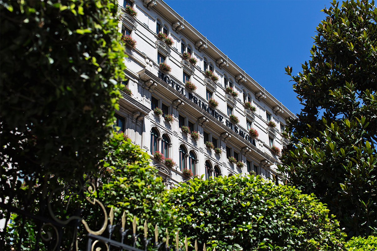
Share:
Reading time: 3 min
contemporary facade of brass curving lines

Dramatic architecture by Paris-based architect Didier Poignant has created a spectacular contemporary hotel out of a cognac ageing warehouse

A former warehouse in the heart of the town of Cognac is set to reopen this year as a luxury hotel. Emma Love gets an exclusive preview of the dramatic Hôtel Chais Monnet

It’s no secret that cognac has become cool. Where once the French brandy – determined as such by being made specifically in the Cognac region in southwest France – had a fusty reputation as an old man’s after-dinner tipple of choice, now the 390 cognac houses producing the stuff seemingly can’t make enough of it (the Hennessy label, owned by LVMH, recently opened a new bottling plant to keep up with demand and increase annual production). The fact that it’s a huge hit in China where it’s seen as a status symbol of wealth, and in the US, where it’s synonymous with rap music, are undoubtedly part of the reason why five bottles of the amber-hued spirit are sold every second somewhere in the world. And just as cognac the spirit has gone through a cultural shift, now the historic town where it’s produced is finding itself in the global spotlight, too.

Follow LUX on Instagram: the.official.lux.magazine

Last year Tony Conigliaro, a mixologist and major influence on London’s cocktail scene (he is behind the legendary bar 69 Colebrooke Row) opened Luciole, a bar with a cognac-based cocktail menu and this summer, the game-changing Hôtel Chais Monnet will open its doors in a former cognac warehouse, set in two hectares of land in the centre of town. Backed by British investor Javad Marandi, who is also the owner of the Soho Farmhouse in Oxfordshire, the hotel will house 92 rooms and suites, plus 13 apartments. “Here in the town we’ve been waiting for this for a long time,” said mayor Michel Gourinchas. “We’ve asked ourselves a number of times what we could do with this site and thanks to this hotel we’ll be able to see a reality of what’s possible in a way that’s in the best interests of our town, its inhabitants, and tourists.”

sleek contemporary interiors of spa relaxtion room with tiled floor and day beds
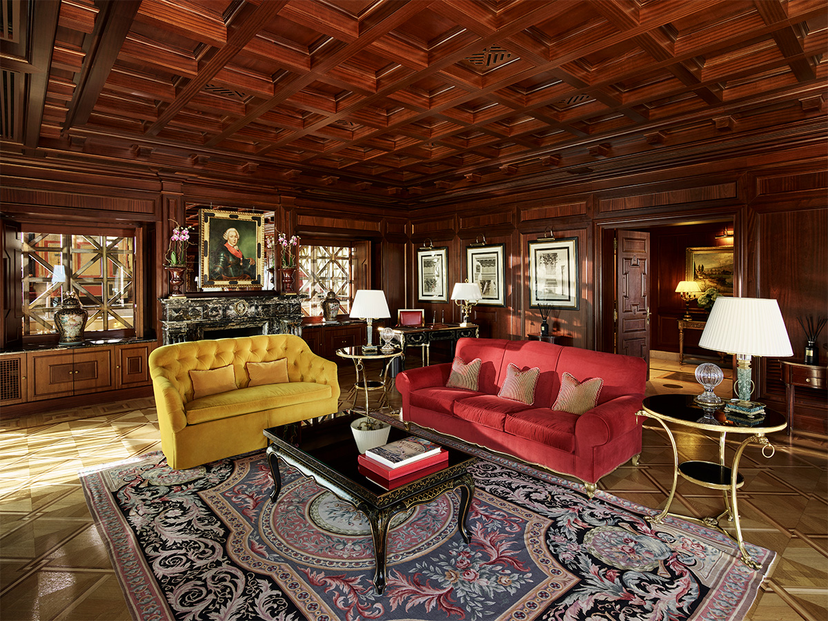
Luxury interiors depicting a marble and wooden hallway with hanging contemporary lights

The public areas of the newly designed Hôtel Chais Monnet, such as the spa (top image) and the hallways, combine cool contemporary design with some original features of the former Monnet warehouse

The site itself has a unique history. The original 19th-century property was once owned by cognac trader Antoine de Salignac who, in 1838, founded the Society of Cognac Vine-growers, a community of several hundred small-vine growers who wanted to pool their strength to have sufficient stock to sell at the same time. Towards the end of that century, the shareholders asked Jean-Gabriel Monnet to manage the society and as part of the role, he and his family moved into the stately mansion and warehouse, naming it Chais JG Monnet. His son, also named Jean Monnet, left school aged 16 to follow in his father’s footsteps, travelling to Germany and America to sell cognac. He went on to become a political economist and diplomat, and an influential proponent of European unity (he is considered one of the founding fathers of the European Union). Later, the site was bought by the LVMH group, and then sold back to the town of Cognac in 2006.

grand interiors of a luxury sitting room with wood panelled ceilings, sofas, chairs, a fireplace and soft lighting

The next chapter in the property’s life looks very different – quite literally. Today, Hôtel Chais Monnet comprises seven original and three new buildings, all designed or remodelled by Didier Poignant of Ertim Architects in Paris. Looking at the hotel, what’s perhaps most striking is the way that the old and modern have been fused together, and how cognac references are subtly employed throughout. “I have never worked on, or seen a hotel like this in France,” says Poignant. “Transforming a historic cognac warehouse with such a large site in a town is very rare. For this reason, it is such a special project.”

Read more: Street artist Alec Monopoly on the purpose of art and wearing a disguise

At the heart of the property are a pair of new Les Ceps glass buildings surrounded by a twisting metallic structure inspired by grape vines. These house some of the rooms (the rest are in an original building, where the cognac was once aged) on the upper levels; on the ground floor of one there is a spa and wellness centre with seven treatment rooms, an indoor/ outdoor swimming pool, a hammam, jacuzzi and gym. The third new building is a series of apartments, which can be rented from three nights to a couple of weeks. The former old barrel-repair warehouse has been turned into a jazz bar with vaulted ceilings, Chesterfield sofas and a piano in one corner. As you’d expect, it will be stocked with a large selection of cognacs, from bottles by the small, lesser known houses to the famous Louis XIII from Rémy Martin.

Architectural render of luxury hotel bedroom with cream walls and large double bed

Render of one of the bedrooms

There are two restaurants within the old ‘Chai Cathedral’: a relaxed French brasserie and a more formal fine-dining offering which has old barrels, once used for cognac ageing, at the entrance. The chef chosen to head up the kitchen of the latter is Sébastian Broda, best known for his light, Mediterranean cooking at Michelin-starred Le Park 45 within Le Grand Hotel Cannes. “What matters,” explains hotel director, Arnaud Bamvens, “is that Sébastien Broda is a name of tomorrow. In his kitchen, which upholds a gastronomy of excellence, we can find his humility, his passion for cooking, and his interest in local produce. We want a cuisine of land and sea, rather than one or the other.” The hotel also has a private cinema, cigar lounge, kid’s club, a rooftop garden bar for summer sundowners, and a series of rooms dedicated to re-telling the story of Chais Monnet so far. The multipurpose ballroom (for up to 220 people) and four seminar rooms are suitable for meetings and events.

Architectural render of a glass entrance linking two warehouses

Render of the glass-encased entrance linking the two original warehouses

Of course, one of the biggest reasons for staying here will be the draw of visiting some of the many cognac houses that are on the doorstep, but the hotel is equally keen to promote the region’s many other attractions. The cobbled streets, the perfectly manicured gardens and traditional architecture, and the Charente river that runs through it, all point to a slower paced, more charmed life.

Read more: andBeyond CEO Joss Kent on creating luxury in the wilderness

“Cognac has a small bar scene but it has a lot of potential,” says Conigliaro, who decided to open a bar in the town with Guillaume Le Dorner, the former bar manager of 69 Colebrook Row, when he returned home to France. It was a smart move, and one that might encourage more drinking of cognac in the town itself (according to figures released in 2016, 97 per cent of cognac is exported, bringing the country 3 billion euros in annual revenue). With the cultural redevelopment of the nearby city of Bordeaux, it means a whole new part of France is opening up to the luxury traveller.

Large indoor swimming pool surrounded by white marble

The hotel’s swimming pool and (below) one of the 21 suites that will be available

interiors of luxury suite decorated in contemporary style with cream and wood furnishings

Four must-visit cognac houses

Meukow

Meukow was founded in 1862 by two brothers, August and Karl Meukow. They first visited Cognac on behalf of the Tsar of Russia, who hired them to buy French brandy supplies for the imperial court at St Petersburg. Look out for Meukow Extra, made from a blend of the very oldest eaux-de-vies in the Paradis Cellar. meukowcognac.com

Domaines Francis Abécassis

Domaines Francis Abécassis is a young cognac house with 220 hectares of vines. It is owned and run by Francis Abécassis and his daughter Elodie, who take a contemporary approach to producing classic cognac, such as in ABK6, blended from a selection of old eaux-de-vies.  abecassis-cognac.com

Camus

One of the largest independent, family-owned cognac houses, as well as one of the largest landowners in the sought-after Borderies cru. Headed up by fifth generation owner Cyril Camus, the house recently launched a new addition to its Borderies range, Camus XO Borderies Family Reserve. camus.fr

Otard

Established by Baron Jean-Baptiste Otard in 1795, this house is known for its medieval residence and its distinctive teardrop shaped bottles. The one to buy is Fortis et Fidelis, created in homage to the house’s founder and featuring the Otard coat of arms motif on the bottle. baronotard.com

For more information and updates on Hôtel Chais Monnet visit: chaismonnethotel.com 

Share:
Reading time: 7 min
Hipster man standing in room filled with old style luggage

Moynat’s Artistic Director, Ramesh Nair

Ramesh Nair worked under Martin Margiela and Jean Paul Gaultier at Hermès until luxury titan Bernard Arnault came calling in 2011,with his personal brand Moynat. The artistic director of the Paris-based luggage house tells LUX why Paris is his inspiration – and why London is Moynat’s hot destination this year

LUX: What role does Paris play in your creative inspiration?
Ramesh Nair: Paris is the city I have lived in the longest at a single stretch and I still find it amazing, creatively speaking. Inspiration comes from many things big and small – simply living here, walking the streets, observing the buildings and the people. The juxtaposition of the old and the new, the quality of the light and the depth of the sky, the architecture (always look upwards while walking through the city). And the unmistakable Parisian style.

Follow LUX on Instagram: the.official.lux.magazine

Paris is a unique city where the past is always with us even as we live modern lives. For me, this is perfectly captured by I.M. Pei’s pyramid for the Louvre with its Cubist inspiration and its determinedly modern use of materials like steel and glass, the perfect counter-balance to the classical architecture of the Louvre itself.

This is the ideal I hold in my mind when I create modern bags or trunks for Moynat: to strike an equilibrium between heritage and modernity, between traditional craftsmanship and contemporary design.

LUX: What’s your favourite part of the city?
Ramesh Nair: Each district in Paris has its own unique personality and flavour. On the left bank, I have a soft spot for the Beaux Arts neighbourhood. Across the river from the Louvre, this is a warren of old streets steeped in history. The profusion of art galleries, specialised boutiques with unusual products, and the presence of the Beaux Arts school helps keep the neighbourhood youthful and avant-garde. The hotel where Oscar Wilde spent his last days is located here, too.

Moynat trunk pictured in Paris in front of the Notre Dame

Moynat Breakfast Trunk for the chef Yannick Alléno

On the right bank, I like the area from Trinité to the Montmartre neighbourhoods. I like the mix of art galleries and artists’ studios, theatres and cabarets, small-scale industries like printers, right next to open-air markets. The Théâtre Réjane was set up in this neighbourhood in 1906 and still functions under the name Petit Théâtre de Paris. There is some remarkable modern architecture to discover, including Adolf Loos’s house for Tristan Tzara.

blue leather handbag with stiff handle and silver "m" shaped clasp

Mini Gabrielle bag by Moynat

LUX: Ever feel the urge to reconnect with nature, away from the big city?
Ramesh Nair: When I have the time, I prefer to drive out of town in search of greenery. Every year, I take a few weeks to explore different parts of France, to discover the diversity of natural beauty in this country, not to mention the wines of the different regions or terroirs.

LUX: Your inside track on Parisian cuisine?
Ramesh Nair: Since I am vegetarian, I often have to ask restaurants to accommodate my choice and I have had some lovely surprises. One of my favourite places in Paris is La Bauhinia at the Shangri-la where chef Christophe Moret impressed me not just with the quality of his organic, locally sourced vegetarian ingredients, but also with the way he elaborates his choices, and of course the exquisite cocktails.

Read more: Luxury Leaders interview with Guillaume Davin, CEO of Moynat

I am also very pleased that so many great chefs are embracing the idea of vegetarian cuisine, from Alain Ducasse at the Plaza Athénée to Thierry Marx at his restaurant Camelia in the Mandarin Oriental.

For me, the fusion of different types of cuisine is really the wave of the future, but it has to be done with a lot of respect for the culinary traditions of each culture. I think chef Atsushi Tanaka has elevated this to an art form at his restaurant AT.

bright pink small leather handbag

A Moynat Cabotin bag

LUX: Is eating out all about the cuisine?
Ramesh Nair: Not at all, I am very sensitive to the authenticity of any experience. From a very simple, home-style environment to a Michelin-star restaurant, truthfulness to one’s vision and passion will always make itself felt. Apart from the ambiance and music, the quality of the service, the contact between guests and staff, the effort made to share what the experience is all about, these are elements that feed all the senses.

LUX: What’s your cultural life in Paris?
Ramesh Nair: My two great loves are art and music. I try and catch as many concerts as possible (blues, jazz, rock…) when work allows me. I like the acoustics of the Olympia and the Grand Rex. Smaller venues like New Morning and La Maroquinerie are great if you want a more intimate setting or to discover rising stars, plus great acoustic quality.

Paris has so many art museums and galleries that it is hard to pick even a few… plus the museums are often breathtaking on their own. At the moment there are two simultaneous exhibitions showcasing the oeuvre of Martin Margiela, whom I had the privilege of working with during my early years in Paris.

Read more from the Image Issue: Gaggenau – the art and architecture of appliances

LUX: Where does a Parisian designer like you shop for clothes?
Ramesh Nair: Mostly at Yohji Yamamoto for clothes. I am obsessed with trainers, of which I have a collection of limited editions and rare models.

LUX: You travel a lot on work, what is the first thing you do when you get home?
Ramesh Nair: Relaxing with my cat is the perfect antidote for jet lag.

old fashioned luxury picnic trunk fitted to the handlebars of a bicycle

Moynat picnic trunk for a bicycle

LUX: What would you recommend all visitors to Paris to do?
Ramesh Nair: Paris is a city meant to be explored on foot. So, walk along the Seine, explore the Ile Saint-Louis with its historic buildings and bridges. If you walk through the Louvre courtyard at night, you can see the art through the windows and it gives you a whole new perspective.

LUX: London was the first city outside of Paris to have a Moynat store – why was that?
Ramesh Nair: Moynat has had historic ties with London since the very founding of the House. In the mid-1800s, radical advances in the way people travelled and experienced the world made it possible for houses like Moynat to reach visitors from the UK and to make their innovations and quality known. This was one of the keys to the reputation and success of Moynat. So it was a natural decision for us to make London our first store outside of Paris.

The Mount Street store is one of my favourites, for its architecture, its luminosity and its distinctive character. We will soon have a second store on the ground floor of Selfridges, which will showcase our House in a different environment and to a different type of customer.

Discover Ramesh Nair’s designs at moynat.com

Share:
Reading time: 6 min
contemporary interior with wine cooling cabinet

Gaggenau’s Vario cooling 400 Series appliances such as this wine climate cabinet are designed to be as much part of the architecture as they are functionally capable

Kitchens were once the utilitarian core of the house. Now, leading manufacturers of kitchen appliances are more about architecture and design than just practicality, meaning they can enhance a home’s aesthetic. Emma Love meets the designer of German high-end manufacturer Gaggenau to hear how life’s all about the experience, and how kitchens can be design statements in themselves

Increasingly, design-led kitchens are an extension of the architecture of the rest of the home. Here, we look at how appliances fit in.

Two years ago, at the Venice Architecture Biennale, Japanese designer Kengo Kuma created The Floating Kitchen, which consisted of a series of shelves with ceramic bowls and plates, urns and vases that he had found in the Chinese city of Chengdu. It was part of a satellite exhibition, the Kitchen Home Project, which imagined what our living environments could look like in the future (the exhibition also included a fully transparent kitchen by Dutch studio MVRDV). And while this crystal-ball creative thinking is certainly a world away from manufacturers such as Gaggenau, whose global success is built on technological advances and an architecturally inspired design language, it does demonstrate that our notion of what a kitchen looks like is changing in all kinds of ways, from the kitchen utensils we use to the plates we serve our food on and to appliances.

Follow LUX on Instagram: the.official.lux.magazine

In the past few years, for instance, there has been a growing interest in knives made by specialist craftsmen. The Japanese Knife Company, which has stores in London, Paris and Stockholm, sells traditional handmade Japanese knives to chefs and home cooks. Equally, more and more chefs are commissioning ceramicists to make tableware for their restaurants, a trend which is also reflected in non-professional kitchens. And when it comes to appliances, gone are the days when refrigerators and freezers were an ugly but necessary addition to an otherwise beautifully designed kitchen.

Now, appliances are increasingly made to reflect the overall aesthetic of the room and the wider home – all clean sculptural lines that blend seamlessly with the rest of the cabinets and furniture – while still setting new standards in terms of function. In other words, the appliances themselves are a crucial part of creating a visually pleasing kitchen landscape.

“People want their kitchens to be both a purposeful and a beautiful space whilst being a seamless extension of the architecture of their home,” says interior designer Natalia Miyar. “The kitchens in our projects are always designed in context of the wider architecture of the home, often with clean silhouettes, grounded by strong, classical materials like stone and softened by interesting textures and warm metals. It is important that a kitchen is designed not as solely a utilitarian space but also to have a warmth and a relaxed feel.”

Modern refrigerator with bottom drawer open

This, of course, includes the design of appliances, which Miyar says is key: “It is important that these elements tie the design together and do not jar with the rest of the scheme. There are more and more design-led functional appliances on the market but I also like to design joinery which conceals larger pieces and provides a further tailor-made aspect to the design.’

One such manufacturer leading the way with design-led functional appliances is Gaggenau, whose Vario 400 series is the first modular system of fully integrated refrigeration products that can be combined to form a cooling wall. Comprising a series of statement handleless pieces, the idea of the system is that it shifts the image of refrigerators and freezers from purely professional appliances to elegant design objects. In part this is achieved through the highest levels of craftsmanship but it is also down to the considered choice of materials (think dark anthracite aluminium, oak-wood and glass doors) and techniques used (the finer glass-bead blasting of the aluminium parts), all of which results in a super-sleek tone.

Read more from the Image Issue: Global entrepreneur Johnny Hon on promoting global exchange

“This new range for Gaggenau is the very essence of refinement in the luxury kitchen appliance market,” says head of design Sven Baacke. “We see extraordinary interior aesthetics as something that should be seen in all spheres of life, including the kitchen. Staged beautifully and with perfect illumination, you are no longer simply storing wine or refrigerating, you are making a statement.” And these days it seems that this architectural statement doesn’t end with the right placement of the cooking island or the finish on the worktops – it encompasses everything else in the kitchen too.

Portrait of Gaggenau designer Lars Dinter standing in front of industrial site

Gaggenau designer Lars Dinter takes inspiration from architecture

We talk to Gaggenau designer Lars Dinter about the architectural influences behind the Vario cooling 400 series.

LUX: How was the new Vario 400 series inspired by architecture?
Lars Dinter: It’s not inspired by any particular style but I’m always very interested in what’s happening in architecture in general. It’s higher than art in a way because it’s a big responsibility and architects create works that last for a very long time compared to product design, for instance. I’m always drawn to contemporary Belgian architects such as Vincent Van Duysen, Marc Merckx and CAAN Architecten. Their style is very minimalist but uses natural materials and textures so buildings still feel warm. One of my big idols is Piero Lissoni. He is a product designer who does lots of interior design and again he has a minimalist style but it’s combined with an Italian elegance.

LUX: Gaggenau regularly consults chefs, sommeliers, interior designers and architects. Did this effect the design of the 400 series?
Lars Dinter: Interior designers and architects often tell us that they wish the products would integrate better into dining rooms and kitchen. The input from sommeliers includes the fact that the LED lights that we’re using need to be free of infrared and ultra-violet wave lengths to make sure that we’re not harming the wine during long-term storage and that we need specialist storage solutions such as humidity controls for storing vegetables and fruit as people are eating more of these and less meat these days.

Read more: Geoffrey Kent on Millennials and transformational travel

LUX: What affects your choice of materials and how do you make them become part of the architecture?
Lars Dinter: It’s as much about the shapes as it is about the materials so we’ve tried to make the overall appearance of the appliances cleaner and more contemporary. With the materials, we have changed from a stainless steel anodising process to anthracite aluminium for components such as the support brackets for the glass shelves (the cavity is still clad in stainless steel). We’re using this to give the appliances a warmer, more elegant feel which we think will also integrate better into the architecture. We want the same warm atmosphere and emotional appeal to our appliances as there is elsewhere in the home without losing that powerful technical performance.

LUX: What technological advances can we see in this series?
Lars Dinter: The most important technical advancement is our opening-assist system for the doors which enables customers to have cabinet fronts without interruptions. In the past there have been handle-less kitchens but the refrigerator and freezer has always still had handles. As far as we know our opening-assist system offers the first fully complete handle-less kitchen – appliances included. You can use the system as a push-to-open device in a handle-less kitchen but it also has a second setting so if you have a more traditional kitchen and still want handles, the same mechanism can be used to support opening heavy doors.

close up photograph of wine cabinet drawers containing bottles of champagne

Gaggenau designer Lars Dinter combines shape and material to create elegant solutions which match form and function

LUX: Tell us about the design of the wine climate cabinet.
Lars Dinter: We are using oak-wood because it has a warm colour, a good grain and fits in with our approach to authentic materials. We have also added new accessories including a serving tray and a bottle presenter. These also feature anthracite aluminium and oak, so they are finely aligned with the rest of the products. With these accessories, we are trying to add more quality and appeal to the pieces. We are trying to make a big step towards becoming more appealing on an emotional level.

LUX: Do you think that kitchens are increasingly seen as architectural spaces?
Lars Dinter: There are no boundaries anymore. Kitchen, living and dining spaces are all merging together in one big living space and our new line-up of kitchen appliances fit into this way of living. Traditionally, a kitchen might have an island or cabinets with an oven or coffee machine and the appliances are integrated into this. We are enabling customers to have a transitional zone with a cabinet wall that has wooden panelling on the front with no hint what is hidden behind. The appliances could be hidden into these cabinets. With connecting rooms, a nice solution is to take the same architectural aesthetic throughout so the wine cooling units for example, could stand in the background of your dining room. After dinner, you can set the lights so they give off a little glow and become part of the mood of the space.

gaggenau.com/gb/

Share:
Reading time: 7 min
Luxury kitchen appliance brand, Gaggenau, gets creative with Brazilian-born artist, Mayra Sérgio, to host an exhibition, ‘Sensorial Shelter’, in their Grade II listed building on London’s Wigmore Street. Celebrating coffee, craftsmanship, design and creativity this installation sees coffee become an art medium in the form of bricks, reflecting the rich architectural history of English bond brick laying. Kitty Harris speaks to the artist about her career, love of coffee and inspiration behind her sculpture.

Kitty Harris: You worked as a set designer for five years in Brazil – how did your studies in Amsterdam influence/change your experience as a creator and artist going forward?
Mayra Sérgio: Studying in the Netherlands [at Gerrit Rietveld Academie] changed completely how I perceive and experience the creation process. I learnt that when starting a new project the least you know what it will be in the end, the better. Not knowing for a while where you are heading can be hard, but that’s when truly new ideas can come around. I also learnt to not only shape materials with my ideas but also let the ideas be shaped by the limitations and possibilities of the material. It’s a dialogue.

Follow LUX on Instagram: the.official.lux.magazine

KH: Why set design?
MS: Since I was a kid I was crafty, always making collages, objects or paintings. When I entered film school and we started making short films it came very naturally that I would be the one in charge of creating and building the sets and props. Along the years I developed a strong sense of how to tell a story through spaces and objects.

KH: How did your relationship begin with Gaggenau?
MS: What brought us together was coffee. Their vision of the meaning of a cup of coffee completely resonates with my work. It feels like a great match.

KH: Where did the inspiration behind the ‘Sensorial Shelter’ come from?
MS: I was busy investigating about what brings a sense of belonging to people. Being a foreigner myself, I started questioning how the spaces and objects around me interfere in that feeling.

Food carries a highly evocative power that enables one to feel ‘at home’ through its look, smell and taste. Food has the power to overcome an estranged space and transform it into a place of belonging. A mug of coffee can be stronger in making me feel at home than any built architecture.

Kitty Harris: What is it about coffee that resonates with you?
Mayra Sérgio: Coffee resonates with me in many different levels. To start with it is a delicious drink. But also, like many people, I carry various warm memories of sharing it with my friends or family. And the more you learn about its process, blends and different types and origins the more interesting it gets. So there you have it in a cup: taste, smell, geography and memory all connected.

KH: How would you describe your art form?
MS: I have an interest in creating works that enable different layers of experience. That can be at the same time sensorial and make people reflect.

Read next: British model Hazel Townsend on learning to be a clown 

KH: You were fond of the English brickwork technique called English bond – what other mediums would you like to work with?
MS: The English bond idea came from presenting Sensorial Shelter in London. It would never have happened elsewhere. I find it fascinating that context can shape the work as well. I like the idea of using materials in unusual contexts.

KH: Is the process of creation different when you are commissioned to do a piece to when you are not?
MS: Commissioned pieces give you a frame to work within but in the end the way you connect ideas and create comes through anyway.

I think it’s healthy to balance both. Commissions are usually based on what people already know from you but when you create something on your own you have the opportunity to explore completely new themes and languages.

KH: What’s next for you?
MS: There are two paths ahead: I’m working on a new art installation but I also want to develop the coffee bricks further. Coffee is an incredible material with a lot of potential so I intend to collaborate with a more scientific partner to fully explore its possibilities as a product.

mayrasergio.com

Share:
Reading time: 3 min
Broomhall House

For the first time since its construction in 1702, the ancestral home of the Bruce family (the Earls of Elgin and Kincardine) is open as an exclusive venue for private events, in collaboration with Wild Thyme and Hickory luxury catering, chauffeur service Little’s and The Balmoral Hotel in Edinburgh. Charlotte Davies journeys to the Kingdom of Fife, Scotland to dine with Lord Bruce surrounded by the portraits and antiques of his ancestors.

Entering Broomhall House rivals walking into the British Museum; casts of the Elgin marbles line the walls of the entrance hall, a Roman sarcophagus stands by the fireplace and flanking the doorway are a pair of 4th-century marble columns thought to be from Diocletian’s Palace in Split, Croatia – the Bruces certainly know how to make a memorable first impression.

What sets Broomhall House apart from other stately homes offering private events is that it is still very much a family home. It feels lived in, as it has been, Lord Bruce proudly informs me, by thirteen generations of Bruces. Over 70 children have been born and brought up within the historic walls.

Walking from entrance hall to drawing room, Lord Bruce recounts the first hundred years of the family’s history, illustrating the heroic lives behind the portraits that adorn the walls: the family first settled in Britain in 1066 during the Norman invasion, and in 1314, Robert the Bruce successfully defended Scottish independence against the English and the family held the throne for two generations. We are later shown King Robert’s sword, which after a certain politician’s mishandling (we’ll name no names), is now kept safely behind glass in the dining room

Passing through the elegant ballroom we learn of Edward Bruce who in 1598 negotiated the succession of James VI to the English throne and arranged the new constitutional entity of Great Britain, and the 8th Earl of Elgin who established political unity in Canada. Whilst the old schoolroom, now a small museum displays some of the gifts the 9th Earl, Victor Alexander, received as viceroy of India in the 1890s. The list of family accolades is quite overwhelming.

Our tour ends in the dining room (which like the rest of the house, is reassuringly more cosy than grand and imposing), where dinner is served round a large oak table. Here we have a moment to appreciate the beauty of the artworks and antiques that surround us; a spectacular mantelpiece that was reconstituted from the marriage bed of James VI and Anne of Denmark and the birth-bed of Charles I and his two sisters, and the pièce de résistance: a 19th-century silver statuette of Queen Victoria (commissioned by the Queen as a reminder of her omnipresence in India). Under the glow of the chandelier and flickering candlelight, we dine on a three-course meal of four types of salmon, beef and a selection of small cakes. The evening passes all too quickly; while sipping wine from nineteenth-century silverware, we discuss a wide variety of subjects from the state of the art market and role of portraiture to the family’s collection of classic cars, which include a 1920s Rolls-Royce Silver Ghost and a 1912 Napier.

broomhallhouse.com

Share:
Reading time: 3 min
beirut architect nadim karam
Installation by Nadim Karam, Japan

The Three Magic Flowers Of Jitchu, Kagami Lake, Todai Ji Temple in Nara, Japan by Nadim Karam

Born in Senegal, and raised in Lebanon, Nadim Karam is an architect, painter, sculptor, writer and designer. With his Beirut-based multidisciplinary design studio, Atelier Hapsitus, Karam has created large-scale urban art projects in Paris, Prague, Dubai, London, Melbourne, Tokyo and Chicago. His work has been exhibited at several Venice Architecture Biennales, and his first major exhibition in the UK is currently on display at The Fine Art Society. Millie Walton speaks to the creative polymath about urban toys, artistic challenges and the importance of fun.

LUX: Your sculptures and paintings are often quite fantastical. Where does your inspiration come from?
Nadim Karam: Life! I believe, like Gabriel Garcia Marquez, that an element of fantasy in a serious context or with a serious message can transport an idea or story, and help it catch alight. A judicious dose of fantasy is one of our antidotes to apathy, ugliness, and pessimism.

Inspiration, I suppose, comes from our experience of life and the way we look at the world… I am lucky to come from Lebanon, with its wonderful, chaotic energy and endless contradictions, and I spent ten years absorbing Japanese cultural philosophy, which is now very much a part of me. I have so many ideas; I just need to find the quiet in-between-work moments to put them down in my sketchbook.

Genesis Diptych 2016 by Nadim Karam

Genesis Diptych 2016 by Nadim Karam

LUX: At Atelier Hapsitus, you combine several different creative disciplines – art, architecture and design – is there an over-arching theme or vision that ties these altogether?
NK: Probably that would be absurdity, memories and stories, which constantly feed into each other. Their meeting point is the public art projects that I create for cities or public contexts.

LUX: You often describe your sculptures as ‘Urban Toys’ – what do you mean by that?
NK: My work is whimsical; I make toys to the scale of the city to create question marks, open a dialogue and introduce moments of delight, or fantasy to urban contexts.

Read next: Why you should invest in a modern classic car

LUX: How do you persuade clients that spending money to make their urban environments ‘playful’ is important?
NK: I believe in it. I believe in it so much that I invest years and years working with communities, municipalities and bureaucrats to persuade them to introduce playfulness to their cities. Urban environments can be lonely places, dominated by real estate, communication and transportation systems and the business of making money. Adults need dreams, fantasy and moments of wonder just as much as they did when they were children, but at a certain point they were required to put their toys away and get on with the serious business of living. If we can introduce organic flexibility within rigid systems through interactive works, we can help reinforce a sense of belonging to a community, and celebrate enjoyment for its own sake.

This will never work if you just cut and paste an artwork into a context – that is not the kind of public art I am talking about. Before proposing a project to a city, I study, with my office, the history and culture, the geography and built context, because I want to create works that feel like they have grown out of the place or in contrast with it, and are adopted by the people who live there.

beirut architect nadim karam

Urban Stories by Nadim Karam

LUX: What’s been your most challenging project to date?
NK: In different ways, many have been challenging; Prague because I had to negotiate through a tense post-communist social climate, Nara (Japan) because it took twenty years to get the Buddhist monks’ acceptance and Melbourne because I had to create ten kinetic three-story high sculptures on the other side of the world in just 9 months.

The scale of my work is getting bigger, though, and this is providing fresh challenges. For Dubai I want to create “The Cloud”, a public garden 300m above ground, and for Lagos I am working on an Elephant City, a dynamic urban system within a giant sculpture. Currently, I am working on projects for Shenzhen, Dilijan and Singapore. They might be far from realisation, but I never stop to think about whether I can do these projects or not. If I don’t stop working, at some point opportunity and encounters will create a window in time to make a project work.

LUX: Do you believe urban environments should be inclusive for everyone and, if so, how do you ensure this is possible in your art/architecture?
Nadim Karam: When you create an artwork, like a painting or a sculpture, and you hang it in a gallery or institution, the context is purposefully neutral and the focus is on the dialogue between the work and the viewer. In the urban environment, the placement of an artwork becomes politicised because the context has its history, memories, sights, sounds and moods. Public spaces are necessarily democratic arenas where opinions are challenged and it is not easy to reach consensus. So a public art project will not happen if people don’t believe in it. But if we can enrich our public spaces with stories, beauty, absurdity, fantasy or questions, we are enriching the community as a whole and enhancing the quality of their shared experiences.

Dreams and Journeys 2017 by Nadim Karam

Dreams and Journeys 2017 by Nadim Karam

LUX: What’s your creative process like?
NK: All my projects grow from my sketchbooks, where I record my raw ideas. A series of these sketches will form a significant part of my new exhibition at The Fine Art Society. I use lapses of time while travelling from one place to another to generate ideas, and when I get back to my office, I work with ten to fifteen people to transform these ideas into workable projects or sculptures. Otherwise, they might become paintings when I reach my studio.

Read next: Modern interpretations of the body at Past Skin, MoMa PS1

LUX: What’s it like to be an artist in Lebanon?
NK: It is challenging, because there is no support from cultural institutions. At the same time, we live with uncertainty; at any time, bombs can explode and we have to close the office. You have to be sufficiently independent to be an artist in Lebanon, because you cannot live from it otherwise. My projects are all over the world, so I spend a lot of time travelling, but I generate all my work from Lebanon – it is a place of continuous energy and inspiration.

LUX: Where are your favourite urban environments in the world and why?
NK: I love the richness of all urban environments and their different cultures. They are a collision of so many factors; each city has a completely different aura and way of being despite all our globalisation efforts. The projects I have created all came from the serendipity of encountering a city and being inspired to interact with it. I celebrate the identity of each place by first trying to understand it, then offering it a bouquet of stories.

Large scale urban art project by Nadim Karam, Prague 1997

T-Race’s PCB 13 General View, Public Art, Prague 1997 by Nadim Karam

LUX: What’s next?
NK: Currently, I have an exhibition entitled ‘Urban Stories’ at The Fine Art Society in London, which showcases over twenty years of my practice. The exhibition came about through the shared motivation of The Fine Art Society and myself to draw a connecting line from my early sketches to my latest works. Meanwhile, I am designing and building my own art studio, “The Muse” in the Lebanese mountains, and the Pavilion of the Whole World.

‘Urban Stories’ runs until 19 May 2017 at The Fine Art Society, Mayfair, London

Share:
Reading time: 6 min

ARCHITECTS, DESIGNERS, ENGINEERS, AS DISCIPLINES MERGE, EVERYTHING IS BLENDING INTO ONE CREATIVE-SCIENTIFIC PARTY. Karys Webber SCOURS THE WORLD FOR SOME OF THE MOST EXCITING CREATIVES IN ARCHITECTURE AND DESIGN

Studio Weave’s The Longest Bench

Studio Weave’s The Longest Bench

STUDIO WEAVE – LONDON

Despite only recently gaining their registrations as architects, duo Je Ahn and Maria Smith founded Studio Weave back in 2006 and completed a number of projects as humble students. With a fun and quirky style, they tend to concentrate on public space improvements; one of their more renowned projects is The Longest Bench in Littlehampton, West Sussex. Made from reclaimed timber interspersed with the odd colourful stainless steel bar, the wiggly bench can seat up to 300 people and was inspired by a charm bracelet.

studioweave.com

KRAUS SCHOENBERG – HAMBURG

Spatial experience and coherence between external and internal spaces is the design focus for German architecture practice Kraus Schoenberg, something they clearly demonstrate in the sustainable housing projects that they are best known for: Haus W and H27D. Clean and contemporary in design, Haus W is a prefabricated, low energy house in Hamburg designed as one big connected space created by rooms of various heights corresponding to their individual function. H27D, a five-storey apartment building in Constance, isn’t much to look at from the outside but was designed this way to match the look and feel of the historic city centre where it lies. The highly engineered building can be recycled to achieve zero waste.

kraus-schoenberg.com

BIG’s cultural arts centre in Bordeaux

BIG’s cultural arts centre in Bordeaux

BIG – COPENHAGEN

Danish architects BIG have designed an enormous new cultural arts centre in Bordeaux alongside French studio, FREAKS freearchitects. Scheduled to open in 2015, MÉCA (Maison de l’Économie Créative et de la Culture en Aquitaine) will become the new combined home of arts organizations the FRAC, the OARA and the ECLA, situated on the Garonne waterfront. The striking design for the 12,000 sq m building features a central rectangular hollow which will be used as a huge stage and exhibition space.

big.dk

AMPHIBIANARC – CALIFORNIA

An ambitious, shape-shifting, ‘transformer building’ has been designed by Californian architects, amphibianArc, for the headquarters of Zoomlion, a Chinese industrial vehicle manufacturer in Changsha, Hunan province. Each end of the proposed building will have a transforming façade made of hinged steel and glass plates designed to mimic the movement of eagles, butterflies and frogs. amphibianArc claim that their goal is to ‘create buildings that not only reshape the lived reality but also inspire minds that will invent the future’.

amphibianarc.com

Polifactory’s Hous.E+ generates energy from a lake on its roof

Polifactory’s Hous.E+ generates energy from a lake on its roof

POLIFACTORY – SHANGHAI

Shanghai-based architects Polifactory have designed Hous.E+, a self-sustaining rammed earth house designed for a rural site in Vancouver, Canada that generates energy from a lake on its roof. The concept house is designed to produce more energy than it consumes; turbines embedded in the walls produce electricity from water being pumped through a system of pipes and the walls would act like a breathing structure, allowing air exchange without significant heat loss.

polifactory.com

Coca-Cola Beatbox, Asif Kahn

Coca-Cola Beatbox, Asif Kahn

ASIF KHAN – LONDON

Despite not technically being an architect (he never quite got round to sitting his final exams), Asif Khan has received impressive acclaim for his experimental work across architecture, products and design. He was awarded Designer of the Future award in 2011 after showing his unique Cloud installation at Art Basel Miami. More recently, Khan teamed up with Pernilla Ohrstedt for the London Olympics project, Coca-Cola Beatbox; a striking red and white sculpture doubling up as an enormous musical instrument.

asif-khan.com

RAW EDGES – LONDON

Tel Aviv-born twosome Yael Mer and Shay Alkalay formed London-based design studio Raw Edges following their graduation from the Royal College of Art in 2006, where they met and teamed up. They have since won a string of highly respected awards for their innovative and striking products for the home which blur the line between art and furniture. Their work can be found within the permanent collection at MoMA in New York and Stella McCartney commissioned the duo to create the floor for her Rome store after spotting their installation at Art Basel.

raw-edges.com

MISCHER’TRAXLER – VIENNA

Vienna-based design studio Mischer’Traxler is made up of partners in both their professional and personal lives, Katharina Mischer and Thomas Traxler. The pair design experimental products, furniture and installations, characterized by conceptual thinking and the use of unexpected materials. Their complex project ‘The Idea of a Tree’ combines natural input with a mechanical process, driven by solar energy, which translates the intensity of the sun into one object a day. The outcome is a unique product that reflects the various sunshine conditions that occur during that day and becomes a three-dimensional recording of its process and time of creation. This kind of innovative thinking won the duo the accolade of Designers of the Future at Design Miami/Basel in 2011.

mischertraxler.com

Hamilton Scotts, Singapore features ensuite sky garages

Hamilton Scotts, Singapore features ensuite sky garages

HAMILTON SCOTTS – SINGAPORE

In Singapore, luxury high-rise residential building Hamilton Scotts, project of real estate developer KOP Properties, have come up with a novel alternative to underground parking: en suite sky garages. Residents need simply to drive their car into a designated spot outside the building and, after a quick biometric thumb scan, their car is whizzed straight up to their apartment via a special lift. By the time the owner reaches their apartment, the car is displayed behind a glass wall off the living room, ready to be admired.

hamiltonscotts.com

COOP HIMMELB(L)AU – VIENNA

Austrian architecture firm Coop Himmelb(l)au have completed work on the enormous Busan Cinema Centre in South Korea. The impressive building boasts a 4000-seat outdoor cinema covered by a seemingly gravity defying cantilevered roof (the world’s largest at 85 metres from end to end), the ceiling of which is illuminated by thousands of LED lights to create a kind of virtual sky. The building will be the new home of the Busan International Film Festival and is Coop Himmelb(l)au’s first project in Korea.

coop-himmelblau.at

DCPP Arquitectos’ 20-storey building porposal for Lima, Peru

DCPP Arquitectos’ 20-storey building porposal for Lima, Peru

DCPP ARQUITECTOS – MEXICO

A luxury 20-storey apartment block featuring individual swimming pools that teeter out over the city like diving boards has been proposed by Mexican architects DCPP Arquitectos to be built in Lima, Peru. The building has been designed with a transparent façade for a location in the east of the city overlooking a golf course. DCPP say the idea behind the design is to ‘incorporate the exterior space to the interior life of the apartments and create a new relation between public and private areas’.

dcpparquitectos.com

YVONNE WENG – LONDON

For her graduation proposal, Architectural Association student, Yvonne Weng, designed The 6th Layer: Explorative Canopy Trail, a non-invasive, airborne system that would allow scientists to live in the treetops of the Amazon rainforest whilst carrying out research, without the risk of damaging the forest’s fragile eco-system. The incredible design imagines a series of super strong webs made of synthetic fibres and suspended teardrop shaped pods where scientists could study and harvest medicinal plants. The concept won Weng acclaim from scientists and architects alike and the 2012 Foster + Partners Prize for excellence in sustainability and infrastructure.

Bamboo Courtyard from HWCD Associates

Bamboo Courtyard from HWCD Associates

HWCD ASSOCIATES – SHANGHAI

The Bamboo Courtyard, a floating teahouse in Yangzhou, northwest of Shanghai, has been created by architects HWCD Associates. Organised in asymetric cubes on a lake, brick rooms are connected and encased by tall rows of bamboo arranged to create depth and interesting visual effects, further intensified by the atmospheric glow from lights inset into the door frames. The architects say ‘the simple form illustrates the harmonious blending of architecture with nature’.

h-w-c-d.com

Lee Sehoon’s Anitya range features a collection of all black funiture

Lee Sehoon’s Anitya range features a collection of all black funiture

LEE SHOON – KOREA

Korean designer, Lee Sehoon uses the process of heating vinyl to create his dramatic, all black furniture range, Anitya.  The idea behind the collections is to create an illusion of perpetual and dynamic movement, achieved by the vinyl expanding when heated and contracting when cooled which results in unexpected and unique shapes. More recently, Sehoon designed Squaring, a clever bookcase design made up of hinged boxes that can be spun around to create numerous shapes and designs.

leesehoon.com
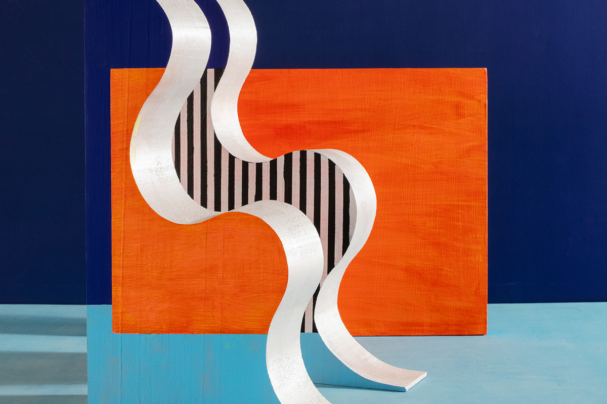
WANG SHU – CHINA

Chinese architect Wang Shu may run a practice called Amateur Architecture alongside his wife, Lu Wenyu, but don’t be fooled, his work is anything but. Shu, also a professor, recently won the extremely prestigious 2012 Pritzker Prize (generally regarded as the Nobel prize for architecture), for work representing consistent and significant contribution to humanity. Shu has completed five major projects in China including three college campuses and the Ningbo History Museum. His style typically combines modern design with traditional, often recycled, materials.

Additional research by Rebecca Stanczyk

Share:
Reading time: 7 min
The second floor will house the permanent exhibition

The second floor will house the permanent exhibition

SIR TERENCE CONRAN IS A MAN WHO CHANGED THE WAY THE WORLD THINKS ABOUT DESIGN. AND HE WANTS TO DO IT AGAIN.Caroline Davies HEARS HIS SAGE WORDS AT THE UNVEILING OF LONDON’S SPECTACULAR NEW DESIGN MUSEUM PROJECT

Terence Conran’s influence on design and culture is astonishing. An independent designer from the age of 21, in 60 years Conran and his work have affected the way we shop, decorate, eat and live, but he is still working to leave his mark.
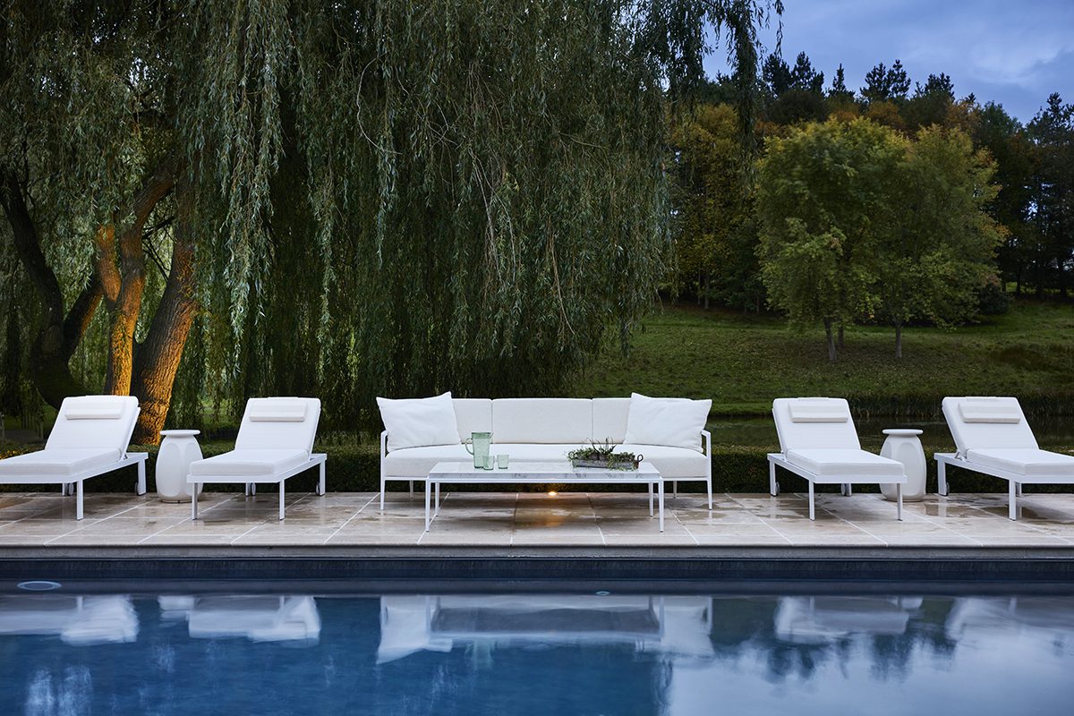
Conran is as active as he has ever been during the past six decades, and his latest project is, he says, one of the most exciting yet. “This to me is really one of the most fantastic days of my rather long life,” he says. “We have the next three years to fulfil our ambition to make this the very best design museum in the world,” he says. “Every city wants a design museum it seems these days, but this is where creative Britain should lead.”
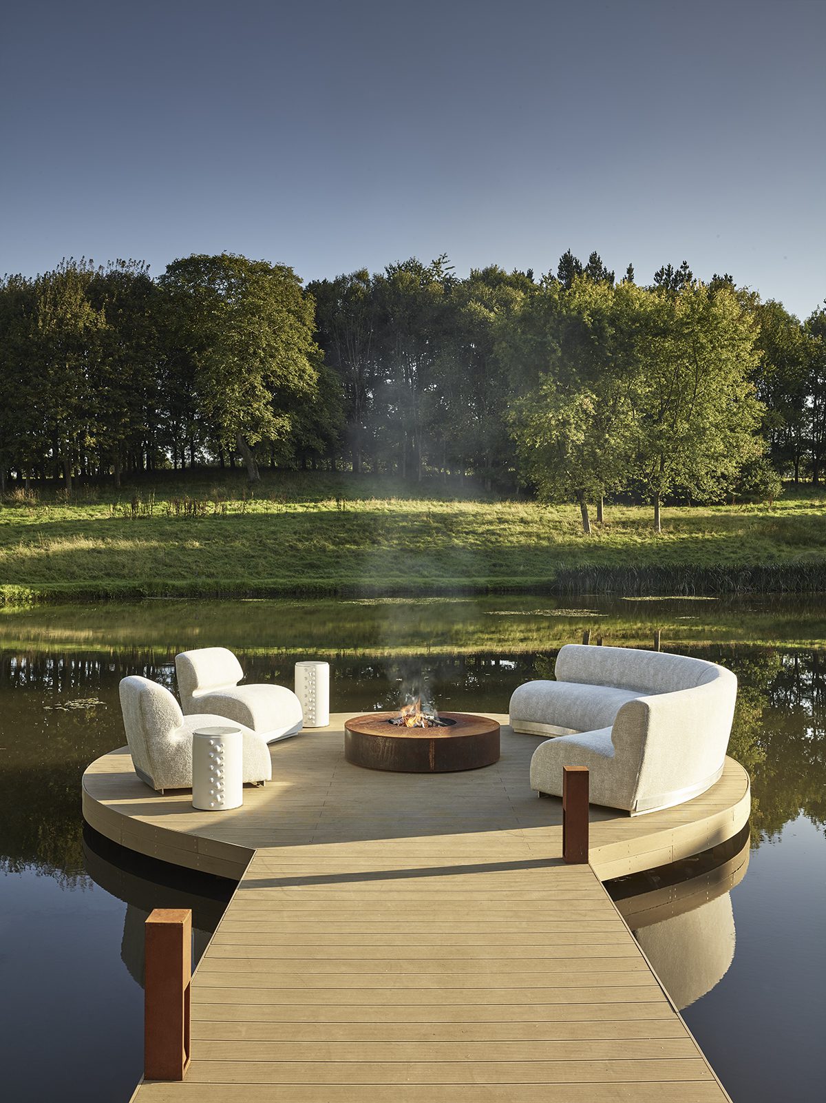
Sir Terrence Conracn

Sir Terrence Conracn

He is speaking at the groundbreaking of Britain’s spectacular new Design Museum, which will be an institution that showcases every type of design from around the world. It will be located on the site of the former Commonwealth Institute in one of London’s wealthiest areas, replacing the boutique site occupied by the current Design Museum.

There are few individuals better placed to lead the project. He is a “serial entrepreneur” whose career has seen him build and establish an architectural practice, a design company and a series of restaurants. Habitat, his furniture store that brought sharply designed furniture to the masses, was the first to introduce Britain to sharp contemporary design with wit and genuine creativity. Wondering how the average CEO’s office morphed from dark oak panels and antiques to minimalist whites, glass and an Alessandro Mendini chair? Conran’s influence influenced those who changed the world.
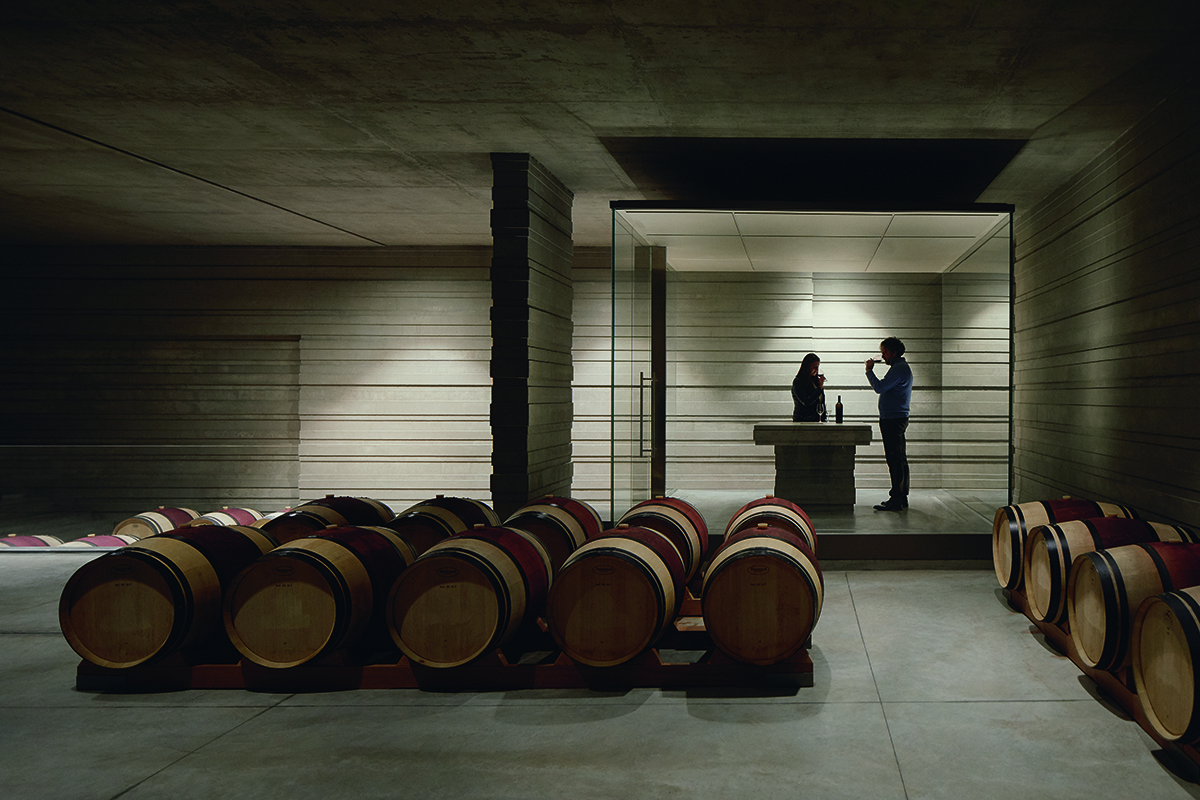
His first restaurant, “Soup Kitchen” was just the second spot in London to boast an espresso machine and his subsequent projects have been credited with popularising fine dining in the UK: his designs made him a restaurant king in the 1990s. And before that his designs for Mary Quant’s stores altered all expectations for the shop floor.  Although Conran’s main projects have been in the UK, his mission to deformalize design and make creativity available to every stratum of society have had a profound effect on every element of design around the world.  Spurred on by his belief that good design should be democratised and celebrated, he founded the Design Museum, firstly in the Victoria and Albert Museum then in its current location in Bermondsey, South London. Gaining credibility and more crucially funding for the project was not an easy process and Conran semi-affectionately refers to the period as their, “guerrilla time in the absolutely terrible old boiler house.”

The museum will be located in the former Commonwealth Instituteon Kensington High Street

The museum will be located in the former Commonwealth Institute
on Kensington High Street

“Getting this particular site was absolutely brilliant,” says Conran. “It is a very important symbol and marker.  Here we have this building from the 1960s an extraordinary structure, sadly sat here for the last 12 years unused.” Soon to be part of the museum hub of Kensington, joining the V&A and the Royal College and Imperial College, the museum is due for completion in 2014.  Despite his passion and ongoing energy for design, Conran does not seem quite as robust as he once was. In his usual blue suit with red cheeks, he moves slowly and rather gingerly, hunched over the microphone, carefully stating his message. His increasing years seem to make him even more determined that the public, and crucially the government, should listen.

The plan for London’s new Design Museum

The plan for London’s new Design Museum

“We must start to make things again,” he says determinedly. “If you can put designers together with entrepreneurs together with engineers we can make beautiful and useful things again in this country that the world will want. I think it just needs a push from government to make this new collaboration of entrepreneurs, designers, engineers to start another industrial revolution.”

The distant beep of an articulated lorry begins in the background.

“I hope government sees it and sees that construction is underway,” says Conran, smiling. “We are going to make a rather large hole.”

Share:
Reading time: 3 min