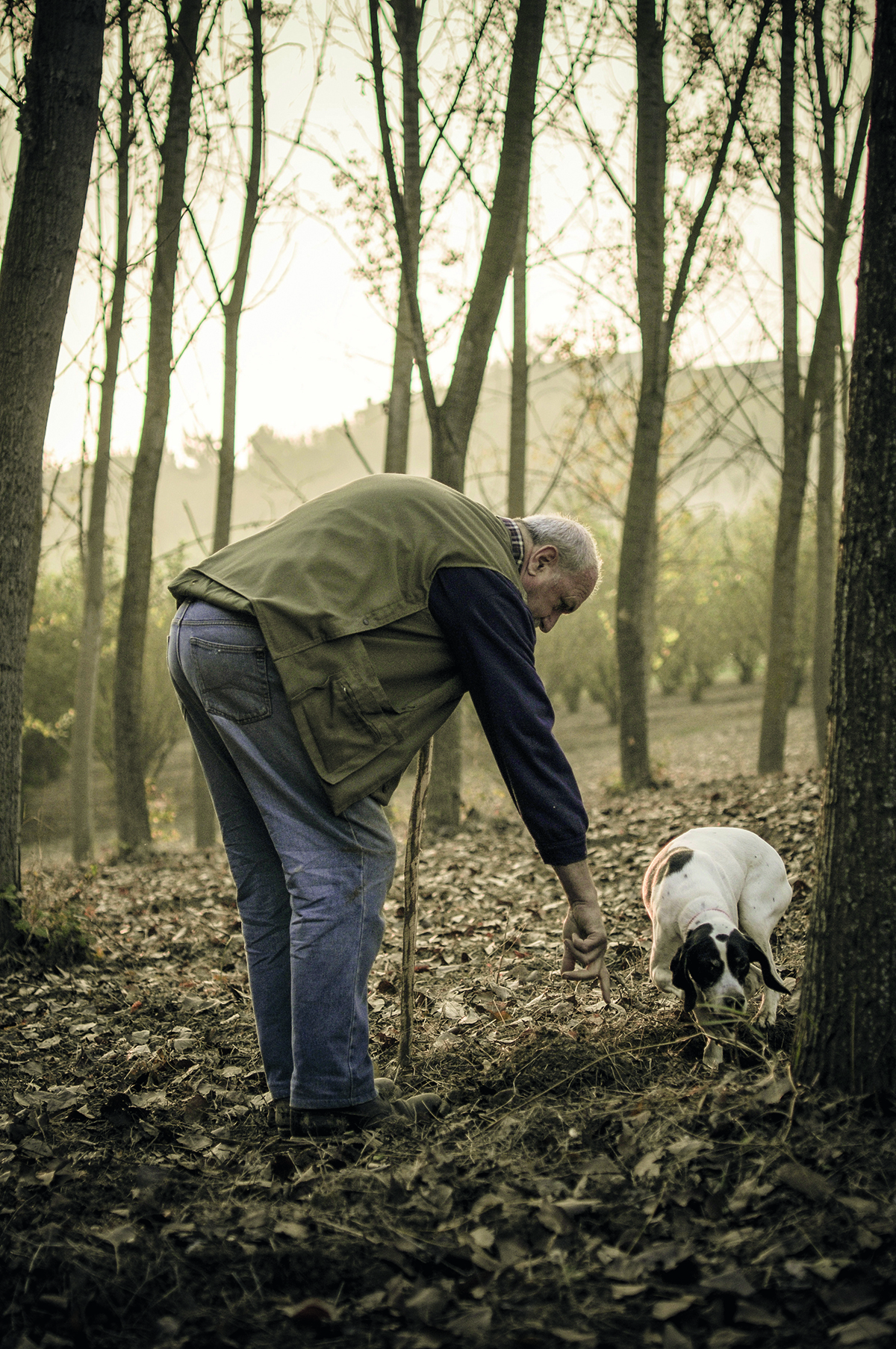
man truffle hunting

Truffle hunting has been in severe decline since the early 20th century, but is once again on the rise as a craft and is currently highlighted by the Respected by Gaggenau campaign

The art of the handmade, and the appreciation of high-quality, low-volume makers, are having a resurgence. With the help of the German luxury appliance maker and their Respected by Gaggenau campaign, the future of crafts and the artisanal, whether in food, winemaking or the crafting of objects, is looking brighter, as Lisa Jayne Harris explains

“The nobility and humility of great craft transcends industries and products,” says Master of Wine, Sarah Abbott. “Artisans offer a sense of adventure, excitement and nuance that’s simply not available elsewhere.” The mystique that comes with creating a product by hand – whether that’s a time-honoured way to age wine and make cheese, or a modern take on knife making – touches us in a unique and deep way that mass-produced goods cannot: “People respond to the beauty, sweat, toil and integrity of craft,” Abbott explains. “We’re in a time of a craft renaissance. Our respect for authenticity and integrity in what we make and consume is growing.”

Follow LUX on Instagram: luxthemagazine

The resurgence in craft’s popularity is at odds with our increasingly digitised everyday lives and fast-paced consumerism. But therein lies its draw, as handcrafted objects seem to reverberate with the energy of their maker when we hold them in our own hands, and they promise to last longer than impulse purchases, too. “We live in a throwaway world,” says author and food critic, Tom Parker Bowles. “So, it’s really refreshing when things are made to last. Technology has a built-in obsolescence to force us to buy a new phone or whatever, but we’re looking at a more sustainable future in all areas of our lives, including food sourcing.”
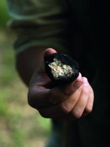
truffle in man's hand

Both Parker Bowles and Abbott are judges of the Respected by Gaggenau initiative, which honours, supports and promotes small producers and artisans in the food industry. “We want to give something back to people who deserve it and need it most,” explains Gaggenau’s managing director, Dr Peter Goetz. Regional experts will nominate artisans who use skilled, traditional techniques to create exceptional and authentic products in food, wine and design.

Such authentic artisanal products are distinguished by their fundamental values of patience, passion and heritage. Both maker and customer have to be patient: “People who appreciate the finer things are usually happy to wait,” says professional truffle hunter and owner of The English Truffle Company, James Feaver. His business plan manages customers’ expectations and controls truffle pre-sales so they don’t take on more orders than are achievable. “Every day of hunting depends on the vagaries of the weather. If people get in touch in advance, we do our best to deliver, but we only harvest what’s sustainable and available at that time. I’m more like a fisherman than an artisan baker. I don’t make truffles like a baker makes his bread; nature has done all the hard work and I just find them.”
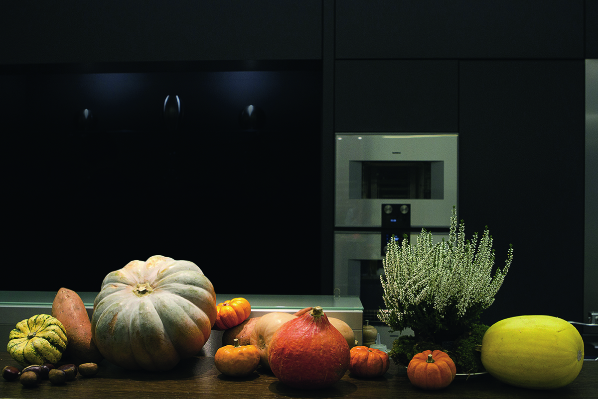
seasonal produce

Gaggenau appliances can be adapted to any seasonal food preparation.

It’s the passion of people like James who make artisanal products stand out. “True artisans really believe in something,” says Gaggenau’s head of design, Sven Baacke. “They have a vision, they’re digressive, authentic and have a strong character. I see that throughout Gaggenau, too, not just in the design team but in the engineers and every department. We’re all striving for the best.” Abbott believes the character of an artisan winemaker is so palpable that she can taste the ‘maker’s mark’: “There’s a certain idiosyncrasy, a distinctive personality and edginess in the wine over different vintages. Great wines from large producers tend to be more polished, assured and even, but artisanal wineries exist on a knife edge, and you can often taste that in their wines.”

Read more: How Chelsea Barracks is celebrating contemporary British craft

The future is uncertain for many small producers. James has led a British truffle hunting resurgence, but the skill very nearly died out when the last professional truffle hunter, Alfred Collins, hung up his boots in 1930. “At one time there were 10 truffle hunters working out of Alfred Collins’s village,” explains James. “Truffle hunting was a sport for the gentry, like shooting or horse riding, but when Collins retired the custom and his knowledge disappeared too. I’ve been truffle hunting since 2008, and it’s only in the past dozen years that knowledge has come back to this country with our renewed interest in sustainability, British produce and farmers markets.” Crafts like truffle hunting are essentially a shared cultural memory, unique to each community they come from, and only by supporting these skills can we ensure they’re not forgotten. As the Arts and Craft designer William Morris said, “The past is not dead, it is living in us, and will be alive in the future which we are now helping to make.”
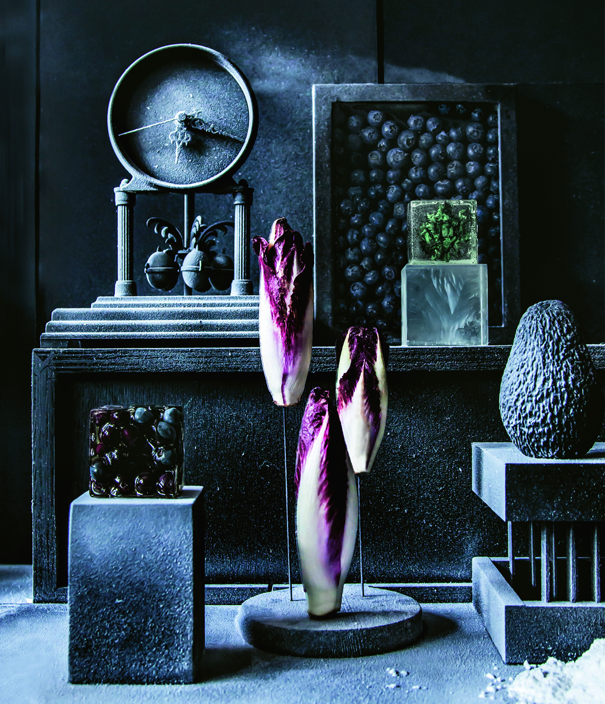
artistic photograph of kitchen

An image from the ‘Frozen in Time’ series by culinary artists Studio Appétit for Gaggenau

Climate change is perhaps the biggest threat to the future of artisan food businesses. “We’re already seeing lower rainfall and higher temperatures,” says James, “And that’s not good for truffles.” Sustainability and biodiversity are necessarily at the heart of artisanal work, because they’re more connected to their locality and environment. But this means climate change affects them even more acutely. “Artisanal wineries typically focus on a single small region or wine style,” Abbott points out. “They can’t spread their bets like larger producers, who mitigate risk across multiple regions and grape varieties.” If one variety fails, the small producer’s whole livelihood is at stake.
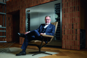
portrait man in chair

Managing director of Gaggenau, Dr Peter Goetz

Everything that makes craft special – the fact that it’s unique, handmade, small scale and highly skilled – is exactly what puts it under threat. The Heritage Crafts Association maintains a list of endangered and extinct handicrafts in the UK, including bell founding, scissor making, tinsmithing and cricket ball making, and they advocate for their preservation. But thankfully many craft producers have demonstrated their ongoing resilience through the Covid-19 pandemic by pivoting their business models or selling directly to customers. While that works on a local level, it still leaves them exposed in the longer term. “Many of these makers are third, fourth or fifth generation. Their domestic reputation is typically very strong, but it’s a challenge for them to reach diverse markets to weather our increasingly global economic storms,” Abbott says. “Small producers thrive through a more intuitive, organic relationship between maker and consumer but in a noisy, ever-expanding, luxury global market. Without resources for strategic marketing or PR, they struggle to be heard.”

Support programmes such as Respected by Gaggenau can go some way in giving artisans a voice and helping them keep doing what they do best. An appliance manufacturer championing small, independent producers might sound surprising, but the Respected by Gaggenau initiative reveals how much they have in common. “Of course, we are an industrial manufacturer,” says Baacke, “and some of our high-tech processes are best done by machines. But if the kitchen is the heart of the home then appliances are the soul. There is always a human touch to our work, like the hand-polished finish or detailed quality control. It’s the perfect balance between craft and industrialisation.”

The 2020 Respected by Gaggenau prize will bring global attention to three regional producers in food, viniculture and design. “Nominees are likely to be unsung heroes,” says Goetz. “Such as a farmer who produces a small amount of exceptional beef for just a handful of top chefs each year. We want to give that farmer recognition and promote their story to our discerning network.”

Ultimately, it’s up to us all to maintain the heritage of craftsmanship: “I’m an optimist,” says Tom Parker Bowles, “But we have to keep supporting artisan producers and value where our food comes from to secure a better future.”

Find out more: gaggenau.com

This article features in the Autumn 2020 Issue, hitting newsstands in October.

Share:
Reading time: 6 min
afternoon tea
afternoon tea

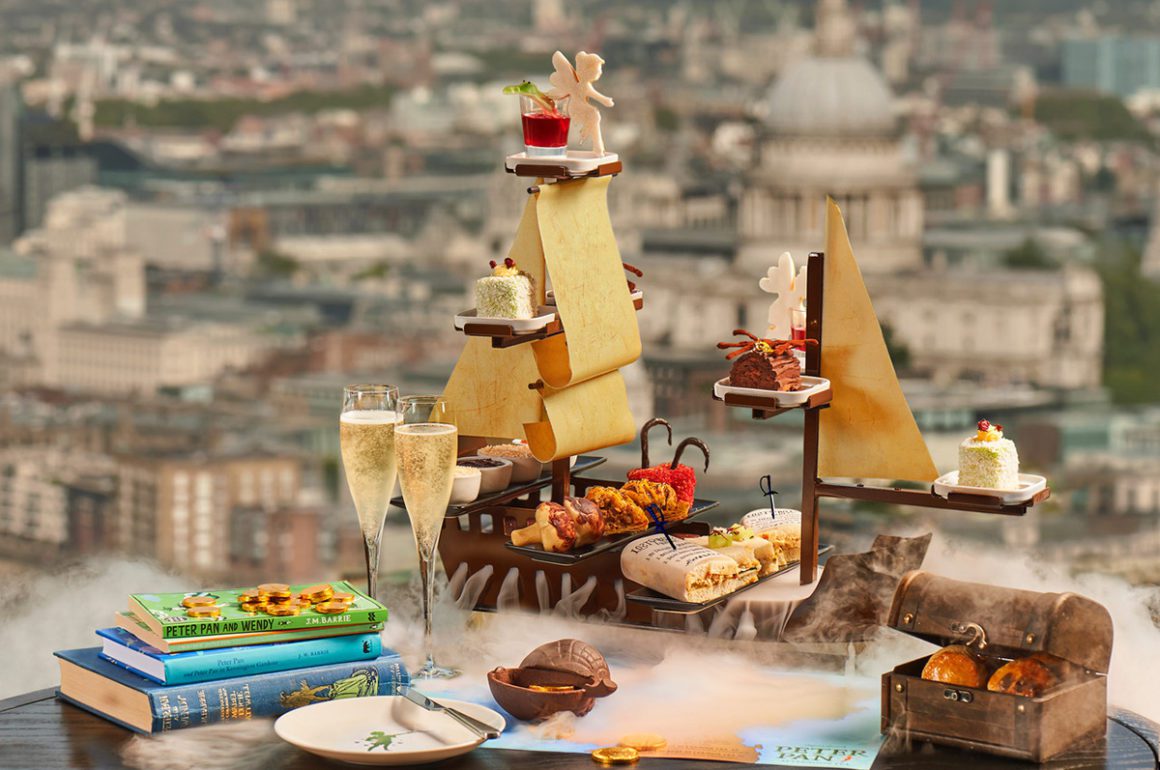
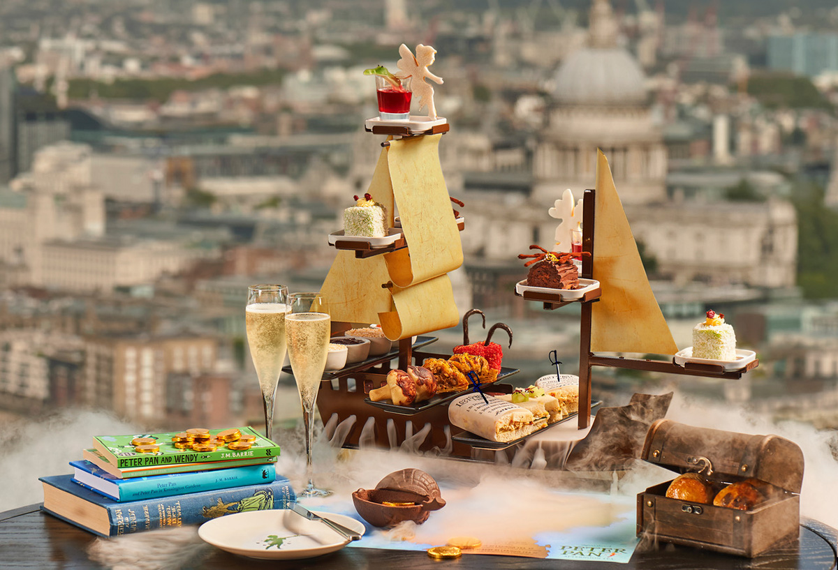
Aqua Shard donates a percentage of the retail price of every Peter Pan Afternoon Tea to Great Ormand Street Hospital

Earlier this month, Aqua Shard in partnership with the Great Ormond Street Hospital Children’s charity GOSH launched a Peter Pan themed Afternoon Tea, inspired by J.M Barrie’s infamous tale. Abigail Hodges experiences the creative menu

Whilst admiring the stunning views over the Thames from the panoramic windows of Aqua Shard, a boat appeared on our table in plumes of billowing smoke. This wondrous craft cradled a creative exhibition of savoury and sweet treats: finger sandwiches wrapped in paper denoting the ‘Lost Boy Rules’, an ‘Enormous Mushroom Chimney’, The ‘Codfish’ Captain Hook cod brandade croquette (named after Peter Pan’s nickname for his nemesis), a Tinker Bell shaped cookie sprinkled with gold fairy dust, a deliciously rich chocolate swirl (representing Peter Pan’s Secret Hollow Tree Entrance) and a chewy Tick-Tock the Crocodile dessert of raspberry and rooibos jelly. We sipped Veuve Clicquot champagne alongside vanilla and rose ‘Darling Tea’, and finished the occasion with warm scones, which came hidden within a special treasure chest, accompanied by sweet apricot marmalade (or ‘mammee-apples’) and a rich coconut clotted cream. A delightful afternoon indeed.

For more information visit: aquashard.co.uk

Share:
Reading time: 1 min
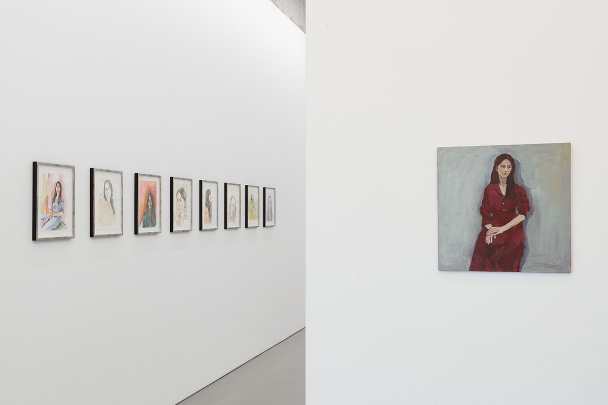
art exhibition installation

Gillian Wearing Lockdown exhibition view: Maureen Paley, London, 2020 © Gillian Wearing, courtesy Maureen Paley, London / Hove

Lockdown: a word that’s more familiar to most of us now than it was this time last year, and one that’s laden with personal and collective meaning. Taking the word as both title and subject, Gillian Wearing’s latest show at Maureen Paley, London is at once a deeply personal revelation of the artist’s creative response, and a wider, more complex meditation on self and the time in which we now live.

Follow LUX on Instagram: luxthemagazine

The artworks – a series of new self-portraits, a wax sculpture (Mask, Masked), and a video work (Your Views, 2013 – present) – are displayed in two rooms between which visitors’ movements are choreographed by notices on the walls prescribing physical distancing.

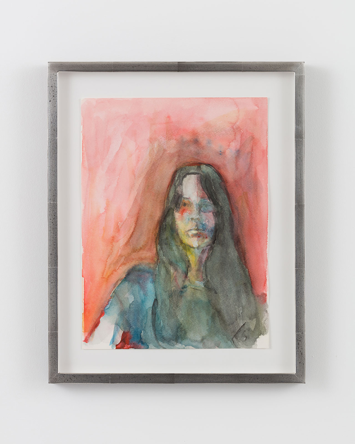
watercolour portrait

Lockdown Portrait 3, 2020 by Gillian Wearing, framed watercolour on paper, 39.5 x 31.5 x 2.6 cm © Gillian Wearing, courtesy Maureen Paley, London / Hove

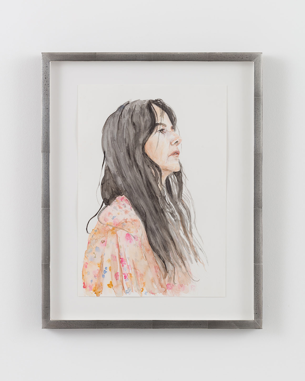
self portrait

Lockdown Portrait 5, 2020 by Gillian Wearing, framed watercolour on paper, 39.5 x 31.5 x 2.6 cm © Gillian Wearing, courtesy Maureen Paley, London / Hove

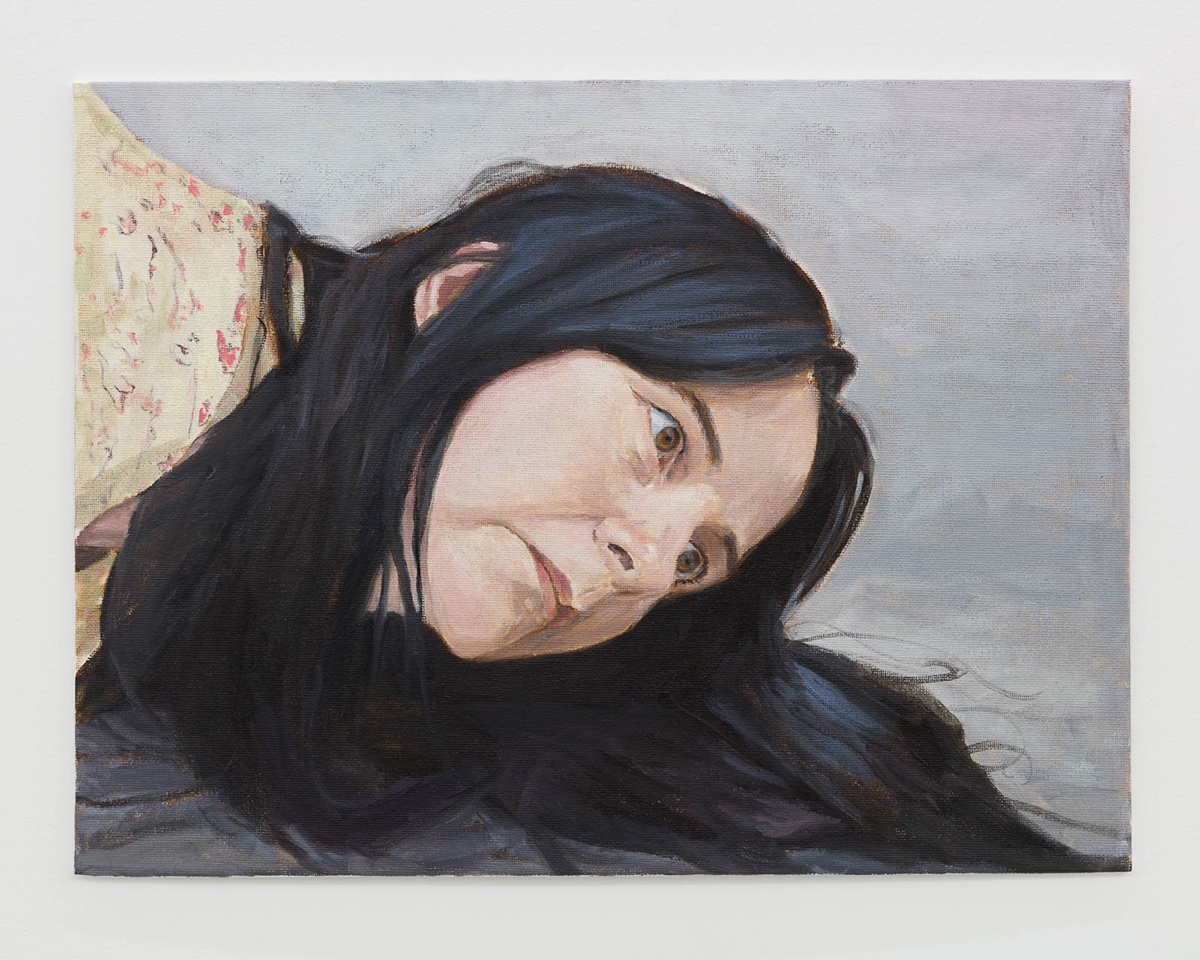
Wearing’s self-portraits, made in watercolour, are a product of the prolonged, enforced isolation brought on by the Covid-19 pandemic. A departure from the photography and videography she is famous for, these small-scale paintings bespeak the self-reflection, both literally and figuratively, which Wearing’s lockdown precipitated. ‘Having represented myself in photography both as myself and as others,’ Wearing writes, ‘I wanted to see how paint and even the manner of painting could change my appearance.’

self portrait painting

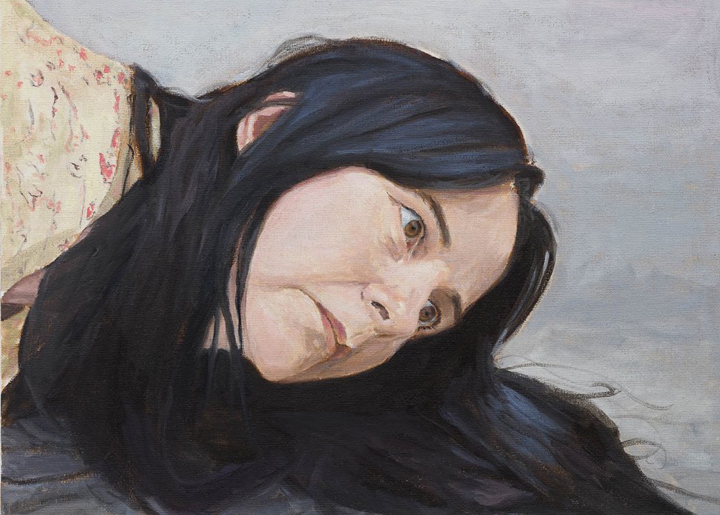
Untitled (lockdown portrait), 2020 by Gillian Wearing, oil on board 30.5 x 40.5 cm © Gillian Wearing, courtesy Maureen Paley, London / Hove

It might be a new medium but the paintings bear all the marks of the artist’s best-known work: the tensions between public and private, between our inner and outer selves. Think ‘Signs that say what you want them to say and not Signs that say what someone else wants you to say’ (1992-93): the police officer whose card reads ‘HELP’. Here, it is Wearing’s own quizzical eyes staring over the viewer’s shoulder, lost in thought, her hair tied up or loose, torso loosely sketched. How do we construct our identities, these pictures ask, how do we perform them?

Read more: British artist Hugo Wilson on creating art from chaos

mask sculpture

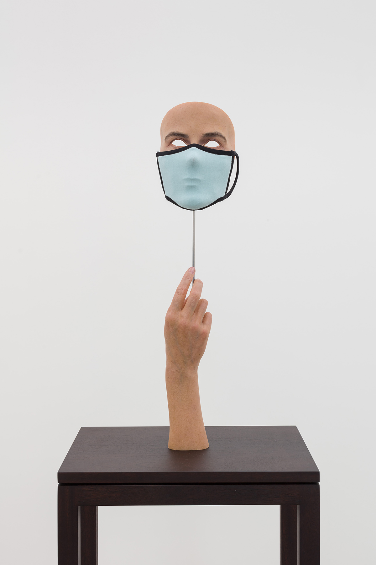
Mask Masked, 2020 by Gillian Wearing, fabric mask, wax sculpture, steel rod and wooden plinth, 56 x 14 x 10 cm © Gillian Wearing, courtesy Maureen Paley, London / Hove

Mask, Masked underlines this question in fleshy three-dimensions. A severed hand reaches skyward, holding a life-like mask of Wearing’s face, eyes removed to reveal the wall behind. Over the mouth and nose is a second mask, reminiscent of the now ubiquitous face coverings worn in public spaces. An impossible masquerade ball attendee, the uncanny sculpture makes manifest the layers of concealment, of fiction, at play in person-to-person interactions, another layer added by the culture of the pandemic.

In a second room, Your Views, Wearing’s open-submission video work, brings together short clips of contributors’ ‘views’ from homes throughout the world, revealed when curtains or blinds are drawn back. Using footage taken during lockdown, including the ‘clap for carers’ celebrations, Your Views is a collage of lived experience. Rather than examine a face, this time the viewer tries on others’ masks, looks out onto the unfolding world. You might not see yourself in Wearing’s lockdown, her artistic response to its solitude, but the artist demonstrates your response has been creative too: your views are here, you are not alone.

‘Lockdown’ by Gillian Wearing runs until 25 October 2020. The exhibition is open by appointment. For more information visit: maureenpaley.com

Tom Cornelius

Share:
Reading time: 3 min
designer at work
townhouses

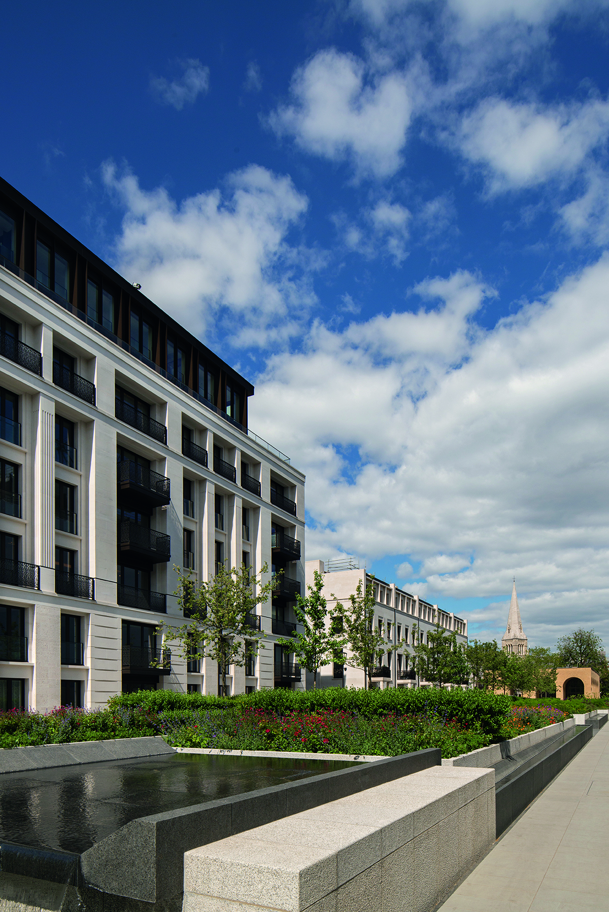
Mulberry Square townhouses at Chelsea Barracks

The exclusive Chelsea Barracks residential development in London aims to be the epitome of contemporary luxury living. It also draws on a wealth of traditional artisanal craft heritage, from specially designed and made oak furniture to bespoke light fittings, to forge a new historically significant landmark, as Mark C. O’Flaherty discovers

Some of the heftiest books lining the shelves of the world’s libraries are devoted to the history of London. The tale of Chelsea Barracks warrants a whole chapter of its own. It is an epic story, with handsome accents. Built as a home to Victorian infantry battalions, the original architecture stood for nearly 100 years. Since the 1960s, various plans for the site have been discussed but not materialised, but today Chelsea Barracks is a landmark again – a residential development that combines contemporary British craft with heritage inspiration. From the public artwork in the grounds to the finishings, light fittings and balustrades of the townhouses, Qatari Diar have brought together a nation of artisans.

Follow LUX on Instagram: luxthemagazine

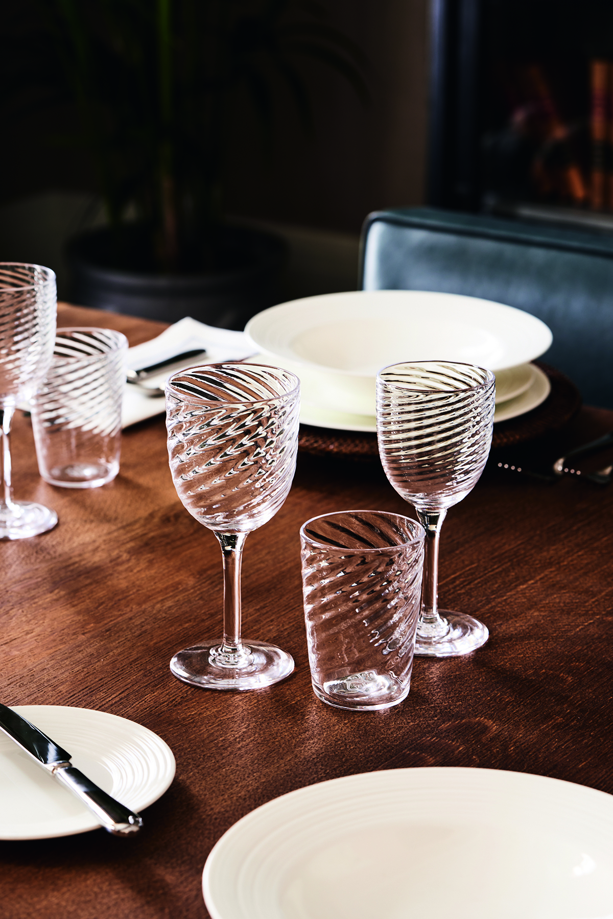
The ongoing story of British craft is told from numerous perspectives, and has culminated in more than just a landmark – there is also The Chelsea Barracks Collection. Under the direction of Albion Nord, the studio responsible for the overall look of the townhouse show-home interiors, an 11-piece capsule of designs has been commissioned from many of the artisans involved. Each object is handmade and represents the highest level of British craftsmanship, creating a dialogue with the Georgian squares of Belgravia. Wine glasses and tumblers echo the glassware produced in the 18th century, while the Belgravia Lamp references the Doric, Ionic and Corinthian columns of local buildings. “It is inspired by the orders of classical architecture,” explains Ottalie Stride, creative director at Albion Nord. “It has strong London connotations.”

designer at work

table

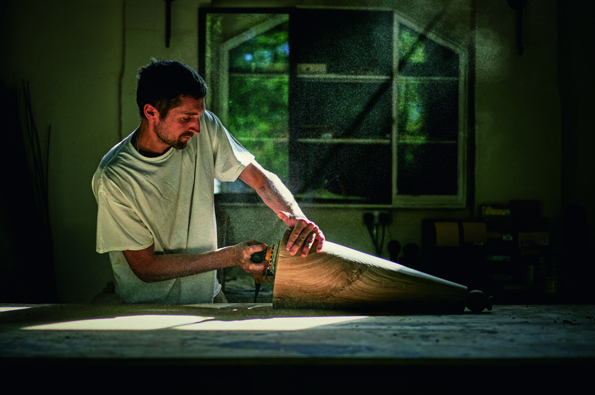
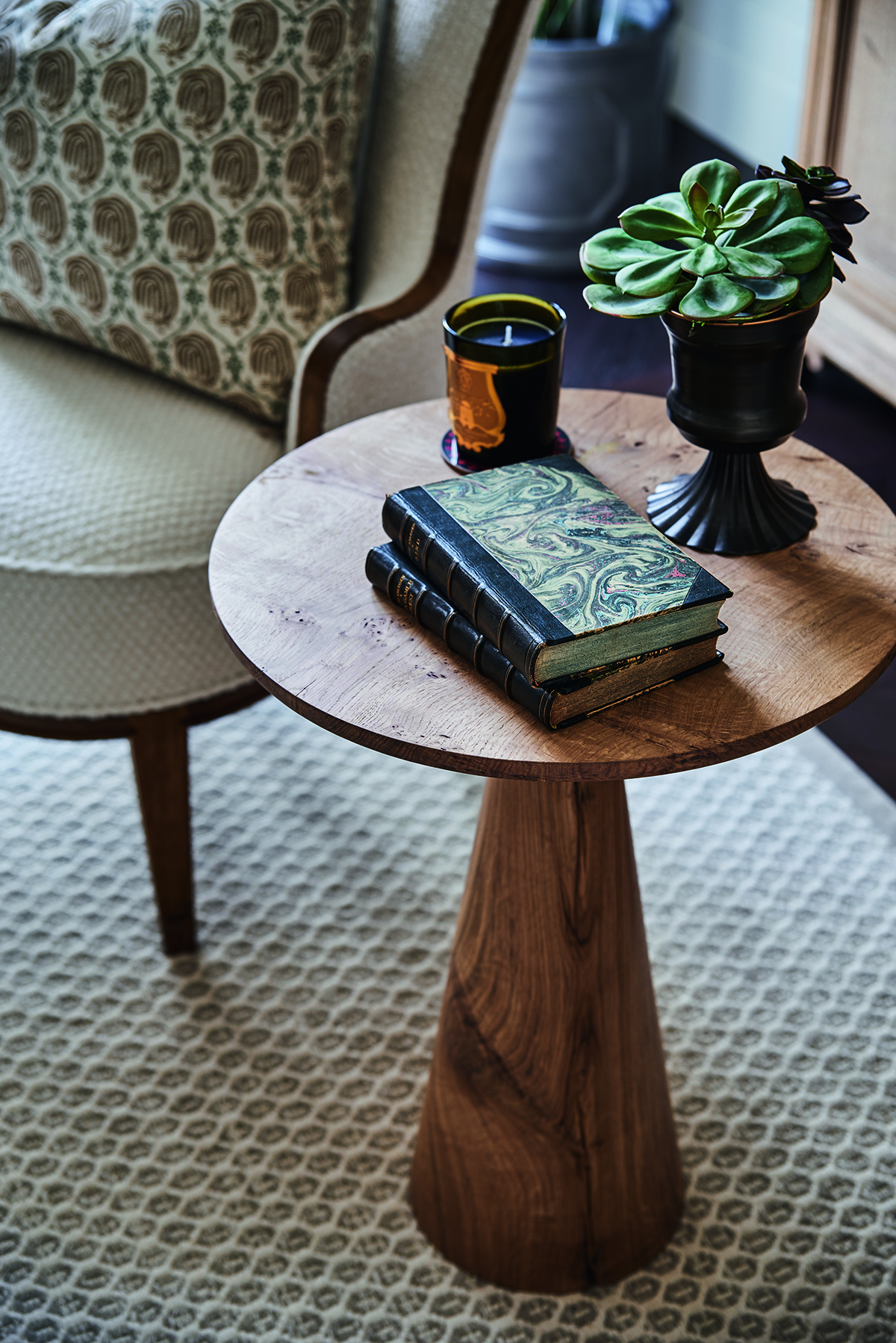
The Chelsea Barracks Collection, designed by Albion Nord, includes the Elizabeth Side Table made by Rory Stride (above) of Stride & Co

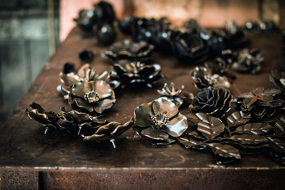
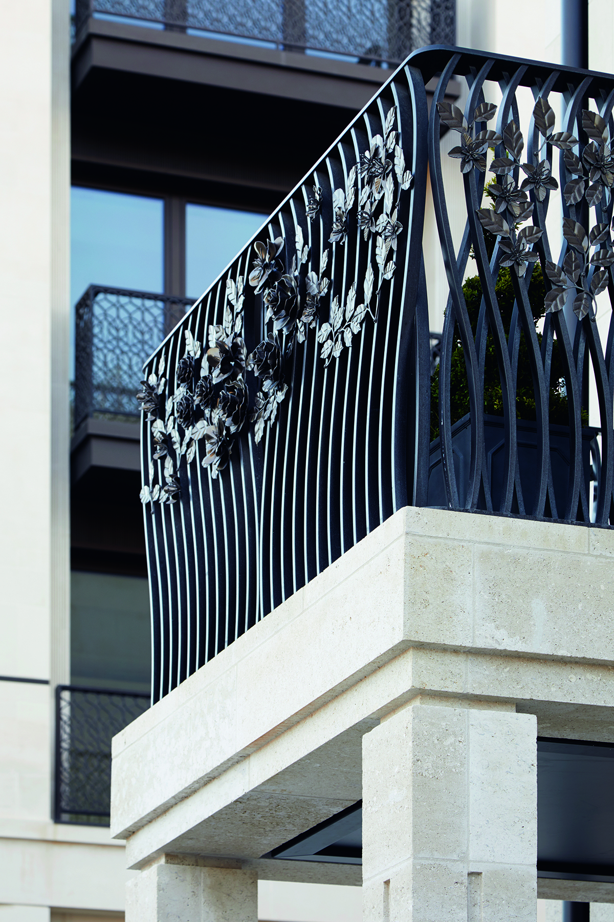
You can see the broader strokes of the style in London-based designer Tord Boontje’s floral elements on the townhouse balconies – the wild roses, peonies and apple blossom of the British countryside, so often showcased at the nearby Chelsea Flower Show – all forged in metal by West Country Blacksmiths, based in a 17th-century workshop in Somerset. From the physicality of their creation, to the greenery of Belgravia, they connect numerous threads within the narrative of Chelsea Barracks. These aren’t things you can take home – they are home.

Boontje’s work to date has been almost exclusively for interiors, so to have his petals adorning a façade is significant. They also form a link with the landscaping outside. From one of Boontje’s balconies you have a radiant view over the perfect floral grids planted by award-winning landscape gardener Jo Thompson and landscape architect Neil Porter. This is one of the most arresting and modern green spaces in the city today.

Read more: How Andermatt Swiss Alps is drawing a new generation of visitors

The best kind of design is often site-specific, taking visual cues from and creating a dialogue with its setting. All of the artisans involved in the development studied the site, its environment and and history. Using designs by Albion Nord, the artisans at Marina Mill created for The Chelsea Barracks Collection silkscreened upholstery in a diamond pattern that references tiling inside the restored Garrison Chapel on the grounds. Other designs by Albion Nord took inspiration from the floor plan of the Royal Hospital Chelsea. As much as upholstery, Marina Mill have been weaving history, too.

Chelsea Barracks is a style and brand as well as a prestigious residential address. The Chelsea Barracks Collection incorporates many elements that link the development to history. A metal and leather pendant lantern is inspired by the flashlights used by soldiers in the first world war, while the Barracks Bench has been created in homage to the Egypt-mania that captured London society in the 18th and 19th centuries. A collection of ceramics, titled Radnor, play on the history of porcelain in the area. Silversmith Nicholas Sprimont was the founder of the Chelsea Porcelain Factory, which from the mid 1740s became the tableware maker for the royal family. “They were the first important porcelain pottery manufacturer in England, so it’s great to bring this material to life,” says Stride.

glassware

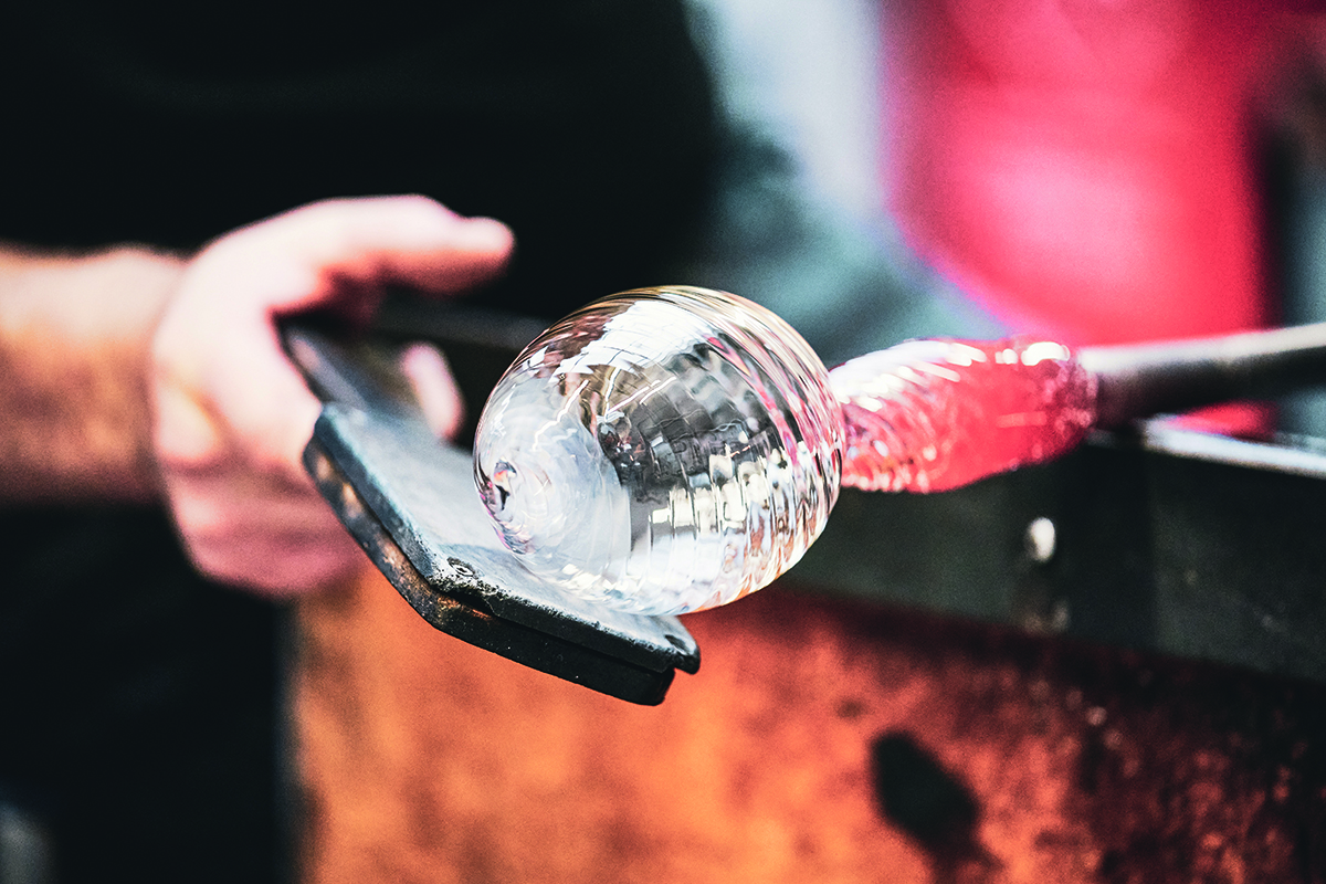
glass making

The Collection also includes Westminster glassware made by Stewart Hearn

Some of the furniture created with the homes, and The Chelsea Barracks Collection, in mind – including a bench, bedside table, side table and writing desk – come from the Stride & Co workshops in West 38are beautifully crafted objects from carpenters accustomed to making only 15 to 20 pieces in a year. Each desk is made from a single piece of oak for consistency of grain. Detail is everything, and so is the story behind each piece – the side table is inspired by the British fondness for tea-drinking, which took hold in the mid 18th century. Other pieces are battalion inspired. “The Wellington Desk made by Stride & Co is inspired by a traditional campaign desk,” explains Stride. “It would have been used by officers and their staff during a military campaign. Our design here aims to retain the portability and simplicity of the original, whilst including special details such as the lion-claw feet and the Chelsea Barracks rose mark, featured on the key to both the desk and the bedside tables.”

metal flowers

metal railings with flowers

Tord Boontje’s specially commissioned metal floral decorations on the townhouse balconies

Like Boontje, bespoke light designer Sharon Marston looked to the history of the Chelsea Flower Show before starting work. Marston’s background flags up her instinctive approach to light and materials. Her career began in jewellery and costume design, working with Bella Freud, Paul Smith and the English National Opera. She creates objects that are luminescent, ethereal and elegant. The British flora is a constant inspiration. The two Willow chandeliers she created for Chelsea Barracks evoke the weeping willow tree found in the English countryside as well as landscapes by Turner and Constable. She was also keen to emphasise the inherent Britishness of the formal properties of her pieces. “Craftmanship is at the heart of my approach,” she explains. “The artisans I work with are small cottage industries dotted around the UK, ranging from glassblowers and ceramicists to metalwork engineers. My close relationship with each is what brings the intricate detail of my work to life. There are approximately 2,000 pieces of hand-crafted decorative components made from woven bronze mesh spread across both chandeliers, taking many weeks to create.”

townhouse gardens

Mulberry Square gardens, planted with fruits, herbs and flowers

Many of the works carried out for Chelsea Barracks pushed the boundaries for their creators. Reedway is an engineering company involved in the nuclear, space and marine industries. The ornate balustrades they created for the residences were inspired by the work of Arts and Crafts visionary William Morris and made using high-pressure water cutting on metal, usually employed in aviation, so making something very much 21st century. Reedway also worked on artist Conrad Shawcross’s tree-like sculpture at the development, Bicameral, constructed from anodised aluminium and installed permanently in the grounds.

What the designers and artisans behind the new Chelsea Barracks have done is take the romance of a classical Georgian home and refract it through the lens of today’s style but grounded it with Victorian muscle. The method in which that style has been crafted tells a story that has depth and longevity, one that will develop for generations to come.

Restoring the past

iron railing

The Grade II listed Victorian iron railings during their restoration

The Victorian railings at Chelsea Barracks were given a pass when the government was requisitioning cast iron for the war effort in the 1940s. Grade II listed for more than ten years, the railings have now been restored to their original grandeur as part of the new development. The development team at Qatari Diar worked with the foundry Paterson Engineering in Scotland on what became a complex task. The original railings were moulded 150 years ago, and despite their apparent uniformity, there was no standard fitting. Each component had to be logged before removal for restoration. Back in their original place, they look magnificent. History has been refreshed and a link has been forged between the new architecture and the Victorian era that made these five hectares world famous. “They mark the border of Chelsea Barracks and pay homage to the history of the site,” explains Richard Oakes, Chief Sales and Marketing Officer Europe and Americas at Qatari Diar. “Together with the Garrison Chapel, the railings are now all that remain of the original 19th-century barracks, and their preservation and restoration has been a journey all of its own and one that we’re extremely proud of.”

Find out more: chelseabarracks.com

This article features in the Autumn 2020 Issue, hitting newsstands in October.

Share:
Reading time: 7 min
park in summer
Our party page could have been blank this issue, but the human spirit always finds a way to emerge. Meghan MacKillop photographs London’s international soul, finding it alive, well and defiantly sipping aperitifs in Hyde Park, Kensington Gardens and Notting Hill

Top row, from left: Oana Piriiac (left) and Tadas Radvilavicius; Lara WT (left) and Isobel Kelly; Julia Raspberg (left) and Amelia Persson. Middle row, from left: Brendon X (left) and Tony Soprana; Chloë Casel (left) and Alice Pickard; Cindy van Niekerk (left) and Johanna Kriisa. Bottom row, from left: Niki Asal; Debbie Smith; Louis Henbrey (left) and Chris Nam; Sly Augustin

This article features in the Autumn 2020 Issue, hitting newsstands in October.
Share:
Reading time: 1 min
crystal star installation
crystal fashion

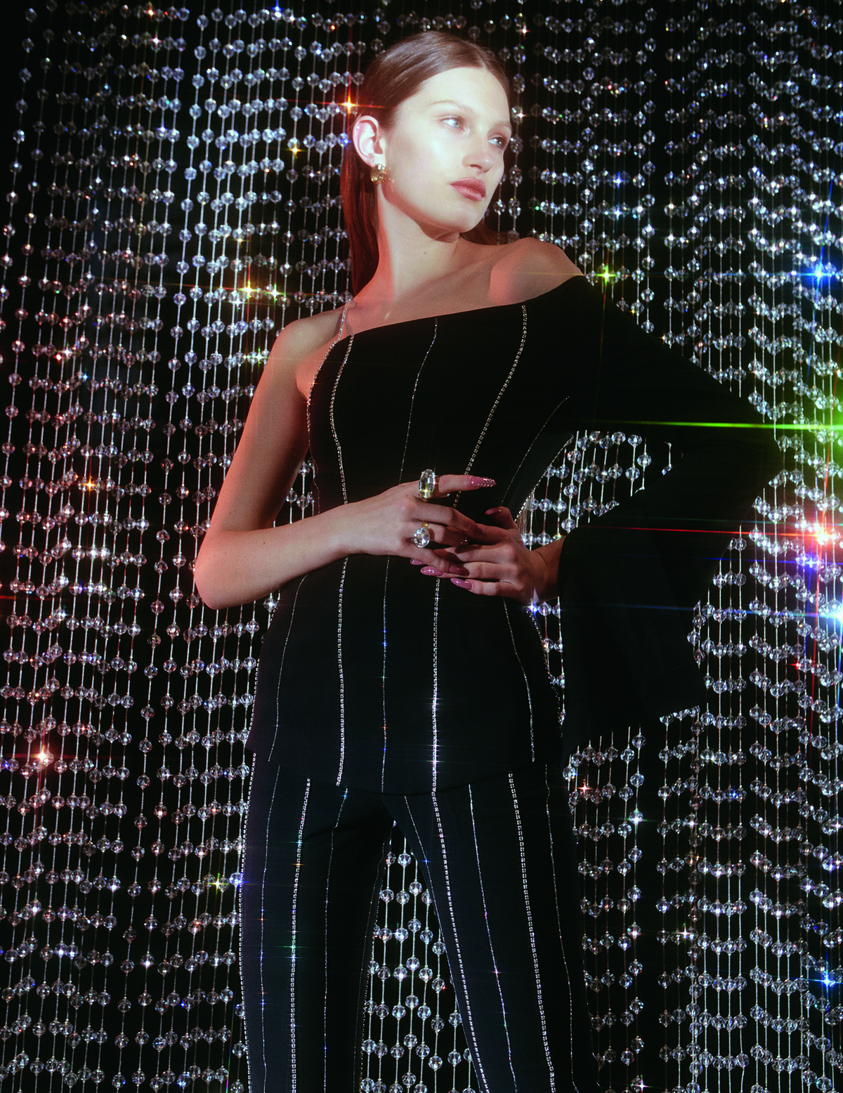
A look from Area’s AW16 collection, incorporating an official collaboration with Swarovski. © Swarovski Corporate Archive

Austrian crystal-maker Swarovski celebrates its 125th anniversary this year with a new creative director in charge. Operating in sectors from infrastructure to telescopes, it is most famous for its crystal figures and collaborations with the entertainment and fashion industries. Ahead of a landmark book being published about the company, Harriet Quick explores a family-owned firm getting ready for the next 125 years

For a brand bringing sparkle to the world’s performance stage and symbolising the dazzle of fashion to be celebrating its 125th anniversary is some achievement in itself, given the changes in the world of entertainment and style since 1895. To be doing so as a family-owned company, run in part by descendants of the original founder, is even more so. But for Swarovski, provider of crystals and sparkle around the world, there is yet another dazzling fact: the company has done so not based on the rue Faubourg Saint-Honoré or Milan’s Golden Triangle, but from a small village in the Austrian Alps.

Follow LUX on Instagram: luxthemagazine

The journey has been epic. Today, the company is managed by the fifth generation of its family members. This year, marking its 125th anniversary, has witnessed big changes. On the visual front, Italian-born fashion director and consultant, Giovanna Battaglia Engelbert has joined the company as worldwide creative director. The stores, a feature of cities and airports around the world, are scheduled for a sweeping revamp.

crystal dome

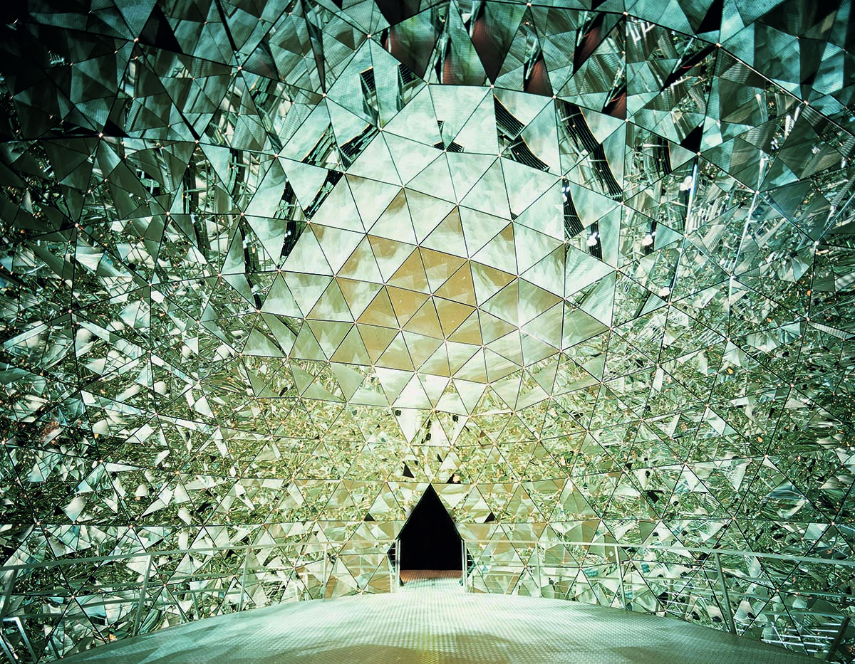
The Crystal Dome at Swarovski Crystal Worlds in Wattens, Austria. © Swarovski Corporate Archive

The brand’s history is as varied as the topography of the Austrian Tyrol where Daniel Swarovski set up his manufacturing plant in the town of Wattens to benefit from the abundant water source that powered the hydroelectric cutting machines. The mountains and valleys of the region are symbolic of the struggles and triumphs of a business that has been driven by the continuous merging of technology, nature and innovative design. There is a generous sprinkling of magic, too. It is embedded in the multifaceted crystals that never fail to arouse awe and around which there has been ample myth-making.

archival family portrait

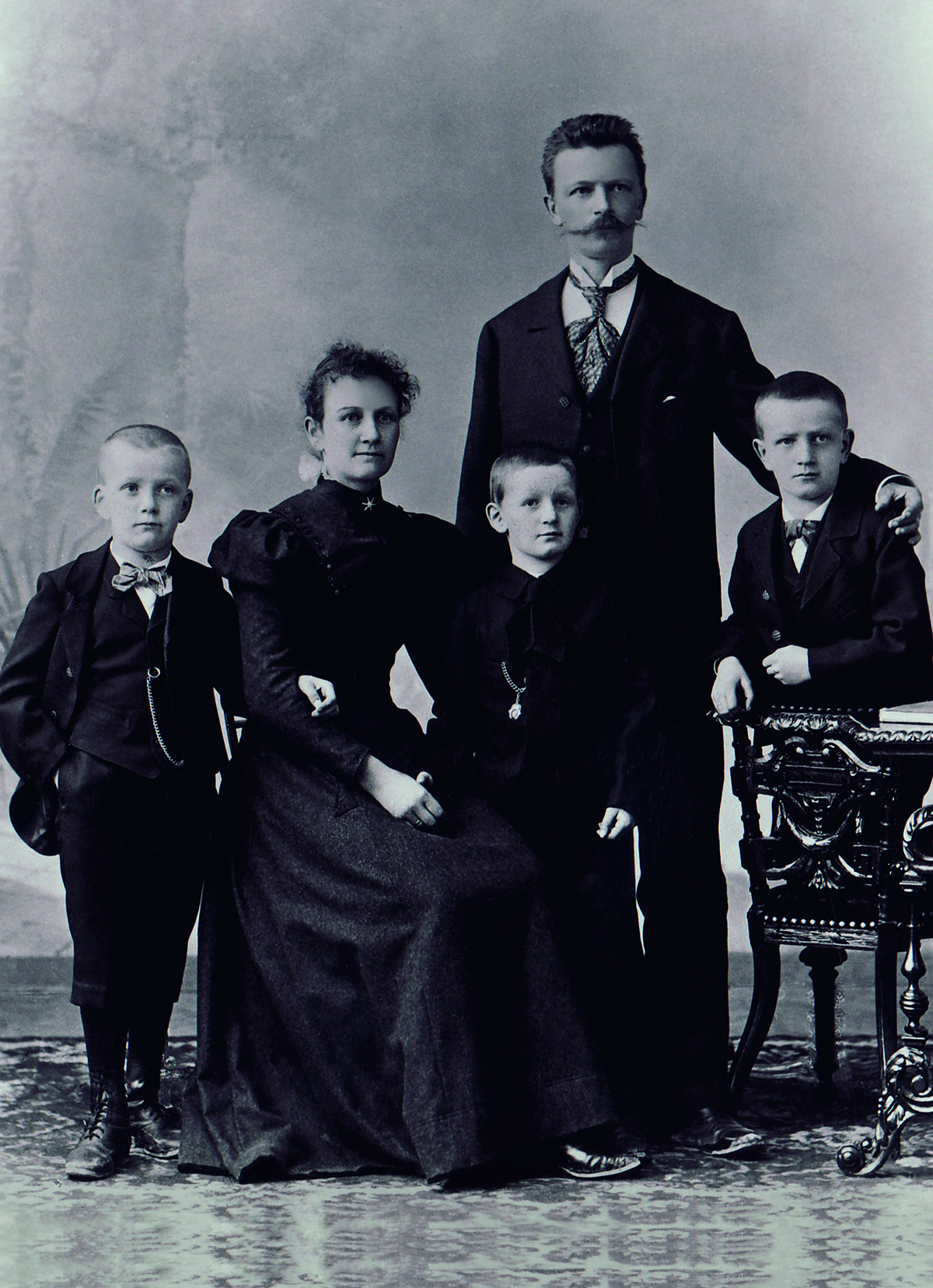
Daniel Swarovski with his family, c. 1890. © Swarovski Corporate Archive

Before the global pandemic, Swarovski’s annual turnover was recorded at 2.7 billion euros and that comprises revenues from its high-end fine jewellery creations, the crystal stones deployed by a whole array of creative minds, including costume designers, chandelier makers and architects, and optics. The lion’s share (75 per cent of the revenue) is generated by fashion jewellery, sunglasses, watches, perfume and the much-adored crystal figurines. The quality of the crystals that are prototyped at Manufaktur, the striking in-house laboratory in Wattens designed by architectural firm Snøhetta, is unparalleled.

Read more: How Andermatt Swiss Alps is drawing a new generation of visitors

The company’s extraordinary creative output has also been bolstered by a roster of collaborators from the fields or architecture, design, fashion, film and stage who have continually brought ideas and seemingly impossible challenges to the company, from the mesmerising Aurora Borealis crystal that was developed by Manfred Swarovski for Christian Dior to the spectacular costumes made for performers including Maria Callas’s gowns, Liberace’s capes and Lady Gaga’s bespangled Ralph Lauren gown featuring 50,000 stones and worn at her Las Vegas residency in 2019. People come to Swarovski for the spectacular and the sublime, like scenic designer Derek McLane, who used 45 million Swarovski crystals for the 2018 Oscars ceremony, and who commented, “I always want to go beyond the clichés”.

crystal jewellery

Swarovski crystals in jewellery featuring in 16 Arlington’s AW20 collection. © Dan and Corina Lecca.

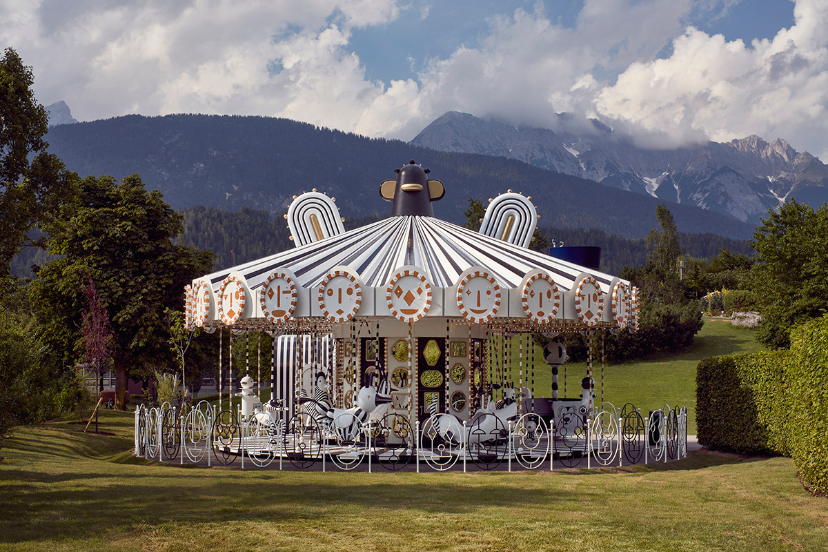
From the fields of design, Daniel Libeskind, Tord Boontje, Jaime Hayon and John Pawson are amongst the greats who have transformed crystal into products, architectural features and lighting. Hayon recently designed a full-scale carousel for the Swarovski Crystal Worlds culture park in Wattens. The monochrome attraction rotates in striking juxtaposition with the lush greenery of the garden and shimmers with 15 million Swarovski crystals across 12 ceiling panels and 16 wall panels illuminated by a warm light. “For me, a carousel can be seen as a moving museum,” explains Hayon.

lake art installation

old fashion carousel

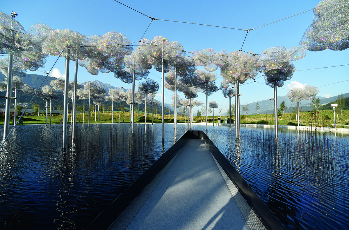
Swarovski Crystal Worlds, with (top) Crystal Cloud by Andy Cao and Xavier Perrot, and (here) the carousel designed by Jaime Hayon © Swarovski Kristallwelten/Mark Cocksedge

Setting a precedent that would inspire future generations, Daniel Swarovski first made his inroads into the worlds of high fashion in Paris. Equipped with suitcases of stones, the founder would take his goods on the road, visiting couturiers including Charles Frederick Worth, Jeanne Lanvin and Jeanne Paquin, as well as the specialist artisan ateliers that supplied Chanel and Schiaparelli with exceptional embroideries, buttons and jewelled adornments. Relationships were forged that outlived the founder and expanded exponentially during the hey-day of couture in the 1950s, attracting Dior, Balmain and Givenchy. “The samples are often the springboard to the creation itself,” remarked Hubert de Givenchy.

Read more: British artist Hugo Wilson on creating art from chaos

crystal star installation

The Swarovski Star by Daniel Libeskind in 2018 for the Rockefeller Center Christmas tree, New York. Image by HappyMonday

Swarovski crystal became a desired material in fashion, adding glamour and value to evening gowns, heels, handbags and costume jewels. It has been endlessly interpreted through the changing waves of minimalism, maximalism, sportswear, theatrical and romantic moods and proved itself a classic. At Versace, Donatella has made crystal chain mail a signature, Miuccia Prada has made sparkle an integral part of her chandelier earrings and party dresses, while at Chanel, crystal is woven into the tweeds and classic costume jewellery.

fashion shoot

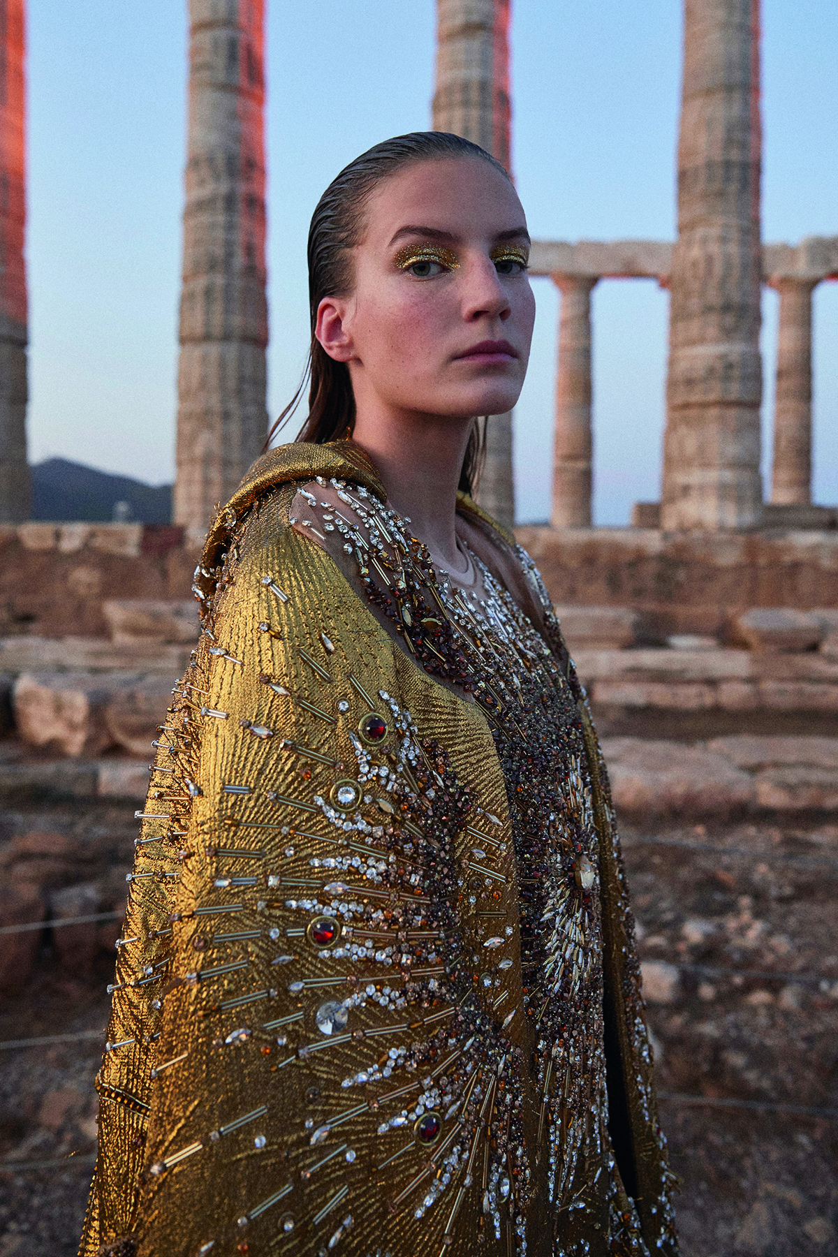
Mary Katrantzou’s SS20 show at the Temple of Poseidon in Greece.

The brand continues to look to the future by investing in new talent and ideas. Sponsorship through the Swarovski Collective programme and graduate award schemes means that emerging creatives are exposed to the potential of the material. Mary Katrantzou, Grace Wales Bonner, Rodarte and Jason Wu are amongst the many who have grown up through the collective. The most famous collaborator is Alexander McQueen, who conjured up brilliant designs fused with narrative richness and theatrical impact. Fittingly, Swarovski was the key sponsor of the record-breaking exhibition ‘Savage Beauty’ (2011) that celebrated his life’s work.

singer on stage

Lady Gaga during her ‘Jazz & Piano’ residency in Las Vegas, 2019. Kevin Mazur/Getty Images for Park MGM Las Vegas.

crystal stage design

Derek McLane’s design for the Academy Awards stage in 2018, using millions of Swarovski crystals. Mark Ralston/AFP/Getty Images

The relationships are best when they are symbiotic. In 2019, Katrantzou designed her Temple of Poseidon couture collection that was staged as a charitable fundraising event in her native Athens with £40k worth of crystal. “Nadja Swarovski has changed the perception of how crystal is perceived, and I have challenged my own preconceptions of it. With something so visually present, it has to be part of the process from the beginning. We never want it to look like an afterthought,” says Katrantzou.

In turn, creative directors have been invited to Swarovski and been given carte blanche to design jewellery collections and components. The results have given crystal new dimensions. Consider Jean-Paul Gaultier’s Kaputt shiny/matte faceted stones, and the one million giant pearls and stones that embellished Olivier Rousteing’s first couture collection for Balmain in 2019. Challenging perceptions, groundbreaking Dutch couturier Iris van Herpen designed a ‘growing crystal’ that features raw and faceted surfaces.

‘Growing’ Swarovski into a new era is the mission for the family now. An era that is challenging for any consumer-facing business: but any company that has lived through two World Wars and a Great Depression has long-term survival in its genes. Sparkle is guaranteed, but who can say what poignant shapes it might find in the future?

For more information visit: swarovski.com

This article features in the Autumn 2020 Issue, hitting newsstands in October.
Share:
Reading time: 6 min
contemporary apartment

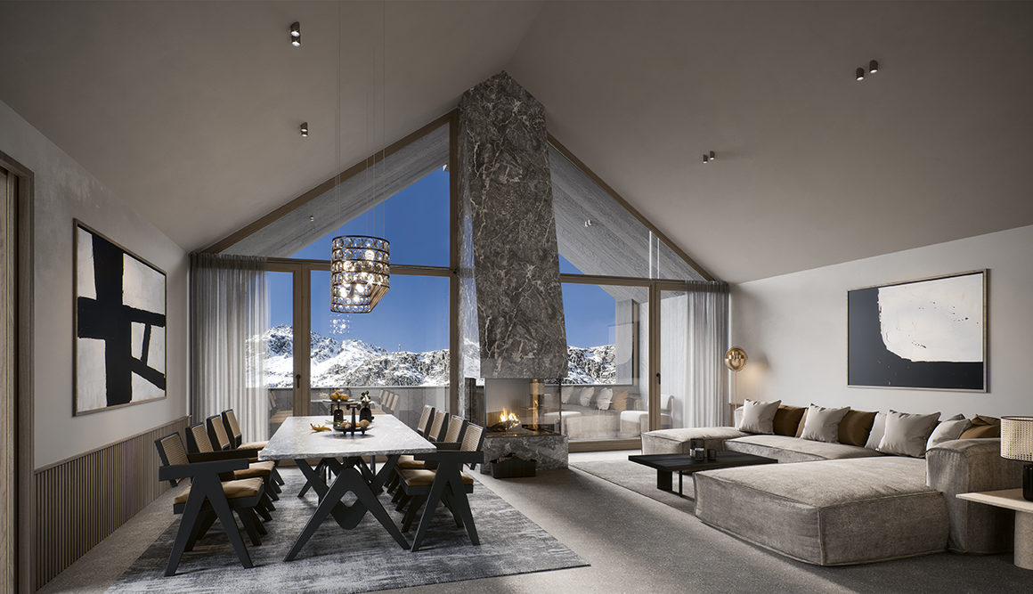
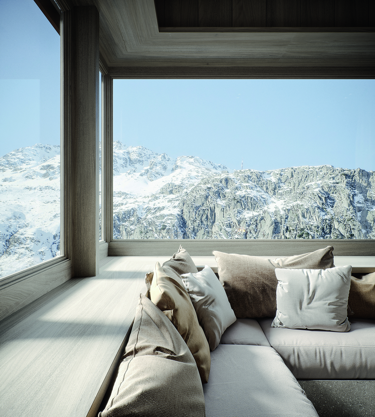
The penthouse apartment at Alma, one of two apartment houses to become available in Andermatt

The transformation of the village of Andermatt in the Swiss Alps into a place for permanent residence or seasonal getaways is taking more than just the rich amenities already there. It is the care and imagination with which the developers are creating the architectural environment that is drawing in investors, too, as Jenny Southan finds out

You want an escape, away from the crowds, to use year-round and as attractive in summer as it is in winter. It needs to be somewhere secure, clean, easily accessible, with excellent facilities; somewhere your family can indulge in outdoor sports on the doorstep, and then gather for a home-cooked meal, or zip out to the local high-class Asian restaurant in the evening. It should also feel like an attractive investment, in a desirable country in which property is hard for foreigners to acquire; and in a location where there is strong demand for holiday rentals, to provide income when you are not there.

Follow LUX on Instagram: luxthemagazine

Welcome to the new apartments being developed in Andermatt in the mountains of central Switzerland. In a country where new-build apartments available for foreigners to buy are almost unheard of, the two new buildings, Frame and Alma, sit aside a central square in the brand-new development village of Andermatt Reuss. They are all part of the spectacular Andermatt Swiss Alps development, which has seen a previously sleepy and marginal ski village in a spectacular location transformed into one of the pearls of the Alps, via a $2bn investment by global place creator Samih Sawiris and his company Orascom.

mountain views

Panoramic windows in Alma’s penthouse apartment

The development starts at The Chedi Andermatt hotel and restaurant complex, on the edge of the old village, through a rebuilt railway station and gondola lift station, to the hotel, retail and residential complex at Andermatt Reuss, which features the central Piazza Gottardo around which the new apartment buildings are located. Owners have access to the huge indoor swimming pool, spa complex and concert hall at the Radisson Blu Reussen hotel next door, and Piazza Gottardo has a big sports shop, restaurant, bar and other retail to come. The 18-hole golf course, one of the most beautifully located and eco-friendly courses in Europe, is nearby. Zurich airport is just over an hour away by car or train; and speaking of cars, all the parking in Andermatt Reuss is underground, meaning there is no traffic.

Read more: British artist Hugo Wilson on creating art from chaos

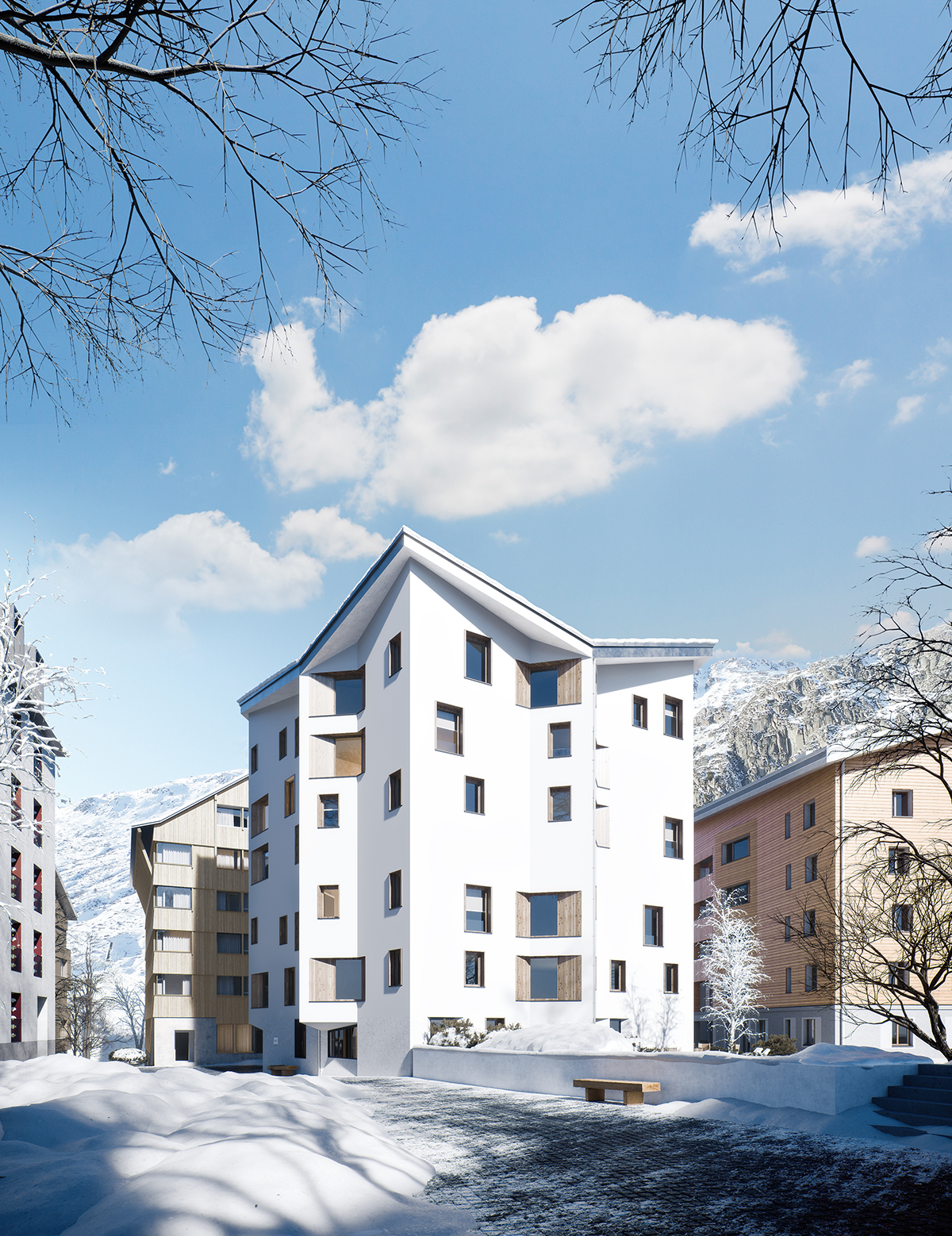
The five-floor Frame apartment house has been designed by Swiss architectural firm OOS with a younger generation in mind. It features 34 apartments (one-bedroom and duplex, some with double-height ceilings) that have been designed to feel airy, generous and bright, despite being compact in size at 50–60 sq m. Bay windows, for example, provide space for sofa beds.

There are also communal areas on the ground level that include bike storage, and a ski room and workshop where you can do repairs. There is a chill-out lounge, a sauna, a courtyard with a fire pit, and the Hearth, which is an entertaining space with a kitchen where you can have drinks or dine with friends. The developer Andermatt Swiss Alps (ASA) says: “You can cook food yourself, get one of the restaurants to deliver or have one of the chefs from the local hotels come in. It’s also a place where, if you are thinking of going out for a week’s hike, you can invite your guide in for a coffee and plot your course.”

communal kitchen area

Frame features a communal dining area with a kitchen

While the exterior of Frame is based on the look of the handsome rendered buildings already in existence in the village, another apartment building called Alma draws its inspiration from local traditional wooden architecture. The developer says: “Our ambition is that in 20 or 30 years’ time the new and old parts of the village will blend together so it will look like one destination. We always ask our architects to look at the wealth of architecture here but interpret it with a more modern eye because we don’t want it to be a pastiche.”

However, the developers don’t want to create an ‘architectural zoo’ – as the developer puts it, “Everything has to have harmony”. Tasked with designing Alma, which sports dark, over-lapping timber cladding, was Dominik Herzog from the Zurich architectural firm Herzog Architekten. Located on the western edge of Andermatt Reuss, Alma has 11 two- and three-bedroom apartments (measuring 122–169 sq m) that have living rooms with fireplaces, bathrooms with freestanding tubs and large picture windows looking out on to the mountains and the Reuss river. There is a sauna on the ground floor.

facade render

Frame’s exterior has been designed to blend in with the village’s existing buildings

The developer says: “The spaces are satisfying, nurturing and enriching. They are not shouty or flashy. They are thoughtfully detailed. Every single apartment has 180-degree views, sunken corner lounges that are heavily upholstered and sheltered balconies so you can go outside even when it’s snowing or windy.” Although Frame and Alma are different from one another, both are firmly rooted in a sense of place. “Their use of materials has been informed by the existing architecture and they have been very careful about how they open up their buildings to the surrounding landscape. The windows almost become the artwork on the walls,” says the developer.

ASA also wanted a car-free environment so much of the investment (millions of dollars in fact) has gone underground to make a double-storey basement of car parking, storage and services. The result is a healthy, liveable, pedestrian-friendly village. The developer explains: “Some people live here full time and others use their property as holiday homes. We have a lot of local clients from Italy, Switzerland and Germany who come for weekends over the season in summer and winter, but also investors from China and Singapore who come and use it before it goes back into the rental pool.”

Open Season

The winter season on Gemsstock runs from 31 October to 25 April, and the Andermatt-Sedrun-Disentis season runs from 19 December to 11 April. These dates are, as always, dependent upon the prevailing snow conditions.

For more information visit: andermatt-swissalps.ch

This article features in the Autumn 2020 Issue, hitting newsstands in October.
Share:
Reading time: 5 min
historic building facade

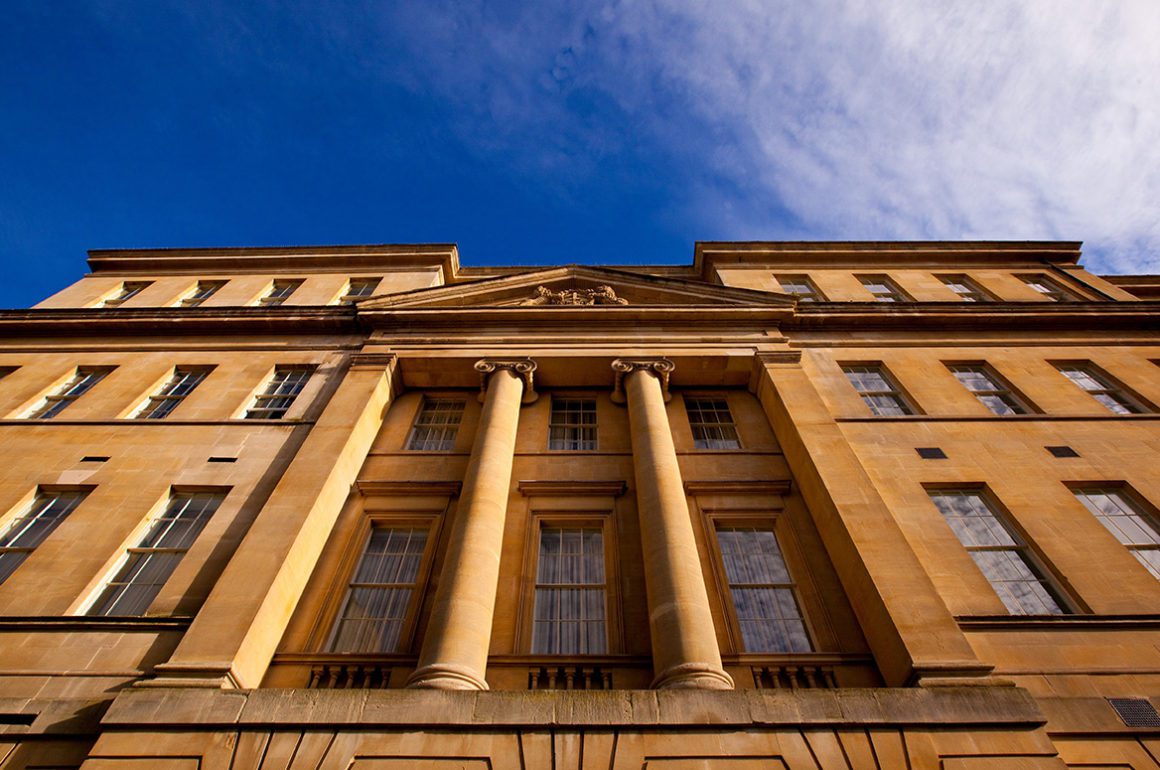
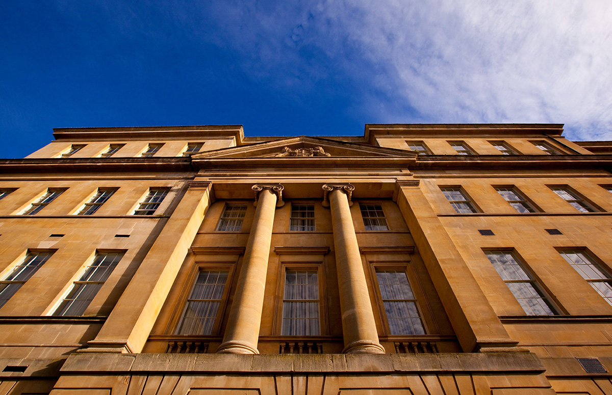
The Gainsborough Bath Spa occupies two Grade II Listed buildings in the heart of Bath

The Gainsborough Bath Spa is located in the heart of the historic city of Bath, but with access to natural thermal waters, extensive spa facilities and a calming atmosphere, it’s no ordinary city hotel. LUX checks in for a midweek stay

Staycations have soared in popularity this summer and it’s likely to be a lasting trend not only for pandemic reasons, but also for travellers seeking a more sustainable alternative to travel. For London residents especially, Bath is a no-brainer. One of the UK’s most beautiful and historic cities, it’s just over an hour by train from Paddington Station or an easy two and half hour drive, and if you’re staying at The Gainsborough Bath Spa you don’t even have to worry about parking. The valet is there to meet you at the bottom of the hotel’s steps and on check-out, the car’s ready and waiting, stocked with water bottles and a little tin of mints for the journey. It might not sound like much, but these are the kinds of thoughtful extras that contribute to a completely stress-free experience.
Follow LUX on Instagram: luxthemagazine

The YTL group (to which The Gainsborough belongs) is known for its acute attention to detail. Added to the top-notch valet service, all the rooms, regardless of category, have complimentary mini-bars stocked with artisanal snacks and juices, and the bathrooms are filled with an abundance of good-sized Aromatherapy Associates toiletries and fitted with underfloor heating.

Luxury hotel bedroom

One of The Gainsborough’s courtyard rooms

The rooms are smart, modern and spacious, decorated in a soothing colour palette of duck-egg blue and gold with varying layouts. We stayed in a two bedroom suite, which takes the form of a maisonette with a double room and bathroom upstairs, and an additional double (or twin) room downstairs with a small sitting room. Both beds were exceptionally soft with piles of pillows, but the downstairs room was somewhat lacking in natural light whilst the rest of the suite benefited from towering ceilings and huge windows.

Read more: Diango Hernández’s disruptive Instagram art project

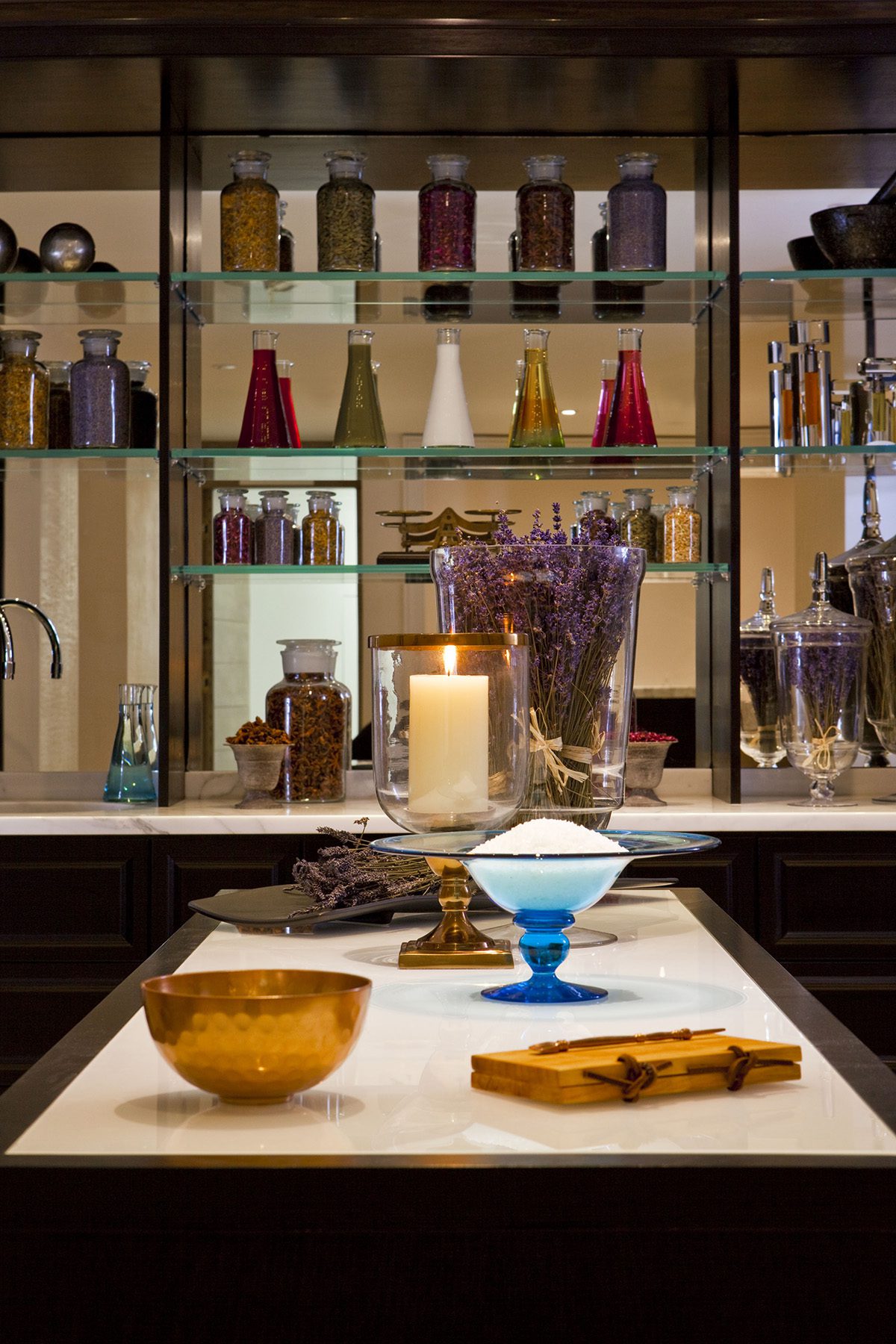
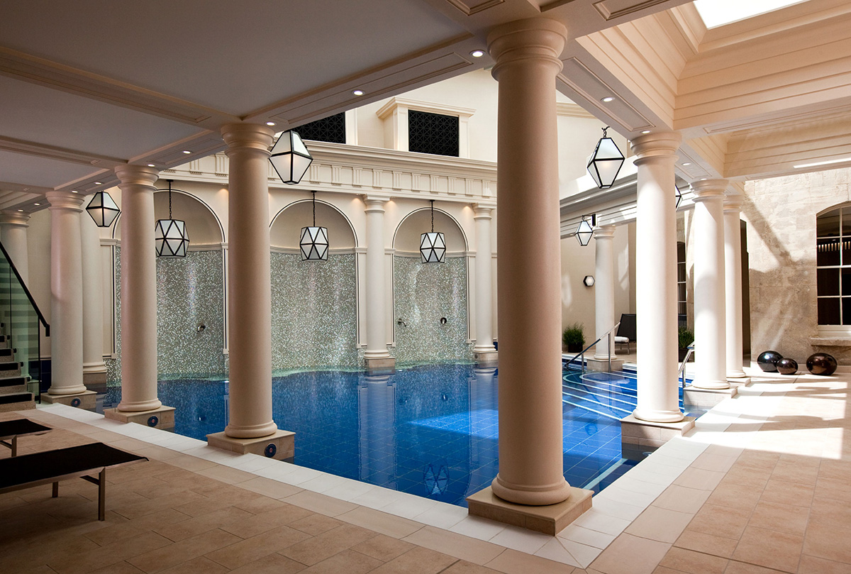
spa interiors

bathing pool

Aromatherapy bar (above) and one of the thermal pools in the hotel’s spa village

The Gainsborough features the only hotel spa with access to the city’s natural thermal waters. Currently, visitors are required to pre-book one-hour bathing sessions to prevent overcrowding, but that still leaves plenty of time to dip into the different pools, sauna and steam rooms with breaks in-between for shots of thick, spiced hot chocolate (a favourite of the Romans). In terms of treatments, there’s usually a wide selection including various acqua therapies, but due to current Covid restrictions, the signature massage is the only offering, beginning with a foot bath in neroli water infused with rosemary and pine essences followed by a full body massage using calming lavender oils. Spa experiences begin with a mini workshop making scented salts using a selection of Aromatherapy oils, and end with a cup of pink Hibiscus tea on the terrace overlooking the baths.

Read more: Holly Chandler of boutique travel company Fish&Pips on travelling post lockdown

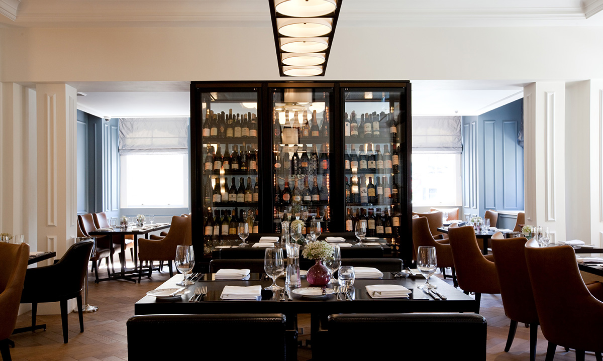
restaurant interiors

Dan Moon’s restaurant is currently only open for breakfast

Dan Moon’s restaurant, which usually serves elegant dishes made from seasonal and locally sourced ingredients, is only open for breakfast at the moment. In the afternoon, tea is served a chic mirrored lounge known as The Canvas Room and the bar is open in the evenings for cocktails.

It’s a hotel that prioritises its guests’ relaxation and privacy. Staff are warm and attentive, but generally leave you to wander freely, creating a pleasing sense of homeliness. It’s the kind of place you can imagine returning to year after year.
Rates start from £325 per night for a Deluxe Room including breakfast (approx. $400/ €350). Book your mid-week getaway: thegainsboroughbathspa.co.uk

Please note: This review was carried out before the global lockdown. Valet parking is currently not available to guests. 

Share:
Reading time: 3 min
artist studio
abstract artwork

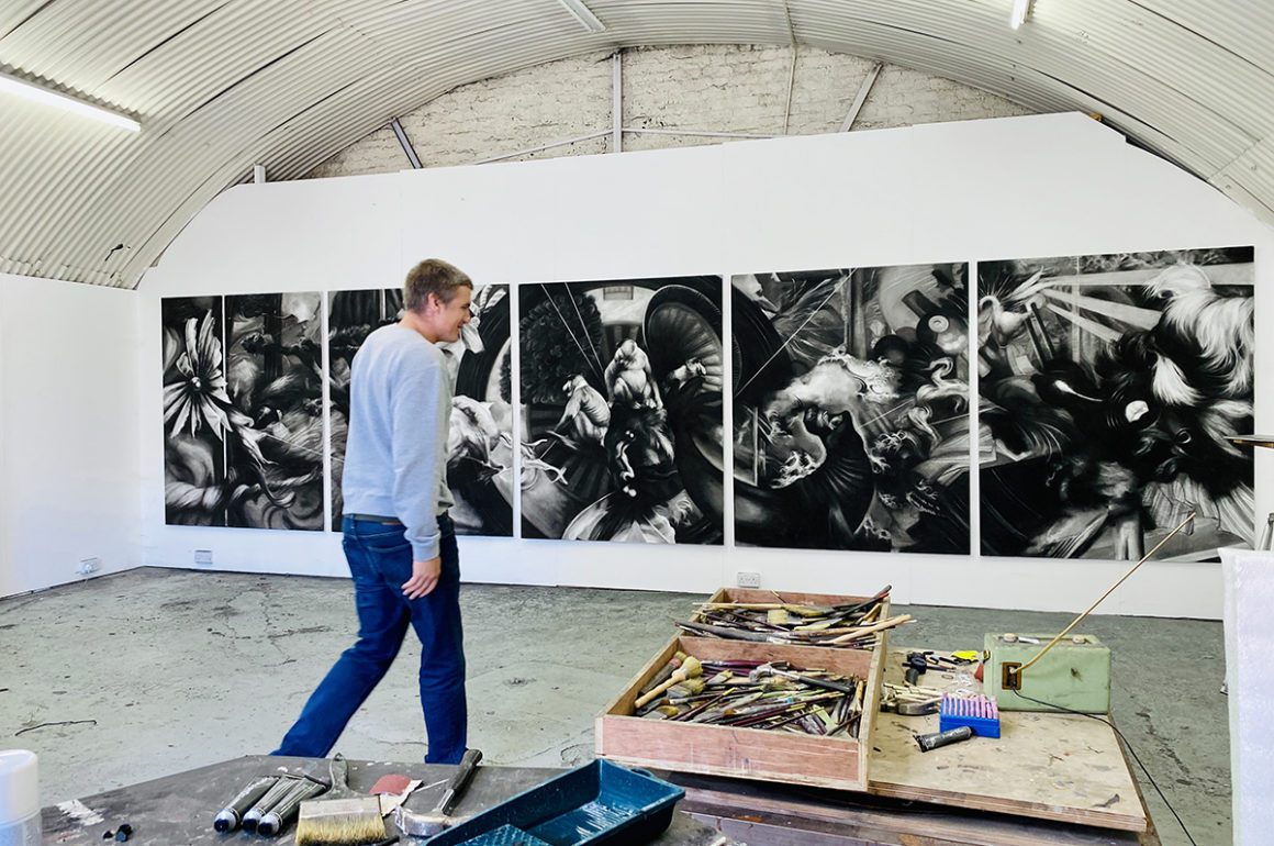
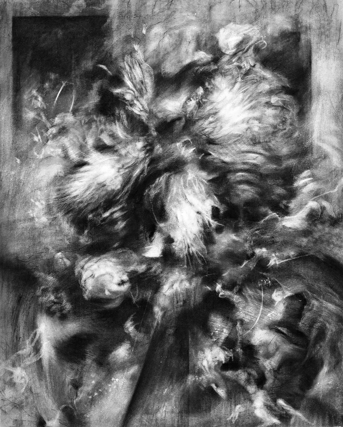
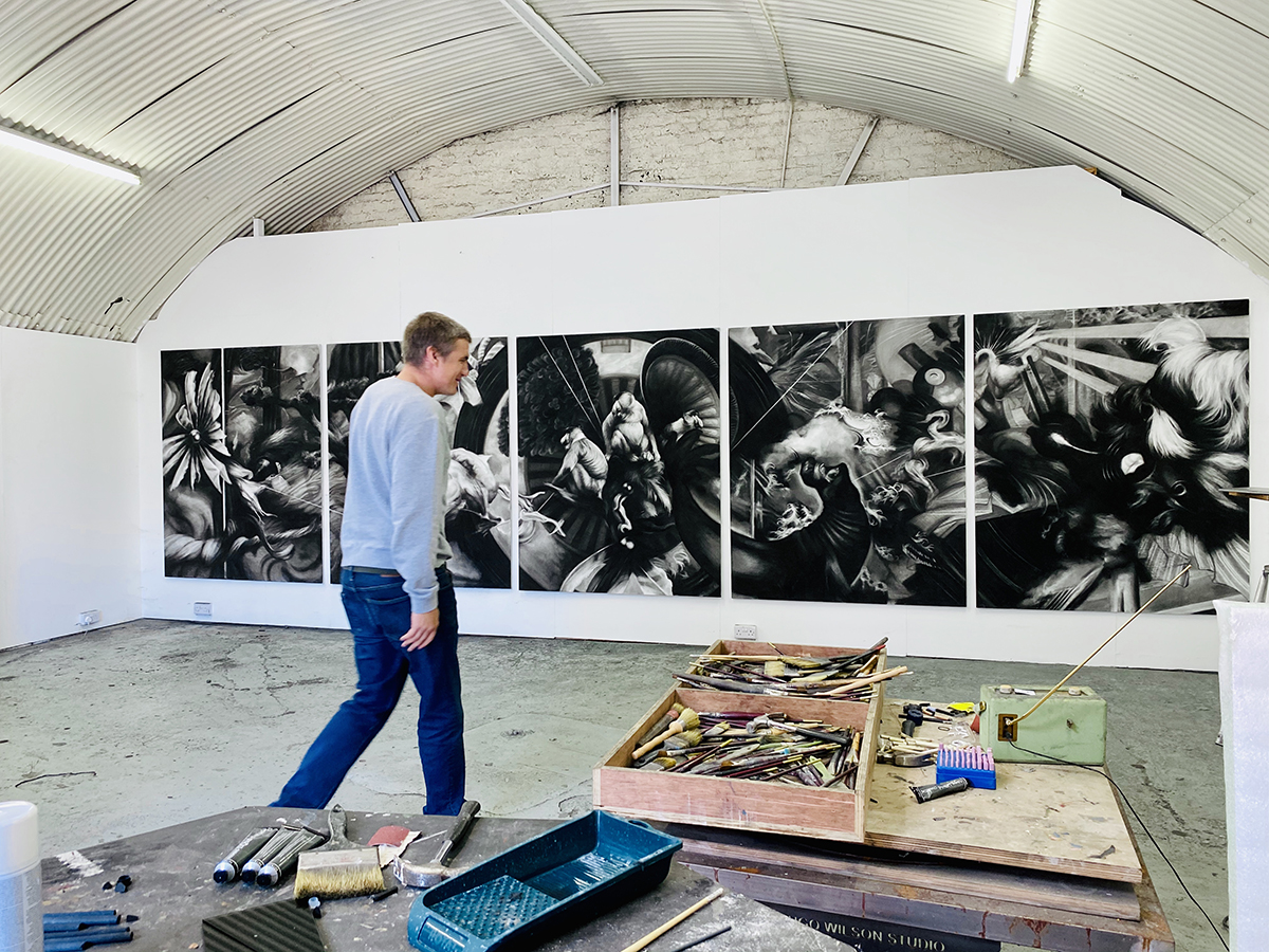
Untitled drawing by Hugo Wilson made with charcoal, black chalk, sandpaper and a sanding machine, paper mounted on aluminium. Photograph by Maryam Eisler

London-based artist Hugo Wilson works with drawing, painting and sculpture, combining images and techniques from Old Masters with contemporary references to create dynamic, layered artworks. LUX contributing editor Maryam Eisler visits his studio to photograph him and discuss refining his practice, creativity in lockdown and finding artistic freedom
colour portrait of Maryam Eisler photographer and contributing LUX editor

Maryam Eisler

Maryam Eisler: Let’s talk about your surfaces.
Hugo Wilson: I think a lot of my work has been very clean in the sense that the surface is quite finished, and quite considered. Whilst I wasn’t particularly aiming for that, that is just how I work. People have said to me over the last few years, ‘You should be leaving thin bits… you should have thick bits…’ and that is fine, but there needs to be a good reason for it all. Just creating surface texture to please makes no sense to me. I am quite bloody minded. I am certainly not going to do something unless I think it is the right thing to do. But slowly, after five or six years, rubbing away has become a part of my practice. Re-painting has also become a part of it. In the case of these particular drawings, I have also pulled things out of seven or eight dark layers which are muddied or clashed to the point of a problem. Suddenly, a sanding machine seemed like the only option. What I realised is that textures were beginning to appear, but they appeared out of clean, conceptual ideas. That required intuition, that required pulling something out of a chaotic situation.

Follow LUX on Instagram: luxthemagazine

Maryam Eisler: There is also great physicality and dynamism involved in your process. Would you agree that the paintings possibly represent a stamping of your own collective energy?
Hugo Wilson: Not consciously, but I think that any great work of art that I love has an honesty of intention, and an honesty of process to reach that intention. In the case of these works, I have, maybe, in a way, understood that my intention is less fixed than I had previously wanted it to be. In the past, I had a plan which I delivered, one way or another, but in this case what I’ve realised is that having a plan is almost pointless. So, creating works that are borne out of an obstacle course make perfect sense. These works also refer to many things, without ever holding a single position. Obviously, collective consciousness then has to come into play.

Man on chair

abstract drawing

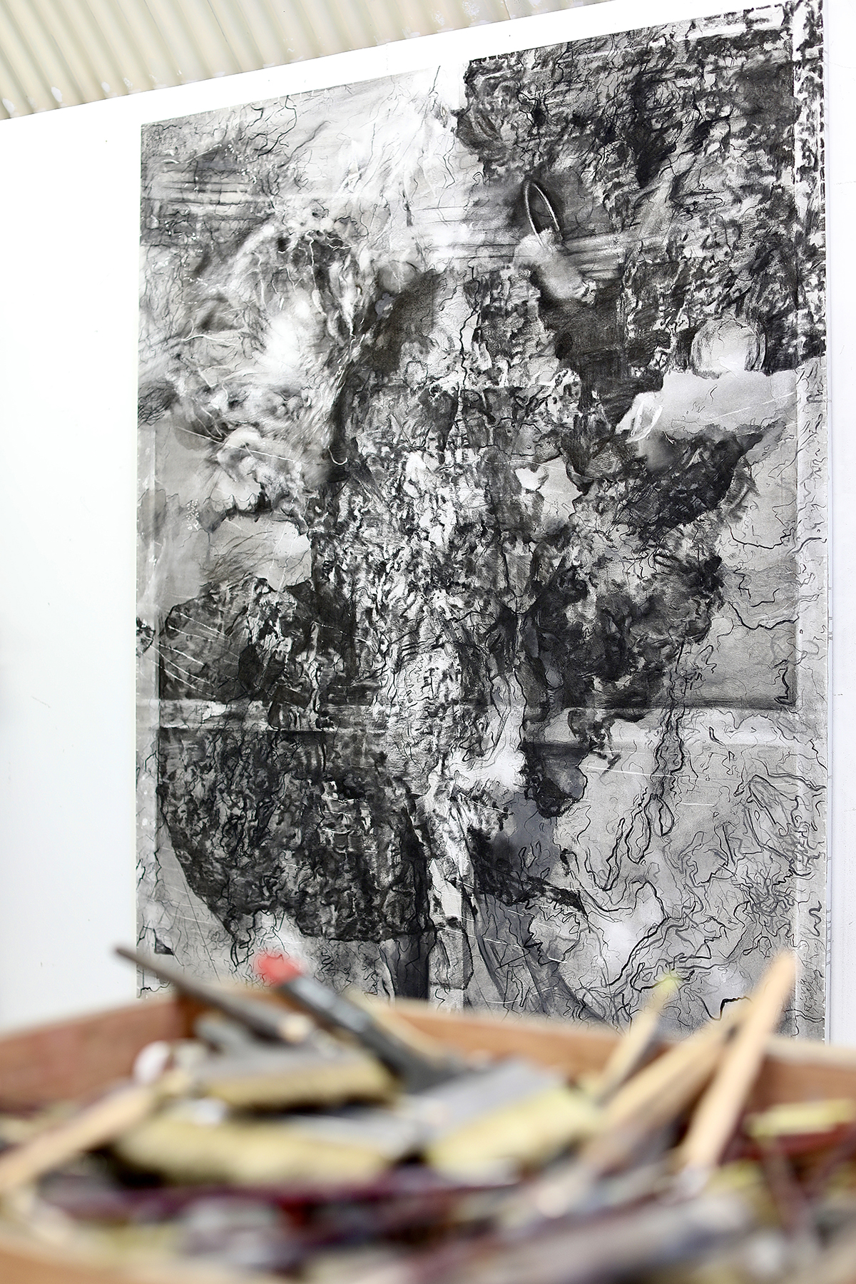
Hugo Wilson (top), and one of the artist’s works in progress (below). Photographs by Maryam Eisler

Maryam Eisler: To me, it seems like you are referencing freedom?
Hugo Wilson: I feel freer today than I ever have felt. That is for sure. I think moving towards more confidence is what I’m doing do. I also think that a heart punch is far more powerful than a head punch.

Maryam Eisler: Less agonising over process?
Hugo Wilson: I think all artists have this immense problem when they walk into an empty room with an empty canvas or a piece of clay or a block of wood. So, we sort of have to have a strategy in order to start, but also, we need to remember to break the rules that we have imposed on ourselves and to trust in that process. It is hard because it requires dropping things that have worked whether that is making a successful work of art, or selling it, or being liked by curators. Just because you are an artist you are not immune from all that; I wish I was. This last year was really hard because I had success for the first time in my career, and then decided to suddenly throw a hand grenade into my own practice, but it got to the point that I couldn’t live with myself if I didn’t do it.

Read more: Diango Hernández’s disruptive Instagram art project

Maryam Eisler: Speaking of bombs, how has this COVID period affected your work?
Hugo Wilson: The last six months have been the best period of work that I have ever had, for two or three reasons. One, the imagined pressure of the art world sort of disappeared for a bit, which I liked. I also realised that I’m terribly untrendy. I think that what is going on in the art world may be a great thing, but the fact that I am not involved in it, is not something that I am bitter about. In a way, I have had to look at that and question ‘well, what does that mean?’ In my case it meant freedom, the freedom to truly know what you care about and want from this. And I think that the answer is to create something, that goes well beyond my own limits, consistently. It can be exhausting though.

sculpture and drawings

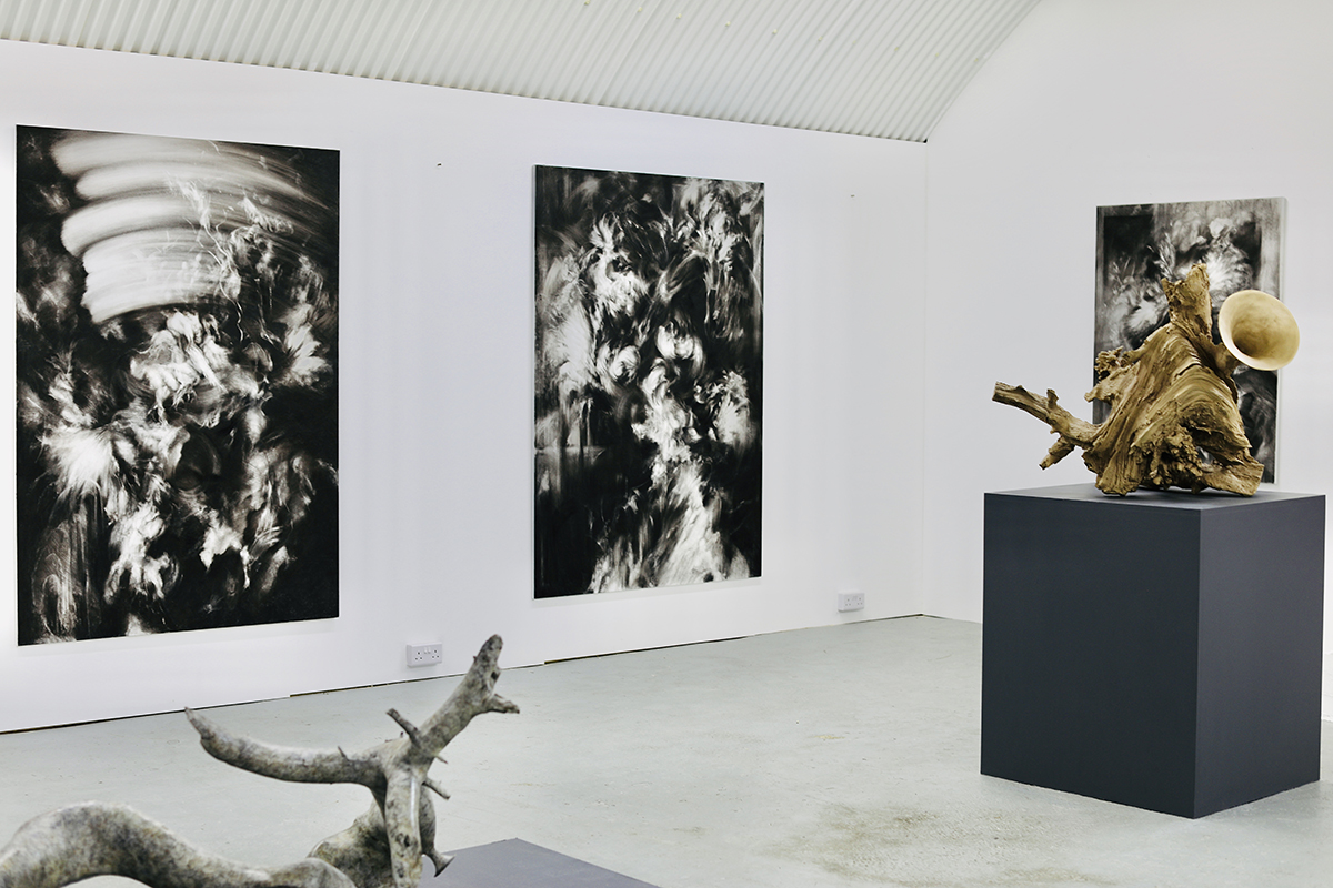
A collection of Wilson’s charcoal works and sculptures. Photograph by Maryam Eisler

Maryam Eisler: Would you say it’s also about personal evolution and revolution?
Hugo Wilson: I think last year was particularly difficult because I had given myself a year to change my practice. I thought, okay I shall only do one show, which was the Berlin show I did earlier this year, which actually ended up feeling and going much better than I thought it would. I also had to have my right lung removed. I have been sober for many years since my mid 20s, for a good reason! And suddenly I was on morphine… It was tough, much tougher than I thought it was going to be, because I am one of those lucky people who nearly crashed and burned young, but didn’t. Most of my adult life, however, I have felt pretty happy, no more or less unstable than most other people. And then suddenly, I was right back in the darkness again, mentally. It was very frightening. At the same time, I was sitting in an empty studio. You know, I sound posh. I sound like I have had advantages that actually I didn’t. I was on big scholarships and so on, but actually, I set myself against the world quite early on. I have always been very intolerant of the “hippy artist” and the idea of self-indulgence. As an artist, it’s natural that you experience bleak periods where you don’t like your own work, but you are going to have to keep going into the studio to make it happen. I had one of those periods, quite a long one, and I can tell you, it is hell.

abstract sculpture

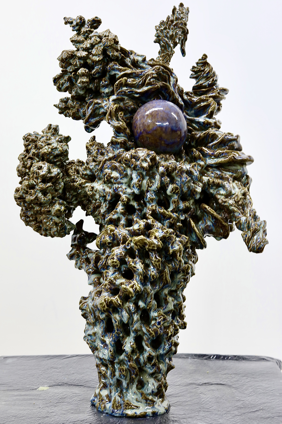
An untitled glazed ceramic sculpture. Photograph by Maryam Eisler.

Maryam Eisler: Now you have come out of that darkness with these wonders, and you’ve almost cut out all the noise …
Hugo Wilson: I am using a 300-gram paper on aluminium. This stuff can take a real beating. I am also using sanding machines and spikes, maybe even fire one day.

Maryam Eisler: And yet, you are classically trained.
Hugo Wilson: I am very classically trained, within an inch of my life!

Read more: Loquet’s Sheherazade Goldsmith on sustainable jewellery design

Maryam Eisler: Can you tell me about your early days in Florence?
Hugo Wilson: I remember going on a school trip to Venice when I was fourteen. I was sitting in front of a Tintoretto and I nearly cried. Now, I understand that I was completely moved by the power of the image, but not one part of me thought I was going to become Catholic. I think, in a way, that the sort of silly, ambitious, quite stupid, young man just thought, ‘I am just going to fucking learn how to do that. He did it, why not me!’ The classical training was, by the way, extraordinary. It was a seventeenth century atelier. There was the master, and everyone who had been there longer than they could teach you, and it was amazing; we drew from plaster casts for a year, before we could draw a naked person, and only two years later, could we actually paint. I do not regret the training at all, but it was a very difficult thing to unpick. It was very addictive. The point is: I was interested in that language, and I learnt it.
artist studio

abstract sculpture

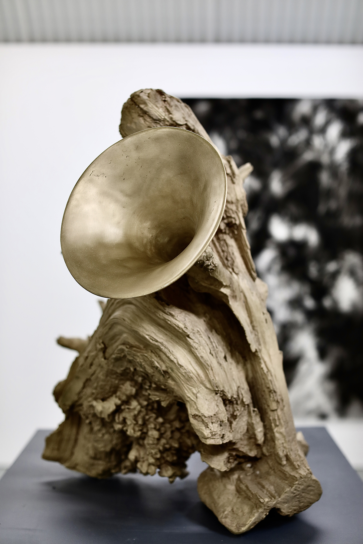
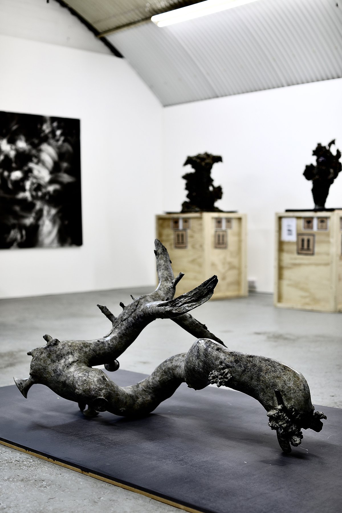
Hugo Wilson in his studio with charcoal works in progress (above) and an untitled bronze sculpture. Photographs by Maryam Eisler

Maryam Eisler: So, that old world story is in your DNA?
Hugo Wilson: I am an English man. The works I have seen throughout my life are from this tradition. Slowly, slowly I am getting far more interested in other traditions actually, like Japanese woodblocks for example. I have also always loved those medieval bronzes and the historical anomalies where you look at a bronze from the fourth century and then you look at a Japanese incense holder, and you realise that they are identical, and that idea is at the very core of my practice. That we don’t change. It doesn’t matter what colour you are, or what time in history you are from, we will create idols which speak to us viscerally. I am not really doing anything different. The advantage I have is the internet, two thousand years of art history available at my finger tips and the ability to compare and contrast, and initiate dialogues. Also, 200 years of psychology and human psychoanalysis, and the realisation that actually the human need to create is far more important to understand than what is actually being done.

Maryam Eisler: What inspires you today?
Hugo Wilson: I am far more interested in process than I have been for years. I’m also looking at artists like Auerbach and Kossoff. Lovely Bacon… sexy Francis! Physical Freud…I have equally realised that these intuitive works take a really long time to create. I know that sounds odd, but, in my case, it’s been twenty years of me in the making, from being classically trained to using a sanding machine!

Maryam Eisler: Why so long?
Hugo Wilson: The process is the reason why it took so long. I think I rather stupidly assumed and felt that these were big physical gestures done in a week, but no. I suppose growing older makes you relaxed. But did I trust the process even last year? No. And it was my wonderful panel maker, that called me and he said, ‘Hugo you have ordered ten panels last week, and I came into your studio and every single one of them has been painted on and then painted over. Are you okay?’ To which I said ‘I am not, actually!’  All of that feeds into what is happening now and the weird joy that I am experiencing. I am not often this joyful, trust me!

art studio

Artworks by Hugo Wilson. Photograph by Maryam Eisler.

Maryam Eisler: You seem able to seamlessly move across mediums. Your sculpture works in particular appear to be an extension of your paint brush, with a few ‘sculptural’ interventions.
Hugo Wilson: Yes, that is what I want. I think that, with these new sculptures particularly, I can be “brave” in a way that I would find trite if they were to be paintings. In a way, given that I have not had a formal training in sculpture, I feel I can be braver with it. I am taking an object and in a way re-contextualising it. Just like a scholar rock, but even a scholar rock is a ready-made. I think it talks about what I am interested in, which is the human need to make systemic ideology. Three thousand years of non-monotheistic history has been placed on these rocks. But, it’s a fucking rock! It is bonkers. These things are going in Christie’s for millions!

Even though I had classical training, I then did a very conceptual master’s degree at City & Guilds [of London Art School] and I had a brilliant tutor called Reece Jones. He was an absolutely wonderful man and a good artist. He was also an angry young man; he would punch me for saying that. Most importantly, he made me ask these questions before starting any artwork: Should this be an artwork? Should it be an artwork made by me? And if it should be an artwork made by me, what is the delivery? And in the case of these bronzes, they are far better than anything I could ever draw. I also like the surface which you really notice. I don’t want to talk about the history of sculpture at all. Hence, my choice of sand casted bronze with its non-finish look, like stone or wood. It is a finish which doesn’t hold any historical position, and that suits me.

Find out more: hugowilson.com
Follow Hugo Wilson on Instagram: @hugowilsonstudio

Share:
Reading time: 11 min
contemporary art sculpture

‘La marea bajita’ from Diango Hernández’s Instopia Instagram project

Dusseldorf-based, Cuban artist Diango Hernández has been blurring the lines between the virtual and physical since 2015 with his ongoing Instagram art project Instopia in which he digitally places his own artworks into existing photographs of luxury spaces. Nick Hackworth speaks to the artist about ownership, challenging perceptions of reality and the culture of revolution
artist in the studio

Diango Hernández

LUX: Can you describe Instopia in a nutshell?
Diango Hernández: Instopia is an ongoing series of images that show artworks of mine in extraordinary places; a painting of mine hanging, for example, in a luxurious villa in Greece or Capri or, say, a huge sculpture inside a high-end ‘white cube’ gallery in New York or London.

Follow LUX on Instagram: luxthemagazine

There’s a bit of magic or sleight of hand, in the way these Instopia images are made. The process begins with me finding an image of one of these luxurious spaces on Instagram or online. Then I design a virtual artwork, it could be painting, a mural or a sculpture, that I think would look perfect in that particular, photographed space. I take into careful consideration of all the elements of the spaces, its colours, lighting and textures. Then I digitally place my artwork into the image of that space and post up this new picture onto my Instagram account. The work only becomes Instopia only when makes you believe that it’s “real”.

LUX: How did you come up with the concept?
Diango Hernández: It wasn’t actually about the irony, cynicism or any form of mockery. It was just that very often when I came across beautiful images of luxurious places I always found in them, some spaces that I thought would be good for my art. But people got offended by the project because it challenged their ideas of reality. They’d look at an Instopia image and ask, ‘How real is it?’ or ‘Are you lying to me? You don’t have a painting of yours hanging in that beautiful mansion!’ I lost friends because of Instopia. In fact, the longer I’ve been continued the project the more that other artists and art dealers have reacted strangely toward me.

abstract art doorway

‘Cadenas de agua’ from Diango Hernández’s Instopia Instagram project

LUX: Why do you think people in the art world reacted so strongly?
Diango Hernández: They were upset, insulted even, because they thought I was using these Instopia images to pretend that my work was hanging in this space or was part of that great collection or museum. For instance, I’d replace a Francis Bacon one of my paintings in an image and people would be like, ‘your work isn’t in that collection!’ They’d be really rude, but I would say to them, ‘I’m not bound to the sense of reality you have. I come from another country, another tradition.’ I still believe we have can an intense dialogue with pictures. Pictures are more serious than most people believe.

Read more: Loquet’s co-founder Sheherazade Goldsmith on creating sustainable jewellery

LUX: In the captions of your Instagram posts do you refer to the reality or unreality of the image?
Diango Hernández: No. On Instagram you have a few elements that will imply a level of truthfulness: the image, the hashtags and the text. I work with all of these elements to make you believe, as much as possible, that the post is real. This is why people got really upset. Galleries even cancelled shows. They had collectors calling and telling them that I was abusing the internet. I was like, ‘Are you kidding me guys? Don’t know the history of collage?’ It just shows you how contradictory the contemporary art world is. Everyone is busy selling the ‘new’ and the ‘radical’ but only a few can really deal with what is really new.

swimming pool artwork

digital artwork

Cielo bajo el agua (above) and Tu muchas veces (here) from Diango Hernández’s Instopia Instagram project

LUX: The negative reactions to your work are interestingly hypocritical. Instagram is a vast, collective platform which people use to project or imagine their own fantasies. But as usual, things get conservative when people with money get upset…
Diango Hernández: Exactly. When people complain about me inserting an artwork into an image of their beautiful interior, they are effectively saying, ‘Come on, I have spent millions of dollars on this living room!’ A lot of the outrage is connected to people’s sense of ‘property’.

Read more: Laid-back fine dining at Knightsbridge restaurant Sumosan Twiga

Most of the legal issues I’ve had have come from photographers complaining that I’d abused their copyright. That make sense as people are crazy about property. They forget that artists challenge and question that very notion of ownership. Somehow, we have to do it, it is in our DNA. A world without people questioning private property is an unfair world. But it’s true that my way of doing this is more ‘gentle’, I just add ‘value’ to your beautiful property by adding my ‘art’ to it!

luxurious interiors

contemporary artwork

Ojos claros (above) and Noches (here) from Diango Hernández’s Instopia Instagram project

LUX: Do you think of your work as having a punk or anarchist spirit?
Diango Hernández: I’d say my attitude isn’t so much punk, I’d say it comes out of the culture of revolution. To illustrate what I mean, a particular story comes to mind…

In the Havana of the 1940s and 1950s there was a very fancy country club park, frequented by Americans and the Cuban bourgeoisie. In January 1961, the Cuban revolutionary leaders Fidel Castro and Che Guevara were enjoying a drink just after they finished a game of golf at the club. They were pondered the future of the country club, since all of its members had fled the country. There and then Guevara proposed the creation of a complex of tuition-free art schools to serve talented young people from all over the Third World. ‘The school must be built just right on top of these holes,’ Che Guevara said.

vintage golf photograph

Cuban revolutionary leaders Fidel Castro and Che Guevara playing golf

A few years later Cuba’s National Art Schools were built. In the design they attempted to reinvent architecture in the same manner that the Cuban Revolution aspired to reinvent society. To this day the art school is one of the most beautiful buildings ever built in Cuba.

That idea of subverting the function of that exclusive country club into a school for the arts, seems to me, like a radical and powerful act of collage. There is a lot to learn from the history of design and architecture. One valuable lesson is that transforming images and the values they embody is one way of transforming our reality, culturally and socially. I want people to interact more thoughtfully with images and to create ‘better’ pictures.

Follow Diango Hernandez on Instagram: @diango.hernandez

Nick Hackworth is a writer and curator of Modern Forms, an art collection and curatorial platform founded by Hussam Otaibi, Managing Partner at Floreat Group

Share:
Reading time: 6 min
shop interiors
shop interiors

Loquet’s London shop located at 73 Elizabeth Street, SW1W 9PJ

London-based jewellery brand Loquet is renewing the concept of a keepsake locket with sustainable, modern designs that consumers can personalise and pass through the generations. Here, Abigail Hodges speaks to co-founder Sheherazade Goldsmith about the brand’s ethical ethos, her love of vintage fashion and collaborating with the Wild at Heart Foundation

1.How does your environmentalist background inform your approach to making jewellery?

women portrait

Sheherazade Goldsmith

I’d say it informs everything. Environmentalism isn’t something you frequent; it’s a way of life and seeps into everything you do. Once you understand the repercussions of not protecting our future and that of our children, it’s impossible to ignore. As a fine jewellery collection, Loquet is part of a luxury world and to me, luxury is sustainability. Our process informs that message by taking the time to source the very best materials, crafted with care and implementing practices that create longevity. Our jewellery is for the generation that makes the purchase, the next generation and the generation after that. It’s about preserving someone’s story to be told, treasured and passed on. At Loquet we are preserving what is important to an individual, without sustainability there would be no point in what we create.

Follow LUX on Instagram: luxthemagazine

Our first port of call is the office itself, we use recycled or recyclable materials wherever we can, and we create a product that has no existential timeframe, it is recyclable and has no waste. The problem with so much of what we consume is the waste, but in jewellery there are no seasons and the sentimentality of the pieces make them heirlooms.

2. What inspired you to reinvent the classical locket form?

I already had a classic photo locket and a charm bracelet. My locket was an Indian antique made in 18kt yellow gold with elaborate coloured enamelling on the inside. I love Indian jewellery for this reason. They believe that everything should be as beautiful on the inside as it is on the outside. My charm bracelet was fun and gregarious, full of charms that patted against my laptop keyboard. On a visit to a fairground my son bought me a present, a pendant made with dried flowers, something I use to do with hedgerow flowers when my children where little. It inspired the idea of being able to combine the two and personalise it myself.

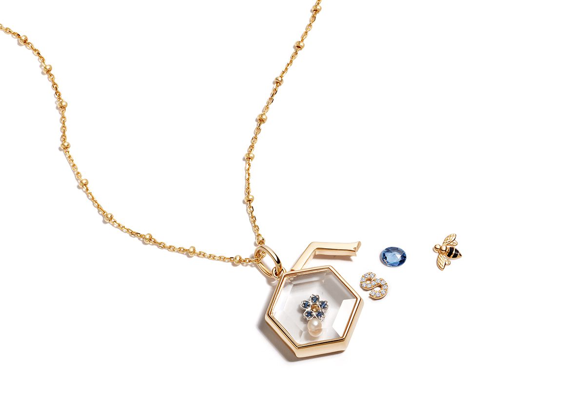
locket necklace

The hexagonal locket with a selection of charms

3. Is there a particular piece that you feel best expresses the story you set out to tell through your work?

Our sapphire crystal lockets are our signature. They allow our customers to be there own designer and create a piece that tells their story, in essence a unique talisman of everything that brings them luck and makes them smile, to be worn close to their heart. We’ve recently relaunched our 14kt collection to include some of my favourite pieces to date, that elegantly translate from day to night. Each of these geometrical shapes is hand cast in 14kt gold encasing a clear faced sapphire crystal facade and can be opened to personalise with our endless selection of meaningful 18kt charms.

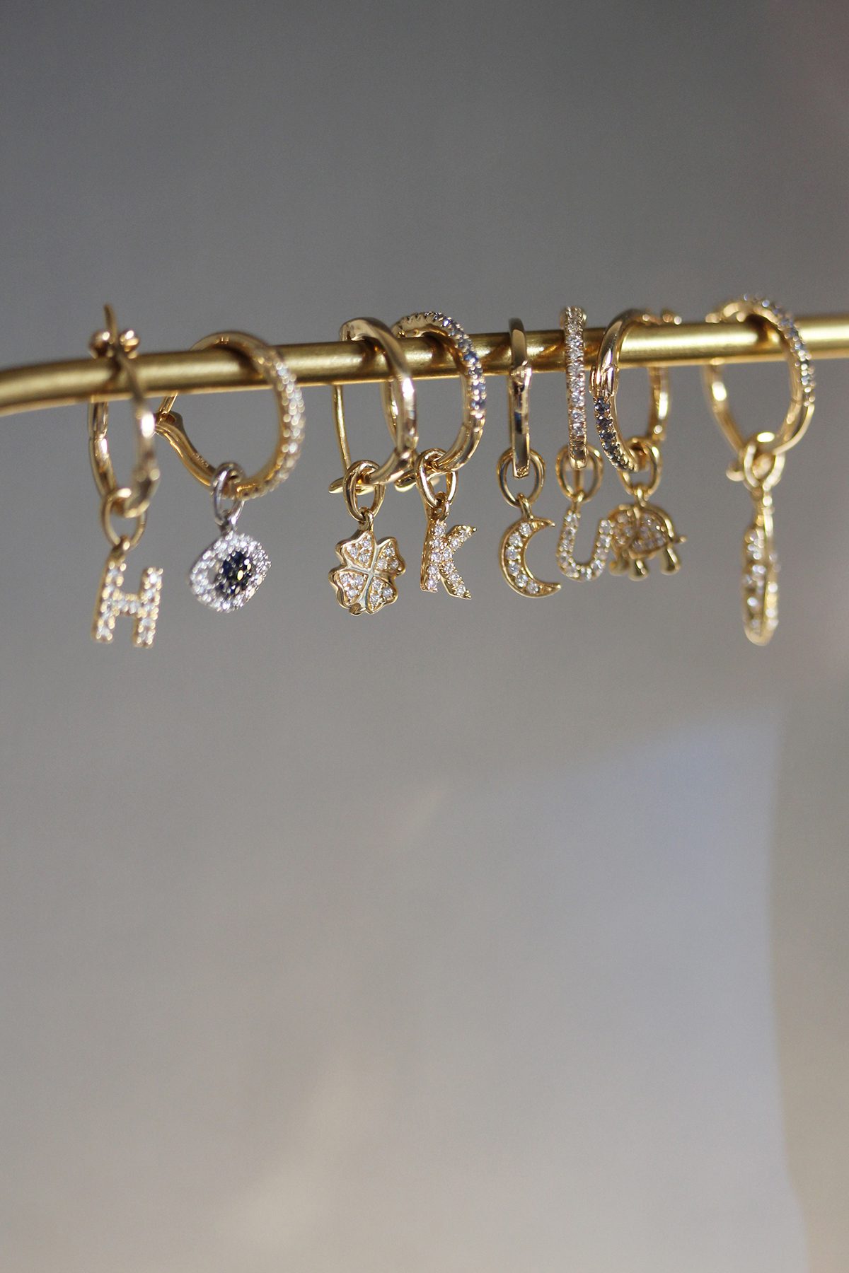
charms

A selection of charns

4. How do you ensure that the elements of your design process are ethical?

I spent a lot of time visiting jewellery studios all over the world before deciding to work with our current ateliers. This was to insure that the working conditions where healthy and vibrant, and to also talk through the designs with the artisans that were selected to make our jewellery. The companies I ended up choosing are all members of the responsible jewellery council or similar organisations and are, therefore, required to adhere to certain workers rights and high environmental standards.

Read more: British-Iranian artist darvish Fakhr on the alchemy of art

The human connection behind what we do is paramount to the Loquet design. Our pieces are emotional and as such need to be made that way. So many of us jewellers won’t work with a company unless they have the same ethos and it’s important to champion those that have worked hard to campaign for their workers and implement high standards that look after both their employees and the environment.

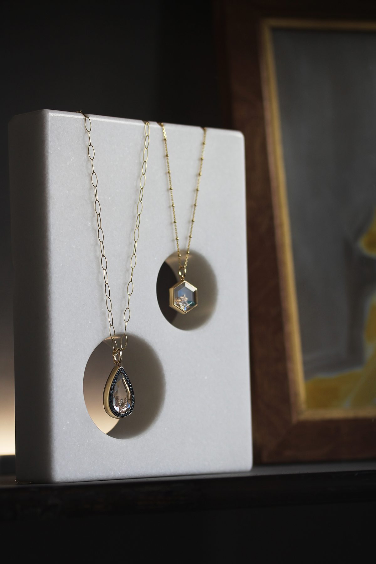
Locket necklaces

Loquet’s pear and hexagonal locket necklaces

5. Besides purchasing from you, how would you advise a consumer looking to shop more sustainably?

Sustainability is about longevity and well-designed things don’t have seasons. Whether that be furniture, clothing, accessories or jewellery, if something is worthwhile it will last through time and trends. With luxury items, less is most definitely more and that is my philosophy both in the way I decorate my house, my jewellery and wardrobe. Admittedly, I wear mostly designer clothing, but much of it is purchased from secondhand websites such as Vestiaire Collective, Hardly Ever Worn and The Real Real. I love vintage fashion, but you can also find all kinds of past-admired items for a quarter of the price. The buying and selling aspect makes you feel part of a community, almost like an exchange and gives your clothes a limitless life.

6. What’s next for Loquet?

We have a very exciting year ahead with some brilliant collaborations. The first launches in October with Nikki Tibbles and the Wild at Heart Foundation. We have put together a charm collection of Nikki’s favourite flowers chosen for their association with her beloved dogs, each epitomising the way we feel about our pets. A percentage of all sales will be donated to her very special dog charity that was set up a few years ago after rescuing a stray from the streets of Puerto Rico, who became her beloved Rose. The charity is now global and works tirelessly to end the unnecessary suffering of these much-loved pets.

Find out more: loquetlondon.com

Share:
Reading time: 5 min
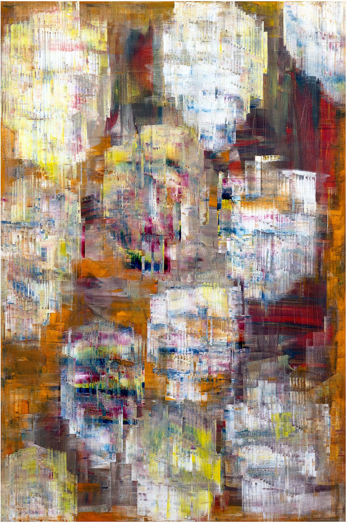
abstract painting
abstract painting

Soul Healing by Sassan Behnam-Bakhtiar

This Friday will see the public opening of Rebirth, an exhibition of new paintings and the unveiling of a major public installation by French-Iranian artist Sassan Behnam-Bakhtiar in the French commune of Saint-Jean-Cap-Ferrat

Sassan Behnam-Bakhtiar‘s latest exhibition, aptly entitled Rebirth marks the inauguration of the beautifully restored Villa Namouna, Saint-Jean-Cap-Ferrat’s brand new cultural space, alongside the unveiling of a major, public sculpture commission.

Follow LUX on Instagram: luxthemagazine

The exhibition, which opens on Friday 11 September with a private view on Thursday 10 September, comprises twenty-five recent paintings, executed in Behnam-Bakhtiar’s distinctive style which involves the scraping and blending of thick, vibrantly-hued oil paints to create  highly emotive, dynamic works.

Abstract painting

Eternal Rose Garden by Sassan Behnam-Bakhtiar

Amongst the paintings on show are a selection from the artist’s latest series ‘The Flowers of the Soul’, which feature stylised depictions of flowers created by scraping away a painting’s surface layers to reveal its multicolour substrata. The flowers hold a deeply personal significance for the artist, connected to certain traumatic and transformative memories of war and imprisonment in Iran, whilst also situating his contemporary practice alongside the likes of Cézanne who similarly fell in love with the region’s climate and flora.

Read more: Ornellaia launches auction with label designs by Tomás Saraceno

abstract coloured painting

Summer Immortal Rose Garden by Sassan Behnam-Bakhtiar

Behnam-Bakhtiar’s new sculpture, also entitled ‘Rebirth’, will be permanently installed at the Place Des Anciens Combattants D’A.F.N. with a smaller version at the Espace de la Theatre de la Mer. Created from welded sections of wrought iron, sprayed white, the sculpture takes the form of a combined silhouette of three people (a woman, man and child), depicting ‘the value of transferring the necessary knowledge from one generation to another.’

‘I think it’s vital for parents to really think about what kind of knowledge they pass on to their children… [part of that] is the understanding that we are part of nature, and that we are all one,’ says the artist. ‘I’m made of the same things as you are and both of us are made of the same things as nature, which is energy, at the end of the day.’

Benham-Bakhtiar’s exhibition ‘Rebirth’ will open with a private view at Villa Cuccia-Noya on 10 September 2020; the show will run at Villa Namouna from 11 September – 11 October 2020.

For more information visit: sassanbehnambakhtiar.com


Share:
Reading time: 2 min
wine bottles
wine bottles

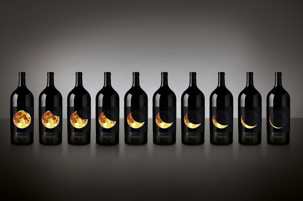
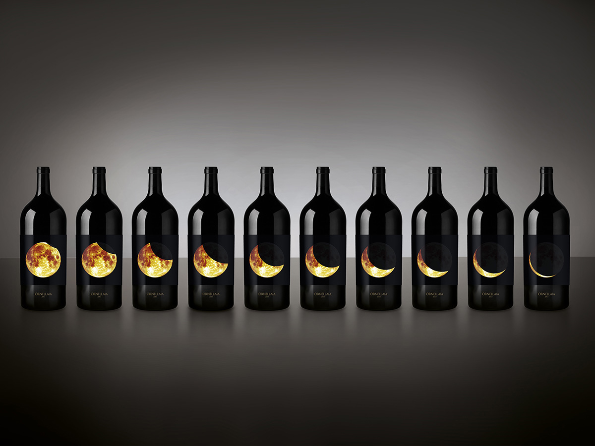
Ornellaia 2017 Solare Vendemmia d’Artista 6 litre with label designs by Tomás Saraceno

This week, Italian wine producer Ornellaia opened its 12th annual online benefit auction in collaboration with Sotheby’s and the Solomon R. Guggenheim Foundation, featuring vintages with label designs by Argentinian artist Tomás Saraceno. Chloe Frost Smith takes a closer look at the available lots
artist signing work

© Photography by Studio Tomás Saraceno, 2019

This year’s auction continues Ornellaia’s Vendemmia d’Artista project, which commissions a different contemporary artist each year to create an artwork for a series of limited-edition labels. The artist is given a single word description of that year’s harvest by the estate director, Axel Heinz, as inspiration. Last year, Iranian artist Shirin Neshat responded to ‘La Tensione’ with a series of monochrome photographs, and this year, Argentinian artist Tomás Saraceno has incorporated ‘Solare’ (‘radiant’ in English) into several aspects of his designs.

Follow LUX on Instagram: luxthemagazine

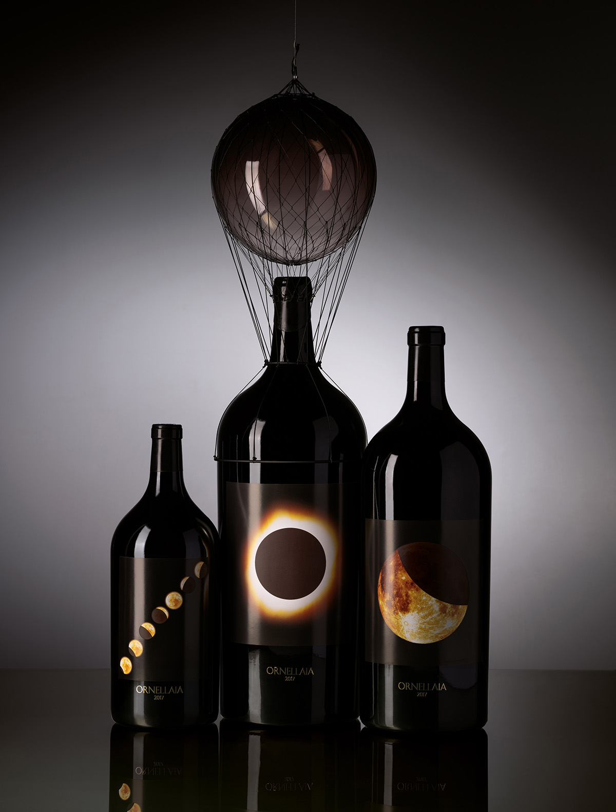
Renowned for his interactive installations that allude to new sustainable ways of living, Saraceno has created a striking set of labels which depict various phases of a solar eclipse for nine lots of Imperials, to be sold individually or in pairs. The auction’s most prestigious lot comes in the form of the Salmanazar sculpture, titled “PNEUMA 4.21×10⁵”, an impressive 9-litre bottle of Ornellaia 2017 topped with a floating sphere anchored to the neck of the bottle. Reminiscent of the artist’s previous work on untethered flight, this celestial sculpture highlights the importance of the relationship between the Sun and the Earth, and of renewable resources more generally.

three wine bottles

Ornellaia 2017 Solare Vendemmia D’Artista, with various designs by Tomás Saraceno including the Salmanazar sculpture (centre)

Not only embodying ‘Solare’ visually, the labels are a tangible take on the concept – made from thermochromic paper, which changes colour according to the heat of a person’s hand. This sensory detail invites reflection on the impact of humanity on the planet, in keeping with the wider issue of environmental sustainability which is at the heart of both Saraceno’s artistic ethos and Ornellaia’s production philosophy, which has long focused on self-sustaining ecosystems and precision agriculture.

Bringing a sense of completion to the auction, a unique vertical of the last six years of Ornellaia is available, in twelve 750ml bottles featuring the customised labels in a celebratory wooden case, alongside six Ornellaia Bianco magnums from the last three vintages.

The auction ends on 9 September 2020. Register via: sothebys.com/ornellaia 

Share:
Reading time: 2 min
dining table
dining table

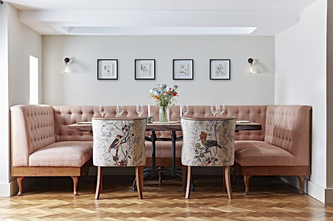
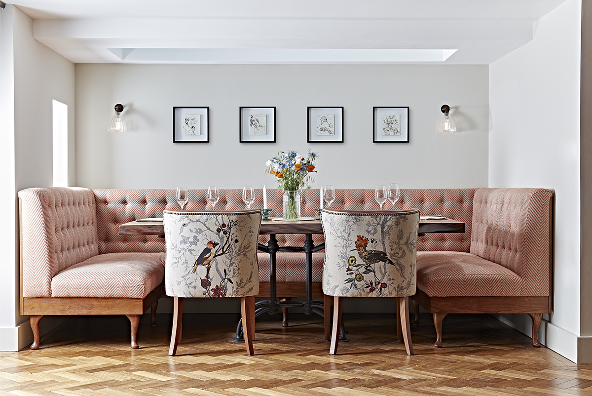
Woolsery Cottage, a private residence with interiors by Hannah Lohan

Since launching in 2015, Hannah Lohan Interiors has developed a reputation for designing uniquely decorative spaces. The studio’s portfolio includes numerous residential properties, boutique hotels, restaurants and spas with two ambitious hotel-village projects currently in development. Here, we speak to the studio’s founder Hannah Lohan about creating immersive environments, the return of maximalism and collecting vintage furniture

1.Where does your design process typically begin?

Hannah Lohan

It starts with the client – we spend as much time as we can getting to know them and developing a deep understanding of how they want their space to feel to their guests. We get them to list their key adjectives – do they want to create somewhere calming, nurturing and tranquil, perhaps? Or would a buzzy, vibrant and eccentric environment be more appropriate? It sounds basic, but the act of narrowing down to just five words can really focus the design process, as well as being a useful reference to prevent the project veering into another direction.

Follow LUX on Instagram: luxthemagazine

The next step is to consider the architecture and locality of the building. We try to draw on the surroundings as much as possible, including local artisans and makers in the design wherever we can. Personal touches and stories from the owners are also so important. The Dunstane Houses in Edinburgh, for example, was a lovely project for us as the owners were keen for us to include references from Orkney, where they grew up. We looked into Orcadian culture and history and came up with a design story for their whisky bar, the Ba’ Bar, based on the Kirkwall Ba’ – the traditional street football game that has been played in Orkney for centuries. We celebrated this with a picture wall full of historical photographs of the games, and even an old Ba’ ball that sits proudly on the shelves. The heritage and history of the building and its owners can play a huge part in shaping the character of the space.

interiors hotel bar

bedroom interior

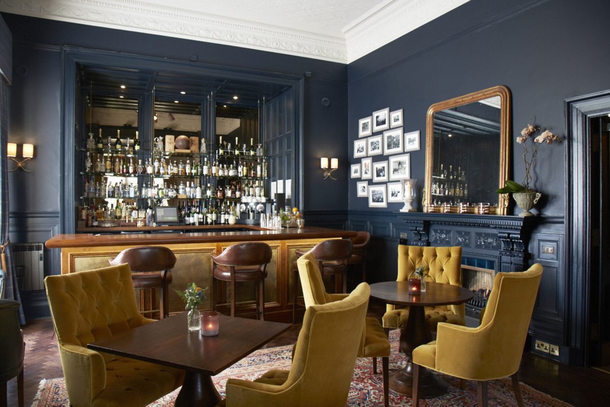
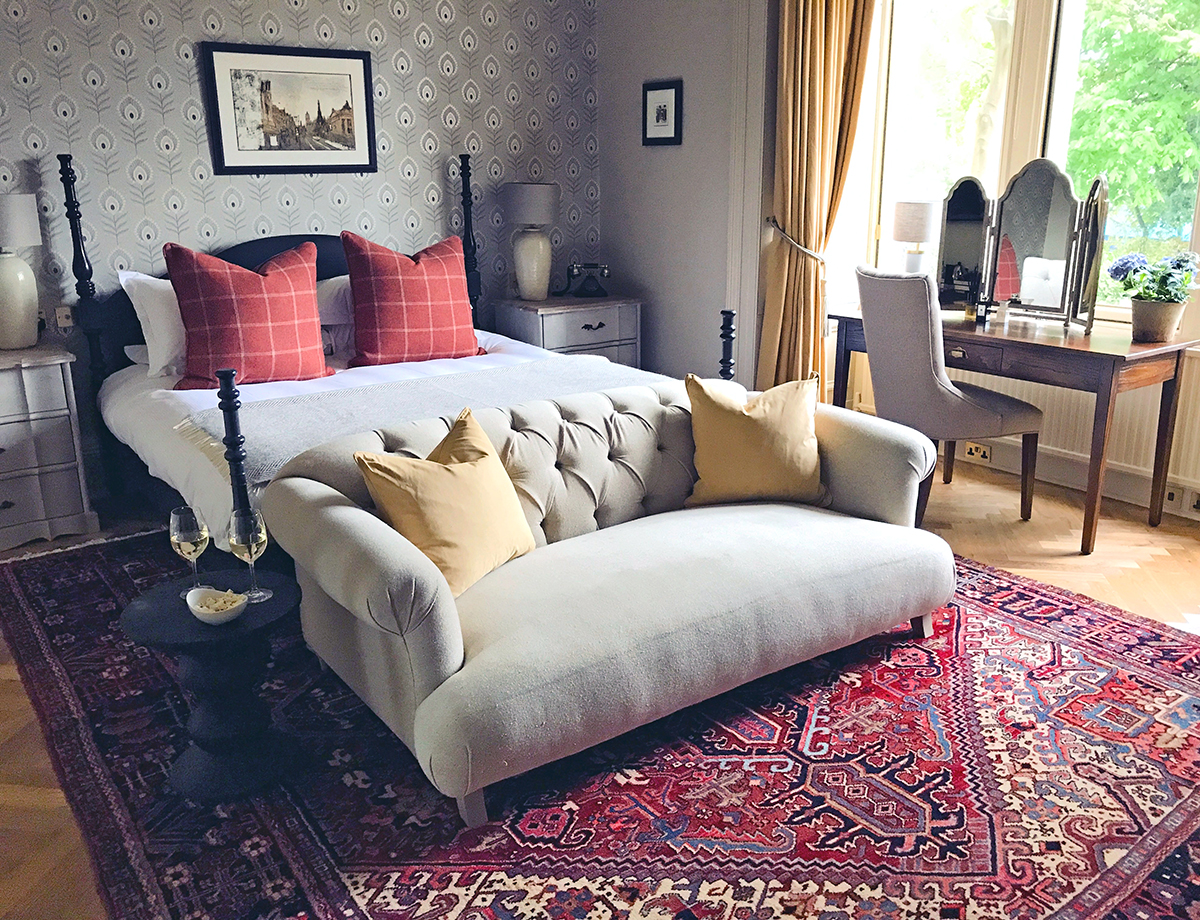
A bedroom at The Dunstane Houses hotel in Edinburgh, and above,Ba’ Bar, the hotel’s whisky bar

2. How do you utilise theatrical and storytelling techniques?

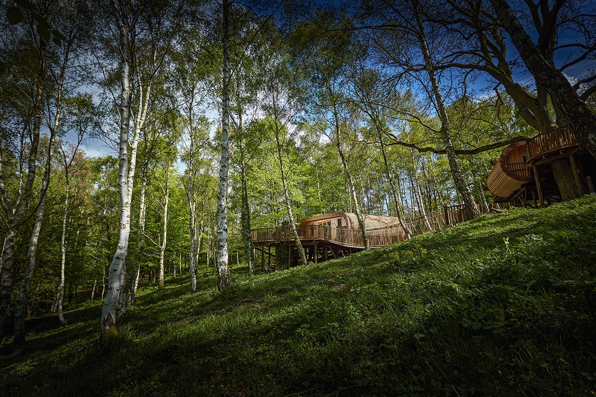
I think my passion for theatre in design comes from years of running a creative events company, designing immersive environments that transport people to other places. We love designing boutique, independent hotels, because they allow us to incorporate that sort of theatrical detail and employ unique elements that create truly memorable spaces. Good interior design isn’t just beautiful, it tells stories and sends you on imaginative journey as you experience it. That can be achieved by including elements of the unexpected and the playful – from treehouses and luxury safari tents hidden in the grounds, to pop-up bars in old horse boxes or disarmingly offbeat boot rooms.

restaurant interiors

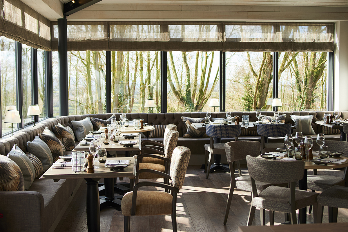
Hook restaurant at The Fish hotel in the Cotswolds

3. Is it more important to have a recognisable aesthetic or to be adaptable?

As designers, it’s our job to be adaptable and to tell our clients’ stories by guiding them through the creative process but I recognise that, as our studio has grown, we’ve become known for a more layered, decorative aesthetic. We wouldn’t be a good fit now for someone wanting a truly minimalist look. I don’t want us to be pigeonholed, and we never, ever take a cookie-cutter approach to our projects, but I am proud of all the work my team and I have put in over the years to research and build a fabulous library of materials, finishes and interesting furniture suppliers and makers, so it would be foolish not to see this as one of our biggest strengths.

pub interiors

The Farmer’s Arms, a Grade II listed pub in Devon, with newly renovated interiors by Hannah Lohan

What makes a design rich and interesting is layer and detail. We have to love what we do and be fully invested in order to create something truly magical. The hardest thing is to get clients to trust you – this is why we work best with creative owners who are willing to push themselves out of their comfort zones and understand that designing a hotel is very different to designing a home.

4. What do you think have been some of the most interesting evolutions in design in recent years?

Hotel design has evolved very quickly in a short space of time. My brother and his wife, James and Tamara, are the founders of boutique travel company Mr & Mrs Smith. When they started 17 years ago, they struggled to find enough hotels with strong enough interior design to fill their first book. Today, it’s completely different; you can really pick a hotel that appeals to your personal taste or go for somewhere that offers something completely different. This has pushed designers and hoteliers to be braver and bolder and makes for a really exciting era in design.

One trend that has been really interesting to be part of is the demand for quirky, outdoorsy places to stay, from cabins and shepherds’ huts to treehouses, like the ones we designed in the grounds of the Fish Hotel in the Cotswold. From the gorgeous Bert’s boxes at The Pig hotels to the luxurious treehouses at Chewton Glen, they’ve proved that you can connect guests to nature without compromising on style or comfort. And as we discover more and more about how important the countryside is for our mental wellbeing, this trend is going to continue to thrive.

luxury treehouse

treehouse bedroom

The treeperches at The Fish hotel in the Cotswolds designed by Hannah Lohan interiors

Provenance is another key trend – guests are engaging with food much more deeply and taking an interest in ingredients and where they come from. This has led to a boom in hotels opening cookery schools (there’s a lovely one at Thyme), and in hotel restaurants opening up their kitchens – first by adding windows, then kitchen theatres, then chef’s tables, and now it’s gone even further, with glass cabinets of butchered meat and wine cellar tours. This has a direct impact on interior design – what was once storage is now display.

The return of maximalism is another trend I find fascinating. Minimalism is such a niche style and shabby chic has evolved in to a more finished and polished look. Amazing designers such as Martin Brudzinski, Kit Kemp, Abigail Ahern and the Soho House design team have shown that maximalism and chintz is all about layering to give a more modern, curated and very glamorous interior. We’re even seeing the trend towards coloured bath suites again – at our project in Devon, we’re bringing back the avocado tub, thanks to the stunning Water Monopoly supplier who we love!

5. Your concepts often combine vintage and modern pieces – is there a design era that you’re particularly drawn to?

I’ve always been attracted to vintage furniture and I love nothing more than finding an old tired chair and giving it a new look with modern fabric and a good French polish. It’s so satisfying to see something old look current again; it just takes a little imagination – maybe contrast piping or a different pattern on the back. We sell a lot of revamped 1950s and 1930s chairs like this through our shop at the Old Cinema in Chiswick. I’m certainly not an antiques expert like lots of my fellow dealers there and I don’t have a preferred era. I buy on instinct, so you’ll find anything from old industrial factory tables to Victorian dressers to French vintage tableware. It’s a constantly evolving collection of lovely finds from our travels and contacts we’ve built up over the years of designing hotels. We love using these pieces in our projects; they add character and it’s a much more sustainable approach.

Hannah Lohan Interiors shop at The Old Cinema in Chiswick, London

6. Does good design last forever?

What is considered ‘good design’ is constantly evolving – but that doesn’t mean you have to do a total refurb every five years. It’s amazing what can be achieved with some simple styling and up-cycling certain pieces of furniture. My favourite design studio, Roman and Williams, headed by Robin Standefer and Stephen Alesch, are such an inspiration to me. They started off their career as set designers for movies and then went on to design amazing hotel interiors, such as the Ace Hotel and the Standard in New York. Their designs are all story-led, as though they were following a film script, which makes them brave in their approach. They don’t follow trends or rules – they love to surprise and disrupt traditional ideas by doing things like painting a Georgian cabinet red, or mixing eras to create a really eclectic, unexpected design. This, to me is good design – having the vision and confidence to adapt what’s there, rather than replace it as trends change.

Find out more: hannahlohaninteriors.com

Share:
Reading time: 7 min
silver timepiece
silver timepiece

The new Oyster Perpetual Submariner, 41mm in Oystersteel. © Rolex/Alain Costa

LUX discovers Rolex’s striking new editions to the iconic Submariner, Datejust, Oyster Perpetual and Sky-Dweller collections

The New Submariner

Submariner Date © Rolex/Alain Costa

Rolex’s history with the world of diving dates back to 1926 when the brand invented the now iconic waterproof Oyster case. Following a series of experiments in collaboration with diving pioneers, the brand launched the Submariner in 1953 as the first divers’ wristwatch waterproof to a depth of 100 metres. Since then, the brand’s Submariner collection has gained iconic status with the Oyster case now guaranteeing waterproof to a depth of 300 metres.

Follow LUX on Instagram: luxthemagazine

The latest editions to the divers’ collection – the Oyster Perpetual Submariner and Oyster Perpetual Submariner Date – both feature a redesigned, slightly larger case in the classic aesthetic of Oystersteel. Other variations of both watches include a 60-minute graduated Cerachrom insert in coloured ceramic, allowing divers to monitor their dive times.

diamond silver watch

Oyster Perpetual Datejust 31 in white Rolesor. © Rolex/Alain Costa

The New Datejust

Four new white Rolesor (combining Oystersteel and 18 ct white gold) versions of the Oyster Perpetual Datejust 31 include a diamond-set bezel and aubergine dial with the three other timepieces fitted respectively with a mint green, white lacquer or dark grey dial.

silver watch

Oyster Perpetual 41 in Oystersteel. © Rolex/Alain Costa

The New Oyster Perpetual

Rolex’s Oyster Perpetual collection features direct descendants of the brand’s original 1926 Oyster waterproof case. The latest model, the Oyster Perpetual 41, is available with a silver or black dial, whilst updates of the Oyster Perpetual 36 feature a range of vibrant lacquer dials in candy pink, turquoise blue, yellow, coral red and green.

Read more: Paris-based artist Cathleen Naundorf on photography, fashion & activism

Both models are equipped with Rolex’s newly launched movement, calibre 3230, which offers gains in terms of precision, power reserve, resistance to shocks and magnetic fields, convenience and reliability.

gold black timepiece

Oyster Perpetual Sky-Dweller, 42 mm, 18ct yellow gold. © Rolex/Alain Costa

The New Sky-Dweller

The perfect watch for frequent travellers, the Sky-Dweller displays the time in two time zones simultaneously and has an annual calendar. This latest 18ct yellow gold version of the Oyster Perpetual Sky-Dweller is fitted with the brand’s innovative Oysterflex bracelet made of high-performance black elastomer, promising both durability and comfort.

Find out more: rolex.com


Share:
Reading time: 2 min