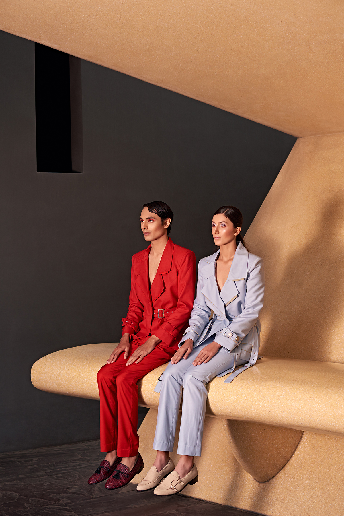
Two Point Two AW20 collection

Anvita Sharma
Anvita Sharma founded her Delhi-based fashion label Two Point Two to celebrate individuality through genderless collections that reject all forms of stereotyping and categorisation. Following the launch of the brand’s latest collection at London Fashion Week, Abigail Hodges speaks to the designer about the concept of beauty, self-expression and acceptance
1. Can you tell us about the historical events that inspired your AW20 collection?
Every collection that we have done so far has had a multicultural reference to it. Maybe it’s because I have lived in such different countries as well as among such different nationalities that amalgamation of these different/opposing or similar things comes very naturally to me. As a creative person, I try to challenge myself with every season. To do something that Two Point Two has not done before, may it be in relation to colours, silhouettes or embroideries.
Follow LUX on Instagram: luxthemagazine
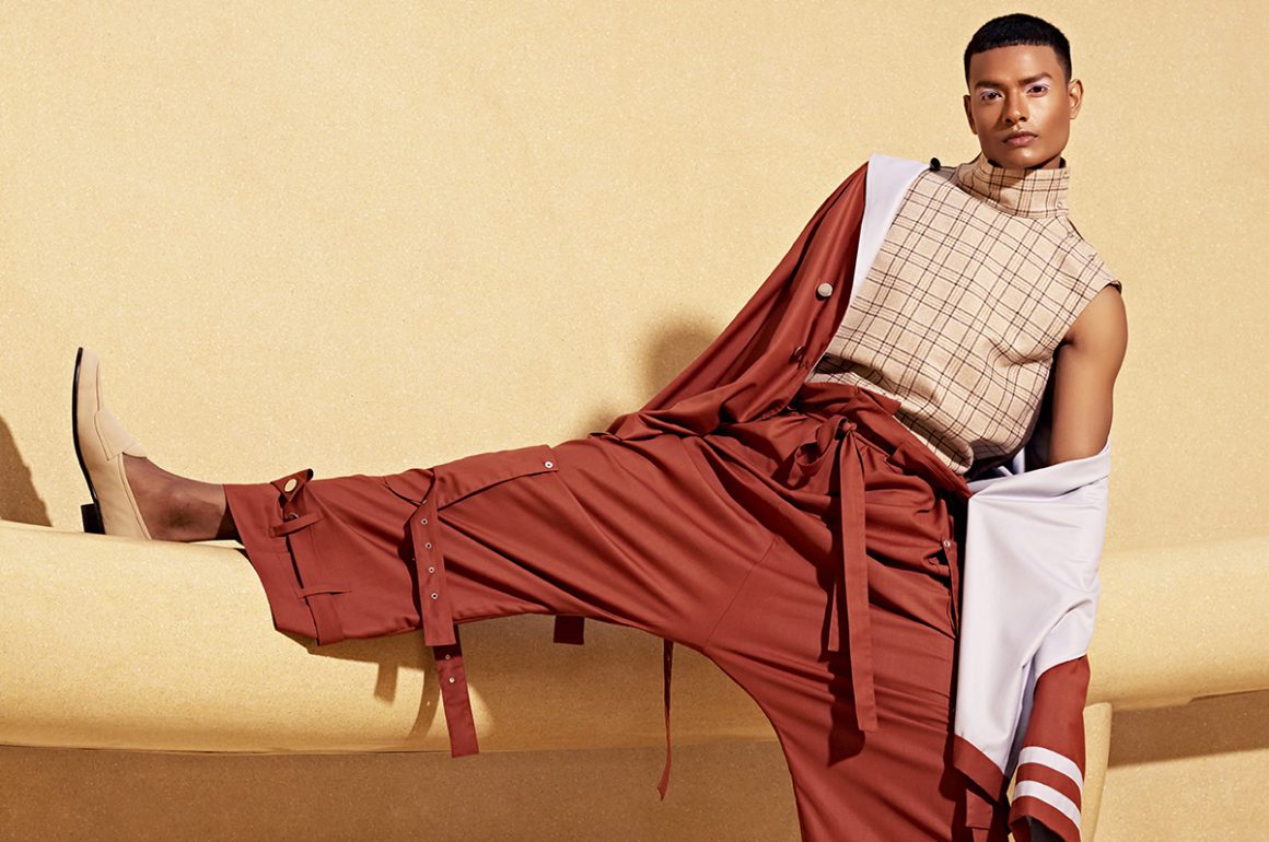
With this collection we wanted to take a step forward, and mix art and comfort. ‘The Self’ embodies a reconceptualisation of genderless clothing, aspiring to refashion a world that breaks down the boundaries of gender and illuminating the very fluidity of it. It speaks about self-confidence despite flaws and quirks. It is about finding perfection in the imperfections; about embracing one’s uniqueness and weirdness because that is what sets you apart from the rest. It is a synthesis of the masculine and feminine energies of the universe in one body which are depicted in our inspiration of the embroideries – “Ardhanareshwara”, an androgynous form of Lord Shiva and Parvati. We made our artwork using the tantric symbols of these deities mixing it with the Japanese character Enso as well as some genderless faces.
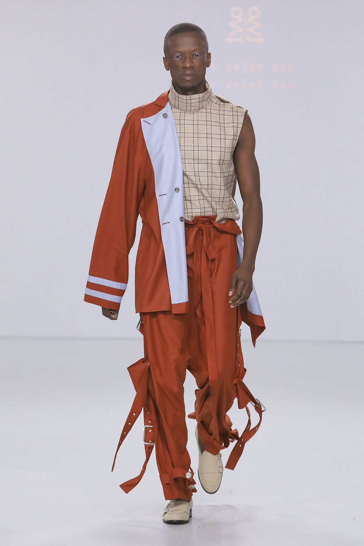
A look from ‘The Self’ collection by Two Point Two, which launched at London Fashion Week 2020. Photo by Gio Staiano
2. How is your brand philosophy reflected in the models that are chosen to showcase the pieces?
We celebrate individuality, confidence and diversity. [Our philosophy] aims to create an “agender” identity, which has characters from maybe both the binaries or maybe neither. It strongly stands against stereotyping and categorisation of anything. Two Point Two believes that beauty exists in every soul and it’s all about accepting and endorsing it as your own. We focus on the individual and not their gender, culture, race or size and support them to express their individuality through clothing even if it’s something unusual. Being ‘Typically Atypical’ is our motto. We chose models who we thought have very strong personalities and character to them. We were very pleased to have all of them in our show as each and every one of them represented Two Point Two’s brand philosophy of inclusivity and individuality to the core. As we did not have any particular category or guidelines as to what type of faces we need, we saw so many interesting people at the casting and instantly fell in love with so many of them that it became difficult to choose.
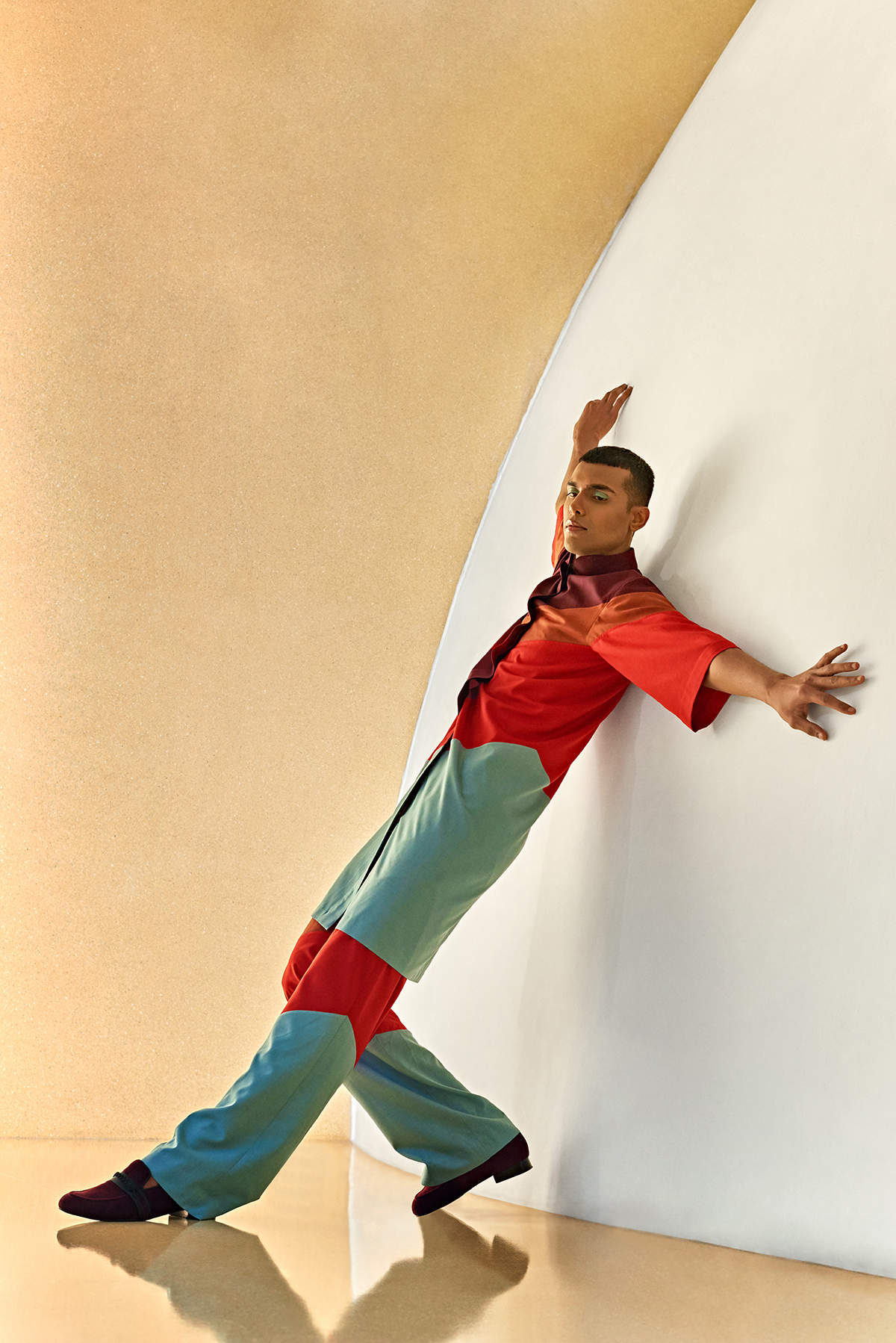
Two Point Two AW20 collection
3. Do you face any institutional obstructions when working to showcase a genderless collection?
The world has started going in a direction of all-inclusivity. It’s becoming very welcoming and embracing everyone’s individuality day by day. Self-expression is easier now than 10-20 years ago. And it’s only getting better. However, since the norms/criteria or categories still exist, there will always be stereotyping among things. Whether a particular look is too feminine or too masculine. Beauty is connected to a particular idea that the society creates. Sexiness is connected to a particular image or type of looks. Idolising that concept of beauty sometimes feels like an obstacle to who we, you and I are. The constant justification required as to why genderless fashion and people adorning it are also sexy/beautiful is something which we face and have no problem reminding everyone about it multiple times.
Read more: Founder of Nila House Lady Carole Bamford’s guide to Jaipur
I was very self-conscious about my looks while growing up. Still sometimes, very rarely, I fall in that vicious cycle of idolising the perfect beauty. So, for me, the concept of Two Point Two and the celebration of individuality and self-confidence it stands for, as well as rebelling against giving any sort of justifications for who you are, is the main goal while working on genderless collections. Also, the gender disparity and the problems the LGBTQIA community faces in India is something I strongly stand against and this is a way to support their community as well as any individual who feels that they don’t “belong”.
4. Which are your favourite pieces from this latest collection?
Oh, it’s very difficult to choose. They are so different yet so similar to each other. I poured my heart and soul to each garment and each detail. But if I have to choose I’ll have to say the monochrome olive-green look. It was very unexpected as the decision of changing its combination happened moments before the runway, so I was very pleasantly surprised by it myself. This is what fashion is to me. Fast paced, maddening and yet very satisfying.
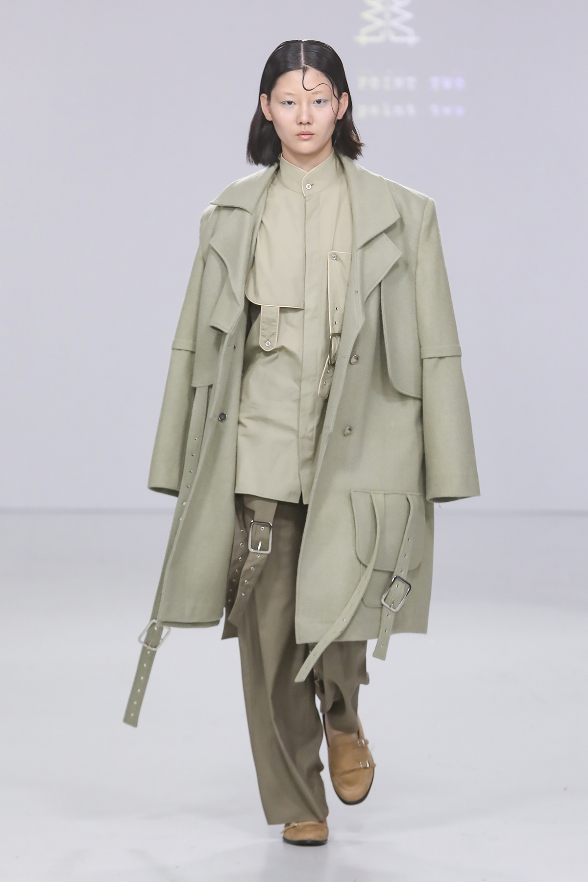
Anvita Sharma’s favourite look from ‘The Self’ collection by Two Point Two. Image by Gio Staiano
5. How has your design process evolved over the recent years?
I think there is a massive growth in terms of design aesthetic as well as the process that we follow. With every season, I learn from my mistakes and evolve and grow making sure that those mistakes are not repeated again. We are of course more organised and clear now as compared to our first collection. Although, our brand ethos, philosophy and belief remains as strong as when we started the brand. And, we still work on a ‘go with the flow’ basis and let the inspiration take over when it has to instead of actively looking for one. Like mentioned earlier, my favourite look was very last minute and unexpected, so these things happen very spontaneously and I strongly believe that the energies of the universe guide you and take you where you are meant to go.
6. What’s your five year vision for the brand?
I want Two Point Two to have a global audience and impact in the coming years as the brand is non-demographic and all-inclusive and can be appropriate for any market and any customer in the world. We also like to be working with more handloom and handwoven fabrics which we are already exploring and used in some collections at the moment and planning to get more involved in it. Also, we would like to support the local artisans and their dying crafts from different regions of India, so we are exploring certain tribes and clusters of various parts in India and getting to know their stories, their histories and cultures as well as helping them economically and incorporating their crafts in Two Point Two and give them an international audience in the coming season.
View the collections: twopointtwostudio.com


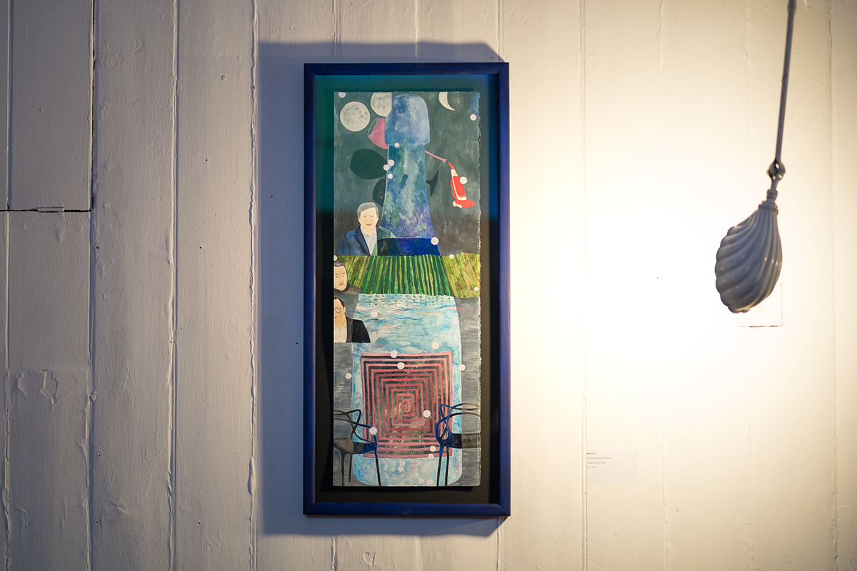
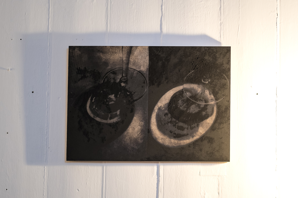
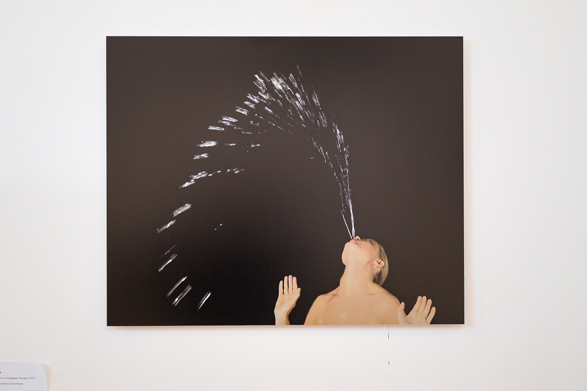
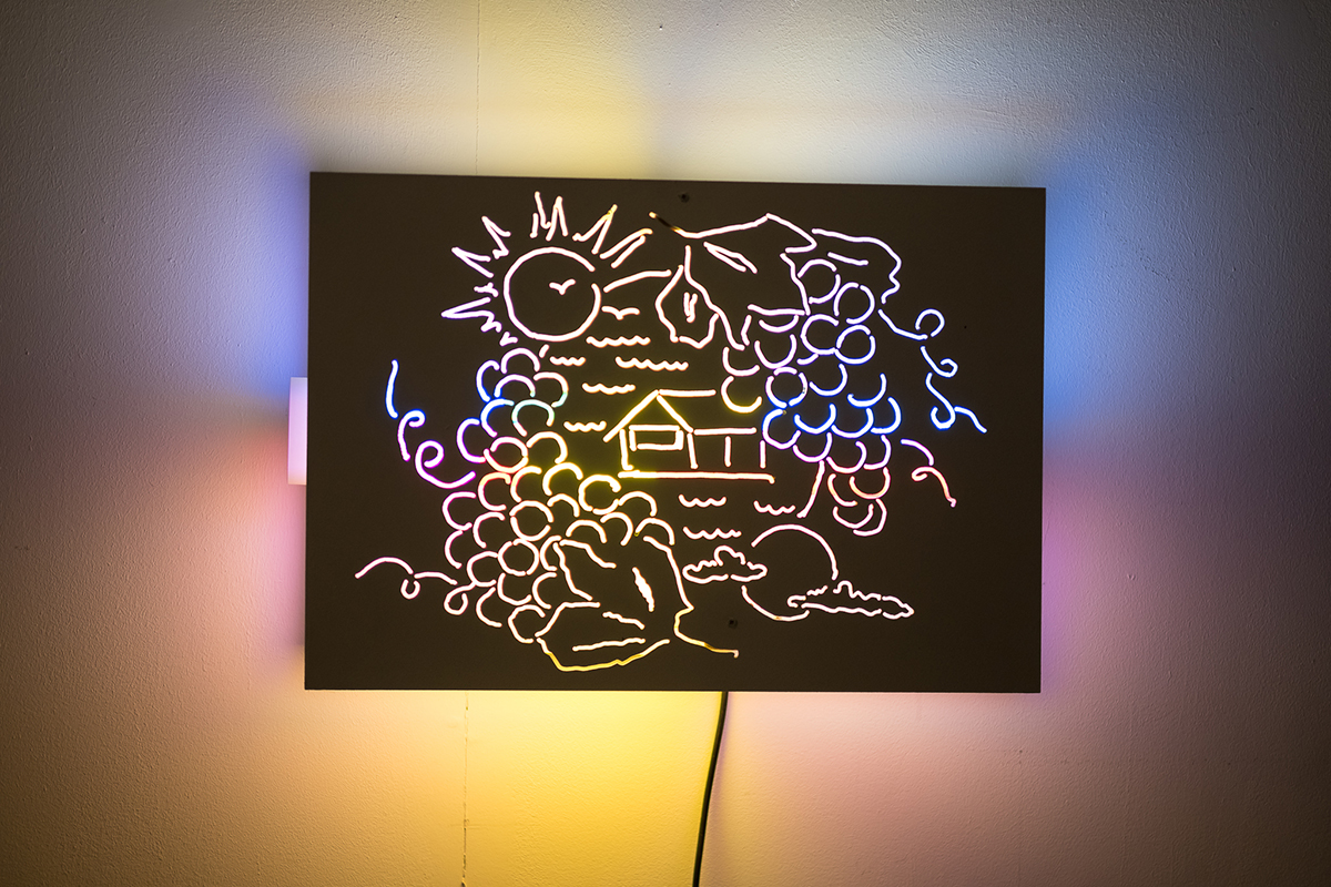
 The recent launch of the 2012 Roederer and Starck rosé champagne marks 13 years of the designer’s collaboration with the French family-owned champagne house and maker of Cristal. Starck has been involved in each step of the production, including, of course, the champagne’s packaging. From the first brut-nature product in 2006, the champagne has been created sugar-free, with zero dosage. As Jean-Baptiste Lécaillon, Roederer’s chef de cave says: “We have used nature as our collaborator as much as anything with our work with Philippe – it is organic, with minimal intervention and a focus on the real taste of champagne. This came from our discussions with him.” The presentation attempts to democratise the luxury product – it looks more like a chic bottle of olive oil than a grand cru. The hand-lettering on the label and box and the rough line of fluorescent pen creating the edging makes it look effortless. As Frédéric Rouzaud, president and family scion of Louis Roederer says: “It represents spontaneity. He wanted a simple paper for the label, and just wrote by hand what the product is. He wanted it to be approachable, to speak to everyone.”


Recent Comments